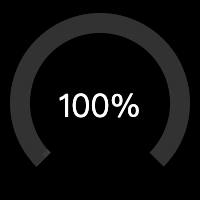
效果
轨道
使用 svg 画个轨道
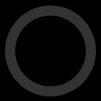
html
  <svg viewBox="0 0 100 100">
    <circle cx="50" cy="50" r="40" fill="none" stroke-width="10" stroke="#333"></circle>
  </svg>
简单的说,就是使用 circle 画个圆。需要注意的是,轨道实际是 circle 的 stroke,所以目标 svg 尺寸是 100,则圆的半径是 40,而 stroke 为 10。
接着,按设计,轨道只需要 3/4 个圆即可:

html
<!-- 3/4 track before rotate -->

<!-- circumference = radius * 2 * PI = 40 * 2 * Math.PI = 251.3274 -->
<!-- stroke-dasharray left = circumference * percent = 251.3274 * 0.75 = 188.4955 -->
<!-- stroke-dasharray right = circumference * (1 - percent) = 251.3274 * (1 - 0.75) = 62.8318 -->
  <svg viewBox="0 0 100 100">
    <circle cx="50" cy="50" r="40" fill="none" stroke-width="10" stroke-dasharray="188.4955,62.8318" stroke="#333"></circle>
  </svg>
为了实现这轨道,这个时候需要用到 stroke-dasharray。
为了更好理解这里 stroke-dasharray 的作用,先画一个 line:

html
  <svg viewBox="0 0 300 10" style="display: block;">
    <line x1="0" y1="5" x2="300" y2="5" stroke-width="10" stroke="#333" stroke-dasharray="75,25"></line>
  </svg>
简单的说,上面 line 长 300,每画一段 75 的 stroke,接着留空一段 25,如此重复,正好重复 3 次,刚好铺满了 300 的长度。
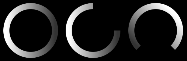
应用到 circle 也是如此,只是它是绕着圆,逆时针的画 stroke,类比的举例:
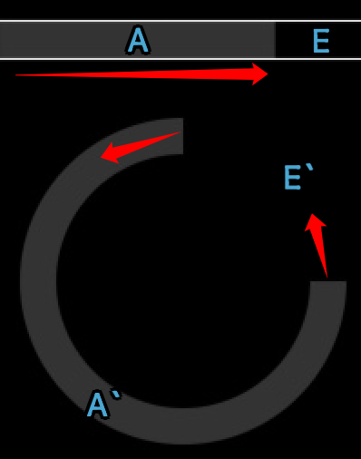
stroke-dasharray 的是长度,这里就需要通过计算周长,得出 A 与 E 分别是多长:
周长 = 半径 * 2 * PI = 40 * 2 * Math.PI = 251.3274
A = 周长 * 3/4 = 251.3274 * 0.75 = 188.4955
E = 周长 * 1/4 = 251.3274 * 0.25 = 62.8318
现在还要使用 transform 旋转 135 度以满足需求:

html
<!-- 3/4 track after rotate 135deg -->
  <svg viewBox="0 0 100 100">
    <circle cx="50" cy="50" r="40" fill="none" stroke-width="10" stroke-dasharray="188.4955,62.8318" transform="rotate(135, 50, 50)" stroke="#333"></circle>
  </svg>
进度条
先画一个纯色的进度条:
css
body {
  background: black;
}

.gauge {
  position: relative;
  display: inline-block;
}

.gauge > svg {
  width: 200px;
  height: 200px;
}

.gauge > span {
  color: #fff;
  position: absolute;
  top: 50%;
  left: 0;
  width: 100%;
  text-align: center;
  transform: translate(0, -50%);
  font-size: 2em;
}
html
<!-- stroke-dasharray left = circumference * 0.75 * percent = 188.4955 * 0.10 = 18.8495 -->
<!-- stroke-dasharray right = circumference * 0.75 * (1 - percent) + circumference * (1 - 0.75) = 188.4955 * (1 - 0.10) + 62.8318 = 232.4778 -->
<div class="gauge">
  <svg viewBox="0 0 100 100">
    <circle cx="50" cy="50" r="40" fill="none" stroke-width="10" stroke-dasharray="188.4955,62.8318" transform="rotate(135, 50, 50)" stroke="#333"></circle>
    <circle cx="50" cy="50" r="40" fill="none" stroke-width="10" stroke-dasharray="18.8495,232.4778" transform="rotate(135, 50, 50)" stroke="#ffff00"></circle>
  </svg>
  <span>10%</span>
</div>

<!-- stroke-dasharray left = circumference * 0.75 * percent = 188.4955 * 0.50 = 94.2477 -->
<!-- stroke-dasharray right = circumference * 0.75 * (1 - percent) + circumference * (1 - 0.75) = 188.4955 * (1 - 0.50) + 62.8318 = 157.0795 -->
<div class="gauge">
  <svg viewBox="0 0 100 100">
    <circle cx="50" cy="50" r="40" fill="none" stroke-width="10" stroke-dasharray="188.4955,62.8318" transform="rotate(135, 50, 50)" stroke="#333"></circle>
    <circle cx="50" cy="50" r="40" fill="none" stroke-width="10" stroke-dasharray="94.2477,157.0795" transform="rotate(135, 50, 50)" stroke="#ffff00"></circle>
  </svg>
  <span>50%</span>
</div>

<!-- stroke-dasharray left = circumference * 0.75 * percent = 188.4955 * 1.00 = 94.2477 -->
<!-- stroke-dasharray right = circumference * 0.75 * (1 - percent) + circumference * (1 - 0.75) = 188.4955 * (1 - 1.00) + 62.8318 = 157.0795 -->
<div class="gauge">
  <svg viewBox="0 0 100 100">
    <circle cx="50" cy="50" r="40" fill="none" stroke-width="10" stroke-dasharray="188.4955,62.8318" transform="rotate(135, 50, 50)" stroke="#333"></circle>
    <circle cx="50" cy="50" r="40" fill="none" stroke-width="10" stroke-dasharray="188.4955,62.8318" transform="rotate(135, 50, 50)" stroke="#ffff00"></circle>
  </svg>
  <span>100%</span>
</div>
有个很重要的前提,例如图中的 10%、50%、100% 的百分比,是基于那 3/4 轨道的,不是整个圆,所以计算 stroke-dasharray 的时候,实际考虑的是 3 个部分:
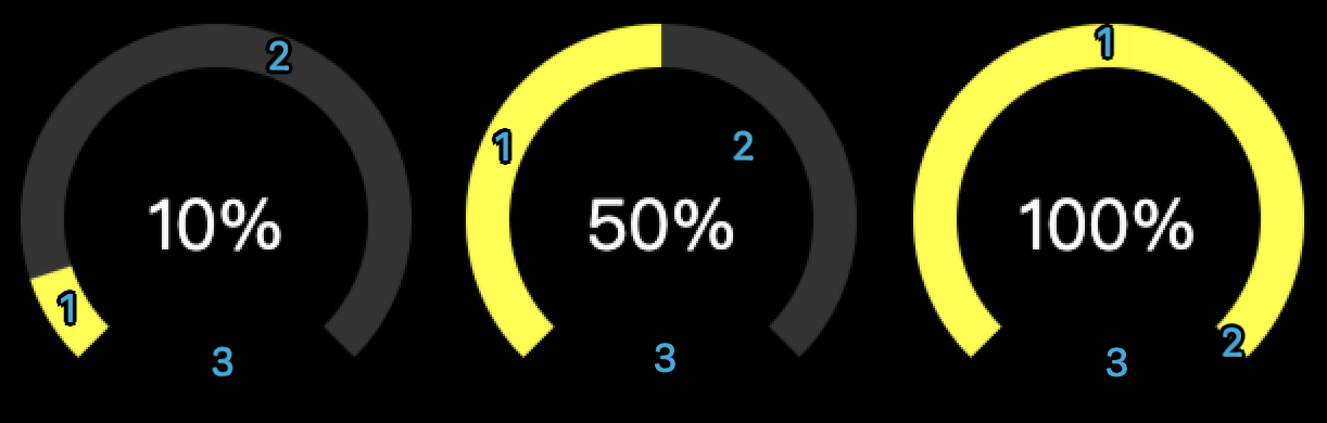
10%
A = s1 = 周长 * 3/4 * progress = 251.3274 * 0.75 * 0.10 = 18.8495
E = s2 + s3 = 周长 * 3/4 * (1 - progress) + 周长 * 1/4 = 251.3274 * 0.75 * (1 - 0.10) + 251.3274 * 0.25 = 232.4778
50%
A = s1 = 周长 * 3/4 * progress = 251.3274 * 0.75 * 0.50 = 94.2477
E = s2 + s3 = 周长 * 3/4 * (1 - progress) + 周长 * 1/4 = 251.3274 * 0.75 * (1 - 0.50) + 251.3274 * 0.25 = 157.0796
100%
A = s1 = 周长 * 3/4 * progress = 251.3274 * 0.75 * 1.00 = 188.4955
E = s2 + s3 = 周长 * 3/4 * (1 - progress) + 周长 * 1/4 = 251.3274 * 0.75 * (1 - 1.00) + 251.3274 * 0.25 = 62.8318
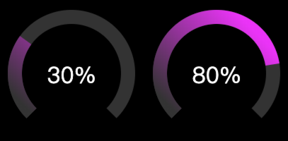
渐变
渐变由最初的从左到右,跟随轨道的 rotate,最后变成从右上到左下,也就意味着,此处的渐变并不是跟随轨道从 0 到 100%,仅实现了类似的感觉的模拟。
html
<!-- progress bar with gradient -->

<!-- stroke-dasharray left = circumference * 0.75 * percent = 188.4955 * 0.30 = 94.2477 -->
<!-- stroke-dasharray right = circumference * 0.75 * (1 - percent) + circumference * (1 - 0.75) = 188.4955 * (1 - 0.30) + 62.8318 = 157.0795 -->
<div class="gauge">
  <svg viewBox="0 0 100 100">
    <circle cx="50" cy="50" r="40" fill="none" stroke-width="10" stroke-dasharray="188.4955,62.8318" transform="rotate(135, 50, 50)" stroke="#333"></circle>
    <circle cx="50" cy="50" r="40" fill="none" stroke-width="10" stroke-dasharray="56.5486,194.7786" transform="rotate(135, 50, 50)" stroke="url(#gauge-gradient)"></circle>
  </svg>
  <span>30%</span>
</div>

<!-- stroke-dasharray left = circumference * 0.75 * percent = 188.4955 * 0.80 = 94.2477 -->
<!-- stroke-dasharray right = circumference * 0.75 * (1 - percent) + circumference * (1 - 0.75) = 188.4955 * (1 - 0.80) + 62.8318 = 157.0795 -->
<div class="gauge">
  <svg viewBox="0 0 100 100">
    <circle cx="50" cy="50" r="40" fill="none" stroke-width="10" stroke-dasharray="188.4955,62.8318" transform="rotate(135, 50, 50)" stroke="#333"></circle>
    <circle cx="50" cy="50" r="40" fill="none" stroke-width="10" stroke-dasharray="150.7964,100.5308" transform="rotate(135, 50, 50)" stroke="url(#gauge-gradient)"></circle>
  </svg>
  <span>80%</span>
</div>
动画
最后,为了实现"效果"中的动画,需要 CSS 配合 JS 实现:
html
<!-- with animation -->

<div class="gauge">
  <svg viewBox="0 0 100 100">
    <circle cx="50" cy="50" r="40" fill="none" stroke-width="10" stroke-dasharray="188.4955,62.8318" transform="rotate(135, 50, 50)" stroke="#333"></circle>
    <circle id="circle" cx="50" cy="50" r="40" fill="none" stroke-width="10" stroke-dasharray="0,251.3274" transform="rotate(135, 50, 50)" stroke="url(#gauge-gradient3)"></circle>
  </svg>
  <span>100%</span>
</div>
css
#circle {
  transition: all 1s linear;
}
javascript
(function() {
  const radius = 40;
  const trackPercent = 0.75
  const circumference = 40 * 2 * Math.PI;
  const percent = 1.00;

  const strokeDasharrayLeft = circumference * trackPercent * percent
  const strokeDasharrayRight = circumference * trackPercent * (1 - percent) + circumference * (1 - trackPercent)

  const circle = document.querySelector('#circle');

  function change() {
    const strokeDasharray = circle.getAttribute('stroke-dasharray').split(',')
    const left = parseFloat(strokeDasharray[0])
    const right = parseFloat(strokeDasharray[1])

    if (left === 0) {
      circle.setAttribute('stroke-dasharray', `${strokeDasharrayLeft},${strokeDasharrayRight}`)
    } else {
      circle.setAttribute('stroke-dasharray', `0,251.3274`)
    }
  }

  setTimeout(function() {

    setInterval(function() {
      change()
    }, 1000)

    change()
  }, 0)
})();
JS 的主要作用就是动态的计算 stroke-dasharray,并配合 CSS 的 transition all 即可实现。
Done!