本文是系列文章的一部分:框架实战指南 - 基础知识
虽然 React、Angular 和 Vue 都提供了简单的内置 API 来访问事件、输入和其他与底层 HTML 元素的绑定;但有时这还不够。
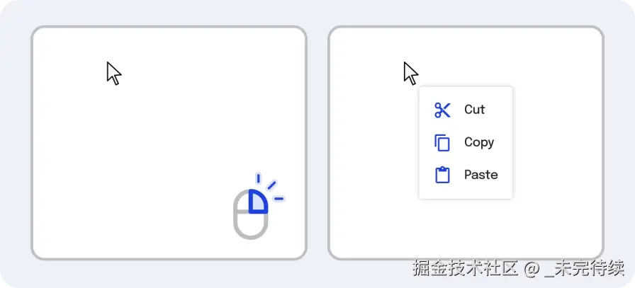
例如,假设我们要构建一个右键菜单,以便用户可以看到与用户当前悬停的文件相关的操作列表:
我们能够使用迄今为止介绍的 API 来构建其中的一些功能,即我们可以:
- 使用我们框架的事件绑定来监听浏览器的
contextmenu事件,让我们知道用户何时单击了鼠标右键 - 有条件地渲染上下文菜单的元素,直到相关
- 绑定
style属性来定位弹出窗口x和y值
html
<!-- App.vue --><!-- This code sample is inaccessible and generally not --><!-- production-grade. It's missing: --><!-- - Focus on menu open --><!-- - Closing upon external click --><!-- --><!-- Read on to learn how to add these --><script setup>import { ref } from "vue";const isOpen = ref(false);const mouseBounds = ref({ x: 0, y: 0,});const close = () => { isOpen.value = false;};const open = (e) => { e.preventDefault(); isOpen.value = true; mouseBounds.value = { // Mouse position on click x: e.clientX, y: e.clientY, };};</script><template> <div style="margin-top: 5rem; margin-left: 5rem"> <div @contextmenu="open($event)">Right click on me!</div> </div> <div v-if="isOpen" :style="` position: fixed; top: ${mouseBounds.y}px; left: ${mouseBounds.x}px; background: white; border: 1px solid black; border-radius: 16px; padding: 1rem; `" > <button @click="close()">X</button> This is a context menu </div></template>这种方法效果很好,直到我们考虑到缺少两个功能:
- 监听弹出窗口内容之外的任何点击
- 当用户右键单击时,聚焦于弹出窗口的内容,键盘快捷键立即应用于弹出窗口
虽然这些功能无需任何新引入的 API即可实现 ,但它们都要求您使用浏览器 API 来document.querySelector摆脱框架的限制。
在极少数情况下,你会希望摆脱控制 HTML 节点访问的框架;每个框架都允许你无需使用专门的浏览器 API 即可访问底层 DOM 节点。这使得我们的代码在保留这些框架提供的响应式系统的同时,仍然保留对底层元素的完全控制。
在本章中,我们将学习:
- 如何引用底层 DOM 元素
- 如何引用元素数组
- 添加焦点和外部点击监听上下文菜单
- 强化知识的代码挑战
基本元素引用
refVue 能够使用超级简单的 API来存储反应数据,以访问 DOM 节点并创建与元素属性值的属性ref具有相同变量名的变量。ref``ref
html
<!-- App.vue --><script setup>import { ref, onMounted } from "vue";// Assign the refconst el = ref();// Use the refonMounted(() => { console.log(el);});</script><template> <p ref="el">Check your console</p></template>这里,el.value指向标签内的HTMLElement。p``template
Vue 还允许您传递一个函数,以便在设置ref时运行该函数,如下所示:ref
html
<!-- App.vue --><script setup>function logEl(el) { console.log(el);}</script><template> <p :ref="logEl">Check your console</p></template>如何保存元素引用数组
假设我们正在构建一个电子邮件应用程序,并希望为用户提供一个按钮,让他们快速滚动到邮件顶部。
构建此按钮的一种方法是将数组中每个底层消息的 DOM 元素存储到元素引用中,然后使用顶部和底部元素的scrollIntoView方法将它们直观地带到页面上。
让我们看看每个框架是如何实现这一点的。
Vue 有一个方便的功能,只需在属性中输入一个字符串,即可创建引用元素的数组ref。然后,这会将ref同名的 转换为我们可以按预期访问的数组。
html
<!-- App.vue --><script setup>import { ref } from "vue";const items = ref([]);function scrollToTop() { items.value[0].scrollIntoView();}function scrollToBottom() { items.value[items.value.length - 1].scrollIntoView();}const messages = [ "The new slides for the design keynote look wonderful!", "Some great new colours are planned to debut with Material Next!", "Hey everyone! Please take a look at the resources I've attached.", "So on Friday we were thinking about going through that park you've recommended.", "We will discuss our upcoming Pixel 6 strategy in the following week.", "On Thursday we drew some great new ideas for our talk.", "So the design teams got together and decided everything should be made of sand.",];</script><template> <div> <button @click="scrollToTop()">Scroll to top</button> <ul style="height: 100px; overflow: scroll"> <li v-for="(message, i) of messages" :key="i" ref="items"> {{ message }} </li> </ul> <button @click="scrollToBottom()">Scroll to bottom</button> </div></template>实际使用情况
现在我们知道了如何访问给定框架中的底层 HTML 元素,让我们回到本章开头的上下文菜单示例。
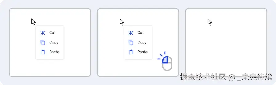
瞧,虽然我们的上下文菜单能够正确显示,但我们缺少两个不同的功能:
- 打开时聚焦下拉元素
- 当用户点击其他地方时关闭上下文菜单
让我们将此功能添加到我们的上下文菜单组件中。
为了添加第一个功能,我们将重点关注上下文菜单的使用element.focus(),以确保键盘用户在尝试使用该功能时不会迷失。
要添加第二个功能,让我们:
- 每次用户点击页面时添加一个监听器
- 在点击监听器中,获取事件的
target属性- 事件目标是用户正在采取行动的元素 - 也就是用户当前正在点击的元素
- 然后我们使用该方法检查它
target是否在上下文菜单中element.contains。
原始 JavaScript 中的代码可能看起来像这样:
html
<button id="clickInside"> If you click outside of this button, it will hide</button><script> const clickInsideButton = document.querySelector("#clickInside"); function listenForOutsideClicks(e) { // This check is saying "`true` if the clicked element is a child of the 'clickInside' button" const isClickInside = clickInsideButton.contains(e.target); if (isClickInside) return; // Hide the button using CSS. In frameworks, we'd use conditional rendering. clickInsideButton.style.display = "none"; } document.addEventListener("click", listenForOutsideClicks);</script>让我们将此逻辑移植到 React、Angular 和 Vue:
让我们采用上述点击监听器并将其应用于我们的onMounted生命周期方法中。
我们还将使用回调引用,在每次上下文菜单打开时运行一个函数。该函数要么不执行任何操作,.focus要么根据元素是否渲染进行调用。
html
<!-- App.vue --><script setup>import { ref, onMounted, onUnmounted } from "vue";const isOpen = ref(false);const mouseBounds = ref({ x: 0, y: 0,});const contextMenuRef = ref(null);function closeIfOutside(e) { const contextMenuEl = contextMenuRef.value; if (!contextMenuEl) return; const isClickInside = contextMenuEl.contains(e.target); if (isClickInside) return; isOpen.value = false;}onMounted(() => { document.addEventListener("click", closeIfOutside);});onUnmounted(() => { document.removeEventListener("click", closeIfOutside);});const close = () => { isOpen.value = false;};const open = (e) => { e.preventDefault(); isOpen.value = true; mouseBounds.value = { x: e.clientX, y: e.clientY, };};function focusOnOpen(el) { contextMenuRef.value = el; if (!el) return; el.focus();}</script><template> <div style="margin-top: 5rem; margin-left: 5rem"> <div @contextmenu="open($event)">Right click on me!</div> </div> <div v-if="isOpen" :ref="(el) => focusOnOpen(el)" tabIndex="0" :style="` position: fixed; top: ${mouseBounds.y}px; left: ${mouseBounds.x}px; background: white; border: 1px solid black; border-radius: 16px; padding: 1rem; `" > <button @click="close()">X</button> This is a context menu </div></template>挑战
让我们根据对元素引用的理解来构建一个新的组件。
具体来说,让我们构建工具提示功能,以便当用户将鼠标悬停在按钮上一秒或更长时间时,它会显示一条弹出消息来帮助用户了解其使用方法。
为此,我们需要考虑以下几点:
- 如何跟踪用户在元素上悬停一秒或更长时间的时间
- 当用户移动鼠标时如何删除弹出窗口
- 确保工具提示位于按钮上方
- 确保工具提示水平居中
- 添加任何必要的润色
步骤 1:跟踪用户何时悬停在元素上
要跟踪元素何时被悬停,我们可以使用HTMLmouseover事件。
为了确保用户悬停至少 1 秒,我们可以添加一个setTimeout来延迟工具提示的显示。
setTimeout记得在组件未渲染时进行清理!
html
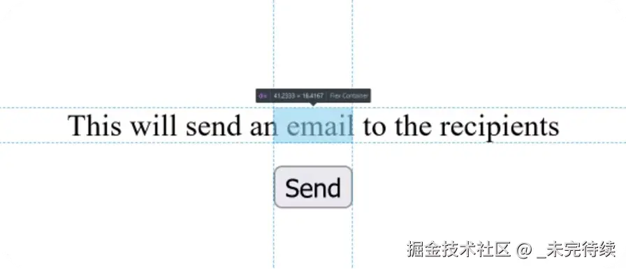
<!-- App.vue --><script setup>import { ref, onUnmounted } from "vue";const buttonRef = ref();const mouseOverTimeout = ref(null);const tooltipMeta = ref({ show: false,});const onMouseOver = () => { mouseOverTimeout.value = setTimeout(() => { tooltipMeta.value = { show: true, }; }, 1000);};onUnmounted(() => { clearTimeout(mouseOverTimeout.current);});</script><template> <div style="padding: 10rem"> <button ref="buttonRef" @mouseover="onMouseOver()">Send</button> <div v-if="tooltipMeta.show">This will send an email to the recipients</div> </div></template>步骤 2:当用户停止悬停时删除元素
现在我们的工具提示已经在我们期望的时间出现了,当我们停止悬停在按钮元素上时,让我们将其删除。
为此,我们将使用HTMLmouseleave事件来设置show和false取消计时器,以便在事件处于活动状态时显示工具提示。
html
<!-- App.vue --><script setup>import { ref, onUnmounted } from "vue";const buttonRef = ref();const mouseOverTimeout = ref(null);const tooltipMeta = ref({ show: false,});const onMouseOver = () => { mouseOverTimeout.value = setTimeout(() => { tooltipMeta.value = { show: true, }; }, 1000);};const onMouseLeave = () => { tooltipMeta.value = { show: false, }; clearTimeout(mouseOverTimeout.current);};onUnmounted(() => { clearTimeout(mouseOverTimeout.current);});</script><template> <div style="padding: 10rem"> <button ref="buttonRef" @mouseover="onMouseOver()" @mouseleave="onMouseLeave()" > Send </button> <div v-if="tooltipMeta.show">This will send an email to the recipients</div> </div></template>步骤 3:将工具提示放置在按钮上方
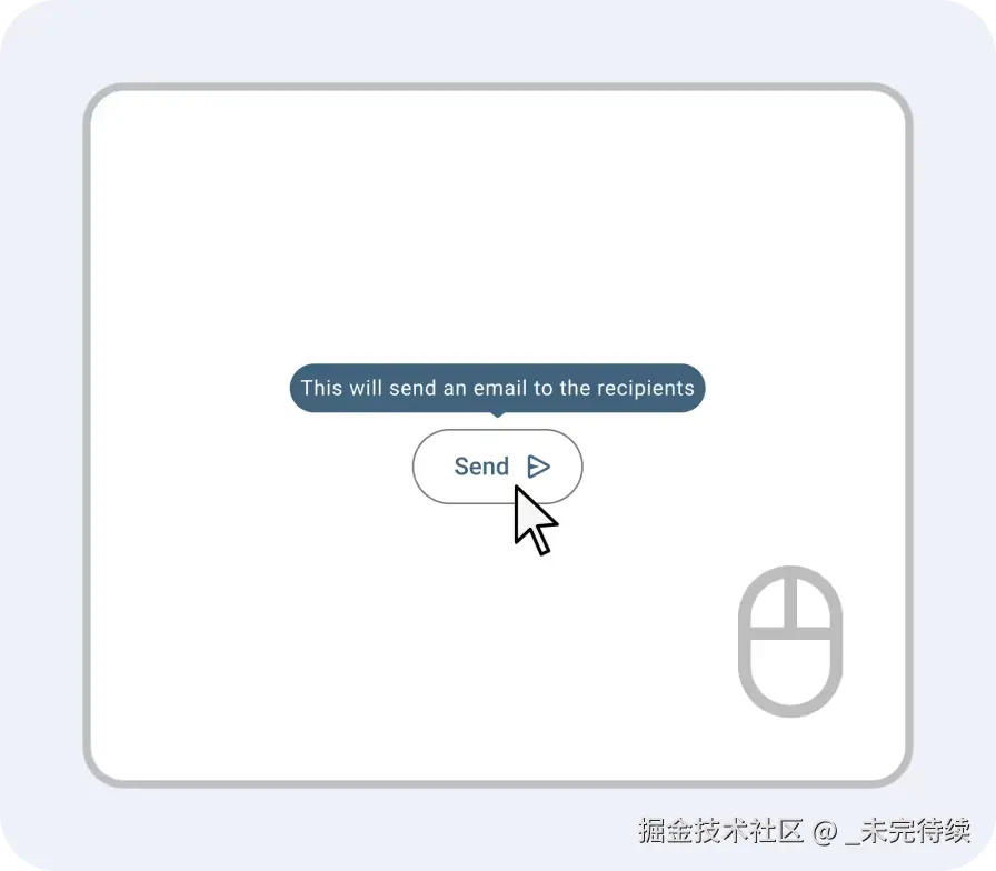
为了将工具提示放置在按钮上方,我们将使用元素引用和的方法来HTMLElement``getBoundingClientRect测量按钮的位置、高度和宽度。
然后,我们将使用这个位置数据和CSSposition: fixed将工具提示定位到按钮轴的8px上方:y
html
<!-- App.vue --><script setup>import { ref, onUnmounted } from "vue";const buttonRef = ref();const mouseOverTimeout = ref(null);const tooltipMeta = ref({ x: 0, y: 0, height: 0, width: 0, show: false,});const onMouseOver = () => { mouseOverTimeout.value = setTimeout(() => { const bounding = buttonRef.value.getBoundingClientRect(); tooltipMeta.value = { x: bounding.x, y: bounding.y, height: bounding.height, width: bounding.width, show: true, }; }, 1000);};const onMouseLeave = () => { tooltipMeta.value = { x: 0, y: 0, height: 0, width: 0, show: false, }; clearTimeout(mouseOverTimeout.current);};// Just in caseonUnmounted(() => { clearTimeout(mouseOverTimeout.current);});</script><template> <div style="padding: 10rem"> <div v-if="tooltipMeta.show" :style="` position: fixed; top: ${tooltipMeta.y - tooltipMeta.height - 8}px; `" > This will send an email to the recipients </div> <button ref="buttonRef" @mouseover="onMouseOver()" @mouseleave="onMouseLeave()" > Send </button> </div></template>步骤 4:水平居中工具提示
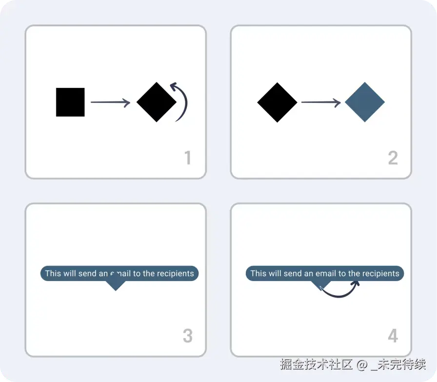
将元素居中position: fixed是一项非常大的挑战。虽然有六种方法可以解决这个问题,但我们最终会选择一个解决方案,它涉及:
- 创建一个
<div>与按钮宽度相同的 - 使其成为
<div>一个应用 CSS 来居中所有子元素display: flex的元素justify-content: center - 允许
div使用内部溢出overflow: visible - 将我们的工具提示的文本放置在应用的范围内,
<div>以white-space: nowrap避免文本换行以满足<div>宽度。
这是可行的,因为<div>的位置应该镜像按钮的位置并允许内容围绕它居中,如下所示:
 最后,我们的样式应该看起来像这样的 HTML 标记:
html
<div style="padding: 10rem"> <!-- The PX values here may differ on your system --> <div style=" display: flex; overflow: visible; justify-content: center; width: 40.4667px; position: fixed; top: 138.8px; left: 168px; " > <div style="white-space: nowrap"> This will send an email to the recipients </div> </div> <button>Send</button></div>让我们在我们的框架内实现这一点:
html
<!-- App.vue --><script setup>import { ref, onUnmounted } from "vue";const buttonRef = ref();const mouseOverTimeout = ref(null);const tooltipMeta = ref({ x: 0, y: 0, height: 0, width: 0, show: false,});const onMouseOver = () => { mouseOverTimeout.value = setTimeout(() => { const bounding = buttonRef.value.getBoundingClientRect(); tooltipMeta.value = { x: bounding.x, y: bounding.y, height: bounding.height, width: bounding.width, show: true, }; }, 1000);};const onMouseLeave = () => { tooltipMeta.value = { x: 0, y: 0, height: 0, width: 0, show: false, }; clearTimeout(mouseOverTimeout.current);};onUnmounted(() => { clearTimeout(mouseOverTimeout.current);});</script><template> <div style="padding: 10rem"> <div v-if="tooltipMeta.show" :style="` display: flex; overflow: visible; justify-content: center; width: ${tooltipMeta.width}px; position: fixed; top: ${tooltipMeta.y - tooltipMeta.height - 8}px; left: ${tooltipMeta.x}px; `" > <div :style="` white-space: nowrap; `" > This will send an email to the recipients </div> </div> <button ref="buttonRef" @mouseover="onMouseOver()" @mouseleave="onMouseLeave()" > Send </button> </div></template>步骤5:添加抛光
我们的工具提示现在可以正常工作了!不过,说实话,它看起来有点朴素,缺乏太多的样式。
让我们通过添加以下内容来解决这个问题:
- 背景颜色
- 指示工具提示元素位置的下拉箭头
虽然可以使用一些background-colorCSS添加第一个项目,但下拉箭头的解决难度更大一些。
下拉箭头更具挑战性的原因是 CSS 通常希望所有元素都表示为正方形 - 而不是任何其他形状。
然而,我们可以利用这些知识来使用正方形,并通过以下方式欺骗人眼,使它认为是一个三角形:
- 使用 CSS将正方形旋转 45 度,使其"侧向"
transform - 使用
background-color - 将正方形定位为仅显示下半部分,并使用
position: absolute负 CSStop值 - 使用负片将其放置在工具提示背景之下
z-index
让我们建造它吧!
html
<!-- App.vue --><script setup>import { ref, onUnmounted } from "vue";const buttonRef = ref();const mouseOverTimeout = ref(null);const tooltipMeta = ref({ x: 0, y: 0, height: 0, width: 0, show: false,});const onMouseOver = () => { mouseOverTimeout.value = setTimeout(() => { const bounding = buttonRef.value.getBoundingClientRect(); tooltipMeta.value = { x: bounding.x, y: bounding.y, height: bounding.height, width: bounding.width, show: true, }; }, 1000);};const onMouseLeave = () => { tooltipMeta.value = { x: 0, y: 0, height: 0, width: 0, show: false, }; clearTimeout(mouseOverTimeout.current);};onUnmounted(() => { clearTimeout(mouseOverTimeout.current);});</script><template> <div style="padding: 10rem"> <div v-if="tooltipMeta.show" :style="` display: flex; overflow: visible; justify-content: center; width: ${tooltipMeta.width}px; position: fixed; top: ${tooltipMeta.y - tooltipMeta.height - 16 - 6 - 8}px; left: ${tooltipMeta.x}px; `" > <div :style="` white-space: nowrap; padding: 8px; background: #40627b; color: white; border-radius: 16px; `" > This will send an email to the recipients </div> <div :style="` height: 12px; width: 12px; transform: rotate(45deg) translateX(-50%); background: #40627b; bottom: calc(-6px - 4px); position: absolute; left: 50%; zIndex: -1; `" ></div> </div> <button ref="buttonRef" @mouseover="onMouseOver()" @mouseleave="onMouseLeave()" > Send </button> </div></template>