📅 我们继续 50 个小项目挑战!------ MobileTabNavigation组件
仓库地址:https://github.com/SunACong/50-vue-projects
项目预览地址:https://50-vue-projects.vercel.app/
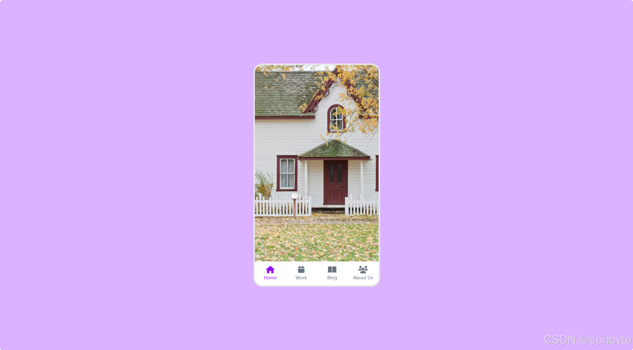
使用 Vue 3 的 <script setup> 语法结合 Tailwind CSS 来创建一个仿手机界面的应用切换组件。这个组件模拟了真实手机中点击底部导航栏切换不同页面的动画效果,非常适合用于展示移动端 UI 设计或作为网页中的交互式演示。
📝 应用目标
- 使用 Vue 3 Composition API 管理组件状态
- 利用
v-for动态渲染多个页面和导航项 - 实现页面切换的淡入淡出动画效果
- 使用 Tailwind CSS 快速构建响应式布局与视觉样式
- 模拟真实手机界面的交互体验
🔧 技术实现点
| 技术点 | 描述 |
|---|---|
Vue 3 <script setup> |
使用 ref 定义响应式数据 |
v-for 指令 |
动态渲染页面和底部导航项 |
@click 事件绑定 |
点击导航项切换当前页面 |
transition-opacity |
实现页面淡入淡出动画 |
absolute 定位 |
实现多页面层叠布局 |
| Tailwind CSS | 快速构建美观 UI 与交互反馈 |
🖌️ 组件实现
🎨 模板结构 <template>
html
<template>
    <div class="flex min-h-screen items-center justify-center bg-purple-300 p-4 font-sans">
        <!-- 手机容器 -->
        <div
            class="relative h-[600px] w-[340px] overflow-hidden rounded-3xl border-4 border-gray-200">
            <!-- 内容区域 -->
            <div
                v-for="(tab, index) in tabs"
                :key="index"
                class="absolute inset-0 transition-opacity duration-300"
                :class="
                    index === currentTabIndex ? 'opacity-100' : 'pointer-events-none opacity-0'
                ">
                <img
                    :src="tab.imageUrl"
                    :alt="tab.name"
                    class="h-full w-full object-cover"
                    style="height: calc(100% - 64px)" />
            </div>

            <!-- 底部导航 -->
            <nav class="absolute bottom-0 left-0 flex h-16 w-full bg-white">
                <ul class="flex w-full">
                    <li
                        v-for="(tab, index) in tabs"
                        :key="index"
                        @click="currentTabIndex = index"
                        class="flex flex-1 cursor-pointer flex-col items-center justify-center p-2 transition-colors duration-200"
                        :class="
                            index === currentTabIndex
                                ? 'text-purple-600'
                                : 'text-gray-500 hover:text-purple-500'
                        ">
                        <i :class="tab.iconClass" class="text-xl"></i>
                        <p class="mt-1 text-xs">{{ tab.name }}</p>
                    </li>
                </ul>
            </nav>
        </div>
    </div>
</template>
模板部分构建了一个居中的"手机"容器,内部包含两个主要区域:
- 内容区域 :使用
v-for渲染多个全屏图片页面,通过opacity控制显示/隐藏。 - 底部导航栏:提供四个可点击的导航项,点击后切换对应页面。
💻 脚本逻辑 <script setup>
js
<script setup>
    import { ref } from 'vue'

    // 响应式状态管理当前选中的标签索引
    const currentTabIndex = ref(0)

    // 标签数据
    const tabs = [
        {
            name: 'Home',
            iconClass: 'fas fa-home',
            imageUrl:
                'https://images.unsplash.com/photo-1480074568708-e7b720bb3f09?ixlib=rb-1.2.1&ixid=eyJhcHBfaWQiOjEyMDd9&auto=format&fit=crop&w=1053&q=80',
        },
        {
            name: 'Work',
            iconClass: 'fas fa-box',
            imageUrl:
                'https://images.unsplash.com/photo-1454165804606-c3d57bc86b40?ixlib=rb-1.2.1&ixid=eyJhcHBfaWQiOjEyMDd9&auto=format&fit=crop&w=1050&q=80',
        },
        {
            name: 'Blog',
            iconClass: 'fas fa-book-open',
            imageUrl:
                'https://images.unsplash.com/photo-1471107340929-a87cd0f5b5f3?ixlib=rb-1.2.1&ixid=eyJhcHBfaWQiOjEyMDd9&auto=format&fit=crop&w=1266&q=80',
        },
        {
            name: 'About Us',
            iconClass: 'fas fa-users',
            imageUrl:
                'https://images.unsplash.com/photo-1522202176988-66273c2fd55f?ixlib=rb-1.2.1&ixid=eyJhcHBfaWQiOjEyMDd9&auto=format&fit=crop&w=1351&q=80',
        },
    ]
</script>
脚本部分非常简洁:
- 使用
ref(0)创建响应式变量currentTabIndex,表示当前选中的页面索引。 - 定义
tabs数组,包含每个页面的名称、图标类名和背景图片 URL。 - 点击导航项时,直接更新
currentTabIndex的值即可触发视图更新。
🎨 Tailwind CSS 样式重点
| 类名 | 作用 |
|---|---|
flex |
启用 Flexbox 布局 |
min-h-screen |
设置最小高度为视口高度 |
items-center / justify-center |
居中对齐内容 |
bg-purple-300 |
设置背景颜色 |
p-4 |
设置内边距 |
font-sans |
使用无衬线字体 |
relative |
设置相对定位,作为子元素的定位上下文 |
h-[600px] w-[340px] |
固定手机容器尺寸 |
overflow-hidden |
隐藏超出容器的内容 |
rounded-3xl |
设置超大圆角,模拟手机外观 |
border-4 border-gray-200 |
添加边框,增强真实感 |
absolute inset-0 |
让页面内容铺满容器 |
transition-opacity duration-300 |
添加透明度过渡动画 |
opacity-100 / opacity-0 |
控制页面显隐 |
pointer-events-none |
禁用鼠标事件,避免隐藏页面干扰交互 |
object-cover |
图片保持比例并填充容器 |
bottom-0 left-0 |
将导航栏定位在底部 |
h-16 |
设置导航栏高度 |
bg-white |
设置导航栏背景色 |
flex-1 |
让导航项平均分配空间 |
cursor-pointer |
显示手型光标 |
transition-colors duration-200 |
颜色变化过渡效果 |
text-purple-600 / text-gray-500 |
设置文字颜色 |
hover:text-purple-500 |
鼠标悬停时的颜色变化 |
🔍 关键功能解析
✅ 页面切换动画
通过 opacity 和 transition-opacity 实现平滑的淡入淡出效果,pointer-events-none 确保隐藏的页面不会响应鼠标事件。
✅ 响应式导航交互
底部导航栏使用 Flex 布局自动均分空间,点击后通过更新 currentTabIndex 实现页面切换。
✅ 真实感设计
- 圆角边框 + 边框阴影(通过背景色模拟)增强手机外观
- 导航栏固定在底部
- 图标与文字垂直居中排列
📁 常量定义 + 组件路由
constants/index.js 添加组件预览常量:
js
{
        id: 38,
        title: 'MobileTabNavigation',
        image: 'https://50projects50days.com/img/projects-img/38-mobile-tab-navigation.png',
        link: 'MobileTabNavigation',
    },
router/index.js 中添加路由选项:
js
{
        path: '/MobileTabNavigation',
        name: 'MobileTabNavigation',
        component: () => import('@/projects/MobileTabNavigation.vue'),
    },
🏁 总结
使用 Vue 3 和 Tailwind CSS 创建了一个高度仿真的手机应用切换组件。通过简单的代码实现了流畅的页面切换动画和直观的交互体验。
想要让你的应用更强大?试试这些扩展功能:
- ✅ 添加顶部状态栏:模拟时间、信号、电量等信息
- ✅ 手势滑动切换:支持左右滑动切换页面
- ✅ 动态图标库 :使用
@fortawesome/vue-fontawesome等图标组件 - ✅ 暗色模式切换:支持夜间主题
- ✅ 页面预加载:优化图片加载体验
👉 下一篇,我们将完成PasswordStrengthBackground组件,实现密码强度检测组件,密码强度越强背景图片越清晰反之越模糊。🚀
感谢阅读,欢迎点赞、收藏和分享 😊