目录
[1.1 需求](#1.1 需求)
[1.2 实现示例图:](#1.2 实现示例图:)
[2.1 实现方法简述](#2.1 实现方法简述)
[2.2 简单科普](#2.2 简单科普)
[2.3 实现步骤及代码](#2.3 实现步骤及代码)
一、实现目标
1.1 需求
搜索联想------自动补全
(1)实现搜索输入框,用户输入时能显示模糊匹配结果
(2)模糊结果在输入框下方浮动显示,并能点击选中
(3)输入防抖功能(自己手写)
1.2 实现示例图:
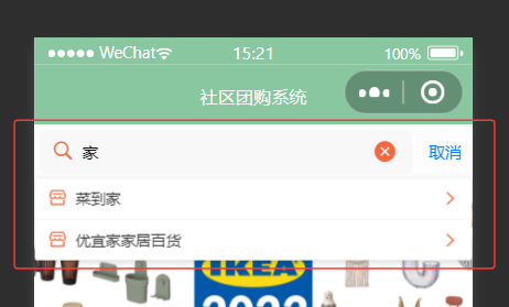
联想框动画丝滑,整体效果也不错,代码给了超详细的注释 , 感兴趣的小伙伴可以按下面步骤试试
那么我们开始吧 !
二、实现步骤
2.1实现方法简述
我们先实现后端根据关键词进行模糊查询的接口,这里会用到mybatis工具,数据库操作部分是基于 MyBatis 实现的,大家需要先去项目里面的pop.xml文件里面引入必要的依赖;
接着实现前端页面部分,选择自定义组件的原因主要有两点:一是 uni-search-bar 可能存在兼容性问题,部分样式易被覆盖导致显示异常;二是将搜索功能抽象为独立组件后,可在多个页面中复用,提高代码复用性;
此外,搜索输入的防抖功能是通过自定义逻辑实现的,如果大家是拿来练手或者学习的话,我们自己手写的防抖功能就已经可以完全满足业务需求,相比于使用lodash.debounce来说手写的防抖功能可以减少依赖体积也更适配业务,当然如果咱们的是大型项目或需要处理多种防抖场景的需求的话 lodash.debounce 功能更多会更合适。
2.2 简单科普
(1). 什么是防抖?
防抖的核心逻辑是:当函数被连续触发时,只有在触发停止后的指定时间内不再有新触发,函数才会执行一次。
例如:搜索输入框中,用户快速输入文字时,不会每输入一个字符就立即请求接口,而是等用户暂停输入(比如停顿 300ms)后,再执行搜索请求,减少无效请求次数。
(2).lodash.debounce 是什么?
lodash.debounce是 JavaScript 工具库 Lodash 提供的一个核心函数,用于实现 防抖(Debounce) 功能。它能控制函数在高频触发场景下的执行时机,避免函数被频繁调用导致的性能问题(如频繁请求接口、频繁渲染等)。
2.3 实现步骤及代码
1.后端部分
新增一个接口可以根据关键词模糊查询商家
我这是模糊查询商家名称大家根据自己的业务需求做相应的更改
Controller层:
java
/**
 * 根据关键词模糊查询商家(搜索联想)
 * @param keyword 搜索关键词
 * @return 匹配的商家列表
 */
@GetMapping("/searchSuggest")
public Result searchSuggest(String keyword) {
    // 构建查询条件,根据商家名称模糊匹配
    Business business = new Business();
    business.setName(keyword);
    // 只查询状态为"通过"的商家(与现有逻辑保持一致)
    business.setStatus("通过");
    List<Business> list = businessService.selectAll(business);
    return Result.success(list);
}
service层
java
    /**
     * 查询所有商家信息
     * @param business 查询条件,可为空对象表示查询所有
     * @return 符合条件的商家列表
     */
    public List<Business> selectAll(Business business) {
        List<Business> businesses = businessMapper.selectAll(business);
        for (Business b : businesses) {
            wrapBusiness(b); // 我这个函数是用来封装评分、订单数等信息
            // 大家根据自己的项目需求写
        }
        return businesses;
    }
Mapper 层支持模糊查询
java
List<Business> selectAll(Business business);Mapper.xml
java
    <select id="selectAll" parameterType="com.example.entity.Business" resultType="com.example.entity.Business">
        select * from business
        <where>
            <if test="id != null">
                and id = #{id}
            </if>
            <if test="username != null">
                and username like concat('%', #{username}, '%')
            </if>
            <if test="name != null">
                and name like concat('%', #{name}, '%')
            </if>
            <if test="status != null">
                and status = #{status}
            </if>
            <if test="type != null">
                and type = #{type}
            </if>
        </where>
        order by id desc
    </select>
当传递 name = keyword 时,会自动生成 name like '%关键词%' 的 SQL,满足模糊查询需求。
2.前端部分
CustomSearchBar.vue组件
html
<template>
	<view class="custom-search-bar">
		<view class="search-box" :style="{borderRadius: radius + 'px', backgroundColor: bgColor}" @click="searchClick">
			<view class="search-icon">
				<uni-icons color="#c0c4cc" size="18" type="search" />
			</view>
			<input
				v-if="show || searchVal"
				:focus="showSync"
				:disabled="readonly"
				:placeholder="placeholderText"
				:maxlength="maxlength"
				class="search-input"
				confirm-type="search"
				type="text"
				v-model="searchVal"
				:style="{color: textColor}"
				@confirm="confirm"
				@blur="blur"
				@focus="emitFocus"
			/>
			<text v-else class="placeholder-text">{{ placeholder }}</text>
			<view
				v-if="show && (clearButton === 'always' || clearButton === 'auto' && searchVal !== '') && !readonly"
				class="clear-icon"
				@click="clear"
			>
				<uni-icons color="#c0c4cc" size="20" type="clear" />
			</view>
		</view>
		<text
			@click="cancel"
			class="cancel-text"
			v-if="cancelButton === 'always' || show && cancelButton === 'auto'"
		>
			{{ cancelText || '取消' }}
		</text>
	</view>
</template>

<script>
	export default {
		name: "CustomSearchBar",
		props: {
			placeholder: {
				type: String,
				default: "请输入搜索商家"
			},
			radius: {
				type: [Number, String],
				default: 5
			},
			clearButton: {
				type: String,
				default: "auto"  // 值为 "auto" 时,组件会根据搜索框的状态动态决定是否显示 "取消" 按钮:
			},
			cancelButton: {
				type: String,
				default: "auto"  // "always":无论搜索框是否激活,始终显示 "取消" 按钮。
			},
			cancelText: {
				type: String,
				default: ""
			},
			bgColor: {
				type: String,
				default: "#F8F8F8"
			},
			textColor: {
				type: String,
				default: "#000000"
			},
			maxlength: {
				type: [Number, String],
				default: 100
			},
			value: {
				type: [Number, String],
				default: ""
			},
			modelValue: {
				type: [Number, String],
				default: ""
			},
			focus: {
				type: Boolean,
				default: false
			},
			readonly: {
				type: Boolean,
				default: false
			}
		},
		data() {
			return {
				show: false,
				showSync: false,
				searchVal: '',
				isAdvanced: true // 初始为 false,代表"未开启高级模式"
			}
		},
		computed: {
			placeholderText() {
				 return this.placeholder  // 返回 props 中定义的 placeholder 的值
				// 在模板中,输入框的占位符使用的是 placeholderText 而非直接使用 this.placeholder
				// placeholderText 作为中间层,将 props 中的 placeholder 值传递给输入框的占位符属性
				// 假设未来需要对 placeholder 进行处理(比如根据语言环境翻译、添加动态后缀等),直接修改 placeholderText 即可,无需改动模板和 props
				// return this.placeholder + (this.isAdvanced ? "(支持模糊搜索)" : "");
			}
		},
		watch: {
			value: { // 监听父组件通过 value 属性传入的搜索值。
			    immediate: true,  // 初始化时立即执行一次handler
			    handler(newVal) {
			      this.searchVal = newVal  // 将外部传入的value同步到组件内部的searchVal
			      if (newVal) {
			        this.show = true  // 如果有值,显示搜索框
			      }
			    }
			},
			modelValue: {  // 适配 Vue 的 v-model 语法糖(modelValue 是 v-model 的默认绑定属性)
				immediate: true,
				handler(newVal) {
					this.searchVal = newVal   // 同步v-model绑定的值到searchVal
					if (newVal) {
						this.show = true
					}
				}
			},
			focus: {  // 监听父组件传入的 focus 属性(控制搜索框是否聚焦)
				immediate: true,
				handler(newVal) {
					if (newVal) {  // 如果父组件要求聚焦
					    if(this.readonly) return  // 只读状态不处理
					    this.show = true;  // 显示搜索框
					    this.$nextTick(() => {
							this.showSync = true  // 确保在 DOM 更新后再设置聚焦,避免操作还未渲染的元素
					    })
					}
				}
			},
			searchVal(newVal, oldVal) {  // 监听组件内部的搜索值 searchVal(用户输入的内容)
			  this.$emit("input", newVal)  // 触发input事件,同步值给父组件
			  this.$emit("update:modelValue", newVal)  // 触发v-model更新
			}
		},
		methods: {
			/**
			   * 搜索框容器点击事件处理
			   * 功能:点击搜索框区域时,激活搜索框并设置聚焦状态
			   * 场景:用户点击搜索框外部容器时触发,用于唤起输入状态
			   */
			searchClick() {
				// 只读状态下不响应点击(禁止交互)
				if(this.readonly) return
				// 若搜索框已激活,无需重复操作
				if (this.show) {
					return
				}
				// 激活搜索框(控制输入框和清除按钮的显示)
				this.show = true;
				// 使用$nextTick确保DOM更新后再聚焦,避免操作未渲染的元素
				this.$nextTick(() => {
					// 触发输入框聚焦(showSync与input的:focus属性绑定)
					this.showSync = true
				})
			},

			/**
			 * 清除按钮点击事件处理
			 * 功能:清空搜索框内容并通知父组件
			 * 场景:用户点击搜索框内的清除图标时触发
			 */
			clear() {
				// 清空组件内部的搜索值
				this.searchVal = ""
				// 等待DOM更新后再通知父组件(确保值已同步清空)
				this.$nextTick(() => {
					// 向父组件发送清除事件,传递空值
					this.$emit("clear", { value: "" })
				})
			},
			/**
			 * 取消按钮点击事件处理
			 * 功能:取消搜索操作,重置组件状态并通知父组件
			 * 场景:用户点击"取消"按钮时触发,用于退出搜索状态
			 */
			cancel() {
				// 只读状态下不响应取消操作
				if(this.readonly) return
				// 向父组件发送取消事件,携带当前搜索值(可能用于后续处理)
				this.$emit("cancel", {
					value: this.searchVal
				});
				// 清空搜索框内容
				this.searchVal = ""
				// 隐藏搜索框(重置激活状态)
				this.show = false
				// 取消输入框聚焦
				this.showSync = false
				// 关闭键盘(优化移动端体验,避免键盘残留)
				uni.hideKeyboard()
			},
			/**
			 * 搜索确认事件处理
			 * 功能:处理搜索确认逻辑(回车或搜索按钮)并通知父组件
			 * 场景:用户输入完成后点击键盘搜索键或组件内确认按钮时触发
			 */
			confirm() {
				// 关闭键盘(输入完成后隐藏键盘)
				uni.hideKeyboard();
				// 向父组件发送确认事件,携带当前搜索值(触发实际搜索逻辑)
				this.$emit("confirm", {
					value: this.searchVal
				})
			},
			/**
			* 输入框失焦事件处理
			* 功能:输入框失去焦点时通知父组件并关闭键盘
			* 场景:用户点击输入框外部区域导致输入框失去焦点时触发
			*/
			blur() {
				// 关闭键盘(失焦后自动隐藏键盘)
				uni.hideKeyboard();
				// 向父组件发送失焦事件,携带当前搜索值(用于状态同步)
				this.$emit("blur", {
					value: this.searchVal
				})
			},
			/**
			 * 输入框聚焦事件处理
			 * 功能:输入框获取焦点时通知父组件
			 * 场景:用户点击输入框或通过代码触发聚焦时触发
			 * @param {Object} e
			 */
			emitFocus(e) {
				// 向父组件发送聚焦事件,传递焦点事件详情(如光标位置等)
				this.$emit("focus", e.detail)
			}
		}
	};
</script>

<style scoped>
.custom-search-bar {
	display: flex;
	align-items: center;
	padding: 10rpx;
}

.search-box {
	display: flex;
	align-items: center;
	flex: 1;
	padding: 0 20rpx;
	height: 75rpx;
	position: relative;
}

.search-icon {
	margin-right: 14rpx;
}

.search-input {
	flex: 1;
	height: 100%;
	font-size: 30rpx;
	background: transparent;
	border: none;
	outline: none;
}

.placeholder-text {
	flex: 1;
	font-size: 30rpx;
	color: #c0c4cc;
}

.clear-icon {
	margin-left: 10rpx;
	padding: 5rpx;
}

.cancel-text {
	margin-left: 20rpx;
	font-size: 30rpx;
	color: #007aff;
	padding: 10rpx;
}
</style>
父组件 html 模版部分
html
		<!-- 搜索 -->
		<view class="search-container">
			<custom-search-bar
				class="custom-searchbar"
				@confirm="search"
				@input="handleInput"
				@focus="showSuggest = true"
				@blur="hideSuggest"
				v-model="searchValue"
				placeholder="请输入要搜索的商家"
			></custom-search-bar>

			<!-- 联想结果浮层 -->
			<view
				class="suggest-container"
				v-if="showSuggest && suggestList.length > 0"
				@click.stop
			>
				<view
					class="suggest-item"
					v-for="(item, index) in suggestList"
					:key="index"
					@click="selectSuggest(item)"
				>
					<view class="suggest-content">
						<uni-icons type="shop" size="16" color="#666" class="suggest-icon"></uni-icons>
						<text class="suggest-text">{{ item.name }}</text>
					</view>
					<uni-icons type="right" size="14" color="#ccc" class="arrow-icon"></uni-icons>
				</view>
			</view>
		</view>
		<!-- 搜索结束 -->
js部分
javascript
<script>
	import CustomSearchBar from '@/components/CustomSearchBar.vue'

	export default {
		components: {
			CustomSearchBar
		},
		data() {
			return {
                // 你的项目其他数据
				searchValue: '',  // 双向绑定到搜索组件的输入框,存储用户输入的搜索关键词
				suggestList: [],  // 存储根据搜索关键词从接口获取的联想建议数据,用于展示搜索提示
				showSuggest: false,  // 通过布尔值控制联想结果浮层是否显示
				debounceTimer: null  // 存储防抖函数中的定时器 ID,用于在用户输入过程中清除未执行的定时器,避免频繁请求
			}
		},
		onLoad() {
			// this.load()
		},
		methods: {
			/**
			 * 手写防抖函数
			 * 功能:限制目标函数的执行频率,避免短时间内频繁调用
			 * 原理:每次触发时清除之前的定时器,重新计时,延迟指定时间后执行目标函数
			 * @param {Function} func - 需要防抖的目标函数(如搜索联想请求函数)
			 * @param {Number} delay - 延迟时间(毫秒),默认300ms
			 * @returns {Function} 经过防抖处理的包装函数
			 */
			debounce(func, delay) {
				return function(...args) {
					// 清除上一次未执行的定时器,避免重复触发
					clearTimeout(this.debounceTimer)
					// 设置新定时器,延迟指定时间后执行目标函数
					this.debounceTimer = setTimeout(() => {
						// 用apply绑定上下文,确保目标函数中的this指向当前组件
						func.apply(this, args)
					}, delay)
				}.bind(this) //// 绑定当前组件上下文,确保定时器中的this正确
			},
			/**
			 * 搜索输入框内容变化处理函数
			 * 功能:监听用户输入,同步搜索值并触发防抖联想请求
			 * @param {String} value - 输入框当前值
			 */
			handleInput(value) {
				// 同步输入值到组件数据,实现双向绑定
				this.searchValue = value
				// 输入为空时重置联想状态(清空列表并隐藏浮层)
				if (!value.trim()) {
					this.suggestList = []
					this.showSuggest = false
					return
				}

				// 使用防抖处理后的函数触发联想请求,减少接口调用次数
				this.debouncedSearch(value)
			},
			/**
			 * 获取搜索联想结果
			 * 功能:根据关键词请求接口,获取并更新联想列表数据
			 * @param {String} keyword - 搜索关键词
			 */
			async fetchSuggest(keyword) {
				try {
					console.log('搜索关键词:', keyword)
					// 调用接口获取联想结果,传递关键词参数
					const res = await this.$request.get('/business/searchSuggest', { keyword })
					console.log('搜索联想结果:', res)
					// 接口返回成功且有数据时,更新联想列表并显示浮层
					if (res.code === '200' && res.data) {
						this.suggestList = res.data
						this.showSuggest = true
					} else {  // 接口返回异常或无结果时,清空列表并隐藏浮层
						this.suggestList = []
						this.showSuggest = false
					}
				} catch (err) {  // 捕获请求异常(如网络错误),重置联想状态
					console.error('获取搜索联想失败', err)
					this.suggestList = []
					this.showSuggest = false
				}
			},
			/**
			 * 选中联想项处理函数
			 * 功能:用户点击联想项时,同步值到搜索框并关闭联想浮层
			 * @param {Object} item - 选中的联想项数据(包含name等字段)
			 */
			selectSuggest(item) {
				console.log('选中联想项:', item)
				// 将联想项名称同步到搜索框
				this.searchValue = item.name
				// 隐藏联想浮层并清空列表
				this.showSuggest = false
				this.suggestList = []
			},
			/**
			 * 隐藏联想浮层处理函数
			 * 功能:搜索框失焦时延迟隐藏浮层,解决快速交互冲突
			 * 说明:延迟200ms确保点击联想项的事件能正常触发
			 */
			hideSuggest() {
				setTimeout(() => {
					this.showSuggest = false
				}, 200)
			},
			/**
			 * 搜索确认处理函数
			 * 功能:用户确认搜索时,跳转到搜索结果页并重置搜索状态
			 */
			search() {
				let value = this.searchValue
				// 搜索值不为空时执行跳转
				if (value.trim()) {
					// 跳转到搜索结果页,通过URL传递关键词(encodeURIComponent处理特殊字符)
					uni.navigateTo({
						url: '/pages/search/search?name=' + encodeURIComponent(value)
					})
					// 重置搜索状态(清空值、列表和浮层)
					this.searchValue = ''
					this.suggestList = []
					this.showSuggest = false
				}
			},

            // 你的项目其他方法

		},
		/**
		 * 组件创建生命周期函数
		 * 功能:初始化防抖函数实例,为搜索联想请求添加防抖处理
		 * 说明:在组件创建时生成延迟300ms的防抖函数,绑定到debouncedSearch
		 */
		created() {
			// 创建防抖函数
			this.debouncedSearch = this.debounce(this.fetchSuggest, 300)
		}
	}
</script>
css样式部分
css
<style>
/* 商家分类项样式 */
.categgory-item {
  flex: 1; /* 等分父容器宽度 */
  display: flex; /* 使用flex布局 */
  flex-direction: column; /* 垂直方向排列子元素(图标在上,文字在下) */
  justify-content: center; /* 垂直居中对齐 */
  align-items: center; /* 水平居中对齐 */
  grid-gap: 10rpx; /* 子元素之间的间距(图标与文字间距) */
  color: #333; /* 文字颜色(深灰色) */
}

/* 全局修改uni-icons图标样式 */
::v-deep .uni-icons {
  color: #F4683d !important; /* 图标颜色(橙色),!important强制覆盖组件内部样式 */
  fill: #F4683d !important; /* 图标填充色(与颜色一致,确保图标显示正常) */
}

/* 自定义搜索栏样式优化 - 最小化边距 */
::v-deep .custom-searchbar{
  padding: 0 !important; /* 清除内边距,让搜索栏紧贴容器 */
  margin: 0 !important; /* 清除外边距,避免额外留白 */
}

/* 搜索容器 - 最小化边距 */
.search-container {
  position: relative; /* 相对定位,用于联想浮层的绝对定位参考 */
  padding: 0; /* 清除内边距 */
  margin: 0; /* 清除外边距 */
  z-index: 1000; /* 设置层级,确保搜索栏在页面上层 */
}

/* 联想容器 - 紧贴搜索栏 */
.suggest-container {
  position: absolute; /* 绝对定位,相对于搜索容器定位 */
  top: 100%; /* 顶部对齐搜索容器底部,实现"紧贴搜索栏下方"效果 */
  left: 0; /* 左侧对齐搜索容器 */
  right: 0; /* 右侧对齐搜索容器,与搜索栏同宽 */
  background-color: #ffffff; /* 白色背景,与页面区分 */
  border: 1px solid #e0e0e0; /* 灰色边框,增强边界感 */
  border-top: none; /* 移除顶部边框,与搜索栏无缝连接 */
  border-radius: 0 0 8rpx 8rpx; /* 只保留底部圆角,优化视觉效果 */
  box-shadow: 0 4rpx 12rpx rgba(0, 0, 0, 0.15); /* 底部阴影,增强浮层感 */
  z-index: 1001; /* 层级高于搜索容器,确保浮层显示在最上层 */
  max-height: 400rpx; /* 限制最大高度,避免内容过多溢出 */
  overflow-y: auto; /* 内容超出时显示垂直滚动条 */
}

/* 联想项 - 美化样式 */
.suggest-item {
  padding: 16rpx 20rpx; /* 内边距,增加点击区域 */
  border-bottom: 1px solid #f0f0f0; /* 底部灰色分隔线,区分相邻项 */
  transition: all 0.2s ease; /* 过渡动画,优化交互体验 */
  display: flex; /* flex布局,实现内容与箭头左右排列 */
  align-items: center; /* 垂直居中对齐 */
  justify-content: space-between; /* 内容靠左,箭头靠右 */
}

/* 最后一个联想项移除底部边框 */
.suggest-item:last-child {
  border-bottom: none; /* 避免最后一项多余边框 */
}

/* 联想项点击状态样式 */
.suggest-item:active {
  background-color: #f8f9fa; /* 点击时背景变浅灰色,反馈交互 */
  transform: translateX(4rpx); /* 轻微右移,增强点击反馈 */
}

/* 联想内容区域 */
.suggest-content {
  display: flex; /* flex布局,图标与文字横向排列 */
  align-items: center; /* 垂直居中对齐 */
  flex: 1; /* 占据剩余空间,确保箭头靠右 */
}

/* 联想图标样式 */
.suggest-icon {
  margin-right: 12rpx; /* 图标与文字间距 */
  flex-shrink: 0; /* 图标不缩放,保持固定大小 */
}

/* 箭头图标样式 */
.arrow-icon {
  flex-shrink: 0; /* 箭头不缩放,保持固定大小 */
}

/* 联想文字样式 */
.suggest-text {
  font-size: 28rpx; /* 文字大小 */
  color: #333333; /* 文字颜色(深灰色) */
  line-height: 1.4; /* 行高,优化多行显示 */
  flex: 1; /* 占据剩余空间,文字过长时自动换行 */
}

/* 定义联想浮层显示动画 */
@keyframes slideIn {
  from {
    opacity: 0; /* 初始状态完全透明 */
    transform: translateY(-10rpx); /* 初始位置向上偏移10rpx */
  }
  to {
    opacity: 1; /* 结束状态完全不透明 */
    transform: translateY(0); /* 结束位置回归正常 */
  }
}

/* 为联想容器应用动画 */
.suggest-container {
  animation: slideIn 0.2s ease-out; /* 应用slideIn动画,0.2秒完成,缓出效果 */
}
</style>
好了 , 代码就到这了 , 快去试试吧
每天进步一点点 , 加油 !