我会用简单的示例博客方便自已也方便各位如何将HTML转化为Vue。
转化方式我采用手动,不需要纠结哪个方式好用,只需要知道"无论是黑猫,还是白猫,能抓老鼠就是好猫"
以下是HTML文件代码
html
<!DOCTYPE html>
<html lang="zh-CN">
<head>
<meta charset="UTF-8">
<meta name="viewport" content="width=device-width, initial-scale=1.0">
<title>雅韵博客 - 个人博客空间</title>
<link rel="stylesheet" href="https://cdnjs.cloudflare.com/ajax/libs/font-awesome/6.4.0/css/all.min.css">
<link href="https://fonts.googleapis.com/css2?family=Playfair+Display:wght@400;600;700&family=Roboto:wght@300;400;500&display=swap" rel="stylesheet">
<style>
:root {
/* 颜色变量 */
--primary-color: #6d5acf;
--primary-light: #8a7dff;
--secondary-color: #ff6b8b;
--dark-bg: #2c2855;
--light-bg: #f9f7fe;
--text-dark: #333;
--text-light: #777;
--text-footer: #e6e1ff;
--white: #fff;
/* 尺寸变量 */
--spacing-sm: 0.8rem;
--spacing-md: 1.5rem;
--spacing-lg: 3rem;
--border-radius: 12px;
--card-shadow: 0 10px 30px rgba(0, 0, 0, 0.08);
--card-hover-shadow: 0 15px 40px rgba(109, 90, 207, 0.15);
}
* {
margin: 0;
padding: 0;
box-sizing: border-box;
}
body {
font-family: 'Roboto', sans-serif;
background: linear-gradient(135deg, var(--light-bg) 0%, #eae6ff 100%);
color: var(--text-dark);
line-height: 1.6;
min-height: 100vh;
display: flex;
flex-direction: column;
}
/* 导航栏样式 */
.navbar {
background: rgba(255, 255, 255, 0.95);
box-shadow: 0 2px 15px rgba(0, 0, 0, 0.05);
padding: var(--spacing-sm) 5%;
position: sticky;
top: 0;
z-index: 100;
backdrop-filter: blur(10px);
border-bottom: 1px solid rgba(220, 210, 255, 0.5);
}
.nav-container {
max-width: 1200px;
margin: 0 auto;
display: flex;
justify-content: space-between;
align-items: center;
}
.logo {
font-family: 'Playfair Display', serif;
font-size: 1.8rem;
font-weight: 700;
color: var(--primary-color);
letter-spacing: 1px;
}
.logo span {
color: var(--secondary-color);
}
.nav-links {
display: flex;
list-style: none;
}
.nav-links li {
margin: 0 1.2rem;
}
.nav-links a {
text-decoration: none;
color: #5a4a9c;
font-weight: 500;
font-size: 1.1rem;
padding: 0.5rem 0.8rem;
border-radius: 4px;
transition: all 0.3s ease;
position: relative;
}
.nav-links a:hover {
color: var(--secondary-color);
}
.nav-links a::after {
content: '';
position: absolute;
width: 0;
height: 2px;
bottom: 0;
left: 0;
background: var(--secondary-color);
transition: width 0.3s ease;
}
.nav-links a:hover::after {
width: 100%;
}
.nav-links a.active {
color: var(--secondary-color);
}
/* 主要内容区域 */
.main-content {
max-width: 1200px;
margin: var(--spacing-lg) auto;
padding: 0 var(--spacing-md);
flex: 1;
}
.welcome-section {
text-align: center;
margin-bottom: 4rem;
animation: fadeIn 1.2s ease-out;
}
.welcome-section h1 {
font-family: 'Playfair Display', serif;
font-size: clamp(2.5rem, 5vw, 3.5rem);
color: #5a4a9c;
margin-bottom: var(--spacing-sm);
letter-spacing: 1px;
}
.welcome-section p {
font-size: 1.2rem;
color: var(--text-light);
max-width: 700px;
margin: 0 auto;
line-height: 1.8;
}
/* 卡片布局 */
.card-container {
display: grid;
grid-template-columns: repeat(auto-fit, minmax(300px, 1fr));
gap: 2.5rem;
margin-top: 2rem;
}
.card {
background: var(--white);
border-radius: var(--border-radius);
overflow: hidden;
box-shadow: var(--card-shadow);
transition: all 0.4s cubic-bezier(0.175, 0.885, 0.32, 1.275);
position: relative;
opacity: 0;
animation: fadeIn 0.8s ease-out forwards;
}
.card:hover {
transform: translateY(-10px);
box-shadow: var(--card-hover-shadow);
}
.card::before {
content: '';
position: absolute;
top: 0;
left: 0;
width: 100%;
height: 5px;
background: linear-gradient(90deg, var(--primary-color), var(--secondary-color));
}
.card-content {
padding: 2.5rem;
text-align: center;
}
.card-icon {
font-size: 2.5rem;
color: var(--primary-color);
margin-bottom: var(--spacing-md);
}
.card-title {
font-family: 'Playfair Display', serif;
font-size: 1.8rem;
color: #5a4a9c;
margin-bottom: var(--spacing-md);
}
.card-text {
color: #666;
margin-bottom: var(--spacing-md);
}
.btn {
display: inline-block;
background: linear-gradient(45deg, var(--primary-color), var(--primary-light));
color: var(--white);
padding: var(--spacing-sm) 2rem;
border-radius: 50px;
text-decoration: none;
font-weight: 500;
transition: all 0.3s ease;
box-shadow: 0 5px 15px rgba(109, 90, 207, 0.3);
border: none;
cursor: pointer;
}
.btn:hover {
transform: translateY(-3px);
box-shadow: 0 8px 20px rgba(109, 90, 207, 0.4);
background: linear-gradient(45deg, #5a4a9c, #7b6cff);
}
/* 页脚样式 */
.footer {
background: var(--dark-bg);
color: var(--text-footer);
padding: var(--spacing-lg) 0 1.5rem;
margin-top: auto;
}
.footer-content {
max-width: 1200px;
margin: 0 auto;
padding: 0 var(--spacing-md);
display: grid;
grid-template-columns: repeat(auto-fit, minmax(250px, 1fr));
gap: var(--spacing-lg);
}
.footer-section h3 {
font-family: 'Playfair Display', serif;
font-size: 1.5rem;
margin-bottom: var(--spacing-md);
color: var(--white);
position: relative;
padding-bottom: 0.5rem;
}
.footer-section h3::after {
content: '';
position: absolute;
bottom: 0;
left: 0;
width: 50px;
height: 2px;
background: linear-gradient(90deg, var(--primary-color), var(--secondary-color));
}
.footer-links {
list-style: none;
}
.footer-links li {
margin-bottom: var(--spacing-sm);
}
.footer-links a {
color: #b8b5ff;
text-decoration: none;
transition: color 0.3s;
}
.footer-links a:hover {
color: var(--white);
}
.social-icons {
display: flex;
gap: var(--spacing-sm);
margin-top: var(--spacing-md);
}
.social-icons a {
display: flex;
align-items: center;
justify-content: center;
width: 40px;
height: 40px;
background: rgba(255, 255, 255, 0.1);
border-radius: 50%;
color: var(--white);
transition: all 0.3s ease;
}
.social-icons a:hover {
background: var(--primary-color);
transform: translateY(-3px);
}
.footer-form input {
padding: var(--spacing-sm);
width: 100%;
margin: var(--spacing-sm) 0;
border-radius: 4px;
border: none;
}
.copyright {
text-align: center;
padding-top: var(--spacing-md);
margin-top: var(--spacing-md);
border-top: 1px solid rgba(255, 255, 255, 0.1);
font-size: 0.9rem;
color: #b8b5ff;
}
/* 动画效果 */
@keyframes fadeIn {
from {
opacity: 0;
transform: translateY(20px);
}
to {
opacity: 1;
transform: translateY(0);
}
}
/* 卡片动画延迟 */
.card:nth-child(1) { animation-delay: 0.2s; }
.card:nth-child(2) { animation-delay: 0.4s; }
.card:nth-child(3) { animation-delay: 0.6s; }
.card:nth-child(4) { animation-delay: 0.8s; }
/* 响应式设计 */
@media (max-width: 768px) {
.nav-links {
display: none;
position: absolute;
top: 70px;
left: 0;
width: 100%;
background: rgba(255, 255, 255, 0.98);
padding: 1rem 0;
box-shadow: 0 10px 20px rgba(0,0,0,0.1);
flex-direction: column;
}
.nav-links.active {
display: flex;
}
.nav-links li {
margin: 0.8rem 0;
text-align: center;
}
.card-container {
grid-template-columns: 1fr;
}
.footer-content {
grid-template-columns: 1fr;
gap: 2rem;
}
}
.mobile-menu-btn {
display: none;
background: none;
border: none;
color: #5a4a9c;
font-size: 1.5rem;
cursor: pointer;
}
@media (max-width: 768px) {
.mobile-menu-btn {
display: block;
}
}
</style>
</head>
<body>
<!-- 导航栏 -->
<nav class="navbar">
<div class="nav-container">
<div class="logo">雅韵<span>博客</span></div>
<ul class="nav-links">
<li><a href="#" class="active">首页</a></li>
<li><a href="#">文章</a></li>
<li><a href="#">分类</a></li>
<li><a href="#">关于</a></li>
<li><a href="#">登录</a></li>
</ul>
<button class="mobile-menu-btn" aria-label="菜单">
<i class="fas fa-bars"></i>
</button>
</div>
</nav>
<!-- 主要内容 -->
<div class="main-content">
<section class="welcome-section">
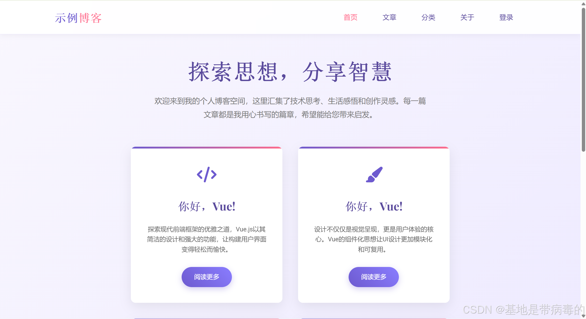
<h1>探索思想,分享智慧</h1>
<p>欢迎来到我的个人博客空间,这里汇集了技术思考、生活感悟和创作灵感。每一篇文章都是我用心书写的篇章,希望能给您带来启发。</p>
</section>
<div class="card-container">
<!-- 卡片 1 -->
<div class="card">
<div class="card-content">
<div class="card-icon">
<i class="fas fa-code"></i>
</div>
<h2 class="card-title">你好,Vue!</h2>
<p class="card-text">探索现代前端框架的优雅之道,Vue.js以其简洁的设计和强大的功能,让构建用户界面变得轻松而愉快。</p>
<a href="#" class="btn">阅读更多</a>
</div>
</div>
<!-- 卡片 2 -->
<div class="card">
<div class="card-content">
<div class="card-icon">
<i class="fas fa-paint-brush"></i>
</div>
<h2 class="card-title">你好,Vue!</h2>
<p class="card-text">设计不仅仅是视觉呈现,更是用户体验的核心。Vue的组件化思想让UI设计更加模块化和可复用。</p>
<a href="#" class="btn">阅读更多</a>
</div>
</div>
<!-- 卡片 3 -->
<div class="card">
<div class="card-content">
<div class="card-icon">
<i class="fas fa-rocket"></i>
</div>
<h2 class="card-title">你好,Vue!</h2>
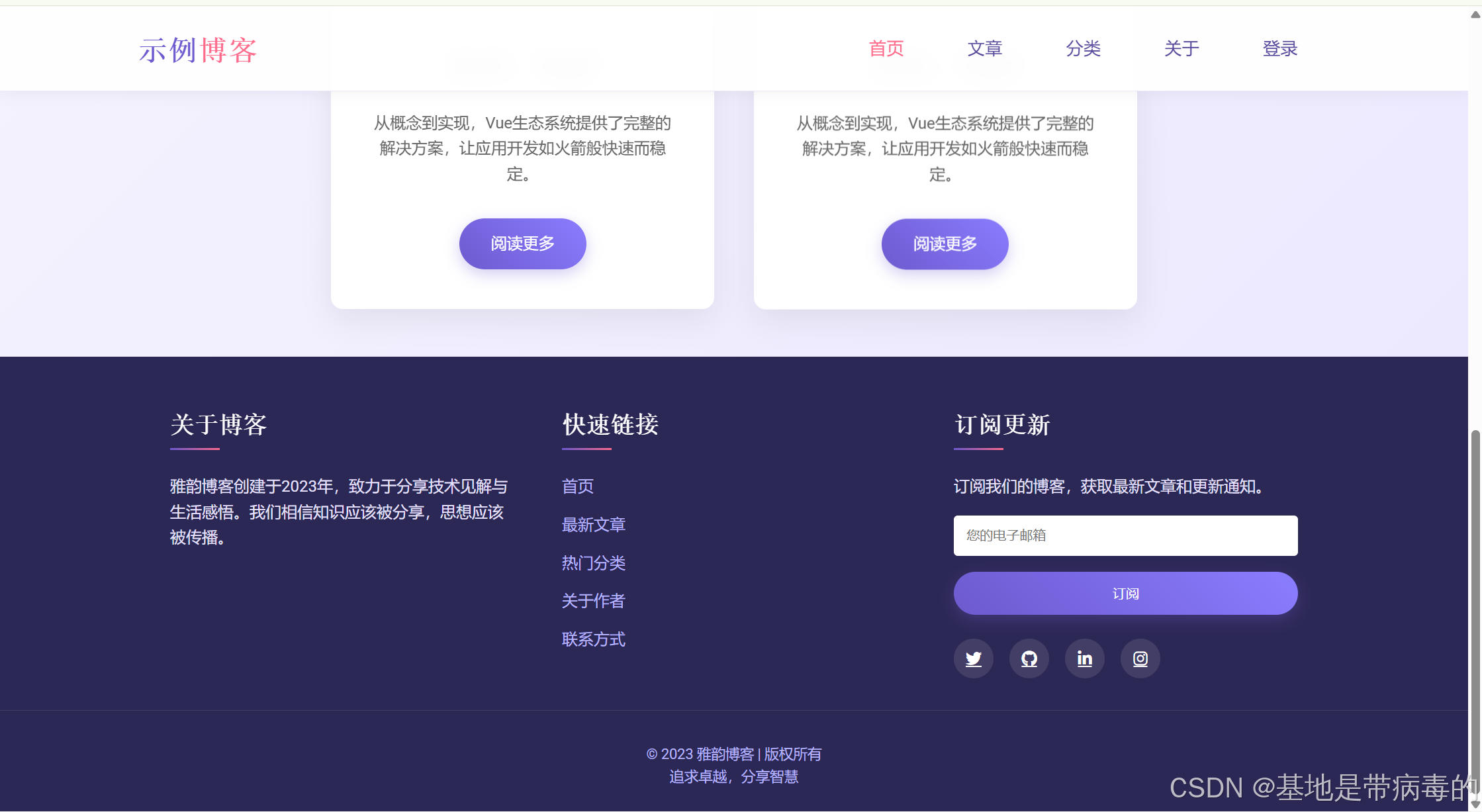
<p class="card-text">从概念到实现,Vue生态系统提供了完整的解决方案,让应用开发如火箭般快速而稳定。</p>
<a href="#" class="btn">阅读更多</a>
</div>
</div>
<!-- 卡片 4 -->
<div class="card">
<div class="card-content">
<div class="card-icon">
<i class="fas fa-cogs"></i>
</div>
<h2 class="card-title">你好,Vue!</h2>
<p class="card-text">深入了解Vue的核心机制,包括响应式系统、虚拟DOM和组件生命周期,提升开发效率。</p>
<a href="#" class="btn">阅读更多</a>
</div>
</div>
</div>
</div>
<!-- 页脚 -->
<footer class="footer">
<div class="footer-content">
<div class="footer-section">
<h3>关于博客</h3>
<p>雅韵博客创建于2023年,致力于分享技术见解与生活感悟。我们相信知识应该被分享,思想应该被传播。</p>
</div>
<div class="footer-section">
<h3>快速链接</h3>
<ul class="footer-links">
<li><a href="#">首页</a></li>
<li><a href="#">最新文章</a></li>
<li><a href="#">热门分类</a></li>
<li><a href="#">关于作者</a></li>
<li><a href="#">联系方式</a></li>
</ul>
</div>
<div class="footer-section">
<h3>订阅更新</h3>
<p>订阅我们的博客,获取最新文章和更新通知。</p>
<form class="footer-form">
<input type="email" placeholder="您的电子邮箱" required>
<button type="submit" class="btn" style="width: 100%;">订阅</button>
</form>
<div class="social-icons">
<a href="#" aria-label="Twitter"><i class="fab fa-twitter"></i></a>
<a href="#" aria-label="GitHub"><i class="fab fa-github"></i></a>
<a href="#" aria-label="LinkedIn"><i class="fab fa-linkedin-in"></i></a>
<a href="#" aria-label="Instagram"><i class="fab fa-instagram"></i></a>
</div>
</div>
</div>
<div class="copyright">
<p>© 2023 雅韵博客 | 版权所有</p>
<p>追求卓越,分享智慧</p>
</div>
</footer>
<script>
document.addEventListener('DOMContentLoaded', function() {
// 卡片悬停效果
const cards = document.querySelectorAll('.card');
cards.forEach(card => {
card.addEventListener('mouseenter', () => {
card.style.transform = 'translateY(-12px)';
});
card.addEventListener('mouseleave', () => {
card.style.transform = '';
});
});
// 移动端菜单切换
const menuBtn = document.querySelector('.mobile-menu-btn');
const navLinks = document.querySelector('.nav-links');
menuBtn.addEventListener('click', () => {
navLinks.classList.toggle('active');
});
// 点击菜单外区域关闭菜单
document.addEventListener('click', (e) => {
if (!navLinks.contains(e.target) && !menuBtn.contains(e.target)) {
navLinks.classList.remove('active');
}
});
});
</script>
</body>
</html>显示页面结果
根据HTML文件来架构Vue文件,如下:
html
📁 elegant-blog
├── 📁 public              # 静态资源
├── 📁 src
│   ├── 📁 components      # 可复用组件
│   │   ├── 📄 Navbar.vue  # 导航栏组件
│   │   ├── 📄 Card.vue    # 卡片组件
│   │   └── 📄 Footer.vue  # 页脚组件
│   ├── 📁 views           # 页面组件
│   │   └── 📄 Home.vue    # 首页
│   ├── 📄 App.vue         # 根组件
│   └── 📄 main.js         # 入口文件
├── 📄 index.html          # 入口HTML
└── 📄 package.json        # 项目配置
然后在看显示页面结果有哪些可以作为组件来使用,比如导航栏、卡片、页脚、按钮等
一,核心组件实现
1. 入口文件(main.js)
javascript
import { createApp } from 'vue'
import App from './App.vue'

// 引入全局样式(后续会提取原CSS到这里)
import './assets/style.css'

createApp(App).mount('#app')
2. 根组件(App.vue)
html
<template>
  <div id="app">
    <!-- 导航栏 -->
    <Navbar />

    <!-- 主内容区(首页) -->
    <Home />

    <!-- 页脚 -->
    <Footer />
  </div>
</template>

<script setup>
import Navbar from './components/Navbar.vue'
import Home from './views/Home.vue'
import Footer from './components/Footer.vue'
</script>

<style>
/* 全局样式可在此处引入或定义 */
</style>
3. 导航栏组件(components/Navbar.vue)
html
<template>
  <nav class="navbar">
    <div class="nav-container">
      <div class="logo">雅韵<span>博客</span></div>

      <!-- 桌面端导航 -->
      <ul class="nav-links" :class="{ active: isMenuOpen }">
        <li><a href="#" class="active" @click="closeMenu">首页</a></li>
        <li><a href="#" @click="closeMenu">文章</a></li>
        <li><a href="#" @click="closeMenu">分类</a></li>
        <li><a href="#" @click="closeMenu">关于</a></li>
        <li><a href="#" @click="closeMenu">登录</a></li>
      </ul>

      <!-- 移动端菜单按钮 -->
      <button class="mobile-menu-btn" aria-label="菜单" @click="toggleMenu">
        <i class="fas fa-bars"></i>
      </button>
    </div>
  </nav>
</template>

<script setup>
import { ref } from 'vue'

// 控制移动端菜单显示/隐藏
const isMenuOpen = ref(false)

const toggleMenu = () => {
  isMenuOpen.value = !isMenuOpen.value
}

const closeMenu = () => {
  isMenuOpen.value = false  // 点击导航项后关闭菜单(移动端)
}
</script>

<style scoped>
/* 导航栏样式复用原CSS,无需重复编写 */
</style>
4. 卡片组件(components/Card.vue)
html
<template>
  <div class="card" @mouseenter="handleMouseEnter" @mouseleave="handleMouseLeave">
    <div class="card-content">
      <div class="card-icon">
        <i :class="icon"></i>
      </div>
      <h2 class="card-title">{{ title }}</h2>
      <p class="card-text">{{ description }}</p>
      <a href="#" class="btn">{{ buttonText }}</a>
    </div>
  </div>
</template>

<script setup>
import { ref } from 'vue'

// 接收父组件传递的属性
const props = defineProps({
  icon: { type: String, required: true },  // 图标类名
  title: { type: String, required: true }, // 卡片标题
  description: { type: String, required: true }, // 卡片描述
  buttonText: { type: String, default: '阅读更多' } // 按钮文字
})

// 卡片交互状态
const cardStyle = ref({})

const handleMouseEnter = () => {
  cardStyle.value.transform = 'translateY(-12px)'
}

const handleMouseLeave = () => {
  cardStyle.value.transform = ''
}
</script>

<style scoped>
/* 卡片样式复用原CSS */
.card {
  transition: all 0.4s cubic-bezier(0.175, 0.885, 0.32, 1.275);
}
</style>
5. 首页组件(views/Home.vue)
html
<template>
<div class="main-content">
<!-- 欢迎区域 -->
<section class="welcome-section">
<h1>探索思想,分享智慧</h1>
<p>欢迎来到我的个人博客空间,这里汇集了技术思考、生活感悟和创作灵感。每一篇文章都是我用心书写的篇章,希望能给您带来启发。</p>
</section>
<!-- 卡片容器 -->
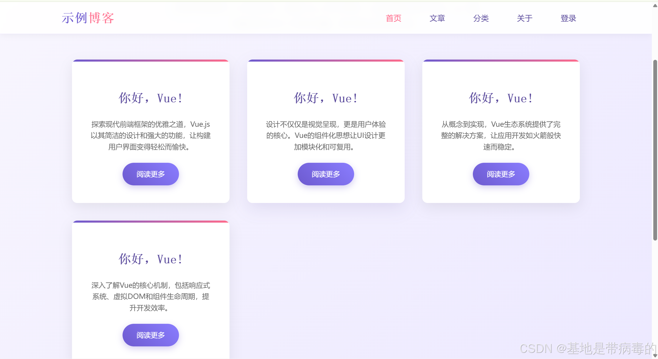
<div class="card-container">
<!-- 复用Card组件,传递不同属性 -->
<Card
icon="fas fa-code"
title="你好,Vue!"
description="探索现代前端框架的优雅之道,Vue.js以其简洁的设计和强大的功能,让构建用户界面变得轻松而愉快。"
/>
<Card
icon="fas fa-paint-brush"
title="你好,Vue!"
description="设计不仅仅是视觉呈现,更是用户体验的核心。Vue的组件化思想让UI设计更加模块化和可复用。"
/>
<Card
icon="fas fa-rocket"
title="你好,Vue!"
description="从概念到实现,Vue生态系统提供了完整的解决方案,让应用开发如火箭般快速而稳定。"
/>
<Card
icon="fas fa-cogs"
title="你好,Vue!"
description="深入了解Vue的核心机制,包括响应式系统、虚拟DOM和组件生命周期,提升开发效率。"
/>
</div>
</div>
</template>
<script setup>
import Card from '../components/Card.vue'
</script>
<style scoped>
/* 首页样式复用原CSS */
</style>6. 页脚组件(components/Footer.vue)
html
<template>
<footer class="footer">
<div class="footer-content">
<!-- 关于博客 -->
<div class="footer-section">
<h3>关于博客</h3>
<p>雅韵博客创建于2023年,致力于分享技术见解与生活感悟。我们相信知识应该被分享,思想应该被传播。</p>
</div>
<!-- 快速链接 -->
<div class="footer-section">
<h3>快速链接</h3>
<ul class="footer-links">
<li><a href="#">首页</a></li>
<li><a href="#">最新文章</a></li>
<li><a href="#">热门分类</a></li>
<li><a href="#">关于作者</a></li>
<li><a href="#">联系方式</a></li>
</ul>
</div>
<!-- 订阅区域 -->
<div class="footer-section">
<h3>订阅更新</h3>
<p>订阅我们的博客,获取最新文章和更新通知。</p>
<form class="footer-form" @submit.prevent="handleSubscribe">
<input
type="email"
placeholder="您的电子邮箱"
v-model="email"
required
>
<button type="submit" class="btn" style="width: 100%;">订阅</button>
</form>
<!-- 社交图标 -->
<div class="social-icons">
<a href="#" aria-label="Twitter"><i class="fab fa-twitter"></i></a>
<a href="#" aria-label="GitHub"><i class="fab fa-github"></i></a>
<a href="#" aria-label="LinkedIn"><i class="fab fa-linkedin-in"></i></a>
<a href="#" aria-label="Instagram"><i class="fab fa-instagram"></i></a>
</div>
</div>
</div>
<!-- 版权信息 -->
<div class="copyright">
<p>© 2023 雅韵博客 | 版权所有</p>
<p>追求卓越,分享智慧</p>
</div>
</footer>
</template>
<script setup>
import { ref } from 'vue'
// 订阅表单数据
const email = ref('')
// 处理订阅提交
const handleSubscribe = () => {
if (email.value) {
alert(`订阅成功!我们会向 ${email.value} 发送更新通知`)
email.value = '' // 清空输入框
}
}
</script>
<style scoped>
/* 页脚样式复用原CSS */
</style>另外可以将原 HTML 中的 <style> 代码提取到 src/assets/style.css,作为全局样式引入(已在 main.js 中配置)。这样既能保持原有设计风格,又能让所有组件共享样式。
那么最终的显示结果是这样,存在一丝丝区别,但不影响我学习
后续的页脚也跟上面的HTML文件一样,主要目的就是学会如何将不同的开发语言相互转化,适配多个不同的场景这才是开发的手段之一
提示
当你有多个独立文件,比如你有1.html,2.html,3.html....等文件,直接创建一个Views文件,然后在里面创建Vue文件,例如1.html,2.html,3.html可以转化为1.vue,2.vue,3.vue等,然后你在不同的独立文件中寻找相同的文件样式,提取出来放到一个公共组件中,方便服用,减少代码太长了问题