前言
上一篇简单的介绍了一下什么是组件,即组件是一个单独且可复用的功能模块的封装。所以这篇文章主要在实际开发中自己动手封装一个简单的导航栏组件,当然在插件市场有很多,但是自己动手封装一个才能真正领会其中的意义。
一、自定义组件
1.创建components文件夹
在项目根目录下创建components文件夹用于保存自己自定义的组件
2.新建titlebar组件
html
<template>
<view class="nav-bar" :style="{ paddingTop: statusBarHeight + 'px' }">
<!-- 左侧返回按钮(靠左) -->
<view class="nav-btn left-btn" @click="handleBack">
<image class="back-image" src="/static/icon_left_back.png" mode="aspectFit" v-if="showBack"></image>
</view>
<!-- 动态标题(居中) -->
<view class="nav-title">{{ title }}</view>
<!-- 右侧刷新按钮(靠右) -->
<view class="nav-btn right-btn" @click="handleRefresh" v-if="showRefresh">
<text>更新</text>
</view>
</view>
</template>
<script>
export default {
props: {
title: {
type: String,
default: '默认标题'
},
showBack: {
type: Boolean,
default: true
},
showRefresh: {
type: Boolean,
default: false
},
},
data() {
return {
statusBarHeight: 0
}
},
mounted() {
this.statusBarHeight = uni.getSystemInfoSync().statusBarHeight || 0;
},
methods: {
// 添加 handleBack 方法
handleBack() {
this.$emit('back'); // 触发父组件的 @back 事件
},
// 添加 handleRefresh 方法
handleRefresh() {
this.$emit('refresh'); // 触发父组件的 @refresh 事件
}
}
}
</script>
<style scoped>
.nav-bar {
width: 100%;
height: 88rpx;
display: flex;
align-items: center;
justify-content: space-between;
/* 关键:左右按钮靠边 */
position: relative;
box-sizing: content-box;
background-color: #fff;
}
/* 左右按钮样式 */
.nav-btn {
height: 100%;
display: flex;
align-items: center;
padding: 0 24rpx;
z-index: 10;
flex-shrink: 0;
/* 防止按钮被压缩 */
}
/* 左侧按钮靠左 */
.left-btn {
justify-content: flex-start;
min-width: 80rpx;
/* 确保点击区域足够 */
}
/* 右侧按钮靠右 */
.right-btn {
justify-content: flex-end;
min-width: 80rpx;
color: #4292E4;
}
/* 标题居中(通过 flex: 1 填充中间空间) */
.nav-title {
flex: 1;
text-align: center;
font-size: 32rpx;
color: #333;
font-weight: 500;
/* 防止标题文字被按钮遮挡 */
padding: 0 100rpx;
/* 根据按钮宽度调整 */
box-sizing: border-box;
}
/* 返回图标样式 */
.back-image {
width: 40rpx;
height: 40rpx;
}
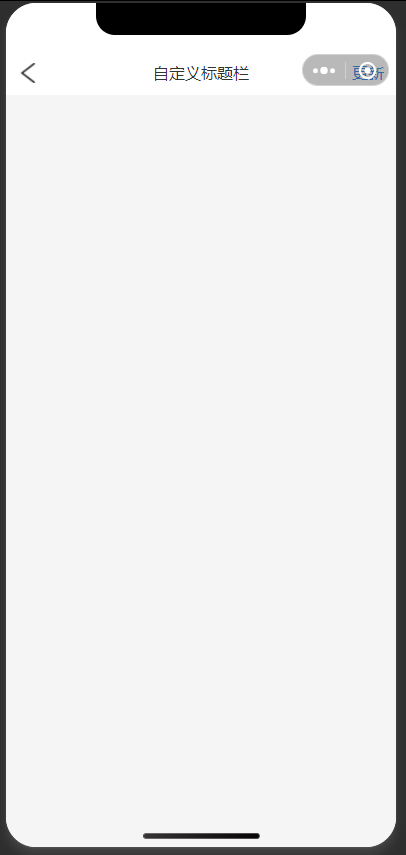
</style>外层容器 (nav-bar)
- 设置了动态的
padding-top,值为statusBarHeight,用于适配不同设备的状态栏高度 - 使用
flex布局,子元素水平排列
左侧返回按钮 (left-btn)
- 显示返回图标(通过
v-if="showBack"控制是否显示) - 点击触发
handleBack方法 - 图标使用
aspectFit模式保持比例
中间标题 (nav-title)
- 显示动态标题文本(通过
titleprop 传入) - 使用
flex: 1占据剩余空间实现居中效果
右侧刷新按钮 (right-btn)
- 显示"更新"文字(通过
v-if="showRefresh"控制是否显示) - 点击触发
handleRefresh方法
Props 定义
title: 导航栏标题,默认为"默认标题"showBack: 是否显示返回按钮,默认为trueshowRefresh: 是否显示刷新按钮,默认为false
数据
statusBarHeight: 存储设备状态栏高度,初始为0
生命周期及方法
mounted钩子中获取系统信息,设置状态栏高度handleBack: 点击返回按钮时触发,向父组件发射back事件handleRefresh: 点击刷新按钮时触发,向父组件发射refresh事件
二、组件注册
局部注册(页面级别组件)
html
<template>
	<view class="content">
		<titlebar :title="pageTitle" :showBack="true" :showRefresh="true" @back="onBack" @refresh="onRefresh">
		</titlebar>
	</view>
</template>

<script>
	import titlebar from '@/components/titlebar.vue';

	export default {
		components: {
			titlebar
		},
		data() {
			return {
				pageTitle: '自定义标题栏',
			}
		},
		onLoad() {

		},
		methods: {
			//返回
			onBack() {
				console.log('点击返回:');
			},
			//刷新
			onRefresh() {
				console.log('点击刷新:');
			}
		}
	}
</script>

<style lang="less">
	.content {
		display: flex;
		flex-direction: column;
		height: 100vh;
		background-color: #f5f5f5;
	}
</style>
全局注册(适用高频组件)
在main.js中注册,但要注意vue2跟vue3的注册方式,vue2,使用 Vue.component() 方法全局注册组件,需要在创建 Vue 实例之前注册 vue3 使用 app.component() 方法注册(通过 createSSRApp 创建的 app 实例),需要在 createApp 函数内部注册
html
// main.js
import titlebar from '@/components/titlebar.vue'
import App from './App'

// #ifndef VUE3
import Vue from 'vue'
import './uni.promisify.adaptor'

// Vue2 全局组件注册
Vue.component('titlebar', titlebar)

Vue.config.productionTip = false
App.mpType = 'app'
const app = new Vue({
	...App
})
app.$mount()
// #endif

// #ifdef VUE3
import {
	createSSRApp
} from 'vue'

export function createApp() {
	const app = createSSRApp(App)

	// Vue3 全局组件注册
	app.component('titlebar', titlebar)

	return {
		app
	}
}
// #endif
三、组件通信
父 -- 子
通过props传值:
父 index.vue中
html
data() {
	return {
		pageTitle: '自定义标题栏',
       }
},
子自定义组件titlebar.vue
html
props: {
	title: {
		type: String,
		default: '默认标题'
	},
    showBack: {
	    type: Boolean,
		default: true
	},
	showRefresh: {
		type: Boolean,
		default: false
	},
},
子-- 父
$emit 触发
子自定义组件 titlebar.vue
html
methods: {
			// 添加 handleBack 方法
			handleBack() {
				this.$emit('back'); // 触发父组件的 @back 事件
			},
			// 添加 handleRefresh 方法
			handleRefresh() {
				this.$emit('refresh'); // 触发父组件的 @refresh 事件
			}
		}
父index.vue中
html
methods: {
			//返回
			onBack() {
				console.log('点击返回:');
			},
			//刷新
			onRefresh() {
				console.log('点击刷新:');
			}
}
四 总结
如果对你有所帮助的话,不妨 点赞收藏
如果你有什么疑问的话,不妨 评论私信
青山不改,绿水长流 ,有缘江湖再见 ~