前言
我们使用 table 的时候肯定遇到过单元格溢出隐藏、只展示几行,鼠标hover显示全部等需求。本篇文章就是分享一下团队自定义单元格渲染的实现
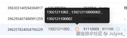
TXListRow
TXListRow 用于多个字符串不想换行展示时使用,超过一行的长度后,会显示一个更多icon,hover时展示全部内容。
表现如下:
tsx
// 用于多个字符串不想换行展示时
// 组件行为:超过一行后提供一个更多按钮,hover展示全部内容

import { cn } from "@/utils/tools";
import { ReactNode, useEffect, useRef, useState } from "react";
import { Content } from "./Content";
import { ShowMore } from "./ShowMore";

export interface ITXListRowProps {
  /** @param 类名 */
  className?: string;
  /** @param 字符串集合 */
  list?: ReactNode | ReactNode[];
  /** @param 分隔符默认为, */
  separator?: ReactNode;
}

export const TXListRow = function TXListRow_(props: ITXListRowProps) {
  const { className = "", list = [], separator = "," } = props;
  const boxRef = useRef<HTMLDivElement>(null);
  const contentRef = useRef<HTMLDivElement>(null);
  const [renderMore, setRenderMore] = useState(false);

  let haveValue = true;

  if (Array.isArray(list) && list.length === 0) {
    haveValue = false;
  }

  if (!Array.isArray(list) && [false, null, undefined].includes(list as null)) {
    haveValue = false;
  }

  if (typeof list === "string" && !list) {
    haveValue = false;
  }

  useEffect(() => {
    if (!boxRef.current || !contentRef.current || !haveValue) {
      return;
    }

    const checkOverflow = () => {
      if (boxRef.current && contentRef.current) {
        const boxWidth = boxRef.current.getBoundingClientRect().width;
        const contentWidth = contentRef.current.getBoundingClientRect().width;
        setRenderMore(contentWidth > boxWidth);
      }
    };

    checkOverflow();

    const resizeObserver = new ResizeObserver(checkOverflow);

    if (boxRef.current) {
      resizeObserver.observe(boxRef.current);
    }
    if (contentRef.current) {
      resizeObserver.observe(contentRef.current);
    }

    return () => {
      resizeObserver.disconnect();
    };
  }, [list, haveValue]);

  if (!haveValue) {
    return <div className={className}>-</div>;
  }

  let realList: ReactNode[] = [];

  if (Array.isArray(list)) {
    realList = list;
  } else {
    realList = [list];
  }

  return (
    <div className={cn("flex wes max-w-full", className)} ref={boxRef}>
      <div className="flex-1 wes">
        <div className="flex gap-1 w-max" ref={contentRef}>
          <Content list={realList} separator={separator} />
        </div>
      </div>
      {renderMore && <ShowMore list={realList} separator={separator} />}
    </div>
  );
};
其中有两点需要注意一下:
- 检查 list 类型,并兼容成需要的类型
- 通过
ResizeObserver判断 Box 的长度 和 content 的长度是否有溢出,如果有溢出则显示更多icon,然后hover时显示全部
配合 table 使用时:
arduino
 {
          title: "电话",
          dataIndex: "phoneNumber",
          key: "phoneNumber",
          dataType: "list",
          width: 100,
},
这里这个 dataType 是我们二次封装了一下 Table 的配置项,当 dataType 为 list 时,就会用 TXListRow 去渲染单元格
单独使用也可以
tsx
<TXListRow className="w-[160px]" separator={false} list={list} />TXTagStr
TXTagStr 用于切割字符串,并以 Tag 渲染
表现如下:

tsx
// 用于展示标签内容联合字符串
// 组件行为:切割字符串,渲染为Tag

import { cn } from "@/utils/tools";
import { Tag, Tooltip } from "antd";

export interface ITXTagStrsProps {
  /** @param 类名 */
  className?: string;
  /** @param 联合字符串 */
  str?: string;
  /** @param 分隔符 默认为, */
  mark?: string;
}

export const TXTagStrs = function TXTagStrs_(props: ITXTagStrsProps) {
  const { className = "", str, mark = "," } = props;

  if (!str) {
    return <div className={className}>-</div>;
  }

  const list = str.split(mark);

  return (
    <div className={cn("flex flex-wrap gap-1 wes max-w-full", className)}>
      {list.map((t, index) => {
        return (
          <Tooltip title={t} key={index}>
            <Tag color="default" className="wes cursor-pointer">
              {t}
            </Tag>
          </Tooltip>
        );
      })}
    </div>
  );
};
配合 table 使用
tsx
{
      title: "成交项目",
      dataIndex: "dataNames",
      key: "dataNames",
      width: 180,
      dataType: "tagStr",
},
直接使用
tsx
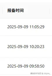
<TXTagStrs str={text} />TXTime
TXTime 用于格式化时间展示
表现如下:
tsx
// 用于时间展示
// 组件行为安装format格式展示时间

import { cn } from "@/utils/tools";
import dayjs from "dayjs";

export interface ITXTimeProps {
  /** @param 类名 */
  className?: string;
  /** @param 时间 */
  time?: string | number;
  /** @param 分隔符 默认为, */
  format?: "YYYY-MM-DD" | "YYYY-MM-DD HH:mm:ss" | string;
}

export const TXTime = function TXTime_(props: ITXTimeProps) {
  const { className = "", time, format = "YYYY-MM-DD" } = props;

  if (!time) {
    return <div className={className}>-</div>;
  }

  return (
    <div className={cn("wes", className)}>{dayjs(time).format(format)}</div>
  );
};
思路就是使用 dayjs 配合 format 一下就行
配合 table 使用
tsx
{
      title: "上次登录时间",
      dataIndex: "lastLoginTime",
      key: "lastLoginTime",
      width: 180,
      dataType: "datetime",
},
单独使用
tsx
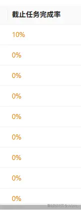
<TXTime time={text} format={"HH:mm:ss"} />TXPercentCell
TXPercentCell 用于展示百分比
表现形式如下:
tsx
// 用于展示百分比

import { BigNumber } from "@/utils/BigNumber";
import { cn } from "@/utils/tools";

export interface ITXPercentCellProps {
  /** @param 类名 */
  className?: string;
  /** @param 百分比 */
  percent?: string | number;
  /** @param 是否为小数 */
  isFloat?: boolean;
  showColor?: boolean;
  /** @param 空白占位符 */
  placeholder?: React.ReactNode;
}

export const TXPercentCell = function TXPercentCell_(
  props: ITXPercentCellProps
) {
  const {
    className = "",
    percent,
    isFloat = false,
    showColor = false,
    placeholder = "-",
  } = props;

  let value = parseFloat(percent as string);
  if (typeof value !== "number" || Number.isNaN(value)) {
    return <div className={cn("wes max-w-full", className)}>{placeholder}</div>;
  }
  if (isFloat) {
    value = new BigNumber(value).multipy(100).getNumber();
  }

  let colorClass = "";
  if (showColor) {
    colorClass = "text-[#EC8100]";
    if (value >= 90) {
      colorClass = "text-[#00A73F]";
    } else if (value >= 60) {
      colorClass = "text-[#0867E9]";
    }
  }

  return (
    <div className={cn("wes max-w-full", className, colorClass)}>{value}%</div>
  );
};
先通过 parseFloat 转成浮点数,或者直接通过 bigNumber 算一下百分比
配合 table 使用
tsx
{
      title: "成交单量占比",
      width: 120,
      dataIndex: "rateOfRepeatedOrders",
      key: "rateOfRepeatedOrders",
      dataType: "percent",
      dataExtraProps: {
        percent: {
          isFloat: true,
        },
      },
},
结尾
还有一些其他的单元格自定义渲染组件,也比较简单。这里就不一一举例啦,把我封装的分享一下