kotlin
// We represent a Composable function by annotating it with the @Composable annotation. Composable
// functions can only be called from within the scope of other composable functions. We should
// think of composable functions to be similar to lego blocks - each composable function is in turn
// built up of smaller composable functions.
@Composable
fun CustomStyledText(displayText: String, style: TextStyle? = null, maxLines: Int? = null) {
    // We should think of composable functions to be similar to lego blocks - each composable
    // function is in turn built up of smaller composable functions. Here, the Text() function is
    // pre-defined by the Compose UI library; you call that function to declare and render text
    // in your app.
    Text(
        text = displayText,
        modifier = Modifier.padding(16.dp),
        style = style ?: TextStyle.Default,
        overflow = TextOverflow.Ellipsis,
        maxLines = maxLines ?: Int.MAX_VALUE
    )
    // A pre-defined composable that renders a thin line on the screen that makes it easy to
    // group contents
    Divider(color = Color.Gray)
}
Text也是一个compose函数,它接受的属性,text显示的文本,
-
modifer,用于修饰
Text的修饰器。这里加了 16dp 的内边距;也可以在这里加点击、背景、尺寸、布局等效果。 -
style = style ?: TextStyle.Default文本样式(字体大小、颜色、字重、行高、字间距、字体家族等)。
这里如果外面传入的
style为空就使用默认样式。注意:style会与MaterialTheme.typography以及LocalTextStyle合并,后者未指定的字段会继承默认值。style中的fontSize、fontWeight、lineHeight、color等可精细控制文本观感;也可直接用MaterialTheme.typography.bodyLarge等预设。
-
overflow = TextOverflow.Ellipsis当文本超出可用空间时的处理方式。
常见取值:
-
TextOverflow.Clip:直接裁切,超出的不显示; -
TextOverflow.Ellipsis:在末尾显示"..." -
TextOverflow.Visible:允许溢出(可能盖住周围控件)。只有在文本被限制(比如
maxLines或容器宽度限制)且确实放不下时才会生效。
-
-
maxLines = maxLines ?: Int.MAX_VALUE最大显示行数。
-
给定具体数字(如
1、2)时,文本超过该行数会根据overflow处理; -
Int.MAX_VALUE等价于"基本不限制行数"(受父布局空间和换行策略影响)。
maxLines=1+overflow=Ellipsis是常见的单行省略号用法。 -
若想单行并显示省略号:
maxLines = 1, overflow = TextOverflow.Ellipsis。 -
多行省略号:
maxLines = 2(或更多)并设置Ellipsis。 -
想控制是否自动换行,可用
softWrap(默认true)。单行省略通常不必改它,只需maxLines=1即可。
-
========================================
样式图:
kotlin
class CustomTextActivity : AppCompatActivity() {
override fun onCreate(savedInstanceState: Bundle?) {
super.onCreate(savedInstanceState)
// This is an extension function of Activity that sets the @Composable function that's
// passed to it as the root view of the activity. This is meant to replace the .xml file
// that we would typically set using the setContent(R.id.xml_file) method. The setContent
// block defines the activity's layout.
setContent {
// We create a ScrollState that's "remember"ed to add proper support for a scrollable component.
// This allows us to also control the scroll position and other scroll related properties.
// remember calculates the value passed to it only during the first composition. It then
// returns the same value for every subsequent composition. More details are available in the
// comments below.
val scrollState = rememberScrollState()
// Column is a composable that places its children in a vertical sequence.
Column(
modifier = Modifier.verticalScroll(scrollState)
) {
// This is a custom composable declared in this file. It allows us to
// configure the text to be rendered on the screen.x
SimpleText()
TextWithColor()
TextWithBiggerFontSize()
BoldText()
ItalicText()
TextWithCustomFontFamily()
TextWithUnderline()
TextWithStrikeThrough()
TextWith1MaxLine()
TextWithShadow()
// Row is a composable that places its children in a horizontal sequence. You
// can think of it similar to a LinearLayout with the horizontal orientation.
// In addition, we pass a modifier to the Row composable. You can think of
// Modifiers as implementations of the decorators pattern that are used to
// modify the composable that its applied to. In this example, we configure the
// Row to occupify the entire available width using Modifier.fillMaxWidth()
CenterTextAlign()
// A pre-defined composable that renders a thin line on the screen that makes it
// easy to group contents
Divider(color = Color.Gray)
JustifyTextAlign()
ModifiedTextIntent()
ModifiedLineHeightText()
CustomAnnotatedText()
// A pre-defined composable that renders a thin line on the screen that makes it
// easy to group contents
Divider(color = Color.Gray)
// Surface is a composable provided to fulfill the needs of the "Surface"
// metaphor from the Material Design specification. It's generally used to
// change the background color, add elevation, clip or add background shape
// to its children composables.
TextWithBackground()
}
}
}
@Composable
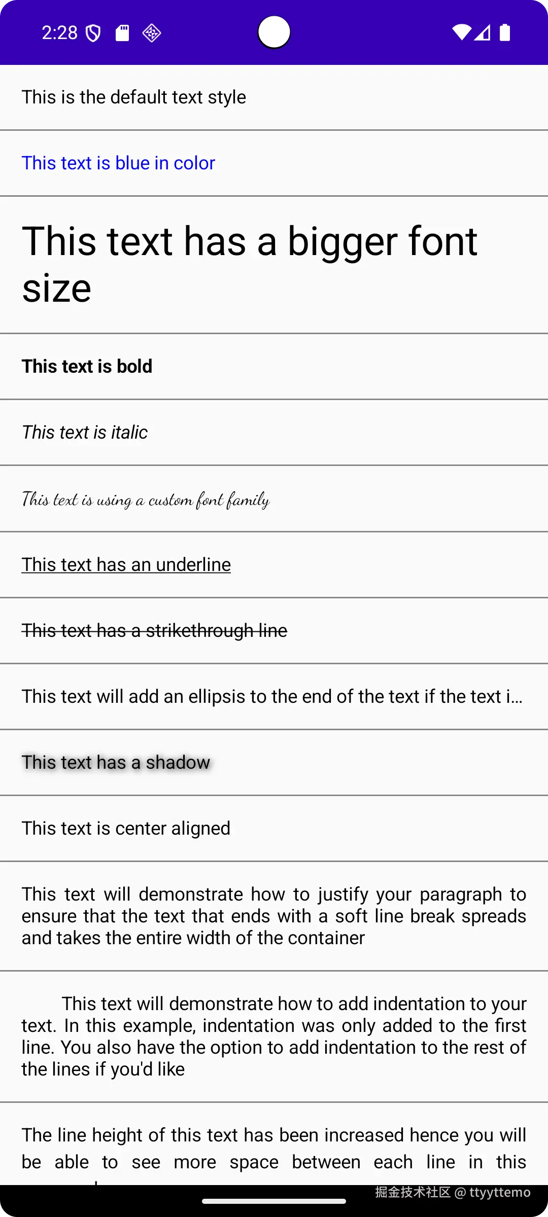
private fun SimpleText() {
CustomStyledText(
"This is the default text style"
)
}
@Composable
private fun TextWithColor() {
CustomStyledText(
"This text is blue in color",
// TextStyle allows you to specify styling configuration for a `Text`
// composable
style = TextStyle(
color = Color.Blue
)
)
}
@Composable
private fun TextWithBiggerFontSize() {
CustomStyledText(
"This text has a bigger font size",
style = TextStyle(
fontSize = 30.sp
)
)
}
@Composable
private fun BoldText() {
CustomStyledText(
"This text is bold",
style = TextStyle(
fontWeight = FontWeight.W700
)
)
}
@Composable
private fun ItalicText() {
CustomStyledText(
"This text is italic",
style = TextStyle(
fontStyle = FontStyle.Italic
)
)
}
@Composable
private fun TextWithCustomFontFamily() {
CustomStyledText(
"This text is using a custom font family",
style = TextStyle(
fontFamily = FontFamily.Cursive
)
)
}
@Composable
private fun TextWithUnderline() {
CustomStyledText(
"This text has an underline",
style = TextStyle(
textDecoration = TextDecoration.Underline
)
)
}
@Composable
private fun TextWithStrikeThrough() {
CustomStyledText(
"This text has a strikethrough line",
style = TextStyle(
textDecoration = TextDecoration.LineThrough
)
)
}
@Composable
private fun TextWith1MaxLine() {
CustomStyledText(
"This text will add an ellipsis to the end " +
"of the text if the text is longer that 1 line long.",
maxLines = 1
)
}
@Composable
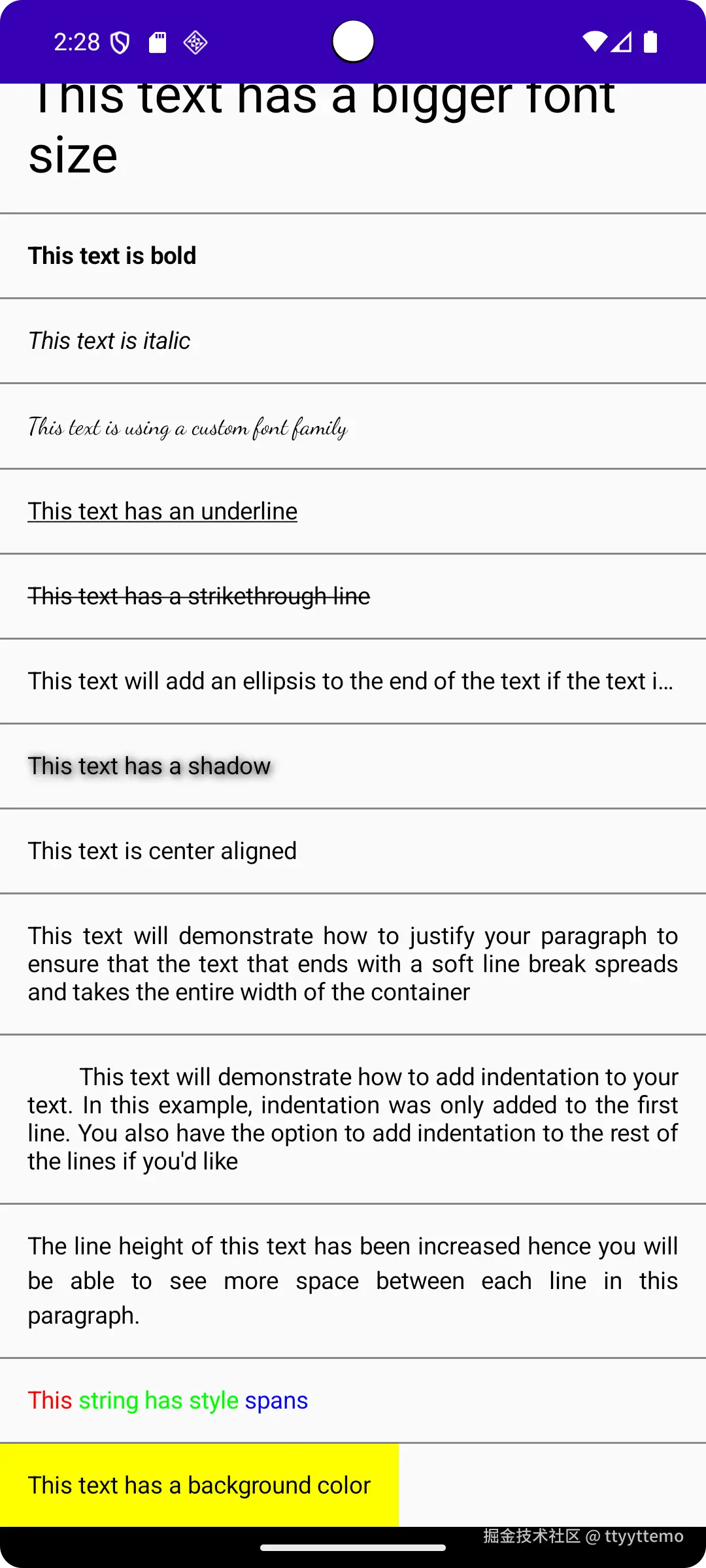
private fun TextWithShadow() {
CustomStyledText(
"This text has a shadow",
style = TextStyle(
shadow = Shadow(
color = Color.Black, blurRadius = 10f,
offset = Offset(2f, 2f)
)
)
)
}
@Composable
private fun CenterTextAlign() {
Row(modifier = Modifier.fillMaxWidth()) {
// Text is a predefined composable that does exactly what you'd expect it to -
// display text on the screen. It allows you to customize its appearance using
// the style property.
Text(
text = "This text is center aligned",
style = TextStyle(
textAlign = TextAlign.Center
),
modifier = Modifier.padding(16.dp)
)
}
}
@Composable
private fun JustifyTextAlign() {
CustomStyledText(
"This text will demonstrate how to justify " +
"your paragraph to ensure that the text that ends with a soft " +
"line break spreads and takes the entire width of the container",
style = TextStyle(
textAlign = TextAlign.Justify
)
)
}
@Composable
private fun ModifiedTextIntent() {
CustomStyledText(
"This text will demonstrate how to add " +
"indentation to your text. In this example, indentation was only " +
"added to the first line. You also have the option to add " +
"indentation to the rest of the lines if you'd like",
style = TextStyle(
textAlign = TextAlign.Justify,
textIndent = TextIndent(firstLine = 30.sp)
)
)
}
@Composable
private fun ModifiedLineHeightText() {
CustomStyledText(
"The line height of this text has been " +
"increased hence you will be able to see more space between each " +
"line in this paragraph.",
style = TextStyle(
textAlign = TextAlign.Justify,
lineHeight = 20.sp
)
)
}
@Composable
private fun CustomAnnotatedText() {
val annotatedString = buildAnnotatedString {
append("This string has style spans")
addStyle(style = SpanStyle(color = Color.Red), start = 0, end = 4)
addStyle(style = SpanStyle(color = Color.Green), start = 5, end = 21)
addStyle(style = SpanStyle(color = Color.Blue), start = 22, end = 27)
}
Text(annotatedString, modifier = Modifier.padding(16.dp))
}
@Composable
private fun TextWithBackground() {
Surface(color = Color.Yellow) {
Text(
text = "This text has a background color",
modifier = Modifier.padding(16.dp)
)
}
}
}
// We represent a Composable function by annotating it with the @Composable annotation. Composable
// functions can only be called from within the scope of other composable functions. We should
// think of composable functions to be similar to lego blocks - each composable function is in turn
// built up of smaller composable functions.
@Composable
fun CustomStyledText(displayText: String, style: TextStyle? = null, maxLines: Int? = null) {
// We should think of composable functions to be similar to lego blocks - each composable
// function is in turn built up of smaller composable functions. Here, the Text() function is
// pre-defined by the Compose UI library; you call that function to declare and render text
// in your app.
Text(
text = displayText,
modifier = Modifier.padding(16.dp),
style = style ?: TextStyle.Default,
overflow = TextOverflow.Ellipsis,
maxLines = maxLines ?: Int.MAX_VALUE
)
// A pre-defined composable that renders a thin line on the screen that makes it easy to
// group contents
Divider(color = Color.Gray)
}
/**
* Android Studio lets you preview your composable functions within the IDE itself, instead of
* needing to download the app to an Android device or emulator. This is a fantastic feature as you
* can preview all your custom components(read composable functions) from the comforts of the IDE.
* The main restriction is, the composable function must not take any parameters. If your composable
* function requires a parameter, you can simply wrap your component inside another composable
* function that doesn't take any parameters and call your composable function with the appropriate
* params. Also, don't forget to annotate it with @Preview & @Composable annotations.
*/
@Preview
@Composable
fun CustomStyledTextPreview() {
CustomStyledText(
"This is preview text",
maxLines = 2,
style = TextStyle(
color = Color.Red,
fontWeight = FontWeight.W900,
fontStyle = FontStyle.Italic,
fontFamily = FontFamily.Serif,
fontSize = 20.sp,
textAlign = TextAlign.Justify
)
)
}