搭建小红书首页的瀑布流
我们来尝试使用Kuikly写一下小项目,尝试复刻小红书的首页瀑布流
2.1 查看示例Demo瀑布流
首先克隆Kuikly项目到本地github.com/Tencent-TDS...,并将示例项目运行起来
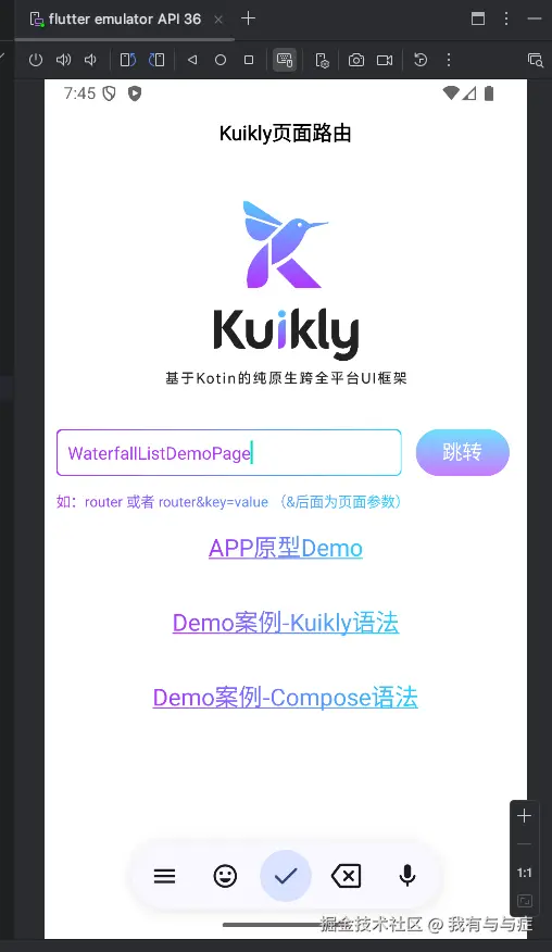
在输入框中输入:WaterfallListDemoPage,并点击跳转,查看瀑布流示例demo 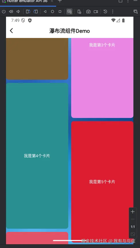
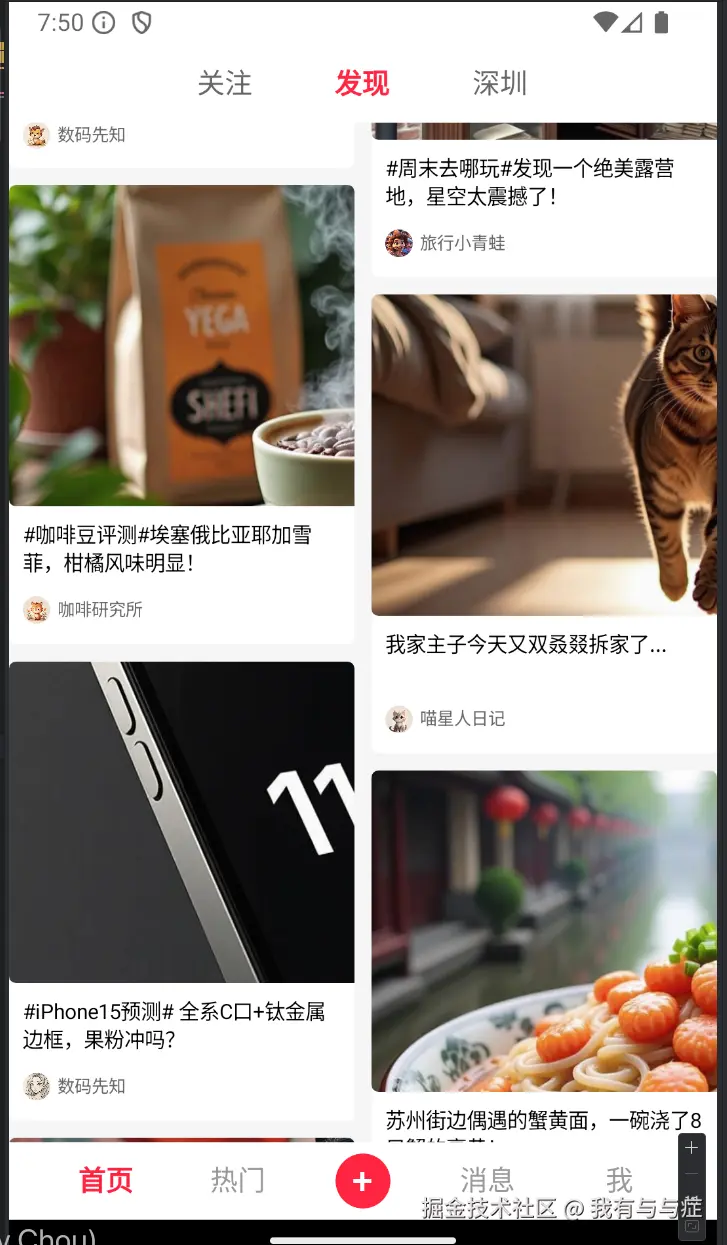
是不是有小红书首页的那味了
查看瀑布流demo的代码,可以看到它使用了WaterfallList组件,并通过随机化卡片的高度实现这种错落有致的信息流效果
kotlin
@Page("WaterfallViewExamplePage")
internal class WaterfallViewExamplePage : BasePager() {
    var dataList by observableList<WaterFallItem>()
    lateinit var footerRefreshRef : ViewRef<FooterRefreshView>
    var footerRefreshText by observable("上拉加载更多")
    override fun body(): ViewBuilder {
        val ctx = this
        return {
            attr {
                backgroundColor(Color(0xFF3c6cbdL))
            }
            // 背景图
            Image {
                attr {
                    absolutePosition(0f, 0f, 0f, 0f)
                    src("https://sqimg.qq.com/qq_product_operations/kan/images/viola/viola_bg.jpg")
                }
            }
            // navBar
            NavBar {
                attr {
                    title = "WaterfallView Example"
                }
            }

            WaterfallList {
                attr {
                    flex(1f)
                    columnCount(2)
                    listWidth(pagerData.pageViewWidth)
                    lineSpacing(10f)
                    itemSpacing(10f)
                }

                // 当view宽度指定和WaterFallList一样宽,则为独占一列布局( 指定宽度超过默认单列宽度,则可独占一列)
                View {
                    attr {
                        width(pagerData.pageViewWidth)
                        height(100f)
                        allCenter()
                        backgroundColor(Color((0..255).random(), (0..255).random(), (0..255).random(), 1.0f))
                    }

                    Text {
                        attr {
                            color(Color.WHITE)
                            text("我是Banner")
                            fontSize(16f)
                        }
                    }
                }

                vfor({ ctx.dataList }) { item ->
                    View {
                        attr {
                            allCenter()
                            height(item.height)
                            backgroundColor(item.bgColor)
                            borderRadius(8f)
                        }

                        Text {
                            attr {
                                text(item.title)
                                color(Color.WHITE)
                            }
                        }

                        event {
                            click {
                                this@View.attr {
                                    height((150..300).random().toFloat())
                                }
                            }
                        }
                    }
                }

                // 加载更多组件
                vif({ctx.dataList.isNotEmpty()}) {
                    FooterRefresh {
                        ref {
                            ctx.footerRefreshRef = it
                        }
                        attr {
                            preloadDistance(600f)
                            allCenter()
                            width(ctx.pageData.pageViewWidth) // 指定宽度超过默认单列宽度,则可独占一列
                            height(60f)

                        }
                        event {
                            refreshStateDidChange {
                                when(it) {
                                    FooterRefreshState.REFRESHING -> {
                                        ctx.footerRefreshText = "加载更多中.."
                                        setTimeout(500) {
                                            if (ctx.dataList.count() > 200) {
                                                ctx.footerRefreshRef.view?.endRefresh(FooterRefreshEndState.NONE_MORE_DATA)
                                            } else {
                                                ctx.addListData()
                                                ctx.footerRefreshRef.view?.endRefresh(FooterRefreshEndState.SUCCESS)
                                            }
                                        }
                                    }
                                    FooterRefreshState.IDLE -> ctx.footerRefreshText = "上拉加载更多"
                                    FooterRefreshState.NONE_MORE_DATA -> ctx.footerRefreshText = "无更多数据"
                                    FooterRefreshState.FAILURE -> ctx.footerRefreshText = "点击重试加载更多"
                                    else -> {}
                                }
                            }
                            click {
                                // 点击重试
                                ctx.footerRefreshRef.view?.beginRefresh()
                            }
                        }

                        Text {
                            attr {
                                color(Color.BLACK)
                                fontSize(20f)
                                text(ctx.footerRefreshText)
                            }
                        }

                    }
                }
            }
        }
    }

    override fun created() {
        super.created()
        addListData()
    }

    private fun addListData() {
        for (index in 0..10) {
            dataList.add(WaterFallItem().apply {
                title = "我是第${this@WaterfallViewExamplePage.dataList.size + 1}个卡片"
                height = (200..500).random().toFloat()
                bgColor = Color((0..255).random(), (0..255).random(), (0..255).random(), 1.0f)
            })
        }
    }
}
2.2 复用组件开发仿小红书首页瀑布流
我们可以尝试复用这个demo组件,并把尝试一些图片和文字放到卡片上面,至于数据从哪里找,可以让ai生成一些用于测试的数据,我的做法是选择让ai根据Kuikly Demo里面的json硬编码一些数据,方便我们使用,如下所示
kotlin
/**
 * 获取瀑布流模拟数据
 */
fun getMockWaterfallData(): List<Map<String, Any>> {
    return listOf(
        mapOf(
            "content" to "清晨的阳光洒在窗台上,一杯咖啡,一本书,一段静谧的时光。生活不需要太多的喧嚣,简单才是最真实的幸福。",
            "userNick" to "晨间漫步者",
            "userAvatar" to "https://vfiles.gtimg.cn/wuji_dashboard/xy/starter/8d0813ca.png",
            "likeNum" to "400",
            "imageUrl" to "https://vfiles.gtimg.cn/wuji_dashboard/xy/starter/59591ba6.jpeg",
            "imageWidth" to 800f,
            "imageHeight" to 1200f
        ),
        mapOf(
            "content" to "我们这代人最擅长的,就是把『我想你』翻译成『你看月亮了吗』。",
            "userNick" to "文字失语症",
            "userAvatar" to "https://vfiles.gtimg.cn/wuji_dashboard/xy/starter/45ad086d.png",
            "likeNum" to "5300",
            "imageUrl" to "https://vfiles.gtimg.cn/wuji_dashboard/xy/starter/8ae4eef2.jpeg",
            "imageWidth" to 800f,
            "imageHeight" to 600f
        ),
       ......

    )
}
现在我们要做的,就是把图片和文字放进卡片中
kotlin
// 主内容区域
View {
    attr {
        flex(1f)
    }

    WaterfallList {
        attr {
            flex(1f)
            // columnCount((pagerData.pageViewWidth / 180f).toInt())
            columnCount(ctx.columnCount)
            listWidth(pagerData.pageViewWidth)
            lineSpacing(10f)
            itemSpacing(10f)
        }

        Refresh {
            attr {
                height(50f)
                backgroundColor(Color.RED)
            }
        }

        vforIndex({ ctx.dataList }) { item, index, _ ->
                // 小红书风格卡片
            View {
                attr {
                    val cardWidth = (pagerData.pageViewWidth - 30f) / ctx.columnCount // 计算单个卡片宽度
                    height(item.calculateAdaptiveHeight(cardWidth))
                    backgroundColor(Color.WHITE)
                    borderRadius(4f)
                    flexDirectionColumn()
                }

                // 主图片
                Image {
                    attr {
                        // 图片宽度与卡片宽度一致
                        val cardWidth = pagerData.pageViewWidth
                        width(cardWidth)
                        // 图片高度占卡片总高度的70%
                        val totalCardHeight = item.calculateAdaptiveHeight(cardWidth)
                        val imageDisplayHeight = totalCardHeight * 0.7f
                        height(imageDisplayHeight)
                        src(item.imageUrl)
                        borderRadius(4f)

                    }
                }

                // 内容区域
                View {
                    attr {
                        flex(1f)
                        backgroundColor(Color.WHITE)
                        borderRadius(0f, 0f, 12f, 12f)
                        padding(8f)
                        flexDirectionColumn()
                        justifyContentSpaceBetween()
                    }

                    // 内容文字
                    Text {
                        attr {
                            text(item.content)
                            fontSize(12f)
                            color(Color.BLACK)
                            lineHeight(16f)
                            marginBottom(8f)
                        }
                    }

                    // 底部用户信息
                    View {
                        attr {
                            height(24f)
                            flexDirectionRow()
                            alignItemsCenter()
                        }

                        // 用户头像
                        Image {
                            attr {
                                width(16f)
                                height(16f)
                                src(item.userAvatar)
                                borderRadius(8f)
                            }
                        }
                        // 用户昵称
                        Text {
                            attr {
                                text(item.userNick)
                                fontSize(10f)
                                color(Color(0xFF666666))
                                marginLeft(4f)
                            }
                        }
                    }
                }
            }
        }
    }
}
再加上顶部导航栏和底部导航栏,这里不再赘述,感兴趣可以查看仓库代码实现
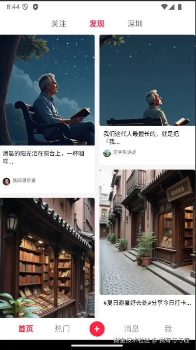
可以看到效果还是不错的!
2.3 页面布局优化
我们看到卡片中间有一大片的空白
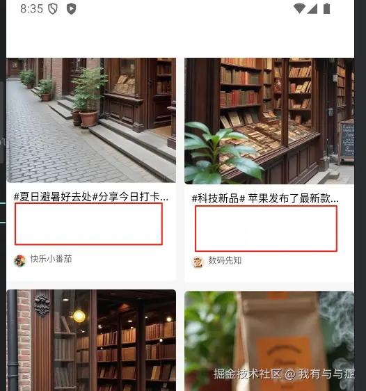
这是因为我们的卡片高度是随机生成的,但实际上卡片应该自动适应图片的文字和图片,我们可以使用Kuikly的flexDirectionColumn()属性,让高度自动适应
然后我们可以根据图片的比例和计算卡片高度:
根据公式:

可得

卡片的宽度就是页面宽度除以列数
代码如下:
kotlin
// 主图片
Image {
    attr {
        val cardWidth = ctx.pageViewWidth / ctx.columnCount // 计算单个卡片宽度
        src(item.imageUrl)
        borderRadius(4f)
        flex(1f)
        size(cardWidth, (item.imageHeight / item.imageWidth) * cardWidth) // 按照比例计算高度
    }
}
最终效果如下
可以看到效果还是比较还原的。
通过搭建仿小红书App的首页,可以体会到Kuikly官方提供了许多的组件,官方的api文档接口也很详细,开发起来还是很流畅的。除了官方提供的组件外,我们也可以自定义组件,在后续内容会继续讲解。