掌握 JSON 模板与动态区块配置,让主题更灵活、更可复用
本文为《Shopify 前端实战系列》的第 2 篇。
示例源码仓库 👉 GitHub · ebinfeng/shopify-demo · course-002
🎯 一、章节目标
通过本章你将掌握:
- 理解 Shopify Online Store 2.0 的结构与页面组织方式
- 使用 JSON 模板 构建页面布局
- 创建可复用的 Section 区块 并在后台可视化配置
- 管理多模板页面(首页、自定义页面)
- 掌握 Schema 配置项与动态样式绑定
本章最终成果:
✅ 你将能从零创建一个带有「产品推荐区块」的首页,并实现后台动态配置。
🧰 二、环境准备
请确保完成以下准备(参考 S01):
bash
node -v     # Node.js >= 18
npm i -g @shopify/cli
shopify auth login --store your-dev-store.myshopify.com
若尚未创建项目,可执行:
bash
shopify theme init course-002
cd course-002
🧱 三、操作步骤
Step 1️⃣ 创建示例数据
- 登录 Shopify 后台 →「产品」→「集合」
- 新建集合:Featured
- 新建几个商品并加入该集合
✅ 确保集合内有商品,后续区块才能展示。
Step 2️⃣ 确认主题目录结构
项目目录应包含以下路径(若缺少可自行创建):
bash
/layout
/templates
/sections
/snippets
/assets
Step 3️⃣ 编写可配置区块
文件路径: /sections/product-recommend.liquid
css
{% schema %}
{
"name": "产品推荐区块",
"settings": [
{ "type": "text", "id": "title", "label": "区块标题", "default": "你可能喜欢" },
{ "type": "collection", "id": "collection", "label": "推荐集合" },
{ "type": "range", "id": "limit", "label": "展示数量", "min": 2, "max": 12, "step": 1, "default": 4 },
{ "type": "color", "id": "bg_color", "label": "背景颜色", "default": "#ffffff" },
{ "type": "checkbox", "id": "show_border", "label": "显示边框", "default": true }
],
"presets": [{ "name": "产品推荐区块" }]
}
{% endschema %}
<section class="product-recommend" style="background-color: {{ section.settings.bg_color }};">
<h2>{{ section.settings.title }}</h2>
{% assign coll = section.settings.collection %}
{% if coll and coll.products_count > 0 %}
<div class="product-grid">
{% for product in coll.products limit: section.settings.limit %}
<a href="{{ product.url }}" class="product-card">
<img src="{{ product.featured_image | img_url: '360x' }}" alt="{{ product.title }}">
<p>{{ product.title }}</p>
<p>{{ product.price | money }}</p>
</a>
{% endfor %}
</div>
{% else %}
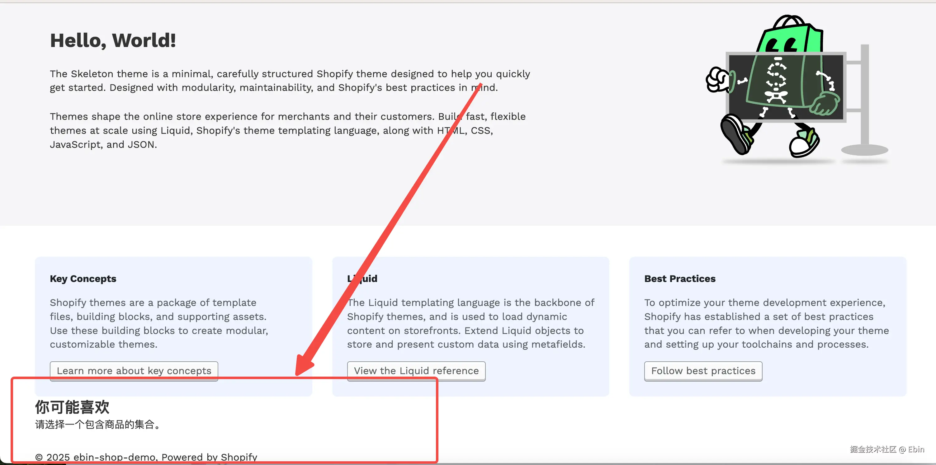
<p>请选择一个包含商品的集合。</p>
{% endif %}
</section>
<style>
.product-grid {
display: grid;
grid-template-columns: repeat(4, 1fr);
gap: 20px;
}
@media(max-width: 768px) {
.product-grid { grid-template-columns: repeat(2, 1fr); }
}
.product-card {
text-decoration: none;
color: #000;
border: {% if section.settings.show_border %}1px solid #ddd{% else %}0{% endif %};
border-radius: 12px;
overflow: hidden;
text-align: center;
background: #fff;
}
.product-card img {
width: 100%; height: auto;
}
</style>Step 4️⃣ 注册区块到首页模板
文件路径: /templates/index.json
css
{
  "sections": {
    "banner": { "type": "banner" },
    "product-recommend": { "type": "product-recommend" }
  },
  "order": ["banner", "product-recommend"]
}
Step 5️⃣ 启动主题并预览
运行命令:
shopify theme dev打开预览链接 → 点击右上角 "自定义(Customize)"
你将看到「产品推荐区块」,并可以:
- 修改标题
- 选择集合(
Featured) - 调整展示数量与样式
💡 修改实时生效,无需重新部署。
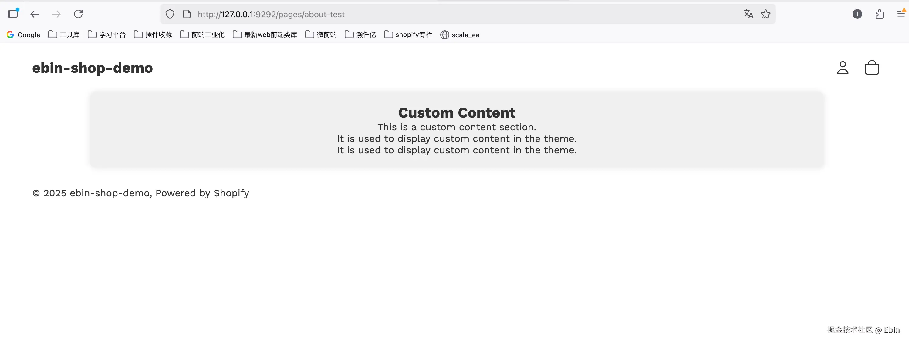
Step 6️⃣ 创建自定义页面模板
新建自定义区块路径: /sections/custom-content.liquid
css
{% comment %}
  Welcome to Shopify theme development!
{% endcomment %}

<div class="custom-content full-width">
  <h2>Custom Content</h2>
  <p>This is a custom content section.</p>
  <p>It is used to display custom content in the theme.</p>
  <p>It is used to display custom content in the theme.</p>
</div>


{% stylesheet %}

 .custom-content {
    width: 80%;
    margin: 0 auto;
    text-align: center;
    padding: 20px;
    background-color: #f0f0f0;
    border-radius: 10px;
    box-shadow: 0 0 10px 0 rgba(0, 0, 0, 0.1);
 }
{% endstylesheet %}

{% schema %}
{
  "name": "Custom Content",
  "settings": [],
  "presets": [
    {
      "name": "Custom Content",
      "category": "Custom"
    }
  ]
}
{% endschema %}
文件路径: /templates/page.about.json
css
{
  "sections": {
    "hero": { "type": "custom-content", "settings": {} }
  },
  "order": ["hero"]
}
后台 →「在线商店」→「页面」→ 新建页面 → 模板选择 page.about
✅ 保存后可访问 /pages/about 查看自定义页面效果。
🔍 四、本章成果验证
完成后你将实现以下功能:
✅ 首页下方新增「产品推荐区块」
✅ 区块可在后台自定义标题、选择集合、展示数量、背景色、边框
✅ 新建「关于我们」页面可使用独立模板 page.about.json
✅ 支持移动端自适应布局
⚡ 五、常见问题
Q1:后台找不到"产品推荐区块"?
→ 检查 Section 文件中是否含有 "presets" 配置。
Q2:集合为空时没有提示?
→ 确认代码中包含 {% else %} 分支。
Q3:模板修改后预览不更新?
→ 在终端按 Ctrl + C 停止再重新运行 shopify theme serve。
📦 六、源码附录
- 本章源码目录:
github.com/ebinfeng/sh... - 文件清单:
bash
/sections/product-recommend.liquid
/sections/custom-content.liquid
/templates/index.json
/templates/page.about.json
🧩 七、小结与下节预告
至此,你已经掌握了:
- Shopify Online Store 2.0 的核心理念
- JSON 模板结构与 Section 注册机制
- Schema 设置项的使用方式
- 创建可视化可配置区块
👉 下一节(S03:Theme App Extension 实战篇 )
我们将学习如何将 App 数据注入到 Theme 中,实现动态数据渲染与前后端交互。