引言
大家好啊,我是前端拿破轮。
最近在学习React Native(简称为RN),所以打算记录一下,希望能够对各位读者有所帮助。
什么是React Native
简单来说,React Native是一个跨平台的移动端开发框架,能够让咱们开发人员使用JavaScript和React构建原生IOS和Android应用程序。
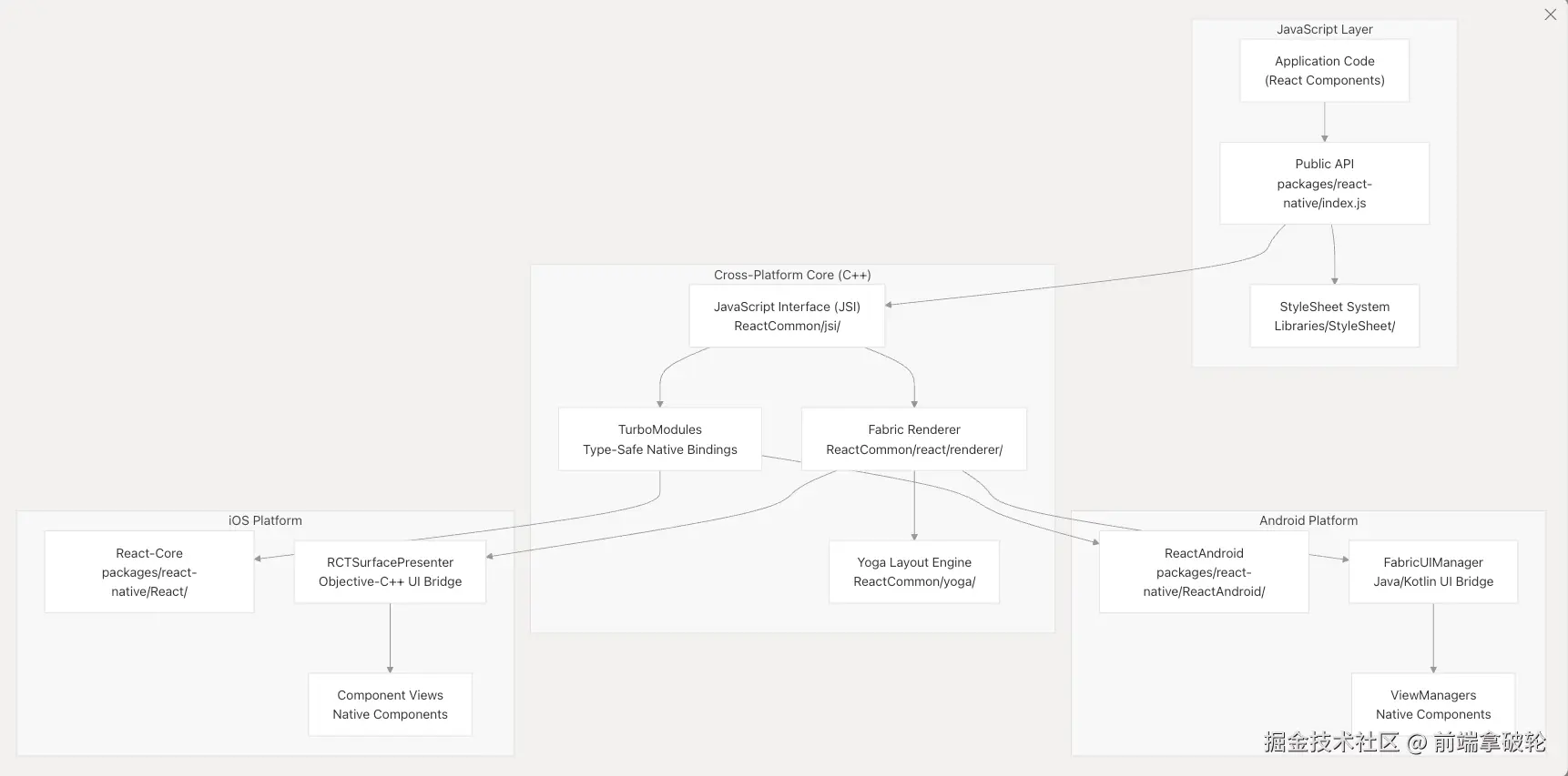
在设计理念上,React Native遵循分层架构,将JavaScript应用程序代码,跨平台的C++渲染基础设施和基于特定平台的本地实现之间的关注点分开。真正实现在React中编写一次,就可以在iOS和Android上生成真正的原生用户界面。
如何使用React Native
这里我们直接从一个demo程序开始,在做的过程中再解释。
配置环境
这里大家可以直接去expo文档官网来查看如何配置环境。
不同的开发设备,配置的方式也有所差异,官方文档都提供了详细的配置教程。
我这里以macOS,使用iOS的模拟器为例,进行开发。
创建应用
shell
# 利用expo框架快速创建一个RN应用
pnpm dlx create-expo-app@latestexpo是一个开发RN应用的框架,集成了一系列的工具和服务,可以让我们快速的开发RN应用。
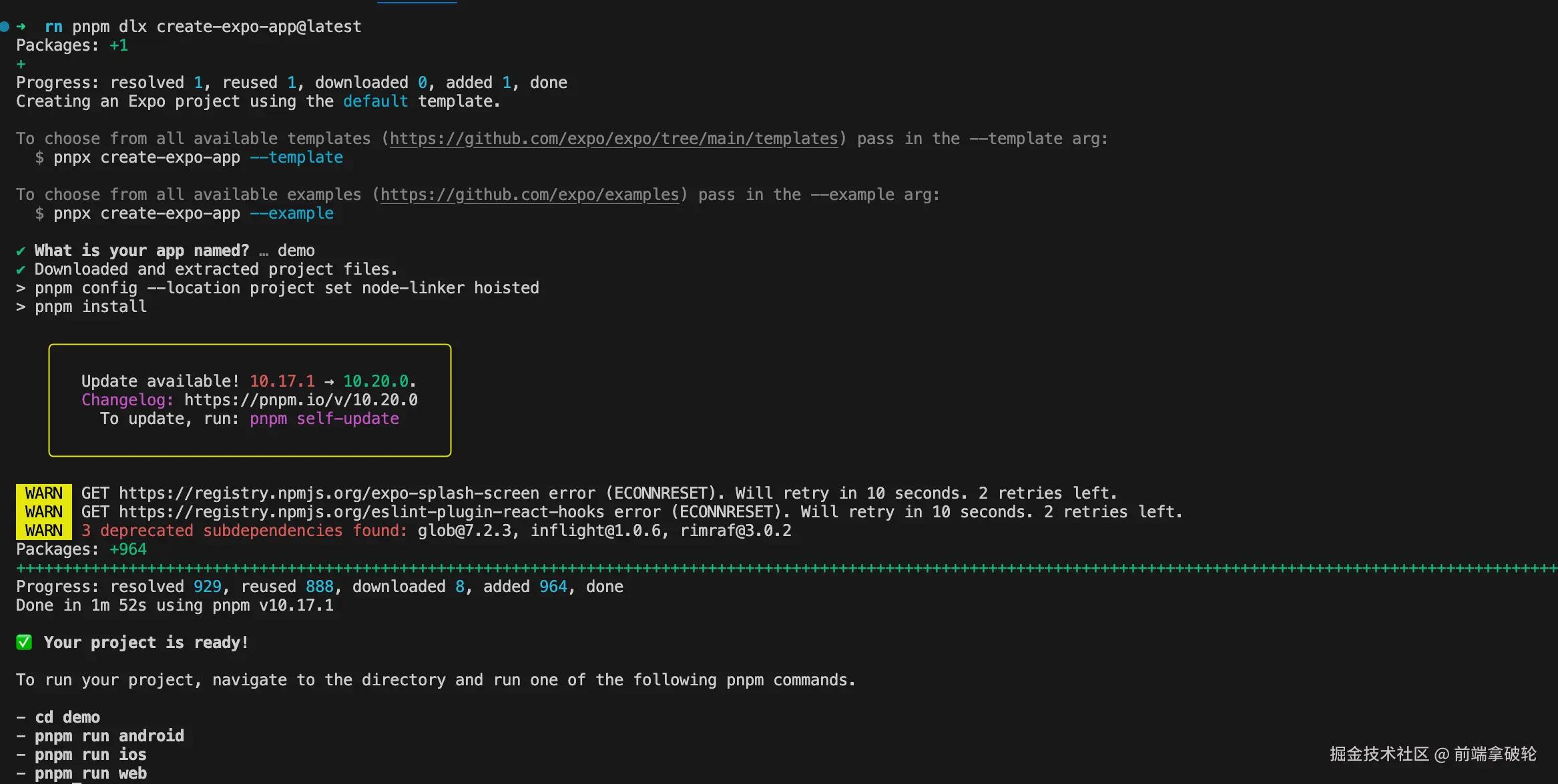
根据命令行提示进入该目录并启动应用。
shell
# 进入demo目录
cd demo

# 启动应用
pnpm ios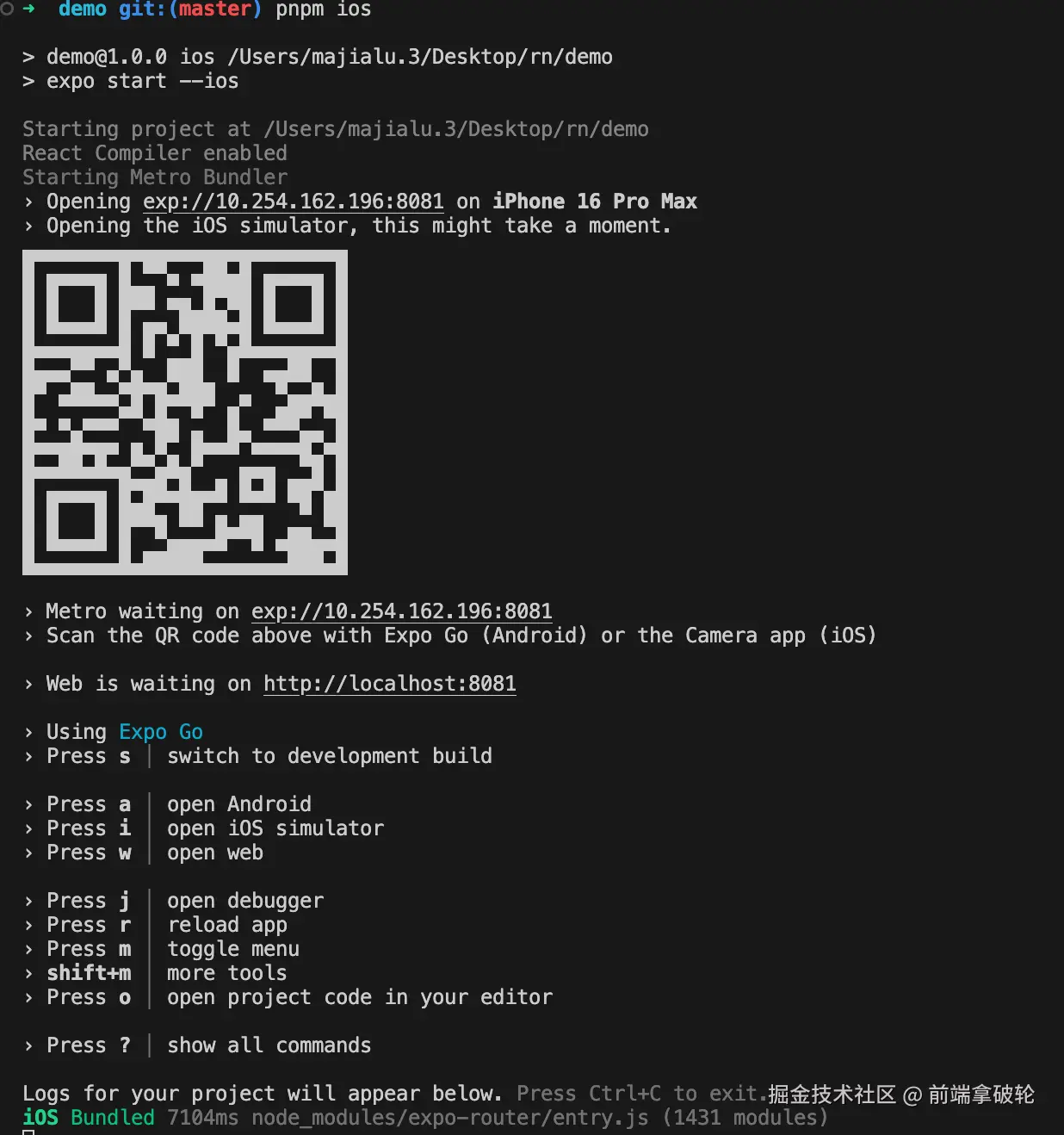
这里如果在手机上下载了expo客户端,可以直接在手机上扫描二维码,打开应用(注意手机和电脑在同一个局域网下)。
我们这里的话使用模拟器打开应用。
热更新
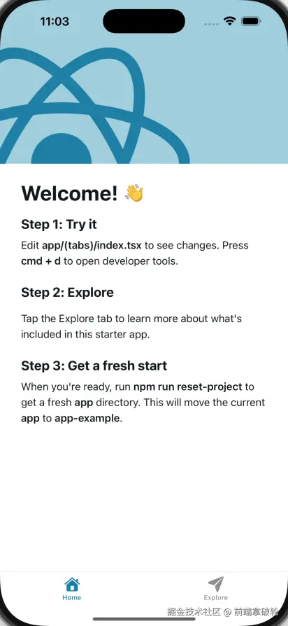
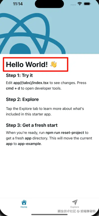
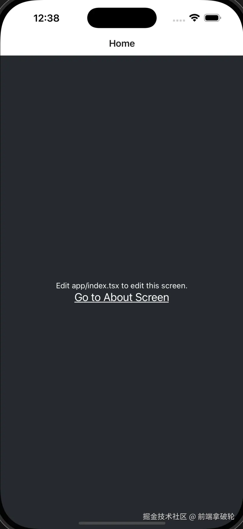
打开app/(tabs)/index.tsx文件,可以看到首页的代码。我们尝试修改Welcome!为Hello World!。

然后我们可以看到应用自己触发了热更新,不用我们手动刷新。
目录介绍
我们来观察一下expo脚手架的目录结构。
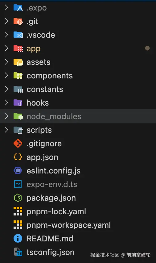
.expo:这是我们在使用pnpm ios的时候自动生成的一个目录,里面存放了一些expo的配置文件。app:这是我们的应用程序代码,包括UI和业务逻辑,类似于我们在Web开发中常用的src目录。assets:存放应用程序的静态资源,比如图片、字体等。components:存放组件的文件夹,不解释。constants:常量,不解释。hooks:存放react的hooks。scripts:存放我们自定义的脚本文件,项目创建时自带一个reset-project的脚本,可以将初始的项目代码重置为空白。app.json:这是RN应用的配置文件,配置在不同平台上应用的基础信息。- 其他:常见的项目配置文件,不解释。
重置项目
我们可以运行以下命令来重置demo代码,开始一个新项目。
shell
pnpm reset-project开发demo
基本概念
这个脚本将app目录中的所有文件移动到app-example,然后创建一个带有index.tsx的新index.tsx文件的新app目录。
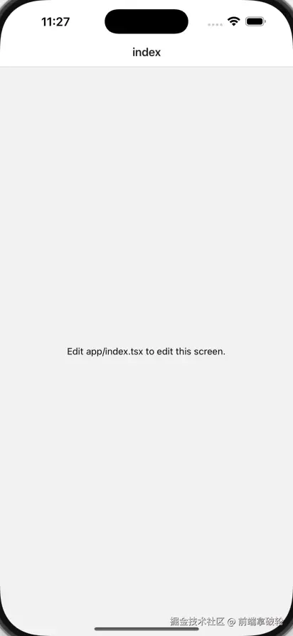
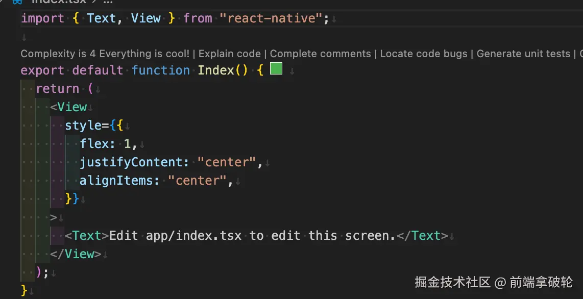
我们可以看到在app/index.tsx文件中,,有一个简单的React函数式组件。
这里使用了两个从react-native导入的组件,Text和View。
Text组件用于显示文本,View组件用于显示容器。
和在Web开发中不同,RN中的文字不能直接写,必须包裹在Text组件中。
View组件就类似于div,用于显示容器。
tsx
import { Text, View } from 'react-native';
export default function Index() {
return (
<View
style={{
flex: 1,
justifyContent: 'center',
alignItems: 'center',
}}
>
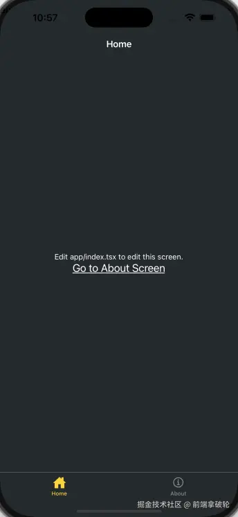
<Text>Edit app/index.tsx to edit this screen.</Text>
</View>
);
}关于样式,我们可以看到style属性是一个对象,里面包含了flex、justifyContent和alignItems等属性。这些和Web开发中的CSS属性类似,用于设置容器的布局和对齐方式。
注意:
RN中没有CSS文件,所有的样式都写在JavaScript中。
如果我们想要书写样式,要使用StyleSheet来创建一个styles。
tsx
import { StyleSheet, Text, View } from 'react-native';

export default function Index() {
  return (
    <View style={styles.container}>
      <Text style={styles.text}>Edit app/index.tsx to edit this screen.</Text>
    </View>
  );
}

const styles = StyleSheet.create({
  container: {
    flex: 1,
    backgroundColor: '#25292e',
    alignItems: 'center',
    justifyContent: 'center',
  },
  text: {
    color: '#fff',
  },
});
添加导航
我们这里使用Expo Router,这是一个基于文件 的路由框架,适用于React Native和Web应用。使用的时候,我们需要了解以下约定:
app目录:这是一个特殊的目录,仅包含路由及其布局。添加到这个目录中的任何文件都会成为我们原生应用中的一个屏幕。app/_layout.tsx文件:这是固定命名文件,不能修改 ,定义了共享的UI元素,比如标题栏和标签栏,以便它们在不同路由之间保持一致。- 路由文件默认导出
React组件,可以用.js,.jsx,.ts,.tsx来命名。
在app目录中新建一个about.tsx的新文件,当用户访问/about路径时,会显示这个页面。
tsx
import { StyleSheet, Text, View } from 'react-native';
import React from 'react';

export default function about() {
  return (
    <View style={styles.container}>
      <Text style={styles.text}>about</Text>
    </View>
  );
}

const styles = StyleSheet.create({
  container: {
    flex: 1,
    backgroundColor: '#25292e',
    alignItems: 'center',
    justifyContent: 'center',
  },
  text: {
    color: '#fff',
  },
});在_layout.tsx中,我们进行相关配置。
tsx
import { Stack } from 'expo-router';

export default function RootLayout() {
  return (
    <Stack>
      <Stack.Screen name="index" options={{ title: 'Home' }} />
      <Stack.Screen name="about" options={{ title: 'About' }} />
    </Stack>
  );
}这里的Stack是Expo Router的组件,用于定义路由的堆栈。
切换屏幕
在app/index.tsx中,我们添加一个按钮,当用户点击按钮时,会跳转到/about路径。
tsx
import { Link } from 'expo-router';
import { StyleSheet, Text, View } from 'react-native';

export default function Index() {
  return (
    <View style={styles.container}>
      <Text style={styles.text}>Edit app/index.tsx to edit this screen.</Text>
      <Link href="/about" style={styles.button}>
        Go to About Screen
      </Link>
    </View>
  );
}

const styles = StyleSheet.create({
  container: {
    flex: 1,
    backgroundColor: '#25292e',
    alignItems: 'center',
    justifyContent: 'center',
  },
  text: {
    color: '#fff',
  },
  button: {
    fontSize: 20,
    textDecorationLine: 'underline',
    color: '#fff',
  },
});
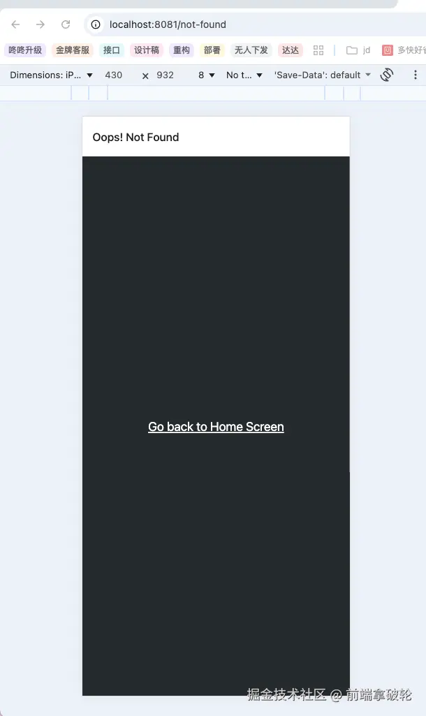
错误路由页面
当路由不存在时,我们可以用+not-found路由来显示备用页面。这样可以避免应用崩溃或者显示对用户不友好的404错误。在Expo Router中,我们可以使用一个特殊的文件+not-found.tsx来实现。
注意,这里的文件名
+not-found.tsx是固定名称,不能随意修改。
- 在
app目录中新建一个+not-found.tsx的新文件,用来添加NotFoundScreen组件。 - 给
Stack.Screen添加options属性,为这个路由自定义屏幕标题。 - 添加一个
Link组件,用于导航到首页。
这里我们在原生应用不是很好测试错误路由页面,所以我们可以在浏览器中访问一个不存在的路由,比如http://localhost:8081/not-found,可以看到Expo Router会自动跳转到+not-found.tsx页面。
tsx
import { StyleSheet, Text, View } from 'react-native';
import React from 'react';
import { Stack } from 'expo-router';

export default function NotFoundScreen() {
  return (
    <>
      <Stack.Screen options={{ title: 'Oops! Not Found' }} />
      <View style={styles.container}>
        <Text style={styles.button}>Go back to Home Screen</Text>
      </View>
    </>
  );
}

const styles = StyleSheet.create({
  container: {
    flex: 1,
    backgroundColor: '#25292e',
    justifyContent: 'center',
    alignItems: 'center',
  },

  button: {
    fontSize: 20,
    textDecorationLine: 'underline',
    color: '#fff',
  },
});
添加导航栏
- 在
app目录下,添加一个(tabs)的子目录,这个目录用于将路由分组并显示在底部的标签栏中。 - 创建
(tabs)/_layout.tsx文件,该文件将用于自定义选项卡布局,该布局和根布局是独立的。 - 将现有的
index.tsx和about.tsx移动到(tabs)目录下,应用程序的目录结构如下所示:
txt
📦app
 ┣ 📂(tabs)
 ┃ ┣ 📜_layout.tsx
 ┃ ┣ 📜about.tsx
 ┃ ┗ 📜index.tsx
 ┣ 📜+not-found.tsx
┗ 📜_layout.tsx更新根布局文件,添加(tabs)路由:
tsx
// apps/_layout.tsx
import { Stack } from 'expo-router';
export default function RootLayout() {
  return (
    <Stack>
      <Stack.Screen name="(tabs)" options={{ headerShown: false }} />
    </Stack>
  );
}在(tabs)/_layout.tsx中,添加一个Tabs组件来定义底部标签布局。
tsx
import { Tabs } from 'expo-router';

export default function TabLayout() {
  return (
    <Tabs>
      <Tabs.Screen name="index" options={{ title: 'Home' }} />
      <Tabs.Screen name="about" options={{ title: 'About' }} />
    </Tabs>
  );
}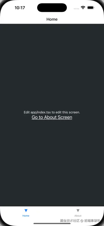
我们可以看到应用已经添加了底部导航栏。但是图标样式是默认的三角形,我们可以自定义修改。
修改导航栏样式
修改(tabs)/_layout.tsx文件来添加标签栏图标。
- 从
@expo/vector-icons中导入Ionicons图标库。 - 将
tabBarIcon添加到index和about路由,这是一个函数,接受focused和color作为参数,并渲染图标组件。 - 在
Tabs组件中添加screenOptions.tabBarActiveTintColor属性,并将其设置为#ffd33d,这用来设置激活时的标签颜色。
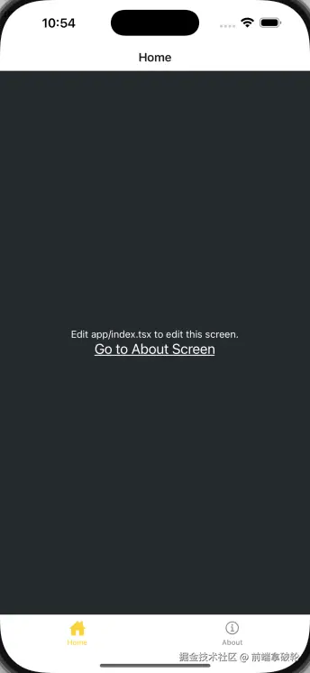
我们还可以利用screenOptions属性来更改标签栏和标题栏的背景颜色
tsx
// app/(tabs)/_layout.tsx
<Tabs
  screenOptions={{
    tabBarActiveTintColor: '#ffd33d',
    headerStyle: {
      backgroundColor: '#25292e',
    },
    headerShadowVisible: false,
    headerTintColor: '#fff',
    tabBarStyle: {
      backgroundColor: '#25292e',
    },
  }}
>
这下导航栏和整个页面的风格也更加的一致。
编辑首页

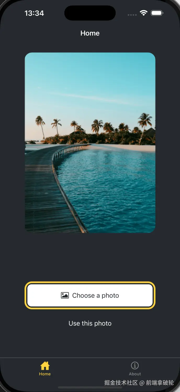
最后,我们要实现一个类似上面的效果。
我们观察发现,页面主要由三个部分组成,分别是
- 占据屏幕大部分的图片
- 选择图片按钮
- 使用默认图片按钮
显示图片
我们使用expo-image来展示图片:
shell
pnpm dlx expo install expo-image访问Expo官网来下载静态资源,并替换app/assets/images。
tsx
// app/(tabs)/index.tsx
import { Image } from 'expo-image';
import { StyleSheet, View } from 'react-native';

const PlaceholderImage = require('@/assets/images/background-image.png');

export default function Index() {
  return (
    <View style={styles.container}>
      <View style={styles.imageContainer}>
        <Image style={styles.image} source={PlaceholderImage} />
      </View>
    </View>
  );
}

const styles = StyleSheet.create({
  container: {
    flex: 1,
    backgroundColor: '#25292e',
    alignItems: 'center',
  },

  imageContainer: {
    flex: 1,
  },

  image: {
    width: 320,
    height: 440,
    borderRadius: 18,
  },
});
拆分组件
在RN开发中,同样遵循组件化的原则。
- 在项目根目录创建
components目录,并在其中创建ImageViewer.tsx文件。 - 将用于显示图像的代码以及
image样式移到此文件中。
tsx
import { Image } from 'expo-image';
import { StyleSheet, View } from 'react-native';

const PlaceholderImage = require('@/assets/images/background-image.png');

export default function Index() {
  return (
    <View style={styles.container}>
      <View style={styles.imageContainer}>
        <Image style={styles.image} source={PlaceholderImage} />
      </View>
    </View>
  );
}

const styles = StyleSheet.create({
  container: {
    flex: 1,
    backgroundColor: '#25292e',
    alignItems: 'center',
  },

  imageContainer: {
    flex: 1,
  },

  image: {
    width: 320,
    height: 440,
    borderRadius: 18,
  },
});在app/(tabs)/index.tsx中使用它:
tsx
import ImageViewer from '@/components/ImageViewer';
import { StyleSheet, View } from 'react-native';

const PlaceholderImage = require('@/assets/images/background-image.png');

export default function Index() {
  return (
    <View style={styles.container}>
      <View style={styles.imageContainer}>
        <ImageViewer imgSource={PlaceholderImage} />
      </View>
    </View>
  );
}

const styles = StyleSheet.create({
  container: {
    flex: 1,
    backgroundColor: '#25292e',
    alignItems: 'center',
  },

  imageContainer: {
    flex: 1,
  },
});
添加按钮
在我们的设计中,需要两个按钮,但是每个按钮的样式和标签都不同。首先,我们需要为这些按钮创建一个可重用的组件。
在components目录下创建一个名为Button的文件,并添加以下代码:
tsx
import { Pressable, StyleSheet, Text, View } from 'react-native';

type Props = {
  label: string;
};

export default function Button({ label }: Props) {
  return (
    <View style={styles.buttonContainer}>
      <Pressable
        style={styles.button}
        onPress={() => alert('You pressed a button')}
      >
        <Text style={styles.buttonLabel}>{label}</Text>
      </Pressable>
    </View>
  );
}

const styles = StyleSheet.create({
  buttonContainer: {
    width: 320,
    height: 68,
    marginHorizontal: 20,
    alignItems: 'center',
    justifyContent: 'center',
    padding: 3,
  },

  button: {
    borderRadius: 10,
    width: '100%',
    height: '100%',
    alignItems: 'center',
    justifyContent: 'center',
    flexDirection: 'row',
  },

  buttonLabel: {
    color: '#fff',
    fontSize: 16,
  },
});
应为两个按钮的样式不同,所以需要我们对Button.tsx组件进行调整。
tsx
import { Pressable, StyleSheet, Text, View } from 'react-native';
import FontAwesome from '@expo/vector-icons/FontAwesome';

type Props = {
  label: string;
  theme?: 'primary';
};

export default function Button({ label, theme }: Props) {
  if (theme === 'primary') {
    return (
      <View
        style={[
          styles.buttonContainer,
          { borderWidth: 4, borderColor: '#ffd33d', borderRadius: 18 },
        ]}
      >
        <Pressable
          style={[styles.button, { backgroundColor: '#fff' }]}
          onPress={() => alert('You press a button.')}
        >
          <FontAwesome
            name="picture-o"
            size={18}
            color="#25292e"
            style={styles.buttonIcon}
          />
          <Text style={[styles.buttonLabel, { color: '#25292d' }]}>
            {label}
          </Text>
        </Pressable>
      </View>
    );
  }
  return (
    <View style={styles.buttonContainer}>
      <Pressable
        style={styles.button}
        onPress={() => alert('You pressed a button')}
      >
        <Text style={styles.buttonLabel}>{label}</Text>
      </Pressable>
    </View>
  );
}

const styles = StyleSheet.create({
  buttonContainer: {
    width: 320,
    height: 68,
    marginHorizontal: 20,
    alignItems: 'center',
    justifyContent: 'center',
    padding: 3,
  },

  button: {
    borderRadius: 10,
    width: '100%',
    height: '100%',
    alignItems: 'center',
    justifyContent: 'center',
    flexDirection: 'row',
  },

  buttonIcon: {
    paddingRight: 8,
  },

  buttonLabel: {
    color: '#fff',
    fontSize: 16,
  },
});修改app/(tabs)/index.tsx文件,在第一个按钮上使用theme="primary"属性
tsx
import { View, StyleSheet } from 'react-native';

import Button from '@/components/Button';
import ImageViewer from '@/components/ImageViewer';

const PlaceholderImage = require('@/assets/images/background-image.png');

export default function Index() {
  return (
    <View style={styles.container}>
      <View style={styles.imageContainer}>
        <ImageViewer imgSource={PlaceholderImage} />
      </View>
      <View style={styles.footerContainer}>
        <Button theme="primary" label="Choose a photo" />
        <Button label="Use this photo" />
      </View>
    </View>
  );
}

const styles = StyleSheet.create({
  container: {
    flex: 1,
    backgroundColor: '#25292e',
    alignItems: 'center',
  },
  imageContainer: {
    flex: 1,
  },
  footerContainer: {
    flex: 1 / 3,
    alignItems: 'center',
  },
});
添加图片选择器
安装expo-image-picker
shell
pnpm dlx expo install expo-image-picker更新app/(tabs)/index.tsx文件
tsx
// ...rest of the import statements remain unchanged
import * as ImagePicker from 'expo-image-picker';

export default function Index() {
  const pickImageAsync = async () => {
    let result = await ImagePicker.launchImageLibraryAsync({
      mediaTypes: ['images'],
      allowsEditing: true,
      quality: 1,
    });

    if (!result.canceled) {
      console.log(result);
    } else {
      alert('You did not select any image.');
    }
  };

  // ...rest of the code remains same
}
更新按钮组件
tsx
import { StyleSheet, View, Pressable, Text } from 'react-native';
import FontAwesome from '@expo/vector-icons/FontAwesome';

type Props = {
  label: string;
  theme?: 'primary';
  onPress?: () => void;
};

export default function Button({ label, theme, onPress }: Props) {
  if (theme === 'primary') {
    return (
      <View
        style={[
          styles.buttonContainer,
          { borderWidth: 4, borderColor: '#ffd33d', borderRadius: 18 },
        ]}
      >
        <Pressable
          style={[styles.button, { backgroundColor: '#fff' }]}
          onPress={onPress}
        >
          <FontAwesome
            name="picture-o"
            size={18}
            color="#25292e"
            style={styles.buttonIcon}
          />
          <Text style={[styles.buttonLabel, { color: '#25292e' }]}>
            {label}
          </Text>
        </Pressable>
      </View>
    );
  }

  return (
    <View style={styles.buttonContainer}>
      <Pressable
        style={styles.button}
        onPress={() => alert('You pressed a button.')}
      >
        <Text style={styles.buttonLabel}>{label}</Text>
      </Pressable>
    </View>
  );
}

const styles = StyleSheet.create({
  buttonContainer: {
    width: 320,
    height: 68,
    marginHorizontal: 20,
    alignItems: 'center',
    justifyContent: 'center',
    padding: 3,
  },
  button: {
    borderRadius: 10,
    width: '100%',
    height: '100%',
    alignItems: 'center',
    justifyContent: 'center',
    flexDirection: 'row',
  },
  buttonIcon: {
    paddingRight: 8,
  },
  buttonLabel: {
    color: '#fff',
    fontSize: 16,
  },
});在app/(tabs)/index.tsx文件中,将pickImageAsync函数添加到第一个<Button>的onPress属性中。
tsx
import { View, StyleSheet } from 'react-native';
import * as ImagePicker from 'expo-image-picker';

import Button from '@/components/Button';
import ImageViewer from '@/components/ImageViewer';

const PlaceholderImage = require('@/assets/images/background-image.png');

export default function Index() {
  const pickImageAsync = async () => {
    let result = await ImagePicker.launchImageLibraryAsync({
      mediaTypes: ['images'],
      allowsEditing: true,
      quality: 1,
    });

    if (!result.canceled) {
      console.log(result);
    } else {
      alert('You did not select any image.');
    }
  };

  return (
    <View style={styles.container}>
      <View style={styles.imageContainer}>
        <ImageViewer imgSource={PlaceholderImage} />
      </View>
      <View style={styles.footerContainer}>
        <Button
          theme="primary"
          label="Choose a photo"
          onPress={pickImageAsync}
        />
        <Button label="Use this photo" />
      </View>
    </View>
  );
}

const styles = StyleSheet.create({
  container: {
    flex: 1,
    backgroundColor: '#25292e',
    alignItems: 'center',
  },
  imageContainer: {
    flex: 1,
  },
  footerContainer: {
    flex: 1 / 3,
    alignItems: 'center',
  },
});我们可以选择一个图片进行测试,在iOS的模拟器上,result类似下面这样:
json
{
  "assets": [
    {
      "assetId": "99D53A1F-FEEF-40E1-8BB3-7DD55A43C8B7/L0/001",
      "base64": null,
      "duration": null,
      "exif": null,
      "fileName": "IMG_0004.JPG",
      "fileSize": 2548364,
      "height": 1669,
      "mimeType": "image/jpeg",
      "type": "image",
      "uri": "file:///data/user/0/host.exp.exponent/cache/ExperienceData/%2540anonymous%252FStickerSmash-13f21121-fc9d-4ec6-bf89-bf7d6165eb69/ImagePicker/ea574eaa-f332-44a7-85b7-99704c22b402.jpeg",
      "width": 1668
    }
  ],
  "canceled": false
}
展示选择的图像
result对象提供了一个assets数组,其中包含所选图片的uri。
我们可以修改app/(tabs)/index.tsx文件来展示选择的图像。
- 使用
React的useState钩子来声明一个名为selectedImage的状态变量,用来保存此状态变量所保存图片的URI。 - 更新
pickImageAsync()函数,将图像的URI保存到selectedImage状态变量中。 - 将
selectedImage状态变量传递给ImageViewer组件。 - 更新
ImageViewer组件,新增selectedImage属性,用于接收selectedImage状态变量。
tsx
import Button from '@/components/Button';
import ImageViewer from '@/components/ImageViewer';
import { StyleSheet, View } from 'react-native';
import * as ImagePicker from 'expo-image-picker';
import { useState } from 'react';

const PlaceholderImage = require('@/assets/images/background-image.png');

export default function Index() {
  const [selectedImage, setSelectedImage] = useState<string | undefined>(
    undefined,
  );
  const pickImageAsync = async () => {
    let result = await ImagePicker.launchImageLibraryAsync({
      mediaTypes: ['images'],
      allowsEditing: true,
      quality: 1,
    });

    if (!result.canceled) {
      console.log(result);
      setSelectedImage(result.assets[0].uri);
    } else {
      alert('You did not select any image');
    }
  };
  return (
    <View style={styles.container}>
      <View style={styles.imageContainer}>
        <ImageViewer
          imgSource={PlaceholderImage}
          selectedImage={selectedImage}
        />
      </View>
      <View style={styles.footerContainer}>
        <Button
          label="Choose a photo"
          theme="primary"
          onPress={pickImageAsync}
        />
        <Button label="Use this photo" />
      </View>
    </View>
  );
}

const styles = StyleSheet.create({
  container: {
    flex: 1,
    backgroundColor: '#25292e',
    alignItems: 'center',
  },

  imageContainer: {
    flex: 1,
    paddingTop: 28,
  },

  footerContainer: {
    flex: 1 / 3,
    alignItems: 'center',
  },
});
tsx
// ImageViewer.tsx

import { Image } from 'expo-image';
import { ImageSourcePropType, StyleSheet } from 'react-native';

type Props = {
  imgSource: ImageSourcePropType;
  selectedImage: string | undefined;
};

export default function ImageViewer({ imgSource, selectedImage }: Props) {
  const imageSource = selectedImage ? { uri: selectedImage } : imgSource;
  return <Image source={imageSource} style={styles.image} />;
}

const styles = StyleSheet.create({
  image: {
    width: 320,
    height: 440,
    borderRadius: 18,
  },
});
创建模态框
在app/(tabs)/index.tsx中:
- 声明一个布尔状态变量
showAppOptions,用于控制模态框的显示和隐藏。默认状态为false。 - 更新
pickImageAsync()函数,在用户选择图像后,将showAppOptions状态变量设置为true。 - 将第二个按钮的点击事件修改为
() => setShowAppOptions(true)。
tsx
import Button from '@/components/Button';
import ImageViewer from '@/components/ImageViewer';
import { StyleSheet, View } from 'react-native';
import * as ImagePicker from 'expo-image-picker';
import { useState } from 'react';

const PlaceholderImage = require('@/assets/images/background-image.png');

export default function Index() {
  const [selectedImage, setSelectedImage] = useState<string | undefined>(
    undefined,
  );
  const [showAppOptions, setShowAppOptions] = useState<boolean>(false);
  const pickImageAsync = async () => {
    let result = await ImagePicker.launchImageLibraryAsync({
      mediaTypes: ['images'],
      allowsEditing: true,
      quality: 1,
    });

    if (!result.canceled) {
      console.log(result);
      setSelectedImage(result.assets[0].uri);
      setShowAppOptions(true);
    } else {
      alert('You did not select any image');
    }
  };
  return (
    <View style={styles.container}>
      <View style={styles.imageContainer}>
        <ImageViewer
          imgSource={PlaceholderImage}
          selectedImage={selectedImage}
        />
      </View>
      {showAppOptions ? (
        <View />
      ) : (
        <View style={styles.footerContainer}>
          <Button
            label="Choose a photo"
            theme="primary"
            onPress={pickImageAsync}
          />
          <Button
            label="Use this photo"
            onPress={() => setShowAppOptions(true)}
          />
        </View>
      )}
    </View>
  );
}

const styles = StyleSheet.create({
  container: {
    flex: 1,
    backgroundColor: '#25292e',
    alignItems: 'center',
  },

  imageContainer: {
    flex: 1,
    paddingTop: 28,
  },

  footerContainer: {
    flex: 1 / 3,
    alignItems: 'center',
  },
});
创建模态框
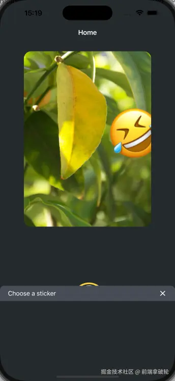
选择图片后,展示的模态框如下所示
在components目录下,创建一个新的CircleButton.tsx文件,并添加以下代码:
tsx
import { Pressable, StyleSheet, View } from 'react-native';
import MaterialIcons from '@expo/vector-icons/MaterialIcons';

type Props = {
  onPress: () => void;
};

export default function CircleButton({ onPress }: Props) {
  return (
    <View style={styles.circleButtonContainer}>
      <Pressable style={styles.circleButton} onPress={onPress}>
        <MaterialIcons name="add" size={38} color="#25292e" />
      </Pressable>
    </View>
  );
}

const styles = StyleSheet.create({
  circleButtonContainer: {
    width: 84,
    height: 84,
    marginHorizontal: 60,
    borderWidth: 4,
    borderColor: '#ffd33d',
    borderRadius: 42,
    padding: 3,
  },

  circleButton: {
    flex: 1,
    justifyContent: 'center',
    alignItems: 'center',
    borderRadius: 42,
    backgroundColor: '#fff',
  },
});在components目录下新建一个IconButton.tsx文件,并添加以下代码:
tsx
import { Pressable, StyleSheet, Text } from 'react-native';
import MaterialIcons from '@expo/vector-icons/MaterialIcons';

type Props = {
  icon: keyof typeof MaterialIcons.glyphMap;
  label: string;
  onPress?: () => void;
};

export default function IconButton({ icon, label, onPress }: Props) {
  return (
    <Pressable style={styles.iconButton} onPress={onPress}>
      <MaterialIcons name={icon} size={24} color="#fff" />
      <Text style={styles.iconButtonLabel}>{label}</Text>
    </Pressable>
  );
}

const styles = StyleSheet.create({
  iconButton: {
    justifyContent: 'center',
    alignItems: 'center',
  },

  iconButtonLabel: {
    color: '#fff',
    marginTop: 12,
  },
});在app/(tabs)/index.tsx中,进行更新
tsx
import Button from '@/components/Button';
import ImageViewer from '@/components/ImageViewer';
import { StyleSheet, View } from 'react-native';
import * as ImagePicker from 'expo-image-picker';
import { useState } from 'react';
import IconButton from '@/components/IconButton';
import CircleButton from '@/components/CircleButton';
const PlaceholderImage = require('@/assets/images/background-image.png');
export default function Index() {
// 选中图片的uri
const [selectedImage, setSelectedImage] = useState<string | undefined>(
undefined,
);
// 是否显示模态框
const [showAppOptions, setShowAppOptions] = useState<boolean>(false);
/**
* 选择图片处理函数
*/
const pickImageAsync = async () => {
let result = await ImagePicker.launchImageLibraryAsync({
mediaTypes: ['images'],
allowsEditing: true,
quality: 1,
});
if (!result.canceled) {
console.log(result);
setSelectedImage(result.assets[0].uri);
setShowAppOptions(true);
} else {
alert('You did not select any image');
}
};
const onReset = () => {
setShowAppOptions(false);
};
const onAddSticker = () => {
// TODO: 添加贴纸
};
const onSaveImageAsync = async () => {
// TODO: 异步保存图片
};
return (
<View style={styles.container}>
<View style={styles.imageContainer}>
<ImageViewer
imgSource={PlaceholderImage}
selectedImage={selectedImage}
/>
</View>
{showAppOptions ? (
<View style={styles.optionContainer}>
<View style={styles.optionRow}>
<IconButton icon="refresh" label="Reset" onPress={onReset} />
<CircleButton onPress={onAddSticker} />
<IconButton
icon="save-alt"
label="save"
onPress={onSaveImageAsync}
/>
</View>
</View>
) : (
<View style={styles.footerContainer}>
<Button
label="Choose a photo"
theme="primary"
onPress={pickImageAsync}
/>
<Button
label="Use this photo"
onPress={() => setShowAppOptions(true)}
/>
</View>
)}
</View>
);
}
const styles = StyleSheet.create({
container: {
flex: 1,
backgroundColor: '#25292e',
alignItems: 'center',
},
imageContainer: {
flex: 1,
paddingTop: 28,
},
footerContainer: {
flex: 1 / 3,
alignItems: 'center',
},
optionContainer: {
position: 'absolute',
bottom: 80,
},
optionRow: {
alignItems: 'center',
flexDirection: 'row',
},
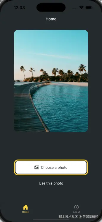
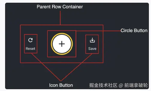
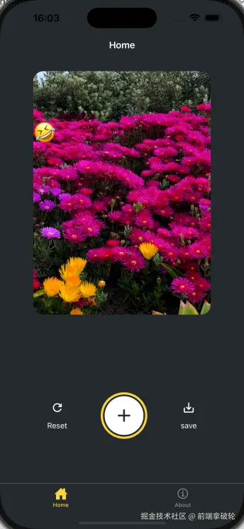
});我们可以看到,当我们选择图片后,底部的按钮就会消失,并且会出现一个模态框,模态框中包含了三个按钮,分别是Reset、Add Sticker和Save。
创建emoji选择器
在components目录下,新建一个EmojiPicker.tsx文件。该组件接受三个props:
isVisible:一个布尔值,用于控制模态框的显示和隐藏。onClose:关闭模态框的函数children:插槽,u用来显示表情符号列表
tsx
import MaterialIcons from '@expo/vector-icons/MaterialIcons';
import { PropsWithChildren } from 'react';
import { Modal, Pressable, StyleSheet, Text, View } from 'react-native';

type Props = PropsWithChildren<{
  isVisible: boolean;
  onClose: () => void;
}>;

export default function EmojiPicker({ isVisible, onClose, children }: Props) {
  return (
    <View>
      <Modal animationType="slide" transparent={true} visible={isVisible}>
        <View style={styles.modalContent}>
          <View style={styles.titleContainer}>
            <Text style={styles.title}>Choose a sticker</Text>
            <Pressable onPress={onClose}>
              <MaterialIcons name="close" color="#fff" size={22} />
            </Pressable>
          </View>
          { children }
        </View>
      </Modal>
    </View>
  );
}

const styles = StyleSheet.create({
  modalContent: {
    height: '25%',
    width: '100%',
    backgroundColor: '#25292e',
    borderTopRightRadius: 18,
    borderTopLeftRadius: 18,
    position: 'absolute',
    bottom: 0,
  },

  titleContainer: {
    height: '16%',
    backgroundColor: '#464c55',
    borderTopRightRadius: 10,
    borderTopLeftRadius: 10,
    paddingHorizontal: 20,
    flexDirection: 'row',
    alignItems: 'center',
    justifyContent: 'space-between',
  },

  title: {
    color: '#fff',
    fontSize: 16,
  },
});修改app/(tabs)/index.tsx文件,在onAddSticker函数中,控制模态框的显示和隐藏。
tsx
/*
 * @Author: majialu.3 majialu.3@jd.com
 * @Date: 2025-10-31 11:25:47
 * @LastEditors: majialu.3 majialu.3@jd.com
 * @LastEditTime: 2025-11-02 15:16:50
 * @FilePath: /demo/app/(tabs)/index.tsx
 * @Description:
 *
 * Copyright (c) 2025 by majialu.3@jd.com All Rights Reserved.
 */
import Button from '@/components/Button';
import ImageViewer from '@/components/ImageViewer';
import { StyleSheet, View } from 'react-native';
import * as ImagePicker from 'expo-image-picker';
import { useState } from 'react';
import IconButton from '@/components/IconButton';
import CircleButton from '@/components/CircleButton';
import EmojiPicker from '@/components/EmojiPicker';

const PlaceholderImage = require('@/assets/images/background-image.png');

export default function Index() {
  // 选中图片的uri
  const [selectedImage, setSelectedImage] = useState<string | undefined>(
    undefined,
  );

  // 是否显示模态框
  const [showAppOptions, setShowAppOptions] = useState<boolean>(false);

  // 是否显示贴纸框
  const [isModalVisible, setIsModalVisible] = useState<boolean>(false);

  /**
   * 选择图片处理函数
   */
  const pickImageAsync = async () => {
    let result = await ImagePicker.launchImageLibraryAsync({
      mediaTypes: ['images'],
      allowsEditing: true,
      quality: 1,
    });

    if (!result.canceled) {
      console.log(result);
      setSelectedImage(result.assets[0].uri);
      setShowAppOptions(true);
    } else {
      alert('You did not select any image');
    }
  };

  const onReset = () => {
    setShowAppOptions(false);
  };

  const onAddSticker = () => {
    // TODO: 添加贴纸
    setIsModalVisible(true);
  };

  const onModalClose = () => {
    setIsModalVisible(false);
  };

  const onSaveImageAsync = async () => {
    // TODO: 异步保存图片
  };

  return (
    <View style={styles.container}>
      <View style={styles.imageContainer}>
        <ImageViewer
          imgSource={PlaceholderImage}
          selectedImage={selectedImage}
        />
      </View>
      {showAppOptions ? (
        <View style={styles.optionContainer}>
          <View style={styles.optionRow}>
            <IconButton icon="refresh" label="Reset" onPress={onReset} />
            <CircleButton onPress={onAddSticker} />
            <IconButton
              icon="save-alt"
              label="save"
              onPress={onSaveImageAsync}
            />
          </View>
        </View>
      ) : (
        <View style={styles.footerContainer}>
          <Button
            label="Choose a photo"
            theme="primary"
            onPress={pickImageAsync}
          />
          <Button
            label="Use this photo"
            onPress={() => setShowAppOptions(true)}
          />
        </View>
      )}
      <EmojiPicker
        isVisible={isModalVisible}
        onClose={onModalClose}
      ></EmojiPicker>
    </View>
  );
}

const styles = StyleSheet.create({
  container: {
    flex: 1,
    backgroundColor: '#25292e',
    alignItems: 'center',
  },

  imageContainer: {
    flex: 1,
    paddingTop: 28,
  },

  footerContainer: {
    flex: 1 / 3,
    alignItems: 'center',
  },

  optionContainer: {
    position: 'absolute',
    bottom: 80,
  },

  optionRow: {
    alignItems: 'center',
    flexDirection: 'row',
  },
});
当我们点击加号来添加贴纸的时候,我们可以发现弹窗已经有了,只不过里面还没有内容而已。
创建表情符号列表
在components目录中创建一个EmojiList.tsx文件并添加以下代码:
tsx
import { Image } from "expo-image";
import { useState } from "react";
import { FlatList, ImageSourcePropType, Platform, Pressable, StyleSheet } from "react-native";

type Props = {
  onSelect: (image: ImageSourcePropType) => void;
  onCloseModal: () => void;
};

export default function EmojiList({ onSelect, onCloseModal }: Props) {
  const [emoji] = useState<ImageSourcePropType[]>([
    require("@/assets/images/emoji1.png"),
    require("@/assets/images/emoji2.png"),
    require("@/assets/images/emoji3.png"),
    require("@/assets/images/emoji4.png"),
    require("@/assets/images/emoji5.png"),
    require("@/assets/images/emoji6.png"),
  ]);
  return (
    <FlatList
      horizontal
      showsHorizontalScrollIndicator={Platform.OS === "web"}
      data={emoji}
      contentContainerStyle={styles.listContainer}
      renderItem={({ item, index }) => (
        <Pressable
          onPress={() => {
            onSelect(item);
            onCloseModal();
          }}
        >
          <Image source={item} key={index} style={styles.image} />
        </Pressable>
      )}
    />
  );
}

const styles = StyleSheet.create({
  listContainer: {
    borderTopRightRadius: 10,
    borderTopLeftRadius: 10,
    paddingHorizontal: 20,
    flexDirection: "row",
    alignItems: "center",
    justifyContent: "space-between",
  },

  image: {
    width: 100,
    height: 100,
    marginRight: 20,
  },
});更新apps/(tabs)/index.tsx文件
tsx
import Button from "@/components/Button";
import ImageViewer from "@/components/ImageViewer";
import { ImageSourcePropType, StyleSheet, View } from "react-native";
import * as ImagePicker from "expo-image-picker";
import { useState } from "react";
import IconButton from "@/components/IconButton";
import CircleButton from "@/components/CircleButton";
import EmojiPicker from "@/components/EmojiPicker";
import EmojiList from "@/components/EmojiList";

const PlaceholderImage = require("@/assets/images/background-image.png");

export default function Index() {
  // 选中图片的uri
  const [selectedImage, setSelectedImage] = useState<string | undefined>(undefined);

  // 是否显示模态框
  const [showAppOptions, setShowAppOptions] = useState<boolean>(false);

  // 是否显示贴纸框
  const [isModalVisible, setIsModalVisible] = useState<boolean>(false);

  // 选中的Emoji
  const [pickedEmoji, setPickedEmoji] = useState<ImageSourcePropType | undefined>(undefined);

  /**
   * 选择图片处理函数
   */
  const pickImageAsync = async () => {
    let result = await ImagePicker.launchImageLibraryAsync({
      mediaTypes: ["images"],
      allowsEditing: true,
      quality: 1,
    });

    if (!result.canceled) {
      console.log(result);
      setSelectedImage(result.assets[0].uri);
      setShowAppOptions(true);
    } else {
      alert("You did not select any image");
    }
  };

  const onReset = () => {
    setShowAppOptions(false);
  };

  const onAddSticker = () => {
    // TODO: 添加贴纸
    setIsModalVisible(true);
  };

  const onModalClose = () => {
    setIsModalVisible(false);
  };

  const onSaveImageAsync = async () => {
    // TODO: 异步保存图片
  };

  return (
    <View style={styles.container}>
      <View style={styles.imageContainer}>
        <ImageViewer imgSource={PlaceholderImage} selectedImage={selectedImage} />
      </View>
      {showAppOptions ? (
        <View style={styles.optionContainer}>
          <View style={styles.optionRow}>
            <IconButton icon="refresh" label="Reset" onPress={onReset} />
            <CircleButton onPress={onAddSticker} />
            <IconButton icon="save-alt" label="save" onPress={onSaveImageAsync} />
          </View>
        </View>
      ) : (
        <View style={styles.footerContainer}>
          <Button label="Choose a photo" theme="primary" onPress={pickImageAsync} />
          <Button label="Use this photo" onPress={() => setShowAppOptions(true)} />
        </View>
      )}
      <EmojiPicker isVisible={isModalVisible} onClose={onModalClose}>
        <EmojiList onSelect={setPickedEmoji} onCloseModal={onModalClose} />
      </EmojiPicker>
    </View>
  );
}

const styles = StyleSheet.create({
  container: {
    flex: 1,
    backgroundColor: "#25292e",
    alignItems: "center",
  },

  imageContainer: {
    flex: 1,
    paddingTop: 28,
  },

  footerContainer: {
    flex: 1 / 3,
    alignItems: "center",
  },

  optionContainer: {
    position: "absolute",
    bottom: 80,
  },

  optionRow: {
    alignItems: "center",
    flexDirection: "row",
  },
});
显示选定的表情符号
在components目录中创建一个EmojiSticker.tsx文件并添加以下代码:
tsx
import { Image } from "expo-image";
import { ImageSourcePropType, View } from "react-native";

type Props = {
  imageSize: number;
  stickerSource: ImageSourcePropType;
};

export default function EmojiSticker({ imageSize, stickerSource }: Props) {
  return (
    <View style={{ top: -350 }}>
      <Image source={stickerSource} style={{ width: imageSize, height: imageSize }} />
    </View>
  );
}在apps/(tabs)/index.tsx文件中,进行相应调整:
tsx
import Button from "@/components/Button";
import ImageViewer from "@/components/ImageViewer";
import { ImageSourcePropType, StyleSheet, View } from "react-native";
import * as ImagePicker from "expo-image-picker";
import { useState } from "react";
import IconButton from "@/components/IconButton";
import CircleButton from "@/components/CircleButton";
import EmojiPicker from "@/components/EmojiPicker";
import EmojiList from "@/components/EmojiList";
import EmojiSticker from "@/components/EmojiSticker";
const PlaceholderImage = require("@/assets/images/background-image.png");
export default function Index() {
// 选中图片的uri
const [selectedImage, setSelectedImage] = useState<string | undefined>(undefined);
// 是否显示模态框
const [showAppOptions, setShowAppOptions] = useState<boolean>(false);
// 是否显示贴纸框
const [isModalVisible, setIsModalVisible] = useState<boolean>(false);
// 选中的Emoji
const [pickedEmoji, setPickedEmoji] = useState<ImageSourcePropType | undefined>(undefined);
/**
* 选择图片处理函数
*/
const pickImageAsync = async () => {
let result = await ImagePicker.launchImageLibraryAsync({
mediaTypes: ["images"],
allowsEditing: true,
quality: 1,
});
if (!result.canceled) {
console.log(result);
setSelectedImage(result.assets[0].uri);
setShowAppOptions(true);
} else {
alert("You did not select any image");
}
};
const onReset = () => {
setShowAppOptions(false);
};
const onAddSticker = () => {
// TODO: 添加贴纸
setIsModalVisible(true);
};
const onModalClose = () => {
setIsModalVisible(false);
};
const onSaveImageAsync = async () => {
// TODO: 异步保存图片
};
return (
<View style={styles.container}>
<View style={styles.imageContainer}>
<ImageViewer imgSource={PlaceholderImage} selectedImage={selectedImage} />
{pickedEmoji && <EmojiSticker imageSize={40} stickerSource={pickedEmoji} />}
</View>
{showAppOptions ? (
<View style={styles.optionContainer}>
<View style={styles.optionRow}>
<IconButton icon="refresh" label="Reset" onPress={onReset} />
<CircleButton onPress={onAddSticker} />
<IconButton icon="save-alt" label="save" onPress={onSaveImageAsync} />
</View>
</View>
) : (
<View style={styles.footerContainer}>
<Button label="Choose a photo" theme="primary" onPress={pickImageAsync} />
<Button label="Use this photo" onPress={() => setShowAppOptions(true)} />
</View>
)}
<EmojiPicker isVisible={isModalVisible} onClose={onModalClose}>
<EmojiList onSelect={setPickedEmoji} onCloseModal={onModalClose} />
</EmojiPicker>
</View>
);
}
const styles = StyleSheet.create({
container: {
flex: 1,
backgroundColor: "#25292e",
alignItems: "center",
},
imageContainer: {
flex: 1,
paddingTop: 28,
},
footerContainer: {
flex: 1 / 3,
alignItems: "center",
},
optionContainer: {
position: "absolute",
bottom: 80,
},
optionRow: {
alignItems: "center",
flexDirection: "row",
},
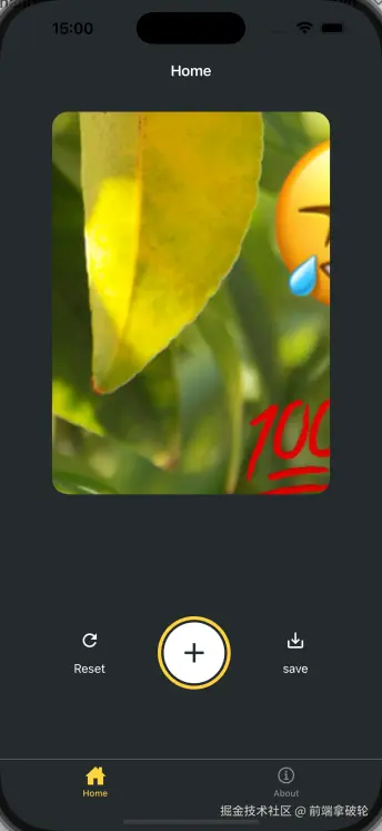
});我们可以看到,当我们选择一个表情符号后,它将被添加到图片上。
添加手势
我们将实现两种手势:
- 双击可放大表情贴纸,再次双击缩小
- 按住贴纸平移可以在屏幕上移动表情贴纸
tsx
// app/(tabs)/index.tsx
// ... rest of the import statements remain same
import { GestureHandlerRootView } from 'react-native-gesture-handler';

export default function Index() {
  return (
    <GestureHandlerRootView style={styles.container}>
      {/* ...rest of the code remains */}
    </GestureHandlerRootView>
  )
}修改components/EmojiSticker.tsx文件:
tsx
import { ImageSourcePropType, View } from "react-native";
import { Gesture, GestureDetector } from "react-native-gesture-handler";
import Animated, { useAnimatedStyle, useSharedValue, withSpring } from "react-native-reanimated";

type Props = {
  imageSize: number;
  stickerSource: ImageSourcePropType;
};

export default function EmojiSticker({ imageSize, stickerSource }: Props) {
  // 照片缩放规模
  const scaleImage = useSharedValue(imageSize);

  // 平移位置
  const translateX = useSharedValue(0);
  const translateY = useSharedValue(0);

  /**
   * 双击动画
   */
  const doubleTap = Gesture.Tap()
    .numberOfTaps(2)
    .onStart(() => {
      if (scaleImage.value !== imageSize * 2) {
        scaleImage.value = scaleImage.value * 2;
      } else {
        scaleImage.value = Math.round(scaleImage.value / 2);
      }
    });

  const drag = Gesture.Pan().onChange((e) => {
    translateX.value += e.changeX;
    translateY.value += e.changeY;
  });

  const containerStyle = useAnimatedStyle(() => {
    return {
      transform: [
        {
          translateX: translateX.value,
        },
        {
          translateY: translateY.value,
        },
      ],
    };
  });

  const imageStyle = useAnimatedStyle(() => {
    return {
      width: withSpring(scaleImage.value),
      height: withSpring(scaleImage.value),
    };
  });
  return (
    <GestureDetector gesture={drag}>
      <Animated.View style={[containerStyle, { top: -350 }]}>
        <GestureDetector gesture={doubleTap}>
          <Animated.Image
            source={stickerSource}
            resizeMode="contain"
            style={[imageStyle, { width: imageSize, height: imageSize }]}
          />
        </GestureDetector>
      </Animated.View>
    </GestureDetector>
  );
}
我们可以发现,当我们双击表情符号时,它会放大或缩小,当我们拖动时,它会平移。
保存图片
我们将使用react-native-view-shot和expo-media-library来保存图片
shell
pnpm dlx expo install react-native-view-shot
pnpm dlx expo install expo-media-library修改app/(tabs)/index.tsx文件:
tsx
import Button from "@/components/Button";
import ImageViewer from "@/components/ImageViewer";
import { ImageSourcePropType, StyleSheet, View } from "react-native";
import * as ImagePicker from "expo-image-picker";
import { useEffect, useRef, useState } from "react";
import IconButton from "@/components/IconButton";
import CircleButton from "@/components/CircleButton";
import EmojiPicker from "@/components/EmojiPicker";
import EmojiList from "@/components/EmojiList";
import EmojiSticker from "@/components/EmojiSticker";
import { GestureHandlerRootView } from "react-native-gesture-handler";
import { captureRef } from "react-native-view-shot";
import * as MediaLibrary from "expo-media-library";

const PlaceholderImage = require("@/assets/images/background-image.png");

export default function Index() {
  // 图片Ref
  const imageRef = useRef<View>(null);

  // 请求权限
  const [permissionResponse, requestPermission] = MediaLibrary.usePermissions();

  // 选中图片的uri
  const [selectedImage, setSelectedImage] = useState<string | undefined>(undefined);

  // 是否显示模态框
  const [showAppOptions, setShowAppOptions] = useState<boolean>(false);

  // 是否显示贴纸框
  const [isModalVisible, setIsModalVisible] = useState<boolean>(false);

  // 选中的Emoji
  const [pickedEmoji, setPickedEmoji] = useState<ImageSourcePropType | undefined>(undefined);

  /**
   * 选择图片处理函数
   */
  const pickImageAsync = async () => {
    let result = await ImagePicker.launchImageLibraryAsync({
      mediaTypes: ["images"],
      allowsEditing: true,
      quality: 1,
    });

    if (!result.canceled) {
      console.log(result);
      setSelectedImage(result.assets[0].uri);
      setShowAppOptions(true);
    } else {
      alert("You did not select any image");
    }
  };

  const onReset = () => {
    setShowAppOptions(false);
  };

  const onAddSticker = () => {
    setIsModalVisible(true);
  };

  const onModalClose = () => {
    setIsModalVisible(false);
  };

  /**
   * 保存函数到图库中
   */
  const onSaveImageAsync = async () => {
    try {
      const localUrl = await captureRef(imageRef, {
        height: 440,
        quality: 1,
      });

      await MediaLibrary.saveToLibraryAsync(localUrl);
      if (localUrl) {
        alert("saved");
      }
    } catch (e) {
      console.log(e);
    }
  };

  useEffect(() => {
    if (!permissionResponse?.granted) {
      requestPermission();
    }
  });
  return (
    <GestureHandlerRootView style={styles.container}>
      <View style={styles.imageContainer}>
        <View ref={imageRef} collapsable={false}>
          <ImageViewer imgSource={PlaceholderImage} selectedImage={selectedImage} />
          {pickedEmoji && <EmojiSticker imageSize={40} stickerSource={pickedEmoji} />}
        </View>
      </View>
      {showAppOptions ? (
        <View style={styles.optionContainer}>
          <View style={styles.optionRow}>
            <IconButton icon="refresh" label="Reset" onPress={onReset} />
            <CircleButton onPress={onAddSticker} />
            <IconButton icon="save-alt" label="save" onPress={onSaveImageAsync} />
          </View>
        </View>
      ) : (
        <View style={styles.footerContainer}>
          <Button label="Choose a photo" theme="primary" onPress={pickImageAsync} />
          <Button label="Use this photo" onPress={() => setShowAppOptions(true)} />
        </View>
      )}
      <EmojiPicker isVisible={isModalVisible} onClose={onModalClose}>
        <EmojiList onSelect={setPickedEmoji} onCloseModal={onModalClose} />
      </EmojiPicker>
    </GestureHandlerRootView>
  );
}

const styles = StyleSheet.create({
  container: {
    flex: 1,
    backgroundColor: "#25292e",
    alignItems: "center",
  },

  imageContainer: {
    flex: 1,
    paddingTop: 28,
  },

  footerContainer: {
    flex: 1 / 3,
    alignItems: "center",
  },

  optionContainer: {
    position: "absolute",
    bottom: 80,
  },

  optionRow: {
    alignItems: "center",
    flexDirection: "row",
  },
});
处理平台差异
刚才我们使用react-native-view-shot来保存图片,但是web平台是无法使用这个的,所以我们要针对web平台进行额外的处理。
这里我们使用dom-to-image来在web中保存图片。
shell
pnpm add dom-to-image

# 安装类型声明文件
pnpm add -D @types/dom-to-image修改app/(tabs)/index.tsx文件:
tsx
  /**
   * 保存函数到图库中
   */
  const onSaveImageAsync = async () => {
    // web平台使用domtoimage
    if (Platform.OS === 'web') {
      try {
        if (!imageRef.current) {
          throw new Error('Image ref is not available');
        }
        const dataUrl = await domtoimage.toJpeg(imageRef.current as unknown as Node, {
          quality: 0.95,
          width: 320,
          height: 440,
        });

        let link = document.createElement('a');
        link.download = 'sticker-smash.jpeg';
        link.href = dataUrl;
        link.click();
      } catch (e) {
        console.error('Failed to save image:', e);
        alert('Failed to save image');
      }
    } else {
      // 其他平台使用react-native-view-shot
      try {
        const localUrl = await captureRef(imageRef, {
          height: 440,
          quality: 1,
        });

        await MediaLibrary.saveToLibraryAsync(localUrl);
        if (localUrl) {
          alert('saved');
        }
      } catch (e) {
        console.log(e);
      }
    }
  };
配置状态栏,启动画面和应用程序图标
配置状态栏
修改app/_layout.tsx文件。
tsx
import { Stack } from 'expo-router';
import { StatusBar } from 'expo-status-bar';

export default function RootLayout() {
  return (
    <>
      <Stack>
        <Stack.Screen name="(tabs)" options={{ headerShown: false }} />
      </Stack>
      <StatusBar style="light" />
    </>
  );
}
启动动画和应用程序图标在app.json文件中已经配置好,我们无需调整。
json
{
  "expo": {
    "name": "demo",
    "slug": "demo",
    "version": "1.0.0",
    "orientation": "portrait",
    "icon": "./assets/images/icon.png",
    "scheme": "demo",
    "userInterfaceStyle": "automatic",
    "newArchEnabled": true,
    "ios": {
      "supportsTablet": true
    },
    "android": {
      "adaptiveIcon": {
        "backgroundColor": "#E6F4FE",
        "foregroundImage": "./assets/images/android-icon-foreground.png",
        "backgroundImage": "./assets/images/android-icon-background.png",
        "monochromeImage": "./assets/images/android-icon-monochrome.png"
      },
      "edgeToEdgeEnabled": true,
      "predictiveBackGestureEnabled": false
    },
    "web": {
      "output": "static",
      "favicon": "./assets/images/favicon.png"
    },
    "plugins": [
      "expo-router",
      [
        "expo-splash-screen",
        {
          "image": "./assets/images/splash-icon.png",
          "imageWidth": 200,
          "resizeMode": "contain",
          "backgroundColor": "#ffffff",
          "dark": {
            "backgroundColor": "#000000"
          }
        }
      ]
    ],
    "experiments": {
      "typedRoutes": true,
      "reactCompiler": true
    }
  }
}
打包构建
这里我们使用expo官方推荐的EAS(Expo Application Services)构建,从而实现更快的分发。
安装最新版的eas-cli
shell
# 全局安装
pnpm add -g eas-cli@latest

# 登录
eas login没有账户的可以去expo官网注册一个。
shell
# 测试是否登录成功
eas whoami

# 配置项目
eas build:configure配置完成后,我们发现在项目的根目录有了一个eas.json文件,这个文件是EAS构建的配置文件。
为了便于开发,我们在这里创建一个开发版本 的应用程序,开发版本包含expo-dev-client方便我们在客户端进行调试。
shell
# 安装开发调试工具
pnpm dlx expo install expo-dev-client这里我们出于简单起见,创建一个Android自由分发的版本,从而避免了应用商店的复杂配置过程。
shell
# 创建Android自由分发的版本
eas build --platform android --profile development云构建完成后,终端会输出一个二维码,用Android手机扫码即可下载应用。
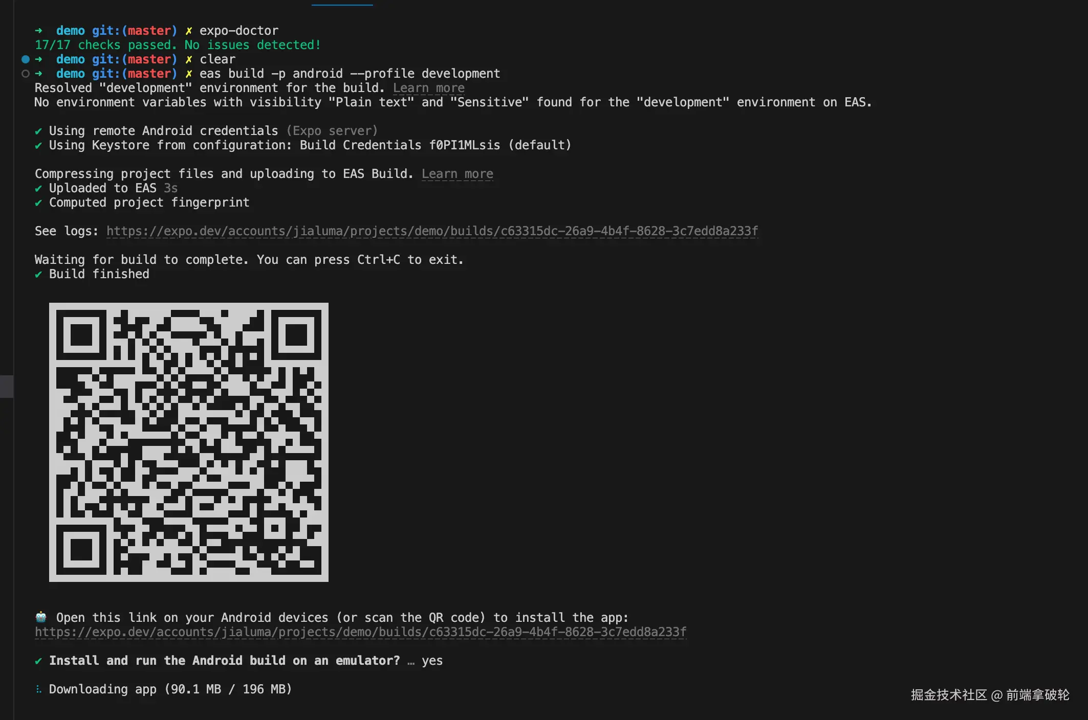
这里最好使用科学上网,否则下载有点慢。如果我们不想要开发版本,想要预览版本,直接构建预览版即可。
shell
# 创建预览版
eas build --platform android --profile preview
总结
本文从RN的介绍出发,用一个简单的应用demo来演示如何使用expo进行RN开发,以及打包构建。
本专栏的后续文章会继续深入讲解RN的开发知识以及性能优化手段,欢迎订阅关注👏🏻👏🏻👏🏻
好了,这篇文章就到这里啦,如果对您有所帮助,欢迎点赞,收藏,分享👍👍👍。您的认可是我更新的最大动力。由于笔者水平有限,难免有疏漏不足之处,欢迎各位大佬评论区指正。
往期推荐✨✨✨
我是前端拿破轮,关注我,和您分享前端知识,我们下期见!