从零实现一个低代码 H5 页面编辑器(Vue3 + 拖拽)
本文带你手把手实现一个类似有赞、微盟的 H5 营销页面编辑器,支持拖拽搭建、实时预览、属性配置。
前言
低代码平台这几年很火,但很多人觉得很复杂不敢下手。其实核心原理并不难,今天我们就用 Vue3 + vuedraggable 实现一个麻雀虽小五脏俱全的 H5 页面编辑器。
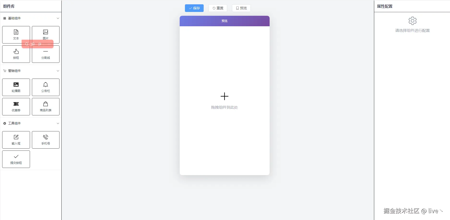
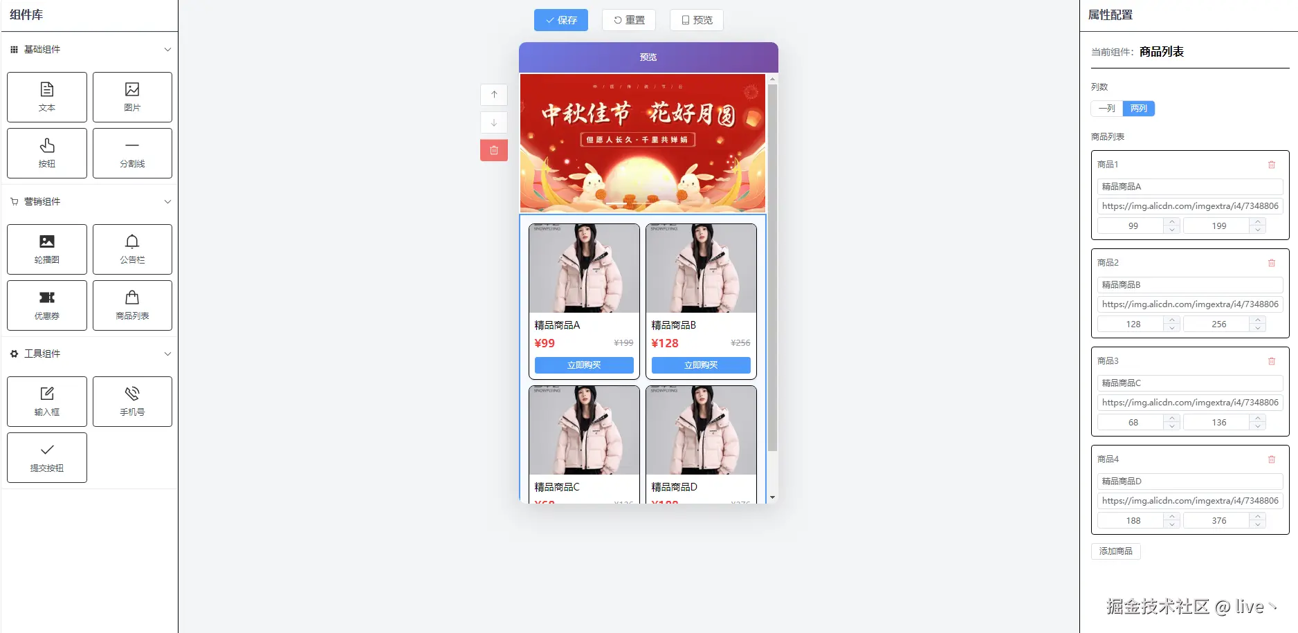
最终效果:
技术栈:
- Vue 3 + Composition API
- Pinia 状态管理
- Element Plus
- vuedraggable 拖拽
- Tailwind CSS
一、整体架构设计
低代码编辑器的核心是 三栏布局 + 统一数据源:
scss
┌──────────────────────────────────────────────────────┐
│                      App.vue                          │
│  ┌──────────┐  ┌────────────────┐  ┌──────────────┐  │
│  │LeftPanel │  │  CenterCanvas  │  │  RightPanel  │  │
│  │  组件库   │ → │    画布预览    │ ← │   属性配置   │  │
│  └──────────┘  └────────────────┘  └──────────────┘  │
│                        ↑↓                             │
│                   Pinia Store                         │
│                  (全局状态管理)                        │
└──────────────────────────────────────────────────────┘
数据流向:
- 左侧组件库 → 拖拽克隆 → 画布
- 点击画布组件 → 选中 → 右侧显示配置
- 修改配置 → 更新 Store → 画布实时刷新
二、定义组件配置
首先定义组件库,每个组件包含类型、名称、图标和默认属性:
js
// src/config/components.js
export const componentLibrary = {
  basic: {
    name: '基础组件',
    icon: 'Grid',
    components: [
      {
        type: 'text',
        name: '文本',
        icon: 'Document',
        props: {
          content: '请输入文本内容',
          fontSize: 14,
          color: '#333333',
          textAlign: 'left',
          fontWeight: 'normal',
          padding: 10
        }
      },
      {
        type: 'image',
        name: '图片',
        icon: 'Picture',
        props: {
          src: 'https://via.placeholder.com/350x150',
          width: '100%',
          borderRadius: 0
        }
      },
      // ... 更多组件
    ]
  },
  marketing: {
    name: '营销组件',
    components: [
      {
        type: 'banner',
        name: '轮播图',
        props: {
          images: ['banner1.jpg', 'banner2.jpg'],
          height: 200,
          autoplay: true
        }
      },
      {
        type: 'coupon',
        name: '优惠券',
        props: {
          title: '满减优惠券',
          value: 50,
          condition: '满200可用'
        }
      }
    ]
  }
}
设计要点:
type用于匹配渲染组件props是默认属性,拖入画布后可独立修改- 分类管理,便于扩展
三、Pinia 状态管理
这是整个编辑器的核心,管理画布状态:
js
// src/stores/editor.js
import { defineStore } from 'pinia'

export const useEditorStore = defineStore('editor', {
  state: () => ({
    components: [],      // 画布中的组件列表
    selectedIndex: -1,   // 当前选中的组件索引
    idCounter: 0         // 组件ID计数器
  }),

  getters: {
    // 获取当前选中的组件
    selectedComponent: (state) => {
      if (state.selectedIndex >= 0) {
        return state.components[state.selectedIndex]
      }
      return null
    }
  },

  actions: {
    // 添加组件(拖入时调用)
    addComponent(component) {
      const newComponent = {
        ...JSON.parse(JSON.stringify(component)), // 深拷贝
        id: ++this.idCounter
      }
      this.components.push(newComponent)
      this.selectedIndex = this.components.length - 1
    },

    // 选中组件
    selectComponent(index) {
      this.selectedIndex = index
    },

    // 删除组件
    deleteComponent(index) {
      this.components.splice(index, 1)
      if (this.selectedIndex >= this.components.length) {
        this.selectedIndex = this.components.length - 1
      }
    },

    // 上移/下移
    moveUp(index) {
      if (index > 0) {
        [this.components[index], this.components[index - 1]] =
        [this.components[index - 1], this.components[index]]
        this.selectedIndex = index - 1
      }
    },

    // 更新组件属性
    updateComponentProps(index, props) {
      if (this.components[index]) {
        this.components[index].props = {
          ...this.components[index].props,
          ...props
        }
      }
    },

    // 导出数据
    getSaveData() {
      return JSON.stringify(this.components)
    }
  }
})
四、左侧组件库(拖拽源)
使用 vuedraggable 实现拖拽,关键是 group 配置:
vue
<!-- src/components/LeftPanel.vue -->
<template>
  <div class="left-panel">
    <div class="p-3 border-b font-bold">组件库</div>

    <el-collapse v-model="activeNames">
      <el-collapse-item
        v-for="(category, key) in componentLibrary"
        :key="key"
        :name="key"
      >
        <template #title>
          <el-icon class="mr-2"><component :is="category.icon" /></el-icon>
          {{ category.name }}
        </template>

        <!-- 🔥 核心:draggable 配置 -->
        <draggable
          :list="category.components"
          :group="{ name: 'components', pull: 'clone', put: false }"
          :clone="cloneComponent"
          :sort="false"
          item-key="type"
        >
          <template #item="{ element }">
            <div class="component-item">
              <el-icon><component :is="element.icon" /></el-icon>
              <span>{{ element.name }}</span>
            </div>
          </template>
        </draggable>
      </el-collapse-item>
    </el-collapse>
  </div>
</template>

<script setup>
import draggable from 'vuedraggable'
import { componentLibrary } from '@/config/components'

// 深拷贝,确保每个实例独立
const cloneComponent = (item) => {
  return JSON.parse(JSON.stringify(item))
}
</script>
🔥 group 配置详解:
| 属性 | 值 | 含义 |
|---|---|---|
name |
'components' |
分组名,同名才能互相拖拽 |
pull |
'clone' |
拖出时克隆,原列表不变 |
put |
false |
禁止放入,只能拖出 |
这样设计的好处:
- 组件库是"模板",拖多少次都不会消失
- 防止用户把画布组件拖回组件库
五、中间画布(拖拽目标)
vue
<!-- src/components/CenterCanvas.vue -->
<template>
  <div class="center-canvas">
    <!-- 工具栏 -->
    <div class="toolbar">
      <el-button type="primary" @click="handleSave">保存</el-button>
      <el-button @click="store.reset()">重置</el-button>
    </div>

    <!-- 手机预览框 -->
    <div class="phone-frame">
      <draggable
        v-model="store.components"
        group="components"
        item-key="id"
        ghost-class="ghost"
        @add="onAdd"
      >
        <template #item="{ element, index }">
          <div
            class="component-wrapper"
            :class="{ selected: store.selectedIndex === index }"
            @click="store.selectComponent(index)"
          >
            <!-- 动态渲染组件 -->
            <component
              :is="previewComponents[element.type]"
              :props="element.props"
            />
          </div>
        </template>
      </draggable>

      <!-- 空状态 -->
      <div v-if="store.components.length === 0" class="empty-tip">
        拖拽组件到此处
      </div>
    </div>

    <!-- 操作按钮 -->
    <div v-if="store.selectedComponent" class="action-btns">
      <el-button @click="store.moveUp(store.selectedIndex)">上移</el-button>
      <el-button @click="store.moveDown(store.selectedIndex)">下移</el-button>
      <el-button type="danger" @click="store.deleteComponent(store.selectedIndex)">
        删除
      </el-button>
    </div>
  </div>
</template>

<script setup>
import draggable from 'vuedraggable'
import { useEditorStore } from '@/stores/editor'
import { previewComponents } from './preview'

const store = useEditorStore()

const onAdd = (evt) => {
  store.selectComponent(evt.newIndex)
}
</script>
动态组件渲染:
js
// src/components/preview/index.js
import TextPreview from './TextPreview.vue'
import ImagePreview from './ImagePreview.vue'
import BannerPreview from './BannerPreview.vue'
// ...

export const previewComponents = {
  'text': TextPreview,
  'image': ImagePreview,
  'banner': BannerPreview,
  // ...
}
通过 element.type 匹配对应的预览组件,实现动态渲染。
六、右侧属性配置
vue
<!-- src/components/RightPanel.vue -->
<template>
  <div class="right-panel">
    <div class="p-3 border-b font-bold">属性配置</div>

    <div v-if="!store.selectedComponent" class="empty">
      请选择组件
    </div>

    <div v-else class="p-4">
      <!-- 文本组件配置 -->
      <template v-if="store.selectedComponent.type === 'text'">
        <el-form label-position="top">
          <el-form-item label="文本内容">
            <el-input
              v-model="props.content"
              type="textarea"
              @input="updateProps"
            />
          </el-form-item>
          <el-form-item label="字体大小">
            <el-slider
              v-model="props.fontSize"
              :min="12" :max="36"
              @change="updateProps"
            />
          </el-form-item>
          <el-form-item label="文字颜色">
            <el-color-picker
              v-model="props.color"
              @change="updateProps"
            />
          </el-form-item>
        </el-form>
      </template>

      <!-- 其他组件配置... -->
    </div>
  </div>
</template>

<script setup>
import { reactive, watch } from 'vue'
import { useEditorStore } from '@/stores/editor'

const store = useEditorStore()
const props = reactive({})

// 监听选中组件变化,同步属性到本地
watch(() => store.selectedComponent, (comp) => {
  if (comp) {
    Object.assign(props, JSON.parse(JSON.stringify(comp.props)))
  }
}, { immediate: true, deep: true })

// 更新属性到 Store
const updateProps = () => {
  if (store.selectedIndex >= 0) {
    store.updateComponentProps(store.selectedIndex, { ...props })
  }
}
</script>
为什么需要本地 props + updateProps?
scss
Store.selectedComponent.props  →  深拷贝  →  本地 props (v-model 绑定)
                                              ↓
                                         用户修改
                                              ↓
                                         updateProps()
                                              ↓
Store.updateComponentProps()  ←  同步回 Store  ←  画布更新
如果直接 v-model 绑定 Store 数据,虽然也能工作,但不够规范。使用本地副本可以:
- 更好地控制更新时机
- 方便做表单校验
- 支持"取消修改"功能
七、预览组件示例
vue
<!-- src/components/preview/TextPreview.vue -->
<template>
  <div
    :style="{
      fontSize: props.fontSize + 'px',
      color: props.color,
      textAlign: props.textAlign,
      fontWeight: props.fontWeight,
      padding: props.padding + 'px'
    }"
  >
    {{ props.content }}
  </div>
</template>

<script setup>
defineProps({
  props: { type: Object, required: true }
})
</script>
每个预览组件接收 props 对象,根据属性渲染样式。
八、总结
核心要点:
- vuedraggable 的 group 配置 -
pull: 'clone'实现克隆拖拽 - Pinia 统一状态管理 - 三个面板共享数据源
- 动态组件 -
<component :is="">根据类型渲染 - 深拷贝 - 确保每个组件实例独立
扩展方向:
- 撤销/重做(操作历史栈)
- 组件嵌套(容器组件)
- 模板保存/加载
- 真实预览(生成 H5 页面)
- 更多组件类型
最后源码地址
gitee: gitee.com/live1906/lo...
如果对你有帮助,欢迎 Star ⭐ 支持一下!
我是文强,专注前端开发,欢迎关注交流 👋