引言
主题切换功能是现代应用的标配特性,它允许用户根据个人喜好或环境光线选择不同的界面风格。在HarmonyOS应用开发中,实现一个完善的主题系统需要考虑多个方面:主题数据模型设计、状态管理、系统主题适配、持久化存储以及流畅的用户体验。
一个优秀的主题系统应该具备以下特点:
- 多主题支持:至少支持浅色、深色两种模式
- 系统跟随:能够自动匹配系统主题设置
- 实时切换:主题切换无需重启应用
- 持久化保存:用户选择的主题在应用重启后仍然生效
- 全局响应:所有页面和组件都能响应主题变化
通过本文,你将掌握在鸿蒙中:
- 如何设计主题数据模型和颜色配置
- 如何实现主题服务的单例模式
- 如何监听系统主题变化
- 如何实现主题切换的动画效果
- 如何让应用组件响应主题变化
学习目标
完成本文后,你将能够:
- ✅ 设计完整的主题数据模型
- ✅ 实现主题服务的单例模式
- ✅ 实现系统主题变化检测
- ✅ 创建主题切换页面
- ✅ 实现主题切换的动画效果
- ✅ 让页面组件响应主题变化
- ✅ 持久化保存主题设置
需求分析
功能模块设计
| 模块 | 功能描述 | 技术要点 |
|---|---|---|
| 主题模型 | 定义主题类型和颜色配置 | 枚举类型、接口定义 |
| 主题服务 | 管理主题状态和切换逻辑 | 单例模式、观察者模式 |
| 系统适配 | 检测系统主题变化 | 资源管理器、显示管理器 |
| 持久化 | 保存和读取主题设置 | Preferences存储 |
| UI组件 | 主题切换界面 | 预览动画、状态反馈 |
| 全局响应 | 组件动态响应主题变化 | AppStorage、状态监听 |
主题类型定义
| 主题类型 | 名称 | 适用场景 |
|---|---|---|
| LIGHT | 浅色模式 | 白天、明亮环境 |
| DARK | 深色模式 | 夜间、护眼需求 |
| SYSTEM | 跟随系统 | 自动适配系统设置 |
核心实现
步骤1: 设计主题数据模型
typescript
// models/ThemeModel.ts

/**
 * 主题类型枚举
 */
export enum ThemeType {
  LIGHT = 'light',           // 浅色模式
  DARK = 'dark',             // 深色模式
  SYSTEM = 'system'          // 跟随系统
}

/**
 * 主题颜色配置接口
 */
export interface ThemeColors {
  // 基础颜色
  background: string;
  cardBackground: string;
  textPrimary: string;
  textSecondary: string;
  textTertiary: string;

  // 主题色
  primaryColor: string;
  primaryLight: string;
  primaryDark: string;

  // 功能色
  buttonBackground: string;
  borderColor: string;
  errorColor: string;
  successColor: string;
  warningColor: string;

  // 季节色(用于节气主题)
  springColor: string;   // 春 - 绿
  summerColor: string;   // 夏 - 粉
  autumnColor: string;   // 秋 - 橙
  winterColor: string;   // 冬 - 蓝
}

/**
 * 浅色主题颜色
 */
export const LightThemeColors: ThemeColors = {
  background: '#F8F7F2',
  cardBackground: '#FFFFFF',
  textPrimary: '#333333',
  textSecondary: '#6B6B6B',
  textTertiary: '#999999',
  primaryColor: '#4A9B6D',
  primaryLight: '#6BBF8A',
  primaryDark: '#3A7A58',
  buttonBackground: '#EEEEEE',
  borderColor: '#E8E8E8',
  errorColor: '#FF4444',
  successColor: '#4A9B6D',
  warningColor: '#FFA500',
  springColor: '#4A9B6D',
  summerColor: '#E8A4B8',
  autumnColor: '#E89058',
  winterColor: '#7BA4B4'
};

/**
 * 深色主题颜色
 */
export const DarkThemeColors: ThemeColors = {
  background: '#1E1E1E',
  cardBackground: '#2C2C2C',
  textPrimary: '#FFFFFF',
  textSecondary: '#B0B0B0',
  textTertiary: '#808080',
  primaryColor: '#0A84FF',
  primaryLight: '#409CFF',
  primaryDark: '#0056B3',
  buttonBackground: '#3A3A3A',
  borderColor: '#404040',
  errorColor: '#FF6B6B',
  successColor: '#4CAF50',
  warningColor: '#FFB74D',
  springColor: '#6BBF8A',
  summerColor: '#FFB6C1',
  autumnColor: '#FFA07A',
  winterColor: '#87CEEB'
};

/**
 * 主题配置接口
 */
export interface ThemeConfig {
  type: ThemeType;
  name: string;
  colors: ThemeColors;
  isDark: boolean;
}

/**
 * 获取主题配置
 */
export function getThemeConfig(themeType: ThemeType): ThemeConfig {
  switch (themeType) {
    case ThemeType.DARK:
      return { type: ThemeType.DARK, name: '深色模式', colors: DarkThemeColors, isDark: true };
    case ThemeType.LIGHT:
      return { type: ThemeType.LIGHT, name: '浅色模式', colors: LightThemeColors, isDark: false };
    case ThemeType.SYSTEM:
    default:
      return { type: ThemeType.SYSTEM, name: '跟随系统', colors: LightThemeColors, isDark: false };
  }
}

/**
 * 主题切换动画配置
 */
export interface ThemeAnimationConfig {
  duration: number;
  curve: Curve;
}

export const ThemeAnimationConfig: ThemeAnimationConfig = {
  duration: 300,
  curve: Curve.EaseInOut
};
设计要点
1. 颜色分类
将颜色分为四类便于管理:
- 基础颜色(5个):背景、卡片、文字层级
- 主题色(3个):品牌色调及其变体
- 功能色(5个):按钮、边框、状态反馈
- 季节色(4个):春绿/夏粉/秋橙/冬蓝,用于节气相关UI
2. 颜色对比
浅色和深色主题的颜色选择遵循以下原则:
- 浅色主题使用暖色调,营造清新明亮的感觉
- 深色主题使用冷色调,减少眼睛疲劳
- 确保文字与背景有足够的对比度(WCAG标准)
3. 季节色设计
为二十四节气应用特别设计了四组季节色彩:
springColor(#4A9B6D) --- 立春、雨水等春季节气使用summerColor(#E8A4B8) --- 夏至、小暑等夏季节气使用autumnColor(#E89058) --- 白露、霜降等秋季节气使用winterColor(#7BA4B4) --- 大雪、冬至等冬季节气使用
步骤2: 实现主题服务
typescript
// services/ThemeService.ts

import { ThemeType, ThemeColors, getThemeConfig, ThemeAnimationConfig } from '../models/ThemeModel';
import { StorageService } from './StorageService';
import { common } from '@kit.AbilityKit';
import window from '@ohos.window';

const THEME_KEY = 'theme_settings';

export type ThemeChangeListener = (themeType: ThemeType, colors: ThemeColors) => void;

export class ThemeService {
  private static instance: ThemeService;
  private storageService: StorageService | null = null;
  private currentThemeType: ThemeType = ThemeType.SYSTEM;
  private currentColors: ThemeColors = getThemeConfig(ThemeType.LIGHT).colors;
  private listeners: ThemeChangeListener[] = [];
  private context: common.Context | null = null;
  private window: window.Window | null = null;
  private systemThemeListener: number | null = null;

  private constructor() {}

  static getInstance(): ThemeService {
    if (!ThemeService.instance) {
      ThemeService.instance = new ThemeService();
    }
    return ThemeService.instance;
  }

  async init(context: common.Context, storageService: StorageService): Promise<void> {
    this.context = context;
    this.storageService = storageService;

    try {
      const savedTheme = await this.loadTheme();
      this.currentThemeType = savedTheme;
      await this.applyTheme(savedTheme);
      this.registerSystemThemeListener();

      console.info('ThemeService 初始化完成,当前主题:', this.currentThemeType);
    } catch (error) {
      console.error('ThemeService 初始化失败:', error);
      await this.applyTheme(ThemeType.LIGHT);
    }
  }

  /**
   * 设置窗口实例(用于深色模式状态栏适配)
   * 在 EntryAbility.onWindowStageCreate 中调用
   */
  setWindow(win: window.Window): void {
    this.window = win;
    this.updateStatusBarStyle();
  }

  // ... loadTheme / saveTheme / applyTheme / updateAppStorage 方法保持不变 ...

  /** 检查系统深色模式 --- 使用 Configuration API */
  private async checkSystemDarkMode(): Promise<boolean> {
    try {
      if (!this.context) return false;

      // 通过 resourceManager.getConfiguration 获取颜色模式
      const config = await this.context.resourceManager.getConfiguration();
      if (config) {
        // colorMode: 1=深色, 0=浅色
        return config.colorMode === 1;
      }
      return false;
    } catch (error) {
      console.error('检查系统深色模式失败:', error);
      return false;
    }
  }

  /** 注册系统主题变化监听(定时轮询) */
  private registerSystemThemeListener(): void {
    try {
      if (!this.context) return;

      // 每30秒检查一次系统主题变化(仅 SYSTEM 模式生效)
      this.systemThemeListener = setInterval(async () => {
        if (this.currentThemeType === ThemeType.SYSTEM) {
          await this.applyTheme(ThemeType.SYSTEM);
        }
      }, 30000);

      console.info('系统主题监听已注册');
    } catch (error) {
      console.error('注册系统主题监听失败:', error);
    }
  }

  /** 更新状态栏样式(仅设置文字颜色,不设置背景色) */
  private async updateStatusBarStyle(): Promise<void> {
    try {
      if (!this.window) return;

      let isDark = false;
      if (this.currentThemeType === ThemeType.SYSTEM) {
        isDark = await this.checkSystemDarkMode();
      } else {
        isDark = this.currentThemeType === ThemeType.DARK;
      }

      await this.window.setSystemBarProperties({
        statusBarContentColor: isDark ? '#FFFFFF' : '#000000',
        navigationBarContentColor: isDark ? '#FFFFFF' : '#000000'
      });
    } catch (error) {
      console.error('更新状态栏样式失败:', error);
    }
  }

  async switchTheme(themeType: ThemeType): Promise<void> {
    await this.saveTheme(themeType);
    await this.applyTheme(themeType);
  }

  // Getter 方法
  getCurrentThemeType(): ThemeType { return this.currentThemeType; }
  getCurrentColors(): ThemeColors { return this.currentColors; }

  /** 获取当前主题配置(含实际颜色和是否深色的判断) */
  getCurrentThemeConfig(): ThemeConfig {
    let actualTheme = this.currentThemeType;
    if (this.currentThemeType === ThemeType.SYSTEM) {
      actualTheme = this.isCurrentDark() ? ThemeType.DARK : ThemeType.LIGHT;
    }
    return getThemeConfig(actualTheme);
  }

  isCurrentDark(): boolean {
    if (this.currentThemeType === ThemeType.DARK) return true;
    if (this.currentThemeType === ThemeType.LIGHT) return false;
    return this.currentColors.background === '#1E1E1E';
  }

  addThemeChangeListener(listener: ThemeChangeListener): void {
    if (!this.listeners.includes(listener)) {
      this.listeners.push(listener);
    }
  }

  removeThemeChangeListener(listener: ThemeChangeListener): void {
    const index = this.listeners.indexOf(listener);
    if (index > -1) {
      this.listeners.splice(index, 1);
    }
  }

  private notifyListeners(themeType: ThemeType, colors: ThemeColors): void {
    this.listeners.forEach(listener => {
      try {
        listener(themeType, colors);
      } catch (error) {
        console.error('主题变化监听器执行失败:', error);
      }
    });
  }

  /** 获取动画配置 */
  getAnimationConfig(): ThemeAnimationConfig {
    return { duration: ThemeAnimationConfig.duration, curve: ThemeAnimationConfig.curve };
  }

  destroy(): void {
    if (this.systemThemeListener) {
      clearInterval(this.systemThemeListener);
      this.systemThemeListener = null;
    }
    this.listeners = [];
    this.window = null;
    this.context = null;
    this.storageService = null;
  }
}
核心技术点
1. 单例模式
使用私有构造函数和静态getInstance方法确保全局只有一个ThemeService实例:
typescript
private constructor() {}

static getInstance(): ThemeService {
  if (!ThemeService.instance) {
    ThemeService.instance = new ThemeService();
  }
  return ThemeService.instance;
}
2. 观察者模式
通过监听器列表实现主题变化的全局通知:
typescript
private listeners: ThemeChangeListener[] = [];

addThemeChangeListener(listener: ThemeChangeListener): void {
  if (!this.listeners.includes(listener)) {
    this.listeners.push(listener);
  }
}

private notifyListeners(themeType: ThemeType, colors: ThemeColors): void {
  this.listeners.forEach(listener => listener(themeType, colors));
}
3. 系统主题检测
使用 resourceManager.getConfiguration().colorMode 检测系统深色模式:
colorMode === 0→ 浅色模式colorMode === 1→ 深色模式
这是 HarmonyOS 官方推荐的方式,比 getSystemTheme() 更稳定。
4. 定时检测机制
每30秒检查一次系统主题变化,确保"跟随系统"模式实时生效:
typescript
this.systemThemeListener = setInterval(async () => {
  if (this.currentThemeType === ThemeType.SYSTEM) {
    await this.applyTheme(ThemeType.SYSTEM);
  }
}, 30000);
5. 状态栏适配
通过 setWindow() 接收窗口实例后,自动根据主题调整状态栏文字颜色:
typescript
// 在 EntryAbility 中调用
const win = await windowStage.getMainWindow();
ThemeService.getInstance().setWindow(win);

// 状态栏只设置 contentColor(文字颜色),不设置背景色
await this.window.setSystemBarProperties({
  statusBarContentColor: isDark ? '#FFFFFF' : '#000000'
});
步骤3: 创建主题切换页面
typescript
// pages/ThemeSwitcher.ets

import router from '@ohos.router';
import promptAction from '@ohos.promptAction';
import { ThemeType, getThemeConfig, ThemeAnimationConfig, LightThemeColors, DarkThemeColors } from '../models/ThemeModel';
import { ThemeService } from '../services/ThemeService';

interface PreviewColors {
  background: string;
  card: string;
  primary: string;
}

interface ThemeOption {
  type: ThemeType;
  name: string;
  description: string;
  icon: string;
  previewColors: PreviewColors;
}

@Entry
@Component
export struct ThemeSwitcher {
  @State currentTheme: ThemeType = ThemeType.SYSTEM;
  @State isAnimating: boolean = false;
  @State showAnimation: boolean = false;
  @State previewBackground: string = '#F8F7F2';
  @State previewCard: string = '#FFFFFF';
  @State previewPrimary: string = '#4A9B6D';

  /** 颜色状态变量 --- 用于实时响应主题变化 */
  @State textPrimary: string = '#333333';
  @State textSecondary: string = '#6B6B6B';
  @State textTertiary: string = '#999999';
  @State cardBackground: string = '#FFFFFF';
  @State borderClr: string = '#E8E8E8';

  private themeService: ThemeService | null = null;

  themeOptions: ThemeOption[] = [
    {
      type: ThemeType.LIGHT,
      name: '浅色模式',
      description: '明亮清新的界面风格',
      icon: '☀️',
      previewColors: {
        background: LightThemeColors.background,
        card: LightThemeColors.cardBackground,
        primary: LightThemeColors.primaryColor
      }
    },
    {
      type: ThemeType.DARK,
      name: '深色模式',
      description: '护眼舒适的深色主题',
      icon: '🌙',
      previewColors: {
        background: DarkThemeColors.background,
        card: DarkThemeColors.cardBackground,
        primary: DarkThemeColors.primaryColor
      }
    },
    {
      type: ThemeType.SYSTEM,
      name: '跟随系统',
      description: '自动匹配系统主题',
      icon: '⚙️',
      previewColors: { background: '#F0F0F0', card: '#FFFFFF', primary: '#4A9B6D' }
    }
  ];

  aboutToAppear() {
    this.themeService = ThemeService.getInstance();
    this.currentTheme = this.themeService.getCurrentThemeType();
    this.updatePreviewColors();
    this.updateThemeColors(); // 初始化颜色变量
  }

  /** 同步当前主题色到组件状态 */
  updateThemeColors(): void {
    const colors = this.themeService?.getCurrentColors();
    if (colors) {
      this.textPrimary = colors.textPrimary;
      this.textSecondary = colors.textSecondary;
      this.textTertiary = colors.textTertiary;
      this.cardBackground = colors.cardBackground;
      this.borderClr = colors.borderColor;
    }
  }

  /** 更新预览区域颜色(带动画) */
  updatePreviewColors(): void {
    const option = this.getCurrentThemeOption();
    if (option) {
      animateTo({ duration: ThemeAnimationConfig.duration, curve: ThemeAnimationConfig.curve }, () => {
        this.previewBackground = option.previewColors.background;
        this.previewCard = option.previewColors.card;
        this.previewPrimary = option.previewColors.primary;
      });
    }
  }

  build(): void {
    Column() {
      this.buildHeader();
      this.buildThemePreview();
      this.buildThemeList();
    }
    .width('100%')
    .height('100%')
    .backgroundColor(this.themeService?.getCurrentColors().background || '#F5F5F5');
  }

  @Builder
  buildHeader(): void {
    Row() {
      Image($r('app.media.icon_back'))
        .width(24)
        .height(24)
        .fillColor(this.themeService?.getCurrentColors().textPrimary || '#333333')
        .onClick(() => router.back());

      Text('主题设置')
        .fontSize(18)
        .fontWeight(FontWeight.Bold)
        .fontColor(this.themeService?.getCurrentColors().textPrimary || '#333333')
        .layoutWeight(1)
        .textAlign(TextAlign.Center);

      Blank().width(24);
    }
    .width('100%')
    .height(56)
    .padding({ left: 16, right: 16 })
    .backgroundColor(this.themeService?.getCurrentColors().cardBackground || '#FFFFFF')
    .shadow({ radius: 4, color: '#0D000000', offsetX: 0, offsetY: 2 });
  }

  @Builder
  buildThemePreview(): void {
    Column({ space: 12 }) {
      Text('主题预览')
        .fontSize(14)
        .fontColor(this.themeService?.getCurrentColors().textSecondary || '#6B6B6B')
        .width('100%')
        .padding({ left: 4 });

      Row() {
        // 左侧预览
        Column({ space: 8 }) {
          // 状态栏
          Row() {
            Text('9:41').fontSize(12).fontColor('#FFFFFF');
            Blank();
            Image($r('app.media.icon_checkin')).width(16).height(16).fillColor('#FFFFFF');
          }
          .width('100%')
          .height(24)
          .padding({ left: 8, right: 8 })
          .backgroundColor(this.previewPrimary);

          // 内容区域
          Column({ space: 6 }) {
            Row() {
              Text('今日节气')
                .fontSize(14)
                .fontWeight(FontWeight.Bold)
                .fontColor(this.themeService?.getCurrentColors().textPrimary || '#333333');
              Blank();
            }.width('100%');

            Column() {
              Text('立春').fontSize(18).fontWeight(FontWeight.Bold).fontColor(this.previewPrimary);
              Text('2026-02-04').fontSize(12).fontColor(this.themeService?.getCurrentColors().textSecondary || '#6B6B6B');
            }
            .width('100%')
            .height(60)
            .backgroundColor(this.previewCard)
            .borderRadius(8)
            .padding(8)
            .shadow({ radius: 4, color: '#0D000000', offsetX: 0, offsetY: 2 });

            // 底部导航
            Row() {
              Column({ space: 2 }) {
                Image($r('app.media.icon_home')).width(20).height(20).fillColor(this.previewPrimary);
                Text('首页').fontSize(10).fontColor(this.previewPrimary);
              }.layoutWeight(1).alignItems(HorizontalAlign.Center);

              Column({ space: 2 }) {
                Image($r('app.media.icon_search')).width(20).height(20).fillColor(this.themeService?.getCurrentColors().textTertiary || '#999999');
                Text('百科').fontSize(10).fontColor(this.themeService?.getCurrentColors().textTertiary || '#999999');
              }.layoutWeight(1).alignItems(HorizontalAlign.Center);

              Column({ space: 2 }) {
                Image($r('app.media.icon_user')).width(20).height(20).fillColor(this.themeService?.getCurrentColors().textTertiary || '#999999');
                Text('我的').fontSize(10).fontColor(this.themeService?.getCurrentColors().textTertiary || '#999999');
              }.layoutWeight(1).alignItems(HorizontalAlign.Center);
            }
            .width('100%')
            .height(48)
            .backgroundColor(this.previewCard)
            .padding({ top: 4 });
          }.width('100%');
        }
        .layoutWeight(1)
        .height(150)
        .padding(12)
        .backgroundColor(this.previewBackground)
        .borderRadius(16)
        .shadow({ radius: 8, color: '#1A000000', offsetX: 0, offsetY: 4 });

        // 右侧说明
        Column({ space: 12 }) {
          Text(this.getCurrentThemeOption().icon).fontSize(48);
          Text(this.getCurrentThemeOption().name)
            .fontSize(18)
            .fontWeight(FontWeight.Bold)
            .fontColor(this.themeService?.getCurrentColors().textPrimary || '#333333');
          Text(this.getCurrentThemeOption().description)
            .fontSize(13)
            .fontColor(this.themeService?.getCurrentColors().textSecondary || '#6B6B6B')
            .textAlign(TextAlign.Center)
            .maxLines(2);
        }
        .layoutWeight(1)
        .height(150)
        .justifyContent(FlexAlign.Center);
      }
      .width('100%')
      .height(180)
      .padding(16);
    }
    .width('100%')
    .padding({ left: 16, right: 16, top: 16, bottom: 8 });
  }

  @Builder
  buildThemeList(): void {
    Scroll() {
      Column({ space: 12 }) {
        ForEach(this.themeOptions, (option: ThemeOption) => {
          this.buildThemeOption(option);
        });
        this.buildThemeTips();
      }
      .padding({ left: 16, right: 16, top: 8, bottom: 40 });
    }
    .width('100%')
    .height('100%')
    .scrollBar(BarState.Off);
  }

  @Builder
  buildThemeOption(option: ThemeOption): void {
    /** 根据选中状态渲染不同样式 */
    if (this.currentTheme === option.type) {
      this.buildSelectedThemeOption(option);
    } else {
      this.buildUnselectedThemeOption(option);
    }
  }

  /** 已选中的选项样式 */
  @Builder
  buildSelectedThemeOption(option: ThemeOption): void {
    Row() {
      Column() { Text(option.icon).fontSize(28) }
        .width(48).height(48)
        .backgroundColor(option.previewColors.primary + '15')
        .borderRadius(12)
        .justifyContent(FlexAlign.Center)

      Column({ space: 4 }) {
        Text(option.name).fontSize(16).fontWeight(FontWeight.Medium).fontColor(this.textPrimary)
        Text(option.description).fontSize(13).fontColor(this.textSecondary)
      }.alignItems(HorizontalAlign.Start).layoutWeight(1).margin({ left: 12 })

      Row() {
        Image($r('app.media.icon_checkin')).width(20).height(20).fillColor(option.previewColors.primary)
      }.width(32).height(32)
        .backgroundColor(option.previewColors.primary + '20').borderRadius(16)
        .justifyContent(FlexAlign.Center)
    }
    .width('100%').height(80).padding({ left: 16, right: 16 })
    .backgroundColor(option.previewColors.background).borderRadius(16)
    .shadow({ radius: 8, color: '#1A000000', offsetX: 0, offsetY: 4 })
    .border({ width: 2, color: option.previewColors.primary })
    .onClick(() => { this.handleThemeChange(option.type); })
  }

  /** 未选中的选项样式 */
  @Builder
  buildUnselectedThemeOption(option: ThemeOption): void {
    Row() {
      Column() { Text(option.icon).fontSize(28) }
        .width(48).height(48)
        .backgroundColor('#F5F5F5').borderRadius(12)
        .justifyContent(FlexAlign.Center)

      Column({ space: 4 }) {
        Text(option.name).fontSize(16).fontWeight(FontWeight.Medium).fontColor(this.textPrimary)
        Text(option.description).fontSize(13).fontColor(this.textSecondary)
      }.alignItems(HorizontalAlign.Start).layoutWeight(1).margin({ left: 12 })

      /** Circle 用 backgroundColor 而非 fillColor 设置颜色 */
      Circle().width(20).height(20).backgroundColor(this.borderClr)
    }
    .width('100%').height(80).padding({ left: 16, right: 16 })
    .backgroundColor(this.cardBackground).borderRadius(16)
    .shadow({ radius: 4, color: '#0D000000', offsetX: 0, offsetY: 2 })
    .onClick(() => { this.handleThemeChange(option.type); })
  }

  @Builder
  buildThemeTips(): void {
    Column({ space: 8 }) {
      Text('💡 温馨提示').fontSize(14).fontWeight(FontWeight.Medium).fontColor(this.textPrimary);

      Column({ space: 6 }) {
        Text('• 深色模式可以减少眼睛疲劳,尤其适合夜间使用').fontSize(13).fontColor(this.textSecondary);
        Text('• 选择"跟随系统"将自动根据手机系统设置切换主题').fontSize(13).fontColor(this.textSecondary);
        Text('• 主题设置会自动保存,下次打开应用时生效').fontSize(13).fontColor(this.textSecondary);
      }
    }
    .width('100%')
    .padding(16)
    .backgroundColor(this.cardBackground)
    .borderRadius(16)
    .shadow({ radius: 4, color: '#0D000000', offsetX: 0, offsetY: 2 });
  }

  getCurrentThemeOption(): ThemeOption {
    return this.themeOptions.find(opt => opt.type === this.currentTheme) || this.themeOptions[0];
  }

  async handleThemeChange(themeType: ThemeType): Promise<void> {
    if (this.currentTheme === themeType) {
      router.back();
      return;
    }

    if (this.isAnimating) return;

    this.isAnimating = true;

    try {
      if (this.themeService) {
        const option = this.themeOptions.find(opt => opt.type === themeType);
        if (option) {
          animateTo({ duration: ThemeAnimationConfig.duration, curve: ThemeAnimationConfig.curve }, () => {
            this.previewBackground = option.previewColors.background;
            this.previewCard = option.previewColors.card;
            this.previewPrimary = option.previewColors.primary;
          });
        }

        await this.themeService.switchTheme(themeType);
        this.currentTheme = themeType;

        promptAction.showToast({ message: `已切换到${this.themeOptions.find(opt => opt.type === themeType)?.name}`, duration: 2000 });
      }
    } catch (error) {
      console.error('切换主题失败:', error);
      promptAction.showToast({ message: '切换主题失败,请重试' });
    } finally {
      this.isAnimating = false;
    }
  }
}
UI设计要点
1. 实时预览
左侧模拟手机界面预览,包含:
- 状态栏(显示时间和图标)
- 内容区域(显示节气卡片)
- 底部导航(首页、百科、我的)
2. 动画效果
使用 animateTo 实现平滑的颜色过渡:
typescript
animateTo({
  duration: ThemeAnimationConfig.duration,   // 300ms
  curve: ThemeAnimationConfig.curve           // EaseInOut
}, () => {
  this.previewBackground = option.previewColors.background;
  this.previewCard = option.previewColors.card;
  this.previewPrimary = option.previewColors.primary;
});
3. 分离式选项渲染
将选项分为两套 Builder,避免条件判断嵌套过深,提升可读性:
typescript
@Builder
buildThemeOption(option: ThemeOption): void {
  if (this.currentTheme === option.type) {
    this.buildSelectedThemeOption(option);     // 选中:带边框+勾选图标
  } else {
    this.buildUnselectedThemeOption(option);   // 未选中:空心圆指示器
  }
}
4. 状态反馈
| 状态 | 视觉效果 |
|---|---|
| 已选中 | 主题色边框 + 勾选图标 + 主题色背景 |
| 未选中 | 无边框 + 空心圆 + 默认背景 |
5. 颜色状态变量
使用独立的 @State 变量存储主题色,确保切换时 UI 实时更新(而非每次从 service 取值):
typescript
@State textPrimary: string = '#333333';
@State textSecondary: string = '#6B6B6B';
// ... 等
updateThemeColors(): void {
const colors = this.themeService?.getCurrentColors();
if (colors) {
this.textPrimary = colors.textPrimary; // 同步到状态变量
this.textSecondary = colors.textSecondary;
// ...
}
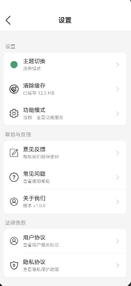
}步骤4: 让设置页面响应主题变化
typescript
// pages/Settings.ets

import { ThemeService } from '../services/ThemeService';
import { ThemeType } from '../models/ThemeModel';

@Entry
@Component
export struct Settings {
  @State settingGroups: SettingGroup[] = [];
  @State currentThemeName: string = '浅色模式';
  private themeService: ThemeService | null = null;

  aboutToAppear() {
    this.themeService = ThemeService.getInstance();
    this.updateCurrentThemeName();

    // 注册主题变化监听
    this.themeService.addThemeChangeListener(() => {
      this.updateCurrentThemeName();
      this.initSettings();
    });

    this.initSettings();
  }

  updateCurrentThemeName(): void {
    if (!this.themeService) return;

    const themeType = this.themeService.getCurrentThemeType();
    switch (themeType) {
      case ThemeType.LIGHT:
        this.currentThemeName = '浅色模式';
        break;
      case ThemeType.DARK:
        this.currentThemeName = '深色模式';
        break;
      case ThemeType.SYSTEM:
        this.currentThemeName = '跟随系统';
        break;
    }
  }

  build(): void {
    const colors = this.themeService?.getCurrentColors();

    Column() {
      // 标题栏
      Row() {
        // ... 使用 colors 动态设置颜色
      }
      .backgroundColor(colors?.cardBackground || '#FFFFFF');

      // 设置列表
      Scroll() {
        // ... 使用 colors 动态设置颜色
      }
      .backgroundColor(colors?.background || '#F5F5F5');
    }
    .backgroundColor(colors?.background || '#F5F5F5');
  }
}
常见问题与解决方案
问题1: 系统主题检测失败
现象:在某些设备上"跟随系统"模式无法正确检测系统主题。
解决方案:
typescript
private async checkSystemDarkMode(): Promise<boolean> {
  try {
    // 方案1:资源管理器
    const resourceManager = this.context.resourceManager;
    if (resourceManager) {
      const systemTheme = await resourceManager.getSystemTheme();
      if (systemTheme) {
        return systemTheme === 'dark';
      }
    }

    // 方案2:显示管理器
    if ('displayManager' in this.context) {
      const displayInfo = await this.context.displayManager.getDefaultDisplay();
      if (displayInfo?.colorMode === 2) {
        return true;
      }
    }

    // 方案3:回退到浅色模式
    return false;
  } catch (error) {
    console.error('检查系统深色模式失败:', error);
    return false;
  }
}优化策略:提供多种检测方式作为备选,确保兼容性。
问题2: 主题切换时闪烁
现象:主题切换过程中出现短暂的颜色闪烁。
解决方案:
typescript
// 使用animateTo实现平滑过渡
animateTo({ duration: 300, curve: Curve.EaseInOut }, () => {
  this.previewBackground = option.previewColors.background;
  this.previewCard = option.previewColors.card;
  this.previewPrimary = option.previewColors.primary;
});优化策略:
- 使用
animateTo包裹状态更新 - 设置合适的动画时长(300ms左右)
- 使用缓动曲线
Curve.EaseInOut
问题3: 组件未响应主题变化
现象:主题切换后,某些组件的颜色没有更新。
解决方案:
typescript
// 在组件中注册主题变化监听
aboutToAppear() {
  this.themeService = ThemeService.getInstance();

  // 注册监听
  this.themeService.addThemeChangeListener((themeType, colors) => {
    // 更新组件状态
    this.currentColors = colors;
  });
}

aboutToDisappear() {
  // 注意:需要保存listener引用才能移除
  // this.themeService?.removeThemeChangeListener(listener);
}优化策略:
- 在组件初始化时注册监听器
- 在组件销毁时移除监听器(避免内存泄漏)
- 使用
AppStorage全局变量实现响应式更新
问题4: 状态栏颜色与主题不一致
现象:切换到深色模式后,状态栏文字颜色没有变化。
解决方案:
在 EntryAbility.onWindowStageCreate 中调用 setWindow() 传入窗口实例:
typescript
// EntryAbility.ets
async onWindowStageCreate(windowStage: window.WindowStage): Promise<void> {
  // ... 初始化 ThemeService 后 ...
  const win = await windowStage.getMainWindow();
  ThemeService.getInstance().setWindow(win);  // ← 关键:传入窗口实例
}
ThemeService 内部仅设置状态栏文字颜色(不设置背景色):
typescript
private async updateStatusBarStyle(): Promise<void> {
  if (!this.window) return;

  let isDark = false;
  if (this.currentThemeType === ThemeType.SYSTEM) {
    isDark = await this.checkSystemDarkMode();
  } else {
    isDark = this.currentThemeType === ThemeType.DARK;
  }

  await this.window.setSystemBarProperties({
    statusBarContentColor: isDark ? '#FFFFFF' : '#000000',
    navigationBarContentColor: isDark ? '#FFFFFF' : '#000000'
    // 注意:不设置 backgroundColor,避免覆盖页面背景
  });
}
重要 :必须在
EntryAbility中调用setWindow(win),否则this.window为 null,状态栏不会更新。
本章小结
核心知识点
本文详细实现了主题切换功能,包括:
1. 主题数据模型设计
- 定义主题类型枚举(LIGHT、DARK、SYSTEM)
- 设计主题颜色配置接口(18个字段:基础5 + 主题3 + 功能5 + 季节4)
- 提供浅色和深色两套完整颜色方案
- 新增季节色彩支持(春绿/夏粉/秋橙/冬蓝)
2. 主题服务实现
- 使用单例模式确保全局唯一实例
- 实现观察者模式支持组件监听
- 使用
getConfiguration().colorMode检测系统深色模式(官方推荐方式) - 实现定时检测机制(每30秒轮询系统主题变化)
- 通过
setWindow()接收窗口实例实现状态栏适配
3. 主题切换页面
- 实时预览动画效果(animateTo + ThemeAnimationConfig)
- 分离式选项渲染(Selected / Unselected 两套 Builder)
- 颜色状态变量实时同步(@State textPrimary 等)
- Circle 组件使用
.backgroundColor()而非.fillColor()
4. 全局响应机制
- 使用 AppStorage 同步全局状态(currentThemeType / themeColors)
- 组件通过 @StorageLink 响应式获取主题色
- 设置页面实时显示当前主题名称
最佳实践总结
| 实践 | 说明 |
|---|---|
| 单例模式 | static getInstance() 确保全局唯一 |
| 观察者模式 | addThemeChangeListener 支持组件监听 |
| Configuration API | getConfiguration().colorMode 检测系统主题 |
| 定时轮询 | setInterval(30s) 跟随系统模式 |
| 状态变量缓存 | @State textPrimary 避免每次从 service 取值 |
| Builder 分离 | Selected / Unselected 减少嵌套层级 |