「写在前面」
在科研数据分析中我们会重复地绘制一些图形,如果代码管理不当经常就会忘记之前绘图的代码。于是我计划开发一个 R 包(Biorplot),用来管理自己 R 语言绘图的代码。本系列文章用于记录 Biorplot 包开发日志。
相关链接
相关代码和文档都存放在了 Biorplot GitHub 仓库:
https://github.com/zhenghu159/Biorplot
欢迎大家 Follow 我的 GitHub 账号:
https://github.com/zhenghu159
我会不定期更新生物信息学相关工具和学习资料。如果您有任何建议,或者想贡献自己的代码,请在我的 GitHub 上留言。
介绍
折线图,是一种通过线段连接数据点的方式来展示数据变化趋势的图表。每个数据点表示一个特定的时间点或数值,线段则反映了数据点之间的关系。折线图通常用于展示时间序列数据、趋势分析、周期性变化等。
在 Biorplot 中,我封装了 Bior_LinePlot() 函数来实现折线图的绘制。
基础折线图
绘制一个基础的分类折线图如下:

绘图代码:
data <- data.frame('x' = c(1:20), 'y' = rnorm(20), 'Type' = rep(c('A','B'), 10))
palette <- c("#f89588","#63b2ee")
Bior_LinePlot(data, x = "x", y = "y", color = "Type", title = "Test Bior_LinePlot",
              palette = palette, plot_type = "l", size = 2, text.size = 30,
              ggtheme = theme_minimal()) +
  font("title", size = 35)
相关系数折线图
绘制一个带有相关系数 R 和 P-value 的折线图如下:
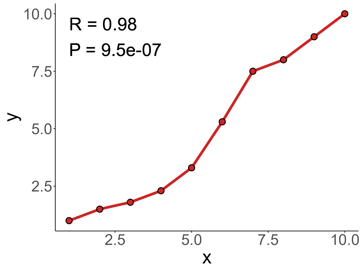
绘图代码:
data <- data.frame('x' = c(1:10), 'y' = c(1,1.5,1.8,2.3,3.3,5.3,7.5,8,9,10))

Bior_LinePlot(data, x = "x", y = "y",
              color = "firebrick3", plot_type = "l", size = 2,
              cor.test = TRUE, cor.label.x=1, cor.label.y=9, R.digits = 2, P.digits = 2,
              cor.label.size = 10,
              text.size = 30, ggtheme = theme_classic()) +
  geom_point(color="black", fill="firebrick3", shape=21, size=4, stroke=1) +
  font("title", size = 30)
源码解析
Biorplot::Bior_LinePlot() 函数主要继承了 ggpubr::ggline()、stats::cor.test() 函数,并对默认参数进行了自定义设置。
新增了标题居中 和标题大小,相关参数:
title.hjust(defaut: title.hjust = 0.5); title hjust valuetext.size(defaut: text.size = 20); text size value
新增了通过 stats::cor.test() 计算相关系数 R 和 P-value 的功能,并通过 ggplot2::geom_text() 设置相关系数文本显示的位置,相关参数:
cor.test(defaut: cor.test = FALSE); whether to use cor.test to calculate correlationsR.digits(defaut: R.digits = 2); digits for RP.digits(defaut: P.digits = 2); digits for Pcor.label.x(defaut: cor.label.x = 1); cor.label x positioncor.label.y(defaut: cor.label.y = 1); cor.label y positioncor.label.size(defaut: cor.label.size=10); cor.label size
源码:
#%%%%%%%%%%%%%%%%%%%%%%%%%%%%%%%%%%%%%%%%%%%%%%%%%%%%%%%%%%%%%%%%%%%%%%%%%%%%%%%

#' Line plot
#' @description Create a line plot.
#'
#' @import ggplot2
#' @importFrom ggpubr ggline theme_pubr
#'
#' @inheritParams ggpubr::ggline
#' @inheritParams stats::cor.test
#' @param title.hjust (defaut: title.hjust = 0.5); title hjust value
#' @param text.size (defaut: text.size = 20); text size value
#' @param cor.test (defaut: cor.test = FALSE); whether to use cor.test to calculate correlations
#' @param R.digits (defaut: R.digits = 2); digits for R
#' @param P.digits (defaut: P.digits = 2); digits for P
#' @param cor.label.x (defaut: cor.label.x = 1); cor.label x position
#' @param cor.label.y (defaut: cor.label.y = 1); cor.label y position
#' @param cor.label.size (defaut: cor.label.size=10); cor.label size
#'
#' @return A ggplot object
#' @export
#'
#' @seealso \code{\link{ggline}}
#' @examples
#' # Examples 1
#' data <- data.frame('x' = c(1:20), 'y' = rnorm(20), 'Type' = rep(c('A','B'), 10))
#' palette <- c("#f89588","#63b2ee")
#' Bior_LinePlot(data, x = "x", y = "y", color = "Type", title = "Test Bior_LinePlot",
#'               palette = palette, plot_type = "l", size = 2, text.size = 30,
#'               ggtheme = theme_minimal()) +
#'   font("title", size = 35)
#'
#'
#' # Examples 2
#' data <- data.frame('x' = c(1:10), 'y' = c(1,1.5,1.8,2.3,3.3,5.3,7.5,8,9,10))
#' Bior_LinePlot(data, x = "x", y = "y",
#'               color = "firebrick3", plot_type = "l", size = 2,
#'               cor.test = TRUE, cor.label.x=1, cor.label.y=9, R.digits = 2, P.digits = 2,
#'               cor.label.size = 10,
#'               text.size = 30, ggtheme = theme_classic()) +
#'   geom_point(color="black", fill="firebrick3", shape=21, size=4, stroke=1) +
#'   font("title", size = 30)
#'
#'
Bior_LinePlot <- function(
    # ggpubr::ggline Arguments
    data, x, y, group = 1, numeric.x.axis = FALSE, combine = FALSE, merge = FALSE,
    color = "black", palette = NULL, linetype = "solid", plot_type = c("b", "l", "p"),
    size = 0.5, shape = 19, stroke = NULL, point.size = size, point.color = color,
    title = NULL, xlab = NULL, ylab = NULL, facet.by = NULL, panel.labs = NULL,
    short.panel.labs = TRUE, select = NULL, remove = NULL, order = NULL, add = "none",
    add.params = list(), error.plot = "errorbar", label = NULL, font.label = list(size = 11, color = "black"),
    label.select = NULL, repel = FALSE, label.rectangle = FALSE, show.line.label = FALSE,
    position = "identity", ggtheme = theme_pubr(),
    # add new Arguments
    title.hjust = 0.5, text.size = 20,
    # stats::cor.test Arguments
    alternative = "two.sided", method = "pearson", exact = NULL, conf.level = 0.95,
    continuity = FALSE,
    # add new Arguments
    cor.test = FALSE, R.digits = 2, P.digits = 2, cor.label.x = 1, cor.label.y = 1,
    cor.label.size=10,
    ...)
{

  ggline.Arguments <- list(
    data = data, x = x, y = y, group = group, numeric.x.axis = numeric.x.axis,
    combine = combine, merge = merge, color = color, palette = palette, linetype = linetype,
    plot_type = plot_type, size = size,  shape = shape, stroke = stroke,
    point.size = point.size, point.color = point.color, title = title, xlab = xlab,
    ylab = ylab, facet.by = facet.by, panel.labs = panel.labs, short.panel.labs = short.panel.labs,
    select = select , remove = remove, order = order, add = add, add.params = add.params,
    error.plot = error.plot, label = label, font.label = font.label, label.select = label.select,
    repel = repel, label.rectangle = label.rectangle, show.line.label = show.line.label,
    position = position, ggtheme = ggtheme, ...)

  cor.test.Arguments <- list(
    alternative = alternative, method = method, exact = exact, conf.level = conf.level,
    continuity = continuity, ...
  )

  p <- do.call(ggpubr::ggline, ggline.Arguments) +
    theme(plot.title = element_text(hjust = title.hjust),
          text = element_text(size = text.size))

  if (cor.test == TRUE) {
    cor <- do.call(stats::cor.test, c(data[x], data[y], cor.test.Arguments))
    R <- round(cor$estimate, R.digits)
    P_value <- format(cor$p.value, digits = P.digits)
    p <- p +
      geom_text(x = cor.label.x, y = cor.label.y, label = paste('R =',R,'\nP =',P_value,sep=' '),
                hjust=0, color="black", size=cor.label.size)
  }

  return(p)
}

#%%%%%%%%%%%%%%%%%%%%%%%%%%%%%%%%%%%%%%%%%%%%%%%%%%%%%%%%%%%%%%%%%%%%%%%%%%%%%%%
「结束」
注:本文为个人学习笔记,仅供大家参考学习,不得用于任何商业目的。如有侵权,请联系作者删除。