6.6 给查看更多设置点击事件实现页面跳转
图片如下:

跳转需要进入的页面

6.6.1 描绘该跳转的关注的人的页面
新建一个pages页面命名为AttentionPage,在添加相应的内容布局代码示例:
@Entry
@Component
struct AttentionPage {
build() {
Column(){
}
}
}
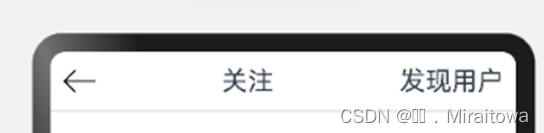
6.6.1.1 设置顶部内容
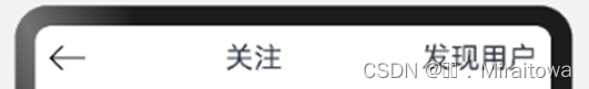
代码示例:
Row(){
Image($r('app.media.xiangzuo')).height(25).width(25)
.onClick(()=>{
router.back()
})
Text('关注').fontSize(20)
Text('发现用户').fontSize(20)
}.justifyContent(FlexAlign.SpaceBetween)
.width('100%').padding(10)
Divider()
Divider 水平分割线,让整体布局更加美观
效果图:
6.6.1.2 绘制tab标签并且添加内容
(1)添加tab标签的自定义
代码示例:
@Entry
@Component
struct AttentionPage {
private tabsController:TabsController=newTabsController()
build() {
(2)tabs的布局以及tabcontent的内容
Tabs({controller: this.tabsController}){
TabContent(){
}.tabBar('关注的人')
TabContent(){
}.tabBar('经常访问')
TabContent(){
}.tabBar('推荐')
TabContent(){
}.tabBar('超话')
6.6.1.3 利用Image组件和TextInput组件添加输入框
给关注的人标签里添加内容
代码示例:
ListItem(){
Column() {
Row().height(12).width('100%').backgroundColor('#EDEDED')
Row() {
Stack() {
Image($r('app.media.sousuo')).width(15).margin({ right: 120 })
TextInput({ placeholder: '搜全部关注' }).textAlign(TextAlign.Center).width('95%')
}
}.padding(10)
6.6.1.4 利用线性布局组件描绘图片以及文本内容
(1) 设置Attention类分装
代码示例:
class Attention {
image: ResourceStr
name:string
constructor (image: ResourceStr,name:string) {
this .image =image
this .name=name
}
}
(2) 设置Atten 列表函数
代码示例:
@State Atten:Array<Attention> = **new** Attention($r('app.media.zuixin'),'特别关注'), **new**Attention($r('app.media.fabu'),'是TA的铁粉'), **new**Attention($r('app.media.zuixin'),'关注分组'), **new**Attention($r('app.media.renqi'),'兴趣主页'),
(3) 利用ForEach 循环渲染
代码示例:
Divider().backgroundColor('#EDEDED')
Row() {
ForEach(this .Atten, (item: Attention) => {
Row({ space: 20 }) {
Column({ space: 5 }) {
Image(item.image).width(50)
Text(item.name)
}
Divider().vertical(true ).height(60)
}.margin({ right: 5 })
})
}.justifyContent(FlexAlign.SpaceBetween)
效果图:

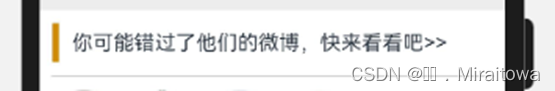
6.6.1.5 利用Divider组件属性和text文本描绘页面
代码示例:
Row().height(12).width('100%').backgroundColor('#EDEDED').margin({ top: 10 })
Column() {
Row({ space: 10 }) {
Divider().vertical(true ).height(30).strokeWidth(5).backgroundColor(Color.Orange) //设置分割线为垂直方向,strokeWidth为线的宽度。
Text('你可能错过了他们的微博,快来看看吧>>')
}.justifyContent(FlexAlign.Start).width('100%').padding(10)
Divider().width('95%')
}
效果图如下:
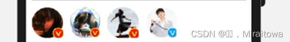
6.6.1.6 利用Row组件设置图片展示
此处所需要的图片很少只需要利用Image组件按照顺序直接排版即可
代码示例:
Row({ space: 10 }) {
Image(r('app.media.liuyifei')).width(50).height(50)
Image(r('app.media.bhead')).width(50).height(50)
Image(r('app.media.yaocen')).width(50).height(50)
Image(r('app.media.Himg')).width(50).height(50)
}.justifyContent(FlexAlign.Start).width('100%').padding(10)
运行结果:
6.6.1.7 利用 Row组件设置文本内容以及背景属性
代码如下:
Row() {
Text('............').fontSize(20)
Text('批量管理').fontColor(Color.Blue).margin({ top: 10 })
Text('............').fontSize(20)
}.backgroundColor('#EDEDED')
.height(50).width('100%')
.justifyContent(FlexAlign.Center)
运行结果:

6.6.1.8 利用 Column 组件布局已关注的人描述
(1)创建自定义Guanzhu的类用来封装
代码示例:
export class Guanzhu{
Himg: ResourceStr
name:string
img: ResourceStr
text:string
img1:ResourceStr
constructor ( Himg: ResourceStr,name:string,img: ResourceStr,text:string,img1:ResourceStr) {
this .Himg=Himg
this .name=name
this .img=img
this .text = text
this .img1=img1
}
}
(2)设置一个自定义列表YAtten的函数用来封装内容
代码示例:
@State YAtten:Array<Guanzhu>= **new** Guanzhu($r('app.media.Yyqx'),'易烊千玺' ,$r('app.media.bhead0'),'演员易烊千玺',$r('app.media.yiguanzhu')), **new**Guanzhu($r('app.media.liuyifei'),'刘亦菲' ,$r('app.media.bhead0'),'演员刘亦菲',$r('app.media.yiguanzhu')), **new**Guanzhu($r('app.media.liuhaocun'),'刘浩存' ,$r('app.media.bhead0'),'演员刘浩存',$r('app.media.yiguanzhu')), **new**Guanzhu($r('app.media.Yyqx'),'易烊千玺' ,$r('app.media.bhead0'),'演员易烊千玺',$r('app.media.yiguanzhu')),
(3)利用ForEach组件循环渲染
代码示例:
Column() {
ForEach(this .YAtten, (item: Guanzhu) => {
Row({ space: 10 }) {
Image(item.Himg).width(60).height(60)
Column() {
Row({ space: 10 }) {
Text(item.name).fontColor(Color.Orange)
Image(item.img).height(25).width(25)
}.justifyContent(FlexAlign.Start).width('100%')
Row({ space: 10 }) {
Text(item.text)
Image(item.img1).width(80).height(40)
}.justifyContent(FlexAlign.SpaceBetween).width('90%')
}.justifyContent(FlexAlign.Start).width('80%')
}.width('100%')
Row({ space: 10 }) {
Image($r('app.media.chaohua')).height(20).width(20)
Text('个人超话')
Button('+关注超话').backgroundColor('#EDEDED').fontColor(Color.Orange)
}
.width('70%')
.height(35)
.backgroundColor('#EDEDED')
.borderRadius(10)
.margin({ left: 50, top: 5 })
Divider().padding(20)
})
}.height('80%')
运行代码:

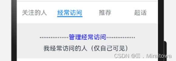
6.6.2 给查看更多里面的经常访问标签绘制页面内容
图片如下:

6.6.2.1 利用Row组件布局并且输入文本内容
(1)创建一自定义页面,命名为OfftenVisit 页面
直接加上export导出,在主页面的标签里面调用即可
代码示例:
@Component
export struct OfftenVisit {
build() {
Column() {
}.height('100%')
}
}
(2)在build里面描绘页面内容
代码示例:
Column({space:10}) {
Row() {
Text('................').fontSize(20)
Text('管理经常访问').fontColor(Color.Blue).margin({ top: 10 })
Text('................').fontSize(20)
}
Text('我经常访问的人(仅自己可见)')
}.backgroundColor('#EDEDED')
.height(90).width('100%')
.justifyContent(FlexAlign.Center)
运行效果图:
6.6.2.2 利用ForEach组件循环渲染内容
(1)定义一个VisitInfo的类用来封装
代码示例:
class VisitInfo{
Himg:ResourceStr
name:string
img1:ResourceStr
img2:ResourceStr
title:string
content:string
constructor ( Himg:ResourceStr,name:string,img1:ResourceStr, img2:ResourceStr,title:string,content:string ) {
this .Himg=Himg
this .name=name
this .img1=img1
this .img2 = img2
this .title = title
this .content =content
}
}
(2)定义一个自定义列表函数Vlist
代码示例:
@Provide Vlist:Array< VisitInfo> = **new** VisitInfo($r('app.media.Yyqx'),'易烊千玺',$r('app.media.gender'),$r('app.media.img2'),'近7天访问25次' ,'人气少年偶像组合TFBOYS成员!'), **new**VisitInfo($r('app.media.liuyifei'),'刘亦菲',$r('app.media.gender'),$r('app.media.img2'),'近7天访问20次' ,'娱乐圈女神神仙姐姐 !'), **new**VisitInfo($r('app.media.Yyqx'),'易烊千玺',$r('app.media.gender'),$r('app.media.img2'),'近7天访问25次' ,'人气少年偶像组合TFBOYS成员!'), **new**VisitInfo($r('app.media.liuyifei'),'刘亦菲',$r('app.media.gender'),$r('app.media.img2'),'近7天访问20次' ,'娱乐圈女神神仙姐姐 !'),
(3)ForEach循环渲染内容展示:
代码示例:
ForEach(this .Vlist,(item:VisitInfo)=>{
Row({space:10}){
Image(item.Himg).width(50).height(50)
Column({space:5}){
Row({space:10}){
Text(item.name).fontSize(18)
Image(item.img1).width(50).height(20)
Image(item.img2).width(80).height(40).margin({top:10,left:50})
}
Row(){
Text(item.title).fontColor(Color.Grey).margin({right:150})
}.height(15).backgroundColor(Color.Orange).width(100)
}
}
Column(){
Text(item.content).padding(10)
}.alignItems(HorizontalAlign.Start)
Divider().padding(10)
})
运行结果:

6.6.2.3 利用Text组件设置底部内容
代码示例:
Row() {
Text('................').fontSize(20)
Text('没有更多了').margin({ top: 10 })
Text('................').fontSize(20)
}.backgroundColor('#EDEDED')
.height(90).width('100%')
.justifyContent(FlexAlign.Center)
运行结果:

6.6.2.4 在Attention Page页面直接调用 OffenVisitPage页面的内容
代码示例:
TabContent(){
OfftenVisit()
}.tabBar('经常访问')
6.6.3 实现页面路由跳转
6.6.3.1给主页面中的查看更多文本添加点击事件实现页面路由跳转
代码示例:
Text('查看更多').fontColor('#36D')
.onClick(() => {
router.pushUrl({
url: 'pages/HQ/AttentionPage'
}, router.RouterMode.Single, (err) => {
if (err) {
console.log(`路由失败,errCode:{err.code}errMsg:{err.message}`)
return ;
}
console.info('Invoke replaceUrl succeeded.');
})
})
6.6.3.2 给进入的页面设置页面跳转返回
代码示例:
Image($r('app.media.xiangzuo')).height(25).width(25)
.onClick(()=>{
router.back()
})