效果图:

代码:
1、样式代码,可以写在窗体资源处或者样式资源文件中
 <Style x:Key="MenuRadioButtonStyle" TargetType="{x:Type RadioButton}">
     <Setter Property="FontSize" Value="16" />
     <Setter Property="Width" Value="100" />
     <Setter Property="Height" Value="40" />
     <!--<Setter Property="Foreground" Value="#333333" />-->
     <Setter Property="Foreground">
         <Setter.Value>
             <SolidColorBrush Color="#333333" />
         </Setter.Value>
     </Setter>
     <Setter Property="VerticalAlignment" Value="Center" />
     <Setter Property="Template">
         <Setter.Value>
             <ControlTemplate TargetType="{x:Type RadioButton}">
                 <Grid>
                     <Border
                         x:Name="bd"
                         Margin="5,0,5,0"
                         Background="#00FFFFFF"
                         CornerRadius="20" />
                     <ContentPresenter
                         Margin="0,0,0,0"
                         HorizontalAlignment="Center"
                         VerticalAlignment="Center" />
                 </Grid>
                 <ControlTemplate.Triggers>
                     <MultiTrigger>
                         <MultiTrigger.Conditions>
                             <Condition Property="IsMouseOver" Value="True" />
                             <Condition Property="IsChecked" Value="False" />
                         </MultiTrigger.Conditions>
                         <MultiTrigger.Setters>
                             <Setter TargetName="bd" Property="Background" Value="#AACCE8FF" />
                         </MultiTrigger.Setters>
                     </MultiTrigger>
                     <Trigger Property="IsChecked" Value="True">
                         <Trigger.EnterActions>
                             <BeginStoryboard>
                                 <Storyboard>
                                     <ColorAnimation
                                         Storyboard.TargetProperty="(RadioButton.Foreground).(SolidColorBrush.Color)"
                                         To="White"
                                         Duration="0:0:.2" />
                                 </Storyboard>
                             </BeginStoryboard>
                         </Trigger.EnterActions>
                         <Trigger.ExitActions>
                             <BeginStoryboard>
                                 <Storyboard>
                                     <ColorAnimation
                                         Storyboard.TargetProperty="(RadioButton.Foreground).(SolidColorBrush.Color)"
                                         To="#333333"
                                         Duration="0:0:.2" />
                                 </Storyboard>
                             </BeginStoryboard>
                         </Trigger.ExitActions>
                     </Trigger>

                 </ControlTemplate.Triggers>
             </ControlTemplate>
         </Setter.Value>
     </Setter>
 </Style>
 <Style x:Key="MenuSliderStyle" TargetType="Border">
     <Setter Property="Width" Value="100"/>
     <Setter Property="Height" Value="40"/>
     <Setter Property="Margin" Value="100,0,0,0"/>
     <Setter Property="HorizontalAlignment" Value="Left"/>
     <Setter Property="Background" Value="#14B9FF"/>
     <Setter Property="CornerRadius" Value="20"/>
 </Style>
2、在要使用的页面中
 <Border
     Width="500"
     Height="50"
     VerticalAlignment="Top"
     Background="#AAFFFFFF"
     CornerRadius="20">
     <Grid>
         <Border
             x:Name="menuBorder"
             Style="{StaticResource MenuSliderStyle}">
             <Border.RenderTransform>
                 <TranslateTransform x:Name="Move" X="0" />
             </Border.RenderTransform>
         </Border>
         <Grid HorizontalAlignment="Center">
             <Grid.ColumnDefinitions>
                 <ColumnDefinition />
                 <ColumnDefinition />
                 <ColumnDefinition />
             </Grid.ColumnDefinitions>
             <RadioButton
                 x:Name="homeRB"
                 Content="Home"
                 IsChecked="True"
                 Style="{StaticResource MenuRadioButtonStyle}">
                 <RadioButton.Triggers>
                     <EventTrigger RoutedEvent="ToggleButton.Checked">
                         <BeginStoryboard >
                             <Storyboard>
                                 <DoubleAnimation
                                     Storyboard.TargetName="menuBorder"
                                     Storyboard.TargetProperty="(UIElement.RenderTransform).(TranslateTransform.X)"
                                     To="0"
                                     Duration="0:0:.2" />
                             </Storyboard>
                         </BeginStoryboard>
                     </EventTrigger>
                 </RadioButton.Triggers>
             </RadioButton>
             <RadioButton
                 x:Name="settingsRB"
                 Grid.Column="1"
                 Content="Settings"
                 Style="{StaticResource MenuRadioButtonStyle}">
                 <RadioButton.Triggers>
                     <EventTrigger RoutedEvent="ToggleButton.Checked">
                         <BeginStoryboard>
                             <Storyboard>
                                 <DoubleAnimation
                                     Storyboard.TargetName="menuBorder"
                                     Storyboard.TargetProperty="(UIElement.RenderTransform).(TranslateTransform.X)"
                                     To="100"
                                     Duration="0:0:.2" />
                             </Storyboard>
                         </BeginStoryboard>
                     </EventTrigger>
                 </RadioButton.Triggers>
             </RadioButton>
             <RadioButton
                 x:Name="LogRB"
                 Grid.Column="2"
                 Content="Logs"
                 Style="{StaticResource MenuRadioButtonStyle}">
                 <RadioButton.Triggers>
                     <EventTrigger RoutedEvent="ToggleButton.Checked">
                         <BeginStoryboard>
                             <Storyboard>
                                 <DoubleAnimation
                                     Storyboard.TargetName="menuBorder"
                                     Storyboard.TargetProperty="(UIElement.RenderTransform).(TranslateTransform.X)"
                                     To="200"
                                     Duration="0:0:.2" />
                             </Storyboard>
                         </BeginStoryboard>
                     </EventTrigger>
                 </RadioButton.Triggers>
             </RadioButton>
         </Grid>
     </Grid>
 </Border>
3、RadioButton就是每个功能按钮,配合Prism框架的导航功能使用,就可以在各个页面之间切换了。
如果需要增加按钮数量,需要进行如下操作:
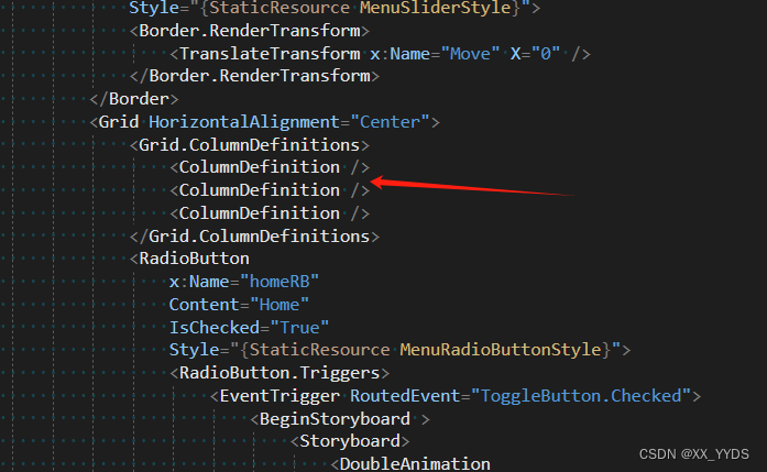
1、在Grid.ColumnDefinitions中,有几个按钮就加到几列,这里是三个按钮,所以是三列。
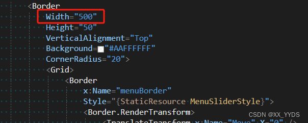
2、修改最外层的Border的宽度,每一个按钮是100的宽度,然后再加上200,就是最后的宽度。
这里三个按钮,是3×100+200=500的宽度。
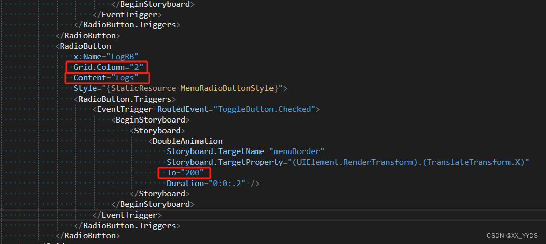
3、按照前面的格式,增加RadioButton,RadioButton就是每个功能按钮,并且修改以下几个属性
(1)Grid.Column 从0开始,每个递增1,即第一个RadioButton的Grid.Column是0,第二个是1,以此类推。
(2)Content 是按钮上面显示的文本。
(3)To 从0开始,每个递增100,即第一个RadioButton的 To 是0,第二个是100,以此类推。
最后效果:
如果加上缓动动画,效果会更自然,可以自行添加缓动效果。