因为这个项目license问题无法开源,更多技术支持与服务请加入我的知识星球。

1、lowflow这里使用了tsx的动态图标,如下:
javascript
import './index.scss'
import type { CSSProperties, PropType } from 'vue'
import { computed, defineComponent, resolveComponent, h } from 'vue'

export default defineComponent({
  name: 'SvgIcon',
  props: {
    name: {
      type: String as PropType<string>,
      required: true
    },
    prefix: {
      type: String as PropType<string>,
      default: 'icon'
    },
    color: {
      type: String as PropType<string>
    },
    size: {
      type: Number as PropType<number>
    },
    className: {
      type: String as PropType<string>
    }
  },
  setup(props) {
    const symbolId = computed(() => `#${props.prefix}-${props.name}`)
    const svgClass = computed(() => [
      'svg-icon',
      props.name && props.name.replace('el:', ''),
      props.className
    ])
    const fill = computed(() => (props.color ? props.color : 'currentColor'))
    const style = computed<CSSProperties>(() => {
      const { size } = props
      if (!size) return {}
      return {
        fontSize: `${size}px`
      }
    })
    return {
      symbolId,
      svgClass,
      fill,
      style
    }
  },
  render() {
    const { $attrs, symbolId, svgClass, fill } = this
    if (this.name) {
      if (this.name.startsWith('el:')) {
        return (
          <el-icon class={svgClass} color={this.color} size={this.size} {...$attrs}>
            {h(resolveComponent(this.name.slice(3)))}
          </el-icon>
        )
      } else {
        return (
          <svg class={svgClass} style={this.style} aria-hidden="true" {...$attrs}>
            <use xlinkHref={symbolId} fill={fill}></use>
          </svg>
        )
      }
    }
    return null
  }
})
这里根据jeecgboot的项目情况增加下面一行,否则会报错(因为没有自动引入组件)
import { computed, defineComponent, resolveComponent, h } from 'vue'
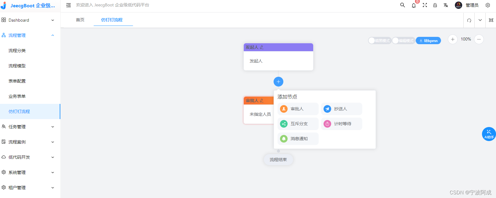
2、在需要用到上面tsx的组件,需要单独引入,因为本身jeecgboot有自己的图标组件,为了不引起冲突,还是单独引入为好,如add.vue增加节点的图标显示
javascript
<script setup lang="ts">
import { ref, reactive, computed, inject, defineComponent } from 'vue';
import type { PopoverInstance } from 'element-plus'
import type { NodeType } from './type'
import type { Ref } from 'vue'
import SvgIcon from '@/views/lowflow/components/SvgIcon/index'

const { readOnly } = inject<{
  readOnly?: Ref<boolean>
}>('flowDesign', { readOnly: ref(false) })
const popoverRef = ref<PopoverInstance>()
const $emits = defineEmits<{
  (e: 'addNode', type: NodeType): void
}>()
const addApprovalNode = () => {
  $emits('addNode', 'approval')
  popoverRef.value?.hide()
}
const addCcNode = () => {
  $emits('addNode', 'cc')
  popoverRef.value?.hide()
}
const addExclusiveNode = () => {
  $emits('addNode', 'exclusive')
  popoverRef.value?.hide()
}
const addTimerNode = () => {
  $emits('addNode', 'timer')
  popoverRef.value?.hide()
}
const addNotifyNode = () => {
  $emits('addNode', 'notify')
  popoverRef.value?.hide()
}
</script>

<template>
  <div class="add-but">
    <el-popover
      placement="bottom-start"
      ref="popoverRef"
      trigger="click"
      title="添加节点"
      :width="336"
    >
      <el-space wrap>
        <div class="node-select" @click="addApprovalNode">
          <svg-icon name="el:Stamp" />
          <el-text>审批人</el-text>
        </div>
        <div class="node-select" @click="addCcNode">
          <svg-icon name="el:Promotion" />
          <el-text>抄送人</el-text>
        </div>
        <div class="node-select" @click="addExclusiveNode">
          <svg-icon name="el:Share" />
          <el-text>互斥分支</el-text>
        </div>
        <div class="node-select" @click="addTimerNode">
          <svg-icon name="el:Timer" />
          <el-text>计时等待</el-text>
        </div>
        <div class="node-select" @click="addNotifyNode">
          <svg-icon name="el:BellFilled" />
          <el-text>消息通知</el-text>
        </div>
      </el-space>
      <template #reference>
        <el-button
          v-show="!readOnly"
          icon="Plus"
          type="primary"
          style="z-index: 1"
          circle
        ></el-button>
      </template>
    </el-popover>
  </div>
</template>

<style scoped lang="scss">
.node-select {
  cursor: pointer;
  display: flex;
  padding: 8px;
  width: 135px;
  border-radius: 10px;
  position: relative;
  background-color: var(--el-fill-color-light);

  &:hover {
    background-color: var(--el-color-primary-light-9);
    box-shadow: var(--el-box-shadow-light);
    color: var(--el-color-primary);
  }

  .svg-icon {
    font-size: 25px;
    padding: 5px;
    border-radius: 50%;
    color: var(--el-color-white);

    &.Stamp {
      background-color: #ff943e;
    }

    &.Promotion {
      background-color: #3296fa;
    }

    &.Share {
      background-color: #45cf9b;
    }

    &.Timer {
      background-color: #e872b7;
    }

    &.BellFilled {
      background-color: #95d475;
    }
  }

  .el-text {
    margin-left: 10px;
  }
}

.add-but {
  display: flex;
  justify-content: center;
  width: 100%;
  padding: 20px 0 32px;
  position: relative;

  &:before {
    content: '';
    position: absolute;
    top: 0;
    left: 0;
    right: 0;
    bottom: 0;
    margin: auto;
    width: 1px;
    height: 100%;
    background-color: var(--el-border-color);
  }
}
</style>
3、效果如下: