文档流
文档流是文档中可显示对象在排列时占用的位置/空间。例如:块元素自上而下摆放,内联元素从左到右摆放。(文档流中限制非常的多,导致很多页面效果无法实现)。
常见文档流限制
高低不齐,底边对齐
html
<head>
    <meta charset="UTF-8">
    <meta name="viewport" content="width=device-width, initial-scale=1.0">
    <title>Document</title>
    <style>
        img{
            width: 200px;
            height: 200px;
        }
    </style>
</head>
<body>
    <span>高低不齐底边对齐</span>
    <img src="0197fd5b680c91a801206a3534717f.jpg@0o.jpg">
</body>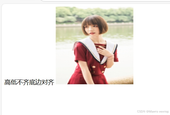
空格折叠(无论在标签文本内添加多少空格,在页面上只显示一个)
html
<span>空格 折叠</span>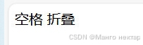
部分元素之间无法实现无空隙
html
<head>
    <meta charset="UTF-8">
    <meta name="viewport" content="width=device-width, initial-scale=1.0">
    <title>Document</title>
    <style>
        img{
            width: 200px;
            height: 200px;
        }
    </style>
</head>
<body>
    <img src="0197fd5b680c91a801206a3534717f.jpg@0o.jpg">
    <img src="0197fd5b680c91a801206a3534717f.jpg@0o.jpg">
</body>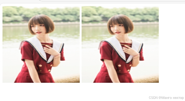
脱离文档流方法
浮动(float)
浮动是添加一个浮层来放置内容。
float属性定义了元素浮动的方向,任何元素都可以浮动。
left: 元素向左浮动
right:元素向右浮动
注意:浮动会使元素脱离文档流,浮动只能左右浮动不可以上下浮动。脱离文档流之后,元素相当于在页面上增加了一个浮层来放置内容,此时可以理解为由两层页面,底层是原页面,上层是脱离文档流的页面。
下面是未脱离文档流的页面
html
    <head>
        <meta charset="UTF-8">
        <meta name="viewport" content="width=device-width, initial-scale=1.0">
        <title>Document</title>
        <style>
            .box1{
                width: 100px;
                height: 100px;
                background-color: red;
            }
            .continer{
                width: 300px;
                height: 300px;
                background-color: aqua;
            }
        </style>
    </head>
    <body>
        <div class="box1"></div>
        <div class="continer"></div>
    </body>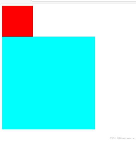
添加float属性脱离文档流后
html
  <head>
        <meta charset="UTF-8">
        <meta name="viewport" content="width=device-width, initial-scale=1.0">
        <title>Document</title>
        <style>
            .box1{
                width: 100px;
                height: 100px;
                background-color: red;
                float: left;
            }
            .continer{
                width: 300px;
                height: 300px;
                background-color: aqua;
            }
        </style>
    </head>
    <body>
        <div class="box1"></div>
        <div class="continer"></div>
    </body>
清除浮动
浮动的副作用
当元素设置float浮动后,该元素就会脱离文档流并向左/向右浮动。
浮动元素会造成父元素高度塌陷,后续元素会受到影响。
清除浮动的方法
1.父元素设置高度
2.受影响的元素添加clear属性
3.使用overflow属性来清除浮动
定位 (position)
该属性指定了元素的定位类型
relative:相对定位(此定位方法是非脱离文档流的定位方法)
absolute: 绝对定位 (每设置一个绝对定位,都会生成一层浮层)
fixed: 固定定位(随着页面的滚动而固定在某个位置)
在设置定位后可以使用四个值进行位置调整:left(左)right(右)top(上)bottom(下)
相对定位(relative) (此定位方法是非脱离文档流的定位方法)
html
  <head>
        <meta charset="UTF-8">
        <meta name="viewport" content="width=device-width, initial-scale=1.0">
        <title>Document</title>
        <style>
            .continer{
                width: 300px;
                height: 300px;
                background-color: aqua;
                position: relative;
                left: 100px;
                right: 100px;
                top: 100px;
                bottom: 100px;
            }
        </style>
    </head>
    <body>
        <div class="continer"></div>
        <div class="box1"></div>
    </body>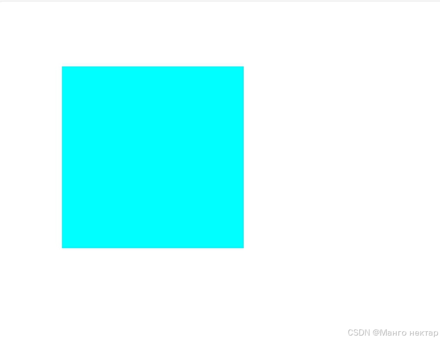
绝对定位(absolute)
html
    <head>
        <meta charset="UTF-8">
        <meta name="viewport" content="width=device-width, initial-scale=1.0">
        <title>Document</title>
        <style>
            .continer{
                width: 300px;
                height: 300px;
                background-color:red;
                position: absolute;
                left: 100px;
                right: 100px;
                top: 100px;
                bottom: 100px;
            }
        </style>
    </head>
    <body>
        <div class="continer"></div>
        <div class="box1"></div>
    </body>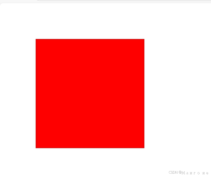
固定定位 (fixed)
html
 <head>
        <meta charset="UTF-8">
        <meta name="viewport" content="width=device-width, initial-scale=1.0">
        <title>Document</title>
        <style>
            .continer{
                width: 300px;
                height: 300px;
                background-color:orange;
                position: fixed;
                left: 100px;
                right: 100px;
                top: 100px;
                bottom: 100px;
            }
        </style>
    </head>
    <body>
        <div class="continer"></div>
        <div class="box1"></div>
    </body>
注意: 设置定位之后,相对定位和绝对定位他是相对于具有定位的父级元素进行位置调整,如果父级元素不存在定位,则继续向上逐级寻找,直到顶层文档。
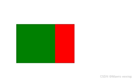
z-index属性
设置元素的堆叠顺序,拥有跟高堆叠顺序的元素总是处于堆叠顺数较低的元素前面
例子:将box1的z-index值设为2,将box2的值设为1
html
    <head>
        <meta charset="UTF-8">
        <meta name="viewport" content="width=device-width, initial-scale=1.0">
        <title>Document</title>
        <style>
            .box1{
                width: 100px;
                height: 100px;
                background-color: red;
                position:absolute;
                z-index: 2;
                left: 100px;
                right: 100px;
                top: 100px;
                bottom: 100px;
            }
            .box2{
                width: 100px;
                height: 100px;
                background-color:green;
                position:absolute;
                z-index: 1;
                left: 50px;
                right: 100px;
                top: 100px;
                bottom: 100px;
            }
        </style>
    </head>
    <body>
        <div class="continer">
        <div class="box2"></div>
        <div class="box1"></div>
    </div>
    </body>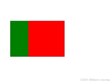
如果将box1的z-index值设为1,将box2的值设为2