1. 三种布局方式

1.1 标准流


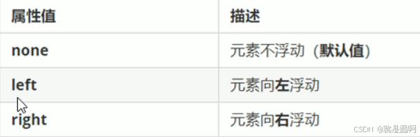
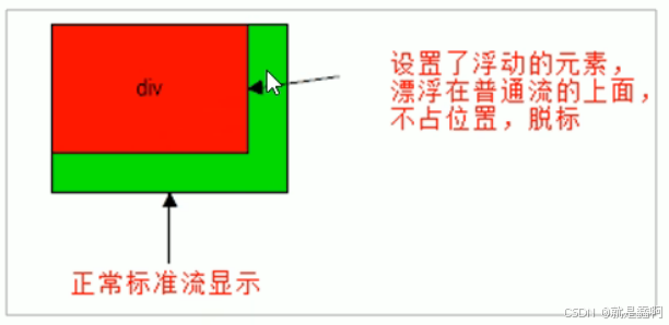
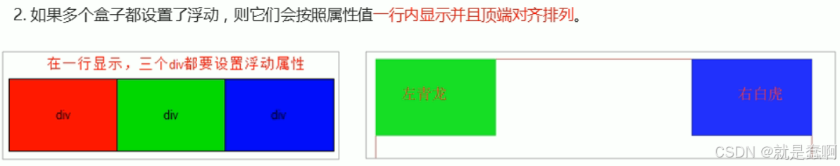
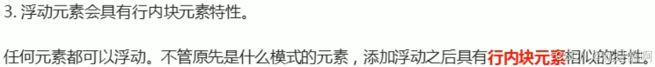
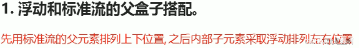
1.2 浮动的使用


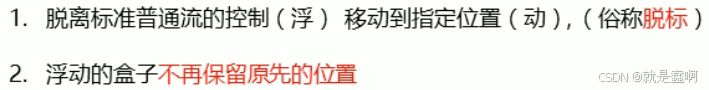
1.3 简述浮动


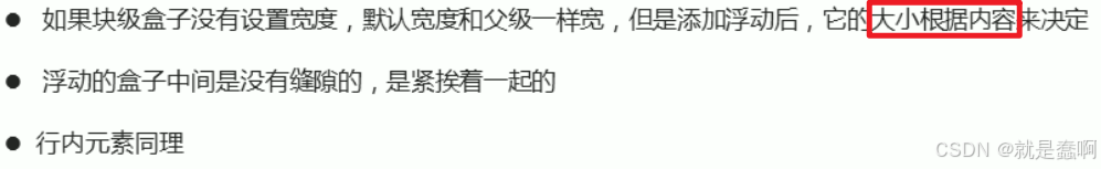
1.3.1 浮动三大特性
html
 <style>
        .out {
            border: 1px red solid;
            width: 1000px;
            height: 500px;
        }

        .one {
            background-color: aquamarine;
            width: 200px;
            height: 100px;
        }

        .two {
            background-color: blueviolet;
            width: 200px;
            height: 100px;
        }

        .add {
            width: 300px;
            height: 200px;
            background-color: blue;
        }
    </style>
</head>
<body>
    <div class="out">
        <div class="one">1111</div>
        <div class="two">2222</div>
        <div class="add">AAAAA</div>
    </div>
</body>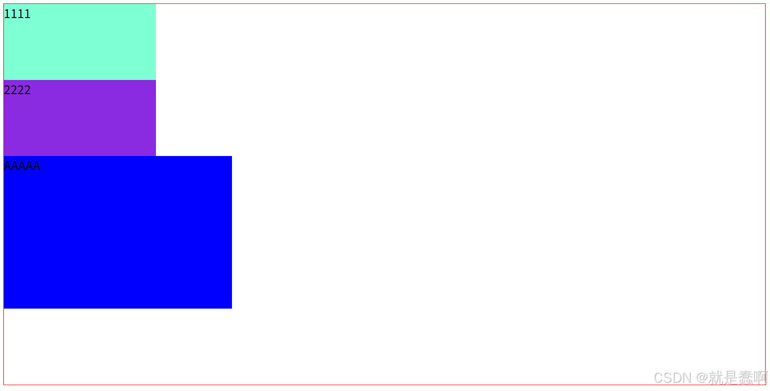


1.3.2 浮动的常规使用


1.4 浮动案例
案例 1 :
html
<!DOCTYPE html>
<html lang="en">
<head>
    <meta charset="UTF-8">
    <meta name="viewport" content="width=device-width, initial-scale=1.0">
    <title>Document</title>
    <style>
        * {
            padding: 0;
            margin: 0;
        }

        .out {
            border: 1px red solid;
            width: 1000px;
            height: 500px;
            margin: 10px auto;
            background-color: bisque;
        }

        .left {
            background-color: aquamarine;
            width: 300px;
            height: 500px;
            float: left;
        }

        .right {
            background-color: blueviolet;
            width: 700px;
            height: 500px;
            float: right;
        }
    </style>
</head>
<body>
    <div class="out">
        <div class="left"></div>
        <div class="right"></div>
    </div>
</body>
</html>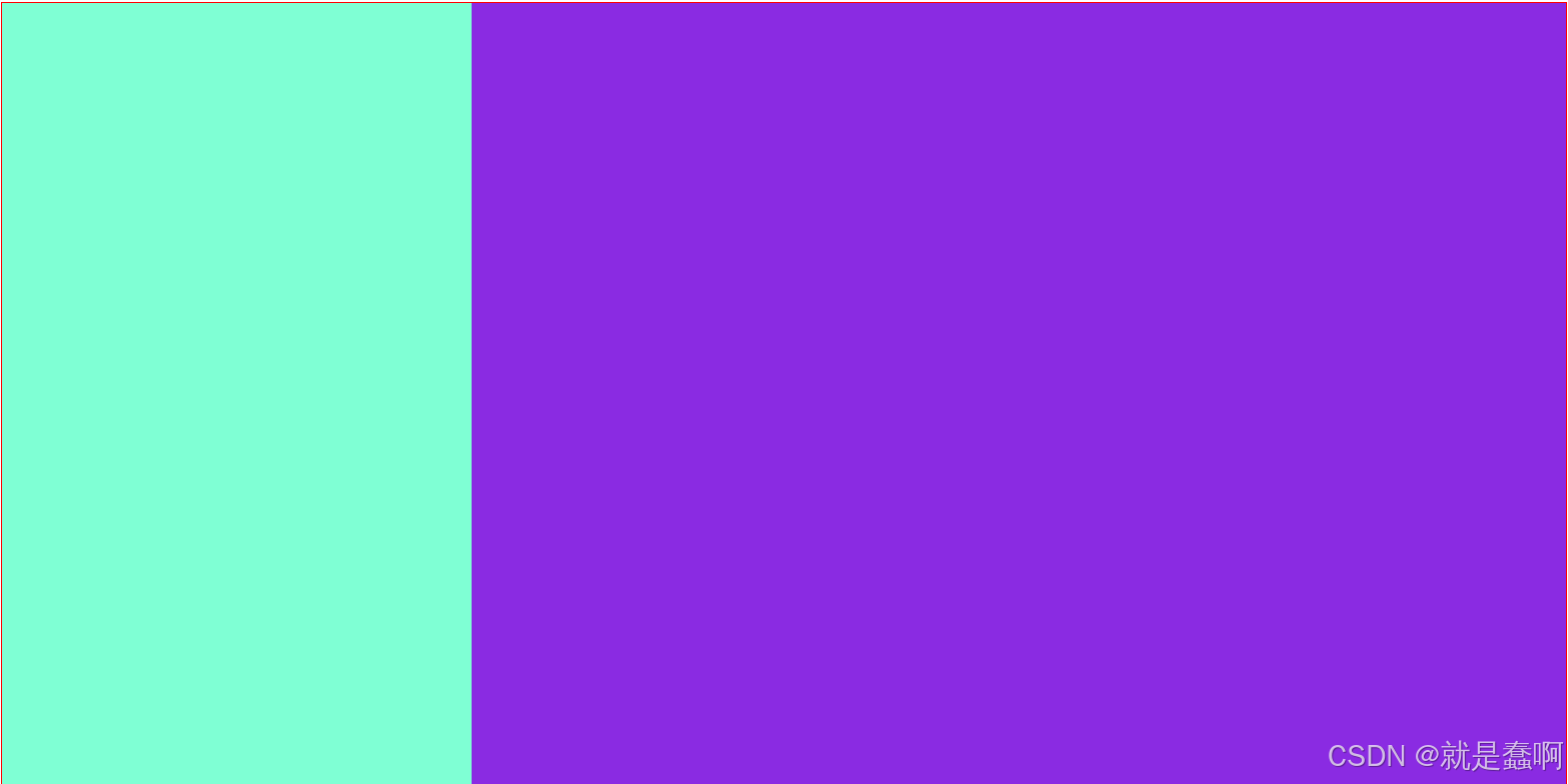
案例 2 :
html
<!DOCTYPE html>
<html lang="en">
<head>
    <meta charset="UTF-8">
    <meta name="viewport" content="width=device-width, initial-scale=1.0">
    <title>Document</title>
    <style>
        * {
            margin: 0;
            padding: 0;
        }

        .out {
            width: 880px;
            height: 170px;
            margin: 10px auto;
            background-color: aquamarine;
        }

        .one,.two,.three,.four {
            height: 150px;
            width: 200px;
            margin: 10px ;
        }

        .one {
            background-color: burlywood;
            float: left;
        }

        .two {
            background-color: cadetblue;
            float: left;
        }

        .three {
            background-color: chocolate;
            float: left;
        }

        .four {
            background-color: darkorange;
            float: left;
        }
    </style>
</head>
<body>
    <div class="out">
        <div class="one">甲</div>
        <div class="two">乙</div>
        <div class="three">丙</div>
        <div class="four">丁</div>
    </div>
</body>
</html>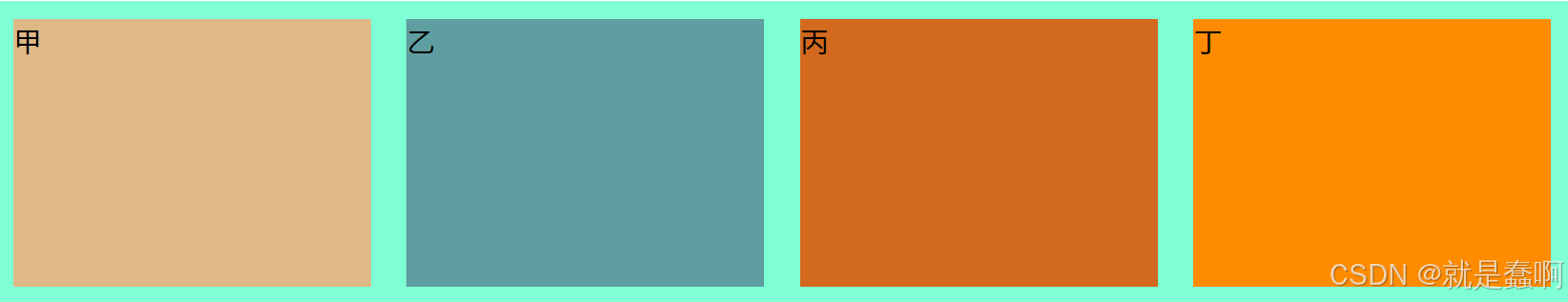
第二种方式:
html
<!DOCTYPE html>
<html lang="en">
<head>
    <meta charset="UTF-8">
    <meta name="viewport" content="width=device-width, initial-scale=1.0">
    <title>Document</title>
    <style>
        /* 在实际生活中,布局的宽高等都是有精确要求的 */
        * {
            margin: 0;
            padding: 0;
        }

        div {
            border: 1px red solid;
            width: 850px;
            height: 300px;
            margin: 10px auto;
        }

        .test {
            list-style: none;
        }

        /* 必须对 li 设置宽高,背景颜色等 */
        .test li {
            float: left;
            width: 150px;
            height: 200px;
            background-color: bisque;
            margin: 10px;
        }
    </style>
</head>
<body>
    <div>
        <ul class="test">
            <li>111</li>
            <li>222</li>
            <li>333</li>
            <li>444</li>
            <li>555</li>
        </ul>
    </div>
</body>
</html>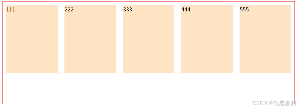
案例 3 :
html
<!DOCTYPE html>
<html lang="en">
<head>
    <meta charset="UTF-8">
    <meta name="viewport" content="width=device-width, initial-scale=1.0">
    <title>Document</title>
    <style>
        * {
            margin: 0;
            padding: 0;
        }

        .out {
            width: 1200px;
            height: 600px;
            margin: 10px auto;
            background-color: aquamarine;
        }

        .left {
            width: 350px;
            height: 600px;
            background-color: bisque;
            float: left;
        }

        .right {
            width: 850px;
            height: 00px;
            background-color: blueviolet;
            float: right;
        }

        .right ul {
            list-style: none;
        }

        .right ul li {
            float: left;
            width: 190px;
            height: 280px;
            background-color: brown;
            margin: 10px;
        }
    </style>
</head>
<body>
    <div class="out">
        <div class="left"></div>
        <div class="right">
            <ul>
                <li></li>
                <li></li>
                <li></li>
                <li></li>
                <li></li>
                <li></li>
                <li></li>
                <li></li>
            </ul>
        </div>
    </div>
</body>
</html>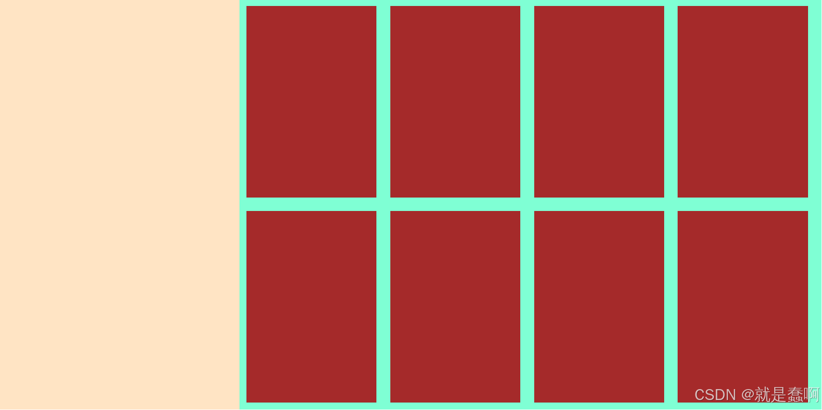
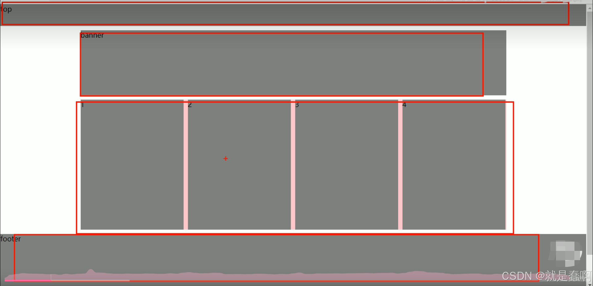
案例 4 :
html
<!DOCTYPE html>
<html lang="en">
<head>
    <meta charset="UTF-8">
    <meta name="viewport" content="width=device-width, initial-scale=1.0">
    <title>Document</title>
    <style>
        * {
            margin: 0;
            padding: 0;
        }

        .top {
            height: 100px;
            background-color: aquamarine;
        }

        .banner {
            margin: 10px auto;
            height: 100px;
            width: 1000px;
            background-color: bisque;
        }

        .up {
            width: 1000px;
            margin: 10px auto;
            background-color: burlywood;
        }

        .up ul {
            list-style: none;
        }

        .up ul li {
            width: 230px;
            height: 100px;
            float: left;
            margin: 10px 10px;
            background-color: blueviolet;
        }

        .down {
            width: 1000px;
            margin: 10px auto;
            background-color: burlywood;
        }

        .down ul {
            list-style: none;
        }

        .down ul li {
            width: 230px;
            height: 300px;
            float: left;
            margin: 10px 10px;
            background-color:burlywood;
        }

        .footer {
            height: 300px;
            background-color:cornflowerblue;
            margin-top: 460px;
        }
    </style>
</head>
<body>
    <div class="top"></div>
    <div class="banner"></div>
    <div class="up">
        <ul>
            <li></li>
            <li></li>
            <li></li>
            <li></li>
        </ul>
    </div>
    <div class="down">
        <ul>
            <li></li>
            <li></li>
            <li></li>
            <li></li>
        </ul>
    </div>
    <div class="footer"></div>
</body>
</html>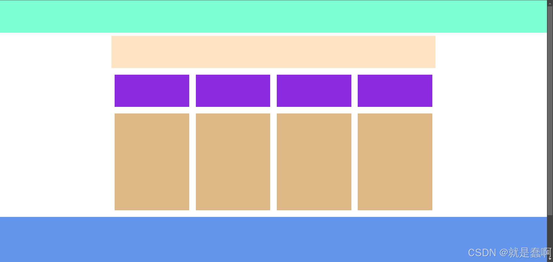
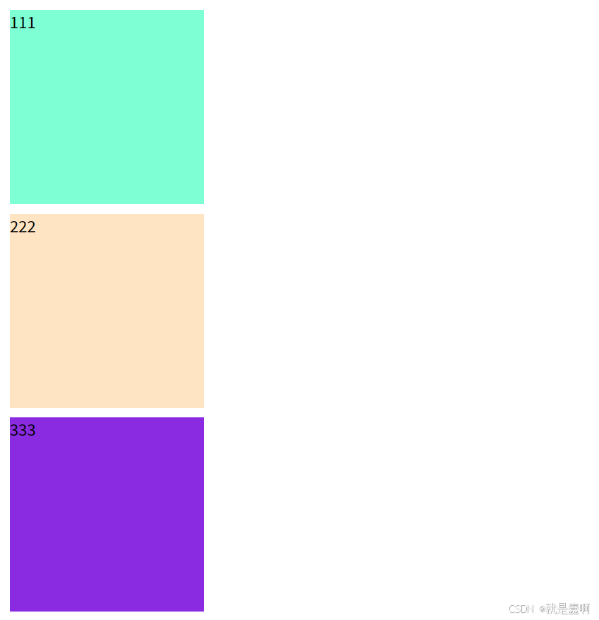
1.5 案例总结

html
<!DOCTYPE html>
<html lang="en">
<head>
    <meta charset="UTF-8">
    <meta name="viewport" content="width=device-width, initial-scale=1.0">
    <title>Document</title>
    <style>
        * {
            padding: 0;
            margin: 0;
        }


        div {
            width: 200px;
            height: 200px;
            margin-top: 10px;
            margin-left: 10px;
        }

        .one {
            background-color: aquamarine;
        }

        .two {
            background-color: bisque;
        }

        .three {
            background-color: blueviolet;
        }
    </style>
</head>
<body>
    <div class="one">111</div>
    <div class="two">222</div>
    <div class="three">333</div>
</body>
</html>