目录
前言
在上一篇文章中,我们介绍了Flutter中的隐式动画的一些相关知识,在这篇文章中,我们可以结合多个隐式动画 Widget 在 Flutter 中创建一些酷炫的视觉效果,比如弹性按钮、旋转动画、颜色过渡等。以下示例展示如何组合不同的隐式动画,以实现更复杂的视觉效果。
1.弹性放大按钮效果
我们可以通过结合隐式动画的Widget组件并且通过设置动画的属性,实现一个弹簧效果。
效果如下:
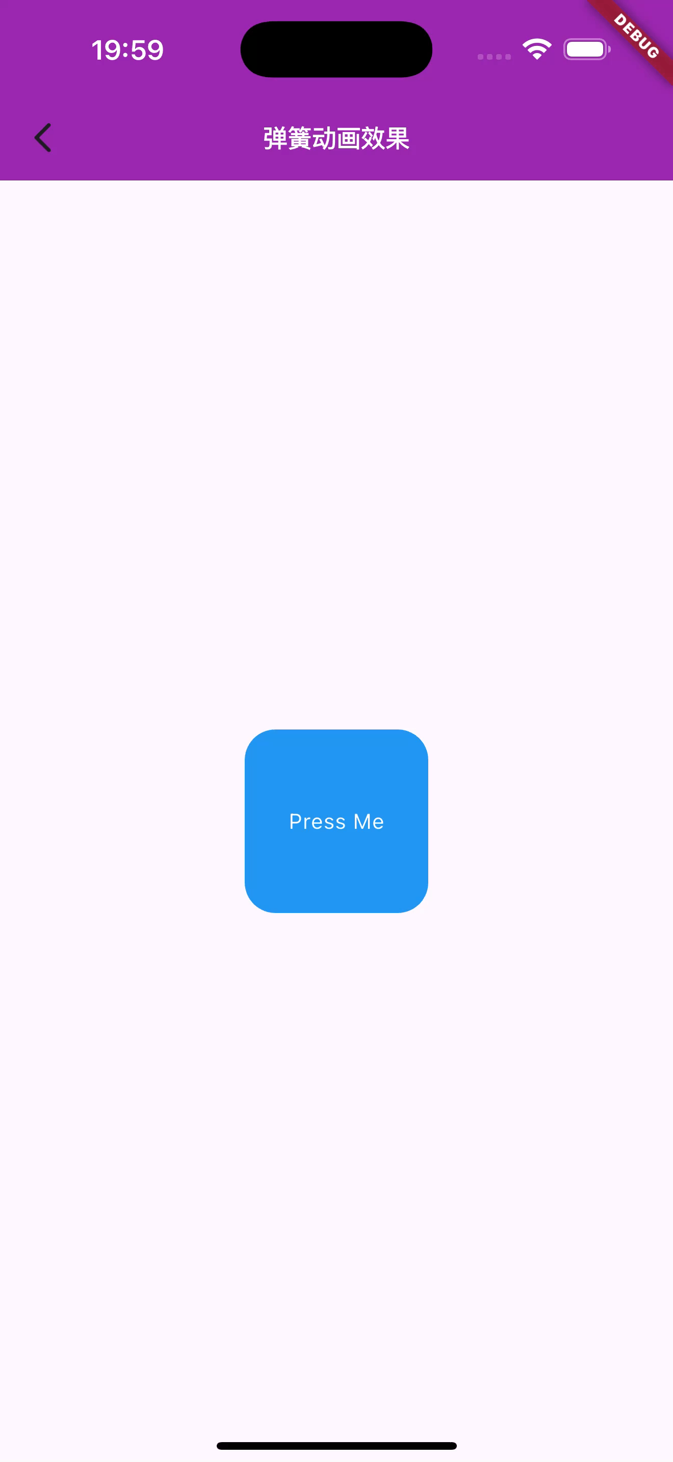
图1.使用AnimatedContainer实现弹簧动画效果
核心代码如下:
Dart
import 'package:flutter/material.dart';

class ElasticButtonExample extends StatefulWidget {
  const ElasticButtonExample({super.key});

  @override
  State<ElasticButtonExample> createState() => _ElasticButtonExampleState();
}

class _ElasticButtonExampleState extends State<ElasticButtonExample> {
  bool _isTapped = false;

  void _toggleSize() {
    setState(() {
      _isTapped = !_isTapped;
    });
  }

  @override
  Widget build(BuildContext context) {
    return Scaffold(
      appBar: AppBar(
        backgroundColor: Colors.purple,
        title: const Text('弹簧动画效果',style: TextStyle(color: Colors.white,fontWeight: FontWeight.bold,fontSize: 16),),
      ),
      body: Center(
        child: GestureDetector(
          onTap: _toggleSize,
          child: AnimatedContainer(
            duration: const Duration(milliseconds: 200),
            curve: Curves.easeOutBack,
            width: _isTapped ? 120 : 100,
            height: _isTapped ? 120 : 100,
            decoration: BoxDecoration(
              color: Colors.blue,
              borderRadius: BorderRadius.circular(20),
            ),
            child: const Center(
              child: Text(
                'Press Me',
                style: TextStyle(color: Colors.white),
              ),
            ),
          ),
        ),
      ),
    );
  }
}
2.旋转和缩放组合动画
点击按钮时实现颜色渐变、旋转和缩放组合动画,让 Widget 更加立体和动感。
在下面的例子中,我们通过结合AnimatedContainer的颜色渐变、旋转和缩放等动画属性实现一个组合的酷炫动画效果。
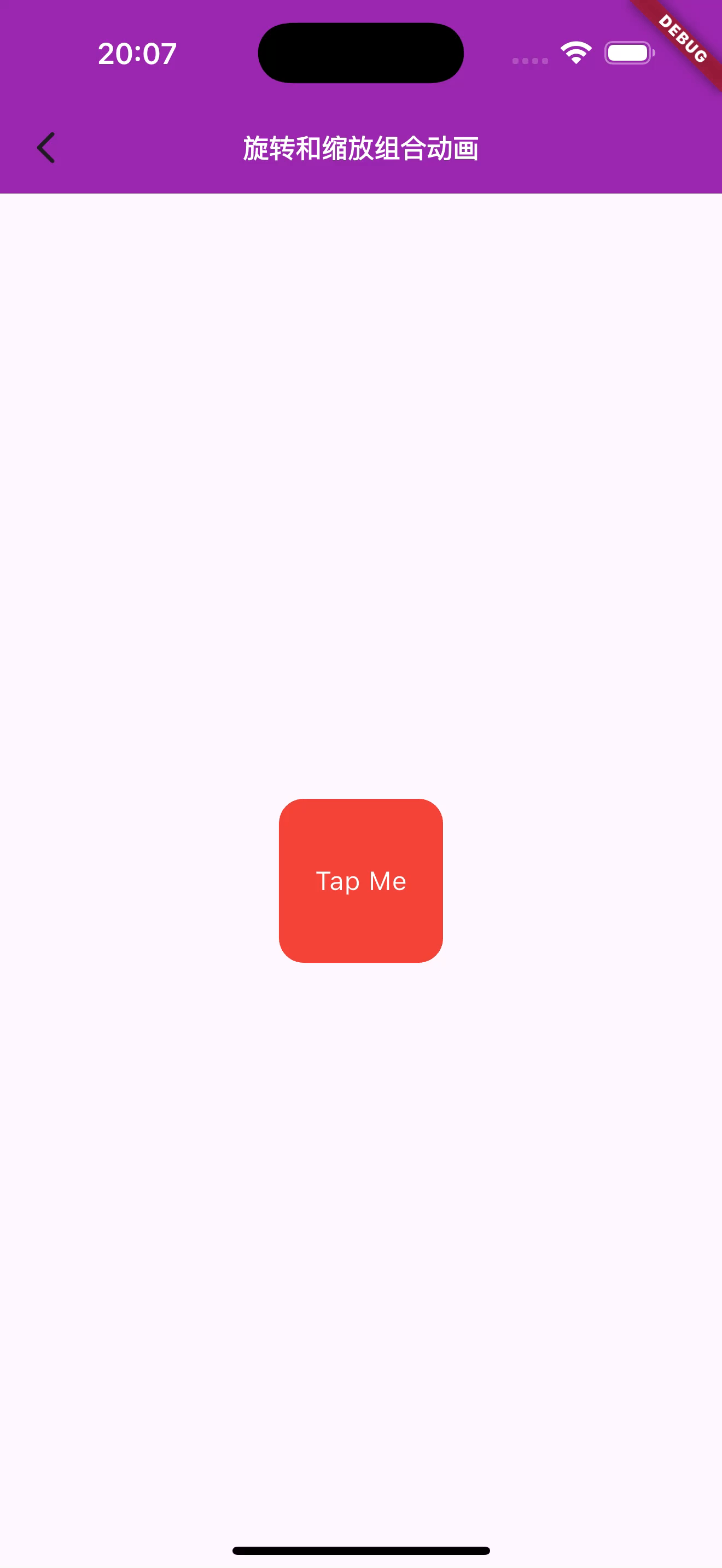
图2.旋转缩放组合动画效果
3.颜色渐变背景动画
实现点击屏幕时背景颜色渐变,带来柔和的视觉效果,适合用于内容页面切换时。
Flutter实现背景渐变动画效果
核心的代码如下:
Dart
class GradientBackgroundExample extends StatefulWidget {
  @override
  _GradientBackgroundExampleState createState() =>
      _GradientBackgroundExampleState();
}

class _GradientBackgroundExampleState extends State<GradientBackgroundExample> {
  bool _isColorChanged = false;

  void _changeBackground() {
    setState(() {
      _isColorChanged = !_isColorChanged;
    });
  }

  @override
  Widget build(BuildContext context) {
    return Scaffold(
      body: GestureDetector(
        onTap: _changeBackground,
        child: AnimatedContainer(
          duration: const Duration(seconds: 1),
          decoration: BoxDecoration(
            gradient: LinearGradient(
              colors: _isColorChanged
                  ? [Colors.purple, Colors.blue]
                  : [Colors.orange, Colors.red],
              begin: Alignment.topLeft,
              end: Alignment.bottomRight,
            ),
          ),
          child: const Center(
            child: Text(
              'Tap to Change Background',
              style: TextStyle(fontSize: 24, color: Colors.white),
            ),
          ),
        ),
      ),
    );
  }
}
4.缩放进出效果
创建一个 Widget 进入和退出时具有缩放动画效果,用于过渡显示内容。
例如我们要实现下面的效果图,主要的核心代码如下: 
图4.缩放进出动画效果
主要的核心代码如下:
Dart
class ScaleInOutExample extends StatefulWidget {
  @override
  _ScaleInOutExampleState createState() => _ScaleInOutExampleState();
}

class _ScaleInOutExampleState extends State<ScaleInOutExample> {
  bool _isVisible = true;

  void _toggleVisibility() {
    setState(() {
      _isVisible = !_isVisible;
    });
  }

  @override
  Widget build(BuildContext context) {
    return Scaffold(
      appBar: AppBar(title: const Text('Scale In/Out Example')),
      body: Center(
        child: Column(
          mainAxisAlignment: MainAxisAlignment.center,
          children: [
            AnimatedOpacity(
              duration: const Duration(milliseconds: 500),
              opacity: _isVisible ? 1.0 : 0.0,
              child: AnimatedScale(
                duration: const Duration(milliseconds: 500),
                scale: _isVisible ? 1.0 : 0.5,
                child: Container(
                  width: 100,
                  height: 100,
                  color: Colors.blue,
                  child: const Center(
                    child: Text(
                      'Hello!',
                      style: TextStyle(color: Colors.white, fontSize: 20),
                    ),
                  ),
                ),
              ),
            ),
            const SizedBox(height: 20),
            ElevatedButton(
              onPressed: _toggleVisibility,
              child: const Text('Toggle Visibility'),
            ),
          ],
        ),
      ),
    );
  }
}