移动开发闲谈(Flex和css 库)
背景
目前在做移动小程序开发,效果必须和设计稿一模一样,一个像素都不能有差异。
虽然公司也提供了图生文的工具,但是有时生成的代码可读性不太好,二次修改也比较费劲,这种情况还不如自己重写。
如果长期没有写样式,知识遗忘是正常的。
单个 css 语法问题查文档或者问 gpt 都很方便解决,重要的是要有 css 库的思路。
伸缩盒模型
简介
CSS Flexbox(弹性盒布局模型)在2009年首次提出,又称伸缩盒模型。
flexbox 提供一种简介而强大的方式来排列和对齐页面中的元素,以及定义元素视觉顺序。
Flex在移动端广泛使用。
弹性容器和弹性项目
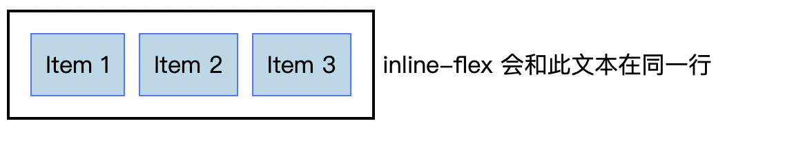
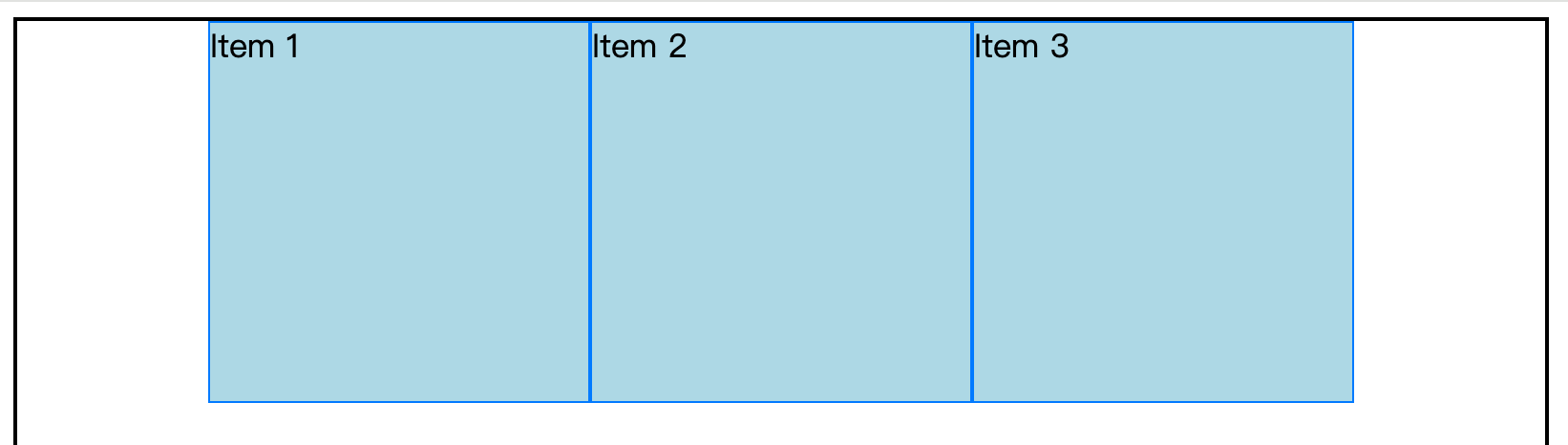
- display:flex 将元素变成
弹性容器,或者称开启flex布局,其孩子(只作用于第一代)自动变成弹性项目 - 弹性项目,不论之前是 block、inline、inline-block,都变成block。比如 span
- display: inline-flex 表现为行内元素。只占据必要的宽度,可以和其他行内元素在同一行排列。
- 一个元素可以同时是弹性容器、弹性项目
javascript
<style>
  .container {
    display: flex;
    /* display: inline-flex; */
    border: 2px solid #000;
    padding: 10px;
  }

  .item {
    box-sizing: border-box;
    background-color: lightblue;
    margin: 5px;
    padding: 10px;
    border: 1px solid #007BFF;
  }
</style>

<div class="container">
  <div class="item">Item 1</div>
  <div class="item">Item 2</div>
  <div class="item">Item 3</div>
</div> inline-flex 会和此文本在同一行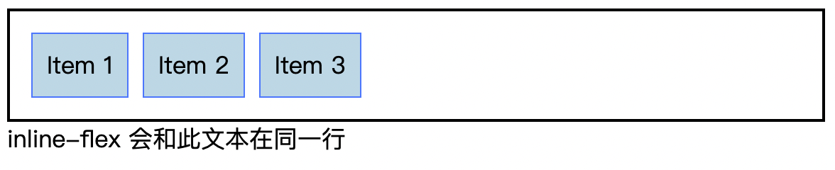
Tip:
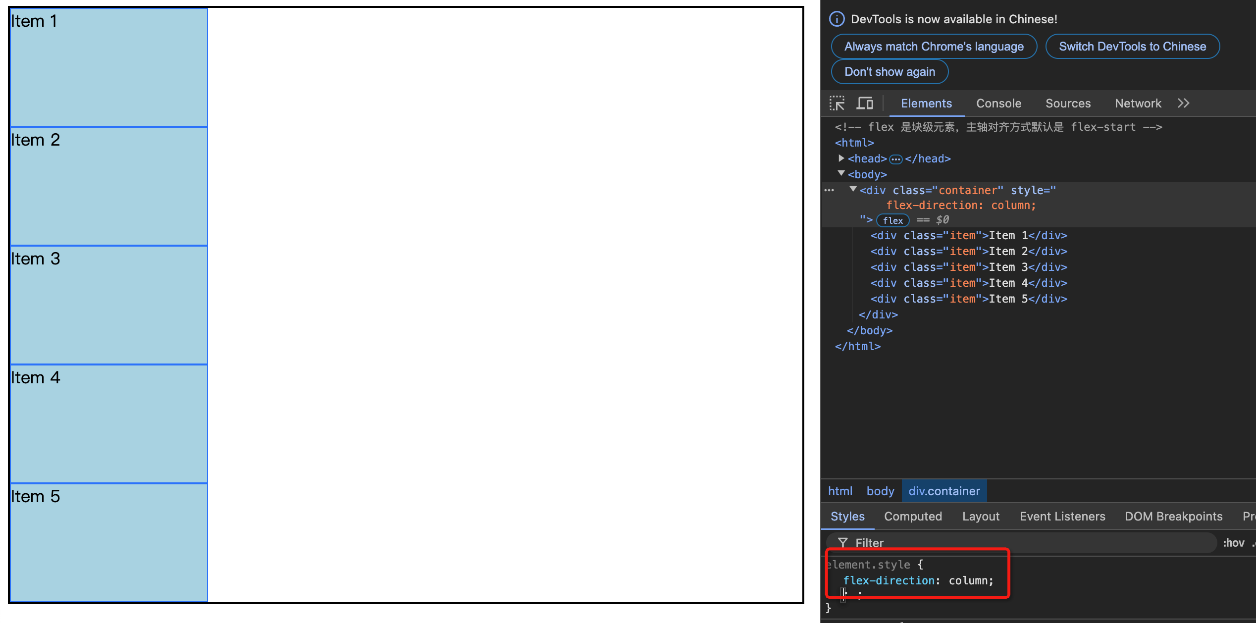
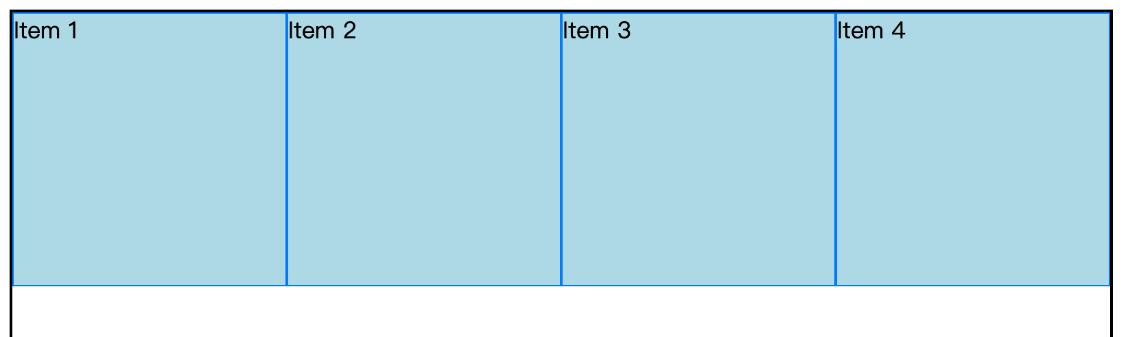
display: flex表现为块级元素;display: inline-flex表现为行内元素;display: inline-flex用的较少。比如将两个 flex 并排放在一行,但两个 flex中间容易出现空隙(比如两个 flex 之间有空格、回车)- 主轴对齐默认:
flex-start,所以上图会左对齐。
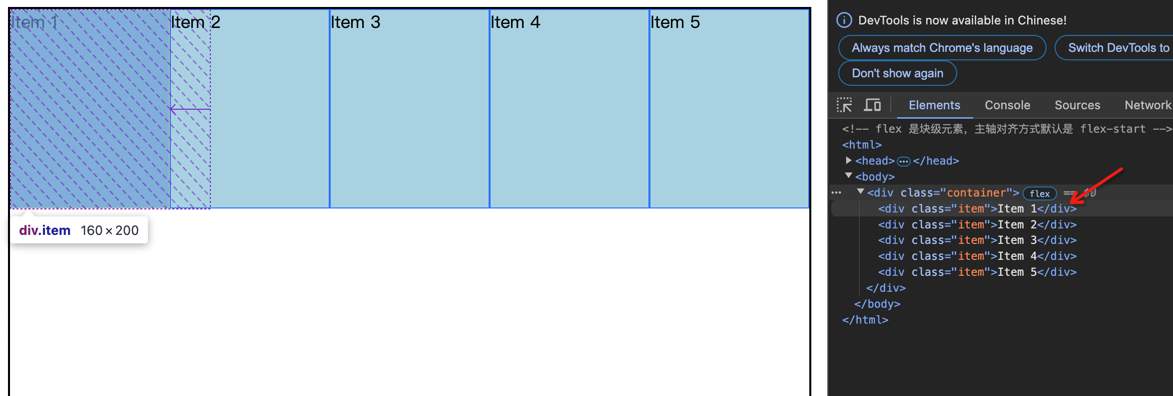
主轴方向
- 主轴默认是
从左到右。弹性项目沿着主轴方向排列。主轴不是只有一条(有N行就可以说有N条主轴) 侧轴(也叫交叉轴)总是与主轴垂直,也可以有多条。侧轴方向只会是:从上到下、从左到右。- 只能修改主轴方向。主轴变化,侧轴也会跟着变。
- 主轴和侧轴的
交叉点在哪里不用关心,因为不需要 - 弹性项目沿着主轴排列,默认方向从左到右
- 侧轴默认方向是从上到下
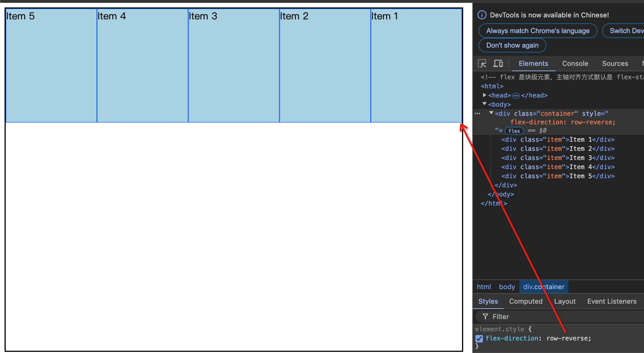
flex-direction: row(默认值:左->右)/row-reverse(右->左)/column(上-> 下)/column-reverse(下->上)
默认不换行(flex-wrap: nowrap):
javascript
.container {
  display: flex;
  align-items: center;
  border: 2px solid #000;
  padding: 10px;
}
flex-direction: row/row-reverse(侧轴对应的方向是:上到下)。请看下图:
flex-direction:column(上到下)/column-reverse(侧轴对应的方向:左到右)。请看下图:
主轴换行
主轴换行:flex-wrap: nowrap(默认)/wrap 换行/wrap-reverse 反向换行
主轴默认是不换行的。比如宽度800600的弹性容器,其中弹性项目宽度200 200,放4个正好。在加一个,仍旧排在一行。这里体现了缩(chrome工具有提示)
如果需要第5个换行,需要将 nowrap 改成 wrap 即可。
javascript
  display: flex;
- flex-wrap: wrap;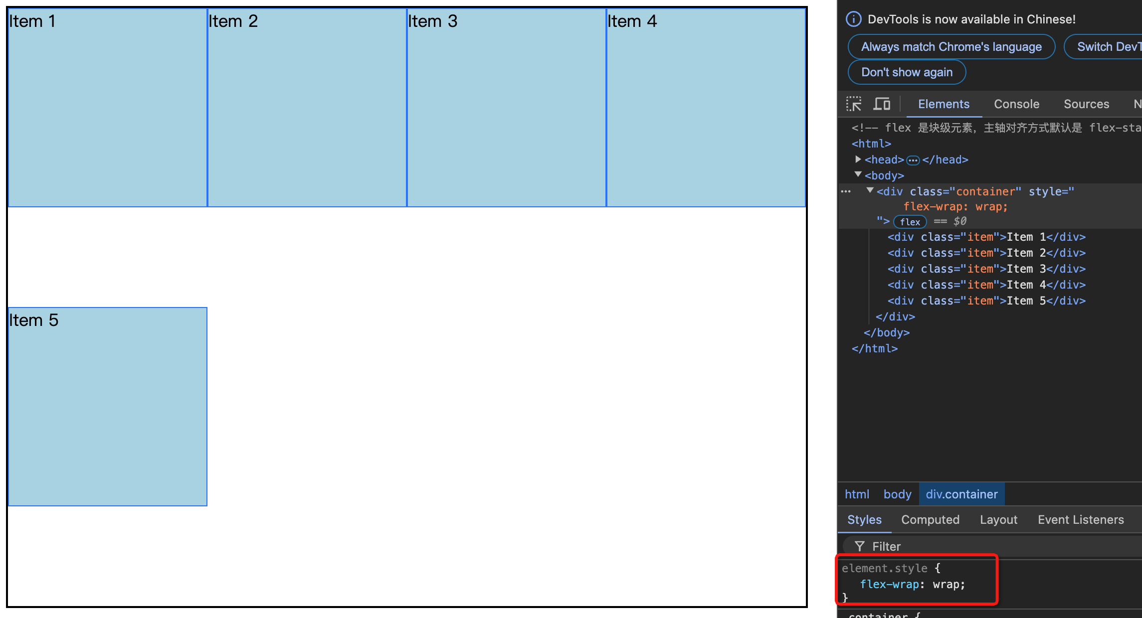
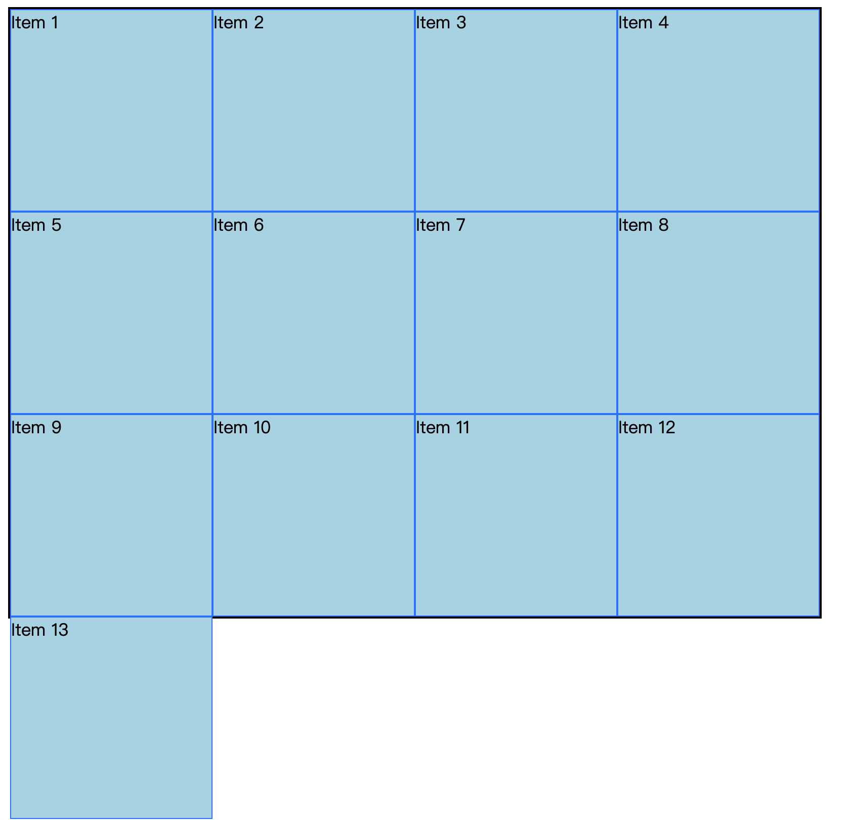
主轴方向比较节省,大家挤一挤。侧轴方向就有点败家(有多的就多花,没有多余的也不会挤一挤)。比如第5个换行后,发现下面还有400的高度,自己占200,没必要和第一行挤在一起,就放在下面400的中间,上下间距100。
第9个出现后,就和上铺的兄弟说,空间不够了,没必要浪费了,于是第二排(例如第5个)紧挨着第一排

第13个出现,则超出容器(600px高度)排列
wrap-reverse:反向换行。之前是从上到下换行,现在是从下到上换行。
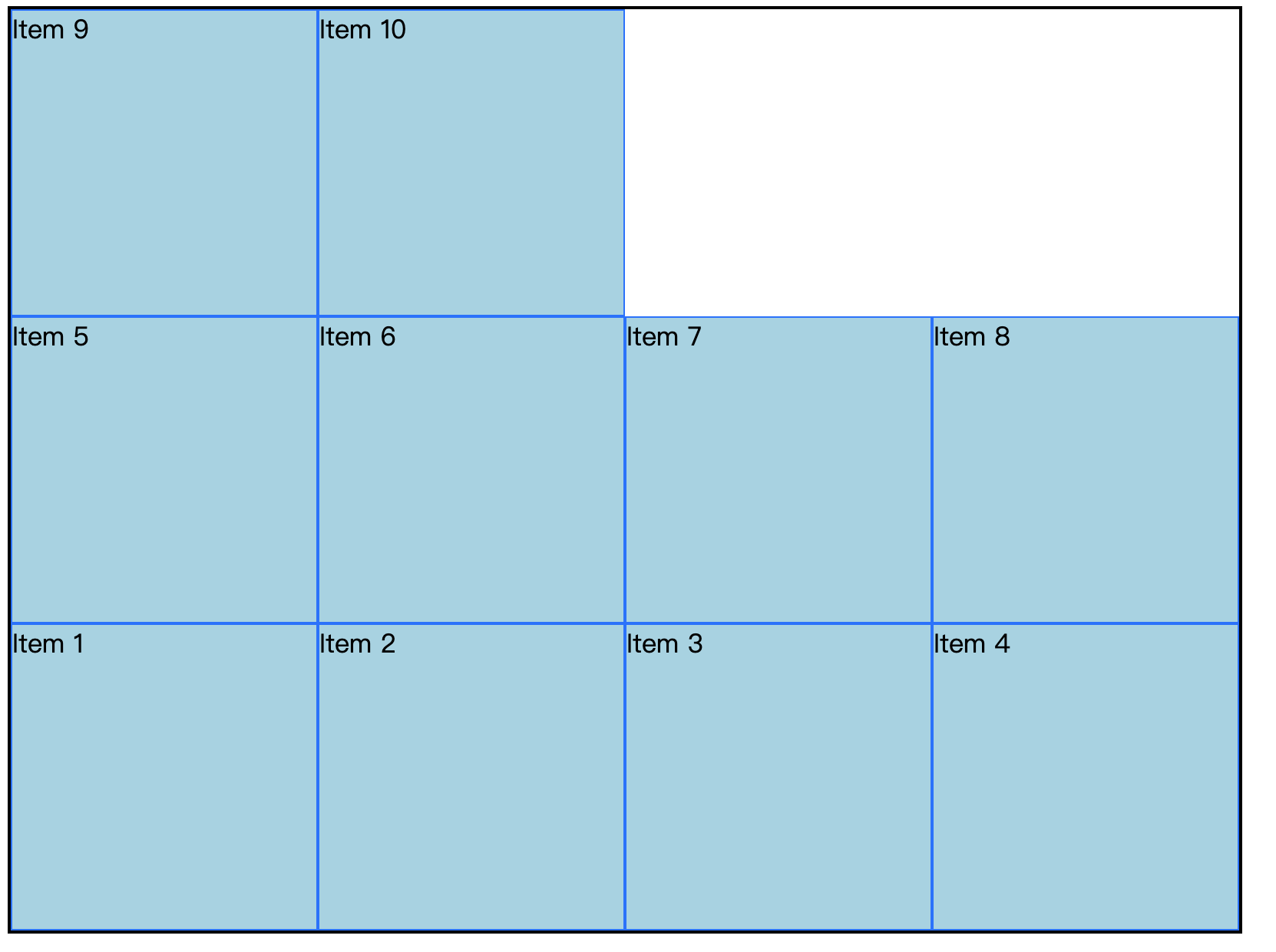
javascript
<style>
  .container {
    height: 600px;
    width: 800px;
    display: flex;
    border: 2px solid #000;
    flex-wrap: wrap-reverse;
  }

  .item {
    box-sizing: border-box;
    background-color: lightblue;
    width: 200px;
    height: 200px;
    border: 1px solid #007BFF;
  }
</style>

<div class="container">
  <div class="item">Item 1</div>
  <div class="item">Item 2</div>
  <div class="item">Item 3</div>
  <div class="item">Item 4</div>
  <div class="item">Item 5</div>
</div>
主轴对齐
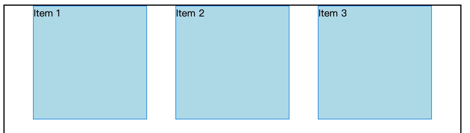
justify-content,中文"调整内容"。内容先放上去,然后在调整对齐方式。值有:
- flex-start(默认值)
- flex-start(主轴起点对齐,默认值)
- flex-end(主轴终点对齐。项目顺序不用变)
- center(居中)
space-between(项目均匀分布,边缘项目紧贴容器。较常用)- space-around(项目均匀分布,边缘是非边缘间距的一半)
- space-evenly(项目均匀分布,边缘和非边缘间距相同)
注:如果太满(一行没有任何间隙),无论哪个属性,都看不出变化。第一行填满后再增加一项,假如换到了第二行,新加的这项的对齐方式就能看出来
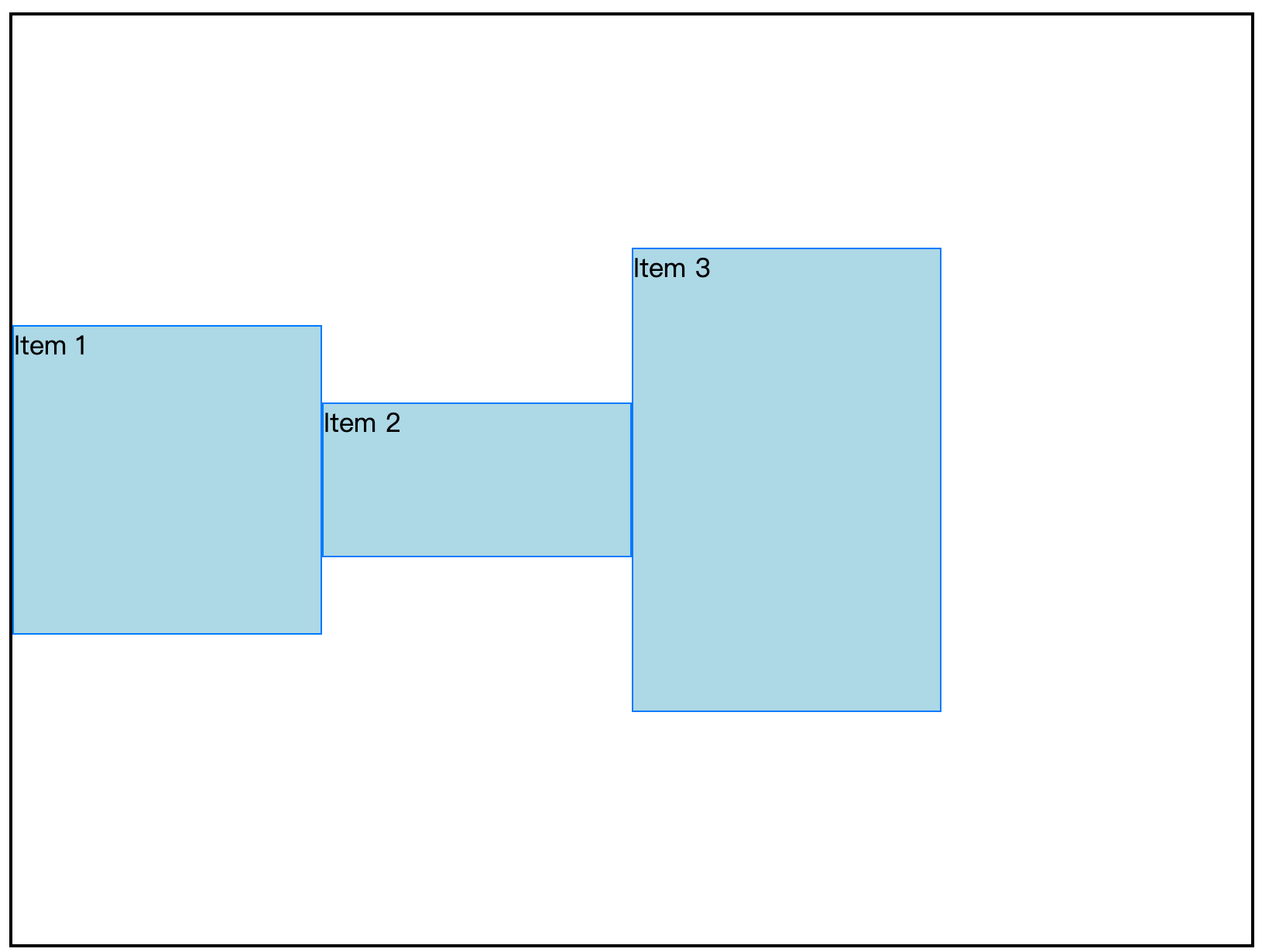
居中对齐:justify-content: center。请看下图:
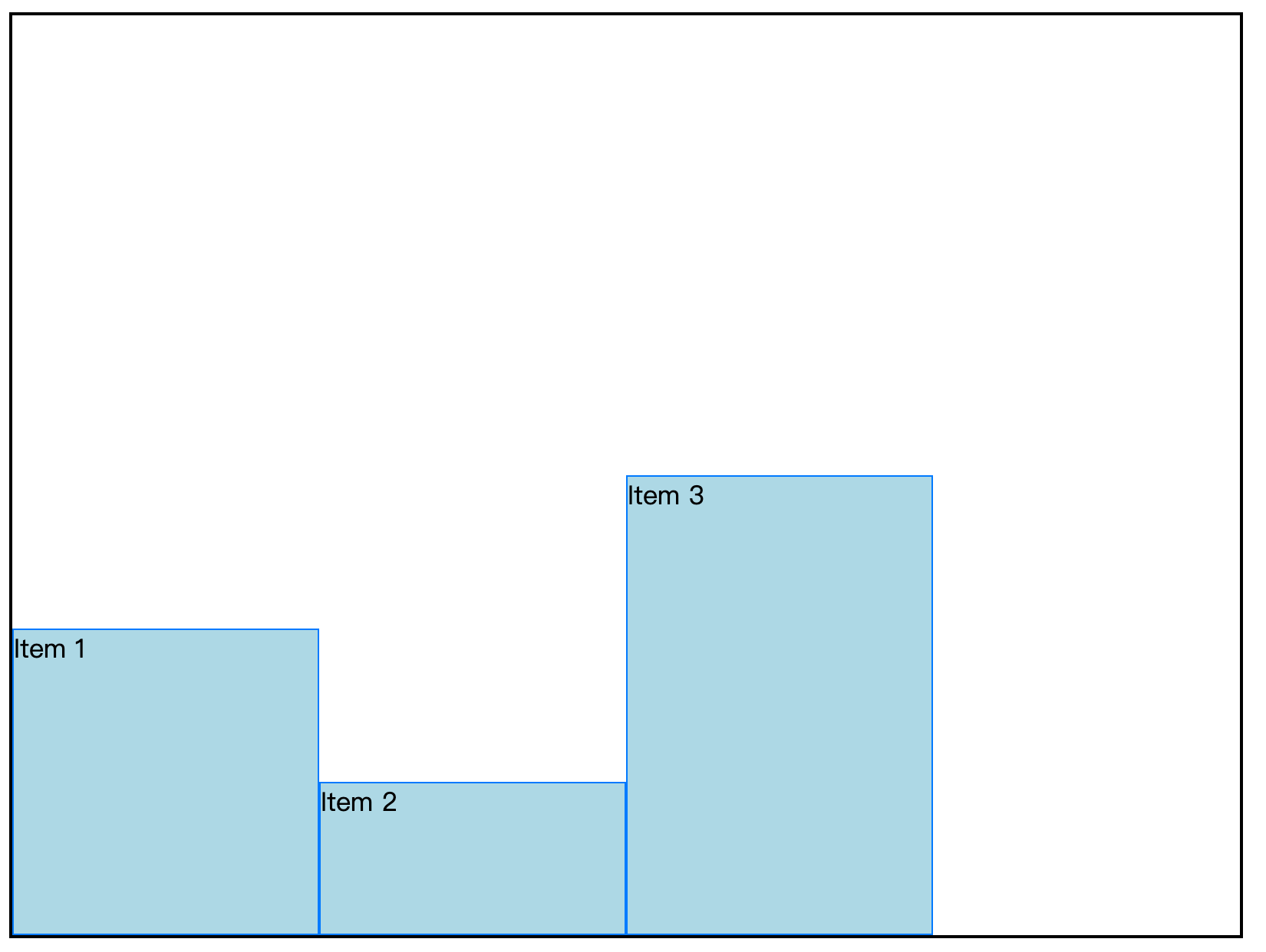
主轴终点对齐:justify-content: flex-end。请看下图:
注:别和换主轴方向(flex-direction: row-reverse)搞混
项目均匀分布,边缘是非边缘间距的一半:justify-content:space-around。请看下图:

项目均匀分布,边缘项目紧贴容器:justify-content:space-between。请看下图:

项目均匀分布,边缘和非边缘间距相同:justify-content: space-evenly。请看下图:
注:如果太满,无论哪个属性,都看不出变化。例如这里的:justify-content: flex-end
javascript
<style>
  .container {
    height: 600px;
    width: 800px;
    display: flex;
    border: 2px solid #000;
    flex-wrap: wrap;
    justify-content: center;
  }

  .item {
    box-sizing: border-box;
    background-color: lightblue;
    width: 200px;
    height: 200px;
    border: 1px solid #007BFF;
  }
</style>

<div class="container">
  <div class="item">Item 1</div>
  <div class="item">Item 2</div>
  <div class="item">Item 3</div>
</div>Tip:更多详情请看:mdn justify-content
侧轴对齐
分单行和多行,每种情况用的属性不同。
单行用 align-items,多行用 align-content。
总结:
- 项目多行:align-content: stretch(默认值。平分剩余容器高度,需要项目不设置高度)/flex-start(侧轴起点对齐)/flex-end(侧轴终点对齐)/center/space-around(和主轴对齐中的属性值含义类似)/space-between/space-evenly(侧轴完全平分间隙)
- 项目多行:每行的高度由其中最高的项目决定
项目单行
align-items:
- flex-start,侧轴起点对齐
- flex-end,侧轴终点对齐
- stretch,默认值。中文"拉伸",如果弹性项目没有设置高度,将拉伸到容器高度
- baseline,第一行文字基线对齐。基本不用。
javascript
<style>
  .container {
    height: 600px;
    width: 800px;
    display: flex;
    border: 2px solid #000;
    flex-wrap: wrap;
    justify-content: flex-start;
  }

  .item {
    box-sizing: border-box;
    background-color: lightblue;
    width: 200px;
    height: 200px;
    border: 1px solid #007BFF;
  }
  .fn-h1{ height: 100px;}
  .fn-h2{ height: 300px;}
</style>

<div class="container">
  <div class="item">Item 1</div>
  <div class="item fn-h1">Item 2</div>
  <div class="item fn-h2">Item 3</div>
</div>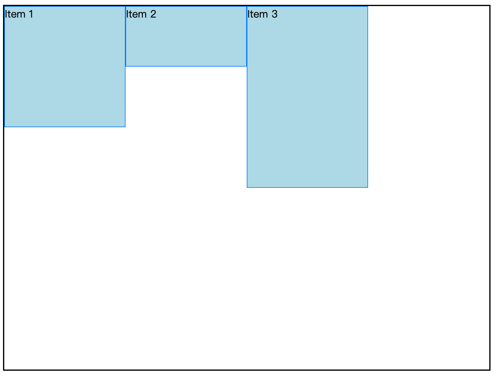
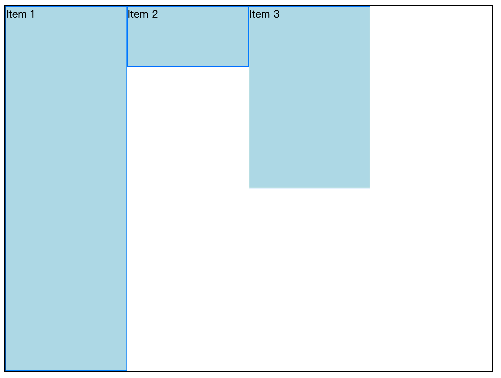
侧轴默认对齐不是顶部:align-items: flex-start,虽然上图表现的效果和 flex-start。这个稍后我们讲。
侧轴底部对齐:align-items: flex-end;
侧轴居中对齐:align-items: center。效果如下:
侧轴基线对齐(几乎不用):align-items: baseline;。请看下图:

align-items: stretch 是默认值,将伸缩项填充父容器高度。
只有伸缩项没有高度时才能拉伸。例如把高度去掉,效果就出来了。
javascript
<style>
  .container {
    height: 600px;
    width: 800px;
    display: flex;
    border: 2px solid #000;
    flex-wrap: wrap;
    justify-content: flex-start;
  }

  .item {
    box-sizing: border-box;
    background-color: lightblue;
    width: 200px;
    /* height: 200px; */
    border: 1px solid #007BFF;
  }
  /* .fn-h1{ height: 100px;} */
  /* .fn-h2{ height: 300px;} */
</style>

<div class="container">
  <div class="item">Item 1</div>
  <div class="item fn-h1">Item 2</div>
  <div class="item fn-h2">Item 3</div>
</div>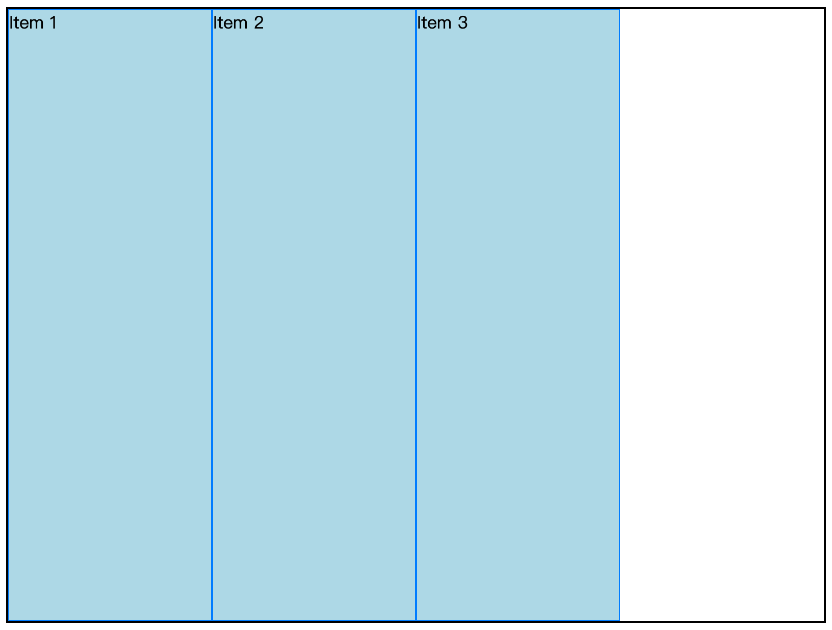
前面因为有高度,无法拉伸,所以效果和 align-items: flex-start 相同。
例如设置后两项的高度,align-items: stretch 效果如下图所示:
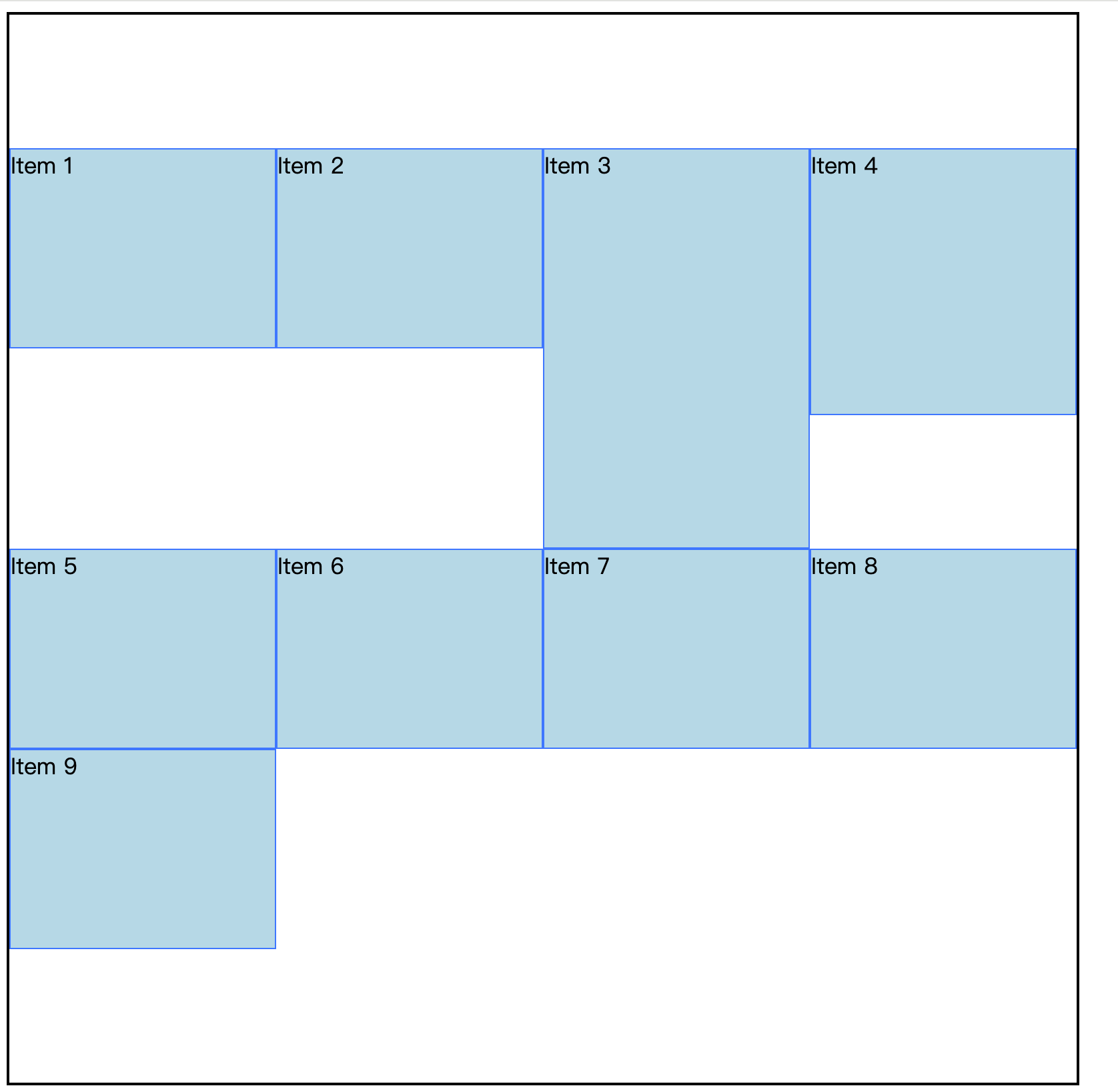
项目多行
align-content(和主轴对齐justify-content的值相似)
- flex-start,侧轴起点对齐
- flex-end,侧轴终点对齐
- center,侧轴中点对齐
space-between,项目均匀分布,边缘项目紧贴容器- space-around,项目均匀分布,边缘是非边缘间距的一半
- space-evenly,项目均匀分布,边缘和非边缘间距相同
- stretch,侧轴拉伸对齐。默认值。没有高度的时候生效。
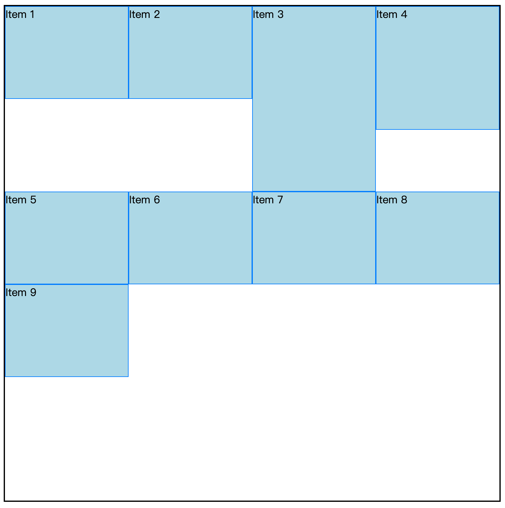
准备环境:准备3行,弹性项目高度不一致。
javascript
<style>
  .container {
    height: 800px;
    width: 800px;
    display: flex;
    border: 2px solid #000;
    flex-wrap: wrap;
  }

  .item {
    box-sizing: border-box;
    background-color: lightblue;
    width: 200px;
    height: 150px;
    border: 1px solid #007BFF;
  }
  .fn-h1{ height: 200px;}
  .fn-h2{ height: 300px;}
</style>

<div class="container">
  <div class="item">Item 1</div>
  <div class="item">Item 2</div>
  <div class="item fn-h2">Item 3</div>
  <div class="item fn-h1">Item 4</div>
  <div class="item">Item 5</div>
  <div class="item">Item 6</div>
  <div class="item">Item 7</div>
  <div class="item">Item 8</div>
  <div class="item">Item 9</div>
</div>
每行以最高的弹性项目为准,侧轴对齐这里讲的就是如何分配多余的空间。前面我们说到侧轴不太会过日子,有点败家。这里我们研究如何败家。
侧轴起点对齐:align-content: flex-start
侧轴中点对齐:align-content: center
侧轴拉伸对齐:align-content: stretch 默认值。假如三行的高度都去掉,将会平分容器的高度
css
.item {
  box-sizing: border-box;
  background-color: lightblue;
  width: 200px;
  /* height: 150px; */
  border: 1px solid #007BFF;
}
/* .fn-h1{ height: 200px;} */
/* .fn-h2{ height: 300px;} */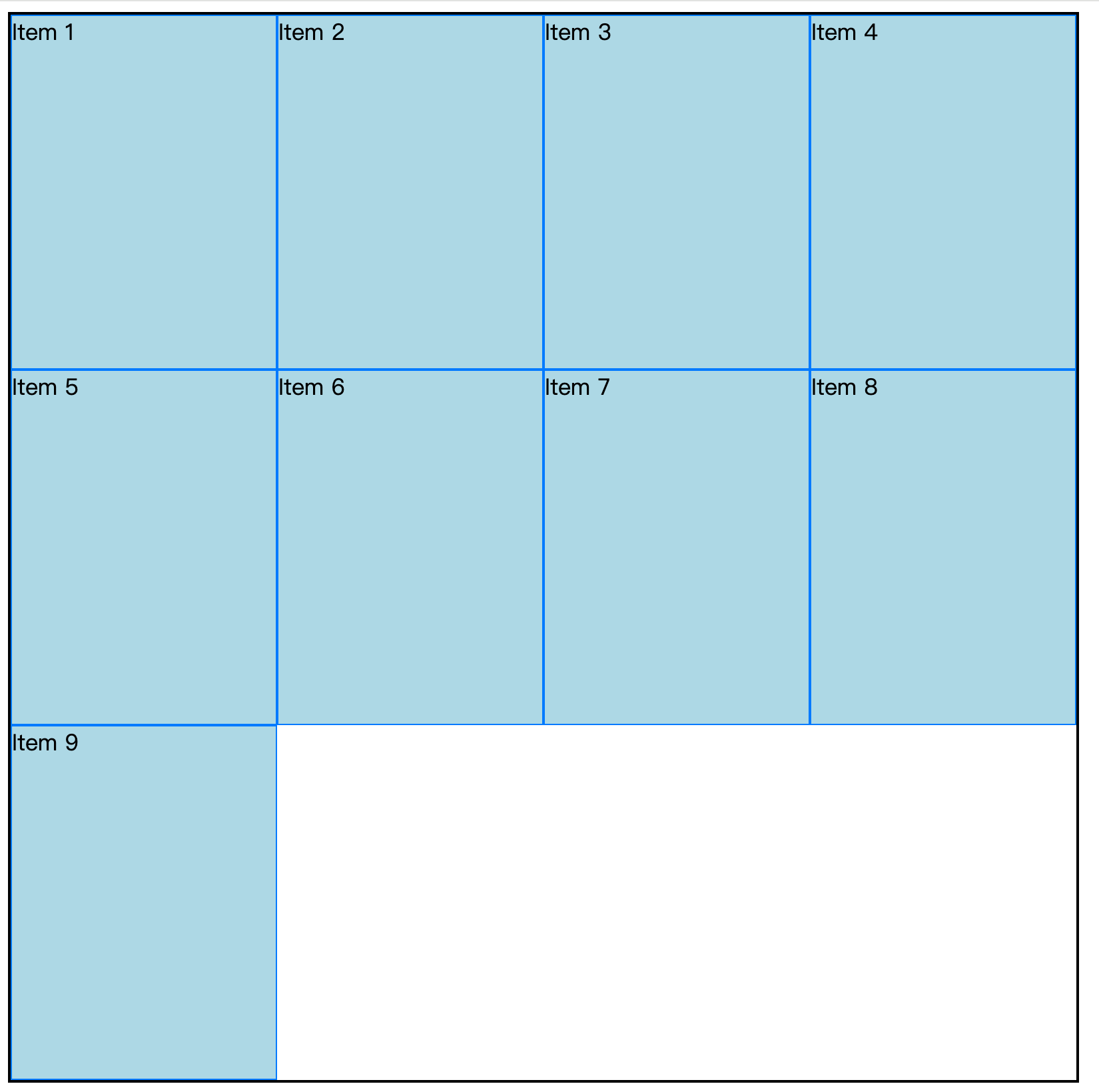
水平垂直居中
方式1
css
display: flex;
align-items: center;
justify-content: center;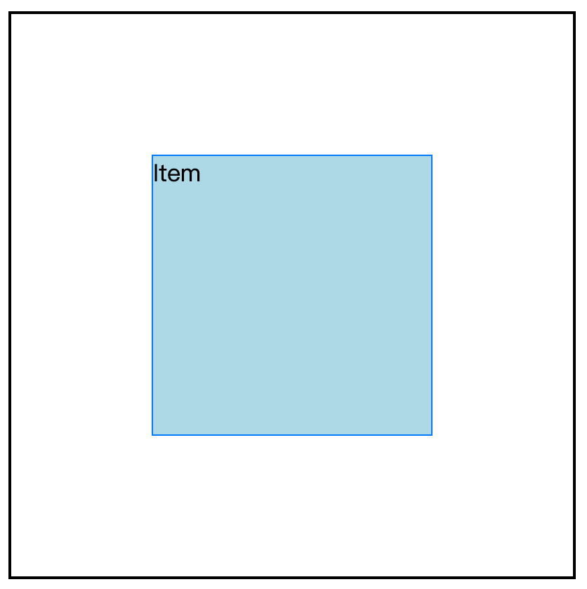
完整代码:
css
<style>
  .container {
    height: 400px;
    width: 400px;
    display: flex;
    align-items: center;
    justify-content: center;
    border: 2px solid #000;
    flex-wrap: wrap;
  }

  .item {
    box-sizing: border-box;
    background-color: lightblue;
    width: 200px;
    height: 200px;
    border: 1px solid #007BFF;
  }
</style>

<div class="container">
  <div class="item">Item</div>
</div>
方式2
父元素 display: flex,子元素 margin: auto,也能实现方式1的效果。
css
<style>
  .container {
    height: 400px;
    width: 400px;
    display: flex;
    border: 2px solid #000;
    flex-wrap: wrap;
  }

  .item {
    margin: auto;
    box-sizing: border-box;
    background-color: lightblue;
    width: 200px;
    height: 200px;
    border: 1px solid #007BFF;
  }
</style>
伸缩性
flex-grow 伸
flex-grow: 1。默认是 0,表示主轴方向存在多余空间,也不拉伸。
为了研究 flex-grow,先准备环境:
css
<style>
  .container {
    height: 800px;
    width: 1000px;
    display: flex;
    border: 2px solid #000;
    flex-wrap: wrap;
  }

  .item {
    box-sizing: border-box;
    background-color: lightblue;
    width: 200px;
    height: 200px;
    border: 1px solid #007BFF;
  }
  .u1 {
    flex-basis: 300px;
  }
</style>

<div class="container">
  <div class="item">Item1</div>
  <div class="item">Item2</div>
  <div class="item u1">Item3</div>
</div>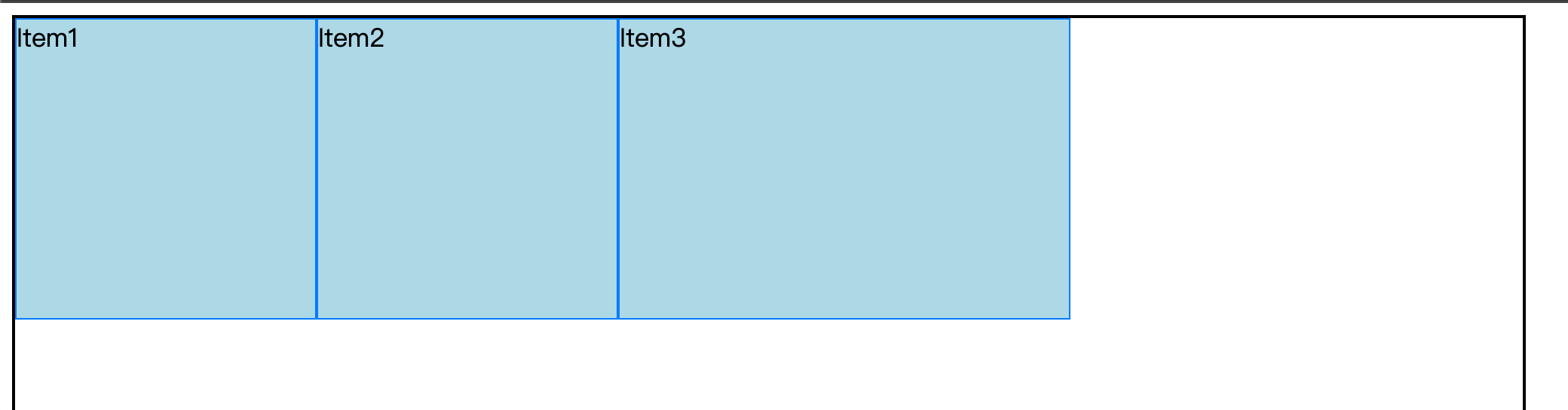
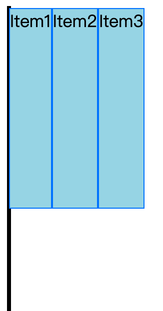
上图可以知道,默认是没有拉伸的。因为剩余300px。
我们给弹性项目增加 flex-grow: 1,弹性盒子则会瓜分剩余空间。
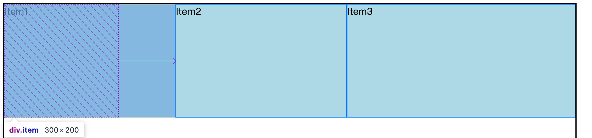
每一个弹性项目都占1/3。
若3个伸缩项目flex-grow的值分别是 1、1、2,则分别瓜分 1/4、1/4、2/4。
flex-grow 默认是 0,即主轴存在剩余空间,也不拉伸。
flex-shrink 缩
flex-shrink,默认值是1。空间不够,会收缩。
注:收缩的比例不同于拉伸
准备环境:弹性盒子宽度是700,但容器宽度只有400
css
<style>
  .container {
    height: 800px;
    width: 400px;
    display: flex;
    border: 2px solid #000;
    /* 不要换行 */
    flex-wrap: nowrap;
  }

  .item {
    box-sizing: border-box;
    background-color: lightblue;
    width: 200px;
    height: 200px;
    border: 1px solid #007BFF;
  }
  .u1 {
    flex-basis: 300px;
  }
</style>

<div class="container">
  <div class="item">Item1</div>
  <div class="item">Item2</div>
  <div class="item u1">Item3</div>
</div>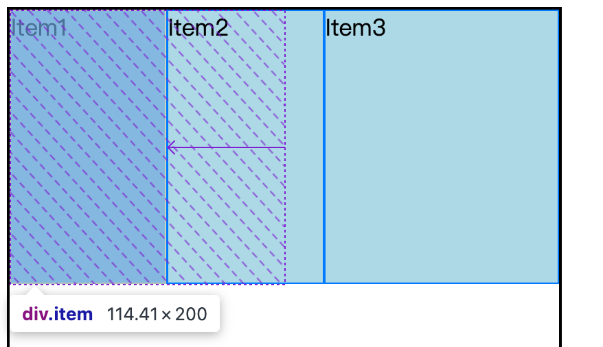
容器有富裕的时候,大家按比例分,但是容器不富裕时,就不是这个规则。否则大家都应该减去100。但上图得知 item1 还有114.41,而不是100。item1 也不是200。
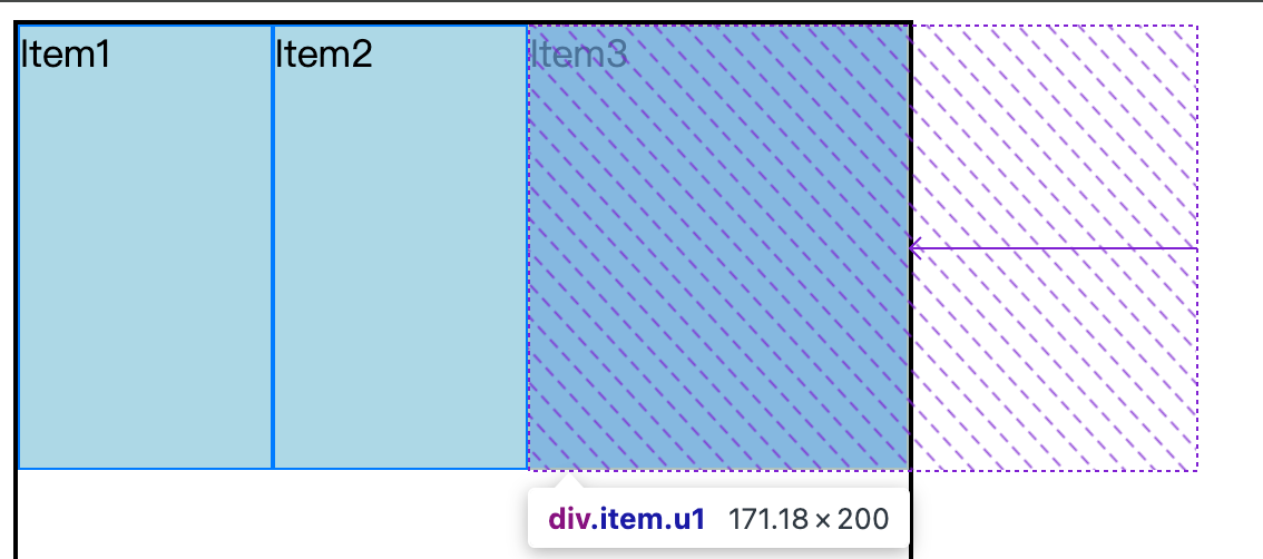
规则是这样:
item1 剩余计算规则:
javascript
1. 缩小比例: 200/(200+200+300)
2. 缩小值:缩小比例 * 300
3. item1 剩余值:

200 - (200/700)*300 = 114.2857142857
但是浏览器是 114.41 和 114.285不一样,原因是浏览器的锅,由于弹性盒子的边框问题造成。
注释掉弹性盒子的边框:
css
  .item {
    /* box-sizing: border-box; */
    background-color: lightblue;
    width: 200px;
    height: 200px;
    /* border: 1px solid #007BFF; */
  }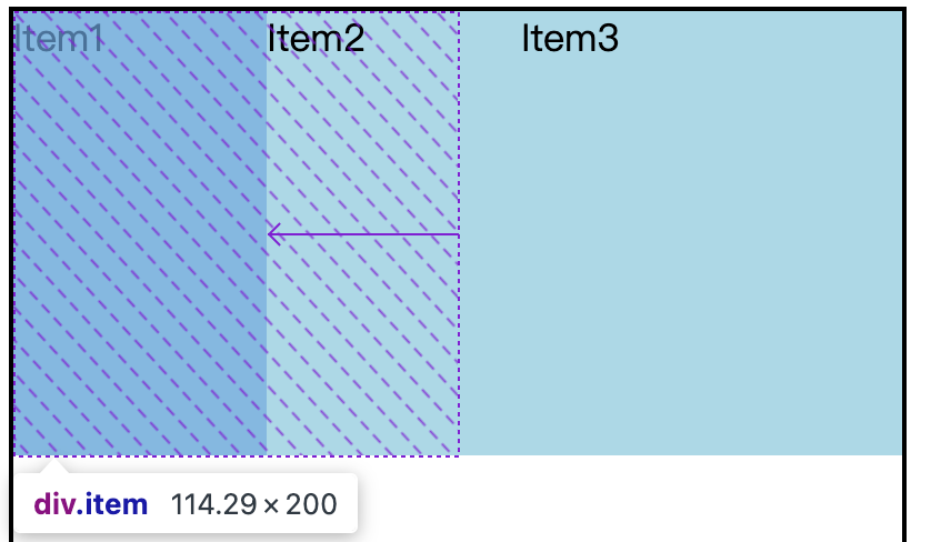
这个值和 114.285就非常接近了。
为什么缩的规则不能简单设置为大家均摊赔了多少钱?比如有的弹性项目本来就只有20,你要人家陪100,不合适。
Tip:缩的极限,即内容能呈现
flex复合属性
flex是3个属性的复合属性,三值顺序必须是:flex-grow、flex-shrink、flex-basis
css
<style>
  .container {
    height: 800px;
    width: 800px;
    display: flex;
    border: 2px solid #000;
    flex-wrap: nowrap;
  }

  .item {
    box-sizing: border-box;
    background-color: lightblue;
    width: 200px;
    height: 200px;
    border: 1px solid #007BFF;
    flex-grow: 1;
    flex-shrink: 1;
    flex-basis: 0;
  }

</style>

<div class="container">
  <div class="item">Item1</div>
  <div class="item">Item2</div>
  <div class="item u1">Item3</div>
</div>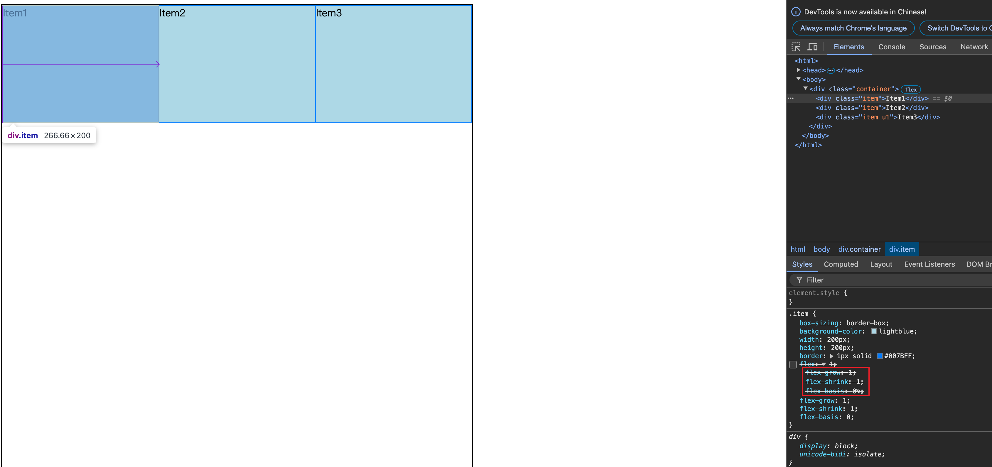
css
flex: 1 1 100px;

/* 等价 */

flex-grow: 1;
flex-shrink 1;
flex-basis: 100px;
css
flex-grow: 1;
flex-shrink: 1;
flex-basis: 0;

/* 等于 */

flex: 1 1 0; /* 最常用。0表示没有宽度,按照 "伸" 来走 */

/* 等于 */

flex: 1;
flex 复合属性之所以感觉难,是因为它还有缩写。比如:
css
flex: auto;

/* 等价 */

flex: 1 1 auto;
css
flex: none

/* 等于 */
flex: 0 0 auto;
css
flex: 0 auto; /* flex 初始值 */

/* 等于 */

flex: 0 1 auto;
排序
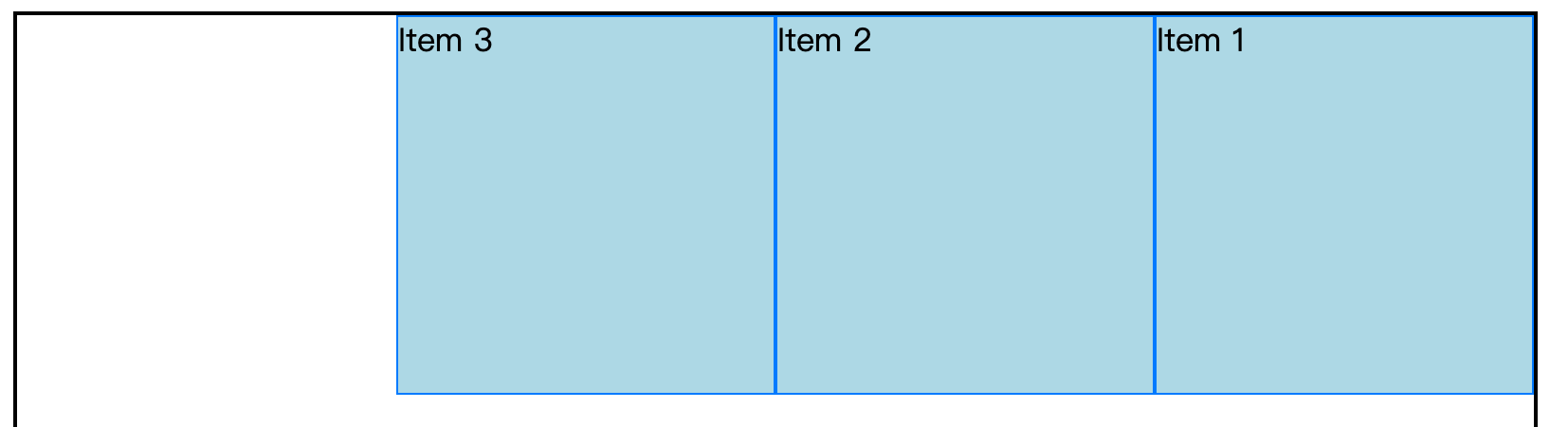
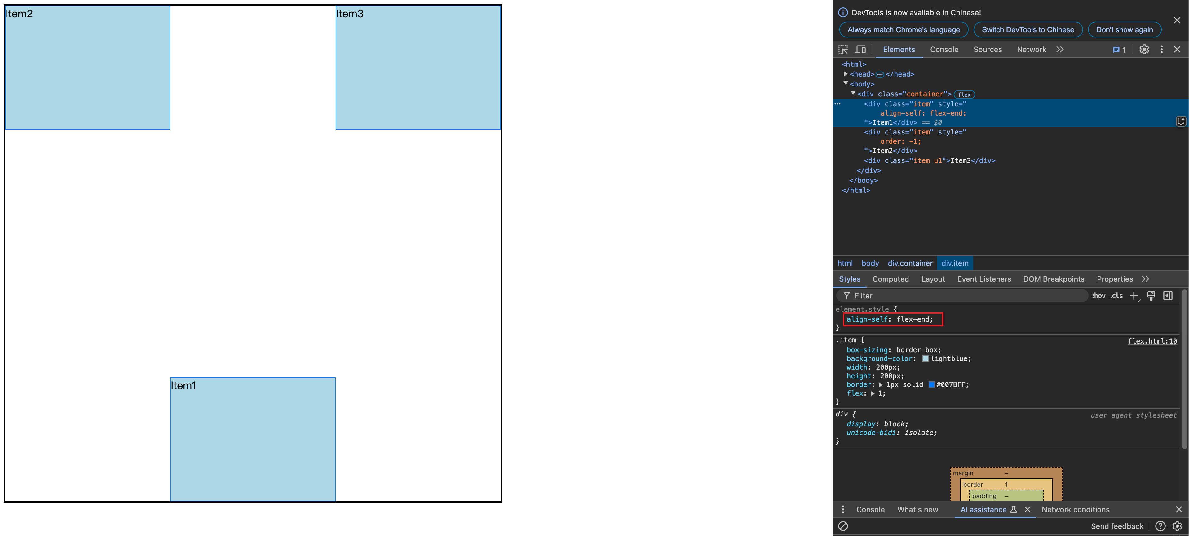
order,默认值是0,值越小,排列越靠前
其他
flex-flow
flex-flow 是复合属性,不建议使用。复合了flex-direction 和 flex-wrap
基准长度
flex-basis(使用较少) 设置主轴方向的基准长度,会让宽度(主轴是水平方向)或高度(主轴是垂直方向)失效
默认值是auto,即弹性盒子的宽度或高度。
浏览器用 flex-basis 计算主轴是否有富裕的空间。
下面示例会让宽度失效
css
<style>
  .container {
    height: 800px;
    width: 800px;
    display: flex;
    border: 2px solid #000;
    flex-wrap: wrap;
  }

  .item {
    box-sizing: border-box;
    background-color: lightblue;
    width: 200px;
    height: 200px;
    border: 1px solid #007BFF;
  }
  .u1 {
    flex-basis: 300px;
  }
</style>

<div class="container">
  <div class="item">Item1</div>
  <div class="item u1">Item2</div>
  <div class="item">Item3</div>
</div>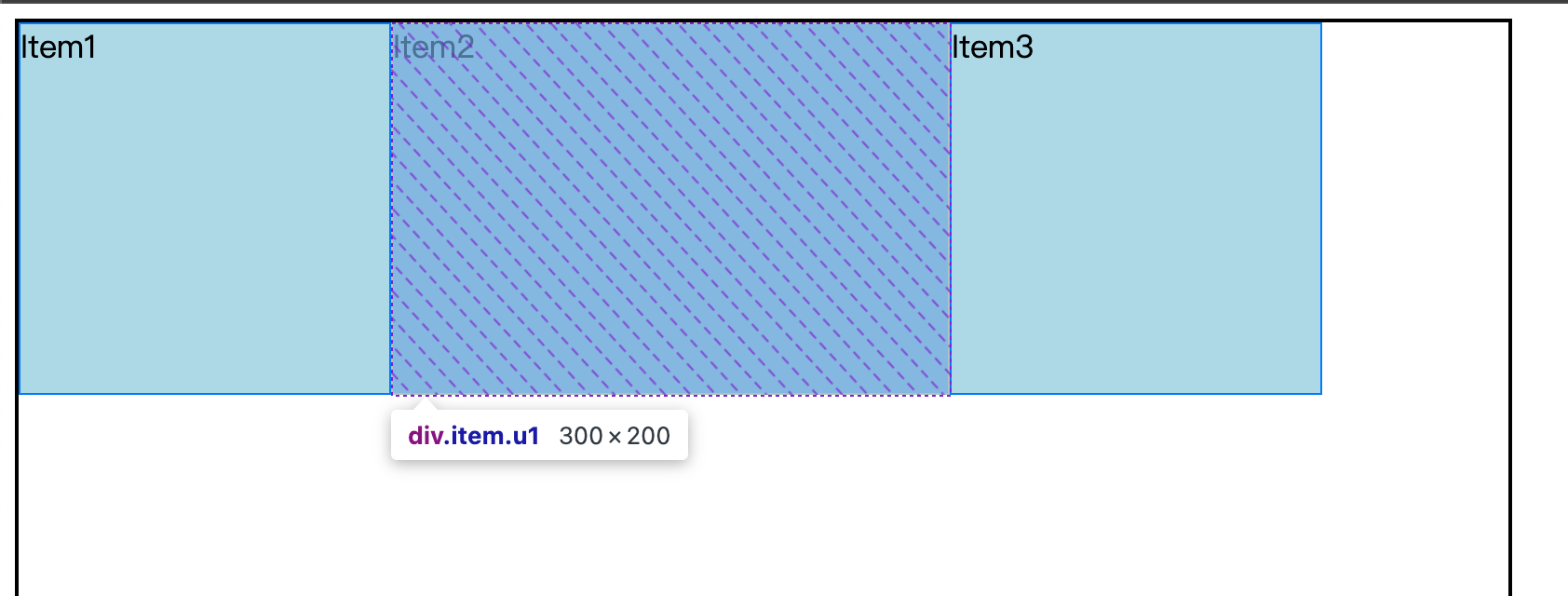
更改主轴方向,则会让高度失效:
css
  display: flex;
- flex-direction: column;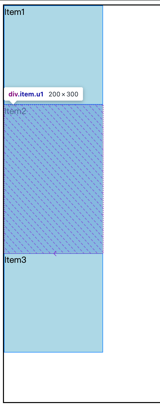
单独对齐
align-self,单独调整弹性项目在侧轴的对齐方式。用的较少。
Tip:为什么只能调整侧轴对齐方式,因为主轴都是连在一起的,无法调。
css 库
单个css 语法不难,重要的是代码复用和可读性。以下是笔者参考网易NEC的css规范写的一个 css 库。
css-library.css
可以将一些常用的 css 零碎的语法统一起来:
javascript
/*
目录
  reset.css
  grid.css
  unit.css
  module.css
  skin.css
  function.css
*/
/* reset.css */

/* 将常用的元素的margin和padding清空,方便布局;之所以不用*{margin:0;padding:0;},主要是性能问题,*{}会匹配很多废弃的元素 */
html,body,h1,h2,h3,h4,h5,h6,div,dl,dt,dd,ul,ol,li,p,blockquote,pre,hr,figure,table,caption,th,td,form,fieldset,legend,input,button,textarea,menu{margin:0;padding:0;}
/* 将html5的标签改为块级元素,如果是移动端开发,可能是多余的(chrome 53测试默认都是block),以防万一吧 */
header,footer,section,article,aside,nav,hgroup,address,figure,figcaption,menu,details{display:block;}
/* 设置table的边框 */
table{border-collapse:collapse;border-spacing:0;}
/* 去除加粗,文本往左 */
caption,th{text-align:left;font-weight:normal;}
/* 去除fieldset、iframe边框 */
html,body,fieldset,img,iframe,abbr{border:0;}
/* 为了语义和设计的兼顾 */
legend{display:none;}
/* i、em、u、s等元素的默认样式保留挺好的 */
/* 去除下面元素的斜体 */
/* i,cite,em,var,address,dfn{font-style:normal;} */
/* 点击summary时有outline,不要 */
[hidefocus],summary{outline:0;}
/* 去除列表样式 */
li{list-style:none;}
/* 去除默认字体大小,继承父类即可,不喜欢normalize.css保留了字体大小 */
h1,h2,h3,h4,h5,h6{font-size:100%;font-weight:normal;}
/* small{font-size:100%;} */
/* 设定sup、sub字体大小为父类的83% */
sup,sub{font-size:83%;}
/* chrome中pre是monospace字体,这里将以下元素字体设置为继承,否则即使设置body的字体,pre的字体还是monospace */
pre,code,kbd,samp{font-family:inherit;}
/* 去除" */
/* q:before,q:after{content:none;} */
/* 不让textarea调整尺寸 */
textarea{resize:none;}
/* 将手势改为default,chrome中summary的手势为auto */
label,summary{cursor:default;}
/* 修改为手 */
a,button{cursor:pointer;}
/* 将em、strong、b加粗 */
/* em,strong,b{font-weight:bold;} */
/* 去除del和s的删除线;去除ins和u的下划线;去除a下划线;*/
a,a:hover{text-decoration:none;}
/* del,ins,u,s{text-decoration:none;} */
/* 1rem=10px */
html{font-size:62.5%;}
/* 设置通用字体;有的字体不能继承,例如chrome中body 16px,即使设置body字体为12px,textarea,input,button,select,keygen仍然还是13.333333px;去除textaret、input、select的outline;*/
body,textarea,input,button,select,keygen,legend{font:14px/1.5 sans-serif,arial,\5b8b\4f53;color:#333;outline:0;/* 若使用rem代替px,p、span等标签在ie10以下文字大小将继承html,而chrome,firefox没问题 */}
/* 将背景ragb(0,0,0,0)改为白色 */
body{background:#fff;}
/* 参考bootstrapV3 */
p{margin-bottom:10px;}
/* 注释下面内容,否则给按钮字体颜色增加很多工作量,不就是chrome点击a字体变红色,没关系 */
/* a,a:hover{color:#333;} */

/* grid.css,网格系统 */
/* 网格容器 */
.g-grid{box-sizing:border-box;margin-left:auto;margin-right:auto;padding-left:15px;padding-right:15px;}
.g-grid-w1{width:86%;}
/* 手机和平板是86%;PC和大屏下是960px */
.g-grid-w960{width:960px;}
/* 清除浮动 */
.g-grid::after,.g-grid .row::after,.g-grid .clearfix::after,.g-grid .clearfix_xs::after,.g-grid .clearfix_sm::after,.g-grid .clearfix_md::after,.g-grid .clearfix_lg::after{display:block;height:0;visibility:hidden;content:'.';clear:both;}
/* Column clearing,配合媒体查询 */
 .g-grid .clearfix_xs,.g-grid .clearfix_sm,.g-grid .clearfix_md,.g-grid .clearfix_lg{display:none;}
/* 行的设置 */
.g-grid .row{box-sizing:border-box;margin-left:-15px;margin-right:-15px;margin-bottom:20px;}
.g-grid .row .row{margin-top:10px;margin-bottom:0;}
/* 列的设置 */
.g-grid [class*="col_"]{position:relative;float:left;box-sizing:border-box;padding:15px;}
.g-grid .col_1{width:8.333333333333334%;}
.g-grid .col_2{width:16.666666666666668%;}
.g-grid .col_3{width:25%;}
.g-grid .col_4{width:33.333333333333336%;}
.g-grid .col_5{width:41.666666666666664%;}
.g-grid .col_6{width:50%;}
.g-grid .col_7{width:58.333333333333336%;}
.g-grid .col_8{width:66.666666666666670%;}
.g-grid .col_9{width:75%;}
.g-grid .col_10{width:83.333333333333330%;}
.g-grid .col_11{width:91.666666666666670%;}
.g-grid .col_12{width:100%;}
/* 偏移 */
.g-grid .offset_col_1{margin-left:8.333333333333334%;}
.g-grid .offset_col_2{margin-left:16.666666666666668%;}
.g-grid .offset_col_3{margin-left:25%;}
.g-grid .offset_col_4{margin-left:33.333333333333336%;}
.g-grid .offset_col_5{margin-left:41.666666666666664%;}
.g-grid .offset_col_6{margin-left:50%;}
.g-grid .offset_col_7{margin-left:58.333333333333336%;}
.g-grid .offset_col_8{margin-left:66.666666666666670%;}
.g-grid .offset_col_9{margin-left:75%;}
.g-grid .offset_col_10{margin-left:83.333333333333330%;}
.g-grid .offset_col_11{margin-left:91.666666666666670%;}
.g-grid .offset_col_12{margin-left:100%;}
/* pull */
.g-grid .pull_col_1{left:8.333333333333334%;}
.g-grid .pull_col_2{left:16.666666666666668%;}
.g-grid .pull_col_3{left:25%;}
.g-grid .pull_col_4{left:33.333333333333336%;}
.g-grid .pull_col_5{left:41.666666666666664%;}
.g-grid .pull_col_6{left:50%;}
.g-grid .pull_col_7{left:58.333333333333336%;}
.g-grid .pull_col_8{left:66.666666666666670%;}
.g-grid .pull_col_9{left:75%;}
.g-grid .pull_col_10{left:83.333333333333330%;}
.g-grid .pull_col_11{left:91.666666666666670%;}
.g-grid .pull_col_12{left:100%;}
/* push */
.g-grid .push_col_1{right:8.333333333333334%;}
.g-grid .push_col_2{right:16.666666666666668%;}
.g-grid .push_col_3{right:25%;}
.g-grid .push_col_4{right:33.333333333333336%;}
.g-grid .push_col_5{right:41.666666666666664%;}
.g-grid .push_col_6{right:50%;}
.g-grid .push_col_7{right:58.333333333333336%;}
.g-grid .push_col_8{right:66.666666666666670%;}
.g-grid .push_col_9{right:75%;}
.g-grid .push_col_10{right:83.333333333333330%;}
.g-grid .push_col_11{right:91.666666666666670%;}
.g-grid .push_col_12{right:100%;}
/* 手机 */
@media screen and (max-width:667px){
  /* 定制宽度 */
  .g-grid-w2{width:100%;}
  .g-grid .clearfix_xs{display:block;}
  .g-grid .xs_col_1{width:8.333333333333334%;}
  .g-grid .xs_col_2{width:16.666666666666668%;}
  .g-grid .xs_col_3{width:25%;}
  .g-grid .xs_col_4{width:33.333333333333336%;}
  .g-grid .xs_col_5{width:41.666666666666664%;}
  .g-grid .xs_col_6{width:50%;}
  .g-grid .xs_col_7{width:58.333333333333336%;}
  .g-grid .xs_col_8{width:66.666666666666670%;}
  .g-grid .xs_col_9{width:75%;}
  .g-grid .xs_col_10{width:83.333333333333330%;}
  .g-grid .xs_col_11{width:91.666666666666670%;}
  .g-grid .xs_col_12{width:100%;}
  /* 偏移 */
  .g-grid .xs_offset_col_1{margin-left:8.333333333333334%;}
  .g-grid .xs_offset_col_2{margin-left:16.666666666666668%;}
  .g-grid .xs_offset_col_3{margin-left:25%;}
  .g-grid .xs_offset_col_4{margin-left:33.333333333333336%;}
  .g-grid .xs_offset_col_5{margin-left:41.666666666666664%;}
  .g-grid .xs_offset_col_6{margin-left:50%;}
  .g-grid .xs_offset_col_7{margin-left:58.333333333333336%;}
  .g-grid .xs_offset_col_8{margin-left:66.666666666666670%;}
  .g-grid .xs_offset_col_9{margin-left:75%;}
  .g-grid .xs_offset_col_10{margin-left:83.333333333333330%;}
  .g-grid .xs_offset_col_11{margin-left:91.666666666666670%;}
  .g-grid .xs_offset_col_12{margin-left:100%;}
  /* pull */
  .g-grid .xs_pull_col_1{left:8.333333333333334%;}
  .g-grid .xs_pull_col_2{left:16.666666666666668%;}
  .g-grid .xs_pull_col_3{left:25%;}
  .g-grid .xs_pull_col_4{left:33.333333333333336%;}
  .g-grid .xs_pull_col_5{left:41.666666666666664%;}
  .g-grid .xs_pull_col_6{left:50%;}
  .g-grid .xs_pull_col_7{left:58.333333333333336%;}
  .g-grid .xs_pull_col_8{left:66.666666666666670%;}
  .g-grid .xs_pull_col_9{left:75%;}
  .g-grid .xs_pull_col_10{left:83.333333333333330%;}
  .g-grid .xs_pull_col_11{left:91.666666666666670%;}
  .g-grid .xs_pull_col_12{left:100%;}
  /* push */
  .g-grid .xs_push_col_1{right:8.333333333333334%;}
  .g-grid .xs_push_col_2{right:16.666666666666668%;}
  .g-grid .xs_push_col_3{right:25%;}
  .g-grid .xs_push_col_4{right:33.333333333333336%;}
  .g-grid .xs_push_col_5{right:41.666666666666664%;}
  .g-grid .xs_push_col_6{right:50%;}
  .g-grid .xs_push_col_7{right:58.333333333333336%;}
  .g-grid .xs_push_col_8{right:66.666666666666670%;}
  .g-grid .xs_push_col_9{right:75%;}
  .g-grid .xs_push_col_10{right:83.333333333333330%;}
  .g-grid .xs_push_col_11{right:91.666666666666670%;}
  .g-grid .xs_push_col_12{right:100%;}
}
/* 平板 */
@media screen and (min-width:668px){
  .g-grid .clearfix_sm{display:block;}
  .g-grid .sm_col_1{width:8.333333333333334%;}
  .g-grid .sm_col_2{width:16.666666666666668%;}
  .g-grid .sm_col_3{width:25%;}
  .g-grid .sm_col_4{width:33.333333333333336%;}
  .g-grid .sm_col_5{width:41.666666666666664%;}
  .g-grid .sm_col_6{width:50%;}
  .g-grid .sm_col_7{width:58.333333333333336%;}
  .g-grid .sm_col_8{width:66.666666666666670%;}
  .g-grid .sm_col_9{width:75%;}
  .g-grid .sm_col_10{width:83.333333333333330%;}
  .g-grid .sm_col_11{width:91.666666666666670%;}
  .g-grid .sm_col_12{width:100%;}
  /* 偏移 */
  .g-grid .sm_offset_col_1{margin-left:8.333333333333334%;}
  .g-grid .sm_offset_col_2{margin-left:16.666666666666668%;}
  .g-grid .sm_offset_col_3{margin-left:25%;}
  .g-grid .sm_offset_col_4{margin-left:33.333333333333336%;}
  .g-grid .sm_offset_col_5{margin-left:41.666666666666664%;}
  .g-grid .sm_offset_col_6{margin-left:50%;}
  .g-grid .sm_offset_col_7{margin-left:58.333333333333336%;}
  .g-grid .sm_offset_col_8{margin-left:66.666666666666670%;}
  .g-grid .sm_offset_col_9{margin-left:75%;}
  .g-grid .sm_offset_col_10{margin-left:83.333333333333330%;}
  .g-grid .sm_offset_col_11{margin-left:91.666666666666670%;}
  .g-grid .sm_offset_col_12{margin-left:100%;}
  /* pull */
  .g-grid .sm_pull_col_1{left:8.333333333333334%;}
  .g-grid .sm_pull_col_2{left:16.666666666666668%;}
  .g-grid .sm_pull_col_3{left:25%;}
  .g-grid .sm_pull_col_4{left:33.333333333333336%;}
  .g-grid .sm_pull_col_5{left:41.666666666666664%;}
  .g-grid .sm_pull_col_6{left:50%;}
  .g-grid .sm_pull_col_7{left:58.333333333333336%;}
  .g-grid .sm_pull_col_8{left:66.666666666666670%;}
  .g-grid .sm_pull_col_9{left:75%;}
  .g-grid .sm_pull_col_10{left:83.333333333333330%;}
  .g-grid .sm_pull_col_11{left:91.666666666666670%;}
  .g-grid .sm_pull_col_12{left:100%;}
  /* push */
  .g-grid .sm_push_col_1{right:8.333333333333334%;}
  .g-grid .sm_push_col_2{right:16.666666666666668%;}
  .g-grid .sm_push_col_3{right:25%;}
  .g-grid .sm_push_col_4{right:33.333333333333336%;}
  .g-grid .sm_push_col_5{right:41.666666666666664%;}
  .g-grid .sm_push_col_6{right:50%;}
  .g-grid .sm_push_col_7{right:58.333333333333336%;}
  .g-grid .sm_push_col_8{right:66.666666666666670%;}
  .g-grid .sm_push_col_9{right:75%;}
  .g-grid .sm_push_col_10{right:83.333333333333330%;}
  .g-grid .sm_push_col_11{right:91.666666666666670%;}
  .g-grid .sm_push_col_12{right:100%;}
}
/* PC */
@media screen and (min-width:960px){
  .g-grid .clearfix_md{display:block;}
  .g-grid .md_col_1{width:8.333333333333334%;}
  .g-grid .md_col_2{width:16.666666666666668%;}
  .g-grid .md_col_3{width:25%;}
  .g-grid .md_col_4{width:33.333333333333336%;}
  .g-grid .md_col_5{width:41.666666666666664%;}
  .g-grid .md_col_6{width:50%;}
  .g-grid .md_col_7{width:58.333333333333336%;}
  .g-grid .md_col_8{width:66.666666666666670%;}
  .g-grid .md_col_9{width:75%;}
  .g-grid .md_col_10{width:83.333333333333330%;}
  .g-grid .md_col_11{width:91.666666666666670%;}
  .g-grid .md_col_12{width:100%;}
  /* 偏移 */
  .g-grid .md_offset_col_1{margin-left:8.333333333333334%;}
  .g-grid .md_offset_col_2{margin-left:16.666666666666668%;}
  .g-grid .md_offset_col_3{margin-left:25%;}
  .g-grid .md_offset_col_4{margin-left:33.333333333333336%;}
  .g-grid .md_offset_col_5{margin-left:41.666666666666664%;}
  .g-grid .md_offset_col_6{margin-left:50%;}
  .g-grid .md_offset_col_7{margin-left:58.333333333333336%;}
  .g-grid .md_offset_col_8{margin-left:66.666666666666670%;}
  .g-grid .md_offset_col_9{margin-left:75%;}
  .g-grid .md_offset_col_10{margin-left:83.333333333333330%;}
  .g-grid .md_offset_col_11{margin-left:91.666666666666670%;}
  .g-grid .md_offset_col_12{margin-left:100%;}
  /* pull */
  .g-grid .md_pull_col_1{left:8.333333333333334%;}
  .g-grid .md_pull_col_2{left:16.666666666666668%;}
  .g-grid .md_pull_col_3{left:25%;}
  .g-grid .md_pull_col_4{left:33.333333333333336%;}
  .g-grid .md_pull_col_5{left:41.666666666666664%;}
  .g-grid .md_pull_col_6{left:50%;}
  .g-grid .md_pull_col_7{left:58.333333333333336%;}
  .g-grid .md_pull_col_8{left:66.666666666666670%;}
  .g-grid .md_pull_col_9{left:75%;}
  .g-grid .md_pull_col_10{left:83.333333333333330%;}
  .g-grid .md_pull_col_11{left:91.666666666666670%;}
  .g-grid .md_pull_col_12{left:100%;}
  /* push */
  .g-grid .md_push_col_1{right:8.333333333333334%;}
  .g-grid .md_push_col_2{right:16.666666666666668%;}
  .g-grid .md_push_col_3{right:25%;}
  .g-grid .md_push_col_4{right:33.333333333333336%;}
  .g-grid .md_push_col_5{right:41.666666666666664%;}
  .g-grid .md_push_col_6{right:50%;}
  .g-grid .md_push_col_7{right:58.333333333333336%;}
  .g-grid .md_push_col_8{right:66.666666666666670%;}
  .g-grid .md_push_col_9{right:75%;}
  .g-grid .md_push_col_10{right:83.333333333333330%;}
  .g-grid .md_push_col_11{right:91.666666666666670%;}
  .g-grid .md_push_col_12{right:100%;}
}
/* 大屏 */
@media screen and (min-width:1024px){
  /* 定制宽度 */
  .g-grid-w2{width:960px;}
  .g-grid .clearfix_lg{display:block;}
  .g-grid .lg_col_1{width:8.333333333333334%;}
  .g-grid .lg_col_2{width:16.666666666666668%;}
  .g-grid .lg_col_3{width:25%;}
  .g-grid .lg_col_4{width:33.333333333333336%;}
  .g-grid .lg_col_5{width:41.666666666666664%;}
  .g-grid .lg_col_6{width:50%;}
  .g-grid .lg_col_7{width:58.333333333333336%;}
  .g-grid .lg_col_8{width:66.666666666666670%;}
  .g-grid .lg_col_9{width:75%;}
  .g-grid .lg_col_10{width:83.333333333333330%;}
  .g-grid .lg_col_11{width:91.666666666666670%;}
  .g-grid .lg_col_12{width:100%;}
  /* 偏移 */
  .g-grid .lg_offset_col_1{margin-left:8.333333333333334%;}
  .g-grid .lg_offset_col_2{margin-left:16.666666666666668%;}
  .g-grid .lg_offset_col_3{margin-left:25%;}
  .g-grid .lg_offset_col_4{margin-left:33.333333333333336%;}
  .g-grid .lg_offset_col_5{margin-left:41.666666666666664%;}
  .g-grid .lg_offset_col_6{margin-left:50%;}
  .g-grid .lg_offset_col_7{margin-left:58.333333333333336%;}
  .g-grid .lg_offset_col_8{margin-left:66.666666666666670%;}
  .g-grid .lg_offset_col_9{margin-left:75%;}
  .g-grid .lg_offset_col_10{margin-left:83.333333333333330%;}
  .g-grid .lg_offset_col_11{margin-left:91.666666666666670%;}
  .g-grid .lg_offset_col_12{margin-left:100%;}
  /* pull */
  .g-grid .lg_pull_col_1{left:8.333333333333334%;}
  .g-grid .lg_pull_col_2{left:16.666666666666668%;}
  .g-grid .lg_pull_col_3{left:25%;}
  .g-grid .lg_pull_col_4{left:33.333333333333336%;}
  .g-grid .lg_pull_col_5{left:41.666666666666664%;}
  .g-grid .lg_pull_col_6{left:50%;}
  .g-grid .lg_pull_col_7{left:58.333333333333336%;}
  .g-grid .lg_pull_col_8{left:66.666666666666670%;}
  .g-grid .lg_pull_col_9{left:75%;}
  .g-grid .lg_pull_col_10{left:83.333333333333330%;}
  .g-grid .lg_pull_col_11{left:91.666666666666670%;}
  .g-grid .lg_pull_col_12{left:100%;}
  /* push */
  .g-grid .lg_push_col_1{right:8.333333333333334%;}
  .g-grid .lg_push_col_2{right:16.666666666666668%;}
  .g-grid .lg_push_col_3{right:25%;}
  .g-grid .lg_push_col_4{right:33.333333333333336%;}
  .g-grid .lg_push_col_5{right:41.666666666666664%;}
  .g-grid .lg_push_col_6{right:50%;}
  .g-grid .lg_push_col_7{right:58.333333333333336%;}
  .g-grid .lg_push_col_8{right:66.666666666666670%;}
  .g-grid .lg_push_col_9{right:75%;}
  .g-grid .lg_push_col_10{right:83.333333333333330%;}
  .g-grid .lg_push_col_11{right:91.666666666666670%;}
  .g-grid .lg_push_col_12{right:100%;}
}

/* unit.css */
.u-hr,.u-hr2{display:block;margin-top:20px;margin-bottom:20px;border:0;border-top:1px solid #eee;}
.u-hr2{margin-top:40px;margin-bottom:40px;}
.u-dot{display:inline-block;height:1em;line-height:1;overflow:hidden;vertical-align:-.2em;}
.u-dot::before{display:block;content: '...\A..\A.';white-space:pre-wrap;animation:dot 3s infinite step-start;}
@keyframes dot{
  33%{transform:translateY(-2em)}
  66%{transform:translateY(-1em)}
}
/* 单行代码 */
.u-code{display:block;padding:2px 4px;border-radius:4px;font-size:90%;color:#c7254e;background-color:#f9f2f4;white-space:normal;word-wrap:break-word;/* 长单词换行,防止溢出 */}
/* 多行代码 参考zhangxinxu */
.u-code2{position:relative;display:block;line-height:1.3;padding:0 15px 0 40px;margin:10px 0;box-sizing:border-box;background:#e4f0f5;white-space:pre-wrap;}
.u-code2::before{position:absolute;top:0;bottom:0;/* 配合top:0定义了此元素的高度,hidden才能生效 */left:0;overflow:hidden;padding-right:5px;border-right:3px solid #3f87a6;background:#fff;content:'01.\A 02.\A 03.\A 04.\A 05.\A 06.\A 07.\A 08.\A 09.\A 10.\A 11.\A 12.\A 13.\A 14.\A 15.\A 16.\A 17.\A 18.\A 19.\A 20.\A 21.\A 22.\A 23.\A 24.\A 25.\A 26.\A 27.\A 28.\A 29.\A 30.\A 31.\A 32.\A 33.\A 34.\A 35.\A 36.\A 37.\A 38.\A 39.\A 40.\A 41.\A 42.\A 43.\A 44.\A 45.\A 46.\A 47.\A 48.\A 49.\A 50.\A 51.\A 52.\A 53.\A 54.\A 55.\A 56.\A 57.\A 58.\A 59.\A 60.\A 61.\A 62.\A 63.\A 64.\A 65.\A 66.\A 67.\A 68.\A 69.\A 70.\A 71.\A 72.\A 73.\A 74.\A 75.\A 76.\A 77.\A 78.\A 79.\A 80.\A 81.\A 82.\A 83.\A 84.\A 85.\A 86.\A 87.\A 88.\A 89.\A 90.\A 91.\A 92.\A 93.\A 94.\A 95.\A 96.\A 97.\A 98.\A 99';/* \A 控制字符的换行 */}
/* 例子 */
.u-example{position:relative;display:block;padding:45px 15px 15px 15px;border:1px solid #ddd;border-radius:4px 4px 0 0;background-color:#fff;}
.u-example::before{position:absolute;top:15px;left:15px;font-weight:700;color:#959595;content:'实例:';text-transform:uppercase;letter-spacing:1px;}
/* 元素标签 em -> <em> */
.u-eLabel::before{content:'<';}
.u-eLabel::after{content:'>';}
/* 超链接 */
.u-link{color:#337ab7;}
.u-link:hover,.u-link:focus{color:#23527c;text-decoration:underline;}
/* 按钮 */
/* 默认蓝色 */
.u-btn{display:inline-block;height:28px;line-height:28px;padding:0 12px;border:transparent;/* 针对<button>标签。chrome中border-width默认是3px */background-color:#0078e7;cursor:pointer;/* 手机端没有用 */color:#fff;vertical-align:middle;letter-spacing:1px;/* 文字间距,中英文间距相同 */text-align:center;font-size:1.2rem;white-space:nowrap;user-select:none;}

/* 提高页面的访问性,通过键盘聚焦和鼠标悬浮时效果保持一致 */
.u-btn:hover,.u-btn:focus{background-image:linear-gradient(transparent,rgba(0,0,0,.05) 40%,rgba(0,0,0,.1));/* color:#fff; 覆盖a:hover的颜色; */}
/* 三角形 特殊用法 */
.u-btn .btnSel{display:inline-block;border:4px solid transparent;border-top-color:#fff;border-bottom-width:0;vertical-align:middle;}
/* 颜色 */
.u-btn-c1{background-color:#e6e6e6;color:rgba(0,0,0,.8);/* 灰色 */}
/* 尺寸 */
.u-btn-lg{height:36px;line-height:36px;padding:0 15px;font-size:1.8rem;}
/* 组合按钮,默认带边框,直角 */
.u-btns{position:relative;/* 用于.u-menu */display:inline-block;/* 清除浮动 */}
.u-btns .u-btn{float:left;margin-left:-1px;/* 防止边框重叠 */border:1px solid #1b6d85;background-color:#269abc;/* 边框和背景色需要设计提供 */}
.u-btns .u-btn:first-child{margin-left:0;/* 去除边框重叠副作用 */}
.u-btns-br .u-btn:first-child{border-radius:5px 0 0 5px;}
.u-btns-br .u-btn:last-child{border-radius:0 5px 5px 0;}
/* 交互式菜单 */
.u-menu{display:none;position:absolute;top:100%;left:0;box-sizing:border-box;/* 防止宽度超出父容器,例如.u-menu-max就离不开 */border:1px solid #d0d0d0;margin: 1px 0 0 0;border-radius:5px;word-spacing:normal;letter-spacing:normal;/* 正常的单词间距和字母间距 */background:#fff;box-shadow:0 5px 15px rgba(0,0,0,0.05);}
.u-menu.z-show{display:block;}
.u-menu li a{display:block;padding:6px 12px;border-top:1px solid #e8e8e8;text-overflow:ellipsis;overflow:hidden;white-space:nowrap;color:#333;}
.u-menu li:first-child a{border:0;border-radius:5px 5px 0 0;/* 不能省,否则在hover下menu的圆角会有缺陷*/}
.u-menu li:last-child a{border-radius:0 0 5px 5px;/* 不能省 */}
.u-menu li a:hover{background:#f7f7f7;}
/* 右对齐 */
.u-menu-rt{left:auto;/* 宽度自动 */right:0;}
/* 至少撑满 */
.u-menu-min{min-width:100%;}
/* 至多撑满 */
.u-menu-max{max-width:100%;}
/* 分组 */
.u-menu-gp li:empty{border-top:1px solid #ddd;margin:5px 0;}
.u-menu-gp li a{border:0;}
/* ##字体 */
.u-font{font-family: 'microsoft yahei',sans-serif;font-size:1.6rem;}
.u-font-xs{font-size:1.2rem;}
.u-font-sm{font-size:1.4rem;}
.u-font-lg{font-size:2rem;}
.u-font-xlg{font-size:2.4rem;}
/* 标注(参考bootstrapV3) */
.u-callout{display:block;padding:20px;margin:20px 0;border:1px solid #eee;border-left-color:#1b809e;border-left-width:5px;border-radius:3px;}
.u-callout .tt{margin-top:0;margin-bottom:5px;font-size:1.8rem;font-weight:500;color:#1b809e;}
.u-callout p{margin-bottom:16px;}
.u-callout p:last-child{margin-bottom:0;}
/* 标注类别 */
.u-callout-danger{border-left-color:#ce4844;}
.u-callout-danger .tt{color:#ce4844;}
.u-callout-warn{border-left-color:#aa6708;}
.u-callout-warn .tt{color:#aa6708;}
/**
 * 标题(参考bootstrapV3)
 * 这里u-tt1~6 其实是对应h1~h6,但取名为tt1而不是h1,是希望不要被h1元素限制使用
 */
.u-tt1{font-size:3.6rem;}
.u-tt2{font-size:3.0rem;}
.u-tt3{font-size:2.4rem;}
.u-tt4{font-size:1.8rem;}
.u-tt5{font-size:1.4rem;}
.u-tt6{font-size:1.2rem;}
.u-tt1,.u-tt2,.u-tt3{margin-top:20px;}
.u-tt4,.u-tt5,.u-tt6{margin-top:10px;}
.u-tt1,.u-tt2,.u-tt3,.u-tt4,.u-tt5,.u-tt6{display:block;margin-bottom:10px;font-weight:500;}
.u-tt1 .sm,.u-tt2 .sm,.u-tt3 .sm{font-size:65%;}
.u-tt4 .sm,.u-tt5 .sm,.u-tt6 .sm{font-size:75%;}
.u-tt1 .sm,.u-tt2 .sm,.u-tt3 .sm,.u-tt4 .sm,.u-tt5 .sm,.u-tt6 .sm{font-weight:400;}
/* header */
.u-tt1-hd{padding-bottom:10px;margin:40px 0 20px 0;border-bottom:1px solid #eee;}
/* 默认无边图片 110*110 */
.u-img,.u-img2{position:relative;/* 可用于close按钮的定位 */display:inline-block;box-sizing:border-box;width:110px;height:110px;/* 场景:图片外总是有一个固定宽高的容器 */}
.u-img img{display:block;/* 与下面紧邻元素没有间隙 */width:100%;height:100%}
/* 有边图片 */
.u-img-b1{padding:2px;border:1px solid #ddd;}
/* 圆角 */
.u-img-br,.u-img-br img{border-radius:5px;/* 不能省 */}
/* 高度自适应 */
.u-img-ha,.u-img-ha img{height:auto;}
/* 自定义宽高 */
.u-img-define,.u-img-define img{width:100%;height:100%}
/* 自定义内容图片 */
.u-img2{width:100%;height:auto;}
/* 有边 */
.u-img2-b1{border:1px solid #ddd;padding:4px;}
/* 圆角 */
.u-img2-br{border-radius:5px;}
/* 图片高度自适应 */
.u-img2 img{display:block;/* 与下面紧邻元素没有间隙 */width:100%;}
/* 加号、减号*/
.u-plus,.u-minus{position:relative;display:inline-block;width:16px;height:16px;background:#2096ff;}
.u-plus::before,.u-plus::after,.u-minus::before{content:'';position:absolute;left:0;right:0;top:0;bottom:0;margin:43.75% 18.75%;/* 长度10,宽度2 */background:#fff;}
.u-plus::after{transform:rotate(90deg);}

/* module.css */
/* 分成N等份,使用了N等份 */
.m-bar{display:inline-block;width:100%;font-size:0;}
.m-bar::before{content:'\3000'line-height:34px;vertical-align:2px;/* 垂直居中 */}
.m-bar [class^=b]{display:inline-block;height:5px;background:#279f57 content-box;padding-right:4px;box-sizing:border-box;}
.m-bar [class^=b]::last-child{padding-right:0;}
.m-bar .z-used{background-color:#9f2727;}
.m-bar .b1{width:100%;}
.m-bar .b2{width:50%;}
.m-bar .b3{width:33.333333333333336%;}
.m-bar .b4{width:25%;}
.m-bar .b5{width:20%;}
.m-bar .b6{width:16.666666666666668%;}
.m-bar .b7{width:14.285714285714286%;}
.m-bar .b8{width:12.5%;}
.m-bar .b9{width:11.11111111111111%;}
.m-bar .b10{width:10%;}
.m-bar .b11{width:9.090909090909092%;}
.m-bar .b12{width:8.333333333333334%;}
.m-bar .b13{width:7.6923076923076925%;}
.m-bar .b14{width:7.142857142857143%;}
.m-bar .b15{width:6.666666666666667%;}
.m-bar .b16{width:6.25%;}
/* 分成N等份,使用了N等份 */
/* 图片垂直对齐文本 from css世界 */
.m-imageAlignText{padding-left:20px;}
.m-imageAlignText .icon{position: absolute;width:20px;margin-left:-20px;background:no-repeat center/20px;}
.m-imageAlignText .icon::before{content:'\3000';/* 让行高生效 */}
.m-imageAlignText .icon-del{background-image: url(../img/del.png);}
.m-imageAlignText .icon-hot{background-image:url(../img/hot.gif);}
/* /图片垂直对齐 */
/* 多行式面包屑导航(默认竖线分隔) */
.m-crumb{display:block;overflow:hidden;/* 溢出隐藏、清除浮动 */}
.m-crumb ul{margin-left:-20px;}
.m-crumb li{float:left;}
.m-crumb li::before{display:inline-block;width:20px;content:'|';text-align:center;}
/* 箭头分隔 */
.m-crumb-arr li::before{content:'>';}
/* 空格分隔 */
.m-crumb-blank li::before{content:'';}

/* 水平文字链接列表 */
.m-list1{display:block;}
.m-list1 li{float:left;margin-right:20px;}
.m-list1 li:last-child{margin-right:0;}
.m-list1::after{display:block;height:0;visibility:hidden;content:'.';clear:both;}
.m-list1 a,.m-list1 a:hover{display:inline-block;/* a和li一样高 */}
.m-list1-c1 a,.m-list1-c1 a:hover,.m-list2-c1 a,.m-list2-c1 a:hover{color:#3891eb;}
/* 手机下一行一列 */
@media screen and (max-width:667px){
  .m-list1-xs li{box-sizing:border-box;width:100%;}
}
/* 一行一列带点列表 */
.m-list2 li{padding-left:10px;}
/* > 为了解决带点列表中内嵌不带点列表 */
.m-list2 > li::before{display:inline-block;margin-left:-10px;margin-right:6px;border:2px solid;content:'';vertical-align:middle;margin-bottom:2px;/* 配合vertical-align让点居中 */}
/* 圆点 */
.m-list2-rds > li::before{border-radius:50%;}
/* 简易数据表格,默认是格边框 */
.m-table{width:100%;}
.m-table caption{padding-top:8px;padding-bottom:8px;color:#777;text-align:left;}
.m-table th{font-weight:bold;}
.m-table td,.m-table th{padding:8px;border:1px solid #ddd;}
/* 行边框 */
.m-table-row th,.m-table-row td{border-width:0 0 1px 0;}
/*
 * 状态类
 * .active 鼠标悬浮在行或单元格
 * .success 标识成功或积极的动作
 * .info 标识普通的提示信息或动作
 * .warn 标识警告或需要用户注意
 * .danger 标识危险或潜在带来负面影响
 */
.m-table .z-active{background:#f5f5f5;}
.m-table .z-success{background:#dff0d8;}
.m-table .z-info{background:#d9edf7;}
.m-table .z-warn{background:#fcf8e3;}
.m-table .z-danger{background:#f2dede;}
/**
 * 圆角
 * 过程如下:
 *  格边框
 *  表格边框分开(好像collapse与border-radius冲突),并在表格元素的右侧、底部各画一条边
 *  重置td、th边框,只画左边框、上边框
 *  把剩余三个角画圆
 */
.m-table-rds{border-collapse:separate;border:1px solid #ddd;border-width:0 1px 1px 0;border-radius:5px;}
.m-table-rds th,.m-table-rds td{border-width:1px 0 0 1px;}
.m-table-rds > thead > :first-child > :first-child{border-top-left-radius:5px;}
.m-table-rds > thead > :first-child > :last-child{border-top-right-radius:5px;}
.m-table-rds > tbody > :last-child > :first-child{border-bottom-left-radius:5px;}

/* skin.css */
/* 情景文字颜色(参考bootstrapV3) */
.s-textMuted{color:#777;/* 静音 */}
.s-textSuccess{color:#3c763d;/* 成功 */}
.s-textPrimary{color:#337ab7;/* 主要的 */}
.s-textInfo{color:#31708f;/* 信息 */}
.s-textWarn{color:#8a6d3b;/* 警告 */}
.s-textDanger{color:#a94442;/* 危险 */}
.s-tip{color:#ff9955;}
/* 情景背景色 */
.s-bgSuccess{background-color:#dff0d8;}
.s-bgPrimary{background-color:#337ab7;color:#fff;}
.s-bgInfo{background-color:#d9edf7;}
.s-bgWarn{background-color:#fcf8e3;}
.s-bgDanger{background-color:#f2dede;}

/* function.css,权重相同,后者生效,所以放最后 */
.f-fs12{font-size:1.2rem;}
.f-fs14{font-size:1.4rem;}
.f-fs16{font-size:1.6rem;}
.f-fs18{font-size:1.8rem;}
.f-fs20{font-size:2rem;}
.f-fs22{font-size:2.2rem;}
.f-fs24{font-size:2.4rem;}
.f-fs30{font-size:3rem;}
.f-fw100{font-weight:100;}
.f-fw200{font-weight:200;}
.f-fw300{font-weight:300;}
.f-fw400{font-weight:400;}
.f-fw600{font-weight:600;}
.f-fw700{font-weight:700;}
.f-fw800{font-weight:800;}
.f-fw900{font-weight:900;}
.f-fwb{font-weight:bold;}
.f-fwn{font-weight:normal;}
.f-ti2{text-indent:2em;/* 中文是两个,英文不是 */}
.f-lhn{line-height:normal;}
.f-lh150{line-height:150%;}
.f-lh180{line-height:180%;}
.f-lh200{line-height:200%;}
/* 下划线 */
.f-tdu,.f-tdu:hover{text-decoration:underline;/* 英文字母有的就没有下划线 */}
/* 去除下划线 */
.f-tdn,.f-tdn:hover{text-decoration:none;}
.f-tdlt,.f-tdlt:hover{text-decoration:line-through;}
/* 一行省略 */
.f-toe{text-overflow:ellipsis;/* 必须配合white-space:nowrap;overflow:hidden; */overflow:hidden;white-space:nowrap;}
/* 两行省略(暂放) */
.f-toe2{display:-webkit-box;-webkit-line-clamp:2;-webkit-box-orient:vertical;overflow:hidden;}
.f-oh{overflow:hidden;}
/* 不换行 */
.f-wsn{white-space:nowrap;}
/* 转为pre */
.f-pre{white-space:pre-wrap;/* 通常建议使用f-pre */}
.f-pre2{white-space:pre;}
/* 长单词换到下一行 */
.f-wwbw{white-space:normal;word-wrap:break-word;}
/* 任意位置换行 */
.f-wbba{white-space:normal;/* 防止break-all与nowrap矛盾 */word-break:break-all;}

/* 定位 */
.f-tal{text-align:left;}
.f-tac{text-align:center;}
.f-tar{text-align:right;}
.f-taj{text-align:justify;/* 两端对齐,不作用在最后一行 */}
/* 块元素居中 */
.f-bc{margin-left:auto;margin-right:auto;}
.f-fl{float:left;}
.f-fr{float:right;}
/* 清除浮动 */
.f-cb{clear:both;}
.f-clearfix::after{display:block;content:'';clear:both;/* 来自《mdn》和《css世界》 */}
.f-clearfix2::after{display:block;height:0;visibility:hidden;/* 仍会占据该位置 */content:'.';clear:both;/* 来自《精通CSS:高级Web标准解决方案》 */}

.f-vam,.f-vama *{vertical-align:middle;/* 该属性可以继承 */}
.f-pr{position:relative;}
.f-pa{position:absolute;}
.f-vh{visibility:hidden;/* 元素不可见,位置占着 */}
.f-dn{display:none;/* 元素不可见,位置腾出来 */}
.f-di{display:inline;}
.f-db{display:block;}
.f-dib{display:inline-block;}
/* 长度高度 */
.f-w10{width:10px;}
.f-w100{width:100px;}
.f-w200{width:200px;}
.f-w250{width:250px;}
.f-w300{width:300px;}
.f-w500{width:500px;}
.f-w100p{width:100%;}
.f-h10{height:10px;}
.f-h50{height:50px;}
.f-h60{height:60px;}
.f-h80{height:80px;}
.f-h100{height:100px;}
.f-h200{height:200px;}
.f-h100p{height:100%;}
/* 最大最小宽度和高度 */
.f-mw500{max-width:500px;}
.f-mw600{max-width:600px;}
.f-mh300{max-height:300px;}
/* 边距 */
.f-m0{margin:0;}
.f-m10{margin:10px;}
.f-m15{margin:15px;}
.f-m30{margin:30px;}
.f-mt5{margin-top:5px;}
.f-mt10{margin-top:10px;}
.f-mt15{margin-top:15px;}
.f-mt20{margin-top:20px;}
.f-mt25{margin-top:25px;}
.f-mt30{margin-top:30px;}
.f-mt40{margin-top:40px;}
.f-mt50{margin-top:50px;}
.f-mt100{margin-top:100px;}
.f-mb10{margin-bottom:10px;}
.f-mb20{margin-bottom:20px;}
.f-mb25{margin-bottom:25px;}
.f-mb30{margin-bottom:30px;}
.f-mb40{margin-bottom:40px;}
.f-mb50{margin-bottom:50px;}
.f-mb60{margin-bottom:60px;}
.f-mb100{margin-bottom:100px;}
.f-mb150{margin-bottom:150px;}
.f-ml5{margin-left:5px;}
.f-ml10{margin-left:10px;}
.f-ml15{margin-left:15px;}
.f-ml20{margin-left:20px;}
.f-ml30{margin-left:30px;}
.f-ml50{margin-left:50px;}
.f-ml100{margin-left:100px;}
.f-mr5{margin-right:5px;}
.f-mr10{margin-right:10px;}
.f-mr15{margin-right:15px;}
.f-mr20{margin-right:20px;}
.f-mr30{margin-right:30px;}
.f-mr50{margin-right:50px;}
.f-mr60{margin-right:60px;}
.f-mr100{margin-right:100px;}
.f-p0{padding:0px;}
.f-p10{padding:10px;}
.f-p15{padding:15px;}
.f-p20{padding:20px;}
.f-p30{padding:30px;}
.f-pt10{padding-top:10px;}
.f-pt15{padding-top:15px;}
.f-pt20{padding-top:20px;}
.f-pt30{padding-top:30px;}
.f-pt50{padding-top:50px;}
.f-pt100{padding-top:100px;}
.f-pb10{padding-bottom:10px;}
.f-pb15{padding-bottom:15px;}
.f-pb20{padding-bottom:20px;}
.f-pb30{padding-bottom:30px;}
.f-pb50{padding-bottom:50px;}
.f-pb60{padding-bottom:60px;}
.f-pb100{padding-bottom:100px;}
.f-pl10{padding-left:10px;}
.f-pl15{padding-left:15px;}
.f-pl20{padding-left:20px;}
.f-pl30{padding-left:30px;}
.f-pl50{padding-left:50px;}
.f-pl100{padding-left:100px;}
.f-pr10{padding-right:10px;}
.f-pr15{padding-right:15px;}
.f-pr20{padding-right:20px;}
.f-pr30{padding-right:30px;}
.f-pr50{padding-right:50px;}
.f-pr60{padding-right:60px;}
.f-pr100{padding-right:100px;}
/* 鼠标 */
.f-csp{cursor:pointer;}
.f-csh{cursor:help;}
.f-csm{cursor:move;}
.f-csd{cursor:default;}
/* 禁止选择文本 ie10+ */
.f-usn{-webkit-user-select:none;-moz-user-select:none;-ms-user-select:none;-o-user-select:none;user-select:none;}
/* 斜体 */
.f-italic{font-style:italic;}
/* 修改盒子模型 */
.f-bsbb{box-sizing:border-box;}
/* #skin.css */
/* ##情景文字颜色 */
/* 颜色参考bootstrapV3 辅助类 */
.s-textMuted{color:#777;/* 静音 */}
.s-textSuccess{color:#3c763d;/* 成功 */}
.s-textPrimary{color:#337ab7;/* 主要的 */}
.s-textInfo{color:#31708f;/* 信息 */}
.s-textWarn{color:#8a6d3b;/* 警告 */}
.s-textDanger{color:#a94442;/* 危险 */}
/* ##情景背景色 */
.s-bgSuccess{background-color:#dff0d8;}
.s-bgPrimary{background-color:#337ab7;color:#fff;}
.s-bgInfo{background-color:#d9edf7;}
.s-bgWarn{background-color:#fcf8e3;}
.s-bgDanger{background-color:#f2dede;}

.s-tip{color:#ff9955;}
css-library.css 应用
javascript
<!DOCTYPE html>
<html>
<head>
<meta charset='utf-8'>
<title>css-library demo</title>
<meta name='keywords' content=''>
<meta name='description' content=''>
<meta name='viewport' content='width=device-width,initial-scale=1.0'>
<link rel='stylesheet' href='css-library.css'>
<style>
/* 用于demo */
.g-grid-s1 [class*="col_"]{background-color:rgba(86,61,124,.15);border:1px solid rgba(86,61,124,.2);}
.f-w85p{width:85%;}
.f-h250{height:250px;}
</style>
</head>
<body>
<div class="g-grid g-grid-w1 g-grid-s1">
<h2>网格</h2>
<div class="row">
<div class="col_4">col_4</div>
<div class="col_4">col_4</div>
<div class="col_4">col_4</div>
</div>
<div class="row">
<div class="col_12 sm_col_3">col_12 sm_col_3</div>
<div class="col_12 sm_col_6">col_12 sm_col_6</div>
<div class="col_12 sm_col_3">col_12 sm_col_3</div>
</div>
<div class="row">
<div class="col_12 lg_col_8">
col_12 lg_col_8
<div class="row">
<div class="col_12 md_col_6">col_12 md_col_6</div>
<div class="col_12 md_col_6">col_12 md_col_6</div>
</div>
</div>
<div class="col_12 lg_col_4">col_12 lg_col_4</div>
</div>
<div class="row">
<p class="f-tac"><i>Column clearing</i></p>
<div class="col_3 xs_col_6">
col_3 xs_col_6 <br><br><br>
小屏幕下看看
</div>
<div class="col_3 xs_col_6">col_3 xs_col_6</div>
<div class="clearfix_xs"></div>
<div class="col_3 xs_col_6">col_3 xs_col_6</div>
<div class="col_3 xs_col_6">col_3 xs_col_6</div>
</div>
<div class="row">
<p class="f-tac"><i>偏移2格</i></p>
<div class="col_5">col_5</div>
<div class="col_5 offset_col_2">col_5 offset_col_2</div>
</div>
<div class="row">
<p class="f-tac"><i>col_3和col_9调换</i></p>
<div class="col_3 md_pull_col_9">col_3 md_pull_col_9</div>
<div class="col_9 md_push_col_3">col_9 md_push_col_3</div>
</div>
</div>
<div class="g-grid g-grid-w1">
<h2>元件</h2>
<div class="col_6">
<p><i>.u-hr</i></p>
<span class="u-hr"></span>
</div>
<div class="col_6">
<p><i>.u-hr2</i>(上下间距更大)</p>
<span class="u-hr2"></span>
</div>
<div class="col_6">
<p><i>.u-code</i>(单行代码)</p>
<span class="u-code">
if(1){
xxx
}else{
长单词换行,不会溢出容器aaaaaaaaaaaaaaaaaaaaaaaaaaaaaaaaaaaaaaaaaaaaaaaaaaaaaaaaaaaaaaaaaa
}
</span>
</div>
<div class="col_6">
<p><i>.u-code2</i>(多行代码)</p>
<div class="u-code2">
if(){
xxx
}else{
aaa
}
</div>
</div>
<div class="col_12">
<span class="u-example">
.u-example
</span>
</div>
<div class="col_6">
<p><i>.u-eLabel</i>(em -> <em>)</p>
<span class="u-eLabel">em</span>
</div>
<div class="col_6">
<p><i>.u-link</i></p>
<a href="#" class="u-link">超链接</a>
</div>
<div class="col_4">
<a href="#" class="u-btn">按钮 a.u-btn</a>垂直居中
</div>
<div class="col_4">
<button class='u-btn'>按钮 button.u-btn</button>
</div>
<div class="col_4">
<span class="u-btn u-btn-c1">按钮 span.u-btn.u-btn-c1</span>
</div>
<div class="col_4">
<i class="u-btn"><i class="btnSel"></i></i>
</div>
<div class="col_4">
<span class="u-btn u-btn-lg">按钮 span.u-btn.u-btn-lg <i class="btnSel"></i></span>
</div>
<div class="col_4">
<span class="u-btns">
<span class="u-btn">按钮</span>
<span class="u-btn">按钮</span>
<span class="u-btn">按钮</span>
</span>
<p>inline-block清除浮动</p>
</div>
<div class="col_4">
<span class="u-btns u-btns-br">
<span class="u-btn">按钮</span>
<span class="u-btn">按钮</span>
<span class="u-btn">按钮</span>
</span>
</div>
<!-- <p class='f-cb'>交互式菜单</p> -->
<div class="col_4">
<span class="u-btns f-mb100">
<span class="u-btn">按钮组 .u-btns</span>
<span class="u-btn">按钮 .u-btn</span>
<span class="u-btn">按钮</span>
<menu class="u-menu z-show">
<li><a href="#">默认左对齐 .u-menu</a></li>
<li><a href="#">menu可以替换成ul</a></li>
<li><a href="#">只对a元素进行了处理</a></li>
</menu>
</span>
</div>
<div class="col_4">
<span class="u-btns f-mb100">
<span class="u-btn">按钮</span>
<span class="u-btn">按钮</span>
<span class="u-btn">按钮</span>
<menu class="u-menu z-show u-menu-rt">
<li><a href="#">右对齐</a></li>
<li><a href="#">.u-menu-rt</a></li>
</menu>
</span>
</div>
<div class="col_4">
<span class="u-btns f-mb100">
<span class="u-btn">按钮</span>
<span class="u-btn">按钮</span>
<span class="u-btn">按钮</span>
<menu class="u-menu z-show u-menu-min">
<li><a href="#">至少撑满</a></li>
<li><a href="#">至少撑满</a></li>
</menu>
</span>
</div>
<div class="col_4">
<span class="u-btns f-mb100">
<span class="u-btn">按钮</span>
<span class="u-btn">按钮</span>
<span class="u-btn">按钮</span>
<menu class="u-menu z-show u-menu-max">
<li><a href="#">最多撑满abcdabcdabcd</a></li>
<li><a href="#">最多撑满</a></li>
</menu>
</span>
</div>
<div class="col_4">
<span class="u-btns f-mb100">
<span class="u-btn">按钮</span>
<span class="u-btn">按钮</span>
<menu class="u-menu z-show u-menu-gp">
<li><a href="#">分组 .u-menu-gp</a></li>
<li><a href="#">分组</a></li>
<li></li>
<li><a href="#">分组</a></li>
</menu>
</span>
</div>
<div class="col_4">
<p class="u-font u-font-xs">.u-font.u-font-xs 12px</p>
</div>
<div class="col_4">
<p class="u-font u-font-sm">.u-font.u-font-sm 14px</p>
</div>
<div class="col_4">
<p class='u-font'>.u-font 16px</p>
</div>
<div class="col_4">
<p class="u-font u-font-lg">.u-font.u-font-lg 20px</p>
</div>
<div class="col_4">
<p class="u-font u-font-xlg">.u-font.u-font-xlg 24px</p>
</div>
<div class="col_4">
<span class="u-callout">
<span class="tt">标注标题 .tt</span>
<p>.u-callout</p>
<p>忽略.......................................................</p>
</span>
</div>
<div class="col_4">
<div class="u-callout u-callout-danger">
<h2 class="tt">标注标题 h2.tt</h2>
<p>.u-callout-danger</p>
<p>标题下只能是p</p>
</div>
</div>
<div class="col_4">
<div class="u-callout u-callout-warn">
<h2 class="tt">标注标题 h2.tt</h2>
<p>.u-callout-warn</p>
</div>
</div>
<i class="clearfix"></i>
<div class="col_6">
<span class="u-tt6">标题 .u-tt6 1.2rem ------ <span class="sm">小标题 .sm</span>(chrome限制,看不出来)</span>
<p>忽略.............</p>
</div>
<div class="col_6">
<span class="u-tt5">标题 .u-tt5 1.4rem ------ <span class="sm">小标题 .sm</span></span>
<p>忽略.............</p>
</div>
<div class="col_6">
<span class="u-tt4">标题 .u-tt4 1.8rem ------ <span class="sm">小标题 .sm</span></span>
<p>忽略.............</p>
</div>
<div class="col_6">
<span class="u-tt3">标题 .u-tt3 2.4rem ------ <span class="sm">小标题 .sm</span></span>
<p>忽略.............</p>
</div>
<div class="col_12">
<span class="u-tt2">标题 .u-tt2 3.0rem ------ <span class="sm">小标题 .sm</span></span>
<p>忽略.............</p>
</div>
<div class="col_12">
<span class="u-tt1">标题 .u-tt1 3.6rem ------ <span class="sm">小标题 .sm</span></span>
<p>忽略.............</p>
</div>
<div class="col_12">
<span class="u-tt1 u-tt1-hd">标题 .u-tt1.u-tt1-hd</span>
<p>忽略.............</p>
</div>
<div class="col_4">
<p>
默认:无边直角定宽定高110*110 <br>
.u-img
</p>
<span class="u-img">
<a href="#"><img src="../../img/1.jpg" alt=""></a>
</span>
</div>
<div class="col_4">
<p>
有边图片<br>
.u-img.u-img-b1
</p>
<span class="u-img u-img-b1">
<a href="#"><img src="../../img/1.jpg" alt=""></a>
</span>
</div>
<div class="col_4">
<p>
有边圆角图片<br>
.u-img.u-img-b1.u-img-br
</p>
<span class="u-img u-img-b1 u-img-br">
<a href="#"><img src="../../img/1.jpg" alt=""></a>
</span>
</div>
<div class="col_4">
<p>
高度自适应<br>
.u-img.u-img-ha
</p>
<span class="u-img u-img-ha">
<a href="#"><img src="../../img/1.jpg" alt=""></a>
</span>
</div>
<div class="col_4">
<p>
自定义(填充父容器大小)<br>
.u-img.u-img-define
</p>
<div class="f-w85p f-h250">
<span class="u-img u-img-define">
<a href="#"><img src="../../img/1.jpg" alt=""></a>
</span>
</div>
</div>
<div class="col_4">
<p>
.u-img2.u-img2-b1.u-img2-br
</p>
<span class="u-img2 u-img2-b1 u-img2-br">
<a href="#"><img src="../img/1.jpg" alt=""></a>
<span class="u-tt2">标题</span>
<p>省略...........................</p>
<span class="u-btn">按钮</span>
</span>
</div>
<div class="col_4">
<p>
<span class='m-imageAlignText'><i class='icon icon-hot'></i>图片和文字水平对齐</span>
</p>
<p class='m-imageAlignText f-fs30'>
<i class='icon icon-del'></i>
图片和文字水平对齐
</p>
</div>
<div class="col_4">
<p>
请求已成功发出<i class="u-dot"></i>
</p>
<p class='u-font-lg'>
请求已成功发出<i class="u-dot"></i>
</p>
</div>
<div class="col_4">
<p>
<span class="m-bar">
<i class="b8 z-used"></i><i class="b8 z-used"></i><i class="b8 z-used"></i>
<i class="b8"></i><i class="b8"></i><i class="b8"></i>
<i class="b8"></i><i class="b8"></i>
</span>
</p>
<p>
<span class="m-bar">
<i class="b3"></i><i class="b3"></i><i class="b3"></i>
</span>
</p>
<p>
<span class="m-bar">
<i class="b1 z-used">
</span>
</p>
</div>
</div>
<div class="g-grid g-grid-w1">
<h2>肤色</h2>
<div class="col_6">
<p class="s-textMuted">静音 .s-textMuted</p>
<p class="s-textSuccess">成功 .s-textSuccess</p>
<p class="s-textPrimary">主要 .s-textPrimary</p>
<p class="s-textInfo">信息 .s-textInfo</p>
<p class="s-textWarn">警告 .s-textWarn</p>
<p class="s-textDanger">危险 .s-textDanger</p>
<p class="s-tip">提示 .s-tip</p>
</div>
<div class="col_6">
<p class="s-bgSuccess f-p15">成功 .s-bgSuccess.f-p15</p>
<p class="s-bgPrimary f-p15">主要 .s-bgPrimary.f-p15</p>
<p class="s-bgInfo f-p15">信息 .s-bgInfo.f-p15</p>
<p class="s-bgWarn f-p15">警告 .s-bgWarn.f-p15</p>
<p class="s-bgDanger f-p15">危险 .s-bgDanger.f-p15</p>
</div>
</div>
<div class="g-grid g-grid-w1">
<h2>模块</h2>
<div class="col_6">
<p>多行式面包屑导航</p>
<span class="m-crumb">
<ul>
<li><a href="#" class='u-link'>默认是竖线分隔</a></li>
<li><a href="#" class='u-link'>默认是竖线分隔</a></li>
<li><a href="#" class="u-link">.m-crumb 内必须是ul,接着是li 换行换行换行换行换行换行换行换行换行换行换行换行换行换行换行换行换行换行</a><span class="s-tip">(一项太长有缺陷)</span></li>
<li><a href="#" class="u-link">默认是竖线分隔</a></li>
<li><a href="#" class="u-link">默认是竖线分隔</a></li>
</ul>
</span>
<span class="m-crumb m-crumb-arr">
<ul>
<li><a href="#" class='u-link'>箭头</a></li>
<li><a href="#" class='u-link'>箭头</a></li>
<li><a href="#" class='u-link'>.m-crumb-arr</a></li>
</ul>
</span>
<span class="m-crumb m-crumb-blank">
<ul>
<li><a href="#" class='u-link'>空格</a></li>
<li><a href="#" class='u-link'>空格</a></li>
<li><a href="#" class='u-link'>.m-crumb-blank</a></li>
</ul>
</span>
</div>
<div class="col_6">
<p>简易文字链接列表,无需任何类,即可实现</p>
<ul>
<li><a href="#" class='u-link'>列表项文字 </a></li>
<li><a href="#" class='u-link'>a.u-link</a></li>
<li><a href="#" class='u-link'>列表项文字</a></li>
<li><a href="#" class='u-link'>列表项文字</a></li>
</ul>
</div>
<div class="col_12 f-cb">
<p>水平文字链接列表</p>
<ul class="m-list1 f-mb20">
<li><a href="#" class='u-link'>列表文字</a></li>
<li><a href="#" class='u-link'>.m-list1 .u-link</a></li>
<li><a href="#" class='u-link'>列表文字</a></li>
<li><a href="#" class='u-link'>列表文字</a></li>
</ul>
<ul class="m-list1 m-list1-c1 f-mb20">
<li><a href="#">列表文字</a></li>
<li><a href="#">换一种颜色</a></li>
<li><a href="#">.m-list1-c1</a></li>
<li><a href="#">列表文字</a></li>
</ul>
<ul class="m-list1 m-list1-c1 m-list1-xs f-mb20">
<li><a href="#">列表文字</a></li>
<li><a href="#">手机下面(667px内)一行一列</a></li>
<li><a href="#">.m-list1.m-list1-c1.m-list1-xs</a></li>
<li><a href="#">文字大小继承ul</a></li>
<li><a href="#">列表文字</a></li>
</ul>
</div>
<div class="col_6">
<p>.m-list2.m-list2-c1</p>
<ul class="m-list2 m-list2-c1 f-mb20">
<li><a href="#">关注点即可</a></li>
<li><a href="#">关注点即可</a></li>
<li><a href="#">关注点即可</a></li>
</ul>
</div>
<div class="col_6">
<p>.m-list2.m-list2-c1.m-list2-rds</p>
<ul class="m-list2 m-list2-c1 m-list2-rds f-mb20">
<li><a href="#">关注点即可</a></li>
<li><a href="#">关注点即可</a></li>
<li><a href="#">关注点即可</a></li>
</ul>
</div>
<div class="col_12">
<table class="m-table">
<caption>格边框 .m-table</caption>
<thead>
<tr><th>格边框</th><th>表头</th><th>表头</th><th>表头</th><th >表头</th></tr>
</thead>
<tbody>
<tr><td>内容</td><td>内容内容内容内容内容内容内容</td><td>内容内容</td><td>内容内容</td><td>内容内容内容</td></tr>
<tr><td>内容</td><td>内容内容内容内容内容内容内容</td><td>内容内容</td><td>内容内容</td><td>内容内容内容</td></tr>
</tbody>
</table>
</div>
<div class="col_12">
<table class="m-table m-table-row">
<caption>行边框 .m-table.m-table-row</caption>
<thead>
<tr><th>格边框</th><th>表头</th><th>表头</th><th>表头</th><th >表头</th></tr>
</thead>
<tbody>
<tr><td>内容</td><td>内容内容内容内容内容内容内容</td><td>内容内容</td><td>内容内容</td><td>内容内容内容</td></tr>
<tr><td>内容</td><td>内容内容内容内容内容内容内容</td><td>内容内容</td><td>内容内容</td><td>内容内容内容</td></tr>
</tbody>
</table>
</div>
<div class="col_12">
<table class="m-table m-table-rds f-mt20">
<caption>圆角 .m-table.m-table-rds 必须有thead和tbody</caption>
<thead>
<tr><th>圆角</th><th>表头</th><th>表头</th><th>表头</th><th >表头</th></tr>
</thead>
<tbody>
<tr><td>内容</td><td>内容内容内容内容内容内容内容</td><td>内容内容</td><td>内容内容</td><td>内容内容内容</td></tr>
<tr><td>内容</td><td>内容内容内容内容内容内容内容</td><td>内容内容</td><td>内容内容</td><td>内容内容内容</td></tr>
<tr><td>内容</td><td>内容内容内容内容内容内容内容</td><td>内容内容</td><td>内容内容</td><td>内容内容内容</td></tr>
</tbody>
</table>
</div>
<div class="col_12">
<table class="m-table m-table-row f-mt20">
<caption>表格提供的状态类</caption>
<tbody>
<tr class='z-active'><td>.m-table .z-active</td><td>鼠标漂浮</td></tr>
<tr class='z-success'><td>.m-table .z-success</td><td>标识成功或积极的动作</td></tr>
<tr class='z-info'><td>.m-table .z-info</td><td>标识普通的提示或动作</td></tr>
<tr class='z-warn'><td>.m-table .z-warn</td><td>标识警告或用户注意</td></tr>
<tr class='z-danger'><td>.m-table .z-danger</td><td>表示危险或潜在带来的负面作用</td></tr>
</tbody>
</table>
</div>
</div>
</body>
</html>