前言
最近在用 UniApp 开发项目时,需要一个横向滑动的工具栏。常见的工具栏一般都是竖着的,但横向滑动的工具栏不仅能展示更多内容,还能让界面看起来更加丰富。不过很多朋友可能会发现,如何让内容"横着"展示又不变形、能流畅滚动、并且能自适应多种屏幕宽度,还是有点麻烦的。
这篇文章我会带大家一步步用 UniApp 实现一个横向滚动的工具栏,并讲解其中的一些关键点。话不多说,咱们直接上代码!
实现思路
横向工具栏的核心其实不复杂,大致可以分成以下几步:
- 用
scroll-view组件实现横向滚动。 - 使用
flex布局,将每个工具项(如图标和文字)在tool-item中垂直排列。 - 优化
scroll-view和tool-item的样式,让它们看起来整齐美观。
主要组件和样式
在 UniApp 中,scroll-view 是一个可以支持滚动的容器。在横向工具栏中,我们设置 scroll-view 的 scroll-x 为 true,这样它就可以左右滑动了。此外,我们还会使用 flex 布局来控制工具栏中的每个图标和文字的排列方式。
页面布局
首先,让我们来写一个基本的页面布局,先不涉及复杂的样式。我们将横向工具栏放在一个 scroll-view 中,每个工具项都放在一个 view 里。这样,可以确保每个工具项是独立的,而且整个工具栏可以横向滚动。
代码实现
1. 初始化项目和页面
首先,创建一个新的 UniApp 项目(可以直接使用 HBuilderX,选择 uni-app 模板)。在项目中创建一个新页面,比如叫 toolbar。然后在页面的 .vue 文件中,编写 HTML 结构。
html
<template>
<scroll-view style="flex: 1">
<view class="container">
<!-- 轮播图部分 -->
<view>
<swiper class="swiper" :indicator-dots="true">
<swiper-item class="swiper-item">
<image class="swiper-image" :src="swiperImage[0]" mode="aspectFill"></image>
</swiper-item>
<swiper-item class="swiper-item">
<image class="swiper-image" :src="swiperImage[1]" mode="aspectFill"></image>
</swiper-item>
<swiper-item class="swiper-item">
<image class="swiper-image" :src="swiperImage[2]" mode="aspectFill"></image>
</swiper-item>
</swiper>
</view>
<!-- 横向滑动工具栏 -->
<scroll-view scroll-x="true" class="tool-bar">
<view class="tool-item" v-for="(tool, index) in tools" :key="index">
<image :src="tool.icon" class="tool-icon"></image>
<text class="tool-text">{{ tool.name }}</text>
</view>
</scroll-view>
<!-- 工具分类卡片(两列布局) -->
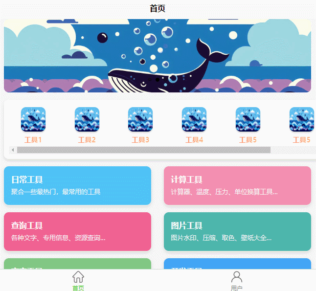
<view class="card-container">
<view class="card" style="background-color: #4fc3f7">
<text class="card-title">日常工具\n</text>
<text class="card-description">聚合一些最热门,最常用的工具</text>
</view>
<view class="card" style="background-color: #f48fb1">
<text class="card-title">计算工具\n</text>
<text class="card-description">计算器、温度、压力、单位换算工具...</text>
</view>
<view class="card" style="background-color: #f06292">
<text class="card-title">查询工具\n</text>
<text class="card-description">各种文字、专用信息、资源查询...</text>
</view>
<view class="card" style="background-color: #4db6ac">
<text class="card-title">图片工具\n</text>
<text class="card-description">图片水印、压缩、取色、壁纸大全...</text>
</view>
<view class="card" style="background-color: #81c784">
<text class="card-title">文字工具\n</text>
<text class="card-description">暗语翻译器、特殊文本、编码工具...</text>
</view>
<view class="card" style="background-color: #42a5f5">
<text class="card-title">开发工具\n</text>
<text class="card-description">各种代码工具、网页转应用...</text>
</view>
<view class="card" style="background-color: #64b5f6">
<text class="card-title">提取工具\n</text>
<text class="card-description">视频提取、图片提取、网页提取...</text>
</view>
<view class="card" style="background-color: #26a69a">
<text class="card-title">系统工具\n</text>
<text class="card-description">应用管理、WiFi密码查看、壁纸工具...</text>
</view>
</view>
</view>
</scroll-view>
</template>2. 数据初始化
接下来,给页面添加数据属性。这里包括 swiperImage 数组(轮播图图片的路径)和 tools 数组(工具栏的图标和名称)。在 <script> 部分中,我们将这些数据初始化:
javascript
<script>
export default {
	data() {
		return {
			swiperImage: [
				'/static/image/swiper/img1.jpeg',
				'/static/image/swiper/img2.jpeg',
				'/static/image/swiper/img3.jpeg'
			],
			tools: [
				{ name: '工具1', icon: '/static/image/swiper/img1.jpeg' },
				{ name: '工具2', icon: '/static/image/swiper/img1.jpeg' },
				{ name: '工具3', icon: '/static/image/swiper/img1.jpeg' },
				{ name: '工具4', icon: '/static/image/swiper/img1.jpeg' },
				{ name: '工具5', icon: '/static/image/swiper/img1.jpeg' },
				{ name: '工具5', icon: '/static/image/swiper/img1.jpeg' },
				{ name: '工具5', icon: '/static/image/swiper/img1.jpeg' },
			]
		}
	}
}
</script>
3. 样式设置
接下来是样式的编写,这一步会影响整个工具栏的展示效果。我们为工具栏、轮播图和卡片分别设置样式,特别是 scroll-view 和 tool-item 这些关键元素。
css
<style>
.container {
	font-size: 14px;
	line-height: 24px;
	background-color: #f5f5f5;
	padding-bottom: 60px; /* 留出底部导航栏的位置 */
}

/* 轮播图样式 */
.swiper {
	height: 150px;
	margin-bottom: 20px;
	border-radius: 10px;
	overflow: hidden;
	margin: 0 10px;
}
.swiper-item {
	height: 150px;
	width: 100%;
	background-color: #ff5e62;
}
.swiper-image {
	width: 100%;
}

/* 横向滑动工具栏样式 */
.tool-bar {
	display: flex;
	flex-direction: row;
	padding: 10px;
	border-radius: 10px;
	margin: 15px 10px 0px 10px;
	background-color: #ffffff;
	overflow-x: auto; /* 允许水平滚动 */
	white-space: nowrap;
	width: 100%;
}
.tool-item {
	width: 80px;
	margin-right: 10px;
	text-align: center;
	display: flex;
	flex-direction: column; /* 垂直排列图标和文字 */
	align-items: center;
}
.tool-icon {
	width: 50px;
	height: 50px;
	border-radius: 10px;
	margin-bottom: 5px;
}
.tool-text {
	font-size: 12px;
	color: #333;
}
</style>tool-bar是整个工具栏的容器,我们设置了flex-direction为row,表示工具项在水平排列。tool-item中,我们设置了flex-direction为column,让图标和文字垂直排列。scroll-view本身设置了overflow-x: auto,使其可以横向滚动。
4. 工具栏的细节优化
现在我们已经有了一个基本的横向工具栏,但为了让它更具吸引力,我们可以进行一些样式优化,使其更美观,并且适配更多的场景。接下来会从样式细节、布局调整和一些动态效果出发,进一步美化这个工具栏。
4.1 增加圆角、阴影和过渡效果
圆角、阴影和过渡效果可以让工具栏看起来更加立体,给用户更好的视觉体验。我们可以在 .tool-item 和 .tool-icon 上增加这些效果。
css
.tool-bar {
	display: flex;
	flex-direction: row;
	padding: 10px;
	border-radius: 10px;
	margin: 15px 10px 0px 10px;
	background-color: #ffffff;
	overflow-x: auto;
	white-space: nowrap;
	width: 100%;
	box-shadow: 0 4px 6px rgba(0, 0, 0, 0.1); /* 添加阴影 */
}

.tool-item {
	width: 80px;
	margin-right: 10px;
	text-align: center;
	display: flex;
	flex-direction: column;
	align-items: center;
	border-radius: 8px; /* 圆角 */
	transition: transform 0.2s ease; /* 添加过渡效果 */
}

.tool-item:hover {
	transform: scale(1.1); /* 鼠标悬浮放大效果 */
}

.tool-icon {
	width: 50px;
	height: 50px;
	border-radius: 50%; /* 图标改为圆形 */
	margin-bottom: 5px;
	box-shadow: 0 2px 4px rgba(0, 0, 0, 0.2); /* 图标阴影 */
}
4.2 动态效果
这里我们给 .tool-item 添加了 :hover 样式,在鼠标悬浮时稍微放大图标,形成一种"弹出"的效果。同时,tool-icon 的阴影让图标看起来不再是"贴"在页面上的,而是有了一些立体感。
4.3 文本颜色和字体
为了让工具栏的文字更具可读性,可以使用更亮眼的颜色和稍大的字体。也可以给文字加上一点渐变效果。
css
.tool-text {
	font-size: 14px;
	color: #333;
	font-weight: bold; /* 加粗字体 */
	background: linear-gradient(90deg, #ff7e5f, #feb47b); /* 渐变颜色 */
	-webkit-background-clip: text;
	color: transparent;
}
5. 响应式布局的实现
在开发移动应用时,响应式设计尤为重要,尤其是在横向滚动工具栏这种组件上。我们希望无论屏幕尺寸如何变化,工具栏的内容都能自适应调整,不会出现溢出或内容过小的问题。
5.1 使用 vw 和 vh 单位
vw(视口宽度)和 vh(视口高度)是 CSS 中非常实用的单位,可以使组件根据屏幕尺寸自动缩放。我们可以用 vw 来控制工具栏宽度,使其适应不同屏幕。
css
.tool-item {
	width: 20vw; /* 每个工具项的宽度占屏幕宽度的20% */
	max-width: 100px; /* 最大宽度设置 */
}
这种设置让每个工具项的宽度根据屏幕的宽度动态调整,但不超过 100px,这样就能适配各种设备。
5.2 媒体查询
如果想让工具栏在不同屏幕尺寸下的显示效果更加精细,可以使用 CSS 的媒体查询功能,在不同的屏幕宽度下调整工具栏的布局。
css
@media screen and (max-width: 600px) {
	.tool-item {
		width: 30vw; /* 在小屏幕上,每个工具项占30%屏幕宽度 */
	}
}

@media screen and (min-width: 600px) {
	.tool-item {
		width: 15vw; /* 在大屏幕上,每个工具项占15%屏幕宽度 */
	}
}
通过这种方式,我们可以确保在屏幕较小的手机上,工具项不会因为太小而难以阅读;在屏幕较大的设备上,工具栏也不会显得拥挤。
6. 交互功能的实现
光有好看的外观还不够,我们可以为工具栏添加一些交互功能,使用户体验更好。例如,当用户点击某个工具项时,可以触发相应的页面跳转或显示详细信息。
6.1 点击事件
在 UniApp 中,可以直接为工具项绑定点击事件。在模板中的 <view> 标签上使用 @click 事件,并在 methods 中定义点击处理逻辑。
html
<view class="tool-item" v-for="(tool, index) in tools" :key="index" @click="handleToolClick(tool)">
	<image :src="tool.icon" class="tool-icon"></image>
	<text class="tool-text">{{ tool.name }}</text>
</view>
javascript
methods: {
	handleToolClick(tool) {
		// 根据工具名称执行相应的操作,可以跳转到不同页面或展示内容
		uni.showToast({
			title: `点击了${tool.name}`,
			icon: 'none'
		});
	}
}
这样,用户点击某个工具项时,会显示提示信息。当然,你也可以根据需求进行页面跳转或执行其他操作,比如跳转到工具的详情页面:
javascript
uni.navigateTo({
	url: `/pages/${tool.pageName}/${tool.pageName}`
});
6.2 让工具栏记住滚动位置
如果希望工具栏在页面切换后能记住用户滚动的位置,可以利用 scroll-left 属性记录和恢复滚动位置。
html
<scroll-view scroll-x="true" class="tool-bar" :scroll-left="scrollLeft">
	<!-- 工具项 -->
</scroll-view>
javascript
data() {
	return {
		scrollLeft: 0, // 滚动位置
	};
},
methods: {
	// 页面离开时记录滚动位置
	saveScrollPosition(event) {
		this.scrollLeft = event.detail.scrollLeft;
	}
}
7. 优化性能
在移动端,性能优化是一个大话题,特别是在像工具栏这种涉及滚动和图片渲染的地方。以下是一些常见的优化措施:
7.1 图片懒加载
如果工具栏里有很多图片,可以启用懒加载,减少初始加载时间。UniApp 提供了 lazy-load 属性,可以在 <image> 标签中设置。
html
<image :src="tool.icon" class="tool-icon" lazy-load="true"></image>这样,只有当图片即将出现在视口中时才会加载,避免一次性加载所有图片,节省资源。
7.2 减少渲染次数
对于动态数据的渲染,可以在页面初次加载时将数据保存到本地存储中,避免每次打开页面都重新获取数据。例如,如果工具栏内容来自接口,可以将结果缓存起来:
javascript
methods: {
	async fetchTools() {
		const cachedTools = uni.getStorageSync('tools');
		if (cachedTools) {
			this.tools = cachedTools;
		} else {
			const res = await uni.request({ url: 'API_URL' });
			this.tools = res.data;
			uni.setStorageSync('tools', this.tools);
		}
	}
}
8. 最终效果展示与总结
经过上述步骤,我们的 UniApp 横向工具栏已经实现得差不多了。这个工具栏具有以下特点:
- 支持横向滚动,使用
scroll-view实现。 - 使用
flex布局,将图标和文字垂直排列,并添加了悬浮效果。 - 自适应布局,确保在各种屏幕尺寸上都能良好展示。
- 点击事件处理,可以轻松跳转或展示信息。
- 性能优化,通过图片懒加载和本地缓存提高了加载速度。
总结
本文介绍了如何在 UniApp 中制作一个横向滚动工具栏,从基础实现到样式优化,再到响应式设计和交互添加,最后进行了性能优化。希望这篇文章能帮助大家更好地理解和掌握 UniApp 中横向工具栏的实现方法,并能在自己的项目中自由运用。
通过这种方式实现的工具栏不仅美观,还具有实用性,可以轻松满足大多数项目需求。祝大家在开发 UniApp 的旅程中一帆风顺!