引言
在 Android 开发中,布局管理是构建用户界面的核心部分。随着应用需求的不断增长,传统的布局方式可能会导致性能问题,尤其是在复杂界面中,嵌套过多的布局层级会增加布局渲染的时间。而为了应对这一挑战,Google 在 Android 中推出了 ConstraintLayout,它不仅提高了布局的灵活性,也显著优化了性能。
作为 Android 官方推荐的强大布局容器,ConstraintLayout 允许开发者通过设置视图之间的约束关系来轻松实现复杂的 UI 布局,且无需嵌套多个布局。无论是静态页面还是动态内容,它都能提供更高效的解决方案。
本篇博客将为您介绍 ConstraintLayout 的基本使用方法、常见属性及实际应用示例,帮助您在项目中灵活运用这一布局方式,提升开发效率并优化用户体验。
ConstraintLayout的基本介绍
ConstraintLayout 是 Android 官方推出的一种布局方式,旨在简化和优化复杂界面的布局设计。它首次出现在 Android 2016 年的 I/O 大会上,并迅速成为了开发者的首选布局工具。ConstraintLayout 的最大特点是它不需要过多的嵌套布局,通过约束关系(constraints)直接控制视图的位置和大小,从而避免了传统布局中可能出现的性能瓶颈。
与其他布局容器(如LinearLayout、RelativeLayout)相比,ConstraintLayout 在实现复杂 UI 时更加高效。它支持百分比布局、响应式设计,以及动态布局调整,使得在屏幕尺寸变化时,控件能够灵活自适应。最重要的是,ConstraintLayout 允许开发者在一个布局文件中组合多个视图,并通过约束关系将它们定位在父容器或其他视图的相对位置,从而实现更加灵活和精确的布局设计。
因此,ConstraintLayout 不仅适用于静态界面布局,同样也非常适合需要动态调整和响应屏幕大小变化的复杂界面。
ConstraintLayout的常见属性
由于 ConstraintLayout 的功能强大 用途广泛,因此它的属性相对于其它布局也会多一些。
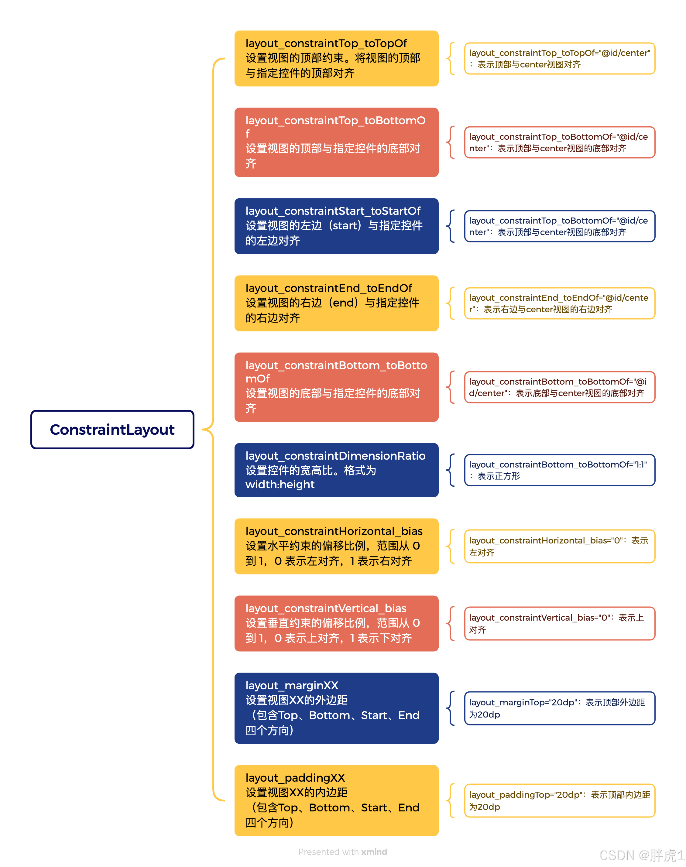
1. layout_constraintTop_toTopOf:
- 作用:将控件的顶部对齐到指定视图的顶部。
- 示例:app:layout_constraintTop_toTopOf="parent" 表示将控件的底部对齐到父视图的底部。
2. layout_constraintBottom_toBottomOf:
- 作用:将控件的底部对齐到指定视图的底部。
- 示例:app:layout_constraintBottom_toBottomOf="parent" 表示将控件的底部对齐到父视图的底部。
3. layout_constraintStart_toStartOf:
- 作用:将控件的左侧对齐到指定视图的左侧。
- 示例:app:layout_constraintStart_toStartOf="parent" 表示将控件的左侧对齐到父视图的左侧。
4. layout_constraintEnd_toEndOf:
- 作用:将控件的右边对齐到指定视图的右边。
- 示例:app:layout_constraintEnd_toEndOf="parent" 表示将控件的右边对齐到父视图的右边。
5. layout_constraintHorizontal_bias:
- 作用:设置控件在水平方向上的偏移,值范围从0.0到1.0,0.0表示左对齐,1.0表示右对齐。
- 示例:app:layout_constraintHorizontal_bias="0.5" 表示让控件水平居中。
6. layout_constraintVertical_bias:
- 作用:设置控件在垂直方向上的偏移,值范围从0.0到1.0,0.0表示上对齐,1.0表示下对齐。
- 示例:app:layout_constraintVertical_bias="0.5" 表示让控件垂直居中。
7. layout_constrainWidth_default和layout_constrainHeight_default
- 作用:用于设置控件的宽高默认值,常见的值有:wrap_content控件的宽高根据内容自动调整,match_parent控件的宽高与父视图大小一致。
- 示例:app:layout_constraintVertical_bias="0.5" 表示让控件垂直居中。
8. layout_constraintCircle系列属性
- 作用:允许控件沿着一个圆形路径进行布局。
- app:layout_constraintCircle="@id/referenceView" 将控件放置在指定视图referenceView 的圆形路径上。
- app:layout_constraintCircleRadius="100dp" 设置圆形路径的半径为100dp。
- app:layout_constraintCircleAngle="45" 设置控件沿圆形路径的角度。
9. layout_constraintGuidePercent和layout_constraintGuideBegin
- 作用:用于在布局中插入引导线(Guideline),通过引导线来辅助控件的位置计算。
- layout_constraintGuidePercent:允许通过百分比来定义引导线。
- layout_constraintGuideBegin:设置从父视图起始位置到引导线的距离。
- 示例:app:layout_constraintGuidePercent="0.5" 在父视图宽度的50%位置插入一个引导线。
10. layout_constraintDimensionRato
- 作用:设置控件的宽高比。
- 示例:app:layout_constraintDimensionRation="W,16:9" 表示控件的宽高比为16:9。
ConstraintLayout使用示例
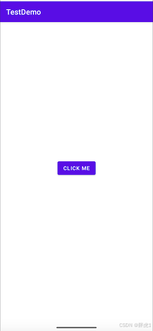
简单的水平和垂直布局居中布局
这是最基础的布局,使用 ConstraintLayout 让控件在父视图中水平和垂直居中。
XML
<androidx.constraintlayout.widget.ConstraintLayout
    xmlns:android="http://schemas.android.com/apk/res/android"
    xmlns:app="http://schemas.android.com/apk/res-auto"
    android:layout_width="match_parent"
    android:layout_height="match_parent">

    <Button
        android:id="@+id/myButton"
        android:layout_width="wrap_content"
        android:layout_height="wrap_content"
        android:text="Click Me"
        app:layout_constraintTop_toTopOf="parent"
        app:layout_constraintBottom_toBottomOf="parent"
        app:layout_constraintStart_toStartOf="parent"
        app:layout_constraintEnd_toEndOf="parent"/>
</androidx.constraintlayout.widget.ConstraintLayout>
效果如下:
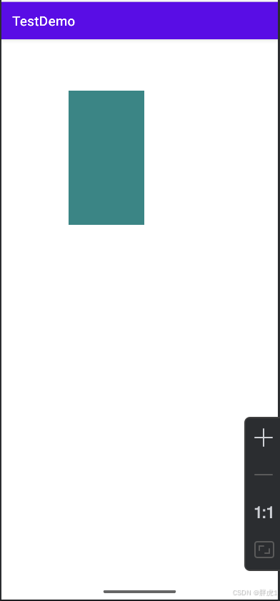
使用 layout_constraintDimensionRatio控制宽高比
可以使用 layout_constraintDimensionRatio 来保持控件的宽高比,这对于创建响应式的图片或视频播放器很有用。
XML
<androidx.constraintlayout.widget.ConstraintLayout
    xmlns:android="http://schemas.android.com/apk/res/android"
    xmlns:app="http://schemas.android.com/apk/res-auto"
    android:layout_width="match_parent"
    android:layout_height="match_parent">

    <ImageView
        android:id="@+id/myImageView"
        android:layout_width="0dp"
        android:layout_height="200dp"
        android:background="@color/teal_700"
        app:layout_constraintDimensionRatio="H,16:9"
        app:layout_constraintTop_toTopOf="parent"
        app:layout_constraintStart_toStartOf="parent"
        android:layout_marginTop="100dp"
        android:layout_marginLeft="100dp"/>
</androidx.constraintlayout.widget.ConstraintLayout>
效果如下:
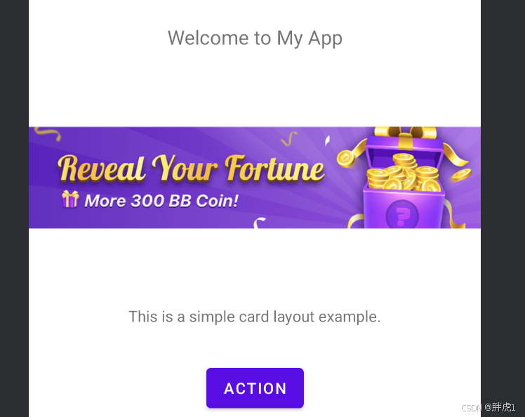
组合属性实现复杂布局
接下来我们使用ConstraintLayout来构建一个简单的卡片式布局,这个布局包含了一个标题、一个展示图片、一些描述文字以及一个操作按钮,构成了一个非常常见的内容展示框架。
通过这个布局示例,我们可以掌握如何使用 ConstraintLayout 来快速构建复杂但不失灵活的界面。接下来,我们将详细讲解每个控件的布局方式,确保它们在不同屏幕尺寸下都能良好地适配。
XML
<androidx.constraintlayout.widget.ConstraintLayout xmlns:android="http://schemas.android.com/apk/res/android"
    xmlns:app="http://schemas.android.com/apk/res-auto"
    android:id="@+id/main"
    android:layout_width="match_parent"
    android:layout_height="wrap_content">

    <!-- 标题 -->
    <TextView
        android:id="@+id/title"
        android:layout_width="wrap_content"
        android:layout_height="wrap_content"
        android:text="Welcome to My App"
        android:textSize="18sp"
        app:layout_constraintTop_toTopOf="parent"
        app:layout_constraintStart_toStartOf="parent"
        app:layout_constraintEnd_toEndOf="parent"
        android:layout_marginTop="100dp"
        android:padding="16dp"/>

    <!-- 图片区域 -->
    <ImageView
        android:id="@+id/image"
        android:layout_width="0dp"
        android:layout_height="200dp"
        android:src="@drawable/activity_banner"
        app:layout_constraintTop_toBottomOf="@id/title"
        app:layout_constraintStart_toStartOf="parent"
        app:layout_constraintEnd_toEndOf="parent"/>

    <!-- 文本描述 -->
    <TextView
        android:id="@+id/description"
        android:layout_width="wrap_content"
        android:layout_height="wrap_content"
        android:text="This is a simple card layout example."
        android:textSize="14sp"
        app:layout_constraintTop_toBottomOf="@id/image"
        app:layout_constraintStart_toStartOf="parent"
        app:layout_constraintEnd_toEndOf="parent"
        android:padding="16dp"/>

    <!-- 按钮 -->
    <Button
        android:id="@+id/btnAction"
        android:layout_width="wrap_content"
        android:layout_height="wrap_content"
        android:text="Action"
        app:layout_constraintTop_toBottomOf="@id/description"
        app:layout_constraintStart_toStartOf="parent"
        app:layout_constraintEnd_toEndOf="parent"
        android:layout_marginTop="16dp"/>


</androidx.constraintlayout.widget.ConstraintLayout>
效果如下:
结语
通过本篇博客,我们简单介绍了 ConstraintLayout 这个强大的布局工具,以及它如何帮助开发者高效地创建灵活、响应式的界面。我们重点讲解了如何利用 ConstraintLayout 来实现基本的居中布局,并通过 layout_constraintDimensionRatio 属性来控制控件的宽高比,确保界面在不同设备上都能保持良好的显示效果。
作为 Android 开发中常用的布局方式,ConstraintLayout 不仅提升了开发效率,也优化了应用的性能。它避免了复杂的布局嵌套,能够在一个布局中灵活地管理控件的位置和大小。无论是简单的 UI 设计,还是复杂的响应式界面,ConstraintLayout 都能提供更精确和高效的布局方案。
希望通过今天的分享,你能更好地掌握 ConstraintLayout,并将其应用到实际开发中。如果你在使用过程中遇到任何问题,欢迎随时与我交流,我们一起探索更多布局技巧!