在前端开发中,视觉效果越来越受到重视。本文将通过一个生动的示例,讲解如何利用 Sass 构建一个具有动态星空滚动效果的背景页面,同时也系统介绍 Sass 的核心功能与实践技巧。
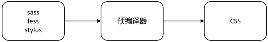
一、Sass 的作用
Sass(Syntactically Awesome Style Sheets)是一种 CSS 的预处理语言,扩展了 CSS 的语法功能。它引入了变量、嵌套规则、混入(Mixin)、函数、模块化引入 等强大特性,能够显著提高样式代码的复用性与可维护性。
举个简单例子,假如我们需要在多个地方复用颜色或字体,只需通过变量统一管理即可:
css
$primary-color: #3498db;

button {
  background-color: $primary-color;
}
Sass 的优点:
- 让样式结构更清晰(嵌套)
- 减少重复代码(混入、继承)
- 便于维护(变量、模块化)
- 支持逻辑控制(函数、条件语句、循环)
二、全局安装 Sass
在项目中使用 Sass 前,需先通过 npm 安装它:
bash
npm install -g sass这将在系统中全局安装 Sass,便于在任何项目中使用其命令行工具。
三、Sass 的两种语法风格
Sass 提供了两种语法风格:Sass(缩进式) 和 SCSS(语法类似 CSS)。
| 风格 | 特点 | 示例 |
|---|---|---|
| Sass | 无需大括号和分号,使用缩进表示层级 | font-size 14px |
| SCSS | 类似 CSS,需使用大括号和分号 | font-size: 14px; |
推荐使用 SCSS 风格:因为它与 CSS 更接近,学习成本更低,且被广泛使用。
四、项目目录结构
项目结构如下图所示:
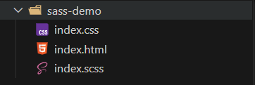
index.html:主页面index.scss:SCSS 源文件index.css:编译生成的 CSS 文件
五、HTML 页面结构
HTML 页面内容如下:
html
<!DOCTYPE html>
<html lang="zh-CN">
<head>
  <meta charset="UTF-8" />
  <meta name="viewport" content="width=device-width, initial-scale=1.0"/>
  <title>星空背景</title>
  <link rel="stylesheet" href="./index.css" />
</head>
<body>
  <div class="layer1"></div>
  <div class="layer2"></div>
  <div class="layer3"></div>
  <div class="layer4"></div>
  <div class="layer5"></div>
  <div class="title">星空背景</div>
</body>
</html>
六、启动 Sass 编译
使用如下命令实时编译 index.scss 文件为 index.css:
bash
sass index.scss index.css --no-source-map -w参数说明:
--no-source-map:选项表示不生成.map文件,源码地图是一种将编译、压缩或转换后的代码映射回原始源代码的技术,主要用于开发调试-w:watch 模式,监听文件变化并自动编译
七、SCSS 样式实现详解
1. 引入模块
css
@use "sass:string";
@use "sass:math";
2. 设置背景和标题样式
css
html {
  height: 100%;
  background: radial-gradient(ellipse at bottom, #1b2735 0%, #090a0f 100%);
  overflow: hidden;
}

.title {
  position: absolute;
  top: 50%;
  left: 0;
  right: 0;
  text-align: center;
  font-size: 50px;
  letter-spacing: 10px;
  font-weight: 300;
  color: transparent;
  font-family: 'Lato', sans-serif;
  background: linear-gradient(white, #38495a);
  background-clip: text;
  -webkit-background-clip: text;
  margin-top: -60px;
}
3. 创建随机星星阴影函数
css
@function createShadow($n) {
  $shadow: '#{math.random(100)}vw #{math.random(100)}vh #fff';
  @for $i from 2 through $n {
    $shadow: '#{$shadow}, #{math.random(100)}vw #{math.random(100)}vh #fff';
  }
  @return string.unquote($shadow);
}
4. 星星层级生成循环
css
$count: 1000;
$duration: 400;

@for $i from 1 through 5 {
  $count: math.floor(calc($count / 2));
  $duration: math.floor(calc($duration / 2));

  .layer#{$i} {
    $size: #{$i}px;
    position: fixed;
    top: 0;
    left: 0;
    width: $size;
    height: $size;
    border-radius: 50%;
    box-shadow: createShadow($count);
    animation: moveUp #{$duration}s linear infinite;

    &::after {
      content: '';
      position: fixed;
      top: 100vh;
      left: 0;
      width: inherit;
      height: inherit;
      border-radius: inherit;
      box-shadow: inherit;
    }
  }
}
5. 动画效果
css
@keyframes moveUp {
  100% {
    transform: translateY(-100vh);
  }
}
6.完整代码
css
@use "sass:string"; // 引入 string 模块
@use "sass:math"; // 引入 math 模块

html {
    height: 100%;
    background: radial-gradient(ellipse at bottom, #1b2735 0%, #090a0f 100%);
    overflow: hidden;
}

.title {
    position: absolute;
    top: 50%;
    left: 0;
    right: 0;
    color: #fff;
    text-align: center;
    font-family: 'lato', sans-serif;
    font-weight: 300;
    font-size: 50px;
    letter-spacing: 10px;
    margin-top: -60px;
    padding-left: 10px;
    background: linear-gradient(white, #38495a);
    background-clip: text;
    -webkit-background-clip: text;

    color: transparent;
}

// 用阴影创建多个星星的函数
@function createShadow($n) {
    $shadow: '#{math.random(100)}vw #{math.random(100)}vh #fff';
    @for $i from 2 through $n {
        $shadow: '#{$shadow}, #{math.random(100)}vw #{math.random(100)}vh #fff'
    }
    // 去掉引号
    @return string.unquote($shadow);
}

// 设置初始的星星数量和动画持续时间
$count:1000;
$duration:400;

// 循环5层
@for $i from 1 through 5{
    // 每层数量减半
    $count:math.floor(calc($count/2));
    // 星星越大(近)移动越快
    $duration: math.floor(calc($duration/2));
    // 打印变量信息
    @debug 'count:#{$count}-duration:#{$duration}';

    .layer#{$i} {
        // 控制星星大小
        $size:#{$i}px;
        position: fixed;
        top: 0px;
        left: 0px;
        width: $size;
        height: $size;
        border-radius: 50%;
        // 用阴影创建多个星星
        box-shadow: createShadow($count);
        // 设置动画
        animation: moveUp #{$duration}s linear infinite;
        // 设置子元素,让layer离开屏幕底部后还有星星出现
        &::after{
            content: '';
            position: fixed;
            left: 0;
            // 子元素在视口底部
            top: 100vh;
            // 继承父元素
            width: inherit;
            height: inherit;
            border-radius: inherit;
            box-shadow: inherit;
        }
    }
}


@keyframes moveUp{
    100%{
        // 星星往上移动一个视口
        transform: translateY(-100vh);
    }
}
八、星空移动原理图解
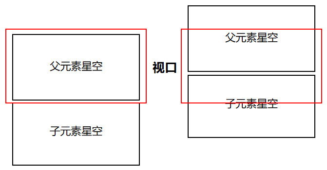
原理简述:
- 每层
.layer通过box-shadow随机绘制大量星星; - 每颗星星被一个元素和其伪元素
::after复制并垂直分布; moveUp动画让星星从底部移动到顶部,形成无限循环的视觉效果;- 每层星星数量、大小、速度不同,营造出真实的视差滚动效果(Parallax Scrolling)。
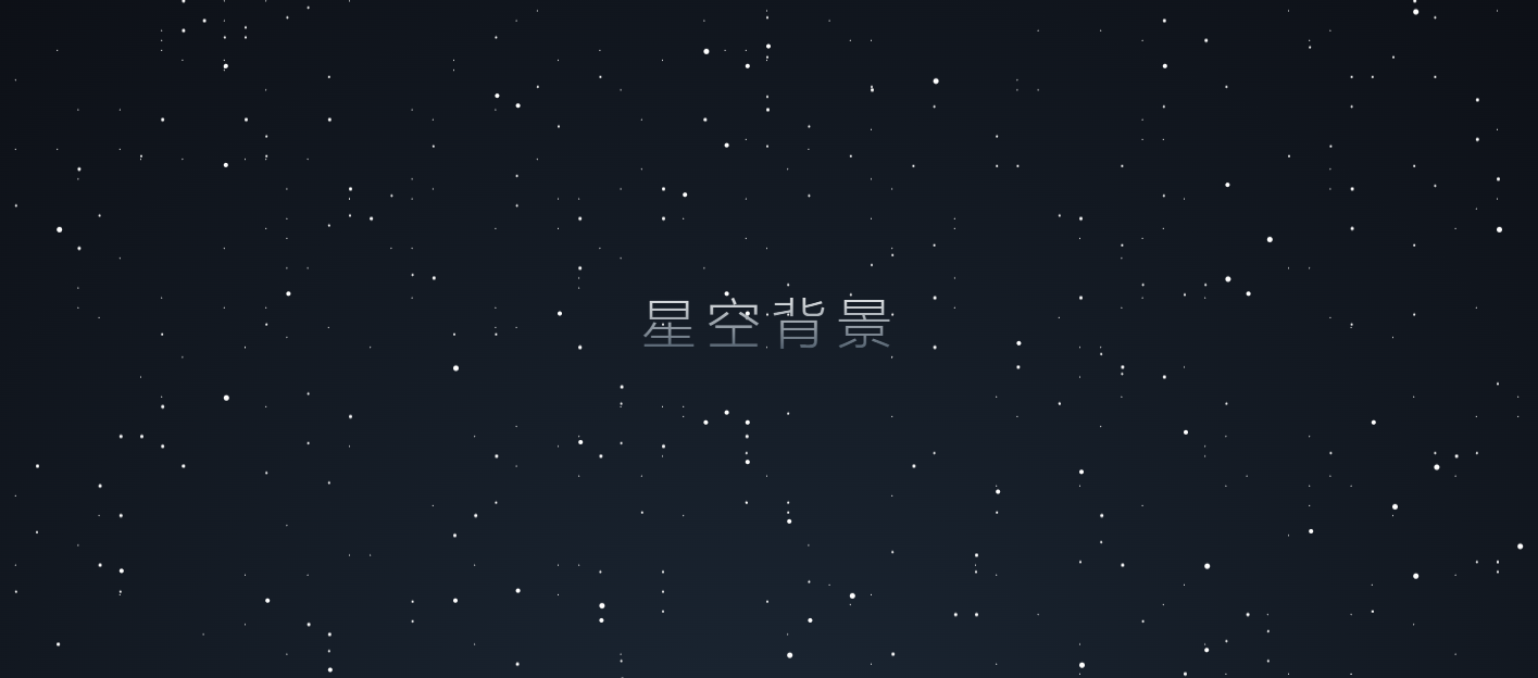
最终效果:
九、技术点回顾:
- Sass 模块
@use和内建函数 - 自定义函数生成
box-shadow - 多层滚动星空的实现逻辑
- 使用
animation+@keyframes实现动态视觉效果
💬 如果你对 Sass、CSS 动效、或前端视觉设计感兴趣,欢迎留言交流或点赞支持!