系列文档目录
国际化
配置文件
文章目录
目录
前言
上一章节讨论按钮组件构建与使用,本章节重点讨论Table组件构建与结合按钮组件使用。
子组件-Table组件构建
创建文件: components/ActionTableCont.vue
实现功能:
1. 栏位定义: 栏位配置由父组件传入,栏位可自定义隐藏。
2. 数据来源: 表格数据由父组件提供。
3. 勾选功能: 支持行数据的勾选操作。
4. 分页功能: 集成分页功能,支持数据分页显示。
html
<template>
  <div>
    <!-- 表格 -->
    <el-table
      :data="currentPageData"
      style="width: 100%"
      border
      @selection-change="handleSelectionChange"
    >
      <!-- 选择列 -->
      <el-table-column
        v-if="showSelection"
        type="selection"
        width="55"
        align="center"
      ></el-table-column>

      <!-- 序号列 -->
      <el-table-column
        type="index"
        label="序号"
        width="50"
        align="center"
      ></el-table-column>

      <!-- 动态列 -->
      <el-table-column
        v-for="column in visibleColumns"
        :key="column.prop"
        :prop="column.prop"
        :label="column.label"
        :width="column.width"
        :align="column.align || 'left'"
      ></el-table-column>
    </el-table>

    <!-- 分页 -->
    <el-pagination
      :current-page="currentPage"
      :page-size="pageSize"
      :page-sizes="pageSizes"
      layout="total, sizes, prev, pager, next, jumper"
      :total="tableData.length"
      @size-change="handleSizeChange"
      @current-change="handleCurrentChange"
      style="margin-top: 20px"
    ></el-pagination>
  </div>
</template>

<script setup>
import { ref, computed, defineProps, defineEmits, watch } from 'vue';

const props = defineProps({
  tableColumns: {
    type: Array,
    required: true,
    default: () => [],
  },
  tableData: {
    type: Array,
    required: true,
    default: () => [],
  },
  pageSize: {
    type: Number,
    default: 10,
  },
  pageSizes: {
    type: Array,
    default: () => [5, 10, 15, 20],
  },
  showSelection: {
    type: Boolean,
    default: false,
  },
});

const emit = defineEmits(['update:currentPage', 'update:pageSize', 'selection-change']);

const currentPage = ref(1);

const currentPageData = computed(() => {
  const start = (currentPage.value - 1) * props.pageSize;
  const end = start + props.pageSize;
  return props.tableData.slice(start, end);
});

const visibleColumns = computed(() => {
  return props.tableColumns.filter((column) => !column.hide);
});

const handleSizeChange = (newSize) => {
  console.log(`分页大小改变,新的分页大小为: ${newSize}`);
  emit('update:pageSize', newSize);
  currentPage.value = 1; // 重置当前页为第一页
  emit('update:currentPage', currentPage.value);
};

const handleCurrentChange = (newPage) => {
  console.log(`当前页码改变,新的页码为: ${newPage}`);
  currentPage.value = newPage;
  emit('update:currentPage', currentPage.value);
};

const handleSelectionChange = (selection) => {
  emit('selection-change', selection);
};

// 监听 currentPage 和 pageSize 的变化并记录日志
watch(currentPage, (newVal, oldVal) => {
  console.log(`currentPage changed from ${oldVal} to ${newVal}`);
});

watch(() => props.pageSize, (newVal, oldVal) => {
  console.log(`pageSize changed from ${oldVal} to ${newVal}`);
});
</script>
父组件-Table组件显示
功能说明:
1. 按钮组件引用: 删除按钮默认不可用。
2. 表格组件引用: 每页显示 5 条数据。
3. 栏位数据模拟: 地址栏位默认隐藏。
4. 勾选功能:
• 勾选数据后,删除按钮变为可用状态;
• 未勾选任何数据时,删除按钮保持不可用状态。
5. 勾选数据展示: 勾选的数据会在表格下方空白处显示。
6. 删除按钮功能: 点击删除按钮时,获取勾选的数据。
html
<template>

  <div>

    <ActionButtonGroup
        :show-add="hasPermission('demo2:create')"
        :show-delete="true"
        :disabled-add="false"
        :disabled-edit="!selectedData.length"
        :disabled-delete="!selectedData.length"

        @add="handleAdd"
        @edit="handleEdit"
        @delete="handleDelete"
      />
    <!-- 表格 -->
    <CustomTable
      :tableColumns="columns"
      :tableData="data"
      :pageSize="pageSize"
      :pageSizes="[5, 10, 15, 20, 30]"
      :showSelection="true"
      @update:currentPage="currentPage = $event"
      @update:pageSize="pageSize = $event"
      @selection-change="handleSelectionChange"
    />


    <!-- 显示选中数据 -->
    <div v-if="selectedData.length > 0" style="margin-top: 20px">
      <h3>选中的数据:</h3>
      <pre>{{ selectedData }}</pre>
    </div>
  </div>
</template>

<script setup>
import { ref } from 'vue';
import CustomTable from '@/components/ActionTableCont.vue';
import { usePermission } from "@/utils/permissionUtils";
import ActionButtonGroup from "@/components/ActionBtnHdrCont.vue";
import {
  Plus,
  Check,
  Delete,
  Edit,
  Message,
  Search,
  Star,
  Upload,
} from '@element-plus/icons-vue'

const hasPermission = usePermission();

const columns = ref([
  {
    prop: 'date',
    label: '日期',
    width: 180,
  },
  {
    prop: 'name',
    label: '姓名',
    width: 180,
  },
  {
    prop: 'address',
    label: '地址',
    hide: true,
  },
]);

const data = ref([
  {
    id: 1,
    date: '2025-04-14',
    name: '张三',
    address: '上海市普陀区金沙江路 1518 弄',
  },
  {
    id: 2,
    date: '2025-04-15',
    name: '李四',
    address: '上海市普陀区金沙江路 1517 弄',
  },
  {
    id: 3,
    date: '2025-04-16',
    name: '王五',
    address: '上海市普陀区金沙江路 1516 弄',
  },
  {
    id: 4,
    date: '2025-04-17',
    name: '赵六',
    address: '上海市普陀区金沙江路 1515 弄',
  },
  {
    id: 5,
    date: '2025-04-18',
    name: '孙七',
    address: '上海市普陀区金沙江路 1514 弄',
  },
  {
    id: 6,
    date: '2025-04-19',
    name: '周八',
    address: '上海市普陀区金沙江路 1513 弄',
  },
  {
    id: 7,
    date: '2025-04-20',
    name: '吴九',
    address: '上海市普陀区金沙江路 1512 弄',
  },
  {
    id: 8,
    date: '2025-04-21',
    name: '郑十',
    address: '上海市普陀区金沙江路 1511 弄',
  },
  {
    id: 9,
    date: '2025-04-22',
    name: '钱十一',
    address: '上海市普陀区金沙江路 1510 弄',
  },
  {
    id: 10,
    date: '2025-04-23',
    name: '孔十二',
    address: '上海市普陀区金沙江路 1509 弄',
  },
  {
    id: 11,
    date: '2025-04-24',
    name: '秦十三',
    address: '上海市普陀区金沙江路 1508 弄',
  },
  {
    id: 12,
    date: '2025-04-25',
    name: '尤十四',
    address: '上海市普陀区金沙江路 1507 弄',
  },
]);

const currentPage = ref(1);
const pageSize = ref(5);// 默认每页显示5条数据

// 用于存储选中的数据
const selectedData = ref([]);

// 处理选中数据变化
const handleSelectionChange = (selection) => {
  selectedData.value = selection;
};

// 获取选中数据
const handleDelete = () => {
  console.log('Selected Data:', selectedData.value);
  console.log('Selected  Data length:', selectedData.value.length);
  if (selectedData.value.length > 0) {
    // 删除逻辑
    console.log('Deleting selected data...');
    selectedData.value = [];
  } else {
    console.log('No selected data to delete.');
  }

};
</script>
演示效果
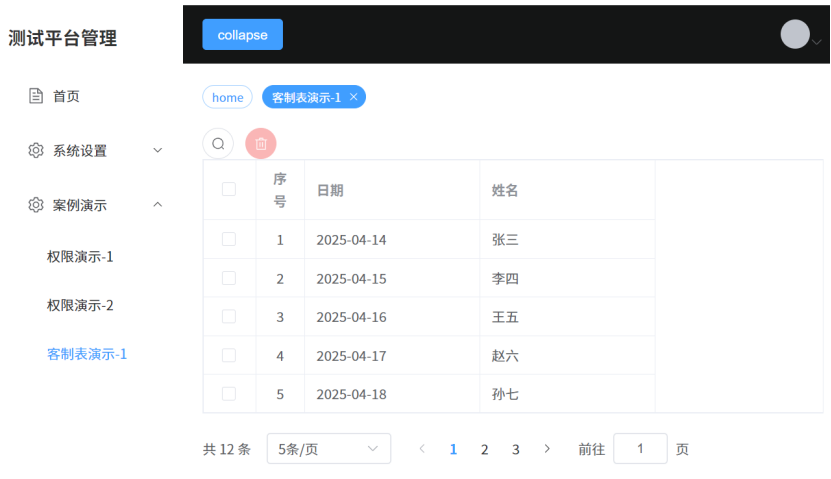
测试效果:
1. 地址栏位: 地址栏位未显示。
2. 数据加载: 数据被成功加载。
3. 分页显示: 页码与翻页功能显示正确。
4. 删除按钮: 删除按钮默认不可用。
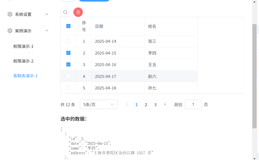
测试效果:
1. 勾选操作:
• 勾选任意数据后,删除按钮显示,选中数据显示勾选资料
• 未勾选任何数据时,删除按钮不显示。
2. 全选与全取消:
• 支持全选操作,全选后删除按钮显示,选中数据显示勾选资料
• 支持全取消操作,全取消后删除按钮不显示。
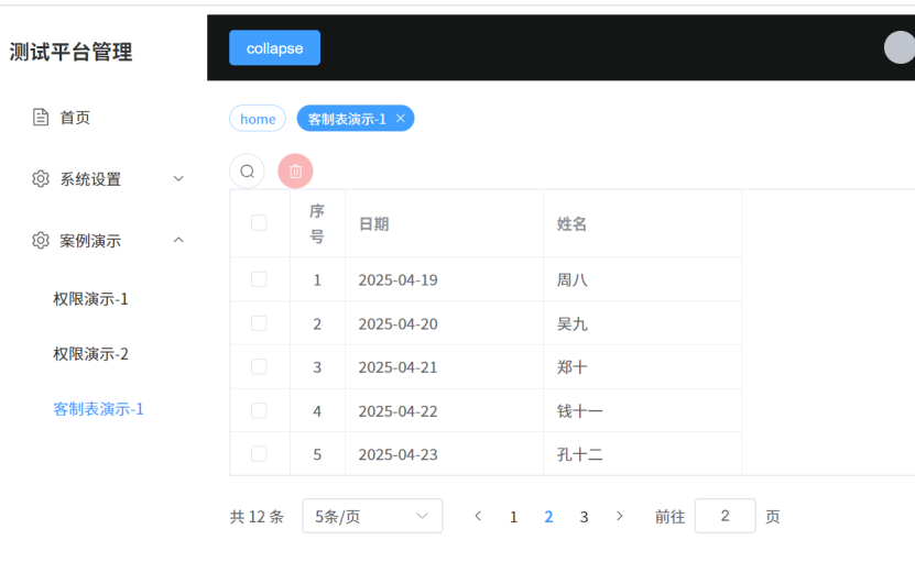
测试效果:
1. 每页显示笔数: 每页显示的记录数正确。
2. 页码选择: 页码选项可正常选择。
3. 前往页码: 支持跳转到指定页码。
后续
本章节主要介绍 :客制化 Table 组件的实现。下一章节将讨论:Form 组件的构建。
代码下载
GitCode - 全球开发者的开源社区,开源代码托管平台GitCode是面向全球开发者的开源社区,包括原创博客,开源代码托管,代码协作,项目管理等。与开发者社区互动,提升您的研发效率和质量。 https://gitcode.com/sen_shan/ssVue3Demo.gitss.vue3.demo: 本项目以 Vue3、Vite、TypeScript、Element Plus 为核心框架,结合 Vue Router、Element Plus Icons、Less、Axios、Pinia、Mock 等技术,初始的构建登录,主界面,权限控制,按钮组件,table组件,form组件等小模型,可以随意搭建web管理系统https://gitee.com/sen_shan/ssVue3Demo.git