二、背景效果
| 属性 | 功能 | 示例值 | 说明 |
|---|---|---|---|
background |
设置背景颜色或渐变 | background: linear-gradient(45deg, #4CAF50, #FF5722); |
设置背景颜色、图片或渐变效果。 |
background-size |
调整背景图片大小 | background-size: cover; |
设置背景图片的显示大小,如 cover 或 contain。 |
background-clip |
控制背景绘制范围 | background-clip: content-box; |
控制背景绘制范围,可选值:border-box、padding-box、content-box。 |
1、背景渐变语法:
/* 线性渐变(默认从上到下) */
background: linear-gradient(方向或角度, 颜色1, 颜色2, ...);
/* 径向渐变(从中心向外扩散) */
background: radial-gradient(形状或位置, 颜色1, 颜色2, ...);
/* 圆锥渐变(围绕中心旋转) */
background: conic-gradient(起始角度, 颜色1, 颜色2, ...);
html
<!DOCTYPE html>
<html lang="zh-CN">
<head>
<meta charset="UTF-8">
<meta name="viewport" content="width=device-width, initial-scale=1.0">
<title>CSS 渐变与多重背景</title>
<style>
body {
font-family: Arial, sans-serif;
background-color: #f4f4f4;
margin: 0;
padding: 20px;
display: flex;
justify-content: space-around;
align-items: center;
height: 100vh;
flex-wrap: wrap;
}
/* 线性渐变 */
.linear-gradient1 {
width: 300px;
height: 200px;
background: linear-gradient( #ff7e5f, #ece3dc); /* 从上到下(默认) */
border-radius: 10px;
display: flex;
justify-content: center;
align-items: center;
color: white;
font-size: 18px;
text-align: center;
}
/* 线性渐变 */
.linear-gradient2 {
width: 300px;
height: 200px;
background: linear-gradient(to right, #ff7e5f, #ece3dc); /* 从左到右 */
border-radius: 10px;
display: flex;
justify-content: center;
align-items: center;
color: white;
font-size: 18px;
text-align: center;
}
/* 线性渐变 */
.linear-gradient3 {
width: 300px;
height: 200px;
background: linear-gradient(to bottom right , #ff7e5f, #ece3dc); /* 对角线(左上到右下) */
border-radius: 10px;
display: flex;
justify-content: center;
align-items: center;
color: white;
font-size: 18px;
text-align: center;
}
/* 线性渐变 */
.linear-gradient4 {
width: 300px;
height: 200px;
background: linear-gradient(45deg, #ff7e5f, #ece3dc); /* 角度(如 45deg) 从左上到右下的渐变 */
border-radius: 10px;
display: flex;
justify-content: center;
align-items: center;
color: white;
font-size: 18px;
text-align: center;
}
/* 径向渐变 */
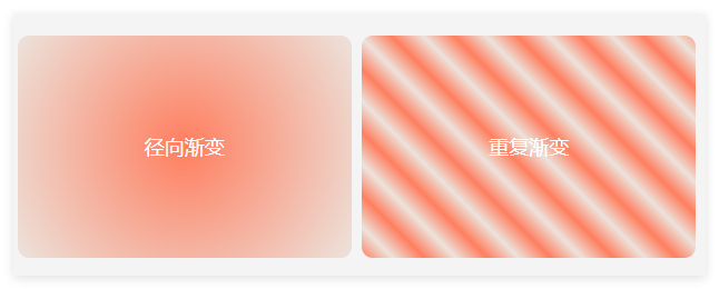
.radial-gradient {
width: 300px;
height: 200px;
background: radial-gradient(circle, #ff7e5f, #ece3dc); /* 从中心向外的圆形渐变 */
border-radius: 10px;
display: flex;
justify-content: center;
align-items: center;
color: white;
font-size: 18px;
text-align: center;
}
/* 重复渐变 */
.repeating-gradient {
width: 300px;
height: 200px;
background: repeating-linear-gradient(45deg, #ff7e5f, #ece3dc 20px, #ff7e5f 40px); /* 重复的线性渐变 */
border-radius: 10px;
display: flex;
justify-content: center;
align-items: center;
color: white;
font-size: 18px;
text-align: center;
}
/* 多重背景叠加 */
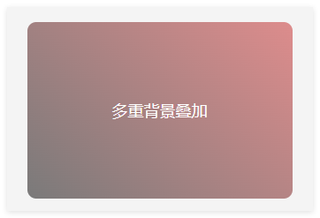
.multi-background {
width: 300px;
height: 200px;
background:
linear-gradient(45deg, rgba(0, 0, 0, 0.5), rgba(197, 36, 36, 0.5)), /* 半透明的线性渐变 */
url('https://via.placeholder.com/300x200') no-repeat center/cover; /* 背景图片 */
border-radius: 10px;
display: flex;
justify-content: center;
align-items: center;
color: white;
font-size: 18px;
text-align: center;
}
</style>
</head>
<body>
<div class="linear-gradient1">
线性渐变-从上到下
</div>
<div class="linear-gradient2">
线性渐变-从左到右
</div>
<div class="linear-gradient3">
线性渐变-对角线
</div>
<div class="linear-gradient4">
线性渐变-角度45deg
</div>
<div class="radial-gradient">
径向渐变
</div>
<div class="repeating-gradient">
重复渐变
</div>
<div class="multi-background">
多重背景叠加
</div>
</body>
</html>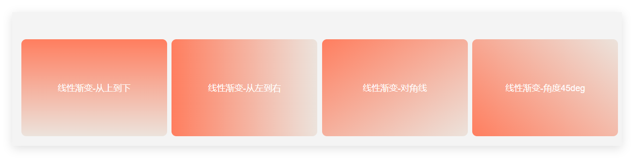
2、背景图片大小
| 属性值/用法 | 描述 | 示例 | 注意事项 |
|---|---|---|---|
**cover** |
保持图片宽高比,拉伸以完全覆盖容器(可能裁剪) | background-size: cover; |
常用于全屏背景设计,需配合 background-position 调整显示区域 |
**contain** |
保持图片宽高比,缩放以完整显示在容器内(可能留白) | background-size: contain; |
适合需完整展示图片的场景(如小图标) |
| 单值语法 | 仅设置宽度,高度自动按比例计算 | background-size: 100px; (宽度 100px,高度自适应) |
百分比值基于容器宽度(如 50% 表示容器宽度的一半) |
| 双值语法 | 同时设置宽度和高度(可能导致图片变形) | background-size: 200px 150px;(固定宽高) |
使用 auto 保留比例(如 100px auto 宽度固定,高度自适应) |
| 百分比 | 基于容器尺寸定义宽高(可能变形) | background-size: 80% 60%;( 宽度占容器 80%,高度占 60%) |
需注意容器尺寸是否明确,否则百分比可能失效 |
在 background 简写中 |
需通过 / 与 background-position 分隔,格式为 position/size |
background: url(image.jpg) center/cover; |
若省略 position,需保留默认值(如 0 0/cover)否则语法错误 |
| 多背景图控制 | 为多个背景图分别设置尺寸,用逗号分隔 | background-size: cover, 50px;(第一张图 cover,第二张图宽度 50px) |
需与 background-image 中图片顺 |
html
<!DOCTYPE html>
<html lang="zh-CN">
<head>
    <meta charset="UTF-8">
    <meta name="viewport" content="width=device-width, initial-scale=1.0">
    <title>Background-Size 示例</title>
    <style>
        body {
            font-family: Arial, sans-serif;
            background-color: #f4f4f4;
            margin: 0;
            padding: 20px;
            display: flex;
            justify-content: space-around;
         }

        .box {
            width: 200px;
            height: 150px;
            border: 1px solid #312121;
            background-image: url('https://img0.baidu.com/it/u=2229144304,3578627907&fm=253&fmt=auto&app=138&f=JPEG?w=467&h=300');
            background-repeat: no-repeat;
            background-position: center;
            text-align: center;
            line-height: 150px;
            color: rgb(190, 39, 60);
            font-size: 14px;
            font-weight: bolder;
        }

        /*  1: 默认大小 */
        .box-auto {
            background-size: auto;
        }

        /* 2: 覆盖容器 */
        .box-cover {
            background-size: cover;
        }

        /* 3: 完全显示 */
        .box-contain {
            background-size: contain;
        }

        /* 4: 指定大小 */
        .box-fixed {
            background-size: 100px 50px; /* 宽度 100px,高度 50px */
        }

         /* 5: 百分比  */
        .box-percent{
            background-size: 80% 60%; /* 宽度 80%,高度 60% */
            /* 80% 是相对于容器的宽度,60% 是相对于容器的高度 */
        }

         /* 6: 多背景图 */
        .box-more {
            background-image: url('https://gimg2.baidu.com/image_search/src=http%3A%2F%2Fimage109.360doc.com%2FDownloadImg%2F2021%2F10%2F2311%2F232626556_7_20211023114804116&refer=http%3A%2F%2Fimage109.360doc.com&app=2002&size=f9999,10000&q=a80&n=0&g=0n&fmt=auto?sec=1748051084&t=fde811de6b9fb97d4415b10895ae5d6d'),linear-gradient(60deg, #ff7e5f, #ece3dc 20px, #d3a69b 40px);
            background-size:  100px auto,cover ; /* 第一图固定宽度,第二图覆盖容器 */
        }
    </style>
</head>
<body>
    <div class="box box-auto">auto</div>
    <div class="box box-cover">cover</div>
    <div class="box box-contain">contain</div>
    <div class="box box-fixed">100px 50px</div>
    <div class="box box-percent">80% 60%</div>
    <div class="box box-more">100px auto, cover</div>
</body>
</html>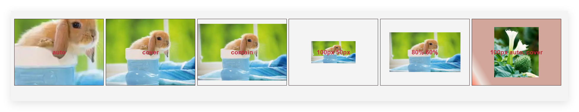
3、背景绘制范围
background-clip: 值;
| 属性值 | 作用 | 示例 |
|---|---|---|
border-box |
默认值,背景延伸到边框区域(包括边框) | background-clip: border-box; |
padding-box |
背景仅延伸到内边距区域(不包含边框) | background-clip: padding-box; |
content-box |
背景仅延伸到内容区域(不包含内边距和边框) | background-clip: content-box; |
text |
背景裁剪为文字形状(需配合 color: transparent 实现文字渐变/图案填充) |
background-clip: text;(需浏览器前缀) |
html
<!DOCTYPE html>
<html lang="zh-CN">
<head>
    <meta charset="UTF-8">
    <meta name="viewport" content="width=device-width, initial-scale=1.0">
    <title>Background-Clip 示例</title>
    <style>
       body {
            font-family: Arial, sans-serif;
            background-color: #f4f4f4;
            margin: 0;
            padding: 20px;
            display: flex;
            justify-content: space-around;
            align-items: center;

        }


        .box {
            width: 200px;
            height: 100px;
            border: 8px double #333;
            background: linear-gradient(45deg, #ff7e5f, #d1ccc9);
            color: white;
            font-size: 14px;
            display: flex;
            justify-content: wrap;
            align-items: center;
            text-align: center;
            margin: 20px;
            padding: 20px;
        }

        /* 默认值:背景绘制到边框外边缘 */
        .border-box {
            background-clip: border-box;
        }

        /* 背景绘制到内边距的外边缘 */
        .padding-box {
            background-clip: padding-box;
        }

        /* 背景仅绘制到内容区域 */
        .content-box {
            background-clip: content-box;
        }

        /* 背景裁剪到文字(仅适用于 Webkit 浏览器) */
        .text-clip {
            font-size: 24px;
            font-weight: bold;
            background-clip: text;
            -webkit-background-clip: text; /* 必须使用 Webkit 前缀 */
            color: transparent; /* 文字透明,显示背景 */
        }
    </style>
</head>
<body>
    <div class="box border-box">border-box</div>
    <div class="box padding-box">padding-box</div>
    <div class="box content-box">content-box</div>
    <div class="box text-clip" style="background: linear-gradient(to right, #ff7e5f, #feb47b);">
        Text Clip
    </div>
</body>
</html>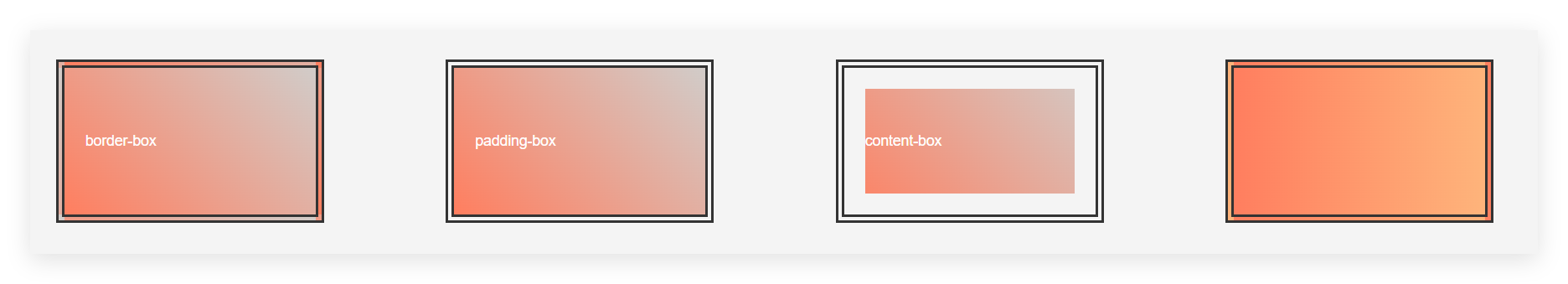
三、文本效果
text-shadow: 水平偏移 垂直偏移 模糊半径 颜色;
| 参数 | 作用 | 示例 |
| 水平偏移 | 阴影水平方向偏移量(正数向右,负数向左) | 2px、-3px |
| 垂直偏移 | 阴影垂直方向偏移量(正数向下,负数向上) | 2px、-1px |
| 模糊半径 | 阴影模糊程度(值越大越模糊,0 为无模糊) | 4px、0(清晰边缘) |
| 颜色 | 阴影颜色(支持所有颜色格式:十六进制、RGB、RGBA 等) | #333、rgba(0,0,0,0.5) |
|---|
| 性 | 功能 | 示例值 | 说明 |
|---|---|---|---|
text-shadow |
添加文本阴影 | text-shadow: 2px 2px 5px rgba(0, 0, 0, 0.5); |
为文本添加阴影效果,支持颜色、模糊半径等。 |
color |
设置文本颜色 | color: #4CAF50; |
设置文本颜色,支持十六进制、RGB、HSL 或颜色名称。 |
font-size |
设置文本大小 | font-size: 20px; |
设置文本的字体大小,支持像素(px)、百分比(%)、em 或 rem 单位。 |
font-weight |
设置文本粗细 | font-weight: bold; |
设置文本粗细,可选值:normal、bold 或数值(如 100、400、700)。 |
line-height |
设置文本行高 | line-height: 1.5; |
设置文本的行高,支持数值、百分比或单位(如 px)。 |
html
<!DOCTYPE html>
<html lang="zh-CN">
<head>
<meta charset="UTF-8">
<meta name="viewport" content="width=device-width, initial-scale=1.0">
<title>Text-Shadow 示例</title>
<style>
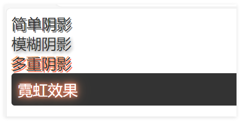
/* 简单阴影 */
.simple-shadow {
font-size: 24px;
color: #333;
text-shadow: 2px 2px 0px #888; /* 水平偏移 2px,垂直偏移 2px,无模糊 */
}
/* 模糊阴影 */
.blur-shadow {
font-size: 24px;
color: #333;
text-shadow: 2px 2px 5px rgba(0, 0, 0, 0.5); /* 模糊半径 5px,半透明黑色 */
}
/* 多重阴影 */
.multi-shadow {
font-size: 24px;
color: #333;
text-shadow: 2px 2px 0px #ff7e5f, -2px -2px 0px #feb47b; /* 多个阴影 */
}
/* 霓虹效果 */
.neon-shadow {
font-size: 24px;
color: #fff;
text-shadow: 0 0 5px #ff7e5f, 0 0 10px #ff7e5f, 0 0 20px #feb47b; /* 多层模糊阴影 */
background-color: #333;
padding: 10px;
border-radius: 5px;
}
</style>
</head>
<body>
<div class="simple-shadow">简单阴影</div>
<div class="blur-shadow">模糊阴影</div>
<div class="multi-shadow">多重阴影</div>
<div class="neon-shadow">霓虹效果</div>
</body>
</html>