ElementUi的Tabs组件在某些情况下难以是自己想要的样式,这时候自定义 Tabs 会是一个更好的选择,可以根据自己想要而设置样式,如图:
一、ElementUi的Tabs样式
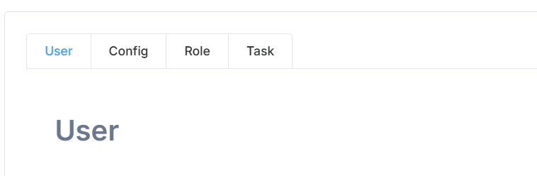
基础:
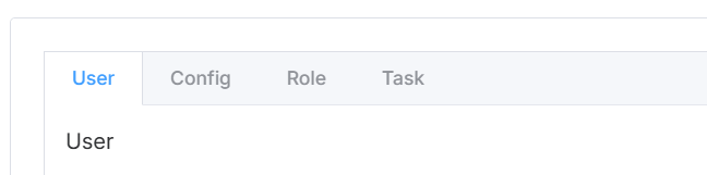
选项卡:
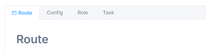
卡片化:
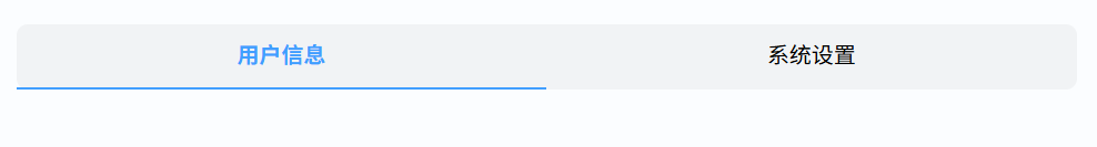
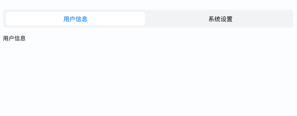
自定义:
以上样式都不是想要的效果,那么自定义一个tabs是一个选择。
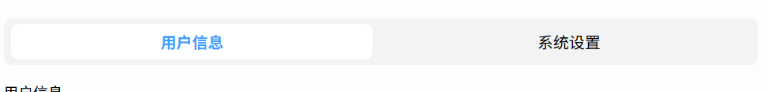
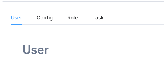
二、自定义tabs
界面渲染
<div class="custom-tabs">
    <div class="tabs-header">
        <div
            v-for="(tab, index) in tabs"
            :key="index"
            class="tab-item"
            :class="{ 'active': currentTab === index }"
            @click="currentTab = index"
        >
            {{ tab.label }}
        </div>
    </div>
    <div class="tabs-content">
        <component :is="tabs[currentTab].component" />
    </div>
</div>
js
// 这里是vue2写法。引入需要的组件,或直接展示内容
import userInfo from "@/views/userg.vue";
import setting from "@/views/setting.vue";
export default {
    name: "",
    components: {
        userInfo,
        setting
    },
    data() {
        return {
            currentTab: 0,
            tabs: [
                { label: "用户信息", component: "userInfo" },
                { label: "系统设置", component: "setting" }
            ]
        }
    },
部分scss
.custom-tabs {
    margin: 20px;
    display: flex;
    flex-direction: column;

    .tabs-header {
        display: flex;
        height: 60px;
        background-color: rgba(0,0,0,0.04);
        border-radius: 10px;

        .tab-item {
            flex: 1;
            text-align: center;
            padding: 12px 0;
            cursor: pointer;
            font-size: 20px;
            color: black;
            position: relative;
            transition: all 0.3s ease;

            &:hover {
                color: black;
            }

            &.active {
                color: #409EFF;
                font-weight: bold;

                &::after {
                    content: '';
                    position: absolute;
                    bottom: 0px;
                    left: 0;
                    width: 100%;
                    height: 2px;
                    background-color: #409EFF;
                }
            }
        }
    }

    .tabs-content {
        height: 400px;
        flex: 1;
        padding: 20px 0;
        overflow: auto;
        min-height: 0;
    }
}.custom-tabs {
margin: 20px;
display: flex;
flex-direction: column;
.tabs-header {
display: flex;
align-items: center;
height: 60px;
background-color: rgba(0,0,0,0.04);
border-radius: 10px;
.tab-item {
height: 46px;
flex: 1;
display: flex;
align-items: center;
justify-content: center;
margin: 10px 10px;
border-radius: 10px;
cursor: pointer;
font-size: 20px;
color: black;
position: relative;
transition: all 0.3s ease;
&:hover {
color: black;
}
&.active {
color: #409EFF;
font-weight: bold;
background-color: white;
&::after {
content: '';
position: absolute;
bottom: 0px;
left: 0;
width: 100%;
}
}
}
}
.tabs-content {
height: 400px;
flex: 1;
padding: 20px 0;
overflow: auto;
min-height: 0;
}
}
想要什么样式,就修改成什么样式,很实用。
若文章对你有帮助,点赞、收藏加关注吧!