相关属性
@keyframes 定义动画的关键帧序列
animation-name 指定 @keyframes 动画的名称
animation-duration 动画单次循环的持续时间(必需属性,否则动画不会生效)
animation-timing-function 动画速度曲线
animation-iteration-count 动画播放次数,数字或者 infinite 无限循环
animation-delay 动画开始前的等待时间(延迟)
animation-direction 动画播放方向
animation-fill-mode 控制动画执行前后的样式状态
animation-play-state 控制动画播放状态,暂停/播放
animation 简写属性,包含 duration | timing-function | delay | iteration-count | direction | fill-mode | play-state | name。
2023 新增属性:
animation-composition 指定了当多个动画同时影响同一属性时应使用的复合操作。
@keyframes
@keyframes 用于定义动画关键帧,还是必须的那种,没有 @keyframes 的关键帧,CSS 动画就没法玩!!
在使用 CSS 动画前,必须优先定义动画关键帧,写法:
css
@keyframes ani1 {
  0% {
    transform: translateX(0);
  }
  100% {
    transform: translateX(605px);
  }
}
以上代码定义了一个名为 ani1 的动画关键帧序列,其中 0% 表示动画开始时没有位移,100% 表示动画结束时位移了 605px。
关键帧名称定义规范:
必须以字母(a-z, A-Z)、下划线(_) 或 连字符(-) 开头,后面可以是字母、数字(0-9)、下划线或连字符,建议不要使用 CSS 关键字,虽然不一定报错。
除了使用百分比定义关键帧序列,还可以使用关键字 from(0%) 和 to(100%)定义,比如:
css
@keyframes ani1 {
  from {
    transform: translateX(0);
  }
  to {
    transform: translateX(605px);
  }
}
还可以多个帧用同一条规则:
css
@keyframes ani1 {
  0% {
    transform: translateX(0);
  }
  40%,
  60% { /* 40% 和 60% 的关键帧都是同一个位置,表示元素不动 */
    transform: translateX(305px);
  }
  100% {
    transform: translateX(605px);
  }
}
需注意关键帧的 CSS 属性不支持 !important,有此写法浏览器会判定属性值无效!!
animation-name
用于指定动画使用的关键帧序列名称,比如:
css
.child {
  animation-name: ani1;
  animation-name: ani1, ani2; /* 同时使用 ani1 和 ani2 两个关键帧序列 */
}
此时,给 .child 指定了一个 ani1 的关键帧序列,但动画还无法执行,原因是缺少动画持续时间。
animation-duration
指定执行一次动画的运行时长,与前文说过的 transition-duration 一致,以秒(s)或毫秒(ms)为单位,默认是 0s。
语法:
css
``` css
.child {
  animation-duration: 2s;
}
看例子,同时应用多个关键帧序列:
html
<div class="box">
  <div class="child">1s</div>
  <div class="child">2s</div>
  <div class="child">3s</div>
</div>
<style>
  @keyframes ani1 {
    0% {
      transform: translateX(0);
    }
    100% {
      transform: translateX(605px);
    }
  }
  @keyframes ani2 {
    0% {
      background-color: #fff;
    }
    100% {
      background-color: rgba(255, 71, 87,1);
    }
  }
  .box {
    border: 2px solid rgba(255, 71, 87,0.3);
    margin: 20px 0;
    width: calc(235px * 3);
  }
  .child {
    border: 2px solid rgba(255, 71, 87,1);
    border-radius: 40px;
    width: 100px;
    height: 40px;
    display: flex;
    align-items: center;
    justify-content: center;
    box-sizing: border-box;
    animation-name: ani1, ani2;
  }
  .child:nth-child(1) {
    animation-duration: 1s; /* 两个关键帧序列都使用一样的时长 */
  }
  .child:nth-child(2) {
    animation-duration: 2s, 1s; /* 第一个关键帧序列的时长是 2s,第二个关键帧序列的时长是 1s */
  }
  .child:nth-child(3) {
    animation-duration: 500ms, 3s; /* 第一个关键帧序列的时长是 500ms,第二个关键帧序列的时长是 3s */
  }
</style>
效果:

animation-timing-function
用于设置速度曲线,控制动画速度变化,与前文的 transition-timing-function 一致,默认是 ease。
关于 贝塞尔曲线 可阅读前一篇文章!
示例:
html
<div class="box">
  <div class="child">ease</div>
  <div class="child">ease-in-out</div>
  <div class="child">cubic-bezier</div>
</div>
<style>
  @keyframes ani1 {
    0% {
      transform: translateX(0);
    }
    100% {
      transform: translateX(605px);
    }
  }
  @keyframes ani2 {
    0% {
      background-color: #fff;
    }
    100% {
      background-color: rgba(255, 71, 87,1);
    }
  }
  .box {
    border: 2px solid rgba(255, 71, 87,0.3);
    margin: 20px 0;
    width: calc(235px * 3);
  }
  .child {
    border: 2px solid rgba(255, 71, 87,1);
    border-radius: 40px;
    width: 100px;
    height: 40px;
    display: flex;
    align-items: center;
    justify-content: center;
    box-sizing: border-box;
    animation-name: ani1, ani2;
    animation-duration: 2s;
  }
  .child:nth-child(1) {
    animation-timing-function: ease;
  }
  .child:nth-child(2) {
    animation-timing-function: ease-in-out;
  }
  .child:nth-child(3) {
    animation-timing-function: cubic-bezier(0.18, 0.89, 0.32, 1.28); /* 使用贝塞尔曲线 */
  }
</style>
效果:

animation-iteration-count
动画默认只执行 1 此,上面效果看起来是循环执行,原因是 gif 图片会重复播放!!
示例:
html
<div class="box">
  <div class="child">ease</div>
  <div class="child">ease-in-out</div>
  <div class="child">cubic-bezier</div>
</div>
<style>
  @keyframes ani1 {
    0% {
      transform: translateX(0);
    }
    100% {
      transform: translateX(605px);
    }
  }
  @keyframes ani2 {
    0% {
      background-color: #fff;
    }
    100% {
      background-color: rgba(255, 71, 87,1);
    }
  }
  .box {
    border: 2px solid rgba(255, 71, 87,0.3);
    margin: 20px 0;
    width: calc(235px * 3);
  }
  .child {
    border: 2px solid rgba(255, 71, 87,1);
    border-radius: 40px;
    width: 100px;
    height: 40px;
    display: flex;
    align-items: center;
    justify-content: center;
    box-sizing: border-box;
    animation-duration: 2s;
    animation-timing-function: cubic-bezier(0.18, 0.89, 0.32, 1.28);
  }
  .box:hover .child { /* 鼠标放上时候,才开始执行动画 */
    animation-name: ani1, ani2;
  }
  .child:nth-child(1) {
    animation-iteration-count: 1; /* 动画执行1次 */
  }
  .child:nth-child(2) {
    animation-iteration-count: 0; /* 动画不执行 */
  }
  .child:nth-child(3) {
    animation-iteration-count: infinite; /* 动画执行无限次 */
  }
</style>
效果:

animation-delay
设置动画开始时的等待时长,默认是 0s。
示例:
html
<div class="box">
  <div class="child">ease</div>
  <div class="child">ease-in-out</div>
  <div class="child">cubic-bezier</div>
</div>
<style>
  @keyframes ani1 {
    0% {
      transform: translateX(0);
    }
    100% {
      transform: translateX(605px);
    }
  }
  @keyframes ani2 {
    0% {
      background-color: #fff;
    }
    100% {
      background-color: rgba(255, 71, 87,1);
    }
  }
  .box {
    border: 2px solid rgba(255, 71, 87,0.3);
    margin: 20px 0;
    width: calc(235px * 3);
  }
  .child {
    border: 2px solid rgba(255, 71, 87,1);
    border-radius: 40px;
    width: 100px;
    height: 40px;
    display: flex;
    align-items: center;
    justify-content: center;
    box-sizing: border-box;
    animation-duration: 2s;
    animation-timing-function: cubic-bezier(0.18, 0.89, 0.32, 1.28);
    animation-iteration-count: 1; /* 动画执行1次 */
  }
  .box:hover .child { /* 鼠标放上时候,才开始执行动画 */
    animation-name: ani1, ani2;
  }
  .child:nth-child(1) {
    animation-delay: 500ms;
  }
  .child:nth-child(2) {
    animation-delay: 1s
  }
  .child:nth-child(3) {
    animation-delay: 2s;
  }
</style>
效果:

animation-direction
设置动画方向,默认是 normal,即从开始到结束。
有效值:
normal 动画在每个循环中正向播放。
reverse 动画在每个循环中反向播放。动画将从结束状态往开始状态运动,速度曲线也将反转。
alternate 动画在每个循环中正反交替播放,第一次迭代是正向播放。
alternate-reverse 动画在每个循环中正反交替播放,第一次迭代是反向播放。
alternate 的两个值会让动画往返来回执行,reverse 两个值会让动画倒着执行。
示例:
html
<div class="box">
  <div class="child">normal</div>
  <div class="child">reverse</div>
  <div class="child">alternate</div>
  <div class="child">alternate-reverse</div>
</div>
<style>
  @keyframes ani1 {
    0% {
      transform: translateX(0);
    }
    100% {
      transform: translateX(605px);
    }
  }
  @keyframes ani2 {
    0% {
      background-color: #fff;
    }
    100% {
      background-color: rgba(255, 71, 87,1);
    }
  }
  .box {
    border: 2px solid rgba(255, 71, 87,0.3);
    margin: 20px 0;
    width: calc(235px * 3);
  }
  .child {
    border: 2px solid rgba(255, 71, 87,1);
    border-radius: 40px;
    width: 100px;
    height: 40px;
    margin: 10px 0;
    display: flex;
    align-items: center;
    justify-content: center;
    box-sizing: border-box;
    animation-duration: 2s;
    animation-timing-function: ease;
    animation-iteration-count: 2; /* 动画执行1次 */
  }
  .box:hover .child { /* 鼠标放上时候,才开始执行动画 */
    animation-name: ani1, ani2;
  }
  .child:nth-child(1) {
    animation-direction: normal;
  }
  .child:nth-child(2) {
    animation-direction: reverse;
  }
  .child:nth-child(3) {
    animation-direction: alternate;
  }
  .child:nth-child(4) {
    animation-direction: alternate-reverse;
  }
</style>
效果:

animation-fill-mode
设置元素动画开始时和结束时的状态,可以理解为动画开始和结束时,是用关键帧序列的 0% 还是 100% 的状态,这与运动方向和运动次数有关。
有效值:
none 默认值,不设置状态。
forwards 设置为动画结束状态。
backwards 设置为动画开始状态。
both 动画将遵循 forwards 和 backwards 的规则,从而在两个方向上扩展动画属性。
示例:
html
<div class="box">
  <div class="child">none</div>
  <div class="child">forwards</div>
  <div class="child">backwards</div>
  <div class="child">both</div>
</div>
<style>
  @keyframes ani1 {
    0% {
      transform: translateX(100px);
    }
    100% {
      transform: translateX(605px);
    }
  }
  @keyframes ani2 {
    0% {
      background-color: #fff;
    }
    100% {
      background-color: rgba(255, 71, 87,1);
    }
  }
  .box {
    border: 2px solid rgba(255, 71, 87,0.3);
    margin: 20px 0;
    width: calc(235px * 3);
  }
  .child {
    border: 2px solid rgba(255, 71, 87,1);
    border-radius: 40px;
    width: 100px;
    height: 40px;
    margin: 10px;
    text-align: center;
    display: flex;
    align-items: center;
    justify-content: center;
    box-sizing: border-box;
    animation-duration: 1s;
    animation-timing-function: ease;
    animation-iteration-count: 1; /* 动画执行1次 */
    animation-direction: alternate; /* 往返运动 */
    animation-delay: 500ms; /* 延迟 500ms 看 fill-mode 效果 */
  }
  .box:hover .child { /* 鼠标放上时候,才开始执行动画 */
    animation-name: ani1, ani2;
  }
  .child:nth-child(1) {
    animation-fill-mode: none;
  }
  .child:nth-child(2) {
    animation-fill-mode: forwards;
  }
  .child:nth-child(3) {
    animation-fill-mode: backwards;
  }
  .child:nth-child(4) {
    animation-fill-mode: both;
  }
</style>
效果:

可以看到,在动画开始时,backwards 和 both 会应用 0% 的状态,在动画结束时,forwards 和 both 会应用 100% 的状态。
animation-play-state
用于控制动画暂停、播放状态。
比如最常见的音乐播放,有个转圈圈的音符,在音乐暂停时候,音符需要暂停。如果使用移除属性的方式,就会回到元素默认状态,而没办法做到暂停。
html
<div class="box">
  <div class="child">音符</div>
</div>
<style>
  @keyframes ani1 {
    0% {
      transform: rotate(0deg);
    }
    100% {
      transform: rotate(360deg);
    }
  }
  .box {
    border: 2px solid rgba(255, 71, 87,0.3);
    margin: 20px 0;
    width: 100px;
  }
  .child {
    border: 2px solid rgba(255, 71, 87,1);
    border-radius: 80px;
    width: 80px;
    height: 80px;
    margin: 10px;
    text-align: center;
    display: flex;
    align-items: center;
    justify-content: center;
    box-sizing: border-box;
    animation-name: ani1;
    animation-duration: 3s;
    animation-timing-function: linear;
    animation-iteration-count: infinite;
  }
  .box .child:hover { /* 鼠标放上时候,暂停动画 */
    animation-play-state: paused;
  }
</style>
效果:
animation
使用简写 animation,可以同时设置多个动画属性,毕竟要实现一个动画需要多个属性配合,只写一个属性就要省事多了。
语法:
css
/* @keyframes duration | timing-function | delay |
iteration-count | direction | fill-mode | play-state | name */
animation: 3s ease-in 1s 2 reverse both paused ani1;

/* 多个动画 */
animation:
  3s linear ani1,
  3s ease-out 5s ani2;
虽然属性值浏览器没有强制要求先后顺序,就算先后顺序错乱浏览器也会自动修正,但推荐按照语法要求来:duration | timing-function | delay | iteration-count | direction | fill-mode | play-state | name 。
animation-composition
使用此属性时,需注意浏览器兼容性,基本上都是2023年后的浏览器版本才开始支持!!
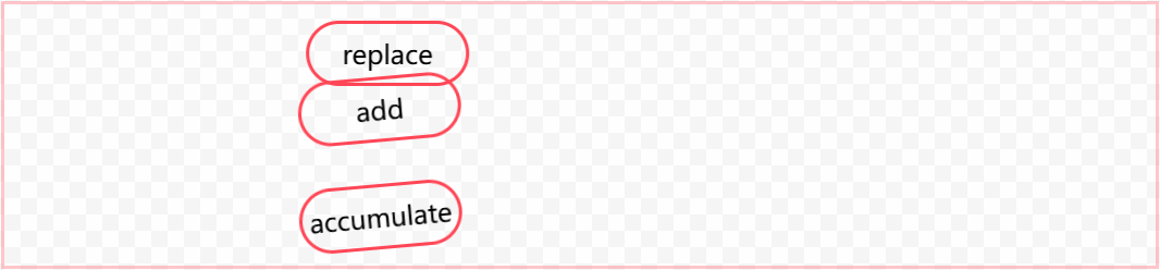
有效值:
replace 默认值,替换已有属性。
add 累加效果。
accumulate 组合效果。
看示例:
html
<div class="box">
  <div class="child">replace</div>
  <div class="child">add</div>
  <div class="child">accumulate</div>
</div>
<style>
  @keyframes ani1 {
    0% {
      transform: translateX(0);
    }
    100% {
      transform: translateX(605px);
    }
  }
  .box {
    border: 2px solid rgba(255, 71, 87,0.3);
    margin: 20px 0;
    width: calc(235px * 3);
  }
  .child {
    border: 2px solid rgba(255, 71, 87,1);
    border-radius: 40px;
    width: 100px;
    height: 40px;
    margin: 10px 0;
    text-align: center;
    display: flex;
    align-items: center;
    justify-content: center;
    box-sizing: border-box;
    animation: 2s ease infinite ani1;
    transform: rotate(-5deg);
  }
  .child:nth-child(1) {
    animation-composition: replace;
  }
  .child:nth-child(2) {
    animation-composition: add;
  }
  .child:nth-child(3) {
    animation-composition: accumulate;
  }
</style>
效果:
以上示例,元素自身携带有 transform: rotate(-5deg);,动画属性也进行了 transform: translateX(605px); 变换,三个值区别就显示出来了:
- replace 覆盖了元素自身的
transform变换。 - add 将元素自身的属性值放在了动画属性前面,变成了 transform: rotate(-5deg) translateX(605px);
- accumulate 将两个属性组合成了一个 3D 矩阵 transform: matrix3d(0.996195, -0.0871557, 0, 0, 0.0871557, 0.996195, 0, 0, 0, 0, 1, 0, 605px, 0, 0, 1);
如果使用 width 属性动画,add 和 accumulate 则看起来没有任何区别。
四个实验性属性
实验性属性规范还未定稿,小范围浏览器支持,未来有可能还会发生变化。
animation-timeline 指定了用于控制 CSS 动画进度的时间线。
animation-range-start 设置 timeline 的开始位置。
animation-range-end 设置 timeline 的结束位置。
animation-range 简写属性,包含 animation-range-start, animation-range-end。
使用 animation-timeline 做一个跟滚动条有关的动画效果,示例:
html
<div class="box">
  <div class="content"></div>
  <div class="child">timeline</div>
  <div class="content"></div>
</div>
<style>
  @keyframes ani1 {
    0% {
      transform: rotate(0deg);
    }
    100% {
      transform: rotate(360deg);
    }
  }
  .box {
    border: 2px solid rgba(255, 71, 87,0.3);
    margin: 20px 0;
    width: calc(235px * 3);
    height: calc(100px * 3);
    overflow: auto;
  }
  .content {
    height: 400px;
  }
  .child {
    border: 2px solid rgba(255, 71, 87,1);
    border-radius: 40px;
    width: 100px;
    height: 40px;
    margin: 10px 0;
    text-align: center;
    display: flex;
    align-items: center;
    justify-content: center;
    box-sizing: border-box;
    view-timeline: --subjectReveal block;
    animation-timeline: --subjectReveal;

    animation-name: ani1;
    animation-range: entry 10% contain 200%;
    animation-fill-mode: both;
    animation-duration: 1ms; /* Firefox requires this to apply the animation */
  }
</style>
效果:

写在最后
其他与动画相关的属性:
- scroll-timeline 滚动条触发动画
- offset-path 让元素沿复杂路径运动
CSS 动画在书写上比 JS 简单很多,也让前端的动画实现变得更容易,但一些涉及到用户交互的动画,还是必须让 JS 登场才行。
CSS animation 与 transition 都能实现动画效果,transition 胜在单次属性过渡,而 animation 胜在可以指定关键帧实现更加复杂的动画场景。