Vue组件半环进度显示器
纯svg实现,不需要其他第三方库,功能简单,理论上现代浏览器都能支持
- 封装组件
所有参数都选填,进度都可选填
html
<template>
  <div class="ys-semiring">
    <div class="svg-container">
      <svg viewBox="0 0 1000 1000">
        <!-- 半圆环背景 -->
        <path :d="path1" :fill="backgroundColor" />

        <!-- 进度环 -->
        <path :d="path2" :fill="progressColor" />

        <!-- 高亮指示器 -->
        <path v-if="isShowIndicator" :d="path4" :fill="highlightColor" />

        <!-- 白色遮挡条,将环分割成x部分 -->
        <line
          v-for="(divider, index) in dividers"
          :key="index"
          :x1="divider.x1"
          :y1="divider.y1"
          :x2="divider.x2"
          :y2="divider.y2"
          :stroke="intervalColor"
          :stroke-width="dividerWidth"
        />
      </svg>
    </div>
    <!-- 插槽 -->
    <div class="cu-slot">
      <slot></slot>
    </div>
  </div>
</template>

<script>
// svg绘制边界
const viewBoxWidth = 1000
// 生成半圆环的y坐标位置
const yPosition = 650
// 环的宽度(厚度)
const ringWidth = 160
// 分割线的内边距
const padding = 80

export default {
  name: 'YsSemiring',
  props: {
    // 进度百分比(0-1)
    percentage: {
      type: Number,
      default: 0.1,
      validator: value => value >= 0 && value <= 1
    },
    // 是否显示高亮指示器
    isShowIndicator: {
      type: Boolean,
      default: false
    },
    // 指示器大小
    indicatorSize: {
      type: Number,
      default: 80
    },
    // 指示器偏移量 0-160
    indicatorOffset: {
      type: Number,
      default: 0
    },
    // 分割段数
    divider: {
      type: Number,
      default: 5
    },
    // 分割线宽度
    dividerWidth: {
      type: Number,
      default: 10
    },
    // 背景颜色
    backgroundColor: {
      type: String,
      default: '#ededf5'
    },
    // 进度颜色
    progressColor: {
      type: String,
      default: '#3570f8'
    },
    // 高亮指示器颜色
    highlightColor: {
      type: String,
      default: '#f8ba49'
    },
    // 分割线颜色
    intervalColor: {
      type: String,
      default: '#ffffff'
    }
  },
  data() {
    return {
      path1: '',
      path2: '',
      path4: '',
      dividers: []
    }
  },
  created() {
    const path1 = this.generateSemiRingPath(yPosition, ringWidth)
    this.path1 = path1

    const path2 = this.generateProgressPath(yPosition, ringWidth, this.percentage)
    this.path2 = path2

    // 显示指示器
    if (this.isShowIndicator) {
      // 获取当前分段索引
      const i = this.getCurrentSegmentIndex(this.percentage, this.divider)
      // 获取当前分段中间点的坐标
      const { midX, midY } = this.getSegmentMidPoint(i, this.divider)
      // 生成指示器的三角形路径
      this.path4 = this.generateTrianglePath(midX, midY)
    }

    // 生成分割线
    if (this.divider >= 1) {
      this.dividers = this.generateDividers(yPosition, ringWidth, this.divider)
    }
  },
  methods: {
    /**
     * 生成半圆环的SVG路径
     * @param {number} yPosition - 水平线的y坐标位置
     * @param {number} ringWidth - 环的宽度(厚度)
     * @returns {string} SVG路径字符串
     */
    generateSemiRingPath(yPosition, ringWidth) {
      const centerX = viewBoxWidth / 2
      const outerRadius = (viewBoxWidth - padding * 2) / 2
      const innerRadius = outerRadius - ringWidth

      const outerStartX = centerX - outerRadius
      const outerEndX = centerX + outerRadius
      const innerStartX = centerX - innerRadius
      const innerEndX = centerX + innerRadius

      return `M ${outerStartX} ${yPosition} A ${outerRadius} ${outerRadius} 0 0 1 ${outerEndX} ${yPosition} L ${innerEndX} ${yPosition} A ${innerRadius} ${innerRadius} 0 0 0 ${innerStartX} ${yPosition} Z`
    },

    /**
     * 生成进度环的SVG路径(0-180度基于percentage)
     * @param {number} yPosition - 水平线的y坐标位置
     * @param {number} ringWidth - 环的宽度
     * @param {number} percentage - 进度比例(0-1)
     * @returns {string} SVG路径字符串
     */
    generateProgressPath(yPosition, ringWidth, percentage) {
      const centerX = viewBoxWidth / 2
      const outerRadius = (viewBoxWidth - padding * 2) / 2
      const innerRadius = outerRadius - ringWidth

      // 将percentage(0-1)转换为角度(180-0度)
      const angle = Math.PI * (1 - percentage)
      const outerEndX = centerX + outerRadius * Math.cos(angle)
      const outerEndY = yPosition - outerRadius * Math.sin(angle)
      const innerEndX = centerX + innerRadius * Math.cos(angle)
      const innerEndY = yPosition - innerRadius * Math.sin(angle)
      const outerStartX = centerX - outerRadius
      const innerStartX = centerX - innerRadius

      // large-arc-flag 设置为0,因为我们总是绘制小于180度的弧
      return `M ${outerStartX} ${yPosition} A ${outerRadius} ${outerRadius} 0 0 1 ${outerEndX} ${outerEndY} L ${innerEndX} ${innerEndY} A ${innerRadius} ${innerRadius} 0 0 0 ${innerStartX} ${yPosition} Z`
    },

    /**
     * 获取当前进度所在的分段索引
     * @param {number} percentage - 进度百分比(0-1)
     * @param {number} segments - 分段数
     * @returns {number} 当前分段索引
     */
    getCurrentSegmentIndex(percentage, segments) {
      // 计算每个分段的起始百分比
      const segmentStartPercentage = percentage => percentage / segments
      // 确定当前进度所在的分段
      let currentIndex = 0
      for (let i = 1; i < segments; i++) {
        if (percentage > segmentStartPercentage(i)) {
          currentIndex = i
        }
      }
      // 确保索引在合理范围内
      currentIndex = Math.min(currentIndex, segments - 1)
      return currentIndex
    },

    // 获取所在分段,向上兼容
    getCurrentSegmentIndex2(percentage, segments) {
      // 计算每个分段所代表的百分比
      const segmentPercentage = 1 / segments
      // 确定当前进度所在的分段
      let currentIndex = Math.floor(percentage / segmentPercentage)
      // 确保索引在合理范围内
      currentIndex = Math.max(0, Math.min(currentIndex, segments - 1))
      return currentIndex
    },

    /**
     * 获取当前分段中间点的坐标
     * @param {number} segmentIndex - 分段索引
     * @param {number} segments - 分段总数
     * @returns {Object} 中间点的坐标 { midX, midY }
     */
    getSegmentMidPoint(segmentIndex, segments) {
      const centerX = viewBoxWidth / 2
      const centerY = yPosition
      const radius = (viewBoxWidth - padding * 2) / 2 - this.indicatorOffset
      const totalAngle = Math.PI
      const segmentAngle = totalAngle / segments

      // 计算当前分段中间的角度
      const midAngle = (segments - segmentIndex - 1) * segmentAngle + segmentAngle / 2

      // 计算中间点的坐标
      const midX = centerX + radius * Math.cos(midAngle)
      const midY = centerY - radius * Math.sin(midAngle)

      return { midX, midY }
    },

    /**
     * 生成指示器的三角形路径
     * @param {number} triangleTopX - 三角形顶点的x坐标
     * @param {number} triangleTopY - 三角形顶点的y坐标
     * @returns {string} SVG路径字符串
     */
    generateTrianglePath(triangleTopX, triangleTopY) {
      const centerX = viewBoxWidth / 2
      const centerY = yPosition
      const angle = Math.PI * 1.5 - Math.atan2(triangleTopX - centerX, triangleTopY - centerY)

      const halfBase = this.indicatorSize * 0.45
      const baseAngle = Math.atan(halfBase / this.indicatorSize)
      const baseLength = Math.sqrt(halfBase * halfBase + this.indicatorSize * this.indicatorSize)

      const triangleLeftX = triangleTopX - baseLength * Math.cos(angle - baseAngle)
      const triangleLeftY = triangleTopY - baseLength * Math.sin(angle - baseAngle)
      const triangleRightX = triangleTopX - baseLength * Math.cos(angle + baseAngle)
      const triangleRightY = triangleTopY - baseLength * Math.sin(angle + baseAngle)

      return `M ${triangleTopX} ${triangleTopY} L ${triangleLeftX} ${triangleLeftY} L ${triangleRightX} ${triangleRightY} Z`
    },

    /**
     * 生成分割线的坐标
     * @param {number} yPosition - 水平线的y坐标位置
     * @param {number} ringWidth - 环的宽度
     * @param {number} segments - 分割段数
     * @returns {Array} 分割线坐标数组
     */
    generateDividers(yPosition, ringWidth, segments) {
      const centerX = viewBoxWidth / 2
      const outerRadius = (viewBoxWidth - padding * 2) / 2
      const innerRadius = outerRadius - ringWidth

      const dividers = []

      // 计算每个分割点的角度(从π到0)
      for (let i = 1; i < segments; i++) {
        const angle = (Math.PI * (segments - i)) / segments

        // 计算内圆和外圆上该角度对应的坐标
        const outerX = centerX + outerRadius * Math.cos(angle)
        const outerY = yPosition - outerRadius * Math.sin(angle)
        const innerX = centerX + innerRadius * Math.cos(angle)
        const innerY = yPosition - innerRadius * Math.sin(angle)

        dividers.push({
          x1: innerX,
          y1: innerY,
          x2: outerX,
          y2: outerY
        })
      }

      return dividers
    }
  }
}
</script>

<style scoped>
.ys-semiring {
  position: relative;
  height: 100%;
  width: 100%;
}

.svg-container {
  margin: auto;
  height: 100%;
  aspect-ratio: 1 / 1;
}

.svg-container > svg {
  width: 100%;
  height: 100%;
  background-color: #ffffff;
}

/* 调整节点位置 */
.cu-slot {
  position: absolute;
  top: 50%;
  left: 50%;
  transform: translateX(-50%);
}
</style>
引用
html
<template>
<div>
<div class="container">
<div v-for="(item, i) in list" :key="i" class="item">
<h3>{{ item.title }}</h3>
<div class="box">
<YsSemiring
:percentage="item.percentage"
:divider="item.divider"
:isShowIndicator="item.isShowIndicator"
:dividerWidth="item.dividerWidth"
:indicatorSize="item.indicatorSize"
:indicatorOffset="item.indicatorOffset"
:backgroundColor="item.backgroundColor"
:progressColor="item.progressColor"
:highlightColor="item.highlightColor"
:intervalColor="item.intervalColor"
>
<template v-if="item.hasSlot">
<div v-if="item.hasSlot === '节点A'" class="aaa">节点A</div>
<div v-else class="bbb">{{ item.hasSlot }}</div>
</template>
</YsSemiring>
</div>
</div>
</div>
</div>
</template>
<script>
import YsSemiring from './components/ys-semiring.vue'
export default {
name: 'SvgRender',
components: { YsSemiring },
data() {
return {
// 进度
list: [
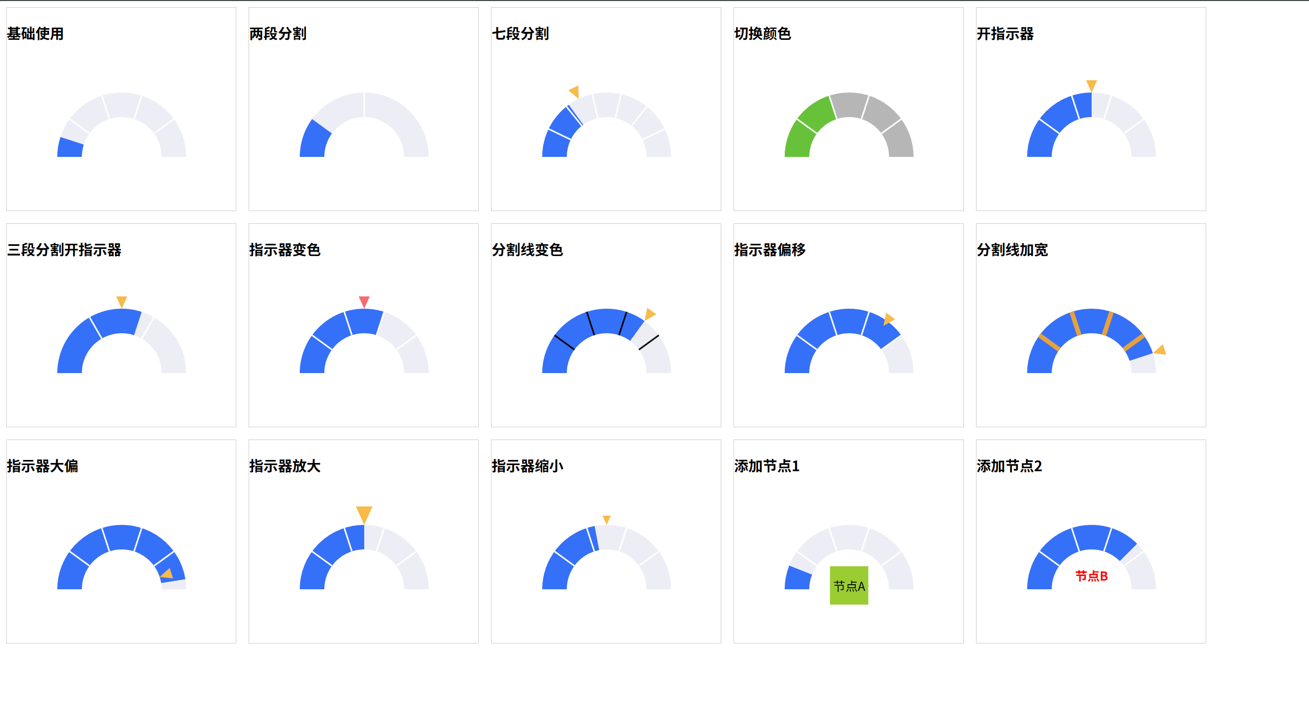
{ title: '基础使用', percentage: 0.1 },
{ title: '两段分割', percentage: 0.2, divider: 2 },
{ title: '七段分割', percentage: 0.3, divider: 7, isShowIndicator: true },
{ title: '切换颜色', percentage: 0.4, backgroundColor: '#B6B6B6', progressColor: '#67C23A' },
{ title: '开指示器', percentage: 0.5, isShowIndicator: true },
{ title: '三段分割开指示器', percentage: 0.6, divider: 3, isShowIndicator: true },
{ title: '指示器变色', percentage: 0.6, isShowIndicator: true, highlightColor: '#F56C6C' },
{ title: '分割线变色', percentage: 0.7, isShowIndicator: true, intervalColor: '#000000' },
{ title: '指示器偏移', percentage: 0.8, isShowIndicator: true, indicatorOffset: 40 },
{ title: '分割线加宽', percentage: 0.9, isShowIndicator: true, dividerWidth: 30, intervalColor: '#E6A23C' },
{ title: '指示器大偏', percentage: 0.95, isShowIndicator: true, indicatorOffset: 160 },
{ title: '指示器放大', percentage: 0.5, isShowIndicator: true, indicatorSize: 120 },
{ title: '指示器缩小', percentage: 0.44, isShowIndicator: true, indicatorSize: 60 },
{ title: '添加节点1', percentage: 0.12, hasSlot: '节点A' },
{ title: '添加节点2', percentage: 0.75, hasSlot: '节点B' }
]
}
},
methods: {},
mounted() {}
}
</script>
<style scoped>
.container {
padding: 0.5rem;
display: grid;
grid-template-columns: repeat(auto-fill, 300px);
gap: 1rem;
}
.item {
border: 1px solid #ccc;
}
.box {
width: 300px;
height: 200px;
}
.aaa {
width: 50px;
height: 50px;
display: flex;
align-items: center;
justify-content: center;
background: yellowgreen;
}
.bbb {
font-weight: bold;
color: red;
}
</style>