从 react-native 中导入使用
ts
import { View } from "react-native";容器 View
默认使用 Flex 布局
ts
// 水平布局示例
<View style={{ flexDirection: 'row', height: 100 }}>
  <View style={{ flex: 1, backgroundColor: 'red' }} />
  <View style={{ flex: 2, backgroundColor: 'green' }} />
  <View style={{ flex: 1, backgroundColor: 'blue' }} />
</View>

// 垂直布局示例
<View style={{ flexDirection: 'column', width: '100%', height: 200 }}>
  <View style={{ flex: 1, backgroundColor: 'yellow' }} />
  <View style={{ flex: 1, backgroundColor: 'purple' }} />
</View>
复杂布局
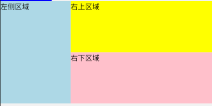
c
      <View style={{ flexDirection: "row", height: 200 }}>
        <View style={{ flex: 1, backgroundColor: "lightblue" }}>
          <Text>左侧区域</Text>
        </View>
        <View style={{ flex: 2, backgroundColor: "lightgreen" }}>
          <View style={{ height: "50%", backgroundColor: "yellow" }}>
            <Text>右上区域</Text>
          </View>
          <View style={{ height: "50%", backgroundColor: "pink" }}>
            <Text>右下区域</Text>
          </View>
        </View>
      </View>
安全区域适配
安全区域(Safe Area)适配是指确保内容不会被设备的刘海、凹槽、状态栏或底部导航栏遮挡。特别是对于 iPhone X 系列和其他异形屏设备,安全区域适配尤为重要。
安装依赖
c
npm install react-native-safe-area-context导入使用
c
import {
  SafeAreaProvider,
  useSafeAreaInsets,
} from "react-native-safe-area-context";
c
const insets = useSafeAreaInsets();
c
    <SafeAreaProvider>
      <View
        style={{
          flex: 1,
          paddingTop: insets.top, // 顶部安全区域
          paddingBottom: insets.bottom, // 底部安全区域
        }}
      >
      // 页面内容
      </View>
    </SafeAreaProvider>
可滚动容器 ScrollView
适用于中等数量内容的滚动场景:
- 图片轮播 - 使用水平滚动和分页功能
- 表单滚动 - 包含多个输入字段的长表单
- 新闻列表 - 垂直滚动的内容列表
- 标签页 - 水平滚动的标签导航
c
    <ScrollView
      horizontal
      keyboardDismissMode="on-drag"
      scrollEventThrottle={16}
      contentContainerStyle={styles.contentContainer}
    >
      {[...Array(20)].map((_, index) => (
        <View key={index} style={styles.item}>
          <Text style={styles.text}>Item {index + 1}</Text>
        </View>
      ))}
    </ScrollView>
默认为垂直滚动
-
水平滚动添加 horizontal
-
scrollEventThrottle 控制着 onScroll 事件被触发的频率,iOS必须写此属性,值通常为16,值为16以下与16无差异,因超过刷新频率。
-
通常都要设置滚动时隐藏键盘
ckeyboardDismissMode="on-drag" -
分页滚动:需拖拽到触发翻页的位置,才会滚动到上/下一页
cpagingEnabled={true} -
禁止滚动
cscrollEnabled={false} -
隐藏滚动条
c// 隐藏垂直滚动条 showsVerticalScrollIndicator={false}c// 隐藏水平滚动条 showsHorizontalScrollIndicator={false} -
到达边界时反弹 bounces
-
keyboardShouldPersistTaps 控制当点击非输入区域时键盘是否收起,通常使用默认值 handled
| 属性名 | 类型 | 描述 |
|---|---|---|
onScroll |
function |
滚动时触发的回调函数 |
onScrollBeginDrag |
function |
开始拖动时触发的回调函数 |
onScrollEndDrag |
function |
结束拖动时触发的回调函数 |
onMomentumScrollBegin |
function |
开始惯性滚动时触发的回调函数 |
onMomentumScrollEnd |
function |
结束惯性滚动时触发的回调函数 |
onContentSizeChange |
function |
内容尺寸变化时触发的回调函数 |
下拉刷新 RefreshControl
c
        refreshControl={
          <RefreshControl
            refreshing={refreshing}
            onRefresh={onRefresh}
            colors={["#ff0000"]}
            progressBackgroundColor="#ffffff"
          />
        }
需导入内置组件 RefreshControl
c
const [refreshing, setRefreshing] = useState(false);
c
  const onRefresh = () => {
    setRefreshing(true);
    // 模拟刷新数据
    setTimeout(() => {
      setRefreshing(false);
    }, 2000);
  };
控制滚动
c
// 滚动到顶部
  const scrollToTop = () => {
    scrollViewRef.current?.scrollTo({ y: 0, animated: true });
  };

// 滚动到指定位置
  const scrollToMiddle = (targetY) => {
    scrollViewRef.current?.scrollTo({ y: targetY, animated: true });
  };

// 滚动到底部
  const scrollToBottom = () => {
    scrollViewRef.current?.scrollToEnd({ animated: true });
  };
实时获取滚动的距离
c
onScroll={handleScroll}
c
  const handleScroll = (event) => {
    const { x, y } = event.nativeEvent.contentOffset;
  };
长列表 FlatList
只渲染屏幕上可见的元素,极大地提高了应用的性能
ts
    <FlatList
      data={DATA}
      renderItem={renderItem}
      keyExtractor={(item) => item.id}
/>-
列表数据 data
c[ { id: "1", title: "电影", icon: "🎬" }, { id: "2", title: "音乐", icon: "🎵" }, { id: "3", title: "书籍", icon: "📚" }, { id: "4", title: "游戏", icon: "🎮" }, { id: "5", title: "体育", icon: "⚽" }, { id: "6", title: "美食", icon: "🍔" }, { id: "7", title: "旅行", icon: "✈️" }, { id: "8", title: "科技", icon: "📱" }, ]; -
renderItem 各项的渲染函数
cconst renderItem = ({ item }) => ( <View style={styles.horizontalItem}> <Text style={styles.iconText}>{item.icon}</Text> <Text style={styles.horizontalTitle}>{item.title}</Text> </View> ); -
keyExtractor - 为列表项生成唯一键的函数
-
horizontal - 水平滚动
-
隐藏滚动条
c// 隐藏垂直滚动条 showsVerticalScrollIndicator={false}c// 隐藏水平滚动条 showsHorizontalScrollIndicator={false} -
多列 numColumns
-
ItemSeparatorComponent - 列表项之间的分隔线组件
c// 渲染分隔线 const renderSeparator = () => <View style={styles.separator} />;cseparator: { height: 1, backgroundColor: "#e0e0e0", marginHorizontal: 10, },
更多用法范例:含上拉刷新,下拉加载等
c
import React, { useState } from "react";
import {
ActivityIndicator,
FlatList,
RefreshControl,
SafeAreaView,
StyleSheet,
Text,
TouchableOpacity,
View,
} from "react-native";
// 初始数据
const initialData = Array.from({ length: 20 }, (_, i) => ({
id: `item-${i}`,
title: `列表项 ${i + 1}`,
description: `这是列表项 ${i + 1} 的详细描述`,
}));
const AdvancedFlatList = () => {
const [data, setData] = useState(initialData);
const [loading, setLoading] = useState(false);
const [refreshing, setRefreshing] = useState(false);
const [page, setPage] = useState(1);
// 模拟加载更多数据
const loadMoreData = () => {
if (loading) return;
setLoading(true);
setTimeout(() => {
const nextPage = page + 1;
const newData = Array.from({ length: 10 }, (_, i) => ({
id: `item-${nextPage * 10 + i}`,
title: `列表项 ${nextPage * 10 + i + 1}`,
description: `这是列表项 ${nextPage * 10 + i + 1} 的详细描述`,
}));
setData((prevData) => [...prevData, ...newData]);
setPage(nextPage);
setLoading(false);
}, 1500);
};
// 模拟刷新数据
const onRefresh = () => {
setRefreshing(true);
setTimeout(() => {
setData(initialData);
setPage(1);
setRefreshing(false);
}, 1500);
};
// 处理列表项点击
const handleItemPress = (item) => {
alert(`你点击了: ${item.title}`);
};
// 渲染列表项
const renderItem = ({ item }) => (
<TouchableOpacity style={styles.item} onPress={() => handleItemPress(item)}>
<Text style={styles.title}>{item.title}</Text>
<Text style={styles.description}>{item.description}</Text>
</TouchableOpacity>
);
  // 渲染分隔线
  const renderSeparator = () => <View style={styles.separator} />;
// 渲染加载更多指示器
const renderFooter = () => {
if (!loading) return null;
return (
<View style={styles.footer}>
<ActivityIndicator size="large" color="#2196f3" />
<Text style={styles.loadingText}>加载更多...</Text>
</View>
);
};
return (
<SafeAreaView style={styles.container}>
<View style={styles.header}>
<Text style={styles.headerText}>高级 FlatList 示例</Text>
<Text style={styles.subheaderText}>
包含下拉刷新、上拉加载、点击事件等功能
</Text>
</View>
<FlatList
data={data}
renderItem={renderItem}
keyExtractor={(item) => item.id}
ItemSeparatorComponent={renderSeparator}
ListFooterComponent={renderFooter}
onEndReached={loadMoreData}
onEndReachedThreshold={0.1}
refreshControl={
<RefreshControl
refreshing={refreshing}
onRefresh={onRefresh}
colors={["#2196f3"]}
progressBackgroundColor="#ffffff"
/>
}
contentContainerStyle={styles.contentContainer}
style={styles.flatList}
/>
</SafeAreaView>
);
};
const styles = StyleSheet.create({
container: {
flex: 1,
backgroundColor: "#f5f5f5",
},
header: {
backgroundColor: "#2196f3",
padding: 20,
alignItems: "center",
},
headerText: {
fontSize: 24,
fontWeight: "bold",
color: "white",
},
subheaderText: {
fontSize: 16,
color: "white",
marginTop: 5,
},
flatList: {
flex: 1,
},
contentContainer: {
paddingBottom: 20,
},
item: {
backgroundColor: "#ffffff",
padding: 15,
marginHorizontal: 10,
marginVertical: 5,
borderRadius: 8,
shadowColor: "#000",
shadowOffset: { width: 0, height: 2 },
shadowOpacity: 0.1,
shadowRadius: 2,
elevation: 2,
},
title: {
fontSize: 18,
fontWeight: "bold",
marginBottom: 5,
},
description: {
fontSize: 14,
color: "#666",
},
  separator: {
    height: 1,
    backgroundColor: "#e0e0e0",
    marginHorizontal: 10,
  },
footer: {
paddingVertical: 20,
borderTopWidth: 1,
borderColor: "#e0e0e0",
alignItems: "center",
},
loadingText: {
marginTop: 10,
fontSize: 16,
color: "#2196f3",
},
});
export default AdvancedFlatList;实战范例
分组列表 SectionList
对列表进行了分组,每个分组都有自己的头部和页脚,其他同 FlatList
常用于字母表分组显示联系人,电商商品分类,按日期或时间段分组显示事件,将应用设置按功能模块分组,按日期分组显示聊天消息,按内容类型(如推荐、热点、视频)或时间分组展示新闻,文件系统目录、分类导航等。
-
使用 stickySectionHeadersEnabled 实现滚动时,粘性固定头部
-
定义整个列表的头部和页脚
tsListHeaderComponent={ListHeader} ListFooterComponent={ListFooter} -
自定义触底加载更多的区域,0.2 即距底部20%时加载更多,推荐值为 0.2或0.3
conEndReachedThreshold={0.2}
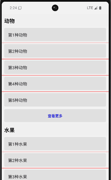
c
import React from "react";
import { SectionList, StyleSheet, Text, View } from "react-native";
// 示例数据
const DATA = [
  {
    title: "动物",
    data: [
      { name: "第1种动物" },
      { name: "第2种动物" },
      { name: "第3种动物" },
      { name: "第4种动物" },
      { name: "第5种动物" },
    ],
  },
  {
    title: "水果",
    data: [
      { name: "第1种水果" },
      { name: "第2种水果" },
      { name: "第3种水果" },
      { name: "第4种水果" },
      { name: "第5种水果" },
    ],
  },
  {
    title: "蔬菜",
    data: [
      { name: "第1种蔬菜" },
      { name: "第2种蔬菜" },
      { name: "第3种蔬菜" },
      { name: "第4种蔬菜" },
      { name: "第5种蔬菜" },
      { name: "第6种蔬菜" },
      { name: "第7种蔬菜" },
      { name: "第8种蔬菜" },
      { name: "第9种蔬菜" },
    ],
  },
];
const SimpleSectionListExample = () => {
  return (
    <SectionList
      sections={DATA}
      keyExtractor={(item, index) => item.name + index}
      stickySectionHeadersEnabled={true}
      renderItem={({ item }) => (
        <View style={[styles.item]}>
          <Text style={styles.title}>{item.name}</Text>
        </View>
      )}
      ItemSeparatorComponent={() => (
        <View style={{ height: 1, backgroundColor: "red" }} />
      )}
      renderSectionHeader={({ section }) => (
        <Text style={styles.header}>{section.title}</Text>
      )}
      renderSectionFooter={({ section }) => (
        <Text style={styles.footer}>查看更多</Text>
      )}
    />
  );
};
const styles = StyleSheet.create({
  header: {
    fontSize: 20,
    fontWeight: "bold",
    backgroundColor: "#f0f0f0",
    padding: 10,
  },
  footer: {
    textAlign: "center",
    fontWeight: "bold",
    padding: 15,
    marginVertical: 5,
    marginHorizontal: 10,
    borderRadius: 5,
    backgroundColor: "#e0e0e0",
    color: "blue", // 设置颜色为蓝色,或者其他你想要的颜色
  },
  item: {
    padding: 15,
    marginVertical: 5,
    marginHorizontal: 10,
    borderRadius: 5,
    backgroundColor: "#e0e0e0",
  },
  title: {
    fontSize: 16,
  },
});
export default SimpleSectionListExample;
文本 Text
- 会独占一行,可设置宽高、边框(不影响字体大小)
- 嵌套的文本不能设置内外边距和文本对齐
对齐
c
      <Text
        style={{
          height: 100,
          fontSize: 30,
          textAlignVertical: "center",
          textAlign: "center",
          borderColor: "red",
          borderWidth: 1,
        }}
      >
        文本水平垂直居中对齐
      </Text>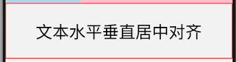
截断
ts
<Text
  style={{ width: 200 }}
  numberOfLines={2}          // 最多显示2行
  ellipsizeMode="tail"       // 截断模式:'head' | 'middle' | 'tail' | 'clip'
>
  这是一段很长的文本,当文本内容超过指定行数时,会按照指定的截断模式进行省略显示...
</Text>
阴影
c
<Text style={{
  textShadowColor: 'rgba(0, 0, 0, 0.5)',
  textShadowOffset: { width: 2, height: 2 },
  textShadowRadius: 3,
}}>
  带阴影的文本
</Text>
自动换行
c
<Text style={{ width: 200, textAlign: 'justify' }}>
  这是一段需要自动换行的文本内容,当文本长度超过容器宽度时,会自动换行显示...
</Text>
自动缩放 allowFontScaling
默认值为 true ,即应用内的文本会根据用户设备的系统字体大小设置进行缩放。例如,如果用户在手机设置中将字体调大,应用中的文本也会相应变大。
除非页面布局固定,不宜改变文字大小,否则都需要支持文字大小跟随系统变化。
文本选择
c
      <Text selectable={true} selectionColor="red">
        这段文本可以被用户选择复制, 选择后背景色为红色
      </Text>
图片 Image
本地图片
ts
<Image source={require('@/assets/images/react-logo.png')} style={{ alignSelf: 'center' }} />
c
{/* 加载网络图片 */}
<Image source={{ uri: 'https://example.com/image.jpg' }} />

{/* 使用 Base64 编码的图片 */}
<Image
  source={{
    uri: 'data:image/png;base64,iVBORw0KGgoAAAANSUhEUgAAADMAAAAzCAYAAAA6oTAqAAAAEXRFWHRTb2Z0d2FyZQBwbmdjcnVzaEB1SfMAAABQSURBVGje7dSxCQBACARB+2/ab8BEeQNhFi6WSYzYLYudDQYGBgYGBgYGBgYGBgZmcvDqYGBgmhivGQYGBgYGBgYGBgYGBgbmQw+P/eMrC5UTVAAAAABJRU5ErkJggg=='
  }}
/>
按比例缩放(设置宽高比)aspectRatio
c
// 按比例缩放(设置宽高比)
<Image
  source={require('./assets/logo.png')}
  style={{ width: 200, aspectRatio: 1.5 }}
/>
使用 resizeMode 属性控制图片如何适应容器(常用 'cover', 'contain')
c
<Image
  source={{ uri: 'https://example.com/image.jpg' }}
  style={{ width: 200, height: 200 }}
  resizeMode="cover"  // 缩放图片以完全覆盖容器,可能裁剪
  // 可选值: 'cover', 'contain', 'stretch', 'repeat', 'center'
/>
模糊和淡入动画时长
c
      <Image
        source={require("@/assets/images/react-logo.png")}
        // 图片模糊效果
        blurRadius={3}
        // 图片淡入动画时长,通常为 200ms
        fadeDuration={200}
      />
图片着色 tintColor,常用于图标变色,暗黑模式切换等
c
      <Image
        source={require("@/assets/images/react-logo.png")}
        tintColor={"red"}
      />
加载状态
defaultSource 仅生产包支持
c
<Image
  source={{ uri: 'https://example.com/image.jpg' }}
  style={{ width: 200, height: 200 }}
  resizeMode="cover"

  // 加载占位图
  defaultSource={require('./assets/loading.png')}

  // 错误占位图
  onError={(error) => console.log('图片加载失败:', error)}

  // 加载完成回调
  onLoad={() => console.log('图片加载完成')}

  onLoadStart={() => console.log("图片加载开始")}
  onLoadEnd={() => console.log("图片加载结束")}

  // 加载进度回调
  onProgress={(e) => {
    const progress = e.nativeEvent.loaded / e.nativeEvent.total;
    console.log('加载进度:', progress);
  }}
/>
缓存策略
适用于网络图片
c
<Image
  source={{
    uri: 'https://example.com/image.jpg',
    cache: 'force-cache'  // 缓存策略
    // 可选值: 'default', 'reload', 'force-cache', 'only-if-cached'
  }}
  style={{ width: 200, height: 200 }}
/>
获取图片信息
使用 Image.resolveAssetSource
c
const image = require('./assets/logo.png');
const imageInfo = Image.resolveAssetSource(image);

console.log('图片宽度:', imageInfo.width);
console.log('图片高度:', imageInfo.height);
console.log('图片URI:', imageInfo.uri);

<Image
  source={image}
  style={{ width: imageInfo.width / 2, height: imageInfo.height / 2 }}
/>
Image.getSize
c
function getImageSizeAsync(uri) {
  return new Promise((resolve, reject) => {
    Image.getSize(
      uri,
      (width, height) => resolve({ width, height }),
      (error) => reject(error)
    );
  });
}

async function loadImage() {
  try {
    const { width, height } = await getImageSizeAsync('https://example.com/image.jpg');
    console.log(`图片尺寸: ${width} x ${height}`);

    // 根据图片尺寸设置样式
    return (
      <Image
        source={{ uri: 'https://example.com/image.jpg' }}
        style={{ width, height }}
      />
    );
  } catch (error) {
    console.log('获取图片尺寸失败:', error);
    return <Text>图片加载失败</Text>;
  }
}
预加载图片
适用于需要显示大量图片或需要快速加载图片的场景
c
import { Image } from 'react-native';

// 预加载网络图片
Image.prefetch('https://example.com/image.jpg')
  .then(() => {
    console.log('图片预加载成功');
  })
  .catch((error) => {
    console.log('图片预加载失败:', error);
  });

// 预加载本地图片
Image.prefetch(require('./assets/logo.png'))
  .then(() => console.log('本地图片预加载成功'));
批量预加载
c
const imageUrls = [
  'https://example.com/image1.jpg',
  'https://example.com/image2.jpg',
  'https://example.com/image3.jpg'
];

Promise.all(imageUrls.map(url => Image.prefetch(url)))
  .then(() => {
    console.log('所有图片预加载成功');
  })
  .catch((error) => {
    console.log('部分图片预加载失败:', error);
  });
背景图片 ImageBackground
可在图片上叠加其他内容,适用于创建带有背景图的界面、卡片或全屏背景。
用法与图片 Image 相同,在其内部的元素会叠加在图片上
实战范例如下:
响应式背景
根据屏幕尺寸调整背景图片
c
import { Dimensions, ImageBackground, Text, StyleSheet } from 'react-native';

const { width, height } = Dimensions.get('window');

const App = () => {
  return (
    <ImageBackground
      source={require('./assets/background.jpg')}
      style={{ width, height }}
      resizeMode="cover"
    >
      <Text style={styles.text}>响应式背景</Text>
    </ImageBackground>
  );
};

const styles = StyleSheet.create({
  text: {
    color: 'white',
    fontSize: 24,
    padding: 20,
  },
});
文本输入 TextInput
单行输入
c
<TextInput
        style={styles.input}
        onChangeText={(value) => setText(value)}
        value={text}
        placeholder="请输入文本"
/>
多行输入
c
<TextInput
  multiline={true}           // 允许多行
  numberOfLines={4}          // 默认行数
  textAlignVertical="top"    // 垂直对齐方式
  scrollEnabled={true}       // 启用滚动
  maxLength={500}            // 最大字符数
  style={{ height: 120 }}    // 设置高度
/>
限制输入
c
<TextInput
  maxLength={10}          // 最大输入长度
  keyboardType="numeric"  // 数字键盘
  secureTextEntry={true}  // 密码输入
  autoCapitalize="words"  // 自动大写
  autoCorrect={false}     // 关闭自动修正
/>- secureTextEntry 不能和多行属性同时使用
自定义外观
c
<TextInput
  underlineColorAndroid="transparent"  // 移除Android下划线
  selectionColor="red"                 // 选中文本颜色
  caretHidden={true}                   // 隐藏光标
  editable={false}                     // 只读
  placeholderTextColor="gray" // 自定义输入提示文本的颜色
/>
自定义键盘
c
<TextInput
  keyboardType="email-address"  // 电子邮件键盘
  returnKeyType="send"          // 返回键类型
  blurOnSubmit={true}           // 提交后失去焦点
  autoFocus={true}              // 自动聚焦
/>
keyboardType 的取值
- default(默认键盘)
- number-pad(数字键盘)
- email-address(邮箱键盘)
- phone-pad(电话键盘)
- decimal-pad(小数键盘)
returnKeyType的取值
- "done":完成当前操作,通常会收起键盘
- "go":前往某个位置或执行操作
- "next":移动到下一个输入字段
- "search":执行搜索操作
- "send":发送内容
相关事件
通常用 onChangeText ,不用 onChange
c
<TextInput
  onFocus={() => console.log('输入框获得焦点')}
  onBlur={() => console.log('输入框失去焦点')}
  onChange={(event) => console.log('文本变化:', event.nativeEvent.text)}
  onChangeText={(text) => console.log('文本内容:', text)}
  onSubmitEditing={() => console.log('提交编辑')}
  onEndEditing={() => console.log('结束编辑')}
/>
按钮
- 简单按钮:使用 Button 或 TouchableOpacity
- 需要明确视觉反馈:使用 TouchableHighlight
- Android 特定按钮:使用 TouchableNativeFeedback
- 复杂交互逻辑:使用 Pressable
- 自定义动画效果:使用 TouchableWithoutFeedback 配合 Animated
| 组件名称 | 视觉反馈 | 平台支持 | 性能 | 自定义能力 | 适用场景 | 主要属性 |
|---|---|---|---|---|---|---|
| TouchableHighlight | 按下时背景色变化 | iOS/Android | 中等 | 高 | 列表项、卡片、自定义按钮 | underlayColor, activeOpacity, onPress, onPressIn, onPressOut, onLongPress |
| TouchableOpacity | 按下时透明度变化 | iOS/Android | 中等 | 高 | 图标按钮、轻量级交互 | activeOpacity, onPress, onLongPress |
| TouchableWithoutFeedback | 无视觉反馈 | iOS/Android | 高 | 极高 | 自定义动画反馈、无视觉变化的交互 | onPress, onPressIn, onPressOut, onLongPress |
| TouchableNativeFeedback | Android 原生波纹效果 | Android 5.0+ | 高 | 中等 | Android 平台的按钮、卡片 | background (Ripple/Drawable), borderless, onPress |
| Button | 平台默认样式 | iOS/Android | 中等 | 低 | 快速原型、简单按钮 | title, onPress, color, disabled |
| Pressable | 灵活自定义 | iOS/Android | 高 | 极高 | 复杂交互、自定义状态管理 | onPress, onPressIn, onPressOut, onLongPress, android_ripple, style (函数) |
TouchableHighlight
- 只支持一个子节点
- 必须复写 onPress

c
              {/* 基本按钮 */}
              <TouchableHighlight
                style={[styles.basicButton, darkMode && styles.darkModeButton]}
                underlayColor="#2196f3"
                activeOpacity={0.8}
                onPress={() => Alert.alert("提示", "基本按钮被点击!")}
              >
                <Text
                  style={[
                    styles.basicButtonText,
                    darkMode && styles.darkModeText,
                  ]}
                >
                  基本按钮
                </Text>
              </TouchableHighlight>
开关 Switch
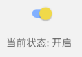
value(布尔值):控制开关状态(true为开启,false为关闭)。onValueChange(函数):状态变化时触发,接收新的布尔值作为参数。disabled(布尔值):是否禁用开关。trackColor(对象):自定义背景颜色(iOS)或轨道颜色(Android)。
c
trackColor={{
    false: '#cccccc', // 关闭时轨道颜色
    true: '#2196F3',  // 开启时轨道颜色
}}-
thumbColor(字符串):自定义开关按钮颜色。 -
- iOS 为圆形滑块,Android 为矩形滑块
- ios_backgroundColor 仅在 iOS 上生效,控制开关关闭时的背景色。
cimport React, { useState } from "react"; import { StyleSheet, Switch, Text, View } from "react-native"; const App = () => { const [isEnabled, setIsEnabled] = useState(false); const toggleSwitch = (value: boolean) => { setIsEnabled(value); console.log(`开关状态: ${value}`); }; return ( <View style={styles.container}> <Text style={styles.label}>通知开关</Text> <Switch trackColor={{ false: "#767577", true: "#81b0ff" }} thumbColor={isEnabled ? "#f5dd4b" : "#f4f3f4"} ios_backgroundColor="#3e3e3e" onValueChange={toggleSwitch} value={isEnabled} /> <Text style={styles.status}>当前状态: {isEnabled ? "开启" : "关闭"}</Text> </View> ); }; const styles = StyleSheet.create({ container: { flex: 1, justifyContent: "center", alignItems: "center", }, label: { fontSize: 18, marginBottom: 10, }, status: { marginTop: 10, fontSize: 16, color: "#666", }, }); export default App;弹窗 Modal
visible(布尔值):控制 Modal 是否显示。animationType(字符串):动画效果,可选值:"slide"(从底部滑入)、"fade"(淡入淡出)、"none"(无动画)。transparent(布尔值):背景是否透明,设为true时可自定义背景样式。onRequestClose(函数):点击硬件返回键(Android)或背景时触发,通常用于关闭 Modal。
实战范例见
https://blog.csdn.net/weixin_41192489/article/details/148687552状态栏 StatusBar
c<StatusBar barStyle="dark-content" // 状态栏文本颜色为深色 backgroundColor="white" // 状态栏背景色为白色 translucent={false} // 状态栏不透明,页面在状态栏下方 hidden={false} // 显示状态栏 />-
barStyle - 状态栏文本颜色
'default'- 默认样式(取决于平台)'light-content'- 白色文本(适用于深色背景)'dark-content'- 黑色文本(适用于浅色背景)
-
backgroundColor - 状态栏背景颜色(仅在
translucent为false时有效) -
translucent - 状态栏是否透明
true- 状态栏透明,内容可以在状态栏下方显示false- 状态栏不透明,内容会被状态栏遮挡
-
hidden - 状态栏是否隐藏
true- 隐藏状态栏false- 显示状态栏
-
networkActivityIndicatorVisible - 是否显示网络活动指示器(仅 iOS)
true- 显示加载指示器false- 不显示
-
animated - 更改状态栏设置时是否使用动画
true- 使用动画过渡false- 立即更改