图片资源存放目录
HarmonyOS鸿蒙的图片存放地址在:entry\src\main\resources\base\media中
我们可以通过:$r('app.media.图片名称') 获取图片
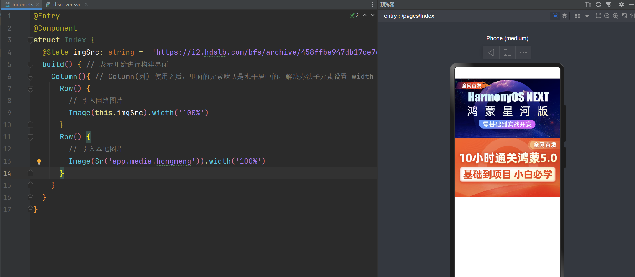
@Entry
@Component
struct Index {
  @State imgSrc: string =  'https://i2.hdslb.com/bfs/archive/458ffba947db17ce7cd048fb43926a3955db7eb2.jpg@672w_378h_1c_!web-search-common-cover.png';
  build() { // 表示开始进行构建界面
    Column(){ // Column(列) 使用之后,里面的元素默认是水平居中的,解决办法子元素设置 width
      Row() {
        // 引入网络图片
        Image(this.imgSrc).width('100%')
      }
      Row() {
        // 引入本地图片
        Image($r('app.media.hongmeng')).width('100%')
      }
    }
  }
}
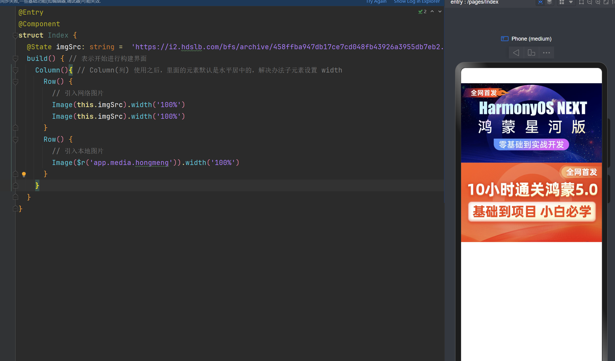
或者这样去写
2张图片的宽度设置为100%
@Entry
@Component
struct Index {
  @State imgSrc: string =  'https://i2.hdslb.com/bfs/archive/458ffba947db17ce7cd048fb43926a3955db7eb2.jpg@672w_378h_1c_!web-search-common-cover.png';
  build() { // 表示开始进行构建界面
    Column(){ // Column(列) 使用之后,里面的元素默认是水平居中的,解决办法子元素设置 width
      Row() {
        // 引入网络图片
        Image(this.imgSrc).width('100%')
        Image(this.imgSrc).width('100%')
      }
      Row() {
        // 引入本地图片
        Image($r('app.media.hongmeng')).width('100%')
      }
    }
  }
}
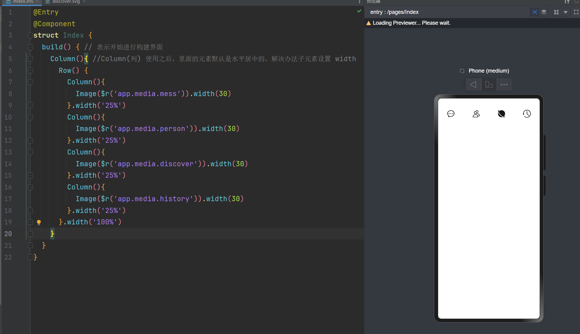
svg图标
当然你也可以使用第三方的图标库,如:阿里的图标库。
先把图标下载存为SVG,然后放在entry\src\main\resources\base\media中。
与图片的存放地址是一样的哈
@Entry
@Component
struct Index {
  build() { // 表示开始进行构建界面
    Column(){ //Column(列) 使用之后,里面的元素默认是水平居中的,解决办法子元素设置 width
      Row() {
        Column(){
          Image($r('app.media.mess')).width(30)
        }.width('25%')
        Column(){
          Image($r('app.media.person')).width(30)
        }.width('25%')
        Column(){
          Image($r('app.media.discover')).width(30)
        }.width('25%')
        Column(){
          Image($r('app.media.history')).width(30)
        }.width('25%')
      }.width('100%')
    }
  }
}
给文字设置背景图
// 给文字设置背景图
Text('我是文字').width(100).height(100).fontColor('#000').backgroundImage($r('app.media.hua'))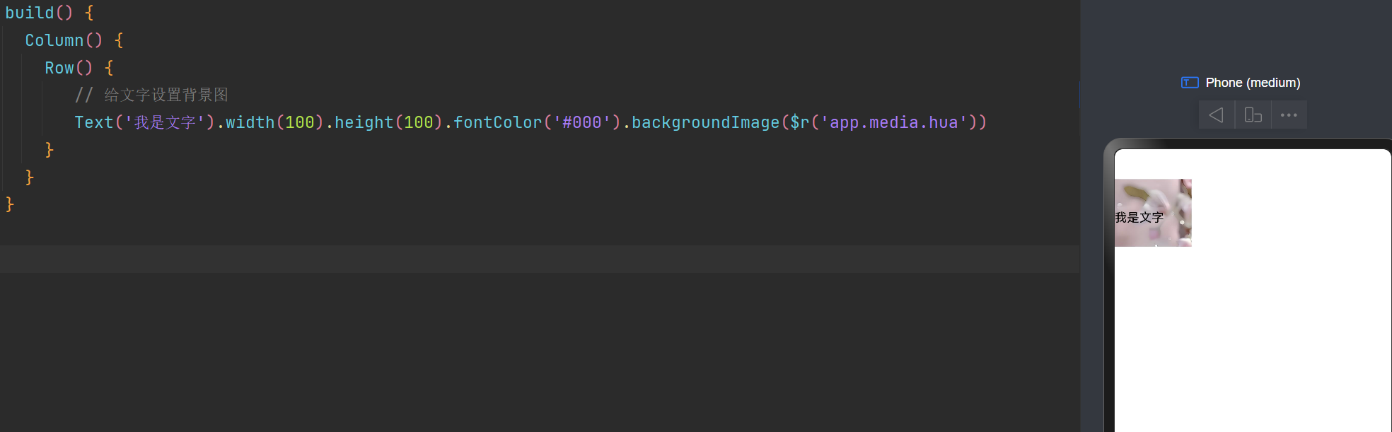
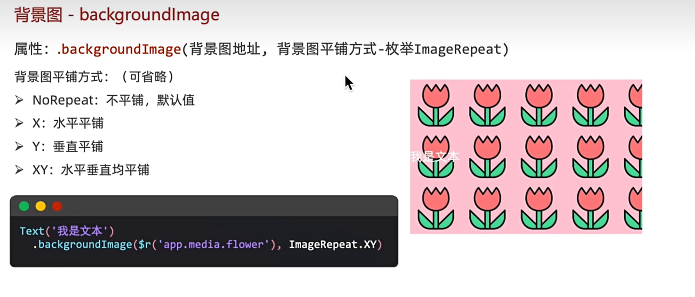
图片是否平铺
语法:backgroundImage(图片地址,是否平铺:默认不平铺)
// 图片在水平方向上平铺
Text('我是文字').width(500).height(100).fontColor('#000').backgroundImage($r('app.media.hua'), ImageRepeat.X)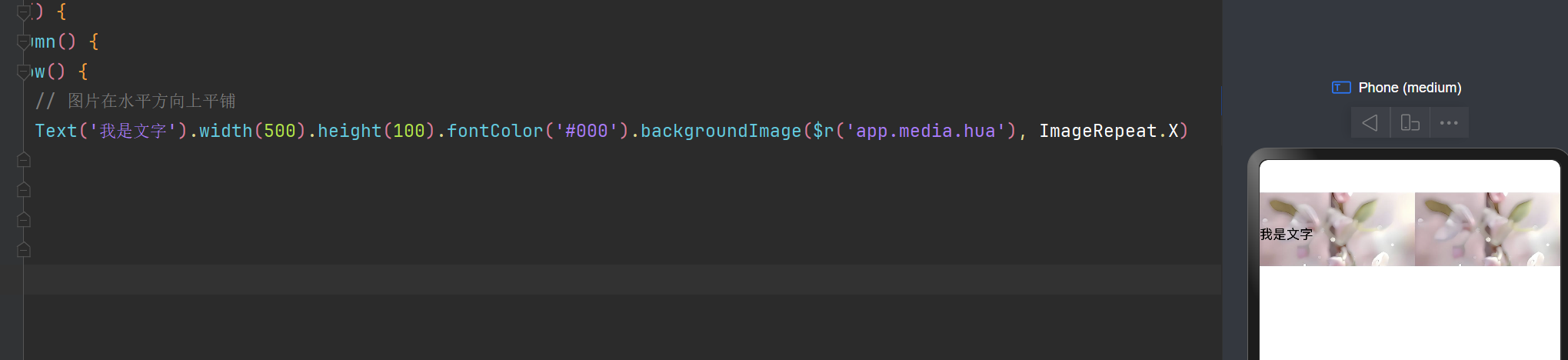
背景图片显示不出来需要注意的点
1,地址是否正确的。
2,是否给Text设置了宽高。如果不设置的话,是显示不出来的哈
设置背景图片的位置
 Text().width('100%').height(100).fontColor('#000').backgroundColor(Color.Pink)
   .backgroundImage($r('app.media.hua'))
   .backgroundImagePosition({x:0, y:0}) // x的位置和y的位置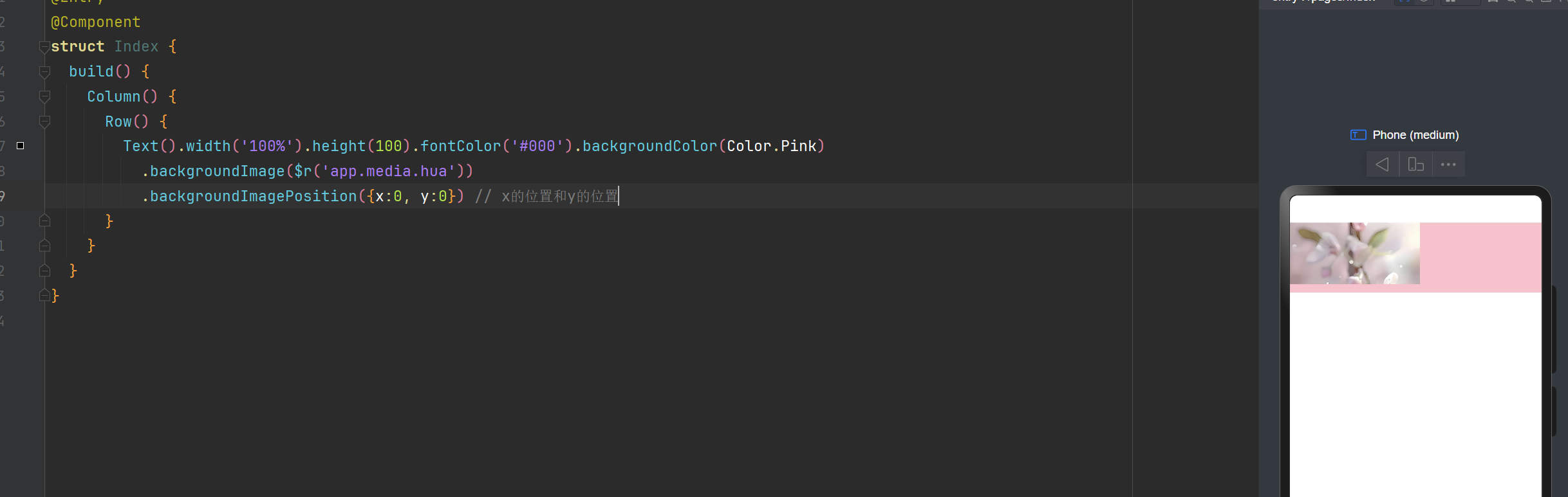
Text().width('100%').height(100).fontColor('#000').backgroundColor(Color.Pink)
  .backgroundImage($r('app.media.hua'))
  .backgroundImagePosition(Alignment.Center) //水平垂直方向上居中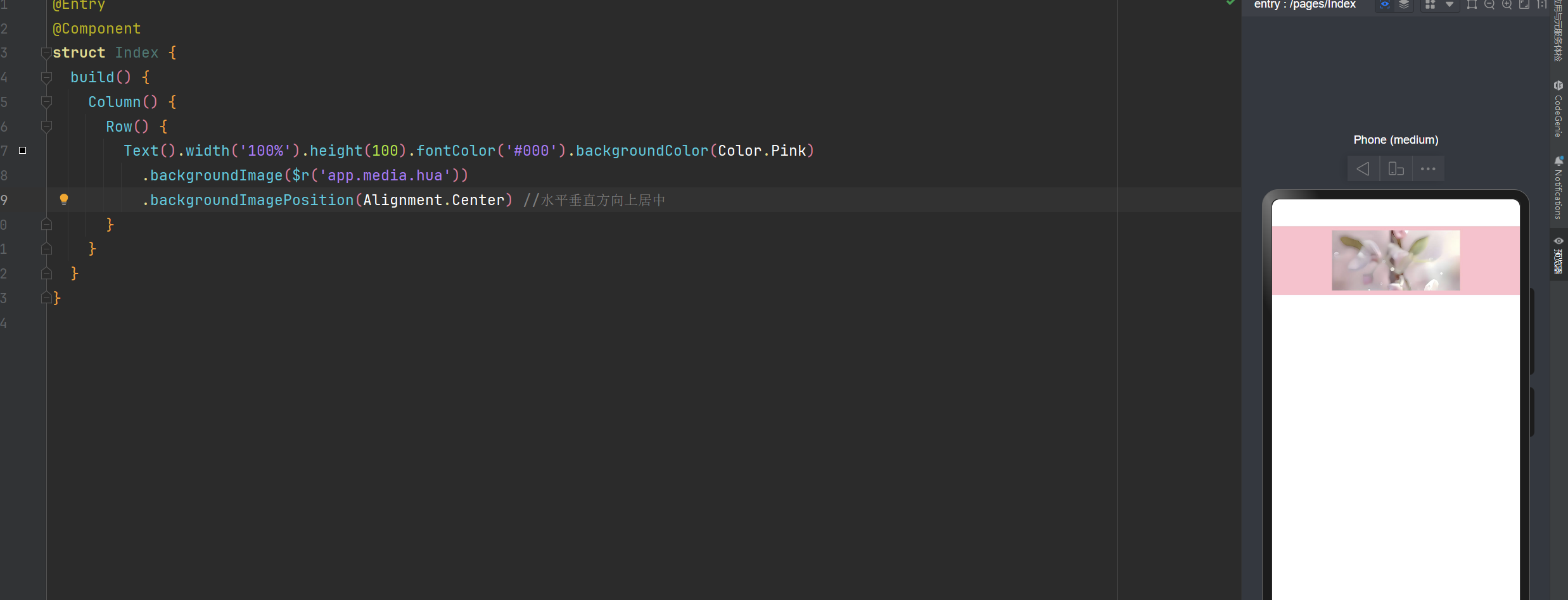
backgroundImagePosition的取值还有这些
Alignment.TopStart(左顶点)、Alignment.Top(在顶部,左右对齐)、Alignment.TopEnd(右顶点)
Alignment.Start(左对齐,上下居中)、Alignment.Center(水平,垂直方向上居中)、Alignment.End(在右边,垂直方向上居中)Alignment.BottomStart(左边底部)、Alignment.Bottom(在底部,左右对齐)、Alignment.BottomEnd(右边底部)
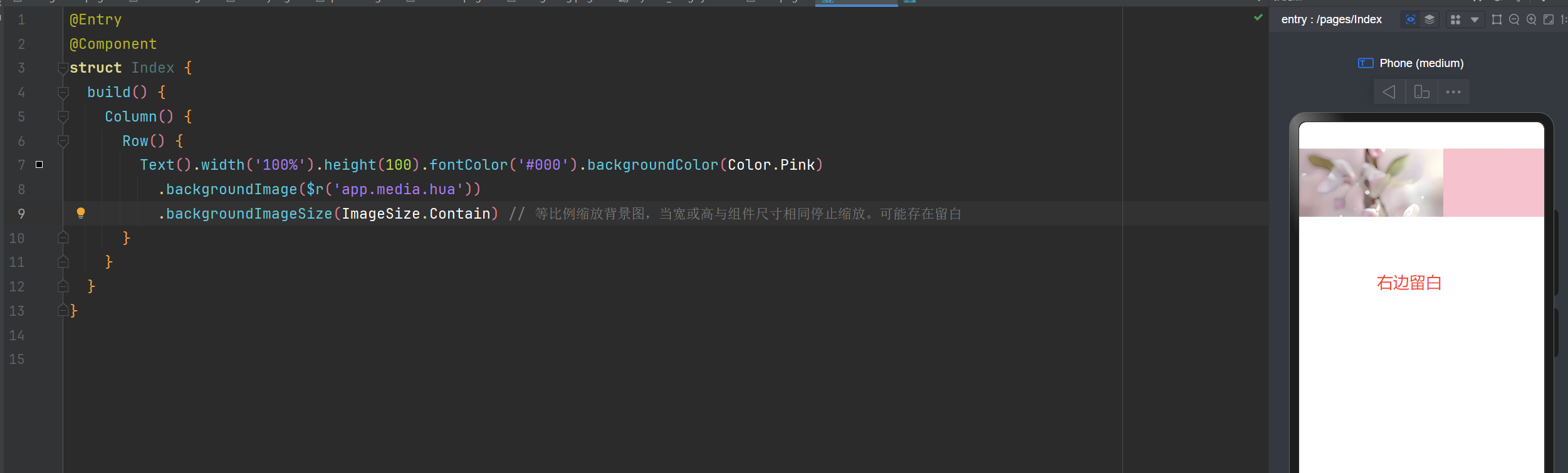
backgroundImageSize 设置背景图片
Text().width('100%').height(100).fontColor('#000').backgroundColor(Color.Pink)
  .backgroundImage($r('app.media.hua'))
  .backgroundImageSize({ height:100, width:100 }) // 设置背景图片的宽和高
ImageSize 图片缩放的枚举值
ImageSize.Contain:等比例缩放背景图,当宽或高与组件尺寸相同停止缩放(可能存在留白)
ImageSize.Cover:等比例缩放背景图至图片完全覆盖组件范围(不会留白,但是有可能会让图片显示不全)
ImageSize.Auto:默认,原图尺寸
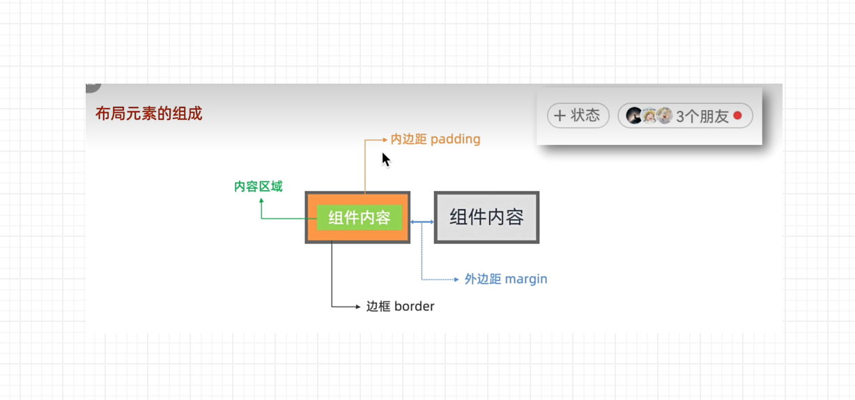
布局元素的组成
一般有:内容,padding,border,margin这4部分组件。
padding会撑大内容(与css一样)
如下图:借用一张网络图片
padding(会撑大内容)
@Entry
@Component
struct Index {
build() { // 表示开始进行构建界面
Column() { //Column(列) 使用之后,里面的元素默认是水平居中的,解决办法子元素设置 width
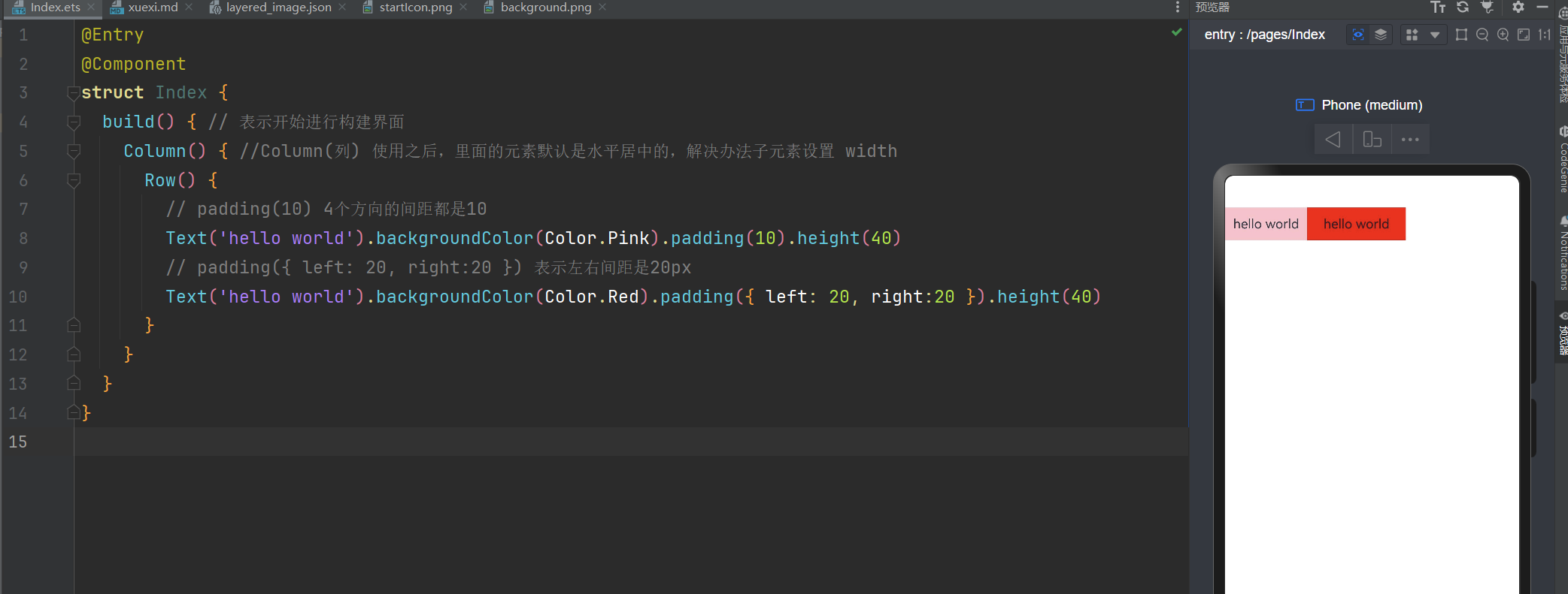
Row() {
// padding(10) 4个方向的间距都是10
Text('hello world').backgroundColor(Color.Pink).padding(10).height(40)
// padding({ left: 20, right:20 }) 表示左右间距是20px
Text('hello world').backgroundColor(Color.Red).padding({ left: 20, right:20 }).height(40)
}
}
}
}
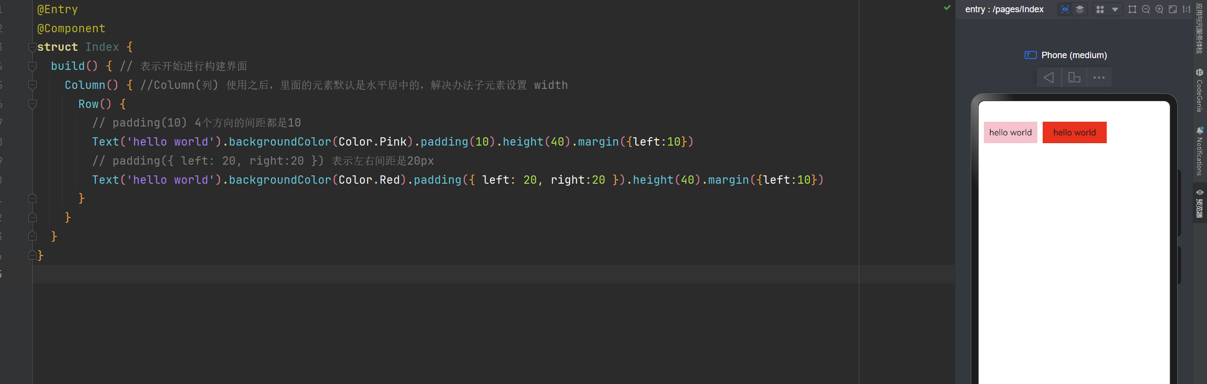
外边距 margin
@Entry
@Component
struct Index {
  build() { // 表示开始进行构建界面
    Column() { //Column(列) 使用之后,里面的元素默认是水平居中的,解决办法子元素设置 width
      Row() {
        // padding(10) 4个方向的间距都是10
        Text('hello world').backgroundColor(Color.Pink).padding(10).height(40).margin({left:10})
        // padding({ left: 20, right:20 }) 表示左右间距是20px
        Text('hello world').backgroundColor(Color.Red).padding({ left: 20, right:20 }).height(40).margin({left:10})
      }
    }
  }
}
外边距 margin
c
@Entry
@Component
struct Index {
  build() { // 表示开始进行构建界面
    Column() { //Column(列) 使用之后,里面的元素默认是水平居中的,解决办法子元素设置 width
      Row() {
        // padding(10) 4个方向的间距都是10
        Text('hello world').backgroundColor(Color.Pink).padding(10).height(40).margin({left:10})
        // padding({ left: 20, right:20 }) 表示左右间距是20px
        Text('hello world').backgroundColor(Color.Red).padding({ left: 20, right:20 }).height(40).margin({left:10})
      }
    }
  }
}
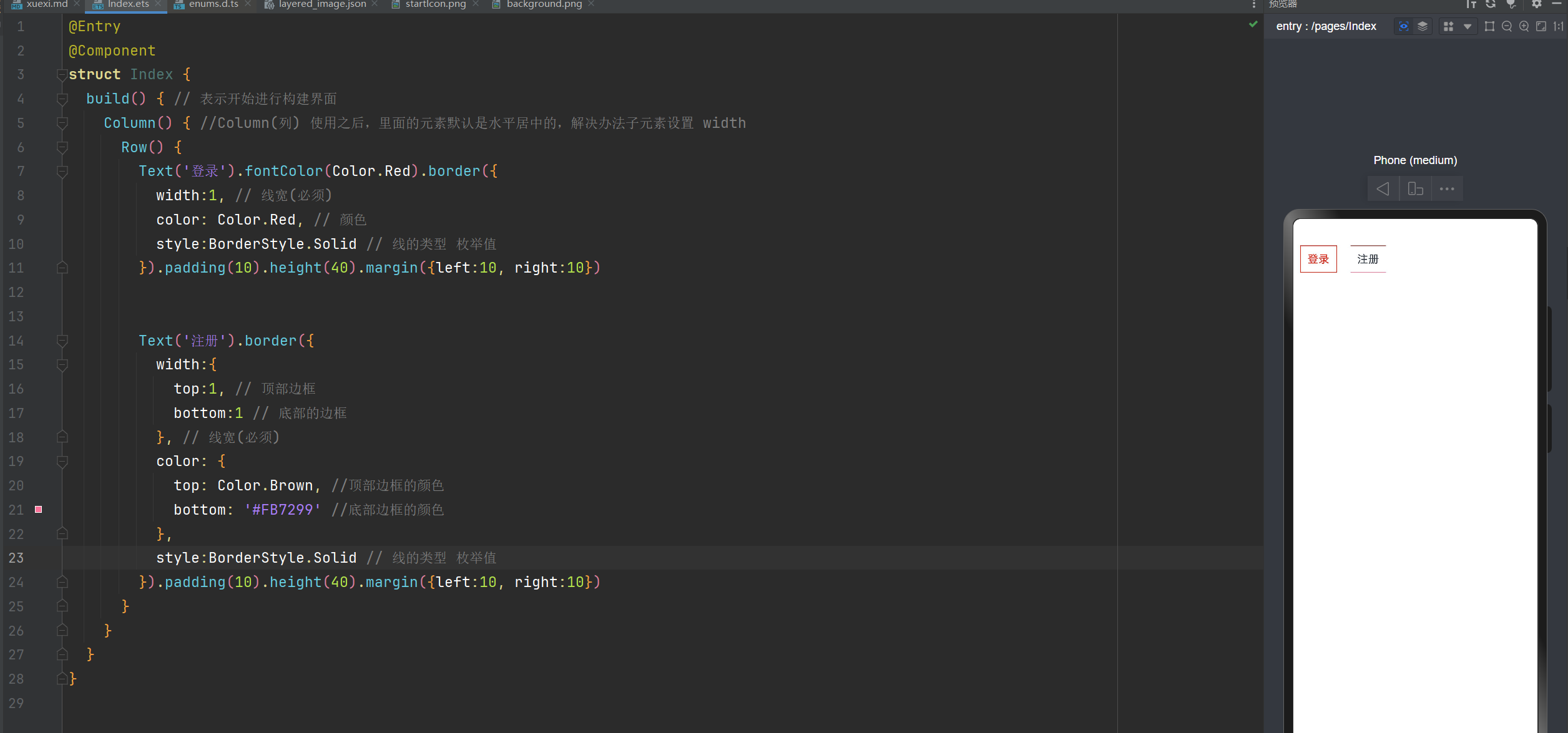
边框:border
@Entry
@Component
struct Index {
  build() { // 表示开始进行构建界面
    Column() { //Column(列) 使用之后,里面的元素默认是水平居中的,解决办法子元素设置 width
      Row() {
        Text('登录').fontColor(Color.Red).border({
          width:1, // 线宽(必须)
          color: Color.Red, // 颜色
          style:BorderStyle.Solid // 线的类型 枚举值
        }).padding(10).height(40).margin({left:10, right:10})
        Text('注册').border({
          width:{
            top:1, // 顶部边框
            bottom:1 // 底部的边框
          }, // 线宽(必须)
          color: {
            top: Color.Brown, //顶部边框的颜色
            bottom: '#FB7299' //底部边框的颜色
          },
          style:BorderStyle.Solid // 线的类型 枚举值
        }).padding(10).height(40).margin({left:10, right:10})
      }
    }
  }
}
圆角 borderRadius(10)
borderRadius(10): // 4个方向上都是10
borderRadius({
topLeft:10, //左上角
topRight:10, // 右上角
bottomLeft: 10, // 左下角
bottomRight:10 // 右下角
})
设置正圆
// 设置正圆,宽度和高度一样,圆角是宽度和高度的一半。
Text('正圆').width(100).height(100).backgroundColor(Color.Green).borderRadius(50)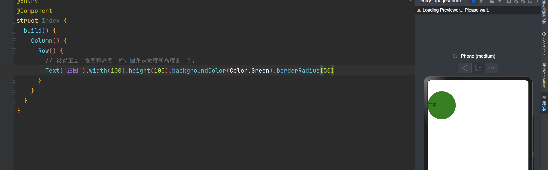
设置胶囊按钮
c
// 设置胶囊按钮,圆角是高度的一半,文字水平居中
Text('胶囊按钮').width(100).height(40).textAlign(TextAlign.Center).backgroundColor(Color.Pink).borderRadius(20)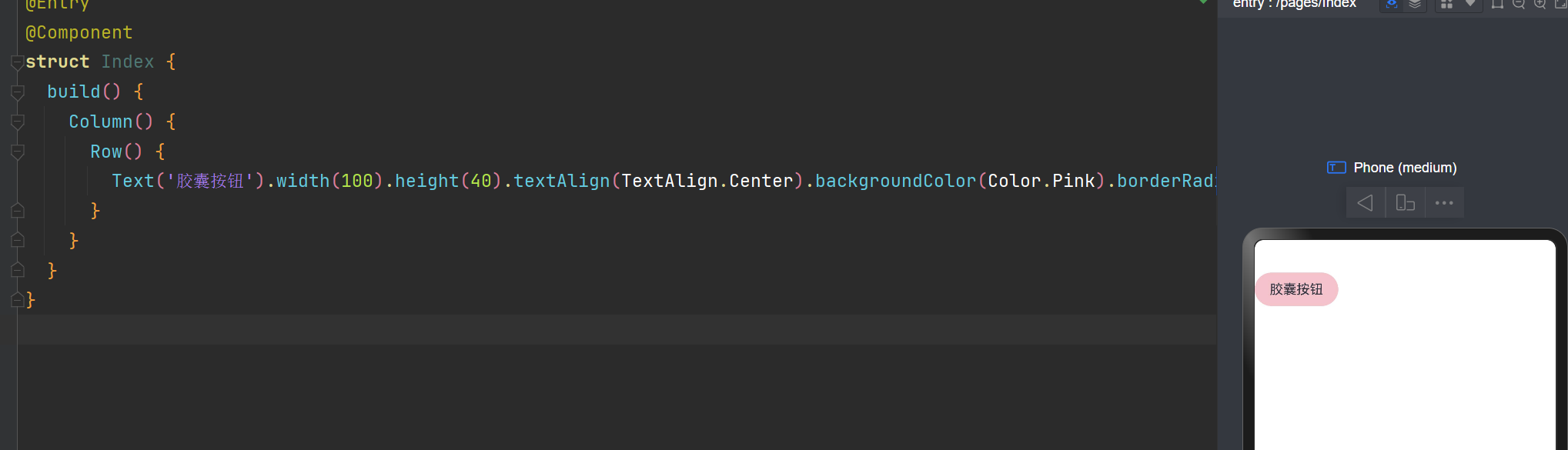
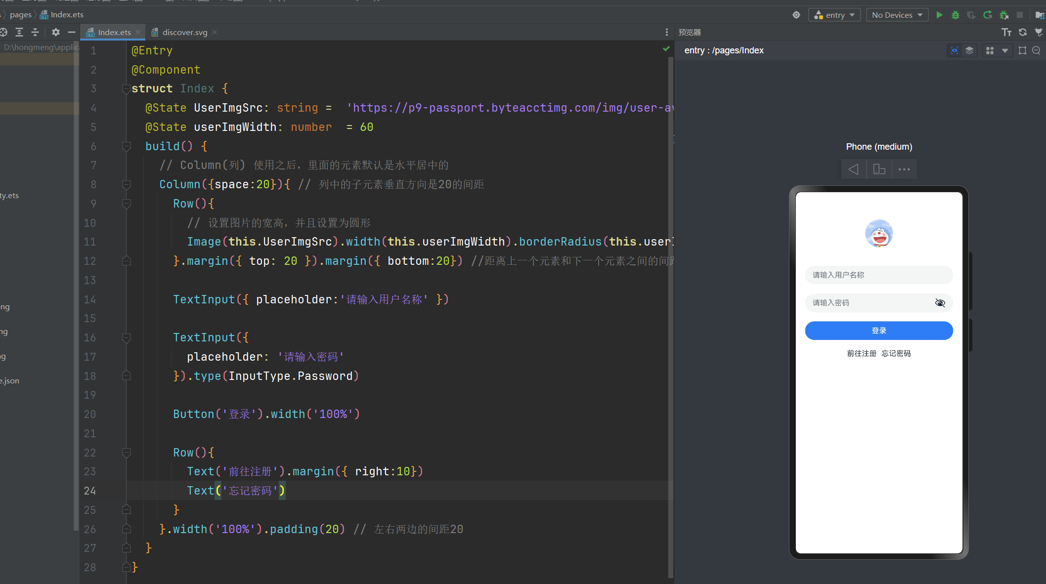
登录页面
通过上面我们学习的知识 一起来做一个登录界面复习一下
@Entry
@Component
struct Index {
  @State UserImgSrc: string =  'https://p9-passport.byteacctimg.com/img/user-avatar/473f3e32c874a82e2cf6f844ba77e362~160x160.png';
  @State userImgWidth: number  = 60
  build() {
    // Column(列) 使用之后,里面的元素默认是水平居中的
    Column({space:20}){ // 列中的子元素垂直方向是20的间距
      Row(){
        // 设置图片的宽高,并且设置为圆形
        Image(this.UserImgSrc).width(this.userImgWidth).borderRadius(this.userImgWidth/2)
      }.margin({ top: 20 }).margin({ bottom:20}) //距离上一个元素和下一个元素之间的间距

      TextInput({ placeholder:'请输入用户名称' })

      TextInput({
        placeholder: '请输入密码'
      }).type(InputType.Password)

      Button('登录').width('100%')

      Row(){
        Text('前往注册').margin({ right:10})
        Text('忘记密码')
      }
    }.width('100%').padding(20) // 左右两边的间距20
  }
}
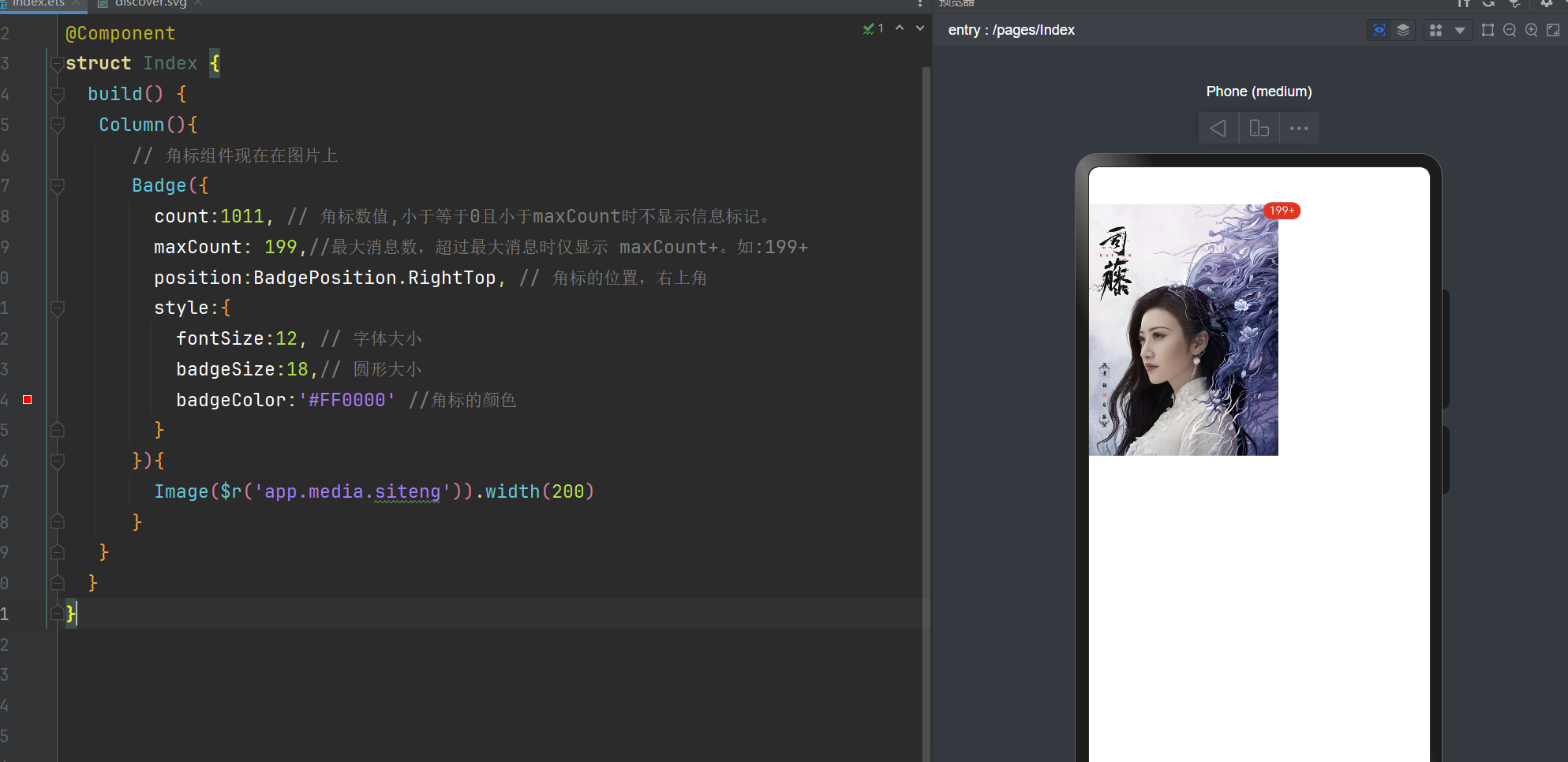
信息标记组件 Badge
@Entry
@Component
struct Index {
  build() {
   Column(){
      // 角标组件现在在图片上
      Badge({
        count:1011, // 角标数值,小于等于0且小于maxCount时不显示信息标记。
        maxCount: 199,// 最大消息数,超过最大消息时仅显示 maxCount+。如:199+
        position:BadgePosition.RightTop, // 角标的位置,右上角
        style:{
          fontSize:12, // 字体大小
          badgeSize:18,// 圆形大小
          badgeColor:'#FF0000' //角标的颜色
        }
      }){
        Image($r('app.media.siteng')).width(200)
      }
   }
  }
}
BadgePosition枚举说明
| 名称 | 值 | 说明 |
|---|---|---|
| BadgePosition.RightTop | 0 | 圆点显示在右上角。 |
| BadgePosition.Right | 1 | 圆点显示在右侧纵向居中。 |
| BadgePosition.Left | 2 | 圆点显示在左侧纵向居中。 |