Matplotlib和Plotly知识点(Dash+Plotly分页展示)
- [0、Matplotlib、Plotly和Dash区别 (推荐用Dash+Plotly)](#0、Matplotlib、Plotly和Dash区别 (推荐用Dash+Plotly))
- [1.1、Matplotlib (静态图)](#1.1、Matplotlib (静态图))
-
-
- [1. Figures(图形)](#1. Figures(图形))
- [2. Subplots(子图)](#2. Subplots(子图))
- [3. Axes(坐标轴对象)](#3. Axes(坐标轴对象))
- [4. Ticks(刻度)](#4. Ticks(刻度))
- 一、Matplotlib简介
- 二、基本概念
-
- [1. Figure(图形)](#1. Figure(图形))
- [2. Axes(子图)](#2. Axes(子图))
- [3. Axis(坐标轴)](#3. Axis(坐标轴))
- [4. Artist(绘图元素)](#4. Artist(绘图元素))
- 三、基本使用流程
-
- [1. 导入库](#1. 导入库)
- [2. 准备数据](#2. 准备数据)
- [3. 创建 Figure 和 Axes](#3. 创建 Figure 和 Axes)
- [4. 绘制图形](#4. 绘制图形)
- [5. 设置图表属性](#5. 设置图表属性)
- [6. 显示图表](#6. 显示图表)
- 四、常见图表类型及示例
-
- [1. 折线图(Line Plot)](#1. 折线图(Line Plot))
- [2. 散点图(Scatter Plot)](#2. 散点图(Scatter Plot))
- [3. 柱状图(Bar Chart)](#3. 柱状图(Bar Chart))
- [4. 直方图(Histogram)](#4. 直方图(Histogram))
- [5. 饼图(Pie Chart)](#5. 饼图(Pie Chart))
- 五、多子图布局
-
- [1. 使用 `subplots` 函数](#1. 使用
subplots函数) - [2. 使用 `GridSpec` 实现复杂布局](#2. 使用
GridSpec实现复杂布局)
- [1. 使用 `subplots` 函数](#1. 使用
- 六、图表定制
-
- [1. 颜色、标记和线条样式](#1. 颜色、标记和线条样式)
- [2. 字体和文本属性](#2. 字体和文本属性)
- [3. 坐标轴和刻度](#3. 坐标轴和刻度)
- 七、保存图表
-
- [1.2 Matplotlib(完整示例)](#1.2 Matplotlib(完整示例))
- 2、Seaborn
- [3.1、Plotly动态图(多组折线图 + 表格)](#3.1、Plotly动态图(多组折线图 + 表格))
- 3.2、Plotly示例
-
- [✅ 1. `data_dict` 假数据构造(含 series 和 table)](#✅ 1.
data_dict假数据构造(含 series 和 table)) - [✅ 2. 使用 Plotly 绘制折线图 + 表格(每组上下两行)](#✅ 2. 使用 Plotly 绘制折线图 + 表格(每组上下两行))
- [✅ 图表展示效果](#✅ 图表展示效果)
- [✅ 后续可选拓展:](#✅ 后续可选拓展:)
- [✅ 1. `data_dict` 假数据构造(含 series 和 table)](#✅ 1.
- [3.3 Plotly(完整示例)](#3.3 Plotly(完整示例))
- 5.1、Dash分页显示多个plotly
-
- [✅ 示例:分页显示 Plotly 折线图(Dash 实现)](#✅ 示例:分页显示 Plotly 折线图(Dash 实现))
- [🔄 其他分页方式(替代 `dcc.Slider`):](#🔄 其他分页方式(替代
dcc.Slider):)
- 5.2、Dash分页显示多个plotly(已保存的)
-
- [✅ 情况一:保存为多个 `.html` 文件](#✅ 情况一:保存为多个
.html文件) - [✅ 情况二:保存为 `.json` 的 Plotly 图对象(使用 `plotly.io.write_json`)](#✅ 情况二:保存为
.json的 Plotly 图对象(使用plotly.io.write_json)) - [✅ 总结](#✅ 总结)
- [✅ 情况一:保存为多个 `.html` 文件](#✅ 情况一:保存为多个
- [5.4 以日期时间分页展示](#5.4 以日期时间分页展示)
-
- [✅ 目标功能](#✅ 目标功能)
- [🧩 第一步:保存图表 `save_plot.py`](#🧩 第一步:保存图表
save_plot.py) - [🧩 第二步:分页查看图表 `view_plot.py`](#🧩 第二步:分页查看图表
view_plot.py) - [✅ 使用说明](#✅ 使用说明)
- 5.3、Dash(完整示例)
0、Matplotlib、Plotly和Dash区别 (推荐用Dash+Plotly)
matplot (不支持滑动):了解fig, axes = plt.subplots即可
plotly(动态图):了解fig = make_subplots即可
Dash(分页):了解分页即可
🔍 一、三者功能定位对比
| 特性/库 | Matplotlib | Plotly | Dash |
|---|---|---|---|
| 类型 | 静态绘图库 | 交互式绘图库 | 基于 Plotly 的 Web 应用框架 |
| 图表交互性 | 低(可嵌入GUI) | 高(支持缩放/悬停) | 高(完整 Web 前端) |
| 图表保存 | 保存为 PNG/PDF | 可保存为 HTML | 可通过网页访问/交互显示 |
| 适合场景 | 快速本地分析 | Web + Notebook 展示 | 搭建完整交互式仪表盘系统 |
| 安装 | pip 安装即可 | pip 安装即可 | 需要安装 dash + 依赖 |
✅ 总结推荐
| 目标 | 推荐 |
|---|---|
| 只保存静态图 | Matplotlib 保存 PNG |
| 保存交互图 | Plotly 保存 HTML |
| 分页浏览多个图 | Dash + Plotly 实现分页界面 |
| 图表标题为日期 | datetime.now().strftime(...) 命名文件 |
Dash+Plotly分页显示效果(适合用于图表展示):Plotly画图,Dash分页显示
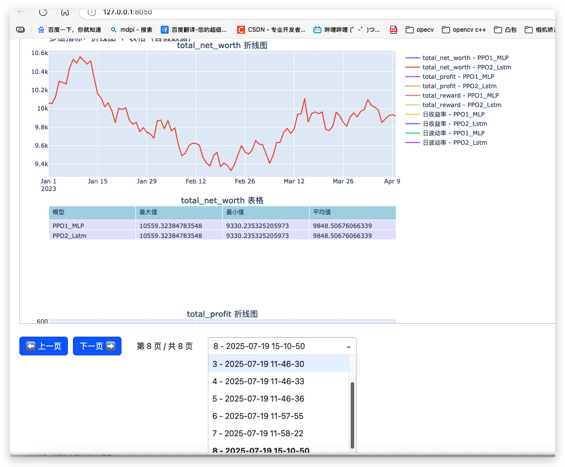
完整代码:
Plotly画图
python
import numpy as np
import pandas as pd

# 1.系列指标
def calculate_metrics_series(history_dict, risk_free_rate=0.0):
    """
        # 折线图数据格式
        {
            "日收益率": {
                "series": [pd.Series1, pd.Series2, ...],  # 列表,而非dict
                "table": [
                    {"model": "PPO1_MLP", ...},
                    {"model": "PPO2_Lstm", ...}
                ]
            },
            ...
        }

        # 汇总表格数据(同上面的)
        [
        {'model': 'PPO1_MLP', 'max': 0.0099, 'min': 0.0, 'mean': 0.0089}
        {'model': 'PPO2_Lstm', 'max': 0.0099, 'min': 0.0, 'mean': 0.0089}
        ]

    """
    data_dict = {}

    for policy_name, history in history_dict.items():
        # net_worth = np.array(history['total_net_worth'])
        # profit = np.array(history['total_profit'])
        # rewards = np.array(history['total_reward'])
        # # dates = pd.date_range(end=history['current_data'], periods=len(net_worth))
        dates = pd.to_datetime(history['current_data'])
        # index = pd.to_datetime(historypre['current_data'])


        # 1. 计算每日收益率
        # 计算每日收益率,系列,
        # np.diff(net_worth):计算净值序列的相邻差值,net_worth[:-1]:取前n-1日的净值作为分母
        # 该计算方式与pandas的pct_change()方法等价:
        # daily_returns = np.diff(net_worth) / net_worth[:-1]


        # 假设 history["total_net_worth"] 已经有数据
        net_worth_series = pd.Series(history['total_net_worth'],dates)
        # 计算每日收益率
        daily_returns = net_worth_series.pct_change().fillna(0)  # 第一天收益率设为0

        # 2. 波动率


        # Step 2: 逐步计算从 day 1 到 t 的累积标准差
        #daily_returns.expanding():创建扩展窗口对象,第1个窗口:[0],第2个窗口:[0,1],第3个窗口:[0,1,2]
        daily_volatility = daily_returns.expanding().std().fillna(0)

         # # 计算从开始时间到当前步的波动率,和上面等价
        # volatility = [np.std(daily_returns[:i+1]) for i in range(len(daily_returns))]

        # 计算 5 日滚动标准差作为波动率
        # daily_volatility = daily_returns.rolling(window=5).std().fillna(0)


        # 添加到每个指标的 data_dict
        def add_to_data_dict(name, series_data,policy_name, table_value=None):
            if name not in data_dict:
                data_dict[name] = {"series": [], "table": []}
            data_dict[name]["series"].append(
                pd.Series(series_data, index=dates, name=policy_name)
            )
            data_dict[name]["table"].append(
                {"model": policy_name, "max": np.max(series_data),
                 "min": np.min(series_data), "mean": np.mean(series_data) if hasattr(series_data, "__len__") else series_data}
            )
         # 原始数据
        # 构造 pandas.Series,索引为日期 # x = pd.to_datetime(historypre['current_data'])
        series_net = pd.Series(history['total_net_worth'], index=dates, name=policy_name)
        series_profit = pd.Series(history['total_profit'], index=dates, name=policy_name)
        series_reward = pd.Series(history['total_reward'], index=dates, name=policy_name)

        for metric_name, series in zip(
            ["total_net_worth", "total_profit", "total_reward"],
            [series_net, series_profit, series_reward]
        ):
            add_to_data_dict(metric_name, series, policy_name,table_value=None)

        # 计算的指标数据
        add_to_data_dict("日收益率", daily_returns,policy_name, table_value=None)
        add_to_data_dict("日波动率",daily_volatility,policy_name, table_value=None)

    return data_dict


# 2.值指标,多个

def calculate_metrics_values(history_dict, risk_free_rate=0.0):
    # data_dict = {}
    data_list = []

    for policy_name, history in history_dict.items():
        net_worth = np.array(history['total_net_worth'])
        profit = np.array(history['total_profit'])
        rewards = np.array(history['total_reward'])
        # dates = pd.date_range(end=history['current_data'], periods=len(net_worth))
        dates = pd.to_datetime(history['current_data'])


        # 收益率
        returns = net_worth / net_worth[0] - 1
        total_return = returns[-1]

        # 日收益率
        daily_returns = pd.Series(net_worth).pct_change().dropna()

        # 波动率(年化)
        volatility = daily_returns.std() * np.sqrt(252)

        # 夏普比率
        sharpe_ratio = (daily_returns.mean() - risk_free_rate) / daily_returns.std() * np.sqrt(252) if daily_returns.std() != 0 else 0

        # 最大回撤
        cumulative = pd.Series(net_worth)
        roll_max = cumulative.cummax()
        drawdown = (cumulative - roll_max) / roll_max
        max_drawdown = drawdown.min()

        # 卡玛比率
        calmar_ratio = total_return / abs(max_drawdown) if max_drawdown != 0 else np.inf

        # 胜率 & 盈亏比
        profit_diff = np.diff(profit)
        win_trades = profit_diff[profit_diff > 0]
        loss_trades = profit_diff[profit_diff < 0]
        win_rate = len(win_trades) / len(profit_diff) if len(profit_diff) > 0 else 0
        avg_win = win_trades.mean() if len(win_trades) > 0 else 0
        avg_loss = abs(loss_trades.mean()) if len(loss_trades) > 0 else 1e-8
        profit_factor = avg_win / avg_loss if avg_loss != 0 else np.inf

         # 存入列表,每个元素是一个字典
        data_list.append({
            "model": policy_name,
            "收益率": total_return,
            "波动率": volatility,
            "夏普比率": sharpe_ratio,
            "累计净值": net_worth[-1],
            "最大回撤": max_drawdown,
            "卡玛比率": calmar_ratio,
            "胜率": win_rate,
            "盈亏比": profit_factor,
        })

    return data_list
    #     # 存结果
    #     data_dict[policy_name] = {
    #         "收益率": total_return,
    #         "波动率": volatility,
    #         "夏普比率": sharpe_ratio,
    #         "累计净值": net_worth[-1],
    #         "最大回撤": max_drawdown,
    #         "卡玛比率": calmar_ratio,
    #         "胜率": win_rate,
    #         "盈亏比": profit_factor,
    #     }

    # return data_dict


if __name__ == "__main__":

    import numpy as np
    import pandas as pd
    from datetime import datetime, timedelta

    # 随机种子
    np.random.seed(42)

    n_steps = 100
    initial_net_worth = 10000
    price_changes = np.random.normal(loc=0.001, scale=0.01, size=n_steps)

    # 系列数据:净值、利润、奖励
    net_worth_series = initial_net_worth * np.cumprod(1 + price_changes)  # ✅ 系列
    profit_series = net_worth_series - initial_net_worth                  # ✅ 系列
    reward_series = price_changes * 100                                   # ✅ 系列

    history = {
        'total_net_worth': net_worth_series.tolist(),
        'total_profit': profit_series.tolist(),
        'total_reward': reward_series.tolist(),
        'current_data': pd.date_range('2023-01-01', periods=len(net_worth_series), freq='D').strftime('%Y-%m-%d').tolist()  # 存储格式化后的日期列表
    }

    # print(history)

    print("\n历史数据最后5条记录:")
    for key in history:
        print(f"{key}:")
        # 对数值数据保留4位小数,日期保持原格式
        values = [round(x, 4) if isinstance(x, (float, np.floating)) else x
                for x in history[key][-5:]]  # 可修改-5为其他数值调整显示数量
        print(values)


# #### ************ceshi************
    # 1、计算指标,系列
    data_dict1 = calculate_metrics_series({'PPO1_MLP': history, 'PPO2_Lstm':history})
    print("\n方法一:评估指标:")

    # 新增打印代码
    print("各指标前3条数据预览:")
    for metric_name in data_dict1:
        print(f"\n=== {metric_name} ===")

        # 打印时序数据前3条
        print(f"时序数据({len(data_dict1[metric_name]['series'])}个模型):")
        for series in data_dict1[metric_name]['series']:
            print(f"{series.name}: {[round(x,4) for x in series.values[:3]]}...")

        # 打印表格数据前3条
        print(f"\n表格统计(前3项):")
        for table_item in data_dict1[metric_name]['table'][:3]:
            print({k: round(v,4) if isinstance(v, float) else v
                for k, v in table_item.items()})

     # 2、计算评估指标值,多值
    data_dict2 = calculate_metrics_values({'PPO1_MLP': history, 'PPO2_Lstm':history})
    print("\n方法二:评估指标:")
    print(data_dict2)


    # 3、绘图
    history_dict={
        'PPO1_MLP': history,
        'PPO2_Lstm': history,
    }
    # data_dict=metrics(history_dict)
    data_dict = calculate_metrics_series(history_dict)  # 生成时序和指标表格
    summary_values = calculate_metrics_values(history_dict)  # 生成整体指标汇总

    import pandas as pd
    import numpy as np
    import plotly.graph_objs as go
    from plotly.subplots import make_subplots


    # 总共有多少组指标,(折线图 + 表格)+(表格)
    n_metrics = len(data_dict)
    n_table = 1 #len(summary_values)

    # 创建子图:每组两行(折线图 + 表格),+(表格)
    fig = make_subplots(
        rows=n_metrics * 2+n_table,
        cols=1,
        row_heights=[0.6, 0.4] * n_metrics+[0.5]*n_table,
        # vertical_spacing=0.1,
        vertical_spacing=0.02,  # 间距改小
        specs=[[{"type": "xy"}], [{"type": "table"}]] * n_metrics+ [[{"type": "table"}]] * n_table,
        subplot_titles=[
            f"{metric} 折线图" if i % 2 == 0 else f"{metric} 表格"
            for metric in data_dict for i in range(2)
        ]+[f"汇总指标表格{i}" for i in range(n_table)],
    )

    row = 1
    for metric_name, metric_data in data_dict.items():
        # 折线图部分
        for s in metric_data["series"]:
            fig.add_trace(
                go.Scatter(
                    x=s.index,
                    y=s.values,
                    mode="lines",
                    name=f"{metric_name} - {s.name}"
                ),
                row=row, col=1
            )

        # 表格部分
        table = metric_data["table"]
        if not table:
            print(f"[警告] 表格为空: {metric_name}")
        # else:
        #     print(f"[信息] 表格不为空: {table}")
        #     for item in table:
        #         print(f"[信息] 表格内容: {item}")
        fig.add_trace(
            go.Table(
                header=dict(
                    values=["模型", "最大值", "最小值", "平均值"],
                    fill_color="lightblue",
                    align="left"
                ),
                cells=dict(
                    # values=[
                    #     [item["model"] for item in table],
                    #     [item["max"] for item in table],
                    #     [item["min"] for item in table],
                    #     [item["mean"] for item in table],
                    # ],
                    values=[
                        [item["model"] for item in table],
                        [float(item["max"]) for item in table],
                        [float(item["min"]) for item in table],
                        [float(item["mean"]) for item in table],
                    ],
                    fill_color="lavender",
                    align="left"
                )
            ),
            row=row + 1, col=1
        )
        row += 2

        #  # 表格
        # table_df = pd.DataFrame(metric_data["table"])
        # fig.add_trace(
        #     go.Table(
        #         header=dict(values=list(table_df.columns), fill_color="lightgrey", align="left"),
        #         cells=dict(values=[table_df[col] for col in table_df.columns], fill_color="white", align="left")
        #     ),
        #     row=row + 1, col=1
        # )
        # row += 2

    # 汇总表格部分
    summary_df = pd.DataFrame(summary_values)
    fig.add_trace(
        go.Table(
            header=dict(
                values=list(summary_df.columns),
                fill_color="lightblue",
                align="left"
            ),
            cells=dict(
                values=[summary_df[col] for col in summary_df.columns],
                fill_color="lavender",
                align="left"
            )
        ),
        row=row, col=1
    )


    # 布局调整
    fig.update_layout(
        height=600 * n_metrics,
        width=1000,
        title="多组指标:折线图 + 表格(含假数据)",
        showlegend=True,
        # margin=dict(t=40),  # 顶部边距,避免标题太靠上
        margin=dict(t=40, b=40, l=40, r=40),  # 上下左右边距
        autosize=True,  # 自动调整大小
    )
    # 显示图表
    fig.show()

   #保存到本地
    import os
    # 保存图表
    # 创建目录
    os.makedirs("charts", exist_ok=True)

    # 当前时间
    now = datetime.now()
    now_str = now.strftime("%Y-%m-%d %H:%M:%S")
    filename_str = now.strftime("%Y-%m-%d_%H-%M-%S")

    filepath = f"charts/linechart_{filename_str}.html"
    fig.write_html(filepath)
    print(f"✅ 图表保存:{filepath}")
Dash分页:
python
# view_plot.py
import os
from dash import Dash, dcc, html, Input, Output, State
import dash
import dash_bootstrap_components as dbc

CHART_DIR = "charts"

def get_sorted_chart_files():
    files = [f for f in os.listdir(CHART_DIR) if f.endswith(".html")]
    return sorted(files, key=lambda f: os.path.getmtime(os.path.join(CHART_DIR, f)))

app = Dash(__name__, external_stylesheets=[dbc.themes.BOOTSTRAP])
app.title = "📊 图表分页浏览器"

app.layout = html.Div([
    html.H3("📈 Plotly 图表分页浏览", style={"marginBottom": "20px"}),

    html.Div(id="chart-title", style={"fontSize": "18px", "marginBottom": "10px"}),

    html.Iframe(id="chart-frame", width="100%", height="600px", style={"border": "1px solid #ccc"}),

    html.Div([
        dbc.Button("⬅ 上一页", id="prev", color="primary"),
        dbc.Button("下一页 ➡", id="next", color="primary"),
        html.Span(id="page-indicator", style={"margin": "0 20px", "fontSize": "16px"}),
        dcc.Dropdown(id="page-selector", style={"width": "300px"}, clearable=False),
    ], style={"marginTop": "20px", "display": "flex", "alignItems": "center", "gap": "10px"}),

    dcc.Store(id="chart-index", data=0)
], style={"padding": "20px"})

@app.callback(
    Output("chart-frame", "srcDoc"),
    Output("chart-index", "data"),
    Output("chart-title", "children"),
    Output("page-indicator", "children"),
    Output("page-selector", "options"),
    Output("page-selector", "value"),
    Input("prev", "n_clicks"),
    Input("next", "n_clicks"),
    Input("page-selector", "value"),
    State("chart-index", "data"),
    prevent_initial_call=True
)
def update_chart(prev_clicks, next_clicks, selected_page, current_index):
    charts = get_sorted_chart_files()
    total = len(charts)

    if total == 0:
        return "<h3>📭 没有图表</h3>", 0, "无图表", "第 0 页 / 共 0 页", [], None

    ctx = dash.callback_context
    triggered_id = ctx.triggered[0]["prop_id"].split(".")[0] if ctx.triggered else None

    if triggered_id == "next" and current_index < total - 1:
        current_index += 1
    elif triggered_id == "prev" and current_index > 0:
        current_index -= 1
    elif triggered_id == "page-selector" and selected_page is not None:
        current_index = selected_page

    file = charts[current_index]
    with open(os.path.join(CHART_DIR, file), "r", encoding="utf-8") as f:
        content = f.read()

    title = file.replace("linechart_", "").replace(".html", "").replace("_", " ")
    page_text = f"第 {current_index + 1} 页 / 共 {total} 页"

    dropdown_options = [
        {"label": f"{i + 1} - {charts[i].replace('linechart_', '').replace('.html', '').replace('_', ' ')}", "value": i}
        for i in range(total)
    ]

    return content, current_index, f"图表时间:{title}", page_text, dropdown_options, current_index

# 初始填充
@app.callback(
    Output("chart-frame", "srcDoc", allow_duplicate=True),
    Output("chart-title", "children", allow_duplicate=True),
    Output("page-indicator", "children", allow_duplicate=True),
    Output("page-selector", "options", allow_duplicate=True),
    Output("page-selector", "value", allow_duplicate=True),
    Input("chart-index", "data"),
    prevent_initial_call="initial_duplicate"
)
def initialize_chart(index):
    charts = get_sorted_chart_files()
    if not charts:
        return "<h3>📭 没有图表</h3>", "无图表", "第 0 页 / 共 0 页", [], None

    file = charts[index]
    with open(os.path.join(CHART_DIR, file), "r", encoding="utf-8") as f:
        content = f.read()

    title = file.replace("linechart_", "").replace(".html", "").replace("_", " ")
    total = len(charts)
    page_text = f"第 {index + 1} 页 / 共 {total} 页"
    dropdown_options = [
        {"label": f"{i + 1} - {charts[i].replace('linechart_', '').replace('.html', '').replace('_', ' ')}", "value": i}
        for i in range(total)
    ]

    return content, f"图表时间:{title}", page_text, dropdown_options, index

if __name__ == "__main__":
    # app.run_server(debug=True)
    app.run(debug=True)
1.1、Matplotlib (静态图)
https://www.runoob.com/matplotlib/matplotlib-tutorial.html
https://www.runoob.com/w3cnote/matplotlib-tutorial.html
https://github.com/rougier/matplotlib-tutorial?tab=readme-ov-file
https://github.com/datawhalechina/fantastic-matplotlib
知识点:
https://github.com/rougier/matplotlib-tutorial?tab=readme-ov-file
Introduction
Simple plot
Figures, Subplots, Axes and Ticks
Animation
Other Types of Plots
Beyond this tutorial
Quick references
Matplotlib 应用
Matplotlib 通常与 NumPy 和 SciPy(Scientific Python)一起使用, 这种组合广泛用于替代 MatLab,是一个强大的科学计算环境,有助于我们通过 Python 学习数据科学或者机器学习。
SciPy 是一个开源的 Python 算法库和数学工具包。
SciPy 包含的模块有最优化、线性代数、积分、插值、特殊函数、快速傅里叶变换、信号处理和图像处理、常微分方程求解和其他科学与工程中常用的计算。
NumPy(Numerical Python) 是 Python 语言的一个扩展程序库,支持大量的维度数组与矩阵运算,此外也针对数组运算提供大量的数学函数库。
Matplotlib Pyplot
Pyplot 是 Matplotlib 的子库,提供了和 MATLAB 类似的绘图 API。
Pyplot 是常用的绘图模块,能很方便让用户绘制 2D 图表。
Pyplot 包含一系列绘图函数的相关函数,每个函数会对当前的图像进行一些修改,例如:给图像加上标记,生新的图像,在图像中产生新的绘图区域等等。
以下是一些常用的 pyplot 函数:
plot():用于绘制线图和散点图
scatter():用于绘制散点图
bar():用于绘制垂直条形图和水平条形图
hist():用于绘制直方图
pie():用于绘制饼图
imshow():用于绘制图像
subplots():用于创建子图
- 基本绘图函数pyplot
- 折线图 :
plt.plot(x, y, [format_string], **kwargs),x和y分别是x轴和y轴的数据,format_string可以用来指定线条的颜色、样式和标记,例如'r--o'表示红色虚线带圆形标记。 - 柱状图
- 垂直柱状图:
plt.bar(x, height, width=0.8, **kwargs),x是柱子的位置,height是柱子的高度。 - 水平柱状图:
plt.barh(y, width, height=0.8, **kwargs)。
- 垂直柱状图:
- 散点图 :
plt.scatter(x, y, s=None, c=None, marker=None, **kwargs),s是点的大小,c是点的颜色,marker是点的形状。 - 饼图 :
plt.pie(sizes, labels=None, autopct='%1.1f%%', **kwargs),sizes是各部分的比例,labels是各部分的标签,autopct用于显示百分比。 - 直方图 :
plt.hist(x, bins=None, range=None, density=False, **kwargs),x是数据,bins是分组数量,range是数据范围,density表示是否将直方图归一化。
- 折线图 :
- 基本概念(Figures、Subplots、Axes 和 Ticks)
- Figure(图形)
整个绘图区域的顶层容器,类似于一张画布,可以包含多个子图(Axes)。 - Axes(子图)
绘图区域中的一个子区域,用于实际绘制数据。一个 Figure 可以包含多个 Axes。 - Axis(坐标轴)
Axes 中的坐标轴,包括 x 轴和 y 轴,用于确定数据的范围和刻度。 - Artist(绘图元素)
Matplotlib 中所有可绘制对象的统称,如线条、文本、图像等。
- Figure(图形)
在 Matplotlib 中,Figures(图形)、Subplots(子图)、Axes(坐标轴对象)和 Ticks(刻度)是创建和定制可视化图形的重要概念,下面详细介绍它们。
1. Figures(图形)
概念
在Matplotlib里,Figure 是最顶层的容器,它就像是一张完整的画布,代表整个绘图窗口或者页面。所有的绘图元素,比如子图、标题、图例等,都要放置在这个 Figure 之上。一个 Figure 可以容纳多个 Axes(也就是子图)。
创建Figure
可以使用 plt.figure() 函数来创建新的 Figure 对象。通过函数的参数,能够指定图形的大小、分辨率等属性。
python
import matplotlib.pyplot as plt

# 创建一个宽8英寸、高6英寸,分辨率为100 dpi的Figure
fig = plt.figure(figsize=(8, 6), dpi=100)
保存和显示Figure
- 保存 :使用
fig.savefig()方法能将图形保存为文件,它支持多种文件格式,像.png、.jpg、.pdf等。
python
fig.savefig('my_plot.png')- 显示 :调用
plt.show()函数就可以将图形显示出来。
python
plt.show()2. Subplots(子图)
概念
Subplots 用于在一个 Figure 中划分出多个小的绘图区域,这些小区域就叫做子图。每个子图都可以独立地绘制不同的图形,这对于对比和展示不同的数据非常有用。
创建Subplots
- 使用
plt.subplots()函数 :这个函数可以一次性创建多个子图,并且会返回一个Figure对象和一个包含所有子图Axes对象的数组。
python
import matplotlib.pyplot as plt
import numpy as np

# 创建一个2行2列的子图布局
fig, axes = plt.subplots(2, 2, figsize=(10, 8))

# 生成示例数据
x = np.linspace(0, 10, 100)

# 在不同子图中绘图
axes[0, 0].plot(x, np.sin(x))
axes[0, 1].plot(x, np.cos(x))
axes[1, 0].plot(x, np.tan(x))
axes[1, 1].plot(x, np.exp(x))

plt.tight_layout()  # 自动调整子图布局,避免子图之间相互重叠
plt.show()- 使用
plt.subplot()函数:该函数需要逐个创建子图,要指定子图的行数、列数以及当前子图的索引。
python
import matplotlib.pyplot as plt
import numpy as np

x = np.linspace(0, 10, 100)

# 创建第一个子图
plt.subplot(2, 2, 1)
plt.plot(x, np.sin(x))

# 创建第二个子图
plt.subplot(2, 2, 2)
plt.plot(x, np.cos(x))

# 创建第三个子图
plt.subplot(2, 2, 3)
plt.plot(x, np.tan(x))

# 创建第四个子图
plt.subplot(2, 2, 4)
plt.plot(x, np.exp(x))

plt.show()
3. Axes(坐标轴对象)
概念
Axes 是 Figure 中的一个具体绘图区域,它包含了实际的绘图元素,例如线条、散点以及坐标轴等。每个 Axes 对象都有自己独立的坐标轴系统,能够在上面进行各种绘图操作。
使用Axes对象绘图
在使用 plt.subplots() 函数创建子图时,返回的 axes 数组中的每个元素都是一个 Axes 对象。可以通过调用 Axes 对象的方法来进行绘图和设置相关属性。
python
import matplotlib.pyplot as plt
import numpy as np

fig, ax = plt.subplots()  # 创建一个包含单个Axes对象的Figure

x = np.linspace(0, 10, 100)
y = np.sin(x)

# 在Axes对象上绘图
ax.plot(x, y)

# 设置Axes对象的属性
ax.set_title('正弦波')
ax.set_xlabel('X轴')
ax.set_ylabel('Y轴')

plt.show()
4. Ticks(刻度)
概念
Ticks 指的是坐标轴上的刻度标记,其作用是表示坐标轴的取值范围和刻度间隔。我们可以对刻度的位置、标签、格式等进行自定义设置。
定制刻度
- 设置刻度位置 :使用
ax.set_xticks()和ax.set_yticks()方法分别设置x轴和y轴的刻度位置。
python
import matplotlib.pyplot as plt
import numpy as np

fig, ax = plt.subplots()

x = np.linspace(0, 10, 100)
y = np.sin(x)

ax.plot(x, y)

# 设置x轴刻度位置
ax.set_xticks([0, 2, 4, 6, 8, 10])

plt.show()- 设置刻度标签 :利用
ax.set_xticklabels()和ax.set_yticklabels()方法分别设置x轴和y轴的刻度标签。
python
import matplotlib.pyplot as plt
import numpy as np

fig, ax = plt.subplots()

x = np.linspace(0, 10, 100)
y = np.sin(x)

ax.plot(x, y)

# 设置x轴刻度位置
ax.set_xticks([0, 2, 4, 6, 8, 10])
# 设置x轴刻度标签
ax.set_xticklabels(['零', '二', '四', '六', '八', '十'])

plt.show()- 自动调整刻度 :使用
plt.tick_params()函数能够对刻度的大小、颜色、方向等进行更精细的调整。
python
import matplotlib.pyplot as plt
import numpy as np

fig, ax = plt.subplots()

x = np.linspace(0, 10, 100)
y = np.sin(x)

ax.plot(x, y)

# 调整刻度参数
plt.tick_params(axis='both', which='major', labelsize=12, length=6, width=2, color='red')

plt.show()总之,Figures、Subplots、Axes 和 Ticks 是Matplotlib中构建和定制图形的关键要素,合理运用它们可以创建出各种各样复杂且美观的可视化图表。
一、Matplotlib简介
Matplotlib 是一个强大的 Python 数据可视化库,可用于创建各种静态、动态、交互式的图表。它具有高度的可定制性,能满足不同场景下的数据可视化需求,广泛应用于数据分析、科学研究、机器学习等领域。
二、基本概念
1. Figure(图形)
整个绘图区域的顶层容器,类似于一张画布,可以包含多个子图(Axes)。
2. Axes(子图)
绘图区域中的一个子区域,用于实际绘制数据。一个 Figure 可以包含多个 Axes。
3. Axis(坐标轴)
Axes 中的坐标轴,包括 x 轴和 y 轴,用于确定数据的范围和刻度。
4. Artist(绘图元素)
Matplotlib 中所有可绘制对象的统称,如线条、文本、图像等。
三、基本使用流程
1. 导入库
python
import matplotlib.pyplot as plt
import numpy as np
2. 准备数据
python
x = np.linspace(0, 10, 100)
y = np.sin(x)
3. 创建 Figure 和 Axes
python
fig, ax = plt.subplots()4. 绘制图形
python
ax.plot(x, y)5. 设置图表属性
python
ax.set_title('Sine Wave')
ax.set_xlabel('X-axis')
ax.set_ylabel('Y-axis')
6. 显示图表
python
plt.show()四、常见图表类型及示例
1. 折线图(Line Plot)
用于展示数据随时间或其他连续变量的变化趋势。
python
import matplotlib.pyplot as plt
import numpy as np

x = np.linspace(0, 10, 100)
y = np.cos(x)

fig, ax = plt.subplots()
ax.plot(x, y, color='blue', linestyle='--', label='Cosine Wave')
ax.set_title('Cosine Wave')
ax.set_xlabel('X')
ax.set_ylabel('Y')
ax.legend()
plt.show()
2. 散点图(Scatter Plot)
用于展示两个变量之间的关系,观察数据的分布情况。
python
import matplotlib.pyplot as plt
import numpy as np

x = np.random.rand(50)
y = np.random.rand(50)
colors = np.random.rand(50)
sizes = 1000 * np.random.rand(50)

fig, ax = plt.subplots()
ax.scatter(x, y, c=colors, s=sizes, alpha=0.5)
ax.set_title('Scatter Plot')
ax.set_xlabel('X')
ax.set_ylabel('Y')
plt.show()
3. 柱状图(Bar Chart)
用于比较不同类别之间的数据大小。
python
import matplotlib.pyplot as plt
import numpy as np

categories = ['A', 'B', 'C', 'D', 'E']
values = [20, 35, 30, 25, 40]

fig, ax = plt.subplots()
ax.bar(categories, values)
ax.set_title('Bar Chart')
ax.set_xlabel('Categories')
ax.set_ylabel('Values')
plt.show()
4. 直方图(Histogram)
用于展示数据的分布情况,将数据分组并显示每个组内数据的频率或数量。
python
import matplotlib.pyplot as plt
import numpy as np

data = np.random.randn(1000)

fig, ax = plt.subplots()
ax.hist(data, bins=30)
ax.set_title('Histogram')
ax.set_xlabel('Values')
ax.set_ylabel('Frequency')
plt.show()
5. 饼图(Pie Chart)
用于展示各部分占总体的比例关系。
python
import matplotlib.pyplot as plt

sizes = [15, 30, 45, 10]
labels = ['Frogs', 'Hogs', 'Dogs', 'Logs']
explode = (0, 0.1, 0, 0)

fig, ax = plt.subplots()
ax.pie(sizes, explode=explode, labels=labels, autopct='%1.1f%%', startangle=90)
ax.axis('equal')
ax.set_title('Pie Chart')
plt.show()
五、多子图布局
1. 使用 subplots 函数
python
import matplotlib.pyplot as plt
import numpy as np

x = np.linspace(0, 10, 100)
y1 = np.sin(x)
y2 = np.cos(x)

fig, axs = plt.subplots(2, 1)
axs[0].plot(x, y1)
axs[0].set_title('Sine Wave')
axs[1].plot(x, y2)
axs[1].set_title('Cosine Wave')

plt.tight_layout()
plt.show()
2. 使用 GridSpec 实现复杂布局
python
import matplotlib.pyplot as plt
import matplotlib.gridspec as gridspec
import numpy as np

x = np.linspace(0, 10, 100)
y = np.sin(x)

fig = plt.figure()
gs = gridspec.GridSpec(2, 2)

ax1 = fig.add_subplot(gs[0, :])
ax1.plot(x, y)
ax1.set_title('Full Width Plot')

ax2 = fig.add_subplot(gs[1, 0])
ax2.scatter(x, y)
ax2.set_title('Scatter Plot')

ax3 = fig.add_subplot(gs[1, 1])
ax3.bar(x[:10], y[:10])
ax3.set_title('Bar Plot')

plt.tight_layout()
plt.show()
六、图表定制
1. 颜色、标记和线条样式
python
import matplotlib.pyplot as plt
import numpy as np

x = np.linspace(0, 10, 10)
y = np.random.rand(10)

fig, ax = plt.subplots()
ax.plot(x, y, color='red', marker='s', linestyle='-.')
ax.set_title('Customized Line Plot')
ax.set_xlabel('X')
ax.set_ylabel('Y')
plt.show()
2. 字体和文本属性
python
import matplotlib.pyplot as plt
import numpy as np

x = np.linspace(0, 10, 100)
y = np.sin(x)

fig, ax = plt.subplots()
ax.plot(x, y)
ax.set_title('Sine Wave', fontsize=18, fontweight='bold')
ax.set_xlabel('X-axis', fontsize=14)
ax.set_ylabel('Y-axis', fontsize=14)
plt.show()
3. 坐标轴和刻度
python
import matplotlib.pyplot as plt
import numpy as np

x = np.linspace(0, 10, 100)
y = np.cos(x)

fig, ax = plt.subplots()
ax.plot(x, y)
ax.set_xlim(0, 12)
ax.set_ylim(-1.2, 1.2)
ax.set_xticks([0, 2, 4, 6, 8, 10])
ax.set_xticklabels(['Zero', 'Two', 'Four', 'Six', 'Eight', 'Ten'])
ax.set_title('Cosine Wave with Custom Ticks')
ax.set_xlabel('X')
ax.set_ylabel('Y')
plt.show()
七、保存图表
python
import matplotlib.pyplot as plt
import numpy as np

x = np.linspace(0, 10, 100)
y = np.sin(x)

fig, ax = plt.subplots()
ax.plot(x, y)
ax.set_title('Sine Wave')
ax.set_xlabel('X')
ax.set_ylabel('Y')

fig.savefig('sine_wave.png', dpi=300, bbox_inches='tight')
以上就是 Matplotlib 的基本教程,涵盖了常见图表类型、多子图布局、图表定制和保存等方面的知识和示例。通过学习这些内容,你可以使用 Matplotlib 创建出各种美观、实用的可视化图表。
1.2 Matplotlib(完整示例)
多模型多指标
python
import matplotlib.pyplot as plt
import numpy as np
import pandas as pd

# 假设我们有3个模型和3个指标,时间维度是10个step
models = ['Model A', 'Model B', 'Model C']
metrics = ['Sharpe Ratio', 'Max Drawdown', 'Annual Return']
time = np.arange(1, 11)

# 模拟数据:每个模型的每个指标在不同时间的值
np.random.seed(0)
data = {metric: {model: np.random.rand(10) for model in models} for metric in metrics}

# 模拟最后一个时间点的对比指标(表格)
final_scores = {metric: {model: round(data[metric][model][-1], 3) for model in models} for metric in metrics}

# 开始绘图
fig, axes = plt.subplots(nrows=len(metrics), ncols=1, figsize=(12, 4 * len(metrics)))

if len(metrics) == 1:
    axes = [axes]

for idx, metric in enumerate(metrics):
    ax = axes[idx]

    # 绘制折线图
    for model in models:
        ax.plot(time, data[metric][model], label=model)

    ax.set_title(f'{metric} Over Time')
    ax.set_xlabel('Time Step')
    ax.set_ylabel(metric)
    ax.legend(loc='upper left')

    # 添加表格(在图下方)
    cell_text = [[final_scores[metric][model] for model in models]]
    table = ax.table(cellText=cell_text,
                     colLabels=models,
                     rowLabels=[f'{metric} Final'],
                     loc='bottom',
                     cellLoc='center',
                     bbox=[0, -0.35, 1, 0.2])  # 表格位置:x, y, width, height

    ax.margins(y=0.2)

plt.tight_layout()
plt.subplots_adjust(hspace=0.6)  # 留出空间给表格
plt.show()
2、Seaborn
https://www.runoob.com/matplotlib/seaborn-tutorial.html
https://www.cainiaoya.com/seaborn/seaborn-jiaocheng.html
Seaborn 是一个建立在 Matplotlib 基础之上的 Python 数据可视化库,专注于绘制各种统计图形,以便更轻松地呈现和理解数据。
Seaborn 的设计目标是简化统计数据可视化的过程,提供高级接口和美观的默认主题,使得用户能够通过少量的代码实现复杂的图形。
Seaborn 提供了一些简单的高级接口,可以轻松地绘制各种统计图形,包括散点图、折线图、柱状图、热图等,而且具有良好的美学效果。
User: Seaborn知识点汇总,不要输出代码
Kimi: 以下是 Seaborn 的知识点汇总,不包括代码示例:
一、概述
- 定义 :Seaborn 是一个基于 Matplotlib 的 Python 数据可视化库,专注于绘制统计图形,旨在简化数据可视化过程^1^,并提供美观的默认主题和高级接口,兼具统计学的深度和可视化艺术性^2^。
- 特点 :
- 提供多种美观的默认主题和颜色调色板。
- 支持多种绘图函数,能够轻松绘制散点图、折线图、柱状图、箱线图、热图等统计图形。
- 兼容 NumPy 和 Pandas 数据结构,方便处理数据。
- 支持对数据子集进行绘图和比较,适用于单变量和双变量分布的可视化^3^。
- 内置丰富的主题和样式,可根据需求快速更改图表的外观^3^。
- 提供高级的绘图函数,能够在单个图表中可视化多个统计趋势^3^。
二、安装与设置
- 安装 :可通过
pip install seaborn安装 Seaborn。 - 设置主题和样式 :Seaborn 提供了
darkgrid、whitegrid、dark、white和ticks等多种主题,以及paper、notebook、talk和poster等绘图上下文。 - 调色板:Seaborn 提供了丰富的调色板,包括分类调色板、连续调色板和离散调色板等。
- 多面板绘图工具 :提供了
FacetGrid和PairGrid等工具,可以轻松创建复杂的多面板图形^5^。
三、主要绘图函数
- 散点图 :可用于显示两个变量之间的关系,支持添加趋势线和分组^1^。
- 折线图 :可用于显示数据随时间或其他连续变量的变化趋势,支持多条折线的绘制和比较^1^。
- 柱状图 :可用于比较不同类别数据的均值或其他统计量^1^。
- 箱线图 :可用于展示数据的分布情况,包括中位数、四分位数、异常值等^1^。
- 热图 :可用于可视化矩阵数据,常用于展示相关性矩阵^1^。
- 小提琴图 :可用于展示数据分布及其概率密度^5^。
- 回归图 :可用于拟合回归模型并显示回归结果^5^。
- 分布图 :可用于绘制单变量或多变量的分布情况^2^,包括直方图、核密度估计图等。
- 联合图 :可用于同时展示两个变量的联合分布和各自的边际分布^2^。
- 重叠区间的估计 :可用于绘制置信区间和其他统计估计^3^。
四、数据准备
- 数据格式 :Seaborn 通常使用 Pandas 的数据框作为输入,支持长格式和宽格式数据^5^。
- 数据加载 :数据可以通过
pd.read_csv()等函数从文件加载,或通过手动创建。 - 数据处理:可使用 Pandas 对数据进行清洗、转换和聚合等操作,以便更好地进行可视化。
五、统计估计
- 回归分析 :Seaborn 可以轻松绘制回归线,并显示回归模型的拟合效果^5^。
- 分布拟合 :可以对数据进行分布拟合,并绘制相应的密度曲线^5^。
- 置信区间 :支持绘制置信区间和标准误,有助于评估统计估计的可靠性^5^。
六、社区与资源
- 官方文档 :Seaborn 官方文档提供了详细的 API 介绍和图表示例^2^。
- GitHub 仓库 :Seaborn 的 GitHub 仓库包含代码仓库和问题追踪^2^。
- Kaggle Notebooks :其他用户在 Kaggle 上分享的 Seaborn 相关 Notebook,可供参考^2^。
3.1、Plotly动态图(多组折线图 + 表格)
plotly(动态图)
plotly绘制多组折线图和表格,数据是panda.series格式索引是日期
-
单组:
pythonimport pandas as pd import numpy as np import plotly.graph_objs as go from plotly.subplots import make_subplots # 模拟多组 Series 数据 date_range = pd.date_range(start="2022-01-01", periods=100) series1 = pd.Series(np.random.randn(100).cumsum(), index=date_range, name="Model A") series2 = pd.Series(np.random.randn(100).cumsum(), index=date_range, name="Model B") series3 = pd.Series(np.random.randn(100).cumsum(), index=date_range, name="Model C") series_list = [series1, series2, series3] # 计算统计表格数据 table_data = { "Model": [], "Max": [], "Min": [], "Mean": [], } for series in series_list: table_data["Model"].append(series.name) table_data["Max"].append(f"{series.max():.2f}") table_data["Min"].append(f"{series.min():.2f}") table_data["Mean"].append(f"{series.mean():.2f}") # 创建带表格的子图(上下布局) fig = make_subplots( rows=2, cols=1, row_heights=[0.7, 0.3], specs=[[{"type": "xy"}], [{"type": "table"}]] ) # 添加折线图 for series in series_list: fig.add_trace( go.Scatter( x=series.index, y=series.values, mode='lines', name=series.name ), row=1, col=1 ) # 添加表格 fig.add_trace( go.Table( header=dict( values=["Model", "Max", "Min", "Mean"], fill_color='paleturquoise', align='left' ), cells=dict( values=[ table_data["Model"], table_data["Max"], table_data["Min"], table_data["Mean"] ], fill_color='lavender', align='left' ) ), row=2, col=1 ) # 图表布局 fig.update_layout( height=700, width=1000, title="多模型折线图 + 统计表格", showlegend=True ) fig.show() -
多组
plotly绘制多组(多个折线图和表格)折线图和表格,折线图数据是panda.series格式索引是日期,表格数据是max、min、mean。
pythonimport pandas as pd import numpy as np import plotly.graph_objs as go from plotly.subplots import make_subplots # 模拟数据:两个指标,每个包含三个模型 np.random.seed(0) dates = pd.date_range("2022-01-01", periods=100) # 创建数据结构:dict[指标名] = list[pd.Series] data_dict = { "收益率": [ pd.Series(np.random.randn(100).cumsum(), index=dates, name="Model A"), pd.Series(np.random.randn(100).cumsum(), index=dates, name="Model B"), pd.Series(np.random.randn(100).cumsum(), index=dates, name="Model C") ], "回撤": [ pd.Series(np.random.randn(100).cumsum(), index=dates, name="Model A"), pd.Series(np.random.randn(100).cumsum(), index=dates, name="Model B"), pd.Series(np.random.randn(100).cumsum(), index=dates, name="Model C") ] } # 每个指标对应两个 subplot:折线图和表格 n_metrics = len(data_dict) fig = make_subplots( rows=n_metrics * 2, cols=1, vertical_spacing=0.1, row_heights=[0.6, 0.4] * n_metrics, specs=[[{"type": "xy"}], [{"type": "table"}]] * n_metrics, subplot_titles=[f"{metric} 折线图" if i % 2 == 0 else f"{metric} 统计表格" for metric in data_dict for i in range(2)] ) row_idx = 1 for metric_name, series_list in data_dict.items(): # 折线图 for series in series_list: fig.add_trace( go.Scatter( x=series.index, y=series.values, mode='lines', name=f"{metric_name} - {series.name}" ), row=row_idx, col=1 ) # 表格统计数据 models = [s.name for s in series_list] max_vals = [f"{s.max():.2f}" for s in series_list] min_vals = [f"{s.min():.2f}" for s in series_list] mean_vals = [f"{s.mean():.2f}" for s in series_list] fig.add_trace( go.Table( header=dict(values=["模型", "最大值", "最小值", "平均值"], fill_color="lightblue", align="left"), cells=dict(values=[models, max_vals, min_vals, mean_vals], fill_color="lavender", align="left") ), row=row_idx + 1, col=1 ) row_idx += 2 # 图表设置 fig.update_layout( height=400 * n_metrics, width=1000, title_text="多组折线图与统计表格展示", showlegend=True ) fig.show() -
数据格式
plotly绘制多组(多个折线图和表格)折线图和表格,折线图数据是panda.series格式索引是日期,表格数据是max、min、mean。data_dict存储多组折线图和表格数据: data_dict = { "收益率": { "series": [...], "table": [ {"model": "Model A", "max": ..., "min": ..., "mean": ...}, ... ] }, ... }pythondata_dict = { "收益率": { "series": [SeriesA, SeriesB, ...], # 每个是 pandas.Series,索引为日期 "table": [ {"model": "Model A", "max": ..., "min": ..., "mean": ...}, ... ] }, "回撤": { ... } }python# 模拟数据:两个指标,每个包含三个模型 np.random.seed(0) dates = pd.date_range("2022-01-01", periods=100) # 创建数据结构:dict[指标名] = list[pd.Series] data_dict = { "收益率": [ pd.Series(np.random.randn(100).cumsum(), index=dates, name="Model A"), pd.Series(np.random.randn(100).cumsum(), index=dates, name="Model B"), pd.Series(np.random.randn(100).cumsum(), index=dates, name="Model C") ], "回撤": [ pd.Series(np.random.randn(100).cumsum(), index=dates, name="Model A"), pd.Series(np.random.randn(100).cumsum(), index=dates, name="Model B"), pd.Series(np.random.randn(100).cumsum(), index=dates, name="Model C") ] } # 计算统计表格数据 table_data = { "Model": [], "Max": [], "Min": [], "Mean": [], }pythonimport pandas as pd import numpy as np import plotly.graph_objs as go from plotly.subplots import make_subplots # 日期索引 dates = pd.date_range("2023-01-01", periods=50) # 随机构造 Series def fake_series(name): return pd.Series(np.random.randn(50).cumsum(), index=dates, name=name) # 构造带假统计数据的 data_dict data_dict = { "收益率": { "series": [fake_series("Model A"), fake_series("Model B"), fake_series("Model C")], "table": [ {"model": "Model A", "max": 12.3, "min": -5.6, "mean": 3.2}, {"model": "Model B", "max": 10.1, "min": -3.2, "mean": 2.8}, {"model": "Model C", "max": 9.7, "min": -4.1, "mean": 1.5}, ] }, "回撤": { "series": [fake_series("Model A"), fake_series("Model B"), fake_series("Model C")], "table": [ {"model": "Model A", "max": -1.2, "min": -8.6, "mean": -4.5}, {"model": "Model B", "max": -0.5, "min": -7.9, "mean": -3.9}, {"model": "Model C", "max": -2.0, "min": -6.3, "mean": -4.1}, ] }, "夏普比": { "series": [fake_series("Model A"), fake_series("Model B"), fake_series("Model C")], "table": [ {"model": "Model A", "max": 2.1, "min": 0.3, "mean": 1.1}, {"model": "Model B", "max": 1.9, "min": 0.5, "mean": 1.0}, {"model": "Model C", "max": 2.3, "min": 0.6, "mean": 1.2}, ] } } # 总共有多少组指标 n_metrics = len(data_dict) # 创建子图:每组两行(折线图 + 表格) fig = make_subplots( rows=n_metrics * 2, cols=1, row_heights=[0.6, 0.4] * n_metrics, vertical_spacing=0.1, specs=[[{"type": "xy"}], [{"type": "table"}]] * n_metrics, subplot_titles=[ f"{metric} 折线图" if i % 2 == 0 else f"{metric} 表格" for metric in data_dict for i in range(2) ] ) row = 1 for metric_name, metric_data in data_dict.items(): # 折线图部分 for s in metric_data["series"]: fig.add_trace( go.Scatter( x=s.index, y=s.values, mode="lines", name=f"{metric_name} - {s.name}" ), row=row, col=1 ) # 表格部分 table = metric_data["table"] fig.add_trace( go.Table( header=dict( values=["模型", "最大值", "最小值", "平均值"], fill_color="lightblue", align="left" ), cells=dict( values=[ [item["model"] for item in table], [item["max"] for item in table], [item["min"] for item in table], [item["mean"] for item in table], ], fill_color="lavender", align="left" ) ), row=row + 1, col=1 ) row += 2 # 布局调整 fig.update_layout( height=400 * n_metrics, width=1000, title="多组指标:折线图 + 表格(含假数据)", showlegend=True ) fig.show()
3.2、Plotly示例
下面是一个完整可运行的示例,包含:
✅ 使用 假数据 构建的 data_dict(不做计算,直接写死 max/min/mean);
✅ 使用 Plotly 绘制 多组折线图 + 表格,每组上下排列展示。
plotly绘制多组(多个折线图和表格)折线图和表格,折线图数据是panda.series格式索引是日期,
表格数据是max、min、mean。data_dict存储多组折线图和表格数据(弄一些假数据即可不需要计算):
data_dict = {
    "收益率": {
        "series": [...],
        "table": [
            {"model": "Model A", "max": ..., "min": ..., "mean": ...},
            ...
        ]
    },
    ...
}
✅ 1. data_dict 假数据构造(含 series 和 table)
python
import pandas as pd
import numpy as np
import plotly.graph_objs as go
from plotly.subplots import make_subplots

# 日期索引
dates = pd.date_range("2023-01-01", periods=50)

# 随机构造 Series
def fake_series(name):
    return pd.Series(np.random.randn(50).cumsum(), index=dates, name=name)

# 构造带假统计数据的 data_dict
data_dict = {
    "收益率": {
        "series": [fake_series("Model A"), fake_series("Model B"), fake_series("Model C")],
        "table": [
            {"model": "Model A", "max": 12.3, "min": -5.6, "mean": 3.2},
            {"model": "Model B", "max": 10.1, "min": -3.2, "mean": 2.8},
            {"model": "Model C", "max": 9.7, "min": -4.1, "mean": 1.5},
        ]
    },
    "回撤": {
        "series": [fake_series("Model A"), fake_series("Model B"), fake_series("Model C")],
        "table": [
            {"model": "Model A", "max": -1.2, "min": -8.6, "mean": -4.5},
            {"model": "Model B", "max": -0.5, "min": -7.9, "mean": -3.9},
            {"model": "Model C", "max": -2.0, "min": -6.3, "mean": -4.1},
        ]
    },
    "夏普比": {
        "series": [fake_series("Model A"), fake_series("Model B"), fake_series("Model C")],
        "table": [
            {"model": "Model A", "max": 2.1, "min": 0.3, "mean": 1.1},
            {"model": "Model B", "max": 1.9, "min": 0.5, "mean": 1.0},
            {"model": "Model C", "max": 2.3, "min": 0.6, "mean": 1.2},
        ]
    }
}
✅ 2. 使用 Plotly 绘制折线图 + 表格(每组上下两行)
python
# 总共有多少组指标
n_metrics = len(data_dict)

# 创建子图:每组两行(折线图 + 表格)
fig = make_subplots(
    rows=n_metrics * 2, cols=1,
    row_heights=[0.6, 0.4] * n_metrics,
    vertical_spacing=0.1,
    specs=[[{"type": "xy"}], [{"type": "table"}]] * n_metrics,
    subplot_titles=[
        f"{metric} 折线图" if i % 2 == 0 else f"{metric} 表格"
        for metric in data_dict for i in range(2)
    ]
)

row = 1
for metric_name, metric_data in data_dict.items():
    # 折线图部分
    for s in metric_data["series"]:
        fig.add_trace(
            go.Scatter(
                x=s.index,
                y=s.values,
                mode="lines",
                name=f"{metric_name} - {s.name}"
            ),
            row=row, col=1
        )

    # 表格部分
    table = metric_data["table"]
    fig.add_trace(
        go.Table(
            header=dict(
                values=["模型", "最大值", "最小值", "平均值"],
                fill_color="lightblue",
                align="left"
            ),
            cells=dict(
                values=[
                    [item["model"] for item in table],
                    [item["max"] for item in table],
                    [item["min"] for item in table],
                    [item["mean"] for item in table],
                ],
                fill_color="lavender",
                align="left"
            )
        ),
        row=row + 1, col=1
    )

    row += 2

# 布局调整
fig.update_layout(
    height=400 * n_metrics,
    width=1000,
    title="多组指标:折线图 + 表格(含假数据)",
    showlegend=True
)

fig.show()
✅ 图表展示效果
-
每组(如"收益率"、"回撤"、"夏普比"):
- 上方是多条模型折线图;
- 下方是手动填入的
max/min/mean表格;
-
使用
Plotly的交互功能(缩放、图例隐藏、悬浮提示等);
✅ 后续可选拓展:
| 功能 | 说明 |
|---|---|
| 自动计算 max/min/mean | 可直接用 Series.max() 等代替表格数据手填 |
| 横向子图排列 | 使用 cols=2 配置,分列展示各指标 |
| 导出图像或 HTML | fig.write_html("result.html") 或 fig.write_image() |
| 响应式宽度/滑动缩放 | 可嵌入网页或交互报告中 |
如需将其封装为函数、支持滑块、分页、搜索过滤等功能,也可以告诉我,我可以继续帮你增强。
3.3 Plotly(完整示例)
时间日期保存,后面的dash完整示例可按照时间显示
python
import numpy as np
import pandas as pd

# 1.系列指标
def calculate_metrics_series(history_dict, risk_free_rate=0.0):
    """
        # 折线图数据格式
        {
            "日收益率": {
                "series": [pd.Series1, pd.Series2, ...],  # 列表,而非dict
                "table": [
                    {"model": "PPO1_MLP", ...},
                    {"model": "PPO2_Lstm", ...}
                ]
            },
            ...
        }

        # 汇总表格数据(同上面的)
        [
        {'model': 'PPO1_MLP', 'max': 0.0099, 'min': 0.0, 'mean': 0.0089}
        {'model': 'PPO2_Lstm', 'max': 0.0099, 'min': 0.0, 'mean': 0.0089}
        ]

    """
    data_dict = {}

    for policy_name, history in history_dict.items():
        # net_worth = np.array(history['total_net_worth'])
        # profit = np.array(history['total_profit'])
        # rewards = np.array(history['total_reward'])
        # # dates = pd.date_range(end=history['current_data'], periods=len(net_worth))
        dates = pd.to_datetime(history['current_data'])
        # index = pd.to_datetime(historypre['current_data'])


        # 1. 计算每日收益率
        # 计算每日收益率,系列,
        # np.diff(net_worth):计算净值序列的相邻差值,net_worth[:-1]:取前n-1日的净值作为分母
        # 该计算方式与pandas的pct_change()方法等价:
        # daily_returns = np.diff(net_worth) / net_worth[:-1]


        # 假设 history["total_net_worth"] 已经有数据
        net_worth_series = pd.Series(history['total_net_worth'],dates)
        # 计算每日收益率
        daily_returns = net_worth_series.pct_change().fillna(0)  # 第一天收益率设为0

        # 2. 波动率


        # Step 2: 逐步计算从 day 1 到 t 的累积标准差
        #daily_returns.expanding():创建扩展窗口对象,第1个窗口:[0],第2个窗口:[0,1],第3个窗口:[0,1,2]
        daily_volatility = daily_returns.expanding().std().fillna(0)

         # # 计算从开始时间到当前步的波动率,和上面等价
        # volatility = [np.std(daily_returns[:i+1]) for i in range(len(daily_returns))]

        # 计算 5 日滚动标准差作为波动率
        # daily_volatility = daily_returns.rolling(window=5).std().fillna(0)


        # 添加到每个指标的 data_dict
        def add_to_data_dict(name, series_data,policy_name, table_value=None):
            if name not in data_dict:
                data_dict[name] = {"series": [], "table": []}
            data_dict[name]["series"].append(
                pd.Series(series_data, index=dates, name=policy_name)
            )
            data_dict[name]["table"].append(
                {"model": policy_name, "max": np.max(series_data),
                 "min": np.min(series_data), "mean": np.mean(series_data) if hasattr(series_data, "__len__") else series_data}
            )
         # 原始数据
        # 构造 pandas.Series,索引为日期 # x = pd.to_datetime(historypre['current_data'])
        series_net = pd.Series(history['total_net_worth'], index=dates, name=policy_name)
        series_profit = pd.Series(history['total_profit'], index=dates, name=policy_name)
        series_reward = pd.Series(history['total_reward'], index=dates, name=policy_name)

        for metric_name, series in zip(
            ["total_net_worth", "total_profit", "total_reward"],
            [series_net, series_profit, series_reward]
        ):
            add_to_data_dict(metric_name, series, policy_name,table_value=None)

        # 计算的指标数据
        add_to_data_dict("日收益率", daily_returns,policy_name, table_value=None)
        add_to_data_dict("日波动率",daily_volatility,policy_name, table_value=None)

    return data_dict


# 2.值指标,多个

def calculate_metrics_values(history_dict, risk_free_rate=0.0):
    # data_dict = {}
    data_list = []

    for policy_name, history in history_dict.items():
        net_worth = np.array(history['total_net_worth'])
        profit = np.array(history['total_profit'])
        rewards = np.array(history['total_reward'])
        # dates = pd.date_range(end=history['current_data'], periods=len(net_worth))
        dates = pd.to_datetime(history['current_data'])


        # 收益率
        returns = net_worth / net_worth[0] - 1
        total_return = returns[-1]

        # 日收益率
        daily_returns = pd.Series(net_worth).pct_change().dropna()

        # 波动率(年化)
        volatility = daily_returns.std() * np.sqrt(252)

        # 夏普比率
        sharpe_ratio = (daily_returns.mean() - risk_free_rate) / daily_returns.std() * np.sqrt(252) if daily_returns.std() != 0 else 0

        # 最大回撤
        cumulative = pd.Series(net_worth)
        roll_max = cumulative.cummax()
        drawdown = (cumulative - roll_max) / roll_max
        max_drawdown = drawdown.min()

        # 卡玛比率
        calmar_ratio = total_return / abs(max_drawdown) if max_drawdown != 0 else np.inf

        # 胜率 & 盈亏比
        profit_diff = np.diff(profit)
        win_trades = profit_diff[profit_diff > 0]
        loss_trades = profit_diff[profit_diff < 0]
        win_rate = len(win_trades) / len(profit_diff) if len(profit_diff) > 0 else 0
        avg_win = win_trades.mean() if len(win_trades) > 0 else 0
        avg_loss = abs(loss_trades.mean()) if len(loss_trades) > 0 else 1e-8
        profit_factor = avg_win / avg_loss if avg_loss != 0 else np.inf

         # 存入列表,每个元素是一个字典
        data_list.append({
            "model": policy_name,
            "收益率": total_return,
            "波动率": volatility,
            "夏普比率": sharpe_ratio,
            "累计净值": net_worth[-1],
            "最大回撤": max_drawdown,
            "卡玛比率": calmar_ratio,
            "胜率": win_rate,
            "盈亏比": profit_factor,
        })

    return data_list
    #     # 存结果
    #     data_dict[policy_name] = {
    #         "收益率": total_return,
    #         "波动率": volatility,
    #         "夏普比率": sharpe_ratio,
    #         "累计净值": net_worth[-1],
    #         "最大回撤": max_drawdown,
    #         "卡玛比率": calmar_ratio,
    #         "胜率": win_rate,
    #         "盈亏比": profit_factor,
    #     }

    # return data_dict


if __name__ == "__main__":

    import numpy as np
    import pandas as pd
    from datetime import datetime, timedelta

    # 随机种子
    np.random.seed(42)

    n_steps = 100
    initial_net_worth = 10000
    price_changes = np.random.normal(loc=0.001, scale=0.01, size=n_steps)

    # 系列数据:净值、利润、奖励
    net_worth_series = initial_net_worth * np.cumprod(1 + price_changes)  # ✅ 系列
    profit_series = net_worth_series - initial_net_worth                  # ✅ 系列
    reward_series = price_changes * 100                                   # ✅ 系列

    history = {
        'total_net_worth': net_worth_series.tolist(),
        'total_profit': profit_series.tolist(),
        'total_reward': reward_series.tolist(),
        'current_data': pd.date_range('2023-01-01', periods=len(net_worth_series), freq='D').strftime('%Y-%m-%d').tolist()  # 存储格式化后的日期列表
    }

    # print(history)

    print("\n历史数据最后5条记录:")
    for key in history:
        print(f"{key}:")
        # 对数值数据保留4位小数,日期保持原格式
        values = [round(x, 4) if isinstance(x, (float, np.floating)) else x
                for x in history[key][-5:]]  # 可修改-5为其他数值调整显示数量
        print(values)


# #### ************ceshi************
    # 1、计算指标,系列
    data_dict1 = calculate_metrics_series({'PPO1_MLP': history, 'PPO2_Lstm':history})
    print("\n方法一:评估指标:")

    # 新增打印代码
    print("各指标前3条数据预览:")
    for metric_name in data_dict1:
        print(f"\n=== {metric_name} ===")

        # 打印时序数据前3条
        print(f"时序数据({len(data_dict1[metric_name]['series'])}个模型):")
        for series in data_dict1[metric_name]['series']:
            print(f"{series.name}: {[round(x,4) for x in series.values[:3]]}...")

        # 打印表格数据前3条
        print(f"\n表格统计(前3项):")
        for table_item in data_dict1[metric_name]['table'][:3]:
            print({k: round(v,4) if isinstance(v, float) else v
                for k, v in table_item.items()})

     # 2、计算评估指标值,多值
    data_dict2 = calculate_metrics_values({'PPO1_MLP': history, 'PPO2_Lstm':history})
    print("\n方法二:评估指标:")
    print(data_dict2)


    # 3、绘图
    history_dict={
        'PPO1_MLP': history,
        'PPO2_Lstm': history,
    }
    # data_dict=metrics(history_dict)
    data_dict = calculate_metrics_series(history_dict)  # 生成时序和指标表格
    summary_values = calculate_metrics_values(history_dict)  # 生成整体指标汇总

    import pandas as pd
    import numpy as np
    import plotly.graph_objs as go
    from plotly.subplots import make_subplots


    # 总共有多少组指标,(折线图 + 表格)+(表格)
    n_metrics = len(data_dict)
    n_table = 1 #len(summary_values)

    # 创建子图:每组两行(折线图 + 表格),+(表格)
    fig = make_subplots(
        rows=n_metrics * 2+n_table,
        cols=1,
        row_heights=[0.6, 0.4] * n_metrics+[0.5]*n_table,
        # vertical_spacing=0.1,
        vertical_spacing=0.02,  # 间距改小
        specs=[[{"type": "xy"}], [{"type": "table"}]] * n_metrics+ [[{"type": "table"}]] * n_table,
        subplot_titles=[
            f"{metric} 折线图" if i % 2 == 0 else f"{metric} 表格"
            for metric in data_dict for i in range(2)
        ]+[f"汇总指标表格{i}" for i in range(n_table)],
    )

    row = 1
    for metric_name, metric_data in data_dict.items():
        # 折线图部分
        for s in metric_data["series"]:
            fig.add_trace(
                go.Scatter(
                    x=s.index,
                    y=s.values,
                    mode="lines",
                    name=f"{metric_name} - {s.name}"
                ),
                row=row, col=1
            )

        # 表格部分
        table = metric_data["table"]
        if not table:
            print(f"[警告] 表格为空: {metric_name}")
        # else:
        #     print(f"[信息] 表格不为空: {table}")
        #     for item in table:
        #         print(f"[信息] 表格内容: {item}")
        fig.add_trace(
            go.Table(
                header=dict(
                    values=["模型", "最大值", "最小值", "平均值"],
                    fill_color="lightblue",
                    align="left"
                ),
                cells=dict(
                    # values=[
                    #     [item["model"] for item in table],
                    #     [item["max"] for item in table],
                    #     [item["min"] for item in table],
                    #     [item["mean"] for item in table],
                    # ],
                    values=[
                        [item["model"] for item in table],
                        [float(item["max"]) for item in table],
                        [float(item["min"]) for item in table],
                        [float(item["mean"]) for item in table],
                    ],
                    fill_color="lavender",
                    align="left"
                )
            ),
            row=row + 1, col=1
        )
        row += 2

        #  # 表格
        # table_df = pd.DataFrame(metric_data["table"])
        # fig.add_trace(
        #     go.Table(
        #         header=dict(values=list(table_df.columns), fill_color="lightgrey", align="left"),
        #         cells=dict(values=[table_df[col] for col in table_df.columns], fill_color="white", align="left")
        #     ),
        #     row=row + 1, col=1
        # )
        # row += 2

    # 汇总表格部分
    summary_df = pd.DataFrame(summary_values)
    fig.add_trace(
        go.Table(
            header=dict(
                values=list(summary_df.columns),
                fill_color="lightblue",
                align="left"
            ),
            cells=dict(
                values=[summary_df[col] for col in summary_df.columns],
                fill_color="lavender",
                align="left"
            )
        ),
        row=row, col=1
    )


    # 布局调整
    fig.update_layout(
        height=600 * n_metrics,
        width=1000,
        title="多组指标:折线图 + 表格(含假数据)",
        showlegend=True,
        # margin=dict(t=40),  # 顶部边距,避免标题太靠上
        margin=dict(t=40, b=40, l=40, r=40),  # 上下左右边距
        autosize=True,  # 自动调整大小
    )
    # 显示图表
    # fig.show()

   #保存到本地
    import os
    # 保存图表
    # 创建目录
    os.makedirs("charts", exist_ok=True)

    # 当前时间
    now = datetime.now()
    now_str = now.strftime("%Y-%m-%d %H:%M:%S")
    filename_str = now.strftime("%Y-%m-%d_%H-%M-%S")

    filepath = f"charts/linechart_{filename_str}.html"
    fig.write_html(filepath)
    print(f"✅ 图表保存:{filepath}")
5.1、Dash分页显示多个plotly
Dash 本身不直接支持 Plotly 图表的"分页"显示,但我们可以通过在 Dash 回调中动态更新图表数据,结合分页控件(如 dcc.Slider、dcc.Dropdown 或自定义页码按钮),来实现"分页"的效果。
下面是一个使用 dcc.Slider 实现分页显示 Plotly 图表的示例(假设每页显示一组线图):
✅ 示例:分页显示 Plotly 折线图(Dash 实现)
python
import dash
from dash import dcc, html, Input, Output
import plotly.graph_objs as go
import pandas as pd
import numpy as np

# 模拟数据:5 页,每页 1 组折线图
pages = 5
x = np.arange(0, 10)
data_dict = {
    f'Line {i+1}': np.sin(x + i)
    for i in range(pages)
}

# Dash app 初始化
app = dash.Dash(__name__)

app.layout = html.Div([
    html.H3("分页显示 Plotly 折线图"),

    dcc.Graph(id='line-plot'),

    html.Div([
        html.Label("选择页码:"),
        dcc.Slider(
            id='page-slider',
            min=1,
            max=pages,
            step=1,
            value=1,
            marks={i: str(i) for i in range(1, pages+1)},
            tooltip={"placement": "bottom", "always_visible": True}
        )
    ], style={"margin": "40px"})
])

# 回调:根据页码更新图表
@app.callback(
    Output('line-plot', 'figure'),
    Input('page-slider', 'value')
)
def update_plot(page):
    line_name = f'Line {page}'
    y = data_dict[line_name]

    fig = go.Figure()
    fig.add_trace(go.Scatter(x=x, y=y, mode='lines+markers', name=line_name))
    fig.update_layout(title=f"第 {page} 页 - {line_name}")
    return fig

if __name__ == '__main__':
    app.run_server(debug=True)
🔄 其他分页方式(替代 dcc.Slider):
- 使用
dcc.Dropdown:适合页数多时选择更方便 - 使用
html.Button("上一页")+html.Button("下一页")自定义页码控制逻辑(需加状态变量)
如果你希望分页显示多个图表或表格组合,或者希望"每页显示多个子图",我也可以给出更高级版本。你可以告诉我你具体的数据结构和需求样式(比如:每页显示多少组、是否带表格等),我会按需修改示例。
5.2、Dash分页显示多个plotly(已保存的)
Dash分页显示已保存在本地的多个plotpy
如果你有多个已经保存在本地的 Plotly 图(.html 文件或 .json 文件) ,你可以使用 Dash 实现分页浏览这些图像。
我们分两种情况来讲解:
✅ 情况一:保存为多个 .html 文件
例如:
saved_figs/
  ├── fig_1.html
  ├── fig_2.html
  ├── fig_3.html
  └── ...
你可以用 Dash 的 html.Iframe 来分页嵌入这些图:
示例代码:
python
import dash
from dash import html, dcc, Input, Output
import os

# 图像目录
fig_dir = "saved_figs"
fig_files = sorted([f for f in os.listdir(fig_dir) if f.endswith('.html')])
num_pages = len(fig_files)

# 构建完整路径列表
fig_paths = [os.path.join(fig_dir, fname) for fname in fig_files]

app = dash.Dash(__name__)

app.layout = html.Div([
    html.H3("分页显示本地保存的 Plotly 图"),

    html.Iframe(
        id='plot-frame',
        srcDoc=open(fig_paths[0], 'r', encoding='utf-8').read(),
        width='100%',
        height='600'
    ),

    dcc.Slider(
        id='page-slider',
        min=1,
        max=num_pages,
        step=1,
        value=1,
        marks={i: str(i) for i in range(1, num_pages + 1)},
        tooltip={"placement": "bottom", "always_visible": True},
        style={'marginTop': '40px'}
    )
])

@app.callback(
    Output('plot-frame', 'srcDoc'),
    Input('page-slider', 'value')
)
def update_page(page):
    filepath = fig_paths[page - 1]
    with open(filepath, 'r', encoding='utf-8') as f:
        return f.read()

if __name__ == '__main__':
    app.run_server(debug=True)
✅ 情况二:保存为 .json 的 Plotly 图对象(使用 plotly.io.write_json)
例如你保存的是:
python
import plotly.io as pio
pio.write_json(fig, "saved_figs/fig_1.json")
可以在 Dash 中读取 .json 文件并直接构造图:
示例代码(JSON方式):
python
import dash
from dash import dcc, html, Input, Output
import plotly.io as pio
import os

fig_dir = "saved_figs"
fig_files = sorted([f for f in os.listdir(fig_dir) if f.endswith('.json')])
fig_paths = [os.path.join(fig_dir, f) for f in fig_files]

app = dash.Dash(__name__)

app.layout = html.Div([
    html.H3("分页显示本地 Plotly JSON 图"),
    dcc.Graph(id='plot'),
    dcc.Slider(
        id='page-slider',
        min=1,
        max=len(fig_paths),
        step=1,
        value=1,
        marks={i: str(i) for i in range(1, len(fig_paths)+1)},
        tooltip={"placement": "bottom", "always_visible": True}
    )
])

@app.callback(
    Output('plot', 'figure'),
    Input('page-slider', 'value')
)
def update_plot(page):
    fig = pio.read_json(fig_paths[page - 1])
    return fig

if __name__ == '__main__':
    app.run_server(debug=True)
✅ 总结
| 图保存格式 | 分页显示方法 |
|---|---|
.html |
html.Iframe + srcDoc |
.json |
dcc.Graph + plotly.io.read_json |
你可以告诉我你当前保存的文件类型,我可以进一步精简对应版本(甚至支持每页多个图分页)。需要我帮你做自动扫描和分页布局也可以提!
5.4 以日期时间分页展示
下面是完整实现方案,支持以下功能:
✅ 目标功能
-
使用 Plotly 绘制简单折线图,标题为当前日期时间;
-
按当前时间命名并保存为
.html文件; -
使用 Dash 实现图表分页浏览:
- 显示当前图表;
- 支持 上一页 / 下一页;
- 支持 滑动页码选择(下拉列表或滑块);
- 显示当前页 / 总页数;
- 图表标题为保存时间。
🧩 第一步:保存图表 save_plot.py
python
# save_plot.py
import plotly.graph_objects as go
from datetime import datetime
import os

os.makedirs("charts", exist_ok=True)

def save_line_chart():
    now = datetime.now()
    title_str = now.strftime("%Y-%m-%d %H:%M:%S")
    filename_str = now.strftime("%Y-%m-%d_%H-%M-%S")

    x = ["2025-07-17", "2025-07-18", "2025-07-19"]
    y = [10, 12, 9]

    fig = go.Figure()
    fig.add_trace(go.Scatter(x=x, y=y, mode="lines+markers", name="示例数据"))
    fig.update_layout(title=f"{title_str} 折线图")

    filepath = f"charts/linechart_{filename_str}.html"
    fig.write_html(filepath)
    print(f"✅ 图表已保存:{filepath}")

# 可多次运行,生成多个图表
save_line_chart()
🧩 第二步:分页查看图表 view_plot.py
python
# view_plot.py
import os
from dash import Dash, dcc, html, Input, Output, State
import dash
import dash_bootstrap_components as dbc

CHART_DIR = "charts"

def get_sorted_chart_files():
    files = [f for f in os.listdir(CHART_DIR) if f.endswith(".html")]
    return sorted(files, key=lambda f: os.path.getmtime(os.path.join(CHART_DIR, f)))

app = Dash(__name__, external_stylesheets=[dbc.themes.BOOTSTRAP])
app.title = "📊 图表分页浏览器"

app.layout = html.Div([
    html.H3("📈 Plotly 图表分页浏览", style={"marginBottom": "20px"}),

    html.Div(id="chart-title", style={"fontSize": "18px", "marginBottom": "10px"}),

    html.Iframe(id="chart-frame", width="100%", height="600px", style={"border": "1px solid #ccc"}),

    html.Div([
        dbc.Button("⬅ 上一页", id="prev", color="primary"),
        dbc.Button("下一页 ➡", id="next", color="primary"),
        html.Span(id="page-indicator", style={"margin": "0 20px", "fontSize": "16px"}),
        dcc.Dropdown(id="page-selector", style={"width": "300px"}, clearable=False),
    ], style={"marginTop": "20px", "display": "flex", "alignItems": "center", "gap": "10px"}),

    dcc.Store(id="chart-index", data=0)
], style={"padding": "20px"})

@app.callback(
    Output("chart-frame", "srcDoc"),
    Output("chart-index", "data"),
    Output("chart-title", "children"),
    Output("page-indicator", "children"),
    Output("page-selector", "options"),
    Output("page-selector", "value"),
    Input("prev", "n_clicks"),
    Input("next", "n_clicks"),
    Input("page-selector", "value"),
    State("chart-index", "data"),
    prevent_initial_call=True
)
def update_chart(prev_clicks, next_clicks, selected_page, current_index):
    charts = get_sorted_chart_files()
    total = len(charts)

    if total == 0:
        return "<h3>📭 没有图表</h3>", 0, "无图表", "第 0 页 / 共 0 页", [], None

    ctx = dash.callback_context
    triggered_id = ctx.triggered[0]["prop_id"].split(".")[0] if ctx.triggered else None

    if triggered_id == "next" and current_index < total - 1:
        current_index += 1
    elif triggered_id == "prev" and current_index > 0:
        current_index -= 1
    elif triggered_id == "page-selector" and selected_page is not None:
        current_index = selected_page

    file = charts[current_index]
    with open(os.path.join(CHART_DIR, file), "r", encoding="utf-8") as f:
        content = f.read()

    title = file.replace("linechart_", "").replace(".html", "").replace("_", " ")
    page_text = f"第 {current_index + 1} 页 / 共 {total} 页"

    dropdown_options = [
        {"label": f"{i + 1} - {charts[i].replace('linechart_', '').replace('.html', '').replace('_', ' ')}", "value": i}
        for i in range(total)
    ]

    return content, current_index, f"图表时间:{title}", page_text, dropdown_options, current_index

# 初始填充
@app.callback(
    Output("chart-frame", "srcDoc", allow_duplicate=True),
    Output("chart-title", "children", allow_duplicate=True),
    Output("page-indicator", "children", allow_duplicate=True),
    Output("page-selector", "options", allow_duplicate=True),
    Output("page-selector", "value", allow_duplicate=True),
    Input("chart-index", "data"),
    prevent_initial_call="initial_duplicate"
)
def initialize_chart(index):
    charts = get_sorted_chart_files()
    if not charts:
        return "<h3>📭 没有图表</h3>", "无图表", "第 0 页 / 共 0 页", [], None

    file = charts[index]
    with open(os.path.join(CHART_DIR, file), "r", encoding="utf-8") as f:
        content = f.read()

    title = file.replace("linechart_", "").replace(".html", "").replace("_", " ")
    total = len(charts)
    page_text = f"第 {index + 1} 页 / 共 {total} 页"
    dropdown_options = [
        {"label": f"{i + 1} - {charts[i].replace('linechart_', '').replace('.html', '').replace('_', ' ')}", "value": i}
        for i in range(total)
    ]

    return content, f"图表时间:{title}", page_text, dropdown_options, index

if __name__ == "__main__":
    app.run_server(debug=True)
if __name__ == "__main__":
    # app.run_server(debug=True)
    app.run(debug=True)
✅ 使用说明
-
运行
save_plot.py多次,生成多个图表文件; -
运行
view_plot.py启动 Dash 网页浏览; -
打开浏览器访问
http://127.0.0.1:8050; -
页面上可以:
- 上一页 / 下一页按钮切换;
- 下拉选择任意页;
- 实时显示当前页码和图表时间。
是否还需要添加:
- 删除图表按钮?
- 上传新图表功能?
- 图表内容关键词搜索功能?
我可以继续为你扩展页面逻辑。
5.3、Dash(完整示例)
plotpy简单折线图(日期时间为标题)以日期时间保存图表,以日期时间分页显示已保存在本地的多个plotpy图表,显示具体的页和上下页及页的滑动列表。
✅ 目标功能
-
使用 Plotly 绘制简单折线图,标题为当前日期时间;
-
按当前时间命名并保存为
.html文件; -
使用 Dash 实现图表分页浏览:
- 显示当前图表;
- 支持 上一页 / 下一页;
- 支持 滑动页码选择(下拉列表或滑块);
- 显示当前页 / 总页数;
- 图表标题为保存时间。
python
# save_plot.py
import plotly.graph_objects as go
from datetime import datetime
import os

# 创建目录
os.makedirs("charts", exist_ok=True)

# 当前时间
now = datetime.now()
now_str = now.strftime("%Y-%m-%d %H:%M:%S")
filename_str = now.strftime("%Y-%m-%d_%H-%M-%S")

# 示例数据
x = ["2025-07-17", "2025-07-18", "2025-07-19"]
y = [10, 12, 9]

# 创建图表
fig = go.Figure()
fig.add_trace(go.Scatter(x=x, y=y, mode="lines+markers", name="示例数据"))
fig.update_layout(title=f"折线图 {now_str}")

# 保存图表
filepath = f"charts/linechart_{filename_str}.html"
fig.write_html(filepath)
print(f"✅ 图表保存:{filepath}")
python
# view_plot.py
import os
from dash import Dash, dcc, html, Input, Output, State
import dash
import dash_bootstrap_components as dbc

CHART_DIR = "charts"

def get_sorted_chart_files():
    files = [f for f in os.listdir(CHART_DIR) if f.endswith(".html")]
    return sorted(files, key=lambda f: os.path.getmtime(os.path.join(CHART_DIR, f)))

app = Dash(__name__, external_stylesheets=[dbc.themes.BOOTSTRAP])
app.title = "📊 图表分页浏览器"

app.layout = html.Div([
    html.H3("📈 Plotly 图表分页浏览", style={"marginBottom": "20px"}),

    html.Div(id="chart-title", style={"fontSize": "18px", "marginBottom": "10px"}),

    html.Iframe(id="chart-frame", width="100%", height="600px", style={"border": "1px solid #ccc"}),

    html.Div([
        dbc.Button("⬅ 上一页", id="prev", color="primary"),
        dbc.Button("下一页 ➡", id="next", color="primary"),
        html.Span(id="page-indicator", style={"margin": "0 20px", "fontSize": "16px"}),
        dcc.Dropdown(id="page-selector", style={"width": "300px"}, clearable=False),
    ], style={"marginTop": "20px", "display": "flex", "alignItems": "center", "gap": "10px"}),

    dcc.Store(id="chart-index", data=0)
], style={"padding": "20px"})

@app.callback(
    Output("chart-frame", "srcDoc"),
    Output("chart-index", "data"),
    Output("chart-title", "children"),
    Output("page-indicator", "children"),
    Output("page-selector", "options"),
    Output("page-selector", "value"),
    Input("prev", "n_clicks"),
    Input("next", "n_clicks"),
    Input("page-selector", "value"),
    State("chart-index", "data"),
    prevent_initial_call=True
)
def update_chart(prev_clicks, next_clicks, selected_page, current_index):
    charts = get_sorted_chart_files()
    total = len(charts)

    if total == 0:
        return "<h3>📭 没有图表</h3>", 0, "无图表", "第 0 页 / 共 0 页", [], None

    ctx = dash.callback_context
    triggered_id = ctx.triggered[0]["prop_id"].split(".")[0] if ctx.triggered else None

    if triggered_id == "next" and current_index < total - 1:
        current_index += 1
    elif triggered_id == "prev" and current_index > 0:
        current_index -= 1
    elif triggered_id == "page-selector" and selected_page is not None:
        current_index = selected_page

    file = charts[current_index]
    with open(os.path.join(CHART_DIR, file), "r", encoding="utf-8") as f:
        content = f.read()

    title = file.replace("linechart_", "").replace(".html", "").replace("_", " ")
    page_text = f"第 {current_index + 1} 页 / 共 {total} 页"

    dropdown_options = [
        {"label": f"{i + 1} - {charts[i].replace('linechart_', '').replace('.html', '').replace('_', ' ')}", "value": i}
        for i in range(total)
    ]

    return content, current_index, f"图表时间:{title}", page_text, dropdown_options, current_index

# 初始填充
@app.callback(
    Output("chart-frame", "srcDoc", allow_duplicate=True),
    Output("chart-title", "children", allow_duplicate=True),
    Output("page-indicator", "children", allow_duplicate=True),
    Output("page-selector", "options", allow_duplicate=True),
    Output("page-selector", "value", allow_duplicate=True),
    Input("chart-index", "data"),
    prevent_initial_call="initial_duplicate"
)
def initialize_chart(index):
    charts = get_sorted_chart_files()
    if not charts:
        return "<h3>📭 没有图表</h3>", "无图表", "第 0 页 / 共 0 页", [], None

    file = charts[index]
    with open(os.path.join(CHART_DIR, file), "r", encoding="utf-8") as f:
        content = f.read()

    title = file.replace("linechart_", "").replace(".html", "").replace("_", " ")
    total = len(charts)
    page_text = f"第 {index + 1} 页 / 共 {total} 页"
    dropdown_options = [
        {"label": f"{i + 1} - {charts[i].replace('linechart_', '').replace('.html', '').replace('_', ' ')}", "value": i}
        for i in range(total)
    ]

    return content, f"图表时间:{title}", page_text, dropdown_options, index

if __name__ == "__main__":
    # app.run_server(debug=True)
    app.run(debug=True)