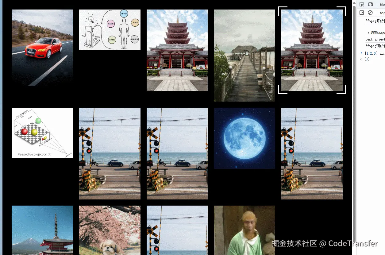
「先看效果✨✨✨」
「具体实现思路💡💡💡」
1️⃣ 把四角边框看成一个设置定位的遮罩元素,动态设置其width、height、left、top
2️⃣ 给图片添加鼠标移入事件,然后获取该图片的物理尺寸信息并计算后动态赋值给遮罩元素
「动手试试🚀🚀🚀」
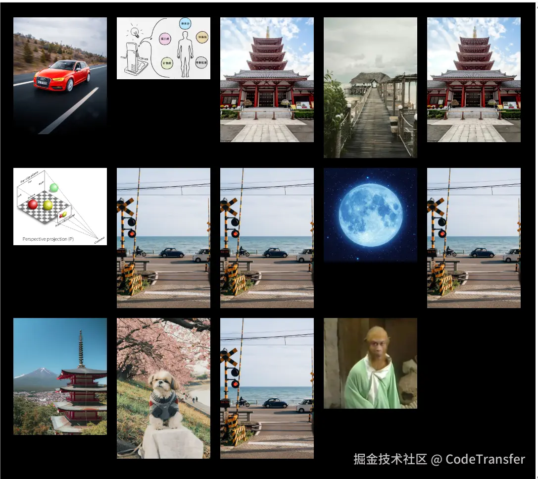
准备几张陈年老图片,简单布局排列起来
js
<template>
  <div ref="cssWrapRef" class="css_wrap">
    <div class="css_hover">
      <img
        v-for="(item, index) in imgList"
        :key="index"
        :src="getSrc(index + 1)"
      />
    </div>
  </div>
</template>

<script setup lang="ts">
import { ref } from "vue";
const imgList = Array.from({ length: 14 });
const cssWrapRef = ref<HTMLDivElement>();
const getSrc = (index: number) => {
  return new URL(`/src/assets/backgroundImg/${index}.jpg`, import.meta.url)
    .href;
};
</script>

<style lang="scss" scoped>
.css_wrap {
  height: 100%;
  overflow: scroll;
  padding: 30px;
  background: #000;
  position: relative;
}
.css_hover {
  display: grid;
  grid-template-columns: repeat(5, 1fr);
  grid-gap: 20px 20px;
  grid-auto-flow: dense;
  img {
    width: 100%;
  }
}
</style>
这里我使用grid布局,只要让图片产生间隙好看点就行
「设计遮罩元素⚡⚡⚡」
上面已经简单分析了遮罩元素需要动态设置的属性,除了上面提到的4 个属性外,还需要有一个gap 表示遮罩元素距离图片的空隙以及lineWidth表示四边角的线宽
js
<template>
<div ref="cssWrapRef" class="css_wrap">
<div class="css_hover">
<img
v-for="(item, index) in imgList"
:key="index"
:src="getSrc(index + 1)"
/>
</div>
<div :style="boxStyle" class="active_box"></div>
</div>
</template>
<script setup lang="ts">
import { ref } from "vue";
const imgList = Array.from({ length: 14 });
const cssWrapRef = ref<HTMLDivElement>();
const boxLeft = ref(0); //遮罩元素left距离
const boxWidth = ref(0); //遮罩元素宽度
const boxHeigt = ref(0); //遮罩元素高度
const boxTop = ref(0); //遮罩元素top距离
const boxGap = ref(10);//gap距离
const lineWidth = computed(() => {
return "30px";
});//四边角的线宽
const getSrc = (index: number) => {
return new URL(`/src/assets/backgroundImg/${index}.jpg`, import.meta.url)
.href;
};
</script>
<style lang="scss" scoped>
.css_wrap {
height: 100%;
overflow: scroll;
padding: 30px;
background: #000;
position: relative;
}
.css_hover {
display: grid;
grid-template-columns: repeat(5, 1fr);
grid-gap: 20px 20px;
grid-auto-flow: dense;
img {
width: 100%;
}
}
.active_box {
position: absolute;
transition: all 0.5s;
cursor: pointer;
border: 3px solid #fff;
background: #fff;
}
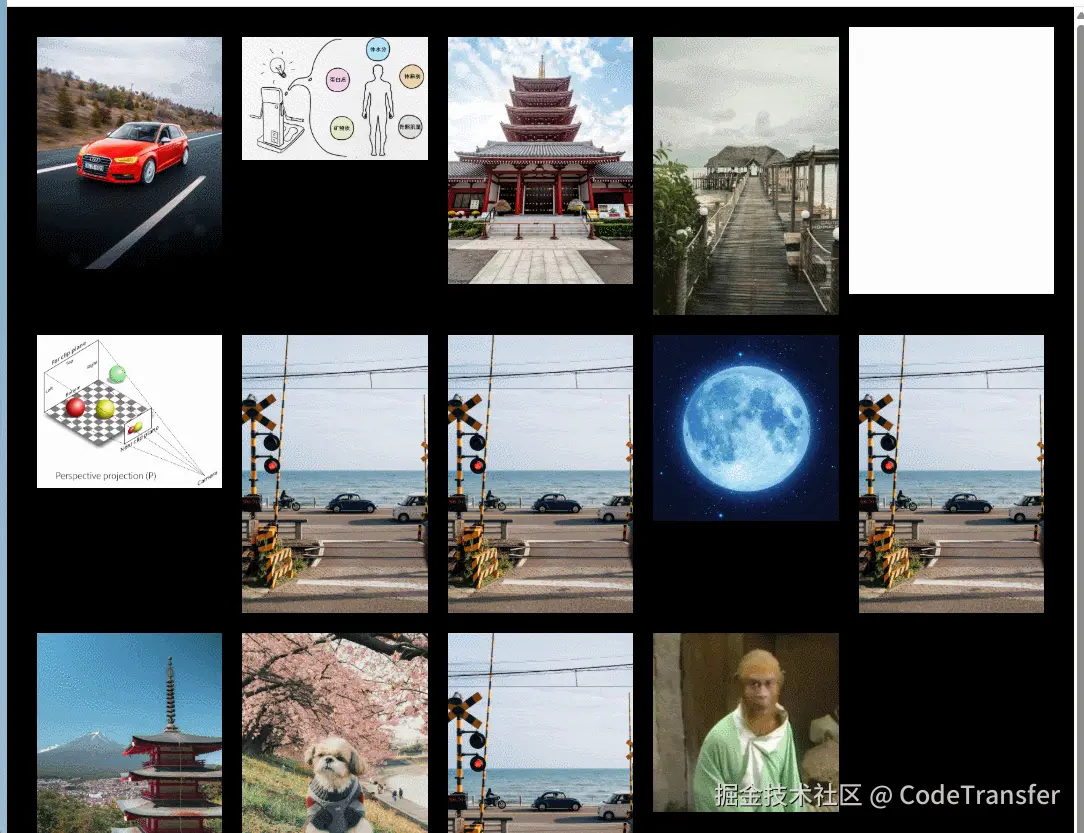
</style>接着为img添加鼠标移入事件来确定遮罩元素的位置,这里我们方便观察吧遮罩元素的背景设为白色
js
 const handleImgEnter = (e: MouseEvent) => {
  const target = e.target as HTMLImageElement;
  const { width, height, x, y } = target.getBoundingClientRect();
  boxWidth.value = width + 2 * boxGap.value;//遮罩元素宽高比图片大2*gap
  boxHeigt.value = height + 2 * boxGap.value;
  boxLeft.value = x - boxGap.value//保持元素居中;
  boxTop.value = y - boxGap.value;
};
「现在的效果」
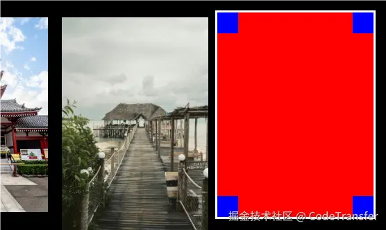
「制作四边角」
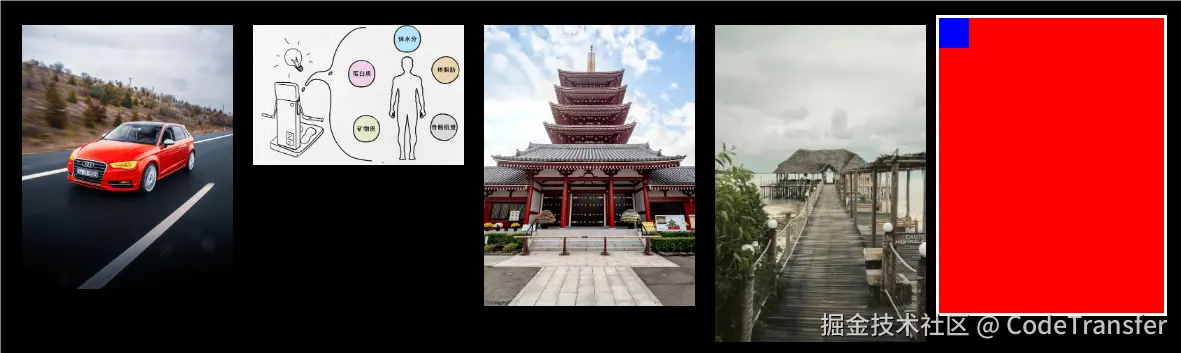
思路使用渐变先在4个角绘制一个小块,这里我们使用conic-gradient渐变容易绘制
background: conic-gradient( at 30px 30px, red 75%, blue 75% ) ;
现在的效果
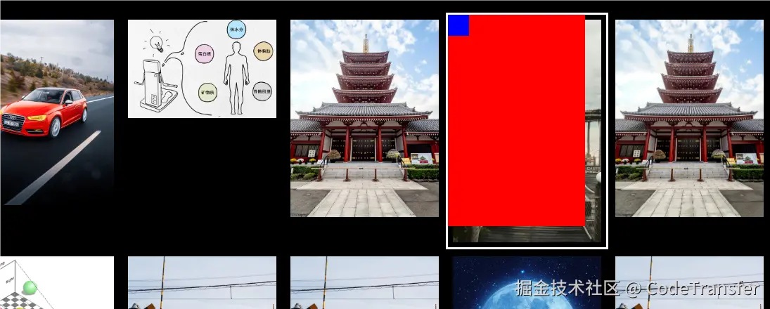
我们想产生4个角的,就只需要调整一下background-size大小就行了
background: conic-gradient(at 30px 30px, red 75%, blue 75%) 0 0 / calc(100% - 30px) calc(100% - 30px);
「为什么这样就行了?」
把background-repeat属性去掉你就知道了,实际剩余3个角就是背景图片repeat3次
我们把红色背景改为透明的
background: conic-gradient(at 30px 30px, transparent 75%, blue 75%) 0 0 / calc(100% - 30px) calc(100% - 30px);
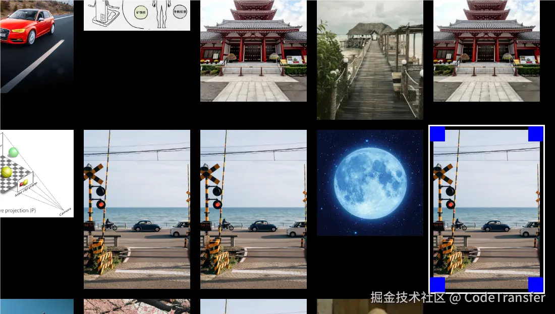
好了,最后我们把这个背景图片就看成一个遮罩图片,在4个角的地方不透明,然后其余部分透明,把background改成mask就是我们想要的效果了!
bacground=>mask
「所有代码」
js
<template>
  <div ref="cssWrapRef" class="css_wrap">
    <div class="css_hover">
      <img
        v-for="(item, index) in imgList"
        :key="index"
        @mouseenter="handleImgEnter"
        @click="handleClick(index)"
        :src="getSrc(index + 1)"
      />
    </div>
    <div :style="boxStyle" class="active_box"></div>
  </div>
</template>

<script setup lang="ts">
import { computed, onMounted, ref } from "vue";
onMounted(() => {
  window.onresize = () => {
    handleImgEnter(currentEvent.value);
  };
});
const imgList = Array.from({ length: 14 });
const boxGap = ref(10);
const lineWidth = ref('30px');
const boxLeft = ref(0);
const boxWidth = ref(0);
const boxHeigt = ref(0);
const cssWrapRef = ref<HTMLDivElement>();
const boxTop = ref(0);
const currentEvent = ref();
const boxStyle = computed(() => {
  return {
    left: boxLeft.value + "px",
    top: boxTop.value + "px",
    width: boxWidth.value + "px",
    height: boxHeigt.value + "px",
  };
});
const handleClick = (index) => {
  console.log(index);
};
const handleImgEnter = (e: MouseEvent) => {
  currentEvent.value = e;
  const target = e.target as HTMLImageElement;
  const { width, height, x, y } = target.getBoundingClientRect();
  boxWidth.value = width + 2 * boxGap.value;
  boxHeigt.value = height + 2 * boxGap.value;
  boxLeft.value = x - boxGap.value + cssWrapRef.value.scrollLeft;
  boxTop.value = y - boxGap.value + cssWrapRef.value.scrollTop;
};
const getSrc = (index: number) => {
  return new URL(`/src/assets/backgroundImg/${index}.jpg`, import.meta.url)
    .href;
};
</script>

<style lang="scss" scoped>
.css_wrap {
  height: 100%;
  overflow: scroll;
  padding: 30px;
  background: #000;
  position: relative;
}
.css_hover {
  display: grid;
  grid-template-columns: repeat(5, 1fr);
  grid-gap: 20px 20px;
  grid-auto-flow: dense;
  img {
    width: 100%;
  }
}
.active_box {
  position: absolute;
  transition: all 0.5s;
  cursor: pointer;
  border: 3px solid #fff;
  mask: conic-gradient(
      at v-bind(lineWidth) v-bind(lineWidth),
      transparent 75%,
      blue 75%
    )
    0 0 / calc(100% - v-bind(lineWidth)) calc(100% - v-bind(lineWidth));
}
</style>