作为前端开发者,你是否遇到过这样的场景:辛辛苦苦写好的组件,一引入项目就发现样式全乱了;团队协作时,明明没改对方的代码,却莫名触发了样式冲突;上线前测试一切正常,生产环境突然出现按钮样式错乱...... 这些让人头大的问题,大概率都和 CSS 类名冲突有关。今天我们就来聊聊如何用 CSS 模块化彻底解决这类问题,以及前端社区还有哪些应对方案。
没有 CSS 模块化的日子,我们踩过哪些坑?
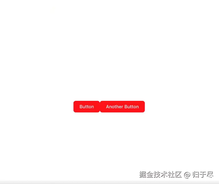
先看个真实场景:我在项目里写了个 Button 组件,用.button类名定义了红色背景;同事小王写了个 AnotherButton 组件,也用了.button类名设置蓝色背景。当两个组件同时引入页面时,你猜怎么着?
结果是后加载的样式覆盖了先加载的,按钮颜色完全失控。这就是典型的类名冲突问题,在团队协作或引入第三方组件时尤为常见。
我们来看一段没有使用 CSS 模块化时的代码示例,感受一下类名冲突的具体情况。
Button 组件的 CSS(button.css):
css
.button {
    background-color: blue;
    color: white;
    padding: 10px 20px;
}
Button 组件(Button.jsx):
jsx
import './button.css'
const Button =()=>{
    return (
        <button className="button">Button</button>
    )
}
export default Button
AnotherButton 组件的 CSS(another-button.css):
css
.button {
    background-color: red;
    color: white;
    padding: 10px 20px;
}
AnotherButton 组件(AnotherButton.jsx):
jsx
import './another-button.css'
const AnotherButton =()=>{
    return (
        <button className="button">AnotherButton</button>
    )
}
export default AnotherButton
当在 App 组件中同时引入这两个组件时,由于都使用了.button类名,后加载的样式会覆盖先加载的,导致按钮样式不符合预期。
那些年被 CSS 冲突支配的恐惧
-
样式污染:全局样式像脱缰的野马,一个组件的样式意外影响到其他组件。我曾遇到过给列表加了.item类名,结果把导航栏的.item样式全改了的乌龙。
-
调试噩梦:生产环境中发现按钮样式错乱,排查时发现是第三方 UI 库的.btn类名和本地样式冲突,但两个类名在源码里长得完全不一样。
-
团队协作障碍:多人开发时必须约定复杂的命名规范(比如 BEM 命名法),但新人往往记不住,老员工也难免疏忽,每次代码评审都要检查类名是否合规。
-
维护成本激增:为了避免冲突,不得不写越来越长的类名,比如header__nav-item--active,既影响开发效率,又让代码变得臃肿。
这些问题本质上都是因为 CSS 的全局作用域特性 ------ 任何一个类名在整个项目中都是全局有效的,就像所有变量都定义在全局作用域一样危险。
CSS 模块化
CSS 模块化的核心思想很简单:让每个 CSS 文件的类名只在当前模块内有效,就像 JavaScript 的局部变量一样。实现方式也不复杂,主流的前端工具(Vite、Webpack 等)都内置了对 CSS 模块化的支持。
看看开头代码中的实现方式,这是使用 CSS 模块化解决上述冲突的代码:
Button 组件的 CSS(button.module.css):
css
.button {
    background-color: blue;
    color: white;
    padding: 10px 20px;
}
Button 组件(Button.jsx):
jsx
import styles from './button.module.css'
const Button =()=>{
    return (
        <button className={styles.button}>Button</button>
    )
}
export default Button
AnotherButton 组件的 CSS(another-button.module.css):
css
.button {
    background-color: red;
    color: white;
    padding: 10px 20px;
}
AnotherButton 组件(AnotherButton.jsx):
jsx
import styles from './another-button.module.css'
const AnotherButton =()=>{
    return (
        <button className={styles.button}>AnotherButton</button>
    )
}
export default AnotherButton
效果达到预期 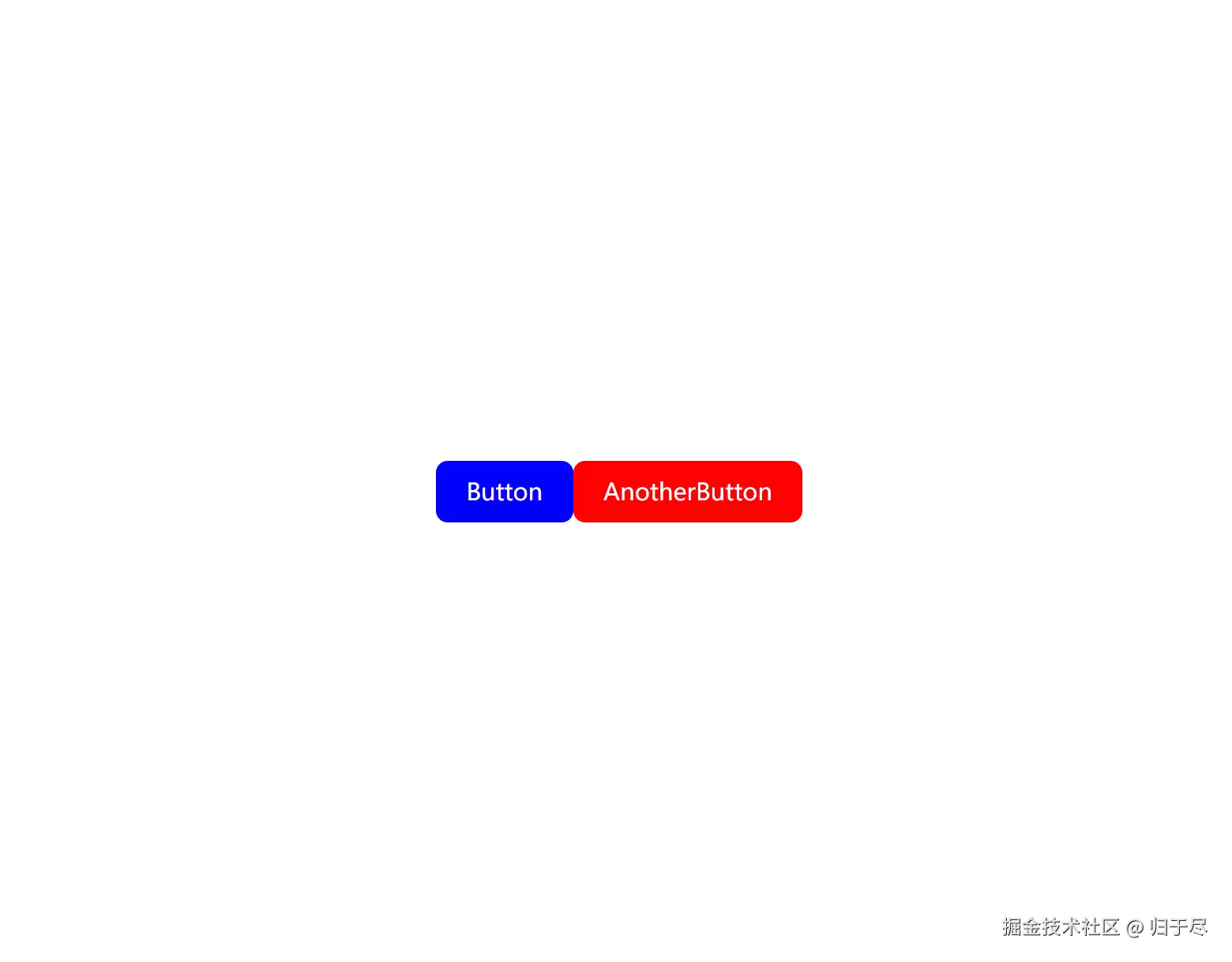
-
文件命名:将 CSS 文件命名为name.module.css,比如button.module.css。这个命名约定告诉构建工具:"这是个模块化 CSS 文件,请帮我处理类名"。
-
引入方式:通过import styles from './button.module.css'导入,此时styles会变成一个对象,键是原类名,值是处理后的唯一类名。例如,在 Button 组件中,styles.button的值可能是button_module__3k2j5。
-
使用方式:用className={styles.button}绑定样式,而不是直接写字符串类名。
当我们运行开发服务器时,构建工具会自动给每个类名添加唯一哈希值。比如原类名.button会被处理成类似button_module__3k2j5的形式,这样即使两个组件都用了.button类名,最终生成的类名也完全不同,从根本上避免了冲突。
模块化带来的好处
-
彻底隔离:组件样式只作用于当前组件,不会污染其他组件,也不会被其他组件的样式影响。就像给每个样式加了个 "金钟罩"。
-
开发友好:源码中依然使用简洁的类名(如.button),不影响可读性。构建工具会在打包时自动处理哈希,开发者完全不用关心。
-
无需死记命名规范:不用再为了避免冲突而写冗长的类名,解放了命名焦虑。
-
支持动态绑定:通过styles对象可以方便地进行条件判断,比如className={isActive ? styles.active : styles.default}。例如:
jsx
import styles from './button.module.css'
const Button =({isActive})=>{
    return (
        <button className={isActive ? styles.active : styles.button}>Button</button>
    )
}
export default Button
其他解决方案
除了 CSS 模块化,前端社区还有几种解决样式冲突的方案,它们各有适用场景:
1. CSS-in-JS
代表库:styled-components、Emotion
这种方案将 CSS 直接写在 JavaScript 中,比如使用 styled-components:
jsx
import styled from 'styled-components';
const StyledButton = styled.button`
  background-color: ${props => props.primary ? 'blue' : 'red'};
  color: white;
  padding: 10px 20px;
`;
const Button = () => {
  return <StyledButton primary>Button</StyledButton>;
};
export default Button;
优势:样式可以直接访问组件的 props,动态样式处理非常方便;天然隔离,无需担心冲突。
劣势:会增加 JavaScript bundle 体积;对 CSS 语法的支持不如原生 CSS 完整;调试体验相对较差。
2. Vue 的 Scoped CSS
在 Vue 单文件组件中,给 style 标签添加scoped属性:
xml
<template>
  <button class="button">Button</button>
</template>
<style scoped>
.button {
  color: white;
  background-color: green;
  padding: 10px 20px;
}
</style>
原理和 CSS 模块化类似,Vue 会给每个元素添加data-v-xxx属性,然后通过属性选择器限制样式作用域。生成的样式类似:
css
.button[data-v-123456] {
  color: white;
  background-color: green;
  padding: 10px 20px;
}
优势:Vue 生态原生支持,使用简单;保留了 CSS 的书写习惯。
劣势:只适用于 Vue 项目;当需要修改子组件样式时,需要使用::v-deep穿透,略繁琐。例如:
xml
<style scoped>
::v-deep .child-component .child-class {
  color: red;
}
</style>
3. BEM 命名规范
BEM 是 Block(块)、Element(元素)、Modifier(修饰符)的缩写,通过严格的命名规则避免冲突:
css
/* 块:组件名 */
.button {}
/* 元素:块内的子元素 */
.button__icon {}
/* 修饰符:不同状态 */
.button--primary {}
对应的组件代码:
jsx
const Button = () => {
  return (
    <button className="button button--primary">
      <span className="button__icon">Icon</span>
      Button
    </button>
  );
};
优势:纯手动约定,不依赖任何工具;适用于所有项目。
劣势:类名冗长;需要团队严格遵守,否则容易失效;无法解决第三方组件的冲突。
什么时候该用 CSS 模块化?
-
React 项目:配合 Vite 或 Create React App 使用时,CSS 模块化几乎是零配置的最佳选择。
-
多团队协作:当多个团队共同开发一个项目时,模块化能有效避免样式污染。
-
引入第三方组件:可以防止第三方组件的样式影响本地组件,反之亦然。
-
追求原生 CSS 体验:如果你更喜欢写原生 CSS,又想解决冲突问题,模块化是理想选择。
写在最后
CSS 模块化确实解决了前端开发中最头疼的样式冲突问题。从代码示例中可以看到,实现成本极低 ------ 只需修改文件名和引入方式,就能获得彻底的样式隔离。
在实际项目中,我更推荐根据技术栈选择方案:React 项目用 CSS 模块化或 CSS-in-JS,Vue 项目用 Scoped CSS。重要的是保持团队统一,避免多种方案混用导致的混乱。
最后想问大家:你在项目中遇到过哪些奇葩的样式冲突?又是怎么解决的?欢迎在评论区分享你的经历~