CSS过渡与动画:让网页元素动起来
在现代网页设计中,动效已经成为提升用户体验的重要组成部分。CSS提供了两种主要的实现动效的方式:过渡(transition)和动画(animation)。本文将深入浅出地介绍这两种技术,帮助你掌握如何让网页元素优雅地动起来。
一、CSS过渡(transition)
1. 什么是CSS过渡?
CSS过渡是一种让元素从一种状态平滑变化到另一种状态的效果。比如当鼠标悬停在按钮上时,按钮颜色逐渐变化而不是突然改变,这种平滑的变化就是过渡效果。
2. 过渡的基本属性
过渡主要通过以下几个属性来控制:
transition-property: 指定要应用过渡效果的CSS属性transition-duration: 定义过渡效果持续的时间transition-timing-function: 设置过渡的速度曲线transition-delay: 设置过渡效果开始前的延迟时间
也可以使用简写属性transition一次性设置以上所有值。
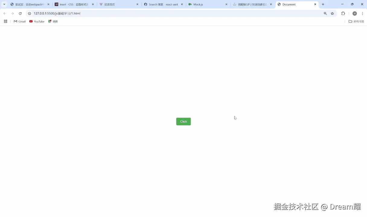
3. 过渡示例
让我们看一个简单的按钮悬停效果:
css
css
.button {
  background-color: #4CAF50;
  color: white;
  padding: 10px 20px;
  border: none;
  border-radius: 4px;
  font-size: 16px;
  transition: background-color 0.3s ease;
}

.button:hover {
  background-color: black;
}
在这个例子中,当鼠标悬停在按钮上时,背景色会在0.3秒内从#4CAF50平滑过渡到black。
4. 过渡的缓动函数
transition-timing-function属性定义了过渡效果的速度曲线。常用的值有:
ease: 默认值,慢速开始,然后变快,然后慢速结束linear: 匀速过渡ease-in: 慢速开始ease-out: 慢速结束ease-in-out: 慢速开始和结束cubic-bezier(n,n,n,n): 自定义速度曲线
5. 多属性过渡
可以同时对多个属性应用过渡效果:
css
css
.box {
  width: 100px;
  height: 100px;
  background: red;
  transition: width 1s, height 1s, background 1s;
}

.box:hover {
  width: 200px;
  height: 200px;
  background: blue;
}
二、CSS动画(animation)
1. 什么是CSS动画?
CSS动画比过渡更强大,它不需要触发事件(如悬停)就能自动播放,并且可以定义更复杂的多阶段动画效果。
2. 动画的基本组成部分
CSS动画由两部分组成:
- 关键帧(@keyframes) : 定义动画在不同时间点的样式
- 动画属性: 将动画应用于元素并控制其行为
3. 定义关键帧
使用@keyframes规则定义动画序列:
css
css
@keyframes example {
  from {background-color: red;}
  to {background-color: yellow;}
}
或者使用百分比定义多个关键帧:
css
css
@keyframes example {
  0% {background-color: red;}
  50% {background-color: blue;}
  100% {background-color: yellow;}
}
4. 应用动画
定义好关键帧后,使用animation属性将动画应用于元素:
css
css
.element {
  animation-name: example;
  animation-duration: 4s;
}
5. 动画属性详解
animation-name: 指定要应用的@keyframes动画名称animation-duration: 定义动画完成一个周期的时间animation-timing-function: 设置动画的速度曲线animation-delay: 设置动画开始前的延迟animation-iteration-count: 定义动画播放次数(infinite表示无限循环)animation-direction: 定义动画是否反向播放animation-fill-mode: 指定动画执行前后如何为元素应用样式animation-play-state: 控制动画的播放状态(running或paused)
也可以使用简写属性animation:
css
css
.element {
animation: example 4s ease-in-out 1s infinite alternate;
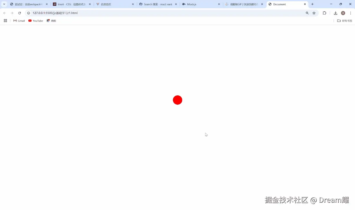
}6. 动画示例
创建一个弹跳的球:
css
css
@keyframes bounce {
  0%, 100% {
    transform: translateY(0);
  }
  50% {
    transform: translateY(-100px);
  }
}

.ball {
  width: 50px;
  height: 50px;
  background-color: red;
  border-radius: 50%;
  animation: bounce 2s ease-in-out infinite;
}
三、过渡与动画的比较
| 特性 | 过渡(transition) | 动画(animation) |
|---|---|---|
| 触发方式 | 需要触发事件(如:hover) | 可以自动播放 |
| 复杂度 | 简单,两状态之间变化 | 复杂,可以定义多关键帧 |
| 循环 | 不能循环 | 可以无限循环 |
| 方向控制 | 只能正向播放 | 可以正向、反向或交替播放 |
| 性能 | 通常性能更好 | 复杂动画可能影响性能 |
| 适用场景 | 简单的状态变化 | 复杂的多阶段动画 |
四、性能优化建议
- 优先使用transform和opacity: 这些属性不会触发重排,动画性能更好
- 避免动画过多: 过多的动画会导致页面卡顿
- 使用will-change: 提前告知浏览器哪些元素会变化
- 合理使用硬件加速: 3D变换可以触发GPU加速
- 减少动画区域: 只对必要元素应用动画
示例:
css
css
.optimized {
  transform: translateZ(0); /* 触发硬件加速 */
  will-change: transform; /* 提前告知浏览器 */
}
五、浏览器兼容性与前缀
虽然现代浏览器对CSS过渡和动画的支持已经很好,但在一些旧版本浏览器中可能需要添加前缀:
css
css
.element {
  -webkit-transition: all 0.3s ease; /* Safari */
  -moz-transition: all 0.3s ease; /* Firefox */
  -o-transition: all 0.3s ease; /* Opera */
  transition: all 0.3s ease;
}

@-webkit-keyframes example { /* Safari */
  0% {background-color: red;}
  100% {background-color: yellow;}
}

@keyframes example {
  0% {background-color: red;}
  100% {background-color: yellow;}
}
可以使用Autoprefixer等工具自动添加所需的前缀。
六、总结
CSS过渡和动画是创建网页动效的两种强大工具:
- 过渡(transition) : 适合简单的两状态之间的变化,需要触发事件,实现简单
- 动画(animation) : 适合复杂的多阶段动画,可以自动播放,控制更精细
在实际开发中,应根据具体需求选择合适的方案。简单的交互效果使用过渡即可,复杂的连续动画则需要使用关键帧动画。无论选择哪种方式,都要注意性能优化,确保动画流畅不卡顿。
通过合理运用这些技术,你可以为用户创造更加生动、有趣的网页体验。现在,就尝试在你的项目中加入一些动效吧!