前言
我们在开发wpf程序的过程中,为了提高代码的重复利用率,经常会使用模板技术,本文就是介绍ControlTemplate以及样式Style的用法
1、ControlTemplate应用于当前控件
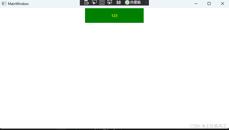
下面的代码在当前控件中建立了一个模板TargetType用于指定模板应用的控件类型,这里是Button,Button中放置了一个Border ,Border的背景色为红色,并且使用ContentPresenter 指定Button的Content内容位于Border控件的水平方向左边和垂直方向下边,运行效果如下图。
csharp
<Window x:Class="wpf之Style.MainWindow"
        xmlns="http://schemas.microsoft.com/winfx/2006/xaml/presentation"
        xmlns:x="http://schemas.microsoft.com/winfx/2006/xaml"
        xmlns:d="http://schemas.microsoft.com/expression/blend/2008"
        xmlns:mc="http://schemas.openxmlformats.org/markup-compatibility/2006"
        xmlns:local="clr-namespace:wpf之Style"
        mc:Ignorable="d"
        Title="MainWindow" Height="450" Width="800">

    <StackPanel >
        <Button Height="50" Content="123">
            <Button.Template>
                <ControlTemplate TargetType="Button">
                    <Border Background="red"   >
                        <ContentPresenter HorizontalAlignment="Left"  VerticalAlignment="Bottom" />
                    </Border>
                </ControlTemplate>
            </Button.Template >
        </Button>
    </StackPanel >
</Window>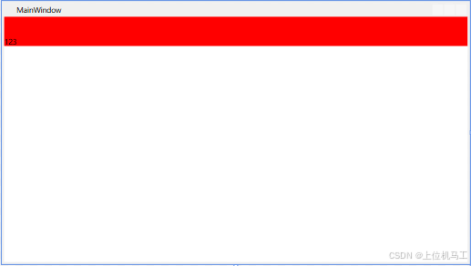
2、根据Key来应用于指定控件
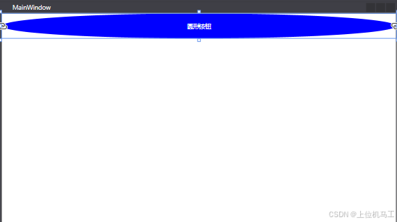
我们可以通过使用资源来给模板指定一个唯一的Key,比如我们可以建立多个不同样式的模板应用于Button控件,你想要哪个样式就通过这个key来使用对应的模板即可。下面的代码中通过ControlTemplate建立了一个模板,指定key为btn_temp,并且通过TargetType来指定模板应用的控件类型,并且这个模板使用一个Grid,Grid中放置一个椭圆,椭圆填充色通过TemplateBinding 来指定椭圆填充色和使用该模板的控件背景色相同,通过ContentPresenter 指定Button的content属性位于Grid的水平和垂直方向中间位置。
csharp
<Window x:Class="wpf之ControlTemplate.MainWindow"
        xmlns="http://schemas.microsoft.com/winfx/2006/xaml/presentation"
        xmlns:x="http://schemas.microsoft.com/winfx/2006/xaml"
        xmlns:d="http://schemas.microsoft.com/expression/blend/2008"
        xmlns:mc="http://schemas.openxmlformats.org/markup-compatibility/2006"
        xmlns:local="clr-namespace:wpf之ControlTemplate"
        mc:Ignorable="d"
        Title="MainWindow" Height="450" Width="800">
    <Window.Resources>
        <ControlTemplate x:Key="btn_temp" TargetType="{x:Type Button}">
            <Grid  >
                <Ellipse Name="ellipse" Fill="{TemplateBinding Background}"/>
                <ContentPresenter HorizontalAlignment="Center" VerticalAlignment="Center" />
            </Grid>
        </ControlTemplate>
    </Window.Resources>

    <StackPanel>
        <Button Height="50" Foreground="White"   Content="圆形按钮" Background="Blue"  Template="{StaticResource btn_temp}"/>
    </StackPanel>
</Window>
最终通过StackPanel中放置一个Button,并且指定Button使用btn_temp模板。
3、结合Style根据Key来应用于指定控件
除了使用ControlTemplate 来彻底重写控件之外,我们还可以使用Style样式来指定模板控件原来默认的属性值,比如我们要建立一个Button控件的模板,我们可以通过Style来设置模板的背景色和字体颜色,从而应用于所有控件,如下。
下面的代码中使用样式指定背景色为红色,字体颜色为黄色;模板中放置一个Grid,背景色和Button的背景色相同,所以一开始颜色和Style指定的颜色相同为红色(这里必须指定背景色和控件相同,否则背景色就使用控件的默认背景色);ContentPresenter 指定Button的内容位于控件的水平和垂直中心;并且定义了一个触发器,鼠标放置在控件上方时,改变控件的背景色为绿色。
csharp
<Window x:Class="wpf之controlTemplate.MainWindow"
        xmlns="http://schemas.microsoft.com/winfx/2006/xaml/presentation"
        xmlns:x="http://schemas.microsoft.com/winfx/2006/xaml"
        xmlns:d="http://schemas.microsoft.com/expression/blend/2008"
        xmlns:mc="http://schemas.openxmlformats.org/markup-compatibility/2006"
        xmlns:local="clr-namespace:wpf之controlTemplate"
        mc:Ignorable="d"
        Title="MainWindow" Height="450" Width="800">
    <Window.Resources>
        <Style TargetType="Button" x:Key="btn_temp">
            <Setter Property="Template">
                <Setter.Value>
                    <ControlTemplate TargetType="Button">
                        <Grid   Background="{TemplateBinding Background }"    >
                            <ContentPresenter HorizontalAlignment="Center"  VerticalAlignment="Center"  />
                        </Grid>
                        <ControlTemplate.Triggers>
                            <Trigger Property="IsMouseOver" Value="True">
                                <Setter Property="Background"   Value="Green"  />
                            </Trigger>
                        </ControlTemplate.Triggers>
                    </ControlTemplate>
                </Setter.Value>
            </Setter>
            <Setter Property="Foreground" Value="Yellow" >
            </Setter>
            <Setter Property="Background"  Value="Red"  >
            </Setter>
        </Style>
    </Window.Resources>
    <StackPanel >
        <Button Content="123" Width="200" Height="50" Style ="{StaticResource btn_temp}" />
    </StackPanel >
</Window>
软件启动后的效果
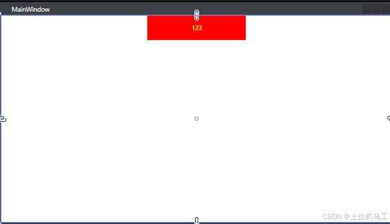
鼠标位于Button上方时。