线性布局
线性布局指的是在布局容器内,子组件呈水平或者垂直线性方向排列。垂直布局是Column组件、水平布局是Row组件。
线性布局通过两个轴线(主轴和交叉轴)作为参考基准,用于确定子组件在容器内的对齐方式。
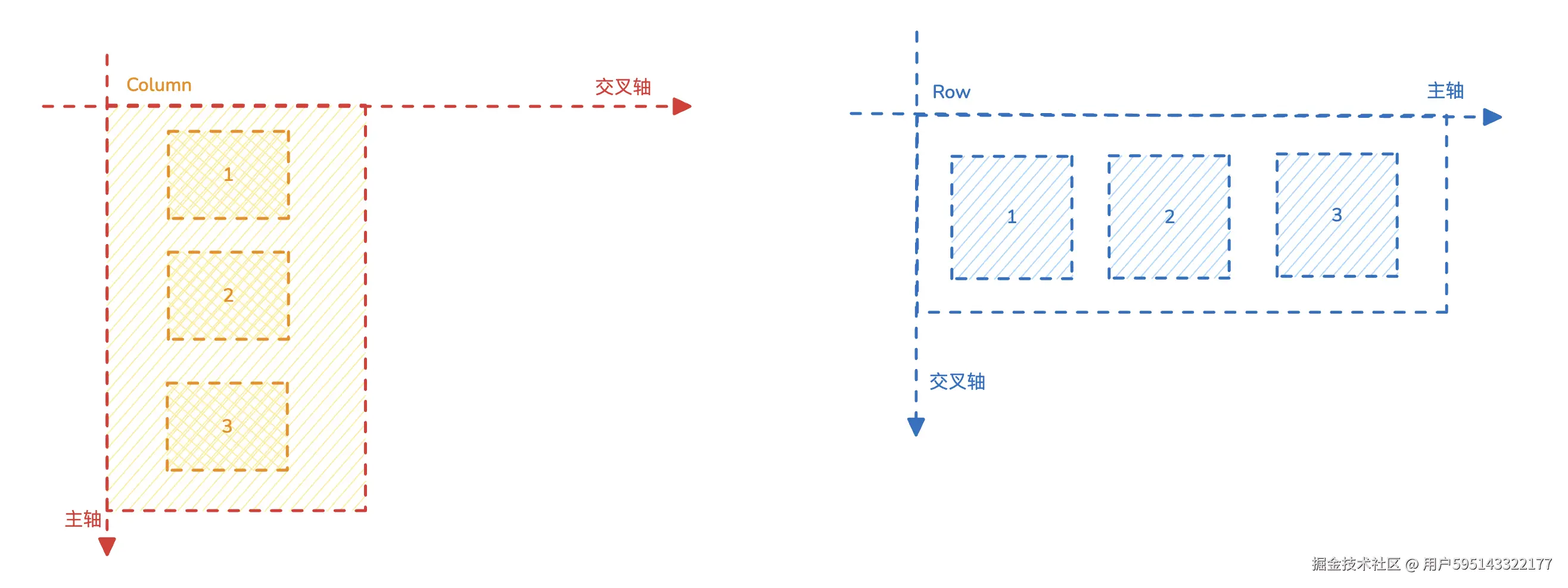
下面详细介绍一下Column和Row的使用
水平布局(Row)
排列方向
Row线性布局子元素默认从左到右排列。可以使用direction来设置排列方向。
ts
Row() {
      Row().width(50).height(50).backgroundColor(Color.Red)
      Row().width(50).height(50).backgroundColor(Color.Green)
      Row().width(50).height(50).backgroundColor(Color.Yellow)
    }
    .width(250)
    .borderWidth(1)
    .margin(10)
    //.direction(Direction.Ltr)	//从左到右(默认效果)


Row() {
      Row().width(50).height(50).backgroundColor(Color.Red)
      Row().width(50).height(50).backgroundColor(Color.Green)
      Row().width(50).height(50).backgroundColor(Color.Yellow)
    }
    .width(250)
    .borderWidth(1)
    .margin(10)
    .direction(Direction.Rtl)	//从右到左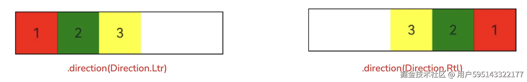
元素间隔
通过Row({space: 10})可以调整字元素之间的间隔。space数字越大间距越大。
ts
Row({space:10}) {
    Text('1').width(50).height(50).backgroundColor(Color.Red)
          .textAlign(TextAlign.Center)

    Text('2').width(50).height(50).backgroundColor(Color.Green)
                .textAlign(TextAlign.Center)

    Text('3').width(50).height(50).backgroundColor(Color.Yellow)
          .textAlign(TextAlign.Center)
}
.width(250)
.borderWidth(1)
.margin(10)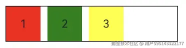
对齐方式
Row对齐方式分为主轴对齐方式和交叉轴对齐方式,属性方法如下。
主轴对齐方式
.justifyContent(value: FlextAlign)主轴对齐方式(水平方向),一共6种对齐方式根据需要选择。- 默认左对齐
FlexAlign.Start
- 默认左对齐
ts
 Row({space:10}) {
  Text('1').width(50).height(50).backgroundColor(Color.Red).textAlign(TextAlign.Center)
  Text('2').width(50).height(50).backgroundColor(Color.Green).textAlign(TextAlign.Center)
  Text('3').width(50).height(50).backgroundColor(Color.Yellow).textAlign(TextAlign.Center)
}
.width(250)
.height(100)
.borderWidth(1)
.margin(10)
.justifyContent(FlexAlign.SpaceEvenly)	//平均对齐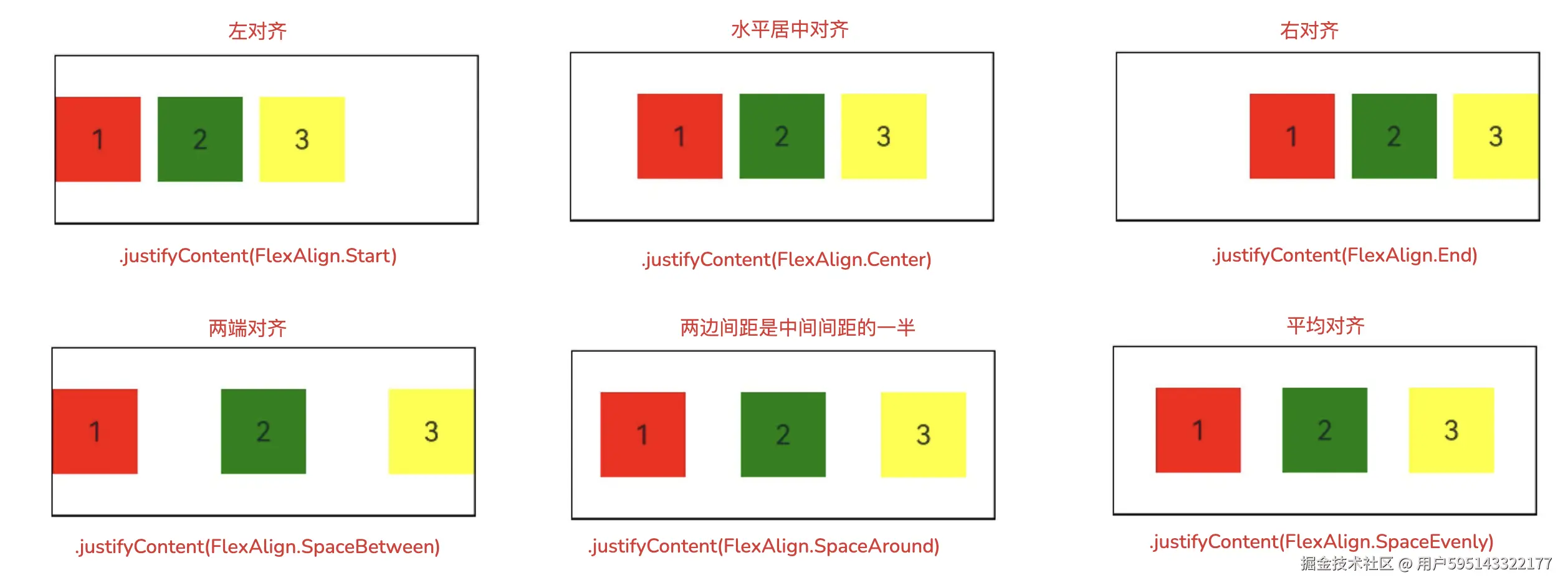
交叉轴对齐方式
.alignItems(value: VerticalAlign) 交叉轴对齐方式(垂直方向),一共3种对齐方式,根据需要选择。
- 默认垂直居中对齐
VerticalAlign.Center
ts
Row({space:10}) {
  Text('1').width(50).height(50).backgroundColor(Color.Red).textAlign(TextAlign.Center)
  Text('2').width(50).height(50).backgroundColor(Color.Green).textAlign(TextAlign.Center)
  Text('3').width(50).height(50).backgroundColor(Color.Yellow).textAlign(TextAlign.Center)
}
.width(250)
.height(100)
.borderWidth(1)
.margin(10)
.justifyContent(FlexAlign.SpaceEvenly)
.alignItems(VerticalAlign.Top)	//上对齐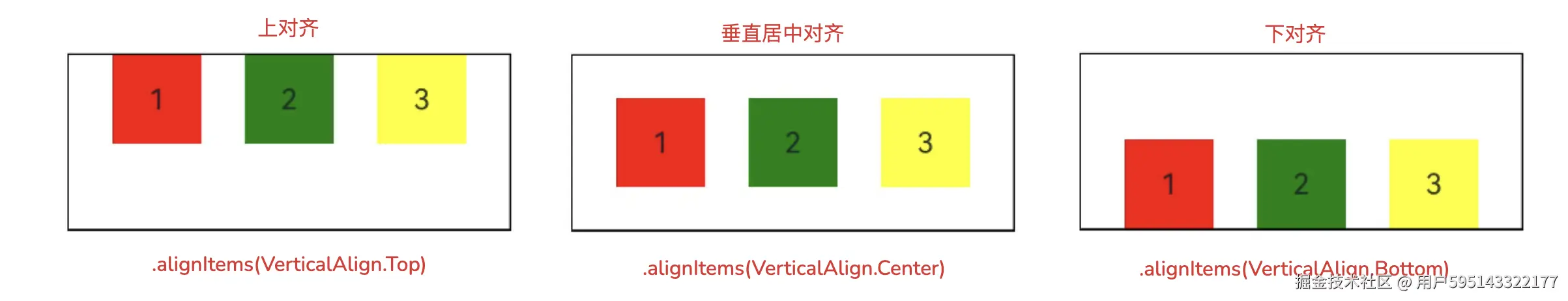
垂直布局(Column)
排列方向
Column线性布局子元素默认从上到下排列。可以使用.reverse(true)来设置排列方向反转。
ts
Column() {
  Text('1').width(50).height(50).backgroundColor(Color.Red).textAlign(TextAlign.Center)
  Text('2').width(50).height(50).backgroundColor(Color.Green).textAlign(TextAlign.Center)
  Text('3').width(50).height(50).backgroundColor(Color.Yellow).textAlign(TextAlign.Center)
}
.width(100)
.height(250)
.borderWidth(1)
.margin(10)
.reverse(true)  //反转(从下到上排列)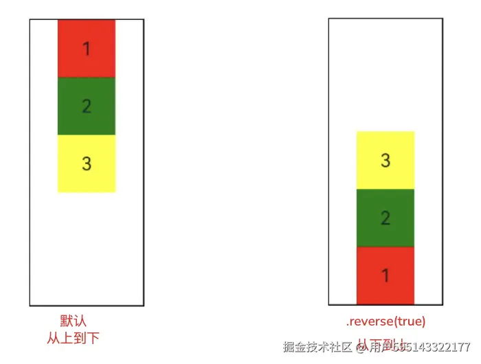
元素间隔
通过Column({space: 10})可以调整字元素之间的间隔。space数字越大间距越大。
ts
Column({space:10}) {
    Text('1').width(50).height(50).backgroundColor(Color.Red)
          .textAlign(TextAlign.Center)

    Text('2').width(50).height(50).backgroundColor(Color.Green)
                .textAlign(TextAlign.Center)

    Text('3').width(50).height(50).backgroundColor(Color.Yellow)
          .textAlign(TextAlign.Center)
}
.width(250)
.borderWidth(1)
.margin(10)
对齐方式
Cloumn对齐方式分为主轴对齐方式和交叉轴对齐方式(垂直方向),属性方法如下。
主轴对齐方式
.justifyContent(value: FlextAlign)主轴对齐方式,一共6种对齐方式根据需要选择。- 默认左对齐
FlexAlign.Start
- 默认左对齐
ts
 Cloumn({space:10}) {
  Text('1').width(50).height(50).backgroundColor(Color.Red).textAlign(TextAlign.Center)
  Text('2').width(50).height(50).backgroundColor(Color.Green).textAlign(TextAlign.Center)
  Text('3').width(50).height(50).backgroundColor(Color.Yellow).textAlign(TextAlign.Center)
}
.width(250)
.height(100)
.borderWidth(1)
.margin(10)
.justifyContent(FlexAlign.SpaceEvenly)	//平均对齐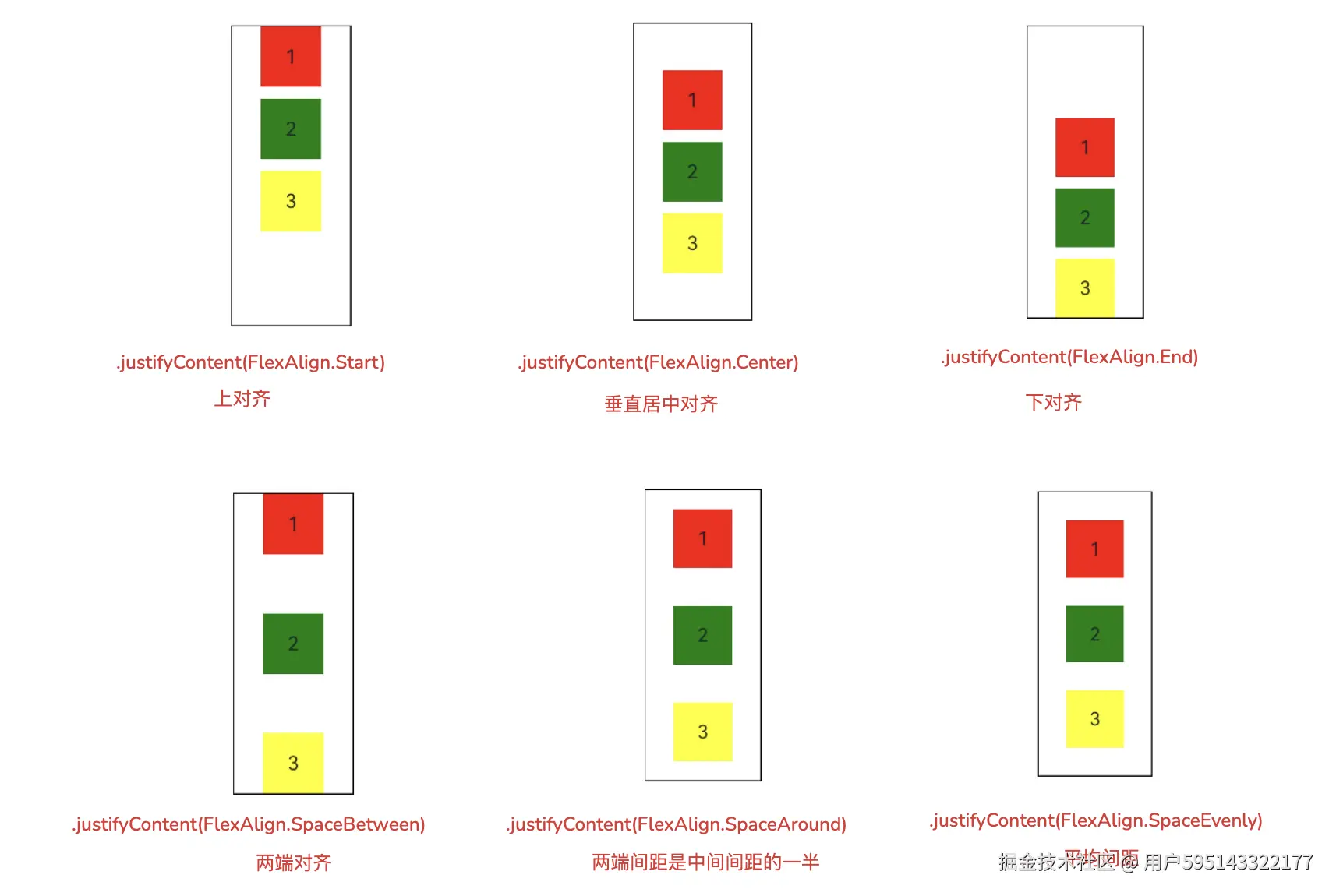
交叉轴对齐方式
.alignItems(value: HorizontalAlign) 交叉轴对齐方式(水平方向),一共3种对齐方式,根据需要选择。
- 默认水平居中对齐
HorizontalAlign.Center
ts
Row({space:10}) {
  Text('1').width(50).height(50).backgroundColor(Color.Red).textAlign(TextAlign.Center)
  Text('2').width(50).height(50).backgroundColor(Color.Green).textAlign(TextAlign.Center)
  Text('3').width(50).height(50).backgroundColor(Color.Yellow).textAlign(TextAlign.Center)
}
.width(250)
.height(100)
.borderWidth(1)
.margin(10)
.justifyContent(FlexAlign.SpaceEvenly)
.alignItems(HorizontalAlign.Start)	//左对齐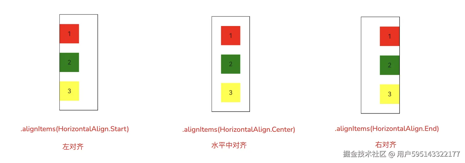
填充空白
在线性布局中可以使用Blank来填充空白区域,让Column、Row的子元素能自适应使用不同尺寸。
ts
Column() {
  Row() {
    Text('蓝牙')
    Blank()
    Toggle({ type: ToggleType.Switch, isOn: true })
  }
  .width("90%")
  .borderWidth(1)
  .borderRadius(15)
  .padding(5)
}.width('100%')
.height('100%')
比例分配
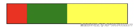
在线性布局中Column和Row,都可以在主轴方向上,按照比例分配子组件的尺寸;
- 通过给子组件添加
.layoutWeight(value: number)属性实现。value:该组件所占比例的份数。
ts
Row() {
    Row().width(50).height(50).backgroundColor(Color.Red)
      .layoutWeight(1)	//占1份

    Row().width(50).height(50).backgroundColor(Color.Green)
      .layoutWeight(2)  //占2份

    Row().width(50).height(50).backgroundColor(Color.Yellow)
      .layoutWeight(3)  //占3份
}
.width(300)
.borderWidth(1)
如图所示:
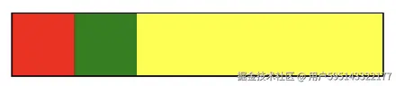
- 如果在
Row或者Column只有一个组件添加了.layoutWeight(1)则表示剩余空间全给该组件。
ts
Row() {
    Row().width(50).height(50).backgroundColor(Color.Red)
    Row().width(50).height(50).backgroundColor(Color.Green)
    Row().width(50).height(50).backgroundColor(Color.Yellow)
      .layoutWeight(3)
}
.width(300)
.borderWidth(1)
如图所示:
到此,线性布局Column和Row的用法就学完了。撒花🎉🎉🎉🎉