你有没有想过,开发也能像逛超市一样有趣?今天带你走进低代码平台物料区的"超市大冒险",看组件如何排队上架、拖拽入篮,遥控器(面板)如何一键切换频道,开发体验直接拉满!🌈
一、引言:组件江湖,物料为王 👑
在低代码平台的世界里,物料区就像厨房里的调料架------没有它,做菜(开发)就没滋味。想象一下,如果你家厨房只有盐和酱油,做出来的菜能好吃吗?物料区的设计,就是让你的开发"调料"丰富多彩,随心搭配!
→ 代码仓库地址内附项目体验地址
二、原理篇:问题-解决方案大起底 🧐
1. 问题场景
- 组件太多,找不到?(就像超市货架太长,找不到辣条)
- 拖拽交互卡顿?(购物车推不动,体验感-100)
- 结构层级混乱?(买了啥都忘了,回家一看全是泡面)
2. 解决思路
- 组件列表(Material):像超市货架,分类明晰
- 拖拽交互(MaterialItem):鼠标一拖,组件随行 🛒
- 结构大纲(Outline):树状结构,层级一目了然 🌳
- 源码预览(Source):所见即所得,代码同步 📝
- 多视图切换(MaterialWrapper):一键切换,效率拉满 🎛️
三、实现篇:代码就是最好的说明书 💡
1. 物料区总控台------MaterialWrapper 🎮
tsx
// src/editor/components/MaterialWrapper/index.tsx
import React, { useState } from 'react'
import { Segmented } from 'antd';
import Material from '../Materail'
import Outline from '../Outline'
import Source from '../Source'

export default function MaterialWrapper() {
    const [key, setKey] = useState('物料')
    return (
        <div>
            {/* 顶部标签切换,像遥控器一样一键切换视图 */}
            <Segmented value={key} options={['物料', '大纲', '源码']} block onChange={setKey} />
            <div className='pd-[20px] h-[calc(100vh-60px-30px-20px)]'>
                {key === '物料' && <Material />}
                {key === '大纲' && <Outline />}
                {key === '源码' && <Source />}
            </div>
        </div>
    )
}详细解读:
Segmented组件就像遥控器的频道按钮,用户可以一键切换"物料"、"大纲"、"源码"三大视图。📺useState控制当前选中的频道,保证切换时内容实时刷新。- 下方内容区根据 key 动态渲染对应的子组件,实现"所见即所得"。
- 生活比喻:MaterialWrapper 就像"万能遥控器",随时切换你想要的频道(视图),再也不用满屋子找遥控器啦!
2. 组件货架------Material & MaterialItem 🛒
Material:组件列表生成器
tsx
// src/editor/components/Materail/index.tsx
import { useMemo } from 'react'
import { useComponentConfigStore } from '../../stores/component-config'
import MaterialItem from '../MaterialItem'
import { useComponentsStore } from '../../stores/components'

export default function Materail() {
  const { componentConfig } = useComponentConfigStore()
  // 过滤掉 Page,只展示可用组件
  const components = useMemo(() => {
    return Object.values(componentConfig).filter(item => item.name !== 'Page')
  }, [componentConfig])

  return (
    <div>
      {components.map((item, index) => {
        return <MaterialItem key={item.name + index} name={item.name} />
      })}
    </div>
  )
}详细解读:
useComponentConfigStore获取全局组件配置,数据驱动,灵活扩展。useMemo优化性能,只有组件配置变化时才重新计算列表,避免无谓渲染。- 过滤掉"Page"组件,防止误操作。
- 遍历生成 MaterialItem,每个都是可拖拽的"商品"。
- 生活比喻:Material 就像超市货架,琳琅满目的商品(组件)任你挑选,别忘了带购物车哦!🛒
MaterialItem:拖拽小能手
tsx
// src/editor/components/MaterialItem/index.tsx
import React from 'react'
import { useDrag } from 'react-dnd'

export interface MaterialItemProps {
  name: string
}

export default function MaterialItem(props: MaterialItemProps) {
  const [_, dragRef] = useDrag(() => ({
    type: props.name,
    item: {  // 被拖动的内容
      type: props.name
    }
  }))
  return (
    <div
      ref={dragRef as any}
      className='
        border-dashed
        border-[1px]
        border-[#000]
        py-[8px]
        px-[10px]
        inline-block
        bg-white
        m-[10px]
        cursor-move
        hover:bg-[#ccc]
      '
    >
      {props.name}
    </div>
  )
}详细解读:
useDrag来自 react-dnd,赋予组件"可拖拽"能力,拖着组件满场飞,开发体验+100!🚀type标识拖拽类型,保证拖拽时能正确识别。dragRef绑定到 div 上,鼠标拖动时就像"购物车"把商品带走。- 样式设计突出"可拖拽"感,鼠标悬停变色,用户体验 up!
- 生活比喻:MaterialItem 就像超市里的商品,每个都能被"购物车"(鼠标)拖走,随时加入你的开发"购物篮"。🧺
3. 结构大纲------Outline 🌳
tsx
// src/editor/components/Outline/index.tsx
import React from 'react'
import { useComponentsStore } from '../../stores/components'
import { DownOutlined } from '@ant-design/icons';
import { Tree } from 'antd';

export default function Outline() {
    const { components, setCurComponentId } = useComponentsStore((state) => state)
    return (
        <div>
            <Tree
                defaultExpandAll
                switcherIcon={<DownOutlined />}
                showLine
                fieldNames={{title: 'desc', key: 'id'}}
                treeData={components as any}
                onSelect={([selectedKey], info) => {
                    setCurComponentId(Number(selectedKey))
                }}
            />
        </div>
    )
}详细解读:
Tree组件展示组件层级结构,像"家谱树"一样清晰,谁是谁的"爸爸"一目了然。👨👩👧👦defaultExpandAll默认全部展开,避免用户频繁点击。fieldNames映射数据字段,灵活兼容不同数据结构。onSelect选中节点时,更新当前组件 id,实现"点谁谁高亮"。- 生活比喻:Outline 就像"家谱树",让你一眼看清组件的"祖孙三代",再也不怕迷路。
4. 源码预览------Source 📝
tsx
// src/editor/components/Source/index.tsx
import React from 'react'
import MonacoEditor from '@monaco-editor/react'
import { useComponentsStore } from '../../stores/components'

export default function Source() {
  const { components } = useComponentsStore()
  return (
    <MonacoEditor
      height={'100%'}
      language="json"
      path='components.json'
      value={JSON.stringify(components, null, 2)}
    />
  )
}详细解读:
MonacoEditor集成 VSCode 编辑器,所见即所得,开发者的"福音"。🎉- 实时展示组件树 JSON,方便开发者调试和导出。
- 生活比喻:Source 就像"X光片",让你看清组件的"骨骼"结构,哪里有问题一目了然。
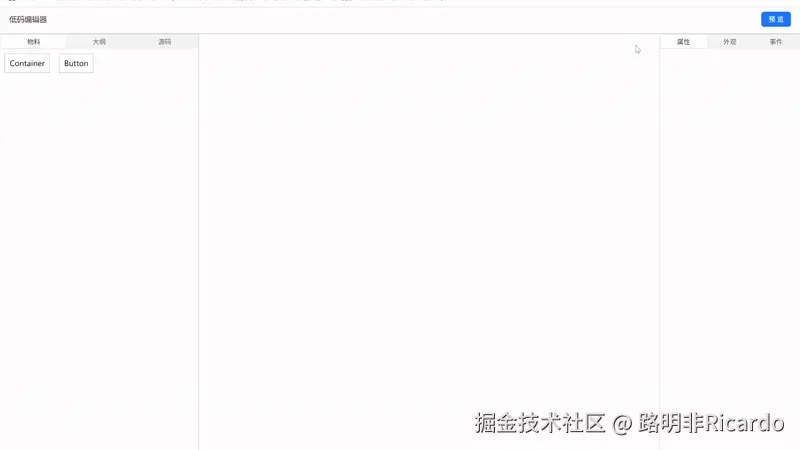
5. 效果展示
四、总结:物料区,让开发像搭乐高一样快乐 🧩
物料区通过组件化、数据驱动和多视图切换,把复杂的组件管理变成了"搭积木"。无论是拖拽、结构梳理还是源码预览,都让开发体验变得轻松有趣。下次你在低代码平台里拖组件时,别忘了,这背后藏着一套"快乐星球"的魔法工坊哦!✨
项目所有代码均已整理至以下仓库,方便大家查看与使用:→ 代码仓库地址内附项目体验地址