@scqilin/phone-ui-vue
前一段时间开发了一个移动端画布编辑器,为了方便在真机上预览效果,抽离了手机外观组件库。这个库可以帮助开发者快速创建手机 UI 模拟器,支持多种机型和灵活的配置选项。
一个专为 Vue 3 设计的手机外观组件库,使用 TypeScript 开发,支持多机型预设和完全自定义外观。
⚠️ 本组件所有机型外观均为演示效果,并非真实手机尺寸,仅供开发测试参考!
✨ 特点
- 🚀 专为 Vue 3 设计,完美支持 Composition API
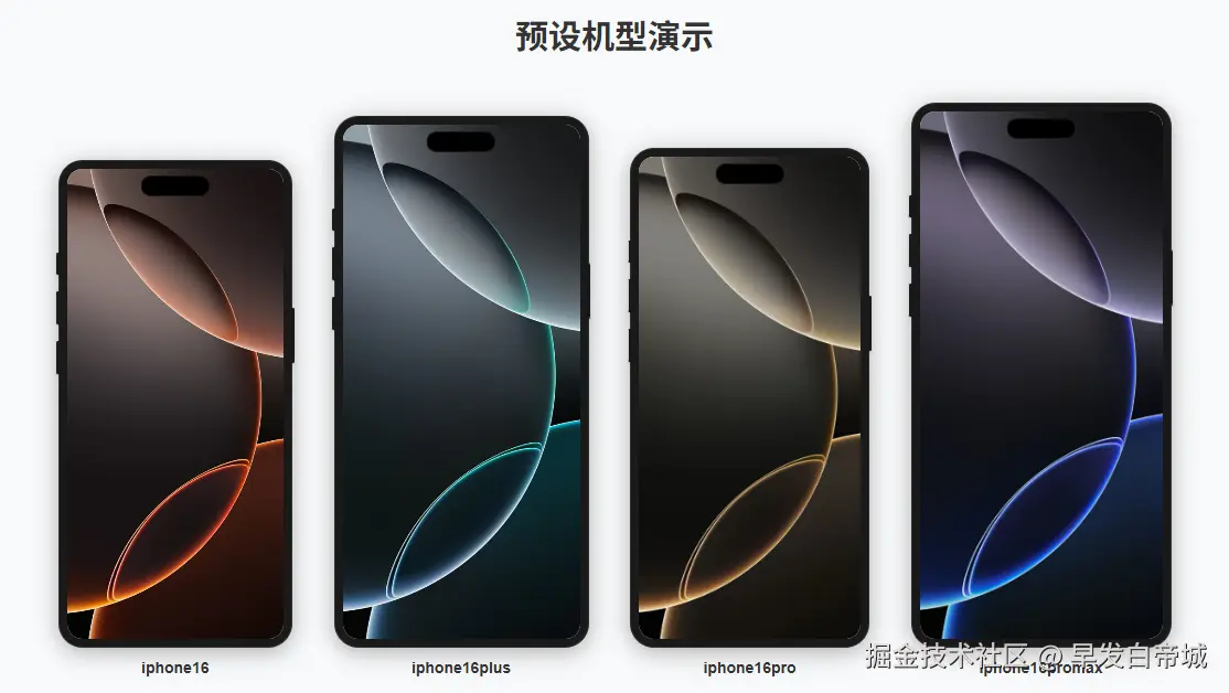
- 📱 内置 iPhone 16 全系列机型预设
- 🎨 灵活配置系统 - 预设机型可覆盖配置,自定义机型完全可控
- 🔧 支持插槽内容 - 可直接在组件内放置其他 Vue 组件
- ⚡ 灵动岛类型 - 支持多种灵动岛样式,可扩展
- 💡 TypeScript 支持,提供完整类型定义
- 🎯 零依赖,仅依赖 Vue 3
📷 演示
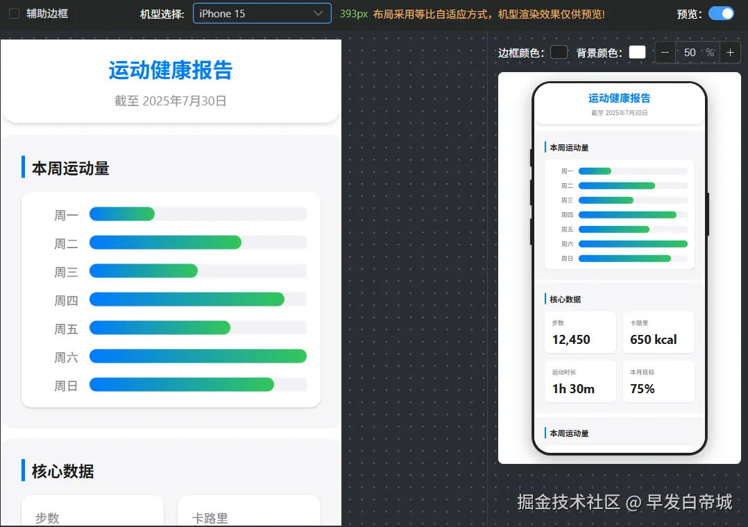
实际项目演示,左边编辑,右边预览,完美。
📦 安装
bash
npm install @scqilin/phone-ui-vue🚀 快速开始
全局注册(推荐)
javascript
// main.ts
import { createApp } from 'vue'
import PhoneUIVue from '@scqilin/phone-ui-vue'
import App from './App.vue'

const app = createApp(App)
app.use(PhoneUIVue)
app.mount('#app')
局部引入
javascript
// 组件内使用
import { PhoneUI } from '@scqilin/phone-ui-vue'
📖 使用示例
预设机型
vue
<template>
  <PhoneUI
    phoneType="iphone16pro"
    frameColor="#111"
    screenColor="#fff"
    :showButtons="true"
  >
    <!-- 在这里放置你的应用内容 -->
    <div class="my-app">
      <header>我的应用头部</header>
      <main>
        <h1>欢迎使用</h1>
        <p>这里是应用内容</p>
        <MyComponent />
      </main>
      <footer>底部导航</footer>
    </div>
  </PhoneUI>
</template>
预设机型 + 覆盖配置
vue
<template>
<PhoneUI
phoneType="iphone16"
:width="400"
:borderRadius="30"
frameColor="#333"
notchType="0"
>
<!-- 使用 iPhone 16 预设,但覆盖部分配置 -->
<MyCustomContent />
</PhoneUI>
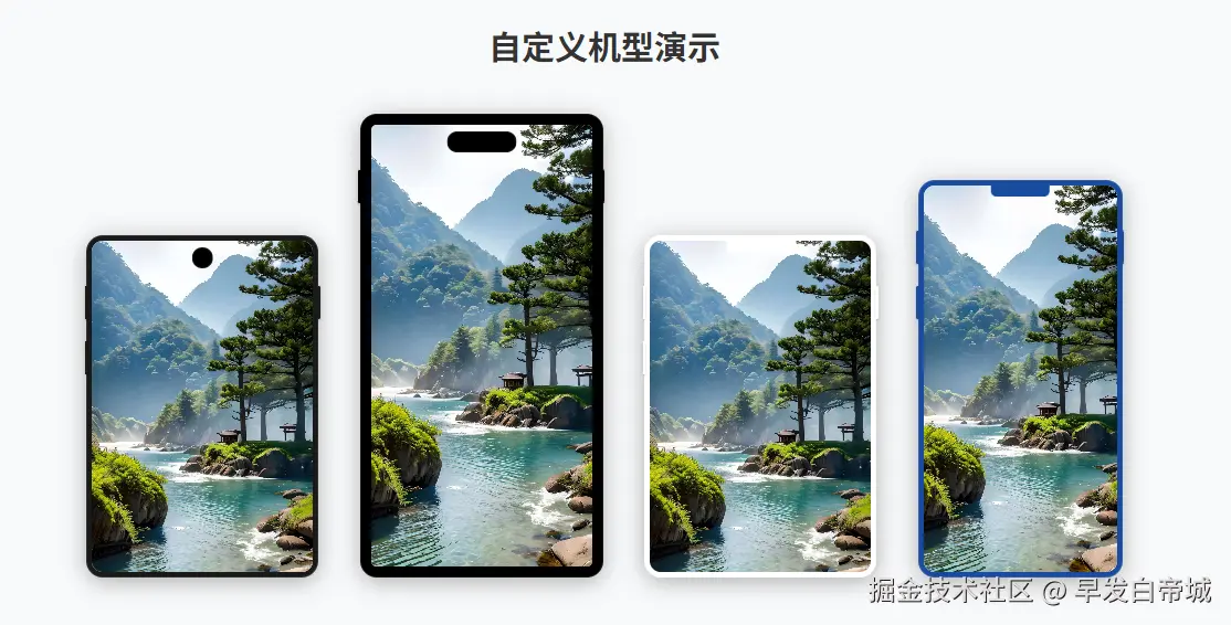
</template>完全自定义机型
vue
<template>
  <PhoneUI
    phoneType="custom"
    :width="375"
    :height="812"
    frameColor="#003e9f"
    screenColor="#f0f8ff"
    :showButtons="true"
    :borderRadius="25"
    :frameWidth="12"
    notchType="1"
  >
    <CustomAppContent />
  </PhoneUI>
</template>
创建新机型
vue
<template>
  <PhoneUI
    phoneType="xiaomi14"
    :width="360"
    :height="780"
    :borderRadius="20"
    notchType="0"
    :buttonConfig="{
      left: [{ top: 100, height: 30 }],
      right: [{ top: 120, height: 50 }]
    }"
  >
    <XiaomiContent />
  </PhoneUI>
</template>
📋 API 文档
Props
| 属性 | 类型 | 默认值 | 说明 |
|---|---|---|---|
| phoneType | string |
'custom' |
手机机型标识,支持预设机型或自定义名称 |
| width | number |
393 |
屏幕宽度,可覆盖预设配置 |
| height | number |
852 |
屏幕高度,可覆盖预设配置 |
| frameColor | string |
'#1a1a1a' |
手机边框颜色 |
| screenColor | string |
'#ffffff' |
屏幕背景颜色 |
| showButtons | boolean |
true |
是否显示侧边按钮 |
| borderRadius | number |
22 |
边框圆角大小,可覆盖预设配置 |
| frameWidth | number |
16 |
边框宽度(包含屏幕黑边+物理边框) |
| notchType | string |
'0' |
灵动岛类型:'0'无灵动岛,'1'椭圆形灵动岛 |
| buttonConfig | object |
{left:[], right:[]} |
按钮配置,可覆盖预设配置 |
插槽
| 名称 | 说明 |
|---|---|
| default | 屏幕内容区域,可放置任意 Vue 组件 |
📱 支持的机型
| 机型 | phoneType 值 | 屏幕尺寸 | 灵动岛 |
|---|---|---|---|
| iPhone 16 | 'iphone16' |
393×852 | ✅ |
| iPhone 16 Plus | 'iphone16plus' |
430×932 | ✅ |
| iPhone 16 Pro | 'iphone16pro' |
402×874 | ✅ |
| iPhone 16 Pro Max | 'iphone16promax' |
440×956 | ✅ |
| 自定义机型 | 'custom' 或任意字符串 |
自定义 | 可选 |
💡 使用说明
配置优先级
组件使用智能配置合并系统:
- 用户传入的 props(最高优先级)
- 预设机型配置(如果 phoneType 在库中存在)
- 默认配置(兜底配置)
预设机型模式
- 当设置
phoneType为库中存在的机型时,会自动使用该机型的预设配置 - 同时可以传入其他 props 来覆盖预设配置的部分参数
- 适合在标准机型基础上微调的场景
自定义机型模式
- 当设置
phoneType为'custom'或库中不存在的值时,使用默认配置 - 可以传入任意 props 来覆盖默认配置
- 适合完全自定义或创建新机型的场景
灵动岛类型
notchType: '-'- 无notchType: '0'- 小圆点(默认)notchType: '1'- 椭圆形灵动岛(iPhone 16 系列)notchType: '2'- 小下巴- 未来将支持更多类型
按钮配置
javascript
buttonConfig: {
  left: [
    { top: 100, height: 30 }, // 按钮位置和高度
    { top: 150, height: 40 }
  ],
  right: [
    { top: 120, height: 50 }
  ]
}
插槽内容
- 可在
<PhoneUI>标签内放置任意 Vue 组件或 HTML 内容 - 内容会自动填充到手机屏幕区域
- 支持完整的 Vue 响应式特性和事件处理
🎨 样式自定义
组件使用 scoped CSS,不会影响全局样式。如需深度自定义样式,可以通过以下方式:
vue
<style>
/* 自定义屏幕内容样式 */
.phone-content {
  /* 您的自定义样式 */
}
</style>
🔧 开发与构建
bash
# 克隆项目
git clone https://github.com/scqilin/phone-ui-vue.git

# 安装依赖
npm install

# 开发模式
npm run dev

# 构建库文件
npm run build:lib

# 预览
npm run preview

# 发布到 npm
npm publish --access public
📝 注意事项
- 需要 Vue 3.0+ 版本
- 按钮为装饰性元素,不提供点击交互功能
- 组件会自动适配内容高度,建议为内容设置适当的 CSS
- 在移动端使用时,建议设置合适的缩放比例
📄 License
MIT © scqilin