**前端环境:Node版本22.13.0, React版本19.1.0, Antd版本5.22.1**
基于之前看了ProComponents基于Antd二次封装,用起来不是很好,所有用自己摸鱼的时间自己来封装一下,名称也叫ProTable。
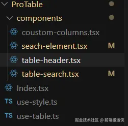
首先要理清封装ProTable所需的内容:
- Table表格主体部分
- Table表格头部标题和头部操作按钮
- Table搜索条和搜索按钮
1.ProTable的Index.tsx页面
包含搜索条件,自定义表格统计,表格头部,表格主体,还有自定义列的弹框和TypeScript的类型,组件用forwardRef和useImperativeHandle暴露组件的方法和属性,目前只暴露了接口调用方法,其他的根据业务需求自己添加,不要用ref的,可以通过callBack回填函数来获取组件的属性。TS的类型没有写到
txs
/* eslint-disable compat/compat */
import { useEffect, forwardRef, useImperativeHandle } from "react";
import type { TableProps } from "antd";
import { Table } from "antd";
import TableHeader from "./components/table-header";
import TableSearch from "./components/table-search";
import { CustomColumns } from "./components/coustom-columns";
import { useTable } from "./use-table";
import type { Dayjs } from "dayjs";
import { useStyle } from "./use-style";
import type { TableRowSelection } from "antd/es/table/interface";

type ColumnsType<T extends object = object> = TableProps<T>["columns"];

type TableComponents<T extends object = object> = TableProps<T>["components"];

// 让 ProTable 支持动态 DataType,可以将 ProTableProps 泛型化
// 并将 DataType 相关类型参数化

// 泛型化 ProTableProps 和相关类型
export type ProTableColumns<T extends object = any> = ColumnsType<T>;

type Generic = string;
type GenericFn = (value: Dayjs) => string;
export type FormatType =
	| Generic
	| GenericFn
	| Array<Generic | GenericFn>
	| {
			format: string;
			type?: "mask";
	  };

export type OptionItem = {
	label: string;
	value: string | number;
};
// 搜索表单类型
export type SearchFormItem = {
	label?: string; // 搜索表单标签
	name: string; // 搜索表单key
	type?: string; // 搜索表单类型
	placeholder?: string; // 搜索表单占位符
	initialValue?: string | string[] | number | number[] | Date | Date[] | any; // 搜索表单初始值
	hidden?: boolean; // 搜索表单是否隐藏
	span?: number; // 搜索表单列宽
	render?: (value?: any) => React.ReactNode; // 搜索表单渲染, 用于自定义搜索表单
	picker?: "date" | "week" | "month" | "quarter" | "year"; // 日期选择器类型
	format?: FormatType; // 日期选择器格式
	rangeName?: string[]; // 范围的key
	showTime?: boolean; // 日期组件是否显示时分秒
	options?: OptionItem[]; // 下拉框选项
	disabled?: boolean; // 搜索表单是否禁用
	allowClear?: boolean; // 搜索表单是否允许清空
	onChange?: (value: any) => void; // 搜索表单变化回调
	value?: any; // 搜索表单值
	isDateRange?: boolean; // 是否是范围选择
};

// 展开行配置
export type Expandable = {
	childrenColumnName?: string; // 指定树形结构的列名
	columnWidth?: number; // 展开行宽度
	defaultExpandAllRows?: boolean; // 初始时,是否展开所有行
	defaultExpandedRowKeys?: string[]; // 默认展开的行
	expandedRowClassName?: (record: any, index: number) => string; // 展开行样式
	expandedRowRender?: (record: any, index: number, indent: number, expanded: boolean) => React.ReactNode; // 额外的展开行
	expandRowByClick?: boolean; // 是否点击行展开
	fixed?: "left" | "right"; // 控制展开图标是否固定,可选 true 'left' 'right'
};

export type OnRowType<T extends object = any> = TableProps<T>["onRow"];

// 表格组件的 props 类型
export interface ProTableProps<T extends object = any> {
	columns: ProTableColumns<T>; // 表格列配置
	api?: (params?: any) => Promise<any>; // 表格数据请求方法
	dataSource?: T[]; // 表格数据,父组件传入的数据
	isPagination?: boolean; // 是否开启分页
	rowKey?: (record: T) => string | number; // 行唯一标识
	rowSelection?: TableRowSelection<T>; // 行选择
	isRowSelection?: boolean; // 是否开启行选择
	callback?: (props: { data: any; selectedRowKeys: React.Key[]; searchParams: any }) => void; // 回调函数
	tableHeaderRightSlot?: React.ReactNode; // 表格头部
	title?: string; // 表格标题
	searchForm?: SearchFormItem[]; // 搜索表单数组数据
	formItemLayout?: any; // 搜索表单布局
	tableRenderStatistics?: (params?: any) => React.ReactNode; // 表格统计渲染
	tableSize?: "small" | "middle" | "large"; // 表格大小,默认large,small为小表格,middle为中表格,large为大表格
	tableFooter?: (params?: any) => React.ReactNode; // 自定义表格底部
	tableTitle?: (params?: any) => React.ReactNode; // 自定义表格标题
	expandable?: Expandable; // 展开行配置
	isShowCustom?: boolean; // 是否显示自定义按钮
	bordered?: boolean; // 是否有边框
	virtual?: boolean; // 是否开启虚拟滚动 通过 virtual 开启虚拟滚动,此时 scroll.x 与 scroll.y 必须设置且为 number 类型。
	scrollX?: number | string; // 虚拟滚动x轴滚动条宽度
	scrollY?: number; // 虚拟滚动y轴滚动条高度
	onRow?: OnRowType<T>; // 行事件
	components?: TableComponents; // 自定义表格组件,用于编辑表格
	outLoading?: boolean; // 外部loading
}

// 表格组件的 ref 类型
interface ProTableRef<R extends object = any> {
	fetchData: (params?: R) => void;
}

// 表格组件
const ProTable = forwardRef(
	<T extends object = any, R extends object = any>(
		{ isPagination = true, ...props }: ProTableProps<T>,
		ref: React.ForwardedRef<ProTableRef<R>>,
	) => {
		// 暴露给父组件的属性
		useImperativeHandle(ref, () => ({
			fetchData,
		}));
		// 表格hooks
		const {
			data,
			loading,
			tableParams,
			rowSelectionNew,
			selectedRowKeys,
			searchFormNew,
			handleTableChange,
			fetchData,
			searchParams,
			showSelectCustom,
			setShowSelectCustom,
			changeColumns,
			columnsNew,
		} = useTable<T, TableRowSelection<T>>({
			...props,
		});

		// 回调函数, 当数据发生变化时,调用回调函数,用于父组件获取子组件的属性和方法的
		useEffect(() => {
			if (props?.callback && typeof props?.callback === "function") {
				props?.callback({ data, selectedRowKeys, searchParams });
			}
		}, [props?.callback, data, selectedRowKeys, searchParams]);

		// 搜索表单提交
		const searchFinish = (values: any) => {
			fetchData(values);
		};

		const { styles } = useStyle();

		// 返回表格组件
		return (
			<div>
				{/* 搜索条件 */}
				{searchFormNew?.length && (
					<TableSearch searchForm={searchFormNew} formItemLayout={props?.formItemLayout} searchFinish={searchFinish} />
				)}
				{/* 表格统计自定义 */}
				{props?.tableRenderStatistics?.(searchParams)}
				{/* 表格头部 */}
				<TableHeader
					title={props?.title}
					tableHeaderRightSlot={props?.tableHeaderRightSlot}
					isShowCustom={props?.isShowCustom}
					setShowSelectCustom={setShowSelectCustom}
				/>
				{/* 表格 */}
				<Table<T>
					columns={columnsNew}
					rowKey={props?.rowKey}
					dataSource={data}
					rowSelection={rowSelectionNew}
					pagination={
						isPagination
							? {
									...tableParams.pagination,
									showTotal: (total, range) => `共${total}条,当前第${range[0]}-${range[1]}条`,
									showQuickJumper: true,
									showSizeChanger: true,
								}
							: false
					}
					size={props?.tableSize}
					loading={props?.outLoading || loading}
					footer={props?.tableFooter}
					title={props?.tableTitle}
					bordered={props?.bordered}
					expandable={props?.expandable}
					virtual={props?.virtual}
					className={styles.customTable}
					scroll={props?.virtual ? { x: props?.scrollX, y: props?.scrollY } : { x: props?.scrollX ?? "max-content" }}
					onChange={handleTableChange}
					onRow={props?.onRow}
					components={props?.components}
				/>
				{/* 自定义表格列 */}
				<CustomColumns
					showSelectCustom={showSelectCustom}
					setShowSelectCustom={setShowSelectCustom}
					columns={props?.columns}
					changeColumns={changeColumns}
				/>
			</div>
		);
	},
) as <T extends object = any, R extends object = any>(
	props: ProTableProps<T> & { ref?: React.Ref<ProTableRef<R>> },
) => React.ReactElement;
export default ProTable;
2.ProTable的自定义了一个Hooks:use-table.ts
use-table.ts集中了ProTable中的业务逻辑。这样的好处:1. 逻辑与 UI 解耦; 2. 可维护性提升;3.易于扩展和定制
ts
import { useState, useEffect, useMemo } from "react";
import type { GetProp, TableProps } from "antd";
import type { SorterResult } from "antd/es/table/interface";
import type { AnyObject } from "antd/es/_util/type";
import type { SearchFormItem, ProTableColumns } from "./Index";
import dayjs from "dayjs";
// type ColumnsType<T extends object = object> = TableProps<T>['columns'];
type TablePaginationConfig = Exclude<GetProp<TableProps, "pagination">, boolean>;
// 表格参数类型
interface TableParams {
	pagination?: TablePaginationConfig;
	sortField?: SorterResult<any>["field"];
	sortOrder?: SorterResult<any>["order"];
	defaultFilters?: Parameters<GetProp<TableProps, "onChange">>[1];
}
// 将对象转换为 URL 参数
const toURLSearchParams = <T extends AnyObject>(record: T) => {
	const params = new URLSearchParams();
	for (const [key, value] of Object.entries(record)) {
		params.append(key, value);
	}
	return params;
};

// 获取表格参数
const getRandomuserParams = (params: TableParams, isPagination?: boolean) => {
	const { pagination, defaultFilters, sortField, sortOrder, ...restParams } = params;

	const result: Record<string, any> = {};

	// https://github.com/mockapi-io/docs/wiki/Code-examples#pagination
	// 如果开启分页,则添加分页参数
	if (isPagination) {
		result.limit = pagination?.pageSize;
		result.page = pagination?.current;
	}

	// https://github.com/mockapi-io/docs/wiki/Code-examples#filtering
	if (defaultFilters) {
		for (const [key, value] of Object.entries(defaultFilters)) {
			if (value !== undefined && value !== null) {
				result[key] = value;
			}
		}
	}

	// https://github.com/mockapi-io/docs/wiki/Code-examples#sorting
	if (sortField) {
		result.orderby = sortField;
		result.order = sortOrder === "ascend" ? "asc" : "desc";
	}

	// 处理其他参数
	for (const [key, value] of Object.entries(restParams)) {
		if (value !== undefined && value !== null) {
			result[key] = value;
		}
	}

	return result;
};
export const useTable = <T extends object = any, R = any>({
	api,
	rowSelection,
	isRowSelection,
	searchForm,
	columns,
	isPagination,
	dataSource,
}: {
	api?: (params?: any) => Promise<any>;
	rowSelection?: R;
	isRowSelection?: boolean;
	searchForm?: SearchFormItem[];
	columns?: ProTableColumns<T>;
	isPagination?: boolean;
	dataSource?: T[];
}) => {
	// 表格数据
	const [data, setData] = useState<T[]>();
	// 自定义表格列
	const [showSelectCustom, setShowSelectCustom] = useState<boolean>(false);
	// 加载状态
	const [loading, setLoading] = useState(false);
	// 选中行
	const [selectedRowKeys, setSelectedRowKeys] = useState<React.Key[]>([]);
	// 自定义列
	const [columnsNew, setColumnsNew] = useState<ProTableColumns<T>>(columns);
	// 搜索参数
	const [searchParams, setSearchParams] = useState<any>({});
	// 表格参数
	const [tableParams, setTableParams] = useState<TableParams>({
		pagination: {
			current: 1,
			pageSize: 10,
		},
	});

	// 搜索表单
	const searchFormNew = useMemo(() => {
		return searchForm?.filter((item) => {
			return !item.hidden;
		});
	}, [searchForm]);

	// 设置初始值,并绑定到form,重置不清除掉值
	const defaultSearchParams = useMemo(() => {
		return searchFormNew?.reduce(
			(acc, item) => {
				// 如果存在范围,则将转化key和value的值
				if (item.rangeName) {
					acc[item.rangeName[0]] = item.initialValue[0]
						? dayjs(item.initialValue[0]).format(item.format as string)
						: "";
					acc[item.rangeName[1]] = item.initialValue[1]
						? dayjs(item.initialValue[1]).format(item.format as string)
						: "";
					// 删除原有的key
					delete acc[item.name];
				} else {
					acc[item.name] = item.initialValue;
				}
				return acc;
			},
			{} as Record<string, any>,
		);
	}, [searchFormNew]);

	// 获取数据
	const fetchData = (searchParams?: any) => {
		if (!api) {
			return;
		}
		const searchParamsNew = searchParams ?? {};
		// 获取参数
		const params = toURLSearchParams(
			getRandomuserParams({ ...defaultSearchParams, ...tableParams, ...searchParamsNew }, isPagination ?? true),
		);
		// 设置搜索参数
		setSearchParams(searchParamsNew);
		// 设置加载状态
		setLoading(true);
		// 请求数据

		api?.(params)
			.then((res) => {
				// 设置表格数据
				const list = res?.page?.list ?? [];
				const total = res?.page?.totalCount ?? 0;
				setData(list);
				// 设置加载状态
				setLoading(false);
				// 设置表格参数
				setTableParams({
					...tableParams,
					pagination: {
						...tableParams.pagination,
						total,
					},
				});
			})
			.catch(() => {
				setLoading(false);
			});
	};

	// 使用 useEffect 来处理数据请求
	useEffect(fetchData, [
		tableParams.pagination?.current,
		tableParams.pagination?.pageSize,
		tableParams?.sortOrder,
		tableParams?.sortField,
	]);

	// 使用 useEffect 来处理数据请求
	useEffect(() => {
		if (dataSource && dataSource.length > 0) {
			setData(dataSource);
		}
	}, [dataSource]);

	// 处理表格变化
	const handleTableChange: TableProps<T>["onChange"] = (pagination, defaultFilters, sorter) => {
		setTableParams({
			pagination,
			defaultFilters,
			sortOrder: Array.isArray(sorter) ? undefined : sorter.order,
			sortField: Array.isArray(sorter) ? undefined : sorter.field,
		});

		// `dataSource` is useless since `pageSize` changed
		if (pagination.pageSize !== tableParams.pagination?.pageSize) {
			setData([]);
		}
	};
	// 选中行
	const onSelectChange = (newSelectedRowKeys: React.Key[]) => {
		console.log("selectedRowKeys changed: ", newSelectedRowKeys);
		setSelectedRowKeys(newSelectedRowKeys);
	};

	// 行选择, 默认不开启,如果开启则使用 rowSelection 的配置,否则使用默认配置
	const rowSelectionNew = isRowSelection
		? rowSelection ||
			({
				selectedRowKeys,
				onChange: onSelectChange,
			} as unknown as R)
		: undefined;

	// 自定义列后的回调函数
	const changeColumns = (columnKeys: React.Key[]) => {
		const columnsNew = columns?.filter((item) => {
			return columnKeys.includes(item.key as string);
		});
		setColumnsNew(columnsNew);
	};

	return {
		tableParams,
		setTableParams,
		data,
		loading,
		handleTableChange,
		rowSelectionNew,
		selectedRowKeys,
		fetchData,
		searchFormNew,
		searchParams,
		showSelectCustom,
		setShowSelectCustom,
		changeColumns,
		columnsNew,
	};
};
3.ProTable的table-header组件页面
表格头部标题右边操作按钮,可自定义
tsx
import styled from "styled-components";
import { Button } from "antd";
import { Icon } from "@/components/icon";
interface TableHeaderProps {
	title?: string;
	tableHeaderRightSlot?: React.ReactNode;
	isShowCustom?: boolean;
	setShowSelectCustom?: (showSelectCustom: any) => void;
}

const TableHeader = ({ title, tableHeaderRightSlot, isShowCustom, setShowSelectCustom }: TableHeaderProps) => {
	const tabHeight = "var(--text-lg)";
	const bgc = "var(--primary)";
	const StyledContainer = styled.div`
    .table-header-title {
      padding-left: 12px;
      position: relative;
      &::before {
        position: absolute;
        top: 4px;
        left: 2px;
        content: '';
        display: block;
        width: 4px;
        height: ${tabHeight};
        background-color: ${bgc};
      }
    }
  `;
	// 自定义
	const customHandle = () => {
		console.log("customHandle");
		setShowSelectCustom?.(true);
	};
	return (
		<div>
			<StyledContainer>
				<div className="flex justify-between pb-2 items-center">
					{title && <div className="table-header-title text-lg font-bold">{title}</div>}
					<div className="flex gap-2">
						{tableHeaderRightSlot && <div className="flex gap-2">{tableHeaderRightSlot}</div>}
						{isShowCustom && (
							<Button color="primary" variant="outlined" onClick={customHandle}>
								<Icon icon="mdi:cog" />
								自定义
							</Button>
						)}
					</div>
				</div>
			</StyledContainer>
		</div>
	);
};

export default TableHeader;
4.ProTable的table-search.tsx搜索组件页面
组件默认一行展示4个表单,超过4个隐藏。搜索的表单类型目前只封装了输入框,下拉框,日期组件,后期根据自己需求在seach-element.tsx组件中添加,支持默认表单值
tsx
import { Form, Button, Row, Col } from 'antd';
import type { FormProps } from 'antd';
import { useState, useMemo, useEffect } from 'react';
import { DownOutlined } from '@ant-design/icons';
import type { SearchFormItem } from '../Index';
import { SearchInput, SearchSelect, SearchDatePicker } from './seach-element';
import dayjs from 'dayjs';
// const { RangePicker } = DatePicker;
// 搜索表单组件
const TableSearch = ({
  searchForm,
  formItemLayout,
  searchFinish,
}: {
  searchForm?: SearchFormItem[];
  formItemLayout?: any;
  searchFinish?: (values?: any) => void;
  getDefualtSearchParams?: (values?: any) => void;
}) => {
  // 表单实例
  const [form] = Form.useForm();
  // 展开状态
  const [expand, setExpand] = useState(false);
  // 默认列宽
  const defaultSpan = 6;
  // 主色调
  const primaryColor = 'var(--primary)';
  // 搜索表单提交
  const onFinish: FormProps<any>['onFinish'] = values => {
    console.log('submit1', values);
    // 将values转换为数组
    const valuesArray = Object.entries(values).map(([key, value]) => ({ key, value }));

    // 如果存在范围,则将转化key和value的值
    for (let key = 0; key < valuesArray.length; key++) {
      // 获取当前key的value
      const value = valuesArray?.[key]?.value;
      // 获取当前key的范围
      const rangeName = getSearchForm?.[key]?.rangeName;
      // 获取当前key的格式
      const format = getSearchForm?.[key]?.format;
      // 获取当前key的名称
      const name = getSearchForm?.[key]?.name ?? '';

      if (rangeName) {
        const keyValue = Array.isArray(value) ? value : [];
        values[rangeName[0]] = Array.isArray(keyValue)
          ? dayjs(keyValue?.[0]).format(format as string)
          : '';
        values[rangeName[1]] = Array.isArray(keyValue)
          ? dayjs(keyValue?.[1]).format(format as string)
          : '';

        delete values[name];
      }
    }
    console.log('submit2', values);
    searchFinish?.(values);
  };

  // 获取搜索表单, 根据expand状态判断是否展开
  const getSearchForm = useMemo(() => {
    return searchForm?.filter((_item, index) => {
      return !expand ? index + 1 <= 24 / searchForm.length : true; // 默认列宽
    });
  }, [searchForm, expand]);

  // 获取按钮列宽
  const getBtnSpan = useMemo(() => {
    const searchLen = getSearchForm?.length;
    if (!searchLen) return 8;
    const num = 24 / defaultSpan;

    if ((searchLen - 1) % num === 0) {
      return 18;
    }
    if ((searchLen - 2) % num === 0) {
      return 12;
    }
    if ((searchLen - 3) % num === 0) {
      return 6;
    }
    if ((searchLen - 4) % num === 0) {
      return 24;
    }
  }, [getSearchForm]);

  // 设置初始值,并绑定到form,重置不清除掉值
  const initialValues = useMemo(() => {
    return getSearchForm?.reduce((acc, item) => {
      acc[item.name] = item.initialValue;
      return acc;
    }, {} as Record<string, any>);
  }, [getSearchForm]);

  // 重置表单
  const resetForm = () => {
    form.resetFields();
    searchFinish?.({});
  };

  // 设置初始值,并绑定到form,用于收起展开回填值
  useEffect(() => {
    for (const item of getSearchForm ?? []) {
      form.setFieldsValue({
        [item.name]: item.initialValue,
      });
    }
  }, [getSearchForm, form]);

  return (
    <div className="mb-4 bg-white rounded-lg shadow-sm">
      <Form
        {...formItemLayout}
        form={form}
        initialValues={initialValues}
        onFinish={onFinish}
        layout="horizontal"
      >
        <Row gutter={16} className="w-full">
          {getSearchForm?.length &&
            getSearchForm.map(item => {
              const render = item?.render;
              return (
                <Col span={item?.span ?? defaultSpan} key={item.name}>
                  <Form.Item name={item.name} label={item?.label}>
                    {item.type === 'input' && (render ? render() : <SearchInput {...item} />)}
                    {item.type === 'select' && <SearchSelect {...item} />}
                    {item.type === 'dateRange' && <SearchDatePicker {...item} />}
                  </Form.Item>
                </Col>
              );
            })}
          {/* 搜索按钮 */}
          <Col span={getBtnSpan}>
            <Form.Item>
              <div className="flex gap-2 items-center justify-end">
                {searchForm?.length && searchForm?.length > 4 && (
                  <div
                    className="cursor-pointer"
                    style={{ color: primaryColor }}
                    onClick={() => {
                      setExpand(!expand);
                    }}
                  >
                    <DownOutlined rotate={expand ? 180 : 0} /> {expand ? '收起' : '展开'}
                  </div>
                )}
                <Button onClick={resetForm}>重置</Button>
                <Button type="primary" htmlType="submit">
                  搜索
                </Button>
              </div>
            </Form.Item>
          </Col>
        </Row>
      </Form>
    </div>
  );
};

export default TableSearch;
5.ProTable搜索条件的表单类型seach-element.tsx组件
注意value属性添加,会影响form.setFieldsValue设置值
tsx
import { Input, Select, DatePicker } from "antd";
import type { SearchFormItem } from "../Index";
import type { DefaultOptionType } from "antd/es/select";
const { RangePicker } = DatePicker;

/**
 * 表单项输入框
 * @param props
 * @returns
 */
export const SearchInput = ({ ...props }: SearchFormItem) => {
	return (
		<Input
			disabled={props?.disabled}
			allowClear={props?.allowClear ?? true}
			placeholder={props?.placeholder ?? `请输入${props?.label}`}
			onChange={props?.onChange}
			value={props?.value}
		/>
	);
};

/**
 * 表单项选择器
 * @param props
 * @returns
 */
export const SearchSelect = ({ ...props }: SearchFormItem) => {
	return (
		<Select
			disabled={props?.disabled}
			options={props?.options as DefaultOptionType[]}
			onChange={props?.onChange}
			allowClear={props?.allowClear ?? true}
			placeholder={props?.placeholder ?? `请选择${props?.label}`}
			value={props?.value}
		/>
	);
};

/**
 * 表单项日期选择器
 * @param props
 * @returns
 */
export const SearchDatePicker = ({ ...props }: SearchFormItem) => {
	return props?.isDateRange ? (
		<RangePicker
			className="w-full"
			picker={props?.picker}
			format={props?.format}
			showTime={props?.showTime}
			onChange={props?.onChange}
			disabled={props?.disabled}
			value={props?.value}
			allowClear={props?.allowClear ?? true}
		/>
	) : (
		<DatePicker
			className="w-full"
			picker={props?.picker}
			format={props?.format}
			showTime={props?.showTime}
			onChange={props?.onChange}
			disabled={props?.disabled}
			value={props?.value}
			allowClear={props?.allowClear ?? true}
		/>
	);
};
6.ProTable中的自定义列coustom-columns.tsx组件
默认自定义按钮是显示的
tsx
import { Modal, Table } from "antd";
import type { ProTableColumns } from "../Index";
import { useState, useEffect } from "react";
interface DataType {
	name: string;
	id: string;
}
export const CustomColumns = ({
	showSelectCustom,
	setShowSelectCustom,
	columns,
	changeColumns,
}: {
	showSelectCustom: boolean;
	setShowSelectCustom: (showSelectCustom: boolean) => void;
	columns: ProTableColumns<any>;
	changeColumns: (columns: React.Key[]) => void;
}) => {
	const [selectedRowKeys, setSelectedRowKeys] = useState<React.Key[]>([]);

	// 数据源
	const dataSource: any[] =
		columns?.map((item) => {
			return {
				name: item.title,
				id: item.key,
			};
		}) || [];

	// 默认选中的列
	const defaultSelectedRowKeys = columns?.map((item) => {
		return item.key;
	});

	// 设置默认选中的列
	useEffect(() => {
		setSelectedRowKeys(defaultSelectedRowKeys as React.Key[]);
	}, []);

	// 自定义列
	const column: ProTableColumns<DataType> = [
		{
			title: "列名",
			dataIndex: "name",
			key: "name",
		},
	];

	// 选中行
	const onSelectChange = (newSelectedRowKeys: React.Key[]) => {
		setSelectedRowKeys(newSelectedRowKeys);
	};
	const rowSelection = {
		selectedRowKeys,
		onChange: onSelectChange,
	};

	// 确定
	const onOk = () => {
		setShowSelectCustom(false);
		changeColumns(selectedRowKeys);
	};

	return (
		<div>
			<Modal
				title="自定义列"
				open={showSelectCustom}
				onOk={onOk}
				zIndex={100000}
				onCancel={() => {
					setShowSelectCustom(false);
				}}
			>
				<Table<DataType>
					columns={column}
					dataSource={dataSource}
					style={{ marginTop: 24 }}
					pagination={false}
					rowKey={(record) => record.id}
					rowSelection={rowSelection}
					bordered
				/>
			</Modal>
		</div>
	);
};
7.ProTable中样式自定义Hooks:use-style.ts
注意需要安装antd-style依赖
ts
import { createStyles } from "antd-style";
export const useStyle = createStyles(({ css }) => {
	// antCls is not present on token, so we use the default Ant Design class prefix
	const antCls = ".ant";
	return {
		customTable: css`
      ${antCls}-table {
        ${antCls}-table-container {
          ${antCls}-table-body,
          ${antCls}-table-content {
            scrollbar-width: thin;
            scrollbar-color: #eaeaea transparent;
            scrollbar-gutter: stable;
          }
        }
      }
    `,
	};
});
ProTable组件的文件组成:
调用示例
tsx
import { Icon } from '@/components/icon';
import type { ColumnsType } from 'antd/es/table';
import { Button } from 'antd';
import { ScrollArea } from '@/ui/scroll-area';
import { userList } from '@/api/services/sysService';
import { useState, useMemo, useEffect } from 'react';
import type { OnRowType } from '@/components/ProTable/Index';
import { ProTable } from '@/components';

import dayjs from 'dayjs';
// import type { UploadFile } from 'antd';
import type { SearchFormItem } from '@/components/ProTable/Index';
// 表格数据类型
interface DataType {
  userId: string;
  username: string;
  email: string;
  createTime: string;
  status: number;
}

// 表格页面
const TablePage = () => {
  const [selectedRowKeys, setSelectedRowKeys] = useState<React.Key[]>([]);
  const [statusDict, setStatusDict] = useState<any[]>([]);

  // 表格列配置
  const columns: ColumnsType<DataType> = [
    {
      title: 'ID',
      dataIndex: 'userId',
      key: 'userId',
      fixed: 'left',
    },
    {
      title: '用户名',
      dataIndex: 'username',
      key: 'username',
      sorter: true,
      filters: [
        {
          text: 'Joe',
          value: 'Joe',
        },
        {
          text: 'Category 1',
          value: 'Category 1',
          children: [
            {
              text: 'Yellow',
              value: 'Yellow',
            },
            {
              text: 'Pink',
              value: 'Pink',
            },
          ],
        },
        {
          text: 'Category 2',
          value: 'Category 2',
          children: [
            {
              text: 'Green',
              value: 'Green',
            },
            {
              text: 'Black',
              value: 'Black',
            },
          ],
        },
      ],
      filterMode: 'tree',
      filterSearch: true,
      onFilter: (value, record) => record.username.includes(value as string),
    },
    {
      title: '邮箱',
      dataIndex: 'email',
      key: 'email',
    },
    {
      title: '状态',
      dataIndex: 'status',
      key: 'status',
      render: (_, record) => (record.status === 1 ? '启用' : '禁用'),
    },
    {
      title: '注册时间',
      key: 'createTime',
      dataIndex: 'createTime',
      // width: 150,
    },
    {
      title: 'Action',
      key: 'action',
      width: 180,
      fixed: 'right',
      render: (_, record) => (
        <div>
          <Button
            className="mr-2"
            color="primary"
            variant="outlined"
            size="small"
            onClick={() => editHandler(record)}
          >
            <Icon icon="mdi:edit" />
            编辑
          </Button>
          <Button color="danger" variant="outlined" size="small">
            <Icon icon="mdi:delete" />
            删除
          </Button>
        </div>
      ),
    },
  ];

  // 搜索表单
  const searchForm = useMemo<SearchFormItem[]>(() => {
    return [
      {
        name: 'username',
        label: '用户名',
        type: 'input',
      },
      {
        name: 'createTime',
        label: '注册时间',
        type: 'dateRange',
        format: 'YYYY-MM-DD',
        rangeName: ['startDate', 'endDate'],
        isDateRange: true,
        initialValue: [dayjs().subtract(12, 'month'), dayjs()],
      },
      {
        name: 'email',
        label: '邮箱',
        type: 'input',
      },
      {
        name: 'status',
        label: '状态',
        type: 'select',
        options: statusDict,
      },
    ];
  }, [statusDict]);

  // 模拟接口请求,在useEffect, 在useEffect中请求接口,并设置状态,不然会有副作用
  useEffect(() => {
    const timer = setTimeout(() => {
      setStatusDict([
        { label: '启用', value: 1 },
        { label: '禁用', value: 0 },
      ]);
    }, 2000);

    return () => clearTimeout(timer);
  }, []);

  // 编辑
  const editHandler = (record: DataType) => {};

  // 回调函数
  const callback = ({ selectedRowKeys }: { selectedRowKeys: React.Key[] }) => {
    setSelectedRowKeys(selectedRowKeys);
  };

  // 展开行配置
  const expandable = {
    expandedRowRender: (record: any) => <p style={{ margin: 0 }}>{record.password}</p>,
    rowExpandable: (record: any) => record.name !== 'Not Expandable',
  };

  // 行事件
  const onRow = (record: DataType, index: number) => {
    return {
      onClick: () => {
        // 点击事件
        console.log(record, index);
      },
      onDoubleClick: () => {
        // 双击事件
        console.log(record, index);
      },
    };
  };

  // 表格头部右侧插槽
  const tableHeaderRightSlot = (
    <div className="flex gap-2">
      <Button type="primary" onClick={() => {}}>
        <Icon icon="mdi:add" />
        新增
      </Button>
      <Button type="primary" disabled={selectedRowKeys.length === 0} danger>
        <Icon icon="mdi:delete" />
        批量删除
      </Button>
    </div>
  );

  return (
    <div>
      <ScrollArea>
        <ProTable<DataType>
          title="用户列表"
          searchForm={searchForm}
          tableHeaderRightSlot={tableHeaderRightSlot}
          callback={callback}
          columns={columns}
          api={userList}
          isRowSelection
          isShowCustom
          rowKey={record => record.userId}
          expandable={expandable}
          onRow={onRow as OnRowType<DataType>}
        />
      </ScrollArea>
    </div>
  );
};

export default TablePage;
最后需要注意事项:需要安装的依赖styled-components,antd-style, antd,dayjs,tailwindcss
更多代码仓库地址:gitee.com/jin_kai_123...