附带源码。
加载图片一直使用Glide + ImageView,在正式环境发现加载gif图片时,设定的圆角没有生效,解决方案就是glide加载需要使用asGif转化,这样很不友好,每个地方都要判断gif进行转化,所以想到ShapeableImageView替代ImageView。
ShapeableImageView是个强大的图片控件,支持圆形/圆角/单圆角/描边设置,使用它的时候,需要设置不同的style,比如:
<style name="SIVCircleStyle">
    <!--圆形-->
    <item name="cornerFamily">rounded</item>
    <item name="cornerSize">50%</item>
</style>

<style name="SIVCorner12Style">
    <!--12dp圆角-->
    <item name="cornerFamily">rounded</item>
    <item name="cornerSize">12dp</item>
</style>

<style name="SIVCorner15Style">
    <!--15dp圆角-->
    <item name="cornerFamily">rounded</item>
    <item name="cornerSize">15dp</item>
</style>
使用方法:app:shapeAppearance="@style/SIVCircleStyle"
这样使用很不灵活,比如圆角大小发生变化,需要重新写个style。
所以需要自定义ShapeableImageView,自定义属性来设置圆形/圆角/单圆角/描边,代码如下:
/**
 * 项目公共ImageView,适用于加载圆形/圆角、带有边框的场景
 * 默认属性
 * scaleType:CenterCrop()
 * 设置描边strokeWidth,自动设置padding防止描边被截断。
 * 没设置描边的strokeColor默认为null
 *
 * 具有以下优势:
 * 1、支持圆形、统一圆角、4个角自定义圆角
 * 2、支持边框
 * 3、支持圆角gif
 *
 * 使用说明:
 * 1、可以通过xml设置圆形/圆角数值--建议
 * 2、也可以通过代码设置圆形/圆角数值
 * 3、设置strokeColor + strokeWidth,自动设置padding防止描边被截断
 */
class AppImageView @JvmOverloads constructor(
    context: Context, attrs: AttributeSet? = null, defStyleAttr: Int = 0
) : ShapeableImageView(context, attrs, defStyleAttr) {

    init {
        if (strokeWidth > 0) {
            // 自动设置padding,padding大小是strokeWidth一半,防止描边被截断。
            setPadding((strokeWidth / 2).roundToInt())
        } else {
            // 设置默认无描边
            strokeColor = null
        }
        // 设置默认缩放类型为中心裁剪
        scaleType = ScaleType.CENTER_CROP

        context.withStyledAttributes(attrs, R.styleable.AppImageView) {
            val cornerRadius = getDimension(R.styleable.AppImageView_image_cornerRadius, -1f)
            val topLeftRadius = getDimension(R.styleable.AppImageView_image_topLeftRadius, -1f)
            val topRightRadius = getDimension(R.styleable.AppImageView_image_topRightRadius, -1f)
            val bottomLeftRadius = getDimension(R.styleable.AppImageView_image_bottomLeftRadius, -1f)
            val bottomRightRadius = getDimension(R.styleable.AppImageView_image_bottomRightRadius, -1f)
            val isCircle = getBoolean(R.styleable.AppImageView_image_circle, false)
            if (isCircle) {
                // 圆形模式 - 忽略所有圆角设置
                setCircle()
            } else if (cornerRadius > 0) {
                // 统一圆角模式
                setRoundRadius(cornerRadius)
            } else {
                // 单独圆角模式
                setRoundRadii(topLeftRadius, topRightRadius, bottomLeftRadius, bottomRightRadius)
            }
        }
    }

    /**
     * 设置圆形
     */
    fun setCircle() {
        shapeAppearanceModel = ShapeAppearanceModel().toBuilder()
            .setAllCornerSizes(RelativeCornerSize(0.5f))
            .build()
    }

    /**
     * 设置圆角,适用于4个圆角一样大小
     * @param radius 圆角大小
     */
    fun setRoundRadius(radius: Float) {
        if (radius <= 0) return
        shapeAppearanceModel = ShapeAppearanceModel().toBuilder()
            .setAllCornerSizes(radius)
            .build()
    }

    /**
     * 设置圆角,适用于4个圆角大小分开设置
     * @param topLeftRadius 左上 圆角大小
     * @param topRightRadius 右上 圆角大小
     * @param bottomLeftRadius 左下 圆角大小
     * @param bottomRightRadius 右下 圆角大小
     */
    fun setRoundRadii(topLeftRadius: Float = 0f, topRightRadius: Float = 0f, bottomLeftRadius: Float = 0f, bottomRightRadius: Float = 0f) {
        if (topLeftRadius <= 0f &&
            topRightRadius <= 0f &&
            bottomLeftRadius <= 0f &&
            bottomRightRadius <= 0f) return
        val builder = ShapeAppearanceModel().toBuilder()
        if (topLeftRadius > 0) {
            builder.setTopLeftCornerSize(topLeftRadius)
        }
        if (topRightRadius > 0) {
            builder.setTopRightCornerSize(topRightRadius)
        }
        if (bottomLeftRadius > 0) {
            builder.setBottomLeftCornerSize(bottomLeftRadius)
        }
        if (bottomRightRadius > 0) {
            builder.setBottomRightCornerSize(bottomRightRadius)
        }
        shapeAppearanceModel = builder.build()
    }
}
自定义属性放在attrs.xml中,代码如下:
<declare-styleable name="AppImageView">
    <attr name="image_cornerRadius" format="dimension" />
    <attr name="image_topLeftRadius" format="dimension" />
    <attr name="image_topRightRadius" format="dimension" />
    <attr name="image_bottomLeftRadius" format="dimension" />
    <attr name="image_bottomRightRadius" format="dimension" />
    <attr name="image_circle" format="boolean" />
</declare-styleable>
使用方式:
圆形:
<xxx.AppImageView
    android:id="@+id/iv_avatar"
    android:layout_width="144dp"
    android:layout_height="144dp"
    android:layout_marginStart="20dp"
    android:layout_marginTop="20dp"
    android:src="@drawable/ic_mine_un_login"
    app:image_circle="true"
    app:layout_constraintStart_toStartOf="parent"
    app:layout_constraintTop_toTopOf="parent" />

四个圆角大小相同:
<xxx.AppImageView
    android:id="@+id/iv_avatar"
    android:layout_width="144dp"
    android:layout_height="144dp"
    android:layout_marginStart="20dp"
    android:layout_marginTop="20dp"
    android:src="@drawable/ic_mine_un_login"
    app:image_cornerRadius="20dp"
    app:layout_constraintStart_toStartOf="parent"
    app:layout_constraintTop_toTopOf="parent" />

分别设置四个圆角大小:
<xxx.AppImageView
    android:id="@+id/iv_avatar"
    android:layout_width="144dp"
    android:layout_height="144dp"
    android:layout_marginStart="20dp"
    android:layout_marginTop="20dp"
    android:src="@drawable/ic_mine_un_login"
    app:image_bottomLeftRadius="10dp"
    app:image_bottomRightRadius="20dp"
    app:image_topLeftRadius="20dp"
    app:image_topRightRadius="10dp"
    app:layout_constraintStart_toStartOf="parent"
    app:layout_constraintTop_toTopOf="parent" />
解释下为什么要设置strokeColor=null,因为在低版本手机不设置strokeColor有警告log。
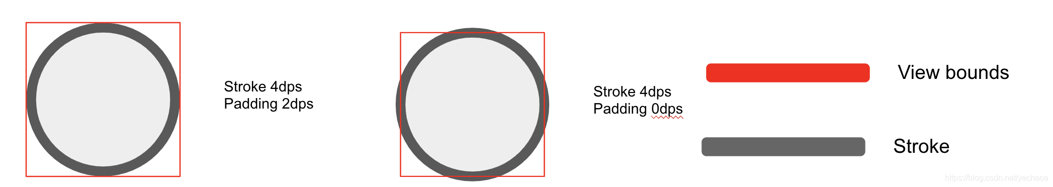
再说下描边问题,借用github图,需要设置padding为strokeWidth的一半,可以参考代码注释,roundToInt()防止设置太小导致padding为0。
再更新一点,这里只是做个记录,以下代码不用copy。
ShapeAppearanceModel类中的MaterialShapeUtils.createDefaultCornerTreatment()创建的是RoundedCornerTreatment,所以默认就是圆角类型,不需要如下设置:
fun setRoundRadius(radius: Float) {
    if (radius <= 0) return
    shapeAppearanceModel = ShapeAppearanceModel().toBuilder()
        .setAllCorners(CornerFamily.ROUNDED, radius)
        .build()
}