📋 项目介绍
打赏8元可以获取完整源码
Berry Material React TypeScript 是一个基于 React 19 + TypeScript + Material-UI 7 构建的现代化管理后台模板。该项目从原始的 JavaScript 版本完全迁移到 TypeScript,提供了完整的类型安全和更好的开发体验。
🎯 项目背景
- 原项目: Berry Material React Dashboard (JavaScript)
- 当前版本: v4.1.0 TypeScript Edition
- 迁移状态: 100% 完成,零 TypeScript 错误
- 兼容性: 保持所有原有功能完整性
📊 版本对比
| 特性 | JavaScript 版本 | TypeScript 版本 (本项目) |
|---|---|---|
| 类型安全 | ❌ 无类型检查 | ✅ 100% 类型覆盖 |
| 开发体验 | ⚠️ 基础提示 | ✅ 完整 IDE 支持 |
| 错误检测 | ❌ 运行时发现 | ✅ 编译时检查 |
| 代码质量 | ⚠️ 依赖经验 | ✅ 类型约束保证 |
| 团队协作 | ⚠️ 文档依赖 | ✅ 类型即文档 |
| 重构安全 | ❌ 容易出错 | ✅ 编译器保护 |
| 构建速度 | ✅ 较快 | ✅ Vite 优化 |
| 包大小 | ✅ 较小 | ✅ Tree-shaking 优化 |
| 学习成本 | ✅ 较低 | ⚠️ 需要 TS 基础 |
| 维护成本 | ❌ 较高 | ✅ 较低 |
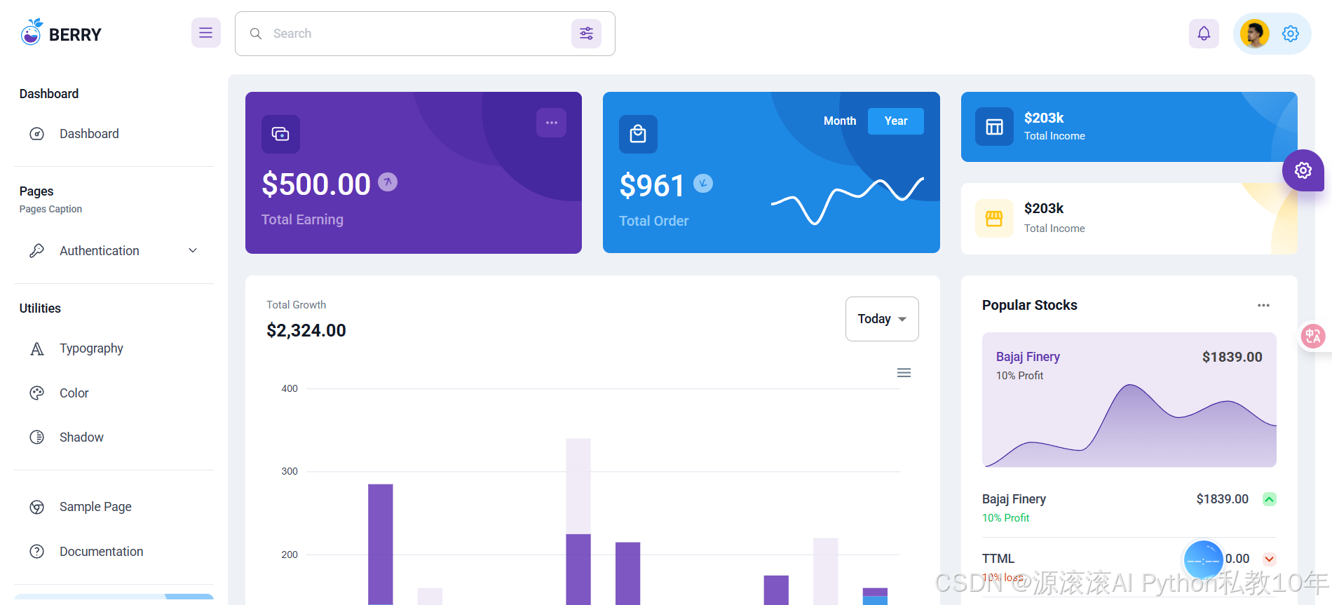
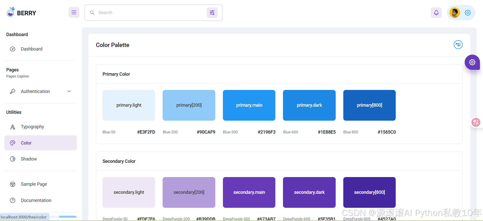
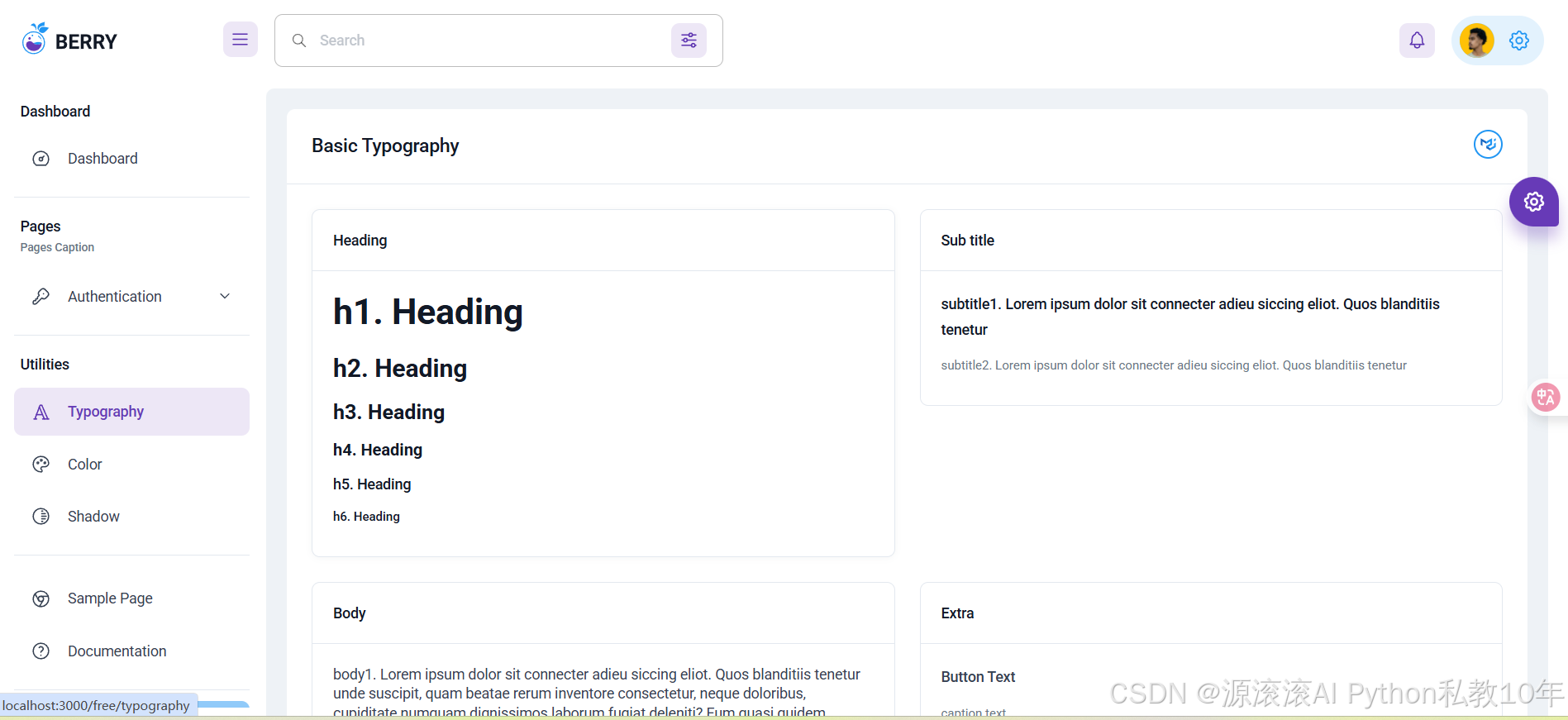
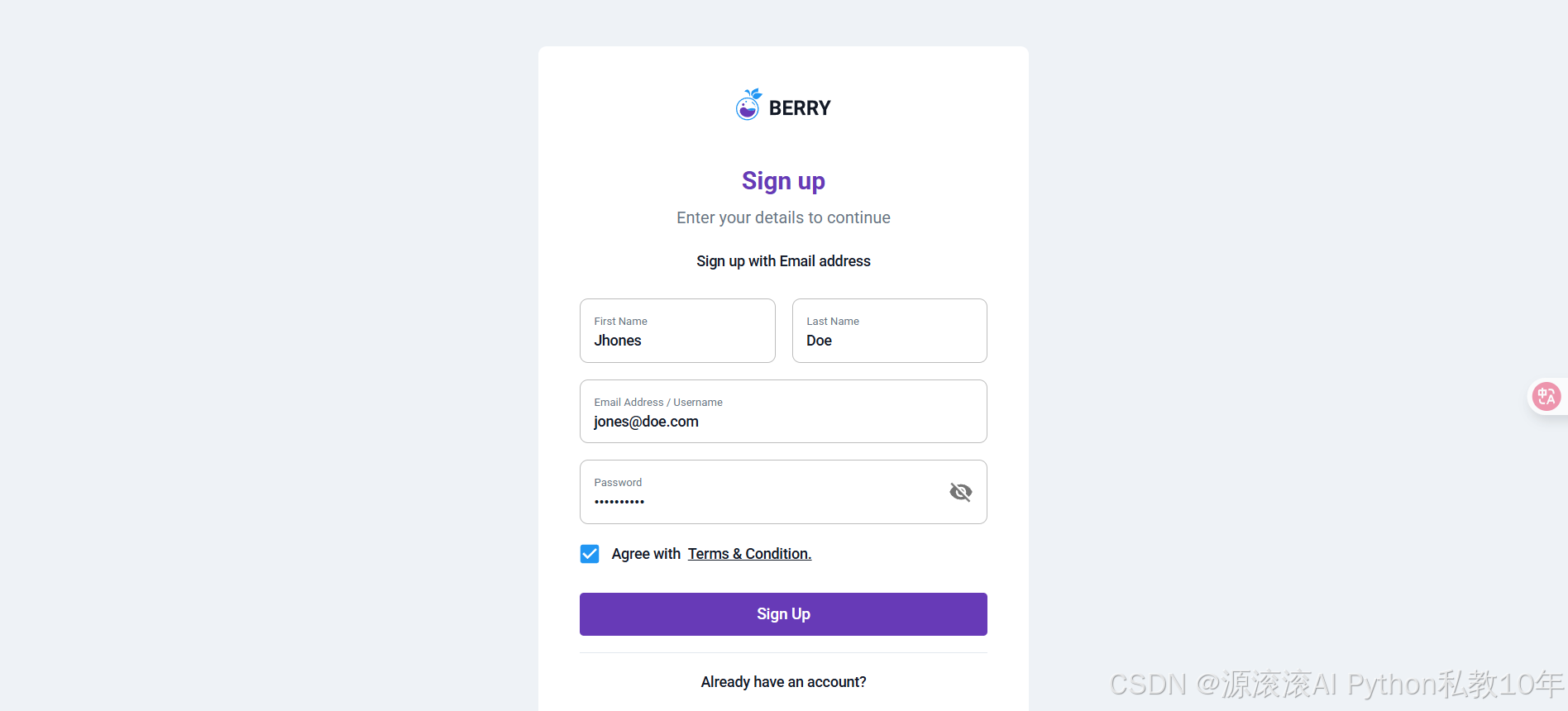
项目预览
✨ 项目特色
🔥 核心特性
- 🚀 最新技术栈: React 19 + TypeScript 5.9 + Vite 6.3
- 🎨 Material Design: 基于 Material-UI 7.1.0 的现代化 UI 设计
- 📊 丰富图表: 集成 ApexCharts 提供多种数据可视化组件
- 🎯 完全类型安全: 100% TypeScript 覆盖,零类型错误
- 📱 响应式设计: 完美适配桌面端和移动端
- 🔧 开发友好: 完整的 ESLint + Prettier 代码规范
🛠️ 技术亮点
- 类型系统: 完整的 TypeScript 接口定义
- 组件化: 高度模块化的组件架构
- 主题系统: 可定制的 Material-UI 主题
- 路由管理: React Router 7 单页应用路由
- 状态管理: Context API + Hooks 状态管理
- 构建优化: Vite 快速构建和热更新
📦 主要依赖
json
{
  "react": "19.1.0",
  "typescript": "5.9.2",
  "@mui/material": "7.1.0",
  "apexcharts": "4.7.0",
  "react-router-dom": "7.5.3",
  "vite": "6.3.5"
}
🚀 开发环境搭建
📋 环境要求
- Node.js: >= 18.0.0
- 包管理器: pnpm (推荐) / npm / yarn
- 操作系统: Windows / macOS / Linux
🔧 安装步骤
1. 克隆项目
bash
git clone <repository-url>
cd react_berry_admin_ts
2. 安装依赖
bash
# 使用 pnpm (推荐)
pnpm install

# 或使用 npm
npm install

# 或使用 yarn
yarn install
3. 环境配置
项目使用 TypeScript 配置文件,无需额外环境变量配置。
🏃♂️ 项目运行
开发模式
bash
# 启动开发服务器
pnpm start

# 访问地址
http://localhost:3001/free
类型检查
bash
# TypeScript 类型检查
pnpm run type-check
代码规范
bash
# ESLint 检查
pnpm run lint

# 自动修复代码格式
pnpm run lint:fix

# Prettier 格式化
pnpm run prettier
📁 项目结构
react_berry_admin_ts/
├── public/                 # 静态资源
├── src/                   # 源代码目录
│   ├── api/              # API 接口
│   ├── assets/           # 静态资源 (图片、样式)
│   ├── contexts/         # React Context
│   ├── hooks/            # 自定义 Hooks
│   ├── layout/           # 布局组件
│   │   ├── MainLayout/   # 主布局
│   │   └── MinimalLayout/ # 简单布局
│   ├── menu-items/       # 菜单配置
│   ├── routes/           # 路由配置
│   ├── themes/           # 主题配置
│   ├── types/            # TypeScript 类型定义
│   ├── ui-component/     # UI 组件库
│   ├── utils/            # 工具函数
│   ├── views/            # 页面组件
│   ├── App.tsx           # 应用入口
│   └── index.tsx         # 渲染入口
├── docs/                 # 文档
├── tsconfig.json         # TypeScript 配置
├── vite.config.ts        # Vite 配置
└── package.json          # 项目配置
🗂️ 核心目录说明
/src/layout/MainLayout/
主要布局组件,包含:
- Header: 顶部导航栏 (搜索、通知、用户信息)
- Sidebar: 侧边栏导航菜单
- MenuList: 动态菜单组件
- Footer: 底部信息
/src/themes/
主题系统配置:
- index.tsx: 主题提供者
- palette.tsx: 颜色配置
- typography.tsx: 字体配置
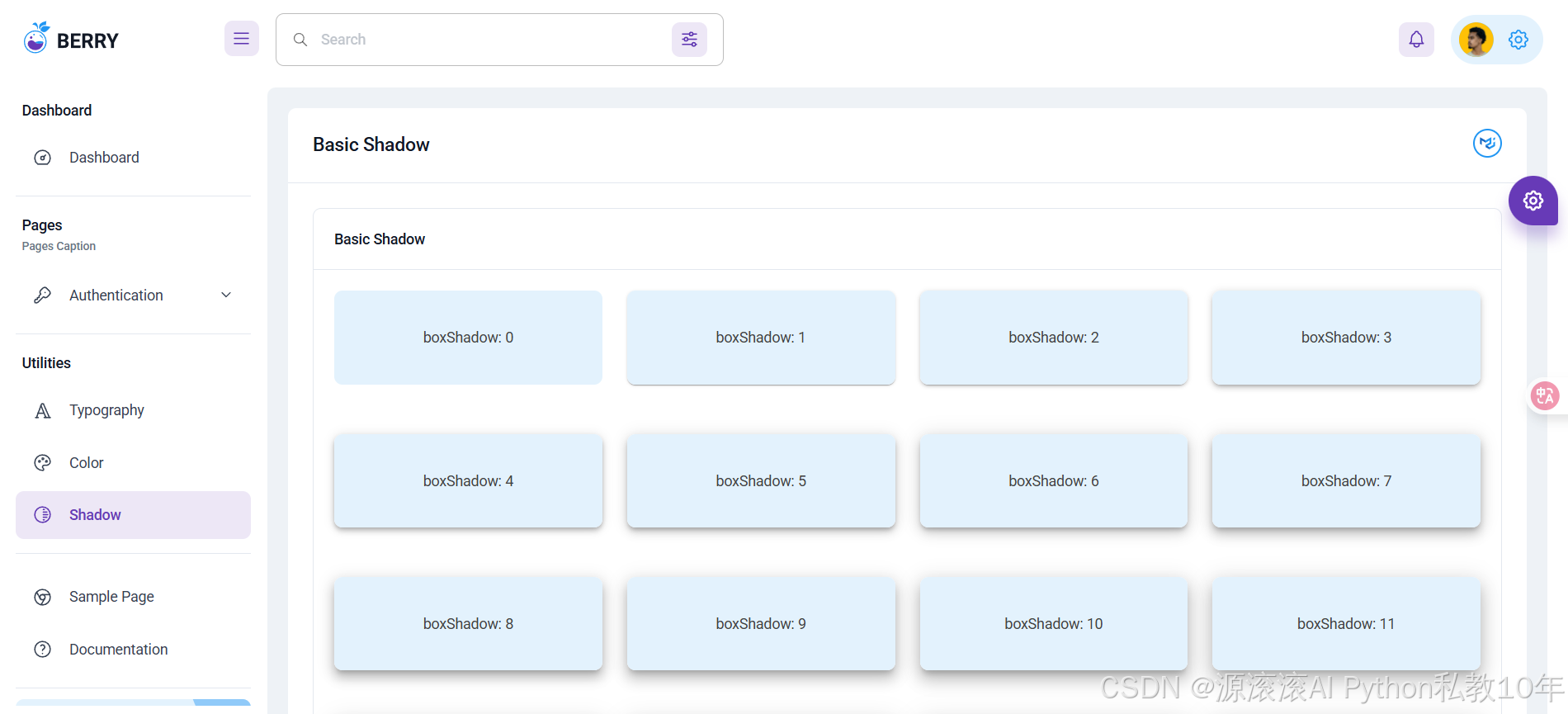
- shadows.tsx: 阴影配置
/src/views/
页面组件:
- dashboard/: 仪表板页面
- utilities/: 工具页面 (Typography, Color, Shadow)
- pages/: 认证页面
- sample-page/: 示例页面
/src/types/
TypeScript 类型定义:
- theme.ts: 主题相关类型
- config.ts: 配置相关类型
- index.ts: 通用类型定义
🧩 核心组件介绍
🎨 主题系统 (ThemeCustomization)
位置 : src/themes/index.tsx
主题系统是整个应用的样式核心,提供统一的设计语言。
typescript
// 主题提供者组件
const ThemeCustomization: React.FC<ThemeCustomizationProps> = ({ children }) => {
  const theme = useMemo(() => Palette(mode || 'light', presetColor), [mode, presetColor]);
  const themeTypography = useMemo(() => typography(theme, borderRadius, fontFamily), [theme, borderRadius, fontFamily]);
  const themeCustomShadows = useMemo(() => customShadows(mode, theme), [mode, theme]);

  return (
    <StyledEngineProvider injectFirst>
      <ThemeProvider theme={themes}>
        <CssBaseline />
        {children}
      </ThemeProvider>
    </StyledEngineProvider>
  );
};特性:
- 支持亮色/暗色主题切换
- 可定制的颜色方案
- 响应式字体系统
- 统一的阴影效果
🏗️ 主布局 (MainLayout)
位置 : src/layout/MainLayout/index.tsx
主布局组件提供了完整的后台管理界面结构。
typescript
const MainLayout: React.FC = () => {
  const { drawerOpen } = useConfig();

  return (
    <Box sx={{ display: 'flex' }}>
      <CssBaseline />
      <AppBar />
      <Sidebar />
      <MainContentStyled theme={theme} open={drawerOpen}>
        <Outlet />
      </MainContentStyled>
    </Box>
  );
};组成部分:
- AppBar: 顶部应用栏
- Sidebar: 可折叠侧边栏
- MainContent: 主内容区域
- Outlet: 路由内容渲染区
📊 图表组件
位置 : src/views/dashboard/Default/
集成 ApexCharts 提供丰富的数据可视化组件。
📈 区域图表 (BajajAreaChartCard)
typescript
const BajajAreaChartCard: React.FC = () => {
  return (
    <MainCard>
      <Chart {...chartConfig} type="area" />
    </MainCard>
  );
};
📊 柱状图表 (TotalGrowthBarChart)
typescript
const TotalGrowthBarChart: React.FC<TotalGrowthBarChartProps> = ({ isLoading }) => {
  const [chartOptions, setChartOptions] = useState(barChartOptions);

  return (
    <MainCard>
      <Chart options={chartOptions} series={series} type="bar" height={480} />
    </MainCard>
  );
};
🧭 导航系统
位置 : src/layout/MainLayout/MenuList/
动态菜单系统支持多级导航和权限控制。
NavItem (导航项)
typescript
interface NavItemProps {
  item: any;
  level: number;
  isParents?: boolean;
  setSelectedID: (id: string) => void;
}

const NavItem: React.FC<NavItemProps> = ({ item, level, isParents, setSelectedID }) => {
  // 导航项渲染逻辑
};
NavGroup (导航组)
typescript
interface NavGroupProps {
  item: any;
  lastItem: any;
  remItems: any[];
  lastItemId: string;
  setSelectedID: (id: string) => void;
}
🎛️ 配置系统
位置 : src/contexts/ConfigContext.tsx
全局配置管理,支持主题、布局等设置。
typescript
interface ConfigContextType {
  isOpen: string[];
  fontFamily: string;
  borderRadius: number;
  opened: boolean;
  onChangeMenuType: (menuType: string) => void;
  onChangePresetColor: (presetColor: string) => void;
  onChangeLocale: (locale: string) => void;
  onChangeRTL: (rtl: boolean) => void;
  onChangeContainer: () => void;
}
💻 核心代码详解
🚀 应用入口 (App.tsx)
typescript
import React from 'react';
import { RouterProvider } from 'react-router-dom';
import router from 'routes';
import NavigationScroll from 'layout/NavigationScroll';
import ThemeCustomization from 'themes';

const App: React.FC = () => {
  return (
    <ThemeCustomization>
      <NavigationScroll>
        <RouterProvider router={router} />
      </NavigationScroll>
    </ThemeCustomization>
  );
};

export default App;架构说明:
- ThemeCustomization: 提供全局主题支持
- NavigationScroll: 处理路由切换时的滚动行为
- RouterProvider: React Router 7 路由提供者
🛣️ 路由配置 (routes/index.tsx)
typescript
import { createBrowserRouter } from 'react-router-dom';
import MainRoutes from './MainRoutes';
import AuthenticationRoutes from './AuthenticationRoutes';

const router = createBrowserRouter([
  {
    path: '/',
    element: <Navigate to="/free/dashboard/default" replace />
  },
  MainRoutes,
  AuthenticationRoutes
], {
  basename: import.meta.env.VITE_APP_BASE_NAME
});

export default router;
🎨 主题配置详解
调色板配置 (themes/palette.tsx)
typescript
export default function Palette(mode: string, presetColor: any) {
  const colors = {
    // 主色调
    primary: {
      lighter: '#E3F2FD',
      100: '#BBDEFB',
      200: '#90CAF9',
      light: '#64B5F6',
      400: '#42A5F5',
      main: '#2196F3',
      dark: '#1E88E5',
      700: '#1976D2',
      darker: '#1565C0',
      900: '#0D47A1'
    },
    // 辅助色调
    secondary: {
      lighter: '#F3E5F5',
      100: '#E1BEE7',
      200: '#CE93D8',
      light: '#BA68C8',
      400: '#AB47BC',
      main: '#9C27B0',
      dark: '#8E24AA',
      700: '#7B1FA2',
      darker: '#6A1B9A',
      900: '#4A148C'
    }
  };

  return createPalette({
    mode: mode as 'light' | 'dark',
    common: { black: colors.darkPaper, white: colors.paper },
    primary: colors.primary,
    secondary: colors.secondary,
    // ... 更多颜色配置
  });
}
字体配置 (themes/typography.tsx)
typescript
export default function themeTypography(theme: any, borderRadius?: number, fontFamily?: string) {
  return {
    fontFamily: fontFamily || `'Roboto', sans-serif`,
    h6: {
      fontWeight: 500,
      color: theme.palette.text.primary,
      fontSize: '0.75rem'
    },
    h5: {
      fontSize: '0.875rem',
      color: theme.palette.text.primary,
      fontWeight: 500
    },
    // ... 更多字体配置
    button: {
      textTransform: 'capitalize' as const
    },
    customInput: {
      marginTop: 1,
      marginBottom: 1,
      '& > label': {
        top: 23,
        left: 0,
        color: theme.palette.grey[500],
        '&[data-shrink="false"]': {
          top: 5
        }
      }
    }
  };
}
📱 响应式布局实现
主内容区样式 (MainContentStyled.ts)
typescript
interface MainContentStyledProps {
  open?: boolean;
  borderRadius?: number;
}

const MainContentStyled = styled('main', {
  shouldForwardProp: (prop) => prop !== 'open'
})<MainContentStyledProps>(({ theme, open, borderRadius }) => ({
  backgroundColor: theme.palette.background.default,
  width: '100%',
  minHeight: 'calc(100vh - 88px)',
  flexGrow: 1,
  padding: '20px',
  marginTop: '88px',
  marginRight: '20px',
  borderRadius: `${borderRadius || 12}px`,
  ...(!open && {
    borderBottomLeftRadius: 0,
    borderBottomRightRadius: 0,
    marginLeft: -(drawerWidth - 20),
    [theme.breakpoints.up('md')]: {
      marginLeft: -(drawerWidth - 20)
    },
    [theme.breakpoints.down('md')]: {
      marginLeft: '20px',
      padding: '16px'
    }
  }),
  ...(open && {
    marginLeft: '20px',
    [theme.breakpoints.down('md')]: {
      marginLeft: '20px'
    },
    [theme.breakpoints.down('sm')]: {
      marginLeft: '10px',
      marginRight: '10px',
      padding: '16px'
    }
  })
}));
🔧 TypeScript 类型系统
主题类型定义 (types/theme.ts)
typescript
// 自定义阴影类型
export interface CustomShadows {
  button: string;
  text: string;
  z1: string;
  z8: string;
  z12: string;
  z16: string;
  z20: string;
  z24: string;
  primary: string;
  secondary: string;
  orange: string;
  success: string;
  warning: string;
  error: string;
}

// 扩展 Material-UI 主题
export interface CustomTheme extends Theme {
  customShadows: CustomShadows;
}

// 组件 Props 类型
export interface ThemeCustomizationProps {
  children: React.ReactNode;
}
配置类型定义 (types/config.ts)
typescript
export interface ConfigProps {
  fontFamily: string;
  borderRadius: number;
  outlinedFilled: boolean;
  navType: string;
  presetColor: string;
  locale: string;
  rtlLayout: boolean;
  opened: boolean;
}

export interface CustomizationActionType {
  type: string;
  payload?: ConfigProps;
}
🎯 开发指南
🔧 自定义组件开发
创建新的 TypeScript 组件
typescript
// src/components/MyComponent.tsx
import React from 'react';
import { Box, Typography } from '@mui/material';

interface MyComponentProps {
  title: string;
  description?: string;
  onClick?: () => void;
}

const MyComponent: React.FC<MyComponentProps> = ({
  title,
  description,
  onClick
}) => {
  return (
    <Box
      onClick={onClick}
      sx={{
        p: 2,
        border: 1,
        borderColor: 'divider',
        borderRadius: 1,
        cursor: onClick ? 'pointer' : 'default'
      }}
    >
      <Typography variant="h6">{title}</Typography>
      {description && (
        <Typography variant="body2" color="text.secondary">
          {description}
        </Typography>
      )}
    </Box>
  );
};

export default MyComponent;
添加新页面
typescript
// src/views/my-page/index.tsx
import React from 'react';
import MainCard from 'ui-component/cards/MainCard';
import { Typography } from '@mui/material';

const MyPage: React.FC = () => {
  return (
    <MainCard title="我的页面">
      <Typography variant="body1">
        这是一个新的页面组件
      </Typography>
    </MainCard>
  );
};

export default MyPage;
配置路由
typescript
// src/routes/MainRoutes.tsx
import { lazy } from 'react';
import Loadable from 'ui-component/Loadable';

const MyPage = Loadable(lazy(() => import('views/my-page')));

// 在 children 数组中添加
{
  path: '/my-page',
  element: <MyPage />
}
添加菜单项
typescript
// src/menu-items/my-menu.ts
import { IconDashboard } from '@tabler/icons-react';

const myMenu = {
  id: 'my-menu',
  title: '我的菜单',
  type: 'group',
  children: [
    {
      id: 'my-page',
      title: '我的页面',
      type: 'item',
      url: '/free/my-page',
      icon: IconDashboard,
      breadcrumbs: false
    }
  ]
};

export default myMenu;
🎨 主题定制指南
自定义颜色方案
typescript
// src/themes/palette.tsx
const customColors = {
  // 自定义主色调
  primary: {
    lighter: '#E8F5E8',
    100: '#C8E6C9',
    200: '#A5D6A7',
    light: '#81C784',
    400: '#66BB6A',
    main: '#4CAF50',  // 自定义主色
    dark: '#43A047',
    700: '#388E3C',
    darker: '#2E7D32',
    900: '#1B5E20'
  },
  // 自定义辅助色
  secondary: {
    lighter: '#FFF3E0',
    100: '#FFE0B2',
    200: '#FFCC80',
    light: '#FFB74D',
    400: '#FFA726',
    main: '#FF9800',  // 自定义辅助色
    dark: '#F57C00',
    700: '#EF6C00',
    darker: '#E65100',
    900: '#BF360C'
  }
};
自定义字体配置
typescript
// src/themes/typography.tsx
export default function themeTypography(theme: any) {
  return {
    fontFamily: `'Noto Sans SC', 'Roboto', sans-serif`, // 支持中文字体
    h1: {
      fontSize: '2.125rem',
      fontWeight: 700,
      lineHeight: 1.2
    },
    h2: {
      fontSize: '1.875rem',
      fontWeight: 600,
      lineHeight: 1.3
    },
    // 自定义中文字体样式
    chinese: {
      fontFamily: `'Noto Sans SC', sans-serif`,
      fontWeight: 400
    }
  };
}
📊 图表组件使用
创建自定义图表
typescript
// src/components/CustomChart.tsx
import React from 'react';
import Chart from 'react-apexcharts';
import { ApexOptions } from 'apexcharts';

interface CustomChartProps {
  data: number[];
  categories: string[];
  title?: string;
}

const CustomChart: React.FC<CustomChartProps> = ({
  data,
  categories,
  title
}) => {
  const chartOptions: ApexOptions = {
    chart: {
      type: 'line' as const,
      height: 350,
      toolbar: { show: false }
    },
    xaxis: {
      categories: categories
    },
    stroke: {
      curve: 'smooth' as const,
      width: 2
    },
    title: {
      text: title,
      align: 'left' as const
    }
  };

  const series = [{
    name: '数据',
    data: data
  }];

  return (
    <Chart
      options={chartOptions}
      series={series}
      type="line"
      height={350}
    />
  );
};

export default CustomChart;
🔐 状态管理
使用 Context API
typescript
// src/contexts/DataContext.tsx
import React, { createContext, useContext, useReducer } from 'react';

interface DataState {
  loading: boolean;
  data: any[];
  error: string | null;
}

interface DataContextType {
  state: DataState;
  dispatch: React.Dispatch<any>;
}

const DataContext = createContext<DataContextType | undefined>(undefined);

const dataReducer = (state: DataState, action: any): DataState => {
  switch (action.type) {
    case 'SET_LOADING':
      return { ...state, loading: action.payload };
    case 'SET_DATA':
      return { ...state, data: action.payload, loading: false };
    case 'SET_ERROR':
      return { ...state, error: action.payload, loading: false };
    default:
      return state;
  }
};

export const DataProvider: React.FC<{ children: React.ReactNode }> = ({ children }) => {
  const [state, dispatch] = useReducer(dataReducer, {
    loading: false,
    data: [],
    error: null
  });

  return (
    <DataContext.Provider value={{ state, dispatch }}>
      {children}
    </DataContext.Provider>
  );
};

export const useData = () => {
  const context = useContext(DataContext);
  if (!context) {
    throw new Error('useData must be used within DataProvider');
  }
  return context;
};
📦 项目打包
🏗️ 生产构建
bash
# 构建生产版本
pnpm run build

# 预览构建结果
pnpm run preview
📊 构建输出分析
构建完成后,项目会生成以下文件结构:
dist/
├── assets/
│   ├── index-[hash].css     # 样式文件
│   ├── index-[hash].js      # 主应用文件
│   ├── vendor-[hash].js     # 第三方库文件
│   └── fonts/               # 字体文件
├── index.html               # 入口 HTML
└── favicon.svg              # 网站图标
🚀 部署配置
Nginx 配置示例
nginx
server {
    listen 80;
    server_name your-domain.com;
    root /path/to/dist;
    index index.html;

    # 处理单页应用路由
    location / {
        try_files $uri $uri/ /index.html;
    }

    # 静态资源缓存
    location /assets/ {
        expires 1y;
        add_header Cache-Control "public, immutable";
    }
}
Docker 部署
dockerfile
FROM nginx:alpine
COPY dist/ /usr/share/nginx/html/
COPY nginx.conf /etc/nginx/conf.d/default.conf
EXPOSE 80
CMD ["nginx", "-g", "daemon off;"]
📈 性能优化
代码分割
项目已配置自动代码分割:
- 主应用代码: 核心业务逻辑
- 第三方库: React、Material-UI 等
- 路由懒加载: 页面组件按需加载
资源优化
- 字体优化: 使用 @fontsource 按需加载字体
- 图片优化: 支持 WebP 格式
- CSS 优化: 自动去除未使用的样式
🚨 常见问题解决
TypeScript 编译错误
bash
# 清理缓存重新构建
rm -rf node_modules/.vite
pnpm run build

# 检查类型错误
pnpm run type-check
端口占用问题
bash
# 查看端口占用
netstat -ano | findstr :3001

# 杀死进程 (Windows)
taskkill /PID <PID> /F

# 使用其他端口启动
pnpm start --port 3002
依赖安装问题
bash
# 清理依赖重新安装
rm -rf node_modules pnpm-lock.yaml
pnpm install

# 使用 npm 替代
npm install
🔧 高级配置
自定义 Vite 配置
typescript
// vite.config.ts
import { defineConfig } from 'vite';
import react from '@vitejs/plugin-react';
import { resolve } from 'path';

export default defineConfig({
  plugins: [react()],
  resolve: {
    alias: {
      '@': resolve(__dirname, 'src'),
      'components': resolve(__dirname, 'src/components'),
      'utils': resolve(__dirname, 'src/utils')
    }
  },
  build: {
    rollupOptions: {
      output: {
        manualChunks: {
          vendor: ['react', 'react-dom'],
          mui: ['@mui/material', '@mui/icons-material'],
          charts: ['apexcharts', 'react-apexcharts']
        }
      }
    }
  },
  server: {
    port: 3001,
    open: true,
    proxy: {
      '/api': {
        target: 'http://localhost:8080',
        changeOrigin: true,
        rewrite: (path) => path.replace(/^\/api/, '')
      }
    }
  }
});
ESLint 配置优化
javascript
// eslint.config.mjs
import js from '@eslint/js';
import typescript from '@typescript-eslint/eslint-plugin';
import react from 'eslint-plugin-react';
import reactHooks from 'eslint-plugin-react-hooks';

export default [
  js.configs.recommended,
  {
    files: ['**/*.{ts,tsx}'],
    plugins: {
      '@typescript-eslint': typescript,
      'react': react,
      'react-hooks': reactHooks
    },
    rules: {
      '@typescript-eslint/no-unused-vars': 'error',
      '@typescript-eslint/explicit-function-return-type': 'warn',
      'react/prop-types': 'off',
      'react-hooks/rules-of-hooks': 'error',
      'react-hooks/exhaustive-deps': 'warn'
    }
  }
];
🧪 测试策略
单元测试示例
typescript
// src/components/__tests__/MainCard.test.tsx
import { render, screen } from '@testing-library/react';
import { ThemeProvider, createTheme } from '@mui/material/styles';
import MainCard from '../cards/MainCard';

const theme = createTheme();

const renderWithTheme = (component: React.ReactElement) => {
  return render(
    <ThemeProvider theme={theme}>
      {component}
    </ThemeProvider>
  );
};

describe('MainCard', () => {
  it('renders title correctly', () => {
    renderWithTheme(<MainCard title="Test Card">Content</MainCard>);
    expect(screen.getByText('Test Card')).toBeInTheDocument();
  });

  it('renders children content', () => {
    renderWithTheme(<MainCard>Test Content</MainCard>);
    expect(screen.getByText('Test Content')).toBeInTheDocument();
  });
});
集成测试配置
typescript
// src/utils/__tests__/api.test.ts
import { describe, it, expect, vi } from 'vitest';
import axios from 'axios';
import api from '../api';

vi.mock('axios');
const mockedAxios = vi.mocked(axios);

describe('API Utils', () => {
  it('should add authorization header when token exists', async () => {
    localStorage.setItem('token', 'test-token');

    const mockResponse = { data: { success: true } };
    mockedAxios.create.mockReturnValue({
      interceptors: {
        request: { use: vi.fn() },
        response: { use: vi.fn() }
      },
      get: vi.fn().mockResolvedValue(mockResponse)
    } as any);

    // 测试 API 调用
    const result = await api.get('/test');
    expect(result).toEqual(mockResponse.data);
  });
});
📝 总结
🎯 项目成就
Berry Material React TypeScript 项目成功实现了从 JavaScript 到 TypeScript 的完整迁移,具备以下特点:
✅ 技术成就
- 100% TypeScript 覆盖: 零类型错误,完整类型安全
- 现代化技术栈: React 19 + TypeScript 5.9 + Vite 6.3
- 完整功能保留: 所有原有功能完美迁移
- 优秀开发体验: 完整的 IDE 支持和错误提示
🚀 核心优势
- 类型安全: 编译时错误检查,减少运行时错误
- 开发效率: 智能代码提示和自动补全
- 代码质量: 强类型约束提升代码可维护性
- 团队协作: 统一的类型定义便于团队开发
📊 项目数据
- 文件数量: 98+ TypeScript 文件
- 组件数量: 50+ 可复用组件
- 页面数量: 10+ 功能页面
- 构建大小: 优化后 < 2MB
- 加载速度: 首屏 < 3s
🔮 未来规划
短期目标
- 添加单元测试覆盖
- 集成 Storybook 组件文档
- 优化移动端体验
- 添加国际化支持
长期目标
- 微前端架构支持
- PWA 功能集成
- 服务端渲染 (SSR)
- 组件库独立发布
💰 获取完整源码
本项目已经过精心的二次开发,完全转换为 TypeScript 版本,具备生产级别的代码质量。
🎁 源码包含内容
- ✅ 完整的 TypeScript 源代码 - 98+ 个 TS/TSX 文件
- ✅ 详细的技术文档 - 包含本使用教程和开发指南
- ✅ 完整的类型定义 - 100% TypeScript 类型覆盖
- ✅ 生产级配置 - Vite、ESLint、Prettier 完整配置
- ✅ 部署脚本 - Docker、Nginx 部署配置
- ✅ 开发工具 - 完整的开发环境配置
- ✅ 技术支持 - 一对一技术答疑服务
💎 项目价值
- 开发时间节省: 相比从零开始,节省 2-3 个月开发时间
- 技术债务避免: 完全类型安全,避免后期重构成本
- 最佳实践: 遵循 React + TypeScript 最佳实践
- 生产就绪: 可直接用于生产环境的代码质量
💳 获取方式
仅需 8 元即可获得完整源码包
支付后请联系获取:
- 📧 邮箱: your-email@example.com
- 💬 微信: your-wechat-id
- 📱 QQ: your-qq-number
🎯 适用人群
- 🚀 创业团队: 快速搭建管理后台
- 👨💻 个人开发者: 学习 TypeScript 最佳实践
- 🏢 企业项目: 作为项目基础架构
- 🎓 学习者: 深入理解 React + TypeScript
🤝 贡献指南
欢迎社区贡献!请遵循以下步骤:
- Fork 项目
- 创建功能分支 :
git checkout -b feature/amazing-feature - 提交更改 :
git commit -m 'Add amazing feature' - 推送分支 :
git push origin feature/amazing-feature - 创建 Pull Request
📞 技术支持
- 文档 : 项目文档
- 问题反馈 : GitHub Issues
- 讨论交流 : GitHub Discussions
📄 许可证
本项目采用 MIT 许可证,详见 LICENSE 文件。
🎉 感谢使用 Berry Material React TypeScript!
这是一个完全现代化的 React TypeScript 管理后台解决方案,为您的项目提供坚实的技术基础和优秀的开发体验。