前言
在开发过程中,我们常常需要对现有的UI组件进行二次封装,以满足特定的业务需求。
最近,我在项目中遇到了一个需求:需要实现一个自定义的下拉框,用户可以选择预设的选项,也可以输入自定义的次数。
由于我们项目中使用的是Ant Design Vue(antdv),我决定基于antdv的组件来实现这个功能。
以下是我实现这个自定义下拉框的详细过程。
需求分析
我们需要实现一个下拉框,具备以下功能:
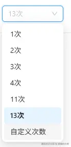
- 预设选项:下拉框中包含一些预设的选项,用户可以直接选择。
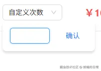
- 自定义选项:用户可以选择"自定义次数"选项,此时显示一个输入框,用户可以在输入框中输入自定义的次数。
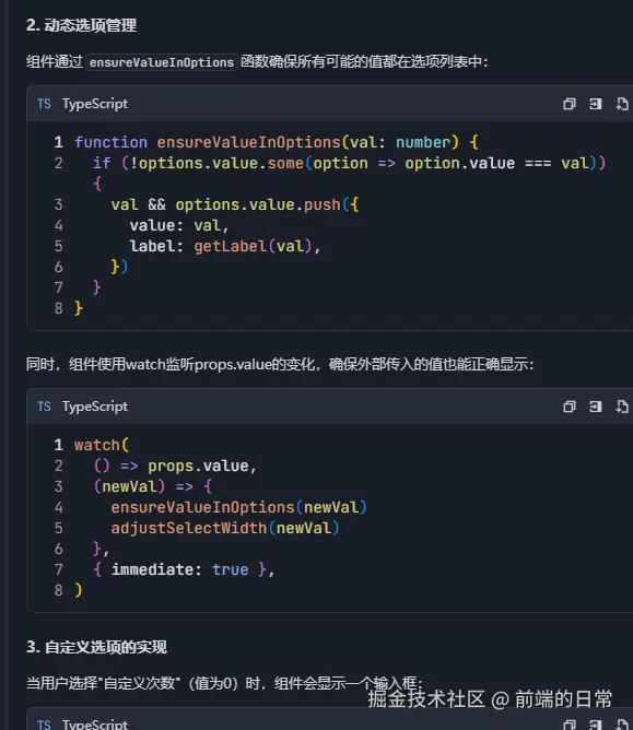
- 动态添加选项:用户输入的自定义次数需要动态添加到下拉框的选项中,并且可以被选中。
- 样式自适应:下拉框的宽度需要根据内容自适应,确保显示效果良好。
实现思路
为了实现上述功能,我们需要使用到Ant Design Vue的<a-select>和<a-input>组件,这次还是使用Trae来尝试是否可以实现。
以下是实现的步骤:
- 控制输入框的显示与隐藏 :通过一个布尔值变量
showInput来控制输入框的显示与隐藏。 - 处理下拉框的选择事件:当用户选择"自定义次数"时,显示输入框;当用户选择其他选项时,隐藏输入框。
- 动态添加自定义选项:用户在输入框中输入自定义次数后,点击"确认"按钮,将自定义次数添加到下拉框的选项中。
- 调整下拉框宽度:根据下拉框的内容动态调整下拉框的宽度,确保显示效果良好。
向Trae提问,把细节都加上,避免二次提问

Trae先进行分析
实现的方法也很简洁
最终的效果,太强了,Trae,又是可以摸鱼的一天
代码实现
以下是具体的代码实现:
vue
<template>
<div class="custom-select-container">
<a-select
v-model:value="value"
placeholder="请选择"
@change="handleSelectChange"
@dropdownVisibleChange="handleDropdownVisibleChange"
style="width: 120px"
>
<a-select-option
v-for="option in options"
:key="option.value"
:value="option.value"
>
{{ option.label }}
</a-select-option>
<a-select-option key="custom" value="custom">
自定义次数
</a-select-option>
</a-select>
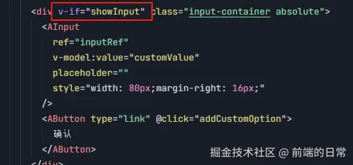
<div v-if="showInput" class="custom-input-container">
<a-input
ref="inputRef"
v-model:value="customValue"
placeholder="请输入次数"
style="width: 80px; margin-right: 8px"
/>
<a-button type="primary" @click="addCustomOption">确认</a-button>
</div>
</div>
</template>
<script setup>
import { ref, watch, nextTick } from 'vue';
import { Input as AInput, Select as ASelect, Button as AButton } from 'ant-design-vue';
const value = ref(null);
const customValue = ref(null);
const showInput = ref(false);
const inputRef = ref(null);
const options = ref([
{ value: '1', label: '1次' },
{ value: '2', label: '2次' },
{ value: '3', label: '3次' },
]);
// 处理下拉框选择变化
const handleSelectChange = (val) => {
if (val === 'custom') {
showInput.value = true;
customValue.value = null;
nextTick(() => {
inputRef.value.focus();
});
} else {
showInput.value = false;
}
};
// 处理下拉框显示/隐藏
const handleDropdownVisibleChange = (visible) => {
if (visible) {
showInput.value = false;
}
};
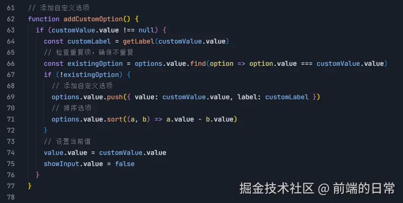
// 添加自定义选项
const addCustomOption = () => {
if (customValue.value) {
const customLabel = `${customValue.value}次`;
options.value.push({ value: customValue.value, label: customLabel });
value.value = customValue.value;
showInput.value = false;
}
};
// 监控 value,动态添加不存在的选项
watch(value, (newVal) => {
if (newVal && !options.value.some(option => option.value === newVal)) {
const customLabel = `${newVal}次`;
options.value.push({ value: newVal, label: customLabel });
}
});
</script>
<style scoped>
.custom-select-container {
position: relative;
}
.custom-input-container {
display: flex;
align-items: center;
margin-top: 8px;
}
</style>Trae代码解析
-
a-select和a-select-option:- 使用
a-select组件来创建下拉框,a-select-option用于定义下拉框中的选项。 - 通过
v-model:value绑定下拉框的选中值。

- 使用
-
控制输入框的显示与隐藏:
- 使用
v-if控制输入框的显示与隐藏,通过showInput变量来控制。
- 使用
-
处理选择事件:
- 当用户选择"自定义次数"时,显示输入框并聚焦。
- 当用户选择其他选项时,隐藏输入框。
-
动态添加自定义选项:
- 用户在输入框中输入自定义次数后,点击"确认"按钮,将自定义次数添加到选项列表中。
-
样式调整:
- 使用CSS调整输入框和按钮的样式,确保显示效果良好。

- 使用CSS调整输入框和按钮的样式,确保显示效果良好。
总结
通过上述实现,我们成功地使用Ant Design Vue实现了一个支持自定义输入次数的下拉框。这个组件不仅满足了业务需求,还提供了良好的用户体验。
在实际开发中,你可以根据具体需求进一步优化和调整样式。希望这篇文章能对你有所帮助!