本教程将带您一步一步构建一个完整的科技风后台管理系统,所有代码都来自 example 项目的实际实现。按照本教程操作,您将获得一个功能完整、界面美观的管理后台系统。
效果预览
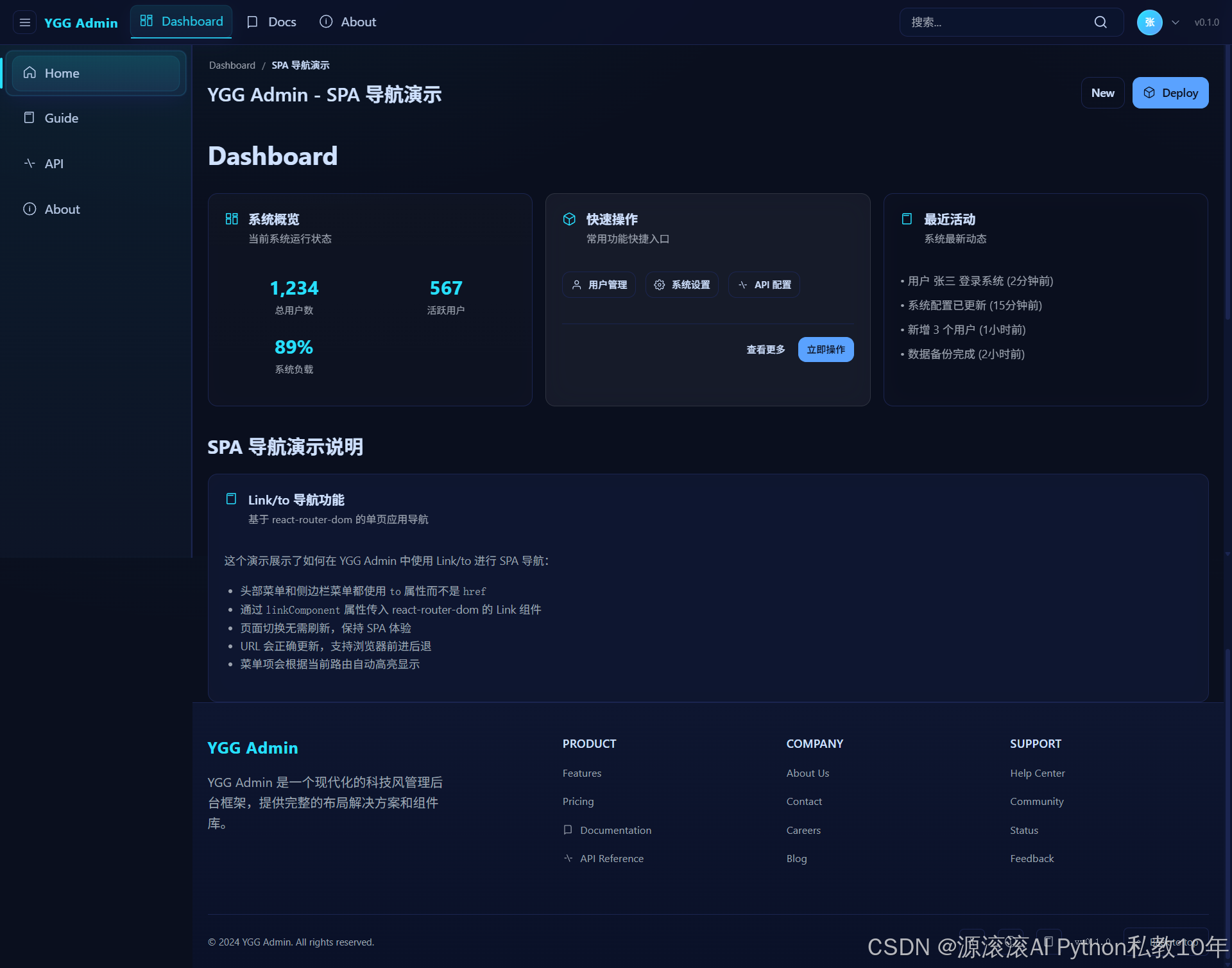
首页
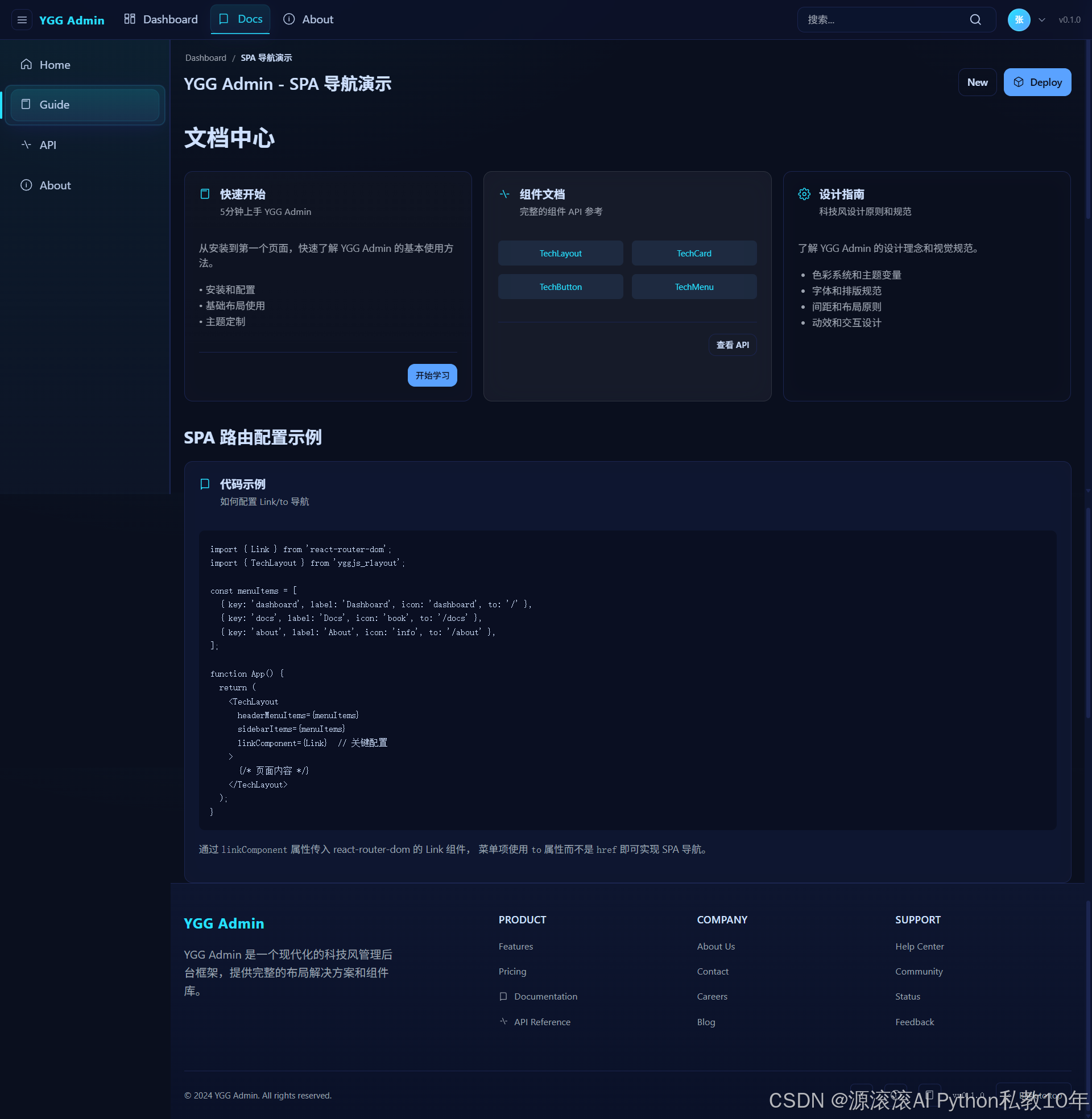
文档页
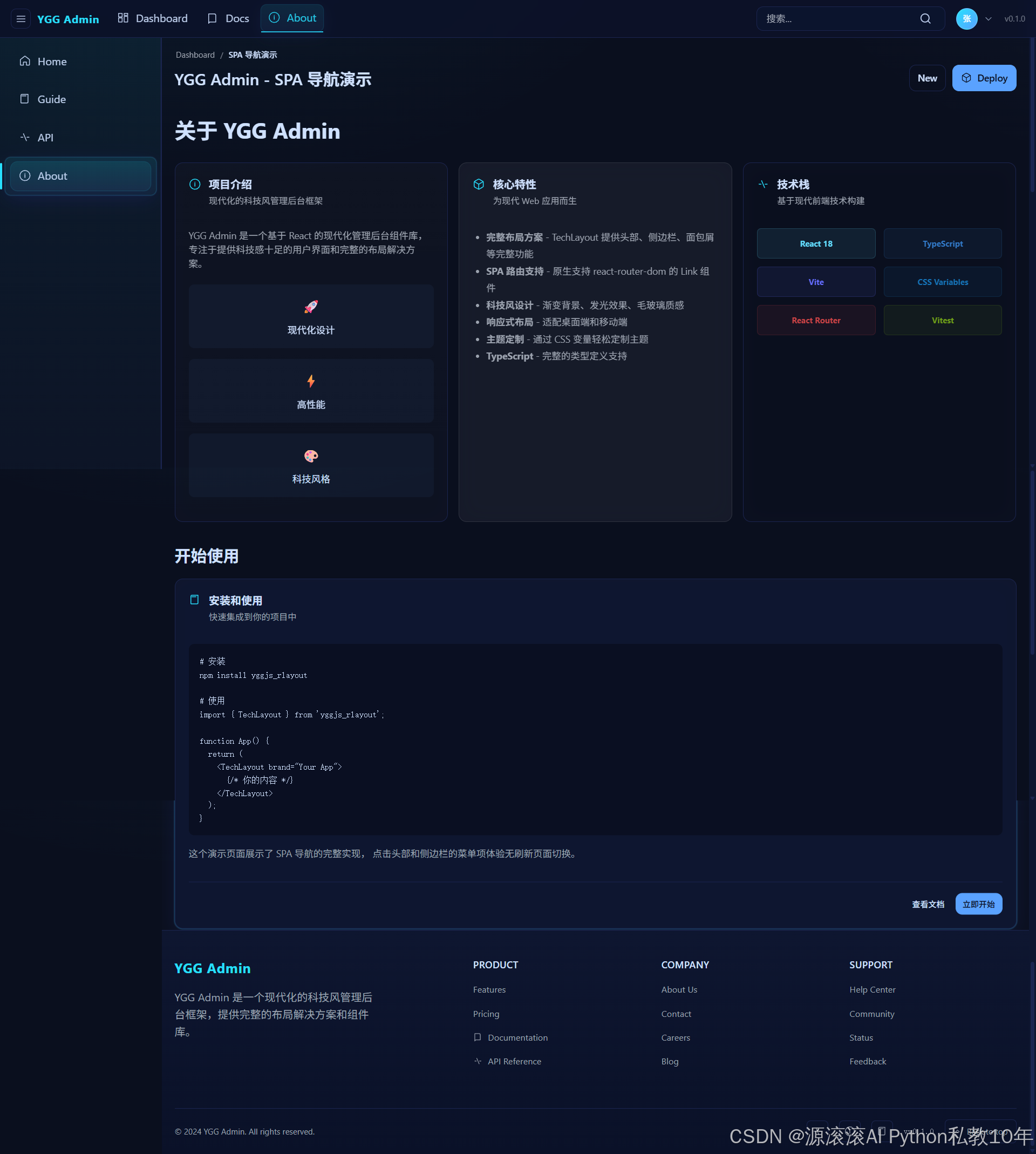
关于页
前置准备
环境要求
- Node.js >= 18
- npm 或 pnpm 或 yarn
- 现代浏览器
技术栈
- React 18
- TypeScript
- Vite
- React Router DOM
- yggjs_rlayout
步骤 1: 创建项目并安装依赖
1.1 创建项目目录
bash
mkdir my-tech-admin
cd my-tech-admin
1.2 初始化项目
bash
npm create vite@latest . -- --template react-ts1.3 安装依赖
bash
# 安装基础依赖
npm install

# 安装项目依赖
npm install react-router-dom yggjs_rlayout
1.4 验证安装
bash
npm run dev确保项目能正常启动,然后停止开发服务器继续下一步。
步骤 2: 配置项目文件
2.1 更新 package.json
将 package.json 中的 scripts 部分更新为:
json
{
  "name": "my-tech-admin",
  "private": true,
  "version": "0.0.0",
  "type": "module",
  "scripts": {
    "dev": "vite",
    "build": "vite build",
    "preview": "vite preview --port 5173"
  },
  "dependencies": {
    "react": "^18.0.0",
    "react-dom": "^18.0.0",
    "react-router-dom": "^6.23.1",
    "yggjs_rlayout": "^0.1.0"
  },
  "devDependencies": {
    "@types/react": "^18.2.66",
    "@types/react-dom": "^18.2.22",
    "@vitejs/plugin-react": "^4.3.1",
    "vite": "^5.3.1",
    "typescript": "^5.5.2"
  }
}
2.2 配置 vite.config.ts
typescript
import { defineConfig } from 'vite'
import react from '@vitejs/plugin-react'

// https://vitejs.dev/config/
export default defineConfig({
  plugins: [react()],
})
2.3 配置 tsconfig.json
json
{
  "compilerOptions": {
    "target": "ES2020",
    "useDefineForClassFields": true,
    "lib": ["ES2020", "DOM", "DOM.Iterable"],
    "module": "ESNext",
    "skipLibCheck": true,

    /* Bundler mode */
    "moduleResolution": "bundler",
    "allowImportingTsExtensions": true,
    "resolveJsonModule": true,
    "isolatedModules": true,
    "noEmit": true,
    "jsx": "react-jsx",

    /* Linting */
    "strict": true,
    "noUnusedLocals": true,
    "noUnusedParameters": true,
    "noFallthroughCasesInSwitch": true
  },
  "include": ["src"],
  "references": [{ "path": "./tsconfig.node.json" }]
}
2.4 更新 index.html
html
<!doctype html>
<html lang="en">
  <head>
    <meta charset="UTF-8" />
    <link rel="icon" type="image/svg+xml" href="/vite.svg" />
    <meta name="viewport" content="width=device-width, initial-scale=1.0" />
    <title>YGG Admin - 科技风管理后台</title>
  </head>
  <body>
    <div id="root"></div>
    <script type="module" src="/src/main.tsx"></script>
  </body>
</html>
步骤 3: 创建项目结构
3.1 创建目录结构
bash
mkdir -p src/pages/tech3.2 项目结构预览
src/
├── pages/
│   ├── App.tsx                    # 欢迎页面
│   └── tech/                      # 科技风主题页面
│       ├── TechLayoutDemo.tsx     # 主布局组件
│       ├── Dashboard.tsx          # 仪表板页面
│       ├── Docs.tsx              # 文档页面
│       └── About.tsx             # 关于页面
├── styles.css                    # 全局样式
└── main.tsx                      # 应用入口
步骤 4: 创建全局样式
4.1 创建 src/styles.css
将以下内容完整复制到 src/styles.css 文件中:
css
/* 重置样式 */
* {
  margin: 0;
  padding: 0;
  box-sizing: border-box;
}

html, body {
  height: 100%;
  font-family: -apple-system, BlinkMacSystemFont, 'Segoe UI', 'Roboto', 'Oxygen',
    'Ubuntu', 'Cantarell', 'Fira Sans', 'Droid Sans', 'Helvetica Neue',
    sans-serif;
  -webkit-font-smoothing: antialiased;
  -moz-osx-font-smoothing: grayscale;
}

#root {
  height: 100%;
}

/* 欢迎页面样式 */
.app {
  min-height: 100vh;
  background: linear-gradient(135deg, #667eea 0%, #764ba2 100%);
  display: flex;
  flex-direction: column;
  align-items: center;
  justify-content: center;
  padding: 20px;
  color: white;
}

.hero {
  text-align: center;
  margin-bottom: 48px;
}

.hero h1 {
  font-size: 3rem;
  font-weight: 700;
  margin-bottom: 16px;
  background: linear-gradient(45deg, #fff, #a0a0ff);
  -webkit-background-clip: text;
  -webkit-text-fill-color: transparent;
  background-clip: text;
}

.hero p {
  font-size: 1.2rem;
  opacity: 0.9;
  max-width: 600px;
}

.nav-grid {
  display: grid;
  grid-template-columns: repeat(auto-fit, minmax(280px, 1fr));
  gap: 24px;
  max-width: 800px;
  width: 100%;
  margin-bottom: 32px;
}

.card {
  background: rgba(255, 255, 255, 0.1);
  backdrop-filter: blur(10px);
  border: 1px solid rgba(255, 255, 255, 0.2);
  border-radius: 16px;
  padding: 32px 24px;
  text-decoration: none;
  color: white;
  transition: all 0.3s ease;
  text-align: center;
  font-size: 1.1rem;
  font-weight: 500;
}

.card:hover {
  transform: translateY(-4px);
  background: rgba(255, 255, 255, 0.15);
  border-color: rgba(255, 255, 255, 0.3);
  box-shadow: 0 20px 40px rgba(0, 0, 0, 0.1);
}

/* 科技风卡片网格 */
.tech-cards {
  display: grid;
  gap: 24px;
  grid-template-columns: repeat(auto-fit, minmax(320px, 1fr));
  margin-bottom: 32px;
}

/* 响应式调整 */
@media (max-width: 768px) {
  .hero h1 {
    font-size: 2rem;
  }

  .hero p {
    font-size: 1rem;
  }

  .nav-grid {
    grid-template-columns: 1fr;
    gap: 16px;
  }

  .card {
    padding: 24px 20px;
    font-size: 1rem;
  }

  .tech-cards {
    grid-template-columns: 1fr;
    gap: 16px;
  }
}

/* 代码块样式 */
code {
  background: rgba(90, 162, 255, 0.2);
  padding: 2px 6px;
  border-radius: 4px;
  font-family: 'Courier New', monospace;
  font-size: 0.9em;
}

/* 自定义滚动条 */
::-webkit-scrollbar {
  width: 6px;
  height: 6px;
}

::-webkit-scrollbar-track {
  background: rgba(255, 255, 255, 0.1);
  border-radius: 3px;
}

::-webkit-scrollbar-thumb {
  background: var(--tech-accent, #5aa2ff);
  border-radius: 3px;
}

::-webkit-scrollbar-thumb:hover {
  background: var(--tech-accent-hover, #4a8ce8);
}
步骤 5: 创建应用入口文件
5.1 创建 src/main.tsx
将以下内容完整复制到 src/main.tsx 文件中:
tsx
import React from 'react';
import { createRoot } from 'react-dom/client';
import { BrowserRouter, Route, Routes } from 'react-router-dom';
import App from './pages/App';
import TechLayoutDemo from './pages/tech/TechLayoutDemo';
import Dashboard from './pages/tech/Dashboard';
import Docs from './pages/tech/Docs';
import About from './pages/tech/About';
import './styles.css';

const root = createRoot(document.getElementById('root')!);
root.render(
  <React.StrictMode>
    <BrowserRouter future={{ v7_startTransition: true, v7_relativeSplatPath: true }}>
      <Routes>
        <Route path="/" element={<TechLayoutDemo />}>
          <Route index element={<Dashboard />} />
          <Route path="docs" element={<Docs />} />
          <Route path="docs/api" element={<Docs />} />
          <Route path="about" element={<About />} />
        </Route>
        <Route path="/welcome" element={<App />} />
        {/* 兼容旧路径 */}
        <Route path="/demo" element={<TechLayoutDemo />} />
        <Route path="/tech-layout" element={<TechLayoutDemo />} />
      </Routes>
    </BrowserRouter>
  </React.StrictMode>
);
5.2 路由结构说明
- 主路由 (
/) - 使用 TechLayoutDemo 作为布局组件- 首页 (
/) - 显示 Dashboard 组件 - 文档页 (
/docs) - 显示 Docs 组件 - API文档 (
/docs/api) - 也显示 Docs 组件 - 关于页 (
/about) - 显示 About 组件
- 首页 (
- 欢迎页 (
/welcome) - 显示 App 组件 - 兼容路径 - 为了向后兼容保留的旧路径
步骤 6: 创建欢迎页面
6.1 创建 src/pages/App.tsx
将以下内容完整复制到 src/pages/App.tsx 文件中:
tsx
import React from 'react';

export default function App() {
  return (
    <div className="app">
      <header className="hero">
        <h1>YGG Admin</h1>
        <p>科技风管理后台组件库 · 现代化的 React 布局解决方案</p>
      </header>

      <section className="nav-grid">
        <a className="card" href="/">
          🚀 YGG Admin SPA 导航演示
        </a>
        <a className="card" href="/docs">
          📚 文档中心
        </a>
        <a className="card" href="/about">
          ℹ️ 关于项目
        </a>
        <a className="card" href="https://github.com" target="_blank" rel="noopener noreferrer">
          🐙 GitHub 代码仓库
        </a>
      </section>

      <footer style={{opacity:.7,marginTop:16}}>
        点击上方卡片查看 YGG Admin 科技风组件库的 SPA 导航演示。
      </footer>
    </div>
  );
}
步骤 7: 创建主布局组件
7.1 创建 src/pages/tech/TechLayoutDemo.tsx
这是最重要的布局组件,将以下内容完整复制到 src/pages/tech/TechLayoutDemo.tsx 文件中:
tsx
import React from 'react';
import { useLocation, Link, Outlet } from 'react-router-dom';
import {
  TechLayout,
  TechButton,
  TechUserCenter,
  createBreadcrumb,
  type TechMenuItem,
  type TechUserCenterItem
} from 'yggjs_rlayout';

// 创建 Link 适配器组件,匹配 LinkLikeComponent 接口
const LinkAdapter: React.FC<{ to: string; className?: string; children?: React.ReactNode }> = ({ to, className, children }) => {
  return <Link to={to} className={className}>{children}</Link>;
};

export default function TechLayoutDemo() {
  const location = useLocation();

  // 头部菜单项 - 使用 to 属性进行 SPA 导航
  const headerMenuItems: TechMenuItem[] = [
    { key: 'dash', label: 'Dashboard', icon: 'dashboard', to: '/' },
    { key: 'docs', label: 'Docs', icon: 'book', to: '/docs' },
    { key: 'about', label: 'About', icon: 'info', to: '/about' },
  ];

  // 用户中心菜单项
  const userCenterItems: TechUserCenterItem[] = [
    {
      key: 'profile',
      label: '个人资料',
      icon: 'profile',
      onClick: () => alert('跳转到个人资料页面'),
    },
    {
      key: 'settings',
      label: '账户设置',
      icon: 'settings',
      onClick: () => alert('跳转到账户设置页面'),
    },
    {
      key: 'help',
      label: '帮助中心',
      icon: 'help',
      onClick: () => alert('跳转到帮助中心'),
    },
    {
      key: 'logout',
      label: '退出登录',
      icon: 'logout',
      danger: true,
      onClick: () => {
        if (confirm('确定要退出登录吗?')) {
          alert('已退出登录');
        }
      },
    },
  ];

  // 侧边栏菜单项 - 使用 to 属性进行 SPA 导航
  const sidebarItems: TechMenuItem[] = [
    { key: 'home', label: 'Home', icon: 'home', to: '/' },
    { key: 'guide', label: 'Guide', icon: 'guide', to: '/docs' },
    { key: 'api', label: 'API', icon: 'api', to: '/docs/api' },
    { key: 'about', label: 'About', icon: 'info', to: '/about' },
  ];

  // 根据当前路径确定选中的菜单项
  const selectedHeaderKey = location.pathname.startsWith('/docs') ? 'docs'
    : location.pathname.startsWith('/about') ? 'about' : 'dash';

  const selectedSidebarKey = location.pathname.startsWith('/docs/api') ? 'api'
    : location.pathname.startsWith('/docs') ? 'guide'
    : location.pathname.startsWith('/about') ? 'about' : 'home';

  const handleSearch = (value: string) => {
    console.log('Search:', value);
    if (value.trim()) {
      alert(`正在搜索: "${value}"`);
    }
  };

  const handleMenuSelect = (key: string) => {
    console.log('Header menu selected:', key);
  };

  const handleSidebarSelect = (key: string) => {
    console.log('Sidebar menu selected:', key);
  };

  // Footer配置
  const footerSections = [
    {
      title: 'Product',
      links: [
        { label: 'Features', href: '#features' },
        { label: 'Pricing', href: '#pricing' },
        { label: 'Documentation', href: '#docs', icon: 'book' as const },
        { label: 'API Reference', href: '#api', icon: 'api' as const },
      ]
    },
    {
      title: 'Company',
      links: [
        { label: 'About Us', href: '#about' },
        { label: 'Contact', href: '#contact' },
        { label: 'Careers', href: '#careers' },
        { label: 'Blog', href: '#blog' },
      ]
    },
    {
      title: 'Support',
      links: [
        { label: 'Help Center', href: '#help' },
        { label: 'Community', href: '#community' },
        { label: 'Status', href: '#status' },
        { label: 'Feedback', href: '#feedback' },
      ]
    }
  ];

  const socialLinks = [
    { label: 'GitHub', href: '#github', icon: 'api' as const },
    { label: 'Twitter', href: '#twitter', icon: 'info' as const },
    { label: 'Discord', href: '#discord', icon: 'guide' as const },
  ];

  // 创建面包屑导航(简约版不需要图标)
  const breadcrumbItems = createBreadcrumb()
    .add('Dashboard', '/')
    .add('SPA 导航演示')
    .build();

  return (
    <TechLayout
      // Header配置
      brand="YGG Admin"
      headerMenuItems={headerMenuItems}
      selectedHeaderKey={selectedHeaderKey}
      onHeaderMenuSelect={handleMenuSelect}
      onSearch={handleSearch}
      headerExtra={
        <TechUserCenter
          username="张三"
          userInfo="zhangsan@example.com"
          items={userCenterItems}
          showUsername={false}
          onAvatarClick={() => console.log('Avatar clicked')}
        />
      }
      version="v0.1.0"

      // Sidebar配置
      sidebarItems={sidebarItems}
      selectedSidebarKey={selectedSidebarKey}
      onSidebarSelect={handleSidebarSelect}

      // SPA 导航配置 - 关键配置
      headerMenuLinkComponent={LinkAdapter}
      sidebarLinkComponent={LinkAdapter}

      // Footer配置
      footerProps={{
        description: "YGG Admin 是一个现代化的科技风管理后台框架,提供完整的布局解决方案和组件库。",
        sections: footerSections,
        socialLinks: socialLinks,
        copyright: "© 2024 YGG Admin. All rights reserved."
      }}

      // 页面头部
      breadcrumb={breadcrumbItems}
      title="YGG Admin - SPA 导航演示"
      pageActions={
        <>
          <TechButton variant="secondary">New</TechButton>
          <TechButton variant="primary" icon="deploy">Deploy</TechButton>
        </>
      }
    >
      {/* 渲染子路由内容 */}
      <Outlet />
    </TechLayout>
  );
}
7.2 关键代码说明
LinkAdapter 适配器:
- 解决 react-router-dom 的 Link 组件与 yggjs_rlayout 类型接口的兼容性问题
- 提供统一的 SPA 导航接口
菜单配置:
headerMenuItems- 头部导航菜单sidebarItems- 侧边栏菜单- 使用
to属性而不是href实现 SPA 导航
选中状态管理:
- 使用
useLocation获取当前路径 - 根据路径自动设置菜单选中状态
SPA 导航配置:
headerMenuLinkComponent={LinkAdapter}- 头部菜单使用 SPA 导航sidebarLinkComponent={LinkAdapter}- 侧边栏菜单使用 SPA 导航
步骤 8: 创建页面组件
8.1 创建 src/pages/tech/Dashboard.tsx
将以下内容完整复制到 src/pages/tech/Dashboard.tsx 文件中:
tsx
import React from 'react';
import { TechCard, TechButton } from 'yggjs_rlayout';

export default function Dashboard() {
  return (
    <div>
      <h1 style={{ color: 'var(--tech-text)', marginBottom: '24px' }}>
        Dashboard
      </h1>

      <div className="tech-cards">
        <TechCard
          title="系统概览"
          subtitle="当前系统运行状态"
          icon="dashboard"
          variant="default"
          hoverable
        >
          <div style={{ padding: '16px 0' }}>
            <div style={{ display: 'grid', gridTemplateColumns: 'repeat(auto-fit, minmax(120px, 1fr))', gap: '16px' }}>
              <div style={{ textAlign: 'center' }}>
                <div style={{ fontSize: '24px', fontWeight: 'bold', color: 'var(--tech-accent)' }}>1,234</div>
                <div style={{ fontSize: '12px', color: 'var(--tech-text-muted)' }}>总用户数</div>
              </div>
              <div style={{ textAlign: 'center' }}>
                <div style={{ fontSize: '24px', fontWeight: 'bold', color: 'var(--tech-accent)' }}>567</div>
                <div style={{ fontSize: '12px', color: 'var(--tech-text-muted)' }}>活跃用户</div>
              </div>
              <div style={{ textAlign: 'center' }}>
                <div style={{ fontSize: '24px', fontWeight: 'bold', color: 'var(--tech-accent)' }}>89%</div>
                <div style={{ fontSize: '12px', color: 'var(--tech-text-muted)' }}>系统负载</div>
              </div>
            </div>
          </div>
        </TechCard>

        <TechCard
          title="快速操作"
          subtitle="常用功能快捷入口"
          icon="deploy"
          variant="glass"
          hoverable
          actions={
            <>
              <TechButton variant="ghost" size="small">查看更多</TechButton>
              <TechButton variant="primary" size="small">立即操作</TechButton>
            </>
          }
        >
          <div style={{ display: 'flex', gap: '12px', flexWrap: 'wrap', padding: '16px 0' }}>
            <TechButton variant="secondary" size="small" icon="user">用户管理</TechButton>
            <TechButton variant="secondary" size="small" icon="settings">系统设置</TechButton>
            <TechButton variant="secondary" size="small" icon="api">API 配置</TechButton>
          </div>
        </TechCard>

        <TechCard
          title="最近活动"
          subtitle="系统最新动态"
          icon="guide"
          variant="outlined"
          hoverable
        >
          <div style={{ padding: '16px 0' }}>
            <div style={{ fontSize: '14px', color: 'var(--tech-text-muted)', lineHeight: 1.6 }}>
              <div style={{ marginBottom: '8px' }}>• 用户 张三 登录系统 (2分钟前)</div>
              <div style={{ marginBottom: '8px' }}>• 系统配置已更新 (15分钟前)</div>
              <div style={{ marginBottom: '8px' }}>• 新增 3 个用户 (1小时前)</div>
              <div>• 数据备份完成 (2小时前)</div>
            </div>
          </div>
        </TechCard>
      </div>

      <div style={{ marginTop: '32px' }}>
        <h2 style={{ color: 'var(--tech-text)', marginBottom: '16px' }}>
          SPA 导航演示说明
        </h2>
        <TechCard
          title="Link/to 导航功能"
          subtitle="基于 react-router-dom 的单页应用导航"
          icon="guide"
          variant="filled"
          hoverable
        >
          <div style={{ padding: '16px 0' }}>
            <p style={{ color: 'var(--tech-text-muted)', margin: '0 0 16px 0', fontSize: '14px', lineHeight: 1.5 }}>
              这个演示展示了如何在 YGG Admin 中使用 Link/to 进行 SPA 导航:
            </p>
            <ul style={{ color: 'var(--tech-text-muted)', fontSize: '14px', margin: 0, paddingLeft: '20px', lineHeight: 1.6 }}>
              <li>头部菜单和侧边栏菜单都使用 <code>to</code> 属性而不是 <code>href</code></li>
              <li>通过 <code>linkComponent</code> 属性传入 react-router-dom 的 Link 组件</li>
              <li>页面切换无需刷新,保持 SPA 体验</li>
              <li>URL 会正确更新,支持浏览器前进后退</li>
              <li>菜单项会根据当前路由自动高亮显示</li>
            </ul>
          </div>
        </TechCard>
      </div>
    </div>
  );
}
8.2 创建 src/pages/tech/Docs.tsx
tsx
import React from 'react';
import { TechCard, TechButton } from 'yggjs_rlayout';

export default function Docs() {
  return (
    <div>
      <h1 style={{ color: 'var(--tech-text)', marginBottom: '24px' }}>
        文档中心
      </h1>

      <div className="tech-cards">
        <TechCard
          title="快速开始"
          subtitle="5分钟上手 YGG Admin"
          icon="guide"
          variant="default"
          hoverable
          actions={
            <TechButton variant="primary" size="small">开始学习</TechButton>
          }
        >
          <div style={{ padding: '16px 0' }}>
            <p style={{ color: 'var(--tech-text-muted)', margin: '0 0 16px 0', fontSize: '14px', lineHeight: 1.5 }}>
              从安装到第一个页面,快速了解 YGG Admin 的基本使用方法。
            </p>
            <div style={{ fontSize: '14px', color: 'var(--tech-text-muted)', lineHeight: 1.6 }}>
              <div>• 安装和配置</div>
              <div>• 基础布局使用</div>
              <div>• 主题定制</div>
            </div>
          </div>
        </TechCard>

        <TechCard
          title="组件文档"
          subtitle="完整的组件 API 参考"
          icon="api"
          variant="glass"
          hoverable
          actions={
            <TechButton variant="secondary" size="small">查看 API</TechButton>
          }
        >
          <div style={{ padding: '16px 0' }}>
            <div style={{ display: 'grid', gridTemplateColumns: 'repeat(auto-fit, minmax(150px, 1fr))', gap: '12px' }}>
              <div style={{ padding: '8px', background: 'rgba(90, 162, 255, 0.1)', borderRadius: '6px', textAlign: 'center' }}>
                <div style={{ fontSize: '12px', color: 'var(--tech-accent)' }}>TechLayout</div>
              </div>
              <div style={{ padding: '8px', background: 'rgba(90, 162, 255, 0.1)', borderRadius: '6px', textAlign: 'center' }}>
                <div style={{ fontSize: '12px', color: 'var(--tech-accent)' }}>TechCard</div>
              </div>
              <div style={{ padding: '8px', background: 'rgba(90, 162, 255, 0.1)', borderRadius: '6px', textAlign: 'center' }}>
                <div style={{ fontSize: '12px', color: 'var(--tech-accent)' }}>TechButton</div>
              </div>
              <div style={{ padding: '8px', background: 'rgba(90, 162, 255, 0.1)', borderRadius: '6px', textAlign: 'center' }}>
                <div style={{ fontSize: '12px', color: 'var(--tech-accent)' }}>TechMenu</div>
              </div>
            </div>
          </div>
        </TechCard>
      </div>
    </div>
  );
}
8.3 创建 src/pages/tech/About.tsx
tsx
import React from 'react';
import { TechCard, TechButton } from 'yggjs_rlayout';

export default function About() {
  return (
    <div>
      <h1 style={{ color: 'var(--tech-text)', marginBottom: '24px' }}>
        关于 YGG Admin
      </h1>

      <div className="tech-cards">
        <TechCard
          title="项目介绍"
          subtitle="现代化的科技风管理后台框架"
          icon="info"
          variant="default"
          hoverable
        >
          <div style={{ padding: '16px 0' }}>
            <p style={{ color: 'var(--tech-text-muted)', margin: '0 0 16px 0', fontSize: '14px', lineHeight: 1.5 }}>
              YGG Admin 是一个基于 React 的现代化管理后台组件库,
              专注于提供科技感十足的用户界面和完整的布局解决方案。
            </p>
            <div style={{ display: 'grid', gridTemplateColumns: 'repeat(auto-fit, minmax(200px, 1fr))', gap: '16px', marginTop: '20px' }}>
              <div style={{ textAlign: 'center', padding: '16px', background: 'rgba(90, 162, 255, 0.05)', borderRadius: '8px' }}>
                <div style={{ fontSize: '20px', fontWeight: 'bold', color: 'var(--tech-accent)', marginBottom: '8px' }}>🚀</div>
                <div style={{ fontSize: '14px', color: 'var(--tech-text)' }}>现代化设计</div>
              </div>
              <div style={{ textAlign: 'center', padding: '16px', background: 'rgba(90, 162, 255, 0.05)', borderRadius: '8px' }}>
                <div style={{ fontSize: '20px', fontWeight: 'bold', color: 'var(--tech-accent)', marginBottom: '8px' }}>⚡</div>
                <div style={{ fontSize: '14px', color: 'var(--tech-text)' }}>高性能</div>
              </div>
              <div style={{ textAlign: 'center', padding: '16px', background: 'rgba(90, 162, 255, 0.05)', borderRadius: '8px' }}>
                <div style={{ fontSize: '20px', fontWeight: 'bold', color: 'var(--tech-accent)', marginBottom: '8px' }}>🎨</div>
                <div style={{ fontSize: '14px', color: 'var(--tech-text)' }}>科技风格</div>
              </div>
            </div>
          </div>
        </TechCard>

        <TechCard
          title="核心特性"
          subtitle="为现代 Web 应用而生"
          icon="deploy"
          variant="glass"
          hoverable
        >
          <div style={{ padding: '16px 0' }}>
            <ul style={{ color: 'var(--tech-text-muted)', fontSize: '14px', margin: 0, paddingLeft: '20px', lineHeight: 1.8 }}>
              <li><strong>完整布局方案</strong> - TechLayout 提供头部、侧边栏、面包屑等完整功能</li>
              <li><strong>SPA 路由支持</strong> - 原生支持 react-router-dom 的 Link 组件</li>
              <li><strong>科技风设计</strong> - 渐变背景、发光效果、毛玻璃质感</li>
              <li><strong>响应式布局</strong> - 适配桌面端和移动端</li>
              <li><strong>主题定制</strong> - 通过 CSS 变量轻松定制主题</li>
              <li><strong>TypeScript</strong> - 完整的类型定义支持</li>
            </ul>
          </div>
        </TechCard>
      </div>
    </div>
  );
}
步骤 9: 运行和测试
9.1 启动开发服务器
bash
npm run dev9.2 访问应用
打开浏览器访问 http://localhost:5173,您应该看到:
- 首页 (Dashboard) - 显示系统概览、快速操作等卡片
- 头部导航 - 包含 Dashboard、Docs、About 菜单
- 侧边栏 - 包含 Home、Guide、API、About 菜单
- 用户中心 - 右上角用户头像和下拉菜单
- 搜索功能 - 头部搜索框
- 面包屑导航 - 页面顶部路径导航
- 页脚 - 底部信息和链接
9.3 测试 SPA 导航
-
点击头部菜单:
- 点击 "Docs" 切换到文档页面
- 点击 "About" 切换到关于页面
- 观察 URL 变化和页面无刷新切换
-
点击侧边栏菜单:
- 点击 "Guide" 切换到文档页面
- 点击 "API" 切换到 API 文档
- 观察菜单高亮状态变化
-
测试浏览器导航:
- 使用浏览器前进后退按钮
- 直接在地址栏输入
/docs或/about - 刷新页面确保路由正常工作
-
测试响应式设计:
- 调整浏览器窗口大小
- 观察侧边栏在移动端的折叠效果
- 测试卡片布局的响应式变化
9.4 功能验证清单
- 页面正常加载,无控制台错误
- 头部菜单 SPA 导航正常
- 侧边栏菜单 SPA 导航正常
- 菜单选中状态正确高亮
- 用户中心下拉菜单正常工作
- 搜索功能正常响应
- 面包屑导航显示正确
- 页面操作按钮正常显示
- 页脚信息正确显示
- 响应式布局正常工作
- 浏览器前进后退正常
- 直接访问路径正常
- 页面刷新后状态保持
步骤 10: 自定义和扩展
10.1 修改品牌信息
在 TechLayoutDemo.tsx 中修改:
tsx
<TechLayout
  brand="您的应用名称"  // 修改品牌名称
  version="v1.0.0"      // 修改版本号
  // ...其他配置
/>
10.2 添加新页面
- 在
src/pages/tech/目录下创建新页面组件 - 在
main.tsx中添加路由配置 - 在
TechLayoutDemo.tsx中添加菜单项
10.3 自定义主题色彩
在 styles.css 中添加:
css
:root {
  --tech-primary: #your-color;
  --tech-accent: #your-accent-color;
  /* 更多自定义变量 */
}
10.4 添加权限控制
tsx
// 根据用户权限过滤菜单
const filteredMenuItems = menuItems.filter(item =>
  hasPermission(user.permissions, item.permission)
);
总结
恭喜!您已经成功创建了一个完整的科技风后台管理系统。这个系统包含:
✅ 已实现的功能
- 完整的布局系统 - 头部、侧边栏、内容区、页脚
- SPA 导航 - 基于 react-router-dom 的无刷新页面切换
- 科技风 UI - 渐变背景、毛玻璃效果、发光元素
- 响应式设计 - 适配桌面端和移动端
- 用户中心 - 用户信息展示和操作菜单
- 搜索功能 - 集成的搜索组件
- 面包屑导航 - 页面路径指示
- 多页面支持 - Dashboard、Docs、About 等页面
🚀 核心特性
- 零配置启动 - 按照步骤操作即可运行
- 类型安全 - 完整的 TypeScript 支持
- 高度可定制 - 通过 CSS 变量轻松定制主题
- 现代化架构 - 基于最新的 React 和构建工具
- 最佳实践 - 遵循 React 和前端开发最佳实践
📚 学习收获
通过本教程,您学会了:
- 如何使用 yggjs_rlayout 构建管理后台
- 如何配置 SPA 路由和导航
- 如何使用科技风主题组件
- 如何实现响应式布局
- 如何自定义主题和样式
现在您可以基于这个基础框架开发自己的管理后台系统了!