前言
不得不说小红书真不错, 复刻上面的一些小组件,对于练习css也很有帮助
前两天刷小红书的时候看到有人用figma做了一个拟物的cmd按钮,效果如下
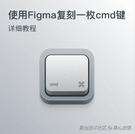
最终效果
我用css+svg复刻了这个按钮,效果如下
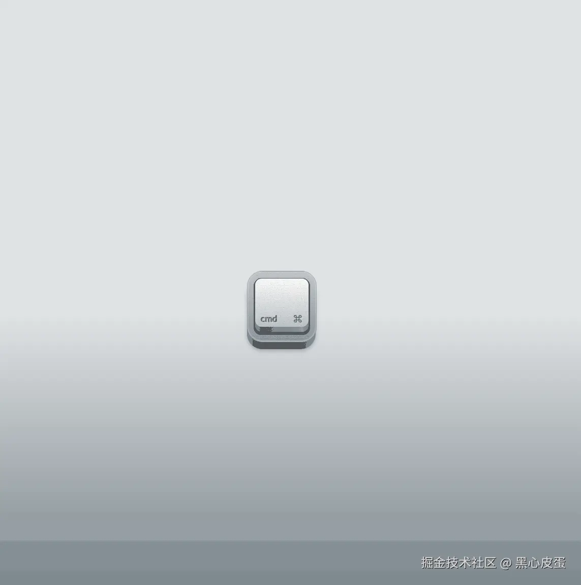
其中svg是用来做按钮上面的噪点效果的,剩下主要是一些阴影的应用,具体就不做过多解释,可以看代码.
完整代码
html
<!DOCTYPE html>
<html lang="zh-cn">
  <head>
    <meta charset="UTF-8" />
    <meta name="viewport" content="width=device-width, initial-scale=1.0" />
    <title>拟物按钮</title>
    <style>
      :root {
        --btn-top: 13px;
      }
      html,
      body {
        position: relative;
        width: 100%;
        height: 100%;
        display: flex;
        align-items: center;
        justify-content: center;
        background: linear-gradient(180deg, #dfe2e4 50%, #657178 100%);
      }
      .btn {
        position: relative;
        width: 135px;
        height: 138px;
        border-radius: 30px;
        cursor: pointer;
        background: linear-gradient(
          90deg,
          #7c8288 0%,
          #4d5357 20%,
          #54595d 74%,
          #878c92 100%
        );
        box-shadow: rgba(0, 0, 0, 0.24) 0px 3px 8px;
      }
      .btn-1 {
        position: absolute;
        top: -16px;
        width: 100%;
        height: 100%;
        border: 1px solid rgba(139, 138, 159, 0.5);
        border-radius: 30px;
        background: linear-gradient(180deg, #c7c8cb 0%, #88959f 100%);
        box-shadow: inset 0 -1px 3px rgba(255, 255, 255, 0.6);
        overflow: hidden;
        display: flex;
        align-items: center;
        justify-content: center;
      }
      .btn-2 {
        position: absolute;
        width: 111px;
        height: 111px;
        border-radius: 15px;
        background: #272727;
      }
      .btn-2__warpper {
        position: absolute;
        top: var(--btn-top);
        width: 105px;
        height: 105px;
        border-radius: 13px;
        background: linear-gradient(
          90deg,
          #8f8f8f 0%,
          #626463 13%,
          #979c9d 89%,
          #797b7c 100%
        );
        border: 1px solid rgba(0, 0, 0, 0.5);
        transition: all 0.15s ease-in-out;
      }
      .btn-2__body {
        position: absolute;
        border-radius: 13px;
        width: 105px;
        height: 95px;
        background: linear-gradient(180deg, #fff 0%, #bfc4c7 100%);
        display: flex;
        align-items: end;
        justify-content: space-between;
        padding: 4px 12px;
        box-sizing: border-box;
        color: #929798;
        text-shadow: -1px -1px 1px #000, 1px 1px 1px rgba(255, 255, 255, 0.5);
        user-select: none;
      }
      /* 噪点背景 */
      .noise {
        position: absolute;
        top: -16px;
        left: 0;
        border-radius: 30px;
        opacity: 0.4;
        z-index: 999;
        display: block;
        transform: scaleY(2.15);
        transform-origin: top;
        pointer-events: none;
      }
    </style>
  </head>
  <body>
    <div class="btn" onmousedown="btnDown()" onmouseup="btnUp()">
      <!-- 噪点背景 -->
      <svg
        class="noise"
        width="135px"
        height="70px"
        viewBox="0 0 135 70"
        xmlns="http://www.w3.org/2000/svg"
      >
        <filter id="noise">
          <feTurbulence
            type="turbulence"
            baseFrequency="3"
            numOctaves="1"
            stitchTiles="stitch"
          />
        </filter>
        <rect width="100%" height="100%" filter="url(#noise)" />
      </svg>
      <div class="btn-1">
        <!-- 按键 -->
        <div class="btn-2"></div>
        <!-- 按键下层圆角矩形 -->
        <div class="btn-2__warpper">
          <!-- 按键白色部分 -->
          <div class="btn-2__body">
            <!-- 文字部分 -->
            <span>cmd</span>
            <span>⌘</span>
          </div>
        </div>
      </div>
    </div>
  </body>
  <script>
    // 按键按下
    const btnDown = () => {
      document.documentElement.style.setProperty('--btn-top', '17px')
    }
    // 按键抬起
    const btnUp = () => {
      document.documentElement.style.setProperty('--btn-top', '13px')
    }
  </script>
</html>