Jetpack Compose 实现 Google 原生 PIN 锁屏解锁效果
在 Android 系统中,Google 原生的 PIN 锁屏解锁界面简洁又酷炫:
- 输入 PIN 时,上方圆点实时变化
- 数字键盘带点击波纹、触感反馈
- 全局确认按钮触发缩放动画
- 支持删除、清空操作,还原系统体验
这篇文章带大家用 Jetpack Compose 从零实现一个高度还原的 PIN 解锁界面。
🎯 效果展示
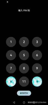
最终效果包含以下几个点:
✅ 数字键盘点击缩放、颜色过渡
✅ 输入 PIN → 上方圆点动态显示
✅ 支持删除、清空 PIN
✅ "确认键"触发全局缩放波纹动画
✅ 带触感反馈(Haptic Feedback)
🛠 整体思路
-
状态管理
- 使用
mutableStateListOf存储用户输入的密码。 - 输入 PIN → 更新状态 → 上方圆点重新绘制。
- 使用
-
圆点指示器
- 使用
Row + Box绘制实心圆点。 - 数量与密码长度绑定。
- 使用
-
数字键盘
- 使用
LazyVerticalGrid创建 3x4 的数字键盘。 - 包含数字键、删除键、确认键。
- 使用
-
按钮交互动画
- 每个按键是一个
PressEffectButton:- 点击时圆角 & 颜色渐变
- 松手后恢复
- 可被全局
SharedFlow触发缩放动画(例如确认键触发所有按钮波纹)。
- 每个按键是一个
-
触感反馈
- 使用
LocalHapticFeedback实现系统级震动反馈。
- 使用
📦 核心代码实现
PIN 输入页面
kotlin
@Composable
fun UnlockScreen() {
    // 全局动画触发器
    val triggerFlow = remember { MutableSharedFlow<Unit>() }
    val scop = rememberCoroutineScope()
    val password = remember { mutableStateListOf<Char>() }
    val haptic = LocalHapticFeedback.current

    Column(
        modifier = Modifier
            .fillMaxSize()
            .background(Color.Black)
            .statusBarsPadding()
            .navigationBarsPadding(),
        horizontalAlignment = Alignment.CenterHorizontally
    ) {
        // 标题
        Text(
            "输入 PIN 码",
            color = Color.White,
            modifier = Modifier.padding(top = 40.dp),
            style = TextStyle(fontSize = 16.sp, fontWeight = FontWeight.W600)
        )

        Spacer(modifier = Modifier.weight(1f))

        // 上方圆点指示器
        SecretDots(passwordLength = password.size)

        Spacer(modifier = Modifier.weight(1f))

        // 数字键盘
        LazyVerticalGrid(
            columns = GridCells.Fixed(3),
            modifier = Modifier.fillMaxWidth(),
            contentPadding = PaddingValues(36.dp)
        ) {
            items(12) { index ->
                val normalColor = if (index == 9 || index == 11) Color.Cyan else Color.White.copy(alpha = 0.2f)
                val normalTextColor = if (index == 9 || index == 11) Color.Black else Color.White

                PressEffectButton(
                    normalColor = normalColor,
                    triggerFlow = triggerFlow,
                    modifier = Modifier
                        .fillMaxWidth()
                        .aspectRatio(1f)
                        .padding(12.dp),
                    itemIndex = index,
                    onClick = {
                        when (index) {
                            // 删除键
                            9 -> if (password.isNotEmpty()) password.removeLast()
                            // 确认键 → 全局触发动画 + 清空输入
                            11 -> {
                                scop.launch { triggerFlow.emit(Unit) }
                                password.clear()
                            }
                            // 数字键
                            else -> password.add(('0' + ((index + 1) % 10)))
                        }
                        haptic.performHapticFeedback(HapticFeedbackType.Confirm)
                    }
                ) {
                    when (index) {
                        9 -> Icon(Icons.Filled.Close, null, tint = Color.Black)
                        11 -> Icon(Icons.Filled.ArrowForward, null, tint = Color.Black)
                        else -> Text("${(index + 1) % 10}", color = normalTextColor, fontSize = 24.sp, fontWeight = FontWeight.W700)
                    }
                }
            }
        }

        // 底部按钮
        Button(
            modifier = Modifier.padding(bottom = 30.dp),
            onClick = { /* 紧急呼叫逻辑 */ },
            colors = ButtonDefaults.buttonColors(containerColor = Color(0XFFADD8E6))
        ) {
            Text("紧急呼叫", color = Color.Black)
        }
    }
}
圆点指示器
scss
@Composable
fun SecretDots(passwordLength: Int, dotSize: Dp = 20.dp, dotSpacing: Dp = 10.dp) {
    Row(horizontalArrangement = Arrangement.spacedBy(dotSpacing)) {
        repeat(passwordLength) {
            Box(
                modifier = Modifier
                    .size(dotSize)
                    .background(Color.White, shape = CircleShape)
            )
        }
    }
}
带缩放/颜色过渡的按钮
scss
@Composable
fun PressEffectButton(
    modifier: Modifier = Modifier,
    normalColor: Color = Color.White.copy(alpha = 0.2f),
    pressedColor: Color = Color.Green,
    triggerFlow: MutableSharedFlow<Unit>,
    itemIndex: Int,
    onClick: () -> Unit,
    animationDuration: Int = 250,
    content: @Composable () -> Unit,
) {
    val cornerAnim = remember { Animatable(50f) }
    val colorAnim = remember { Animatable(normalColor) }
    val scaleAnim = remember { Animatable(1f) }

    // 监听全局触发
    LaunchedEffect(triggerFlow) {
        triggerFlow.collectLatest {
            delay(itemIndex * 50L)
            scaleAnim.animateTo(0.8f, tween(100))
            scaleAnim.animateTo(1f, tween(100))
        }
    }

    Box(
        modifier = modifier
            .graphicsLayer {
                scaleX = scaleAnim.value
                scaleY = scaleAnim.value
            }
            .background(colorAnim.value, RoundedCornerShape(percent = cornerAnim.value.toInt()))
            .pointerInput(Unit) {
                detectTapGestures(
                    onPress = {
                        coroutineScope {
                            launch { cornerAnim.animateTo(16f, tween(animationDuration)) }
                            launch { colorAnim.animateTo(pressedColor, tween(animationDuration)) }
                        }
                        val released = tryAwaitRelease()
                        coroutineScope {
                            launch { cornerAnim.animateTo(50f, tween(animationDuration)) }
                            launch { colorAnim.animateTo(normalColor, tween(animationDuration)) }
                            if (released) onClick()
                        }
                    }
                )
            },
        contentAlignment = Alignment.Center
    ) {
        content()
    }
}
✨ 优化点
-
触感反馈
使用
LocalHapticFeedback提升交互质感。 -
全局动画
确认键触发
SharedFlow,所有按钮按顺序缩放,营造"波纹扩散"的动效。 -
颜色/圆角过渡
Animatable控制颜色和圆角半径,点击时柔和过渡,避免生硬跳变。 -
扩展性
- PIN 长度可控(4/6 位)
- 支持错误输入时加上抖动动画
- 键盘样式可主题化(深色/浅色模式切换)
📌 总结
通过 Jetpack Compose,我们可以用非常声明式的写法实现一个 还原度极高的 PIN 锁屏解锁界面。
LazyVerticalGrid→ 数字键盘Animatable→ 按键动画SharedFlow→ 全局缩放波纹效果LocalHapticFeedback→ 系统级触感反馈
Compose 的优势在于 UI 与状态高度绑定,让类似系统解锁这种交互复杂的界面也能写得清晰易扩展。
👉 如果你觉得这篇文章有帮助,欢迎点赞 + 收藏,我会继续分享更多 Compose 自定义控件实战 🙌