Tailwind CSS 是一个实用的 CSS 框架,通过提供低级别的实用类来快速构建自定义设计。下面我将通过多个示例展示如何使用 Tailwind。
基础示例
html
<!DOCTYPE html>
<html lang="zh-CN">
<head>
    <meta charset="UTF-8">
    <meta name="viewport" content="width=device-width, initial-scale=1.0">
    <title>Tailwind CSS 示例</title>
    <script src="https://cdn.tailwindcss.com"></script>
</head>
<body class="bg-gray-100 p-6">
    <!-- 文本样式 -->
    <h1 class="text-3xl font-bold text-blue-600 mb-4">Tailwind CSS 示例</h1>

    <!-- 按钮样式 -->
    <button class="bg-blue-500 hover:bg-blue-700 text-white font-bold py-2 px-4 rounded">
        主要按钮
    </button>

    <!-- 卡片组件 -->
    <div class="max-w-sm rounded overflow-hidden shadow-lg mt-6">
        <div class="px-6 py-4">
            <div class="font-bold text-xl mb-2">卡片标题</div>
            <p class="text-gray-700 text-base">
                这是一个使用 Tailwind CSS 构建的卡片组件示例。
            </p>
        </div>
    </div>
</body>
</html>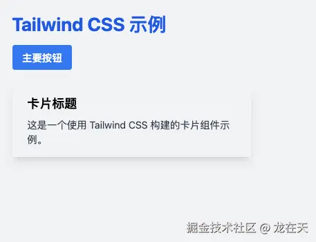
布局示例
html
<!DOCTYPE html>
<html lang="zh-CN">
<head>
<meta charset="UTF-8">
<meta name="viewport" content="width=device-width, initial-scale=1.0">
<title>Tailwind 布局示例</title>
<script src="https://cdn.tailwindcss.com"></script>
</head>
<body class="bg-gray-100 p-6">
<!-- Flexbox 布局 -->
<div class="flex flex-col md:flex-row gap-4 mb-8">
<div class="flex-1 bg-white p-4 rounded shadow">
<h2 class="text-xl font-semibold mb-2">Flex 项目 1</h2>
<p>在移动设备上垂直排列,在中等屏幕上水平排列。</p>
</div>
<div class="flex-1 bg-white p-4 rounded shadow">
<h2 class="text-xl font-semibold mb-2">Flex 项目 2</h2>
<p>响应式设计让布局适应各种屏幕尺寸。</p>
</div>
<div class="flex-1 bg-white p-4 rounded shadow">
<h2 class="text-xl font-semibold mb-2">Flex 项目 3</h2>
<p>使用 gap 类轻松添加间距。</p>
</div>
</div>
<!-- Grid 布局 -->
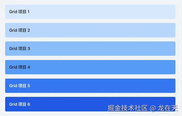
<div class="grid grid-cols-1 md:grid-cols-3 gap-4">
<div class="bg-blue-100 p-4 rounded">Grid 项目 1</div>
<div class="bg-blue-200 p-4 rounded">Grid 项目 2</div>
<div class="bg-blue-300 p-4 rounded">Grid 项目 3</div>
<div class="bg-blue-400 p-4 rounded">Grid 项目 4</div>
<div class="bg-blue-500 p-4 rounded text-white">Grid 项目 5</div>
<div class="bg-blue-600 p-4 rounded text-white">Grid 项目 6</div>
</div>
</body>
</html>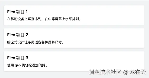
表单示例
html
<!DOCTYPE html>
<html lang="zh-CN">
<head>
    <meta charset="UTF-8">
    <meta name="viewport" content="width=device-width, initial-scale=1.0">
    <title>Tailwind 表单示例</title>
    <script src="https://cdn.tailwindcss.com"></script>
</head>
<body class="bg-gray-100 p-6">
    <div class="max-w-md mx-auto bg-white p-6 rounded-lg shadow-md">
        <h2 class="text-2xl font-bold mb-6 text-center">用户注册</h2>

        <form>
            <div class="mb-4">
                <label class="block text-gray-700 text-sm font-bold mb-2" for="username">
                    用户名
                </label>
                <input class="shadow appearance-none border rounded w-full py-2 px-3 text-gray-700 leading-tight focus:outline-none focus:shadow-outline" id="username" type="text" placeholder="请输入用户名">
            </div>

            <div class="mb-4">
                <label class="block text-gray-700 text-sm font-bold mb-2" for="email">
                    电子邮箱
                </label>
                <input class="shadow appearance-none border rounded w-full py-2 px-3 text-gray-700 leading-tight focus:outline-none focus:shadow-outline" id="email" type="email" placeholder="请输入电子邮箱">
            </div>

            <div class="mb-6">
                <label class="block text-gray-700 text-sm font-bold mb-2" for="password">
                    密码
                </label>
                <input class="shadow appearance-none border rounded w-full py-2 px-3 text-gray-700 mb-3 leading-tight focus:outline-none focus:shadow-outline" id="password" type="password" placeholder="请输入密码">
            </div>

            <div class="flex items-center justify-between">
                <button class="bg-blue-500 hover:bg-blue-700 text-white font-bold py-2 px-4 rounded focus:outline-none focus:shadow-outline" type="button">
                    注册
                </button>
                <a class="inline-block align-baseline font-bold text-sm text-blue-500 hover:text-blue-800" href="#">
                    忘记密码?
                </a>
            </div>
        </form>
    </div>
</body>
</html>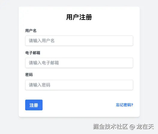
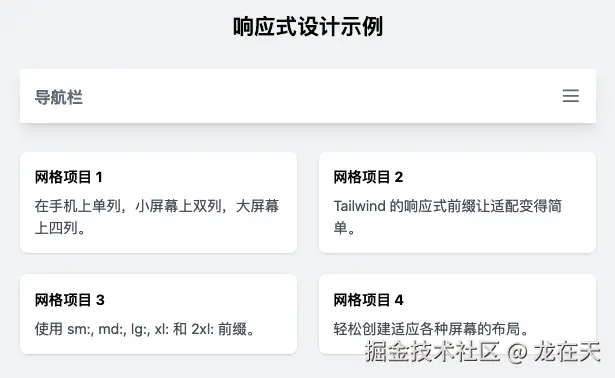
响应式设计示例
html
<!DOCTYPE html>
<html lang="zh-CN">
<head>
    <meta charset="UTF-8">
    <meta name="viewport" content="width=device-width, initial-scale=1.0">
    <title>Tailwind 响应式示例</title>
    <script src="https://cdn.tailwindcss.com"></script>
</head>
<body class="bg-gray-100 p-6">
    <div class="container mx-auto">
        <h1 class="text-2xl md:text-4xl font-bold text-center mb-8">响应式设计示例</h1>

        <!-- 响应式导航栏 -->
        <nav class="bg-white shadow-lg mb-8">
            <div class="max-w-6xl mx-auto px-4">
                <div class="flex justify-between">
                    <div class="flex space-x-7">
                        <div>
                            <a href="#" class="flex items-center py-4">
                                <span class="font-semibold text-gray-500 text-lg">导航栏</span>
                            </a>
                        </div>
                    </div>
                    <div class="hidden md:flex items-center space-x-3">
                        <a href="#" class="py-2 px-2 font-medium text-gray-500 rounded hover:bg-blue-500 hover:text-white transition duration-300">首页</a>
                        <a href="#" class="py-2 px-2 font-medium text-gray-500 rounded hover:bg-blue-500 hover:text-white transition duration-300">服务</a>
                        <a href="#" class="py-2 px-2 font-medium text-gray-500 rounded hover:bg-blue-500 hover:text-white transition duration-300">关于</a>
                        <a href="#" class="py-2 px-2 font-medium text-gray-500 rounded hover:bg-blue-500 hover:text-white transition duration-300">联系</a>
                    </div>
                    <div class="md:hidden flex items-center">
                        <button class="outline-none mobile-menu-button">
                            <svg class="w-6 h-6 text-gray-500" fill="none" stroke-linecap="round" stroke-linejoin="round" stroke-width="2" viewBox="0 0 24 24" stroke="currentColor">
                                <path d="M4 6h16M4 12h16M4 18h16"></path>
                            </svg>
                        </button>
                    </div>
                </div>
            </div>
        </nav>

        <!-- 响应式网格 -->
        <div class="grid grid-cols-1 sm:grid-cols-2 lg:grid-cols-4 gap-6">
            <div class="bg-white rounded-lg shadow p-4">
                <h3 class="font-bold mb-2">网格项目 1</h3>
                <p class="text-gray-600">在手机上单列,小屏幕上双列,大屏幕上四列。</p>
            </div>
            <div class="bg-white rounded-lg shadow p-4">
                <h3 class="font-bold mb-2">网格项目 2</h3>
                <p class="text-gray-600">Tailwind 的响应式前缀让适配变得简单。</p>
            </div>
            <div class="bg-white rounded-lg shadow p-4">
                <h3 class="font-bold mb-2">网格项目 3</h3>
                <p class="text-gray-600">使用 sm:, md:, lg:, xl: 和 2xl: 前缀。</p>
            </div>
            <div class="bg-white rounded-lg shadow p-4">
                <h3 class="font-bold mb-2">网格项目 4</h3>
                <p class="text-gray-600">轻松创建适应各种屏幕的布局。</p>
            </div>
        </div>

        <!-- 响应式文本 -->
        <div class="mt-8 p-4 bg-blue-100 rounded-lg">
            <p class="text-sm md:text-base lg:text-lg xl:text-xl">这段文字会随着屏幕尺寸增大而变大,使用响应式文本类实现。</p>
        </div>
    </div>
</body>
</html>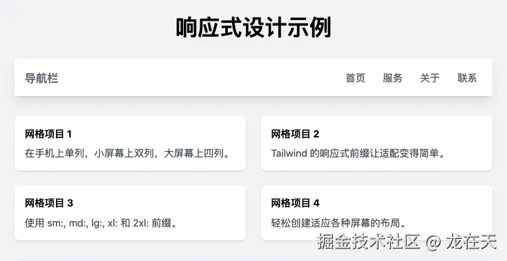
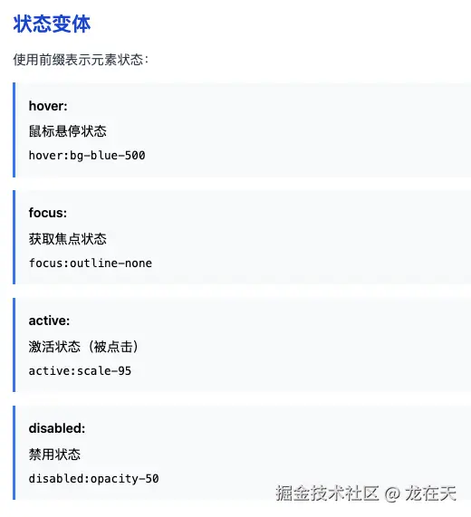
悬停和焦点状态示例
html
<!DOCTYPE html>
<html lang="zh-CN">
<head>
    <meta charset="UTF-8">
    <meta name="viewport" content="width=device-width, initial-scale=1.0">
    <title>Tailwind 状态示例</title>
    <script src="https://cdn.tailwindcss.com"></script>
</head>
<body class="bg-gray-100 p-6">
    <div class="max-w-md mx-auto">
        <h1 class="text-2xl font-bold mb-6">状态交互示例</h1>

        <!-- 悬停效果 -->
        <div class="mb-6">
            <h2 class="text-xl font-semibold mb-3">悬停效果</h2>
            <button class="bg-green-500 hover:bg-green-700 text-white font-bold py-2 px-4 rounded transition duration-300 ease-in-out transform hover:-translate-y-1 hover:scale-110">
                悬停我有动画
            </button>
        </div>

        <!-- 焦点效果 -->
        <div class="mb-6">
            <h2 class="text-xl font-semibold mb-3">焦点效果</h2>
            <input class="shadow appearance-none border rounded w-full py-2 px-3 text-gray-700 leading-tight focus:outline-none focus:ring-2 focus:ring-blue-500 focus:border-transparent" type="text" placeholder="点击我有焦点效果">
        </div>

        <!-- 激活状态 -->
        <div class="mb-6">
            <h2 class="text-xl font-semibold mb-3">激活状态</h2>
            <button class="bg-red-500 active:bg-red-800 text-white font-bold py-2 px-4 rounded">
                点击查看激活状态
            </button>
        </div>

        <!-- 禁用状态 -->
        <div class="mb-6">
            <h2 class="text-xl font-semibold mb-3">禁用状态</h2>
            <button class="bg-gray-500 text-white font-bold py-2 px-4 rounded opacity-50 cursor-not-allowed" disabled>
                禁用按钮
            </button>
        </div>
    </div>
</body>
</html>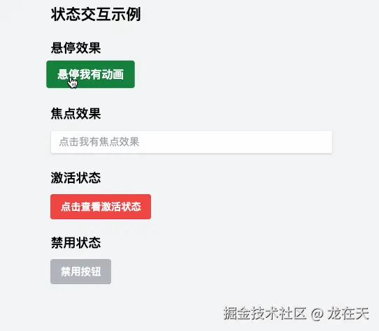
实际应用:个人资料卡片
html
<!DOCTYPE html>
<html lang="zh-CN">
<head>
    <meta charset="UTF-8">
    <meta name="viewport" content="width=device-width, initial-scale=1.0">
    <title>个人资料卡片</title>
    <script src="https://cdn.tailwindcss.com"></script>
</head>
<body class="bg-gray-200 min-h-screen flex items-center justify-center p-4">
    <div class="bg-white rounded-2xl shadow-xl overflow-hidden w-full max-w-md">
        <div class="bg-cover bg-center h-56 p-4" style="background-image: url(https://images.unsplash.com/photo-1579546929662-711aa81148cf?ixlib=rb-1.2.1&auto=format&fit=crop&w=750&q=80)">
            <div class="flex justify-end">
                <svg class="h-6 w-6 text-white fill-current" xmlns="http://www.w3.org/2000/svg" viewBox="0 0 24 24">
                    <path d="M12 21.35l-1.45-1.32C5.4 15.36 2 12.28 2 8.5 2 5.42 4.42 3 7.5 3c1.74 0 3.41.81 4.5 2.09C13.09 3.81 14.76 3 16.5 3 19.58 3 22 5.42 22 8.5c0 3.78-3.4 6.86-8.55 11.54L12 21.35z"/>
                </svg>
            </div>
        </div>
        <div class="flex justify-center -mt-16">
            <img class="rounded-full border-4 border-white h-32 w-32" src="https://images.unsplash.com/photo-1500648767791-00dcc994a43e?ixlib=rb-1.2.1&ixid=eyJhcHBfaWQiOjEyMDd9&auto=format&fit=facearea&facepad=2.25&w=256&h=256&q=80" alt="个人头像">
        </div>
        <div class="text-center px-3 pb-6 pt-2">
            <h3 class="text-2xl font-bold text-gray-800">张三</h3>
            <p class="mt-2 text-sm text-gray-600">前端开发工程师 | UI设计师</p>
        </div>
        <div class="flex justify-center pb-6 text-gray-600">
            <div class="text-center mr-6">
                <h2 class="text-xl font-bold">245</h2>
                <span>项目</span>
            </div>
            <div class="text-center mr-6">
                <h2 class="text-xl font-bold">3.8K</h2>
                <span>关注者</span>
            </div>
            <div class="text-center">
                <h2 class="text-xl font-bold">126</h2>
                <span>关注中</span>
            </div>
        </div>
        <div class="flex justify-center pb-6">
            <button class="bg-blue-500 hover:bg-blue-700 text-white font-bold py-2 px-4 rounded-full">
                关注
            </button>
            <button class="ml-4 bg-white hover:bg-gray-200 text-gray-800 font-bold py-2 px-4 border border-gray-400 rounded-full">
                发消息
            </button>
        </div>
    </div>
</body>
</html>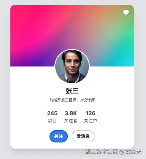
总结
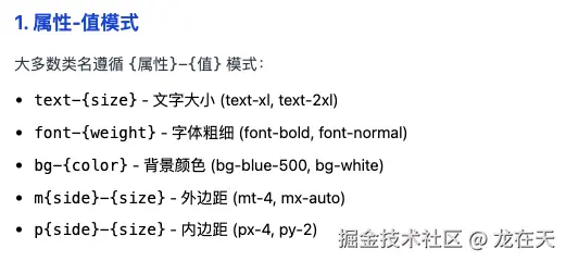
如何记忆 Tailwind 类名
理解命名模式
Tailwind 的类名不是随机的,而是遵循一套系统模式:
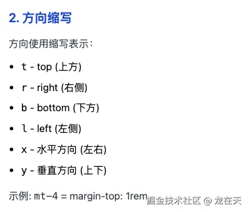
{属性}-{值}(如:text-center,bg-red-500){属性}{方向}-{值}(如:mt-4,px-2){状态}:{属性}-{值}(如:hover:bg-blue-700)
掌握核心缩写
- 方向: t (top), r (right), b (bottom), l (left), x (水平), y (垂直)
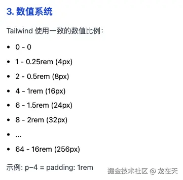
- 属性: m (margin), p (padding), w (width), h (height), bg (background)
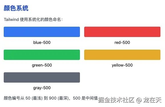
- 颜色: 颜色名-深浅度 (blue-500, gray-800)
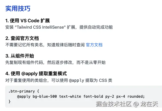
使用工具辅助
- VS Code 扩展: Tailwind CSS IntelliSense 提供自动补全
- 官方文档: 随时查阅,不需要记住所有类名
- 开发者工具: 浏览器中实时调试和查看效果
实践胜过记忆
通过实际项目练习,你会自然记住最常用的类名。不常用的类名随时查阅文档即可。
记住:Tailwind 的设计理念是提供一套系统化的工具集,而不是要求你记住所有类名。掌握其命名规律比记忆具体类名更重要。
以上示例展示了 Tailwind CSS 的核心功能:
- 实用类优先:通过组合简单类实现复杂样式
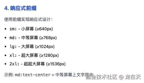
- 响应式设计 :使用前缀如
sm:,md:,lg:等实现响应式布局 - 状态变体 :使用
hover:,focus:,active:等处理交互状态 - 间距系统:使用一致的间距比例系统
- 颜色系统:预定义的颜色调色板
Tailwind 的优势在于可以快速构建自定义 UI,而无需编写自定义 CSS,同时保持代码的一致性和可维护性。