这套 CSS 规则的核心是一种非常巧妙的"视觉欺骗"技巧,它通过 主体 和 两个伪元素 的拼接,来创造出带有"反向圆角"的 Tab 凸起效果。
其实现思路可以拆解为以下三个步骤:
1. 主体形状 (.tab-item.active)
- 这是我们能直接看到的、带有文字的 Tab 主体部分。
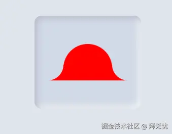
background-color: red;:这是整个效果能够成立的关键 。这个颜色必须和<body>的背景色(在您的代码中是#e0e5ec)完全一样。当颜色相同时,它就能和页面背景融为一体,产生"浮出"的错觉。您在 Canvas 中看到的red应该是一个为了调试或演示而设置的临时颜色。border-radius: 162px 162px 0 0;:这为主体的左上角和右上角设置了非常大的圆角,而底部两个角则保持直角,构成了 Tab 凸起的基本形状。
2. "反向圆角"的原材料 (.tab-item.active::before, ::after)
- 这是整个技巧最核心、最神奇的部分。我们使用
::before和::after这两个伪元素来分别构造左右两边的"凹陷"圆角。 - 画一个大圆 :我们并没有直接画一个圆角,而是先用
border-radius: 100%和box-shadow: 0 0 0 40px red画了两个巨大的、和背景色相同的实心圆。使用box-shadow而非background是一个聪明的技巧,因为它不占据实际的布局空间,便于定位。 - 精确定位 :通过
position: absolute、bottom: 0和left: -55px/right: -55px,我们将这两个大圆正好放置在了主体部分的左下角和右下角的外侧。
3. 裁剪与拼接 (clip-path)
-
现在我们有了两个紧贴着主体的大圆,但我们实际上只需要每个圆的四分之一来形成那个"凹陷"的弧度。
-
clip-path登场 :clip-path属性就像一把剪刀,可以裁剪掉元素不需要的部分。- 对于左边的
::before,clip-path: inset(50% -10px 0 50%)裁剪掉了圆的"左半部分"和"上半部分",只留下了右下角的四分之一。 - 对于右边的
::after,clip-path: inset(50% 50% 0 -10px)裁剪掉了圆的"右半部分"和"上半部分",只留下了左下角的四分之一。
- 对于左边的
-
完成拼接:这样一来,两个被裁剪后的四分之一圆弧,就完美地与主体的直角底部拼接在了一起,从视觉上"覆盖"了灰色容器的直角,从而形成了流畅的、内凹的反向圆角效果。
xml
<!DOCTYPE html>
<html lang="zh-CN">

<head>
    <meta charset="UTF-8">
    <meta name="viewport" content="width=device-width, initial-scale=1.0">
    <title>纯净版反向圆角Tabs</title>
    <style>
        @import url('https://fonts.googleapis.com/css2?family=Inter:wght@400;500;600&display=swap');

        /* --- 基础和布局样式 --- */
        body {
            font-family: 'Inter', sans-serif;
            display: grid;
            place-items: center;
            min-height: 100vh;
            margin: 0;
            background-color: #e0e5ec;
        }

        /* --- Tab 容器样式 --- */
        .tab {
            display: flex;
            background-color: #d1d9e6;
            padding: 50px;
            border-radius: 12px;
            box-shadow: inset 5px 5px 10px #babecc, inset -5px -5px 10px #f0f2f5;
        }

        /* --- Tab-Item 默认样式 --- */
        .tab-item {
            position: relative; /* 为伪元素提供定位上下文 */
            padding: 12px 23px;
            font-size: 16px;
            font-weight: 500;
            color: #6d6d6d;
            cursor: pointer;
            transition: color 0.3s ease;
            white-space: nowrap;
            border-radius: 12px;
        }

        /* --- 激活状态下的样式 --- */
        .tab-item.active {
            width:40px;
            height:40px;
            color: #1a73e8;
            background-color: red; /* 背景色必须与页面背景一致 */
            border-radius: 162px 162px 0 0;
            transition: color 0.3s ease;
        }

        /* 隐藏非激活状态下的伪元素 */
        .tab-item::before,
        .tab-item::after {
            content: '';
            position: absolute;
            bottom: 0;
            opacity: 0;
            pointer-events: none;
            transition: opacity 0.3s ease;
        }

        /*
         * --- 魔法核心: 伪元素拼接反向圆角 ---
         * 激活状态下显示伪元素,并赋予它们固定的尺寸和样式
         */
        .tab-item.active::before,
        .tab-item.active::after {
            opacity: 1;
            width: 55px;  /* 反向圆角尺寸 */
            height: 55px; /* 反向圆角尺寸 */
            border-radius: 100%;
            /* 使用与页面背景色一致的阴影来填充圆形 */
            box-shadow: 0 0 0 40px red;
        }

        /* 左侧反向圆角 */
        .tab-item.active::before {
            left: -55px; /* 根据尺寸定位 */
            clip-path: inset(50% -10px 0 50%);
        }

        /* 右侧反向圆角 */
        .tab-item.active::after {
            right: -55px; /* 根据尺寸定位 */
            clip-path: inset(50% 50% 0 -10px);
        }
    </style>
</head>

<body>

    <nav class="tab">
        <a class="tab-item active"></a>
    </nav>

    <script>
        document.addEventListener('DOMContentLoaded', () => {
            const tabItems = document.querySelectorAll('.tab-item');

            tabItems.forEach(item => {
                item.addEventListener('click', () => {
                    // 移除所有兄弟元素的 active 类
                    tabItems.forEach(i => i.classList.remove('active'));
                    // 为当前点击的项添加 active 类
                    item.classList.add('active');
                });
            });
        });
    </script>
</body>

</html>