大家好,我是大华! 今天给大家分享两个 CSS + Vue3 实现的3D卡片翻转动画效果,可以让咱们的网页瞬间提升N个档次!
3D 翻转卡片
直接看效果图
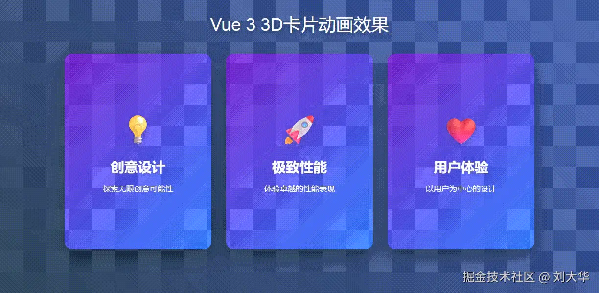
当鼠标悬停在卡片上时,卡片会以3D方式翻转展示背面内容,并伴有光泽流动效果。 这种效果非常适合产品展示、功能介绍等场景!感兴趣的朋友可以瞅瞅!
实现思路
- 使用CSS3的3D变换属性实现卡片翻转效果
- 通过伪元素创建光泽动画效果
- 使用渐变色背景提升视觉体验
Vue3 代码结构
html
<template>
  <div class="container">
    <h1>Vue 3 3D卡片动画效果</h1>
    <div class="card-grid">
      <div
        v-for="(card, index) in cards"
        :key="index"
        class="card"
      >
        <!-- 卡片内层容器(用于3D旋转) -->
        <div class="card-inner">
          <!-- 正面 -->
          <div class="card-face card-front shine-effect">
            <div class="card-icon">{{ card.frontIcon }}</div>
            <div class="card-title">{{ card.frontTitle }}</div>
            <div class="card-content">{{ card.frontContent }}</div>
          </div>

          <!-- 背面 -->
          <div class="card-face card-back">
            <div class="card-title">{{ card.backTitle }}</div>
            <div class="card-content">{{ card.backContent }}</div>
            <button class="card-button">了解更多</button>
          </div>
        </div>
      </div>
    </div>
  </div>
</template>
<script setup>
import { ref } from 'vue';

// 定义卡片数据(前后内容)
const cards = ref([
  {
    frontIcon: '💡',
    frontTitle: '创意设计',
    frontContent: '探索无限创意可能性',
    backTitle: '创意解决方案',
    backContent: '我们提供独特的设计思路和创意解决方案,帮助您的项目脱颖而出。'
  },
  {
    frontIcon: '🚀',
    frontTitle: '极致性能',
    frontContent: '体验卓越的性能表现',
    backTitle: '性能优化',
    backContent: '通过先进的技术优化,确保您的应用运行流畅、响应迅速。'
  },
  {
    frontIcon: '❤️',
    frontTitle: '用户体验',
    frontContent: '以用户为中心的设计',
    backTitle: '用户至上',
    backContent: '我们始终将用户体验放在首位,打造直观易用的交互界面。'
  }
]);
</script>
核心CSS样式
css
<style scoped>
/* 容器样式 */
.container {
  display: flex;
  flex-direction: column;
  align-items: center;
  max-width: 100%;
  padding: 20px;
  background: linear-gradient(45deg, #2c3e50, #4a69bd);
  font-family: 'Arial', sans-serif;
  overflow: hidden;
  height: 90dvh;
  padding-top: 50px;
}

/* 卡片网格布局 */
.card-grid {
  display: flex;
  flex-wrap: wrap;
  justify-content: center;
  gap: 30px;
  width: 100%;
}

/* 卡片容器 - 关键3D透视设置 */
.card {
  width: 300px;
  height: 400px;
  perspective: 1500px; /* 3D透视效果 */
  cursor: pointer;
}

/* 卡片内层 - 实现3D翻转 */
.card-inner {
  position: relative;
  width: 100%;
  height: 100%;
  transform-style: preserve-3d; /* 保持3D空间 */
  transition: transform 0.8s cubic-bezier(0.175, 0.885, 0.32, 1.275);
  box-shadow: 0 15px 35px rgba(0, 0, 0, 0.3);
  border-radius: 15px;
}

/* 悬停时翻转卡片 */
.card:hover .card-inner {
  transform: rotateY(180deg);
}

/* 卡片正面和背面共用样式 */
.card-face {
  position: absolute;
  width: 100%;
  height: 100%;
  backface-visibility: hidden; /* 隐藏背面 */
  border-radius: 15px;
  display: flex;
  flex-direction: column;
  justify-content: center;
  align-items: center;
  padding: 20px;
  overflow: hidden;
}

/* 正面样式 */
.card-front {
  background: linear-gradient(135deg, #6a11cb 0%, #2575fc 100%);
  color: white;
}

/* 背面样式 - 初始时已翻转180度 */
.card-back {
  background: linear-gradient(135deg, #ff758c 0%, #ff7eb3 100%);
  color: white;
  transform: rotateY(180deg);
}

/* 光泽效果 */
.shine-effect::before {
  content: '';
  position: absolute;
  top: -50%;
  left: -50%;
  width: 200%;
  height: 200%;
  background: rgba(255, 255, 255, 0.1);
  transform: rotate(45deg);
  transition: all 0.6s ease;
  pointer-events: none;
}

.card:hover .shine-effect::before {
  transform: translate(50%, 50%) rotate(45deg);
}
</style>
关键点
- perspective属性:为父元素设置透视,创建3D空间感
- transform-style: preserve-3d:保持子元素在3D空间中的位置关系
- backface-visibility: hidden:隐藏元素背面,避免翻转时内容重叠
- cubic-bezier过渡:使用自定义缓动函数使动画更生动
- 伪元素动画:使用::before创建光泽流动效果
3D 翻转卡片完整代码
html
<template>
  <div class="container">
    <h1>Vue 3 3D卡片动画效果</h1>
    <div class="card-grid">
      <div
        v-for="(card, index) in cards"
        :key="index"
        class="card"
      >
        <!-- 卡片内层容器(用于3D旋转) -->
        <div class="card-inner">
          <!-- 正面 -->
          <div class="card-face card-front shine-effect">
            <div class="card-icon">{{ card.frontIcon }}</div>
            <div class="card-title">{{ card.frontTitle }}</div>
            <div class="card-content">{{ card.frontContent }}</div>
          </div>

          <!-- 背面 -->
          <div class="card-face card-back">
            <div class="card-title">{{ card.backTitle }}</div>
            <div class="card-content">{{ card.backContent }}</div>
            <button class="card-button">了解更多</button>
          </div>
        </div>
      </div>
    </div>
  </div>
</template>

<script setup>
import { ref } from 'vue';

// 定义卡片数据(前后内容)
const cards = ref([
  {
    frontIcon: '💡',
    frontTitle: '创意设计',
    frontContent: '探索无限创意可能性',
    backTitle: '创意解决方案',
    backContent: '我们提供独特的设计思路和创意解决方案,帮助您的项目脱颖而出。'
  },
  {
    frontIcon: '🚀',
    frontTitle: '极致性能',
    frontContent: '体验卓越的性能表现',
    backTitle: '性能优化',
    backContent: '通过先进的技术优化,确保您的应用运行流畅、响应迅速。'
  },
  {
    frontIcon: '❤️',
    frontTitle: '用户体验',
    frontContent: '以用户为中心的设计',
    backTitle: '用户至上',
    backContent: '我们始终将用户体验放在首位,打造直观易用的交互界面。'
  }
]);
</script>

<style scoped>

.container {
  display: flex;
  flex-direction: column;
  align-items: center;
  max-width: 100%;
  padding: 20px;
  background: linear-gradient(45deg, #2c3e50, #4a69bd);
  font-family: 'Arial', sans-serif;
  overflow: hidden;
  height: 90dvh;
  padding-top: 50px;
}

h1 {
  text-align: center;
  color: white;
  margin-bottom: 40px;
  font-size: 36px;
  text-shadow: 0 2px 10px rgba(0, 0, 0, 0.3);
}

.card-grid {
  display: flex;
  flex-wrap: wrap;
  justify-content: center;
  gap: 30px;
  width: 100%;
}

/* 卡片容器 */
.card {
  width: 300px;
  height: 400px;
  perspective: 1500px;
  cursor: pointer;
}

/* 卡片内层 - 实现3D翻转 */
.card-inner {
  position: relative;
  width: 100%;
  height: 100%;
  transform-style: preserve-3d;
  transition: transform 0.8s cubic-bezier(0.175, 0.885, 0.32, 1.275);
  box-shadow: 0 15px 35px rgba(0, 0, 0, 0.3);
  border-radius: 15px;
}

.card:hover .card-inner {
  transform: rotateY(180deg);
}

/* 正面与背面共用样式 */
.card-face {
  position: absolute;
  width: 100%;
  height: 100%;
  backface-visibility: hidden;
  border-radius: 15px;
  display: flex;
  flex-direction: column;
  justify-content: center;
  align-items: center;
  padding: 20px;
  overflow: hidden;
}

/* 正面样式 */
.card-front {
  background: linear-gradient(135deg, #6a11cb 0%, #2575fc 100%);
  color: white;
}

/* 背面样式 */
.card-back {
  background: linear-gradient(135deg, #ff758c 0%, #ff7eb3 100%);
  color: white;
  transform: rotateY(180deg);
}

/* 图标 */
.card-icon {
  font-size: 60px;
  margin-bottom: 20px;
  text-shadow: 0 5px 15px rgba(0, 0, 0, 0.2);
}

/* 标题 */
.card-title {
  font-size: 28px;
  font-weight: bold;
  margin-bottom: 15px;
  text-align: center;
  text-shadow: 0 2px 10px rgba(0, 0, 0, 0.2);
}

/* 内容文本 */
.card-content {
  text-align: center;
  line-height: 1.6;
  font-size: 16px;
  padding: 0 15px;
}

/* 按钮 */
.card-button {
  margin-top: 25px;
  padding: 12px 30px;
  background: rgba(255, 255, 255, 0.2);
  border: 2px solid white;
  color: white;
  border-radius: 50px;
  font-weight: bold;
  cursor: pointer;
  transition: all 0.3s ease;
  backdrop-filter: blur(5px);
}

.card-button:hover {
  background: white;
  color: #ff758c;
  transform: translateY(-3px);
  box-shadow: 0 5px 15px rgba(0, 0, 0, 0.2);
}

/* 光泽效果 */
.shine-effect::before {
  content: '';
  position: absolute;
  top: -50%;
  left: -50%;
  width: 200%;
  height: 200%;
  background: rgba(255, 255, 255, 0.1);
  transform: rotate(45deg);
  transition: all 0.6s ease;
  pointer-events: none;
}

.card:hover .shine-effect::before {
  transform: translate(50%, 50%) rotate(45deg);
}
</style>
3D悬停卡片
效果图 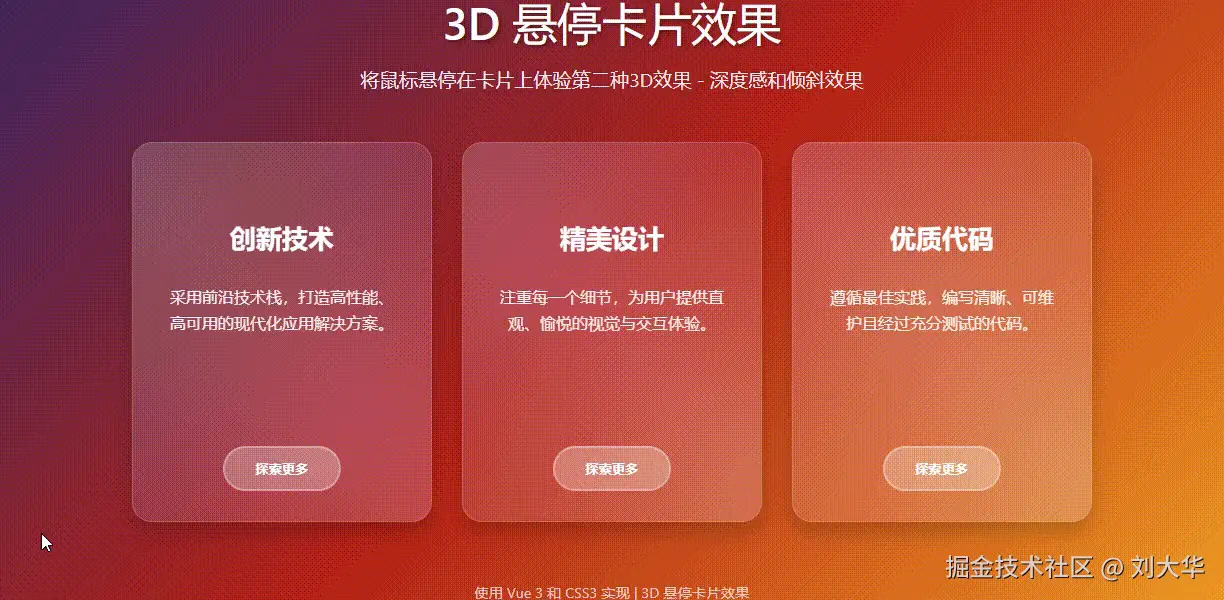
当鼠标悬停时卡片会浮起、倾斜并产生动态的光泽效果,同时所有的元素会有深度感变化。
实现思路
- 使用CSS3的3D变换和透视效果创造深度感
- 利用玻璃态设计(Glassmorphism)增强现代感
- 通过多层动画和过渡效果创造丰富交互体验
Vue3 代码结构
html
<template>
  <div class="container">
    <h1>3D 悬停卡片效果</h1>

    <div class="cards-container">
      <div
        v-for="(card, index) in cards"
        :key="index"
        class="card"
      >
        <!-- 反光层 -->
        <div class="card-glare"></div>

        <!-- 图标 -->
        <div class="card-icon">
          <i :class="card.icon"></i>
        </div>

        <!-- 标题 -->
        <h3 class="card-title">{{ card.title }}</h3>

        <!-- 内容 -->
        <p class="card-content">{{ card.content }}</p>

        <!-- 按钮 -->
        <button class="card-button">探索更多</button>
      </div>
    </div>
  </div>
</template>
<script setup>
import { ref } from 'vue';

// 定义卡片数据
const cards = ref([
  {
    icon: 'fas fa-rocket',
    title: '创新技术',
    content: '采用前沿技术栈,打造高性能、高可用的现代化应用解决方案。'
  },
  {
    icon: 'fas fa-paint-brush',
    title: '精美设计',
    content: '注重每一个细节,为用户提供直观、愉悦的视觉与交互体验。'
  },
  {
    icon: 'fas fa-code',
    title: '优质代码',
    content: '遵循最佳实践,编写清晰、可维护且经过充分测试的代码。'
  }
]);
</script>
核心CSS样式
css
<style scoped>
/* 容器样式 - 渐变背景 */
.container {
  max-width: 100%;
  text-align: center;
  color: white;
  background: linear-gradient(135deg, #1a2a6c, #b21f1f, #fdbb2d);
  font-family: 'Segoe UI', Tahoma, Geneva, Verdana, sans-serif;
  overflow-x: hidden;
  padding: 20px;
}

/* 卡片容器 - 设置3D透视 */
.cards-container {
  display: flex;
  flex-wrap: wrap;
  justify-content: center;
  gap: 30px;
  perspective: 1000px; /* 创建3D透视环境 */
}

/* 卡片基础样式 - 玻璃态效果 */
.card {
  width: 300px;
  height: 380px;
  border-radius: 20px;
  background: rgba(255, 255, 255, 0.1);
  backdrop-filter: blur(10px); /* 毛玻璃效果 */
  border: 1px solid rgba(255, 255, 255, 0.2);
  padding: 30px;
  display: flex;
  flex-direction: column;
  align-items: center;
  transition: all 0.5s cubic-bezier(0.175, 0.885, 0.32, 1.275);
  transform-style: preserve-3d; /* 保持3D空间 */
  box-shadow: 0 10px 20px rgba(0, 0, 0, 0.2);
  position: relative;
  overflow: hidden;
  cursor: pointer;
}

/* 悬停时的3D变换效果 */
.card:hover {
  transform: translateY(-15px) rotateX(5deg) rotateY(-5deg) scale(1.03);
  box-shadow: 0 20px 30px rgba(0, 0, 0, 0.3);
}

/* 图标样式与3D效果 */
.card-icon {
  font-size: 60px;
  margin-bottom: 25px;
  color: #fff;
  transition: all 0.3s ease;
  transform: translateZ(30px); /* 初始Z轴位移 */
}

.card:hover .card-icon {
  transform: translateZ(50px) scale(1.2); /* 悬停时增加Z轴位移 */
  color: #ffdb58;
}

/* 标题样式与3D效果 */
.card-title {
  font-size: 26px;
  font-weight: 700;
  margin-bottom: 15px;
  transition: all 0.3s ease;
  transform: translateZ(20px);
}

.card:hover .card-title {
  transform: translateZ(40px);
  color: #ffdb58;
}

/* 光泽效果实现 */
.card-glare {
  position: absolute;
  top: 0;
  left: 0;
  width: 100%;
  height: 100%;
  border-radius: 20px;
  overflow: hidden;
  pointer-events: none;
}

.card-glare::after {
  content: '';
  position: absolute;
  top: -50%;
  left: -50%;
  width: 200%;
  height: 200%;
  background: linear-gradient(45deg, transparent, rgba(255, 255, 255, 0.1), transparent);
  transform: rotate(45deg);
  transition: all 0.5s ease;
  opacity: 0;
}

.card:hover .card-glare::after {
  opacity: 1;
  animation: glare 1.5s ease-in-out;
}

/* 光泽动画 */
@keyframes glare {
  0% {
    transform: rotate(45deg) translate(-50%, -50%);
  }
  100% {
    transform: rotate(45deg) translate(50%, 50%);
  }
}
</style>
关键点
- perspective属性:在卡片容器上设置透视,创建3D空间感
- transform-style: preserve-3d:保持子元素在3D空间中的位置关系
- translateZ()变换:为不同元素设置不同的Z轴位移,创造层次感
- 玻璃态效果(Glassmorphism):使用半透明背景和backdrop-filter实现
- 多层次动画:卡片整体变换与内部元素独立动画相结合
- 动态光泽效果:使用渐变和动画创造光斑移动效果
3D悬停卡片完整代码
html
<template>
  <div class="container">
    <h1>3D 悬停卡片效果</h1>

    <div class="cards-container">
      <div
        v-for="(card, index) in cards"
        :key="index"
        class="card"
      >
        <!-- 反光层 -->
        <div class="card-glare"></div>

        <!-- 图标 -->
        <div class="card-icon">
          <i :class="card.icon"></i>
        </div>

        <!-- 标题 -->
        <h3 class="card-title">{{ card.title }}</h3>

        <!-- 内容 -->
        <p class="card-content">{{ card.content }}</p>

        <!-- 按钮 -->
        <button class="card-button">探索更多</button>
      </div>
    </div>
  </div>
</template>

<script setup>
import { ref } from 'vue';

// 定义卡片数据
const cards = ref([
  {
    icon: 'fas fa-rocket',
    title: '创新技术',
    content: '采用前沿技术栈,打造高性能、高可用的现代化应用解决方案。'
  },
  {
    icon: 'fas fa-paint-brush',
    title: '精美设计',
    content: '注重每一个细节,为用户提供直观、愉悦的视觉与交互体验。'
  },
  {
    icon: 'fas fa-code',
    title: '优质代码',
    content: '遵循最佳实践,编写清晰、可维护且经过充分测试的代码。'
  }
]);
</script>

<style scoped>
.container {
  max-width: 100%;
  text-align: center;
  color: white;
  background: linear-gradient(135deg, #1a2a6c, #b21f1f, #fdbb2d);
  font-family: 'Segoe UI', Tahoma, Geneva, Verdana, sans-serif;
  overflow-x: hidden;
  padding: 20px;
}

h1 {
  font-size: 2.8rem;
  margin-bottom: 20px;
  text-shadow: 2px 2px 4px rgba(0, 0, 0, 0.4);
}

.cards-container {
  display: flex;
  flex-wrap: wrap;
  justify-content: center;
  gap: 30px;
  perspective: 1000px;
}

.card {
  width: 300px;
  height: 380px;
  border-radius: 20px;
  background: rgba(255, 255, 255, 0.1);
  backdrop-filter: blur(10px);
  border: 1px solid rgba(255, 255, 255, 0.2);
  padding: 30px;
  display: flex;
  flex-direction: column;
  align-items: center;
  transition: all 0.5s cubic-bezier(0.175, 0.885, 0.32, 1.275);
  transform-style: preserve-3d;
  box-shadow: 0 10px 20px rgba(0, 0, 0, 0.2);
  position: relative;
  overflow: hidden;
  cursor: pointer;
}

.card::before {
  content: '';
  position: absolute;
  top: 0;
  left: 0;
  width: 100%;
  height: 100%;
  background: linear-gradient(45deg, transparent, rgba(255, 255, 255, 0.1), transparent);
  transition: all 0.5s;
}

.card:hover {
  transform: translateY(-15px) rotateX(5deg) rotateY(-5deg) scale(1.03);
  box-shadow: 0 20px 30px rgba(0, 0, 0, 0.3);
}

.card:hover::before {
  transform: translateX(100%);
}

.card-icon {
  font-size: 60px;
  margin-bottom: 25px;
  color: #fff;
  transition: all 0.3s ease;
  transform: translateZ(30px);
}

.card:hover .card-icon {
  transform: translateZ(50px) scale(1.2);
  color: #ffdb58;
}

.card-title {
  font-size: 26px;
  font-weight: 700;
  color: white;
  margin-bottom: 15px;
  transition: all 0.3s ease;
  transform: translateZ(20px);
}

.card:hover .card-title {
  transform: translateZ(40px);
  color: #ffdb58;
}

.card-content {
  color: rgba(255, 255, 255, 0.9);
  line-height: 1.6;
  margin-bottom: 25px;
  transform: translateZ(10px);
  transition: all 0.3s ease;
}

.card:hover .card-content {
  transform: translateZ(30px);
}

.card-button {
  padding: 12px 30px;
  background: rgba(255, 255, 255, 0.15);
  border: 2px solid rgba(255, 255, 255, 0.3);
  color: white;
  border-radius: 50px;
  font-weight: 600;
  cursor: pointer;
  transition: all 0.3s ease;
  backdrop-filter: blur(5px);
  transform: translateZ(10px);
  margin-top: auto;
}

.card-button:hover {
  background: rgba(255, 255, 255, 0.25);
  transform: translateZ(30px) scale(1.05);
}

.card-glare {
  position: absolute;
  top: 0;
  left: 0;
  width: 100%;
  height: 100%;
  border-radius: 20px;
  overflow: hidden;
  pointer-events: none;
}

.card-glare::after {
  content: '';
  position: absolute;
  top: -50%;
  left: -50%;
  width: 200%;
  height: 200%;
  background: linear-gradient(45deg, transparent, rgba(255, 255, 255, 0.1), transparent);
  transform: rotate(45deg);
  transition: all 0.5s ease;
  opacity: 0;
}

.card:hover .card-glare::after {
  opacity: 1;
  animation: glare 1.5s ease-in-out;
}

@keyframes glare {
  0% {
    transform: rotate(45deg) translate(-50%, -50%);
  }
  100% {
    transform: rotate(45deg) translate(50%, 50%);
  }
}

</style>
总结
3D翻转卡片 :适合各种信息的展示,内容一目了然 3D悬停卡片:适合视觉吸引方面,提升交互体验
两套代码都的结构都很清晰,注释完整,复制粘贴就可以拿来即用!
公众号:程序员刘大华,专注分享前后端开发的实战笔记。关注我,少走弯路,一起进步!
📌往期精彩
《工作 5 年没碰过分布式锁,是我太菜还是公司太稳?网友:太真实了!》
《90%的人不知道!Spring官方早已不推荐@Autowired?这3种注入方式你用对了吗?》