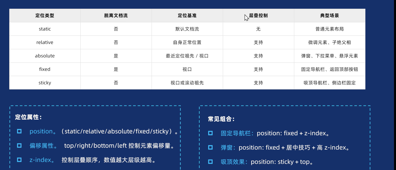
1.定义
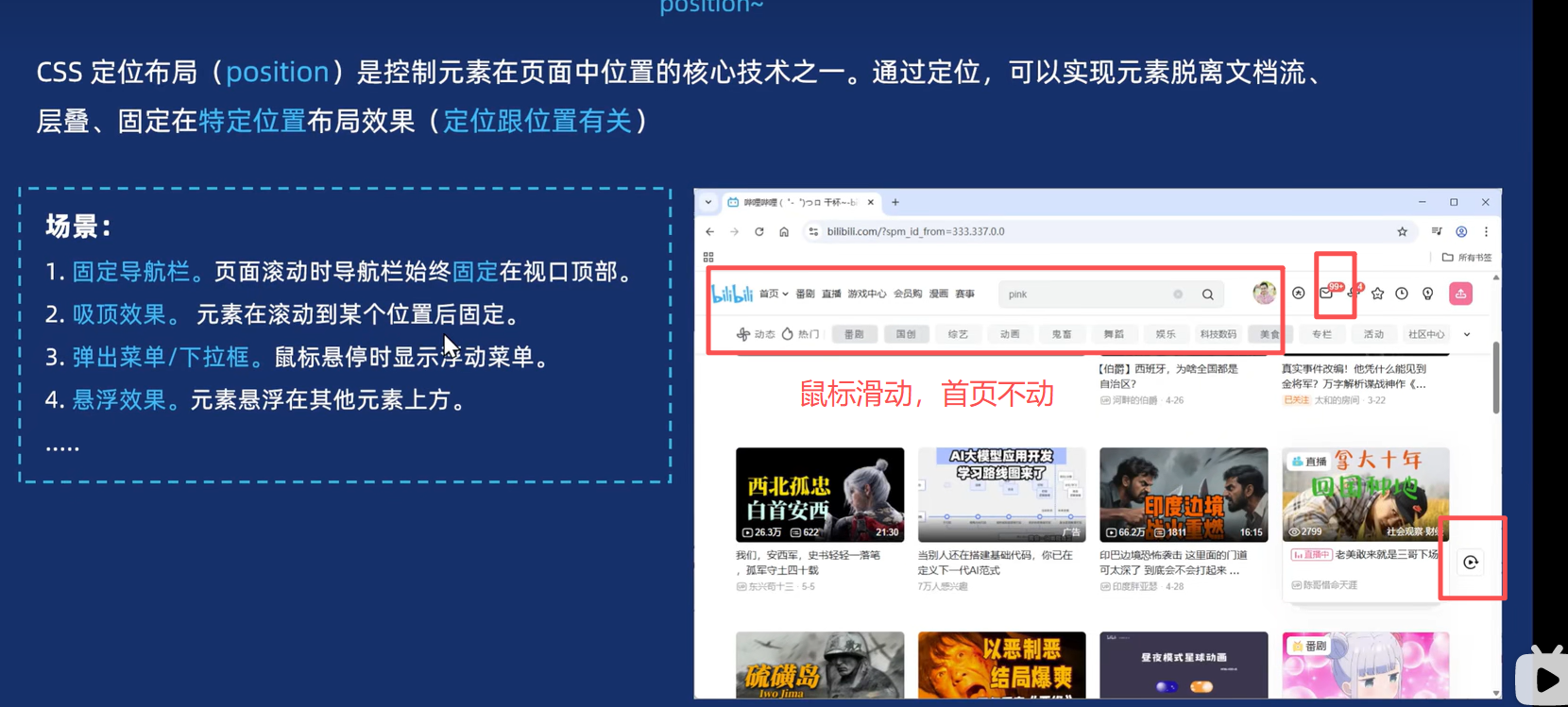
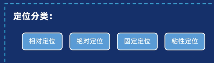
2.分类
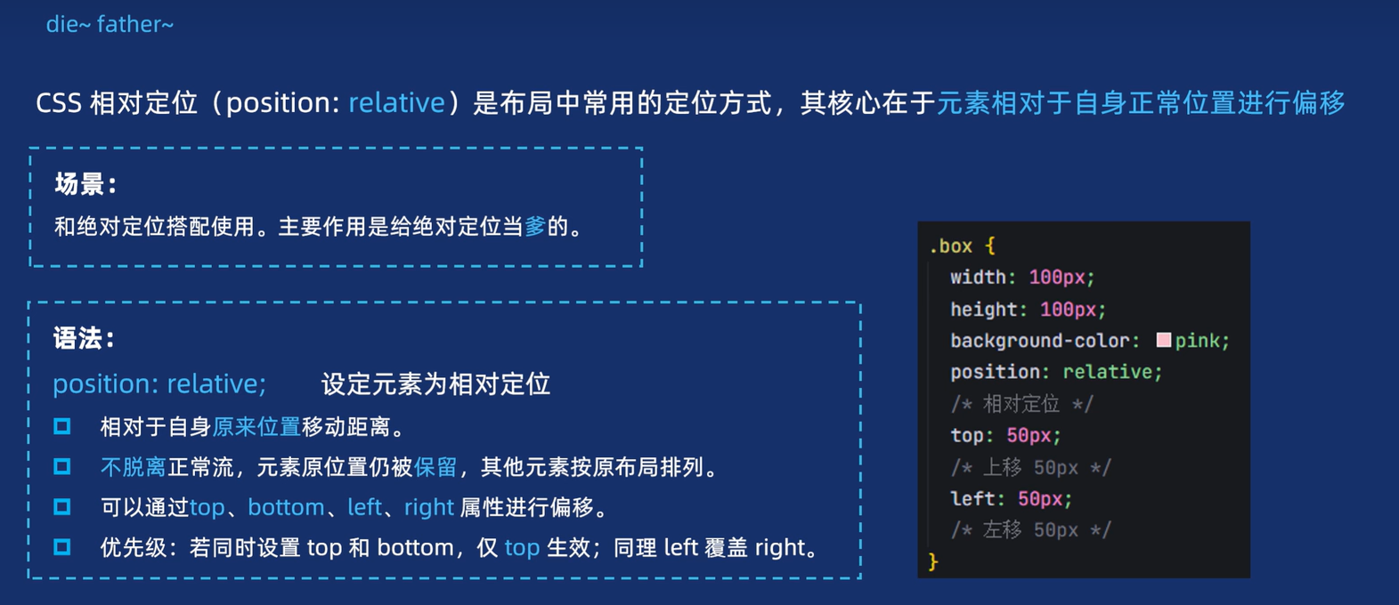
2.1 相对定位
【1】定义
【2】代码演示
html
<head>
  <meta charset="UTF-8">
  <meta name="viewport" content="width=device-width, initial-scale=1.0">
  <title>Document</title>
  <style>
    .box1 {
      /* 给元素加相对定位 */
      position: relative;
      /* 距离顶部 */
      top: 100px;
      /* 距离左侧 */
      left: 100px;
      width: 200px;
      height: 200px;
      background-color: pink;
    }

    .box2 {
      width: 200px;
      height: 200px;
      background-color: skyblue;
    }
  </style>
</head>

<body>
  <div class="box1"></div>
  <div class="box2"></div>
</body>
2.2 绝对定位
【1】语法
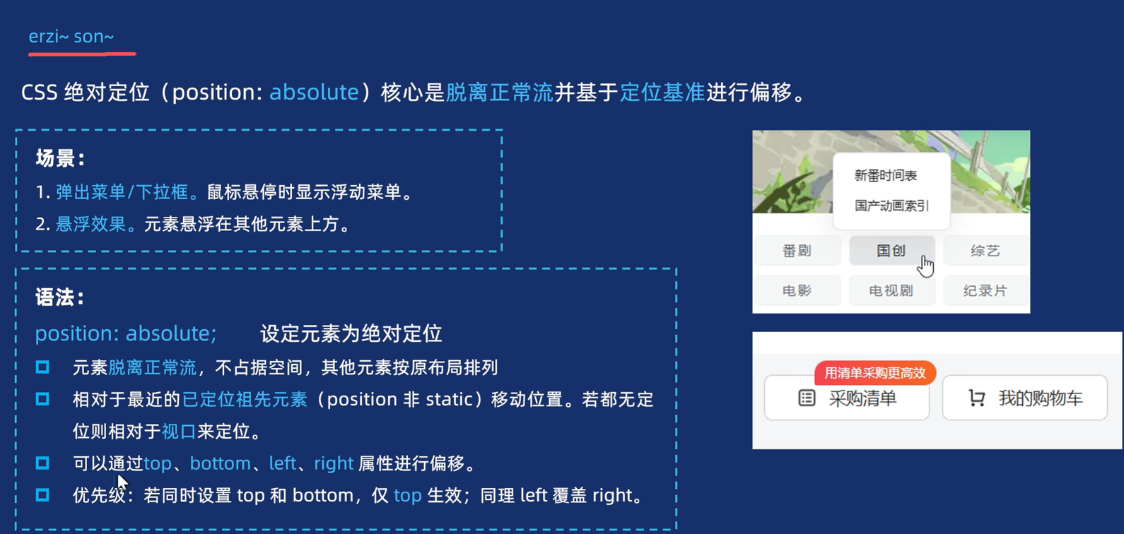
区别:相对定位保留位置,绝对定位不保留位置。
【2】代码演示
html
<head>
  <meta charset="UTF-8">
  <meta name="viewport" content="width=device-width, initial-scale=1.0">
  <title>Document</title>
  <style>
    .father {
      /* 给父亲加相对定位 */
      position: relative;
      width: 300px;
      height: 300px;
      background-color: #ccc;
      margin: 50px;
    }

    .son1 {
      /* 给儿子加绝对定位 */
      position: absolute;
      /* 加过绝对定位后,他就不占位置了,第二个盒子就是跑上去 */
      /* 他这个盒子距离,是距离视口的,父亲不会移动 */
      /* 但是可以给父亲加一个相对定位, */
      /* 那么他的距离,就会以父亲为标准 只在父亲内部移动 */
      top: 50px;
      left: 50px;
      width: 150px;
      height: 150px;
      background-color: pink;
    }

    .son2 {
      width: 120px;
      height: 120px;
      background-color: skyblue;
    }
  </style>
</head>

<body>
  <div class="father">
    <div class="son1">第一个盒子</div>
    <div class="son2">第二个盒子</div>
  </div>
</body>
总结
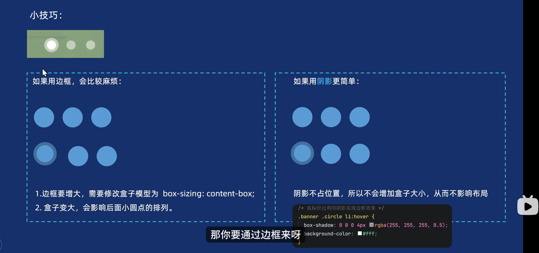
PS:轮播图小圆点技巧
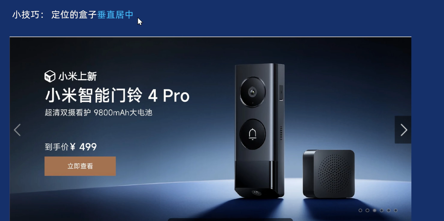
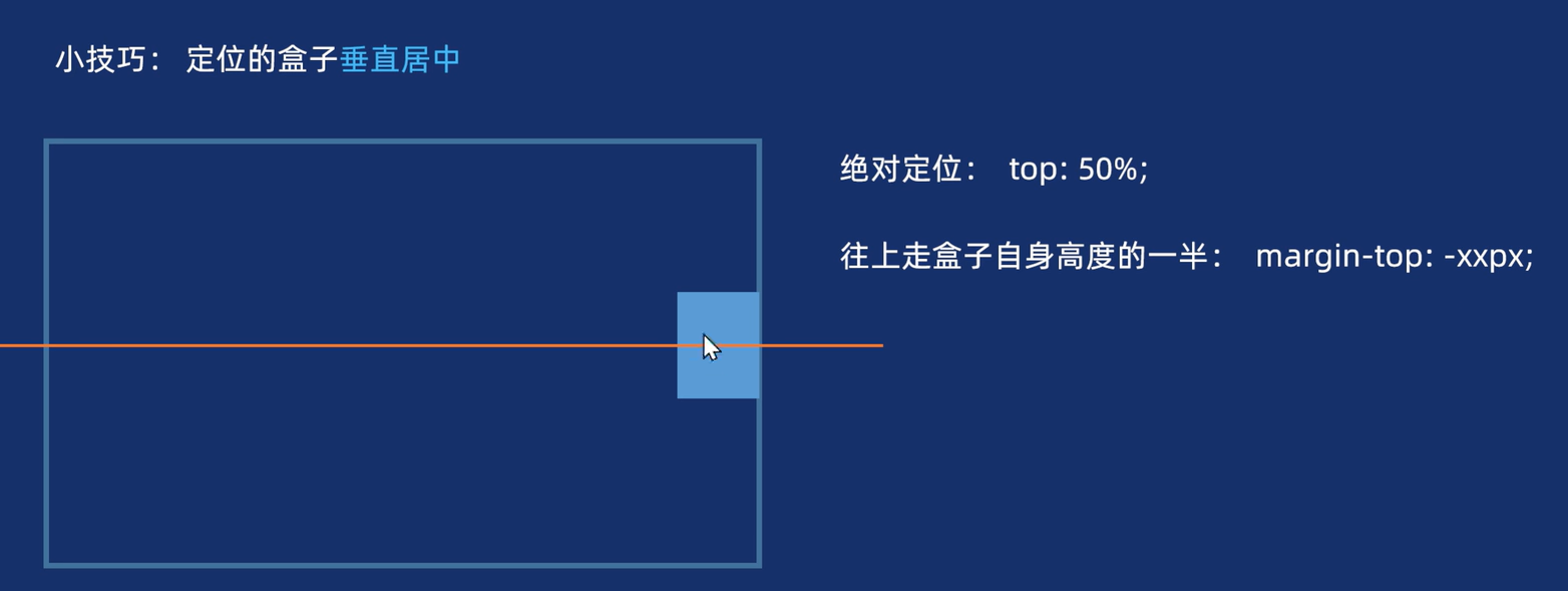
2.3 定位盒子的垂直居中
2.4 案例实现
html
<head>
<meta charset="UTF-8">
<meta name="viewport" content="width=device-width, initial-scale=1.0">
<title>Document</title>
<style>
.box {
/* 其他的隐藏即可 */
overflow: hidden;
/* 给父亲加相对定位 */
position: relative;
width: 1000px;
margin: 100px auto;
}
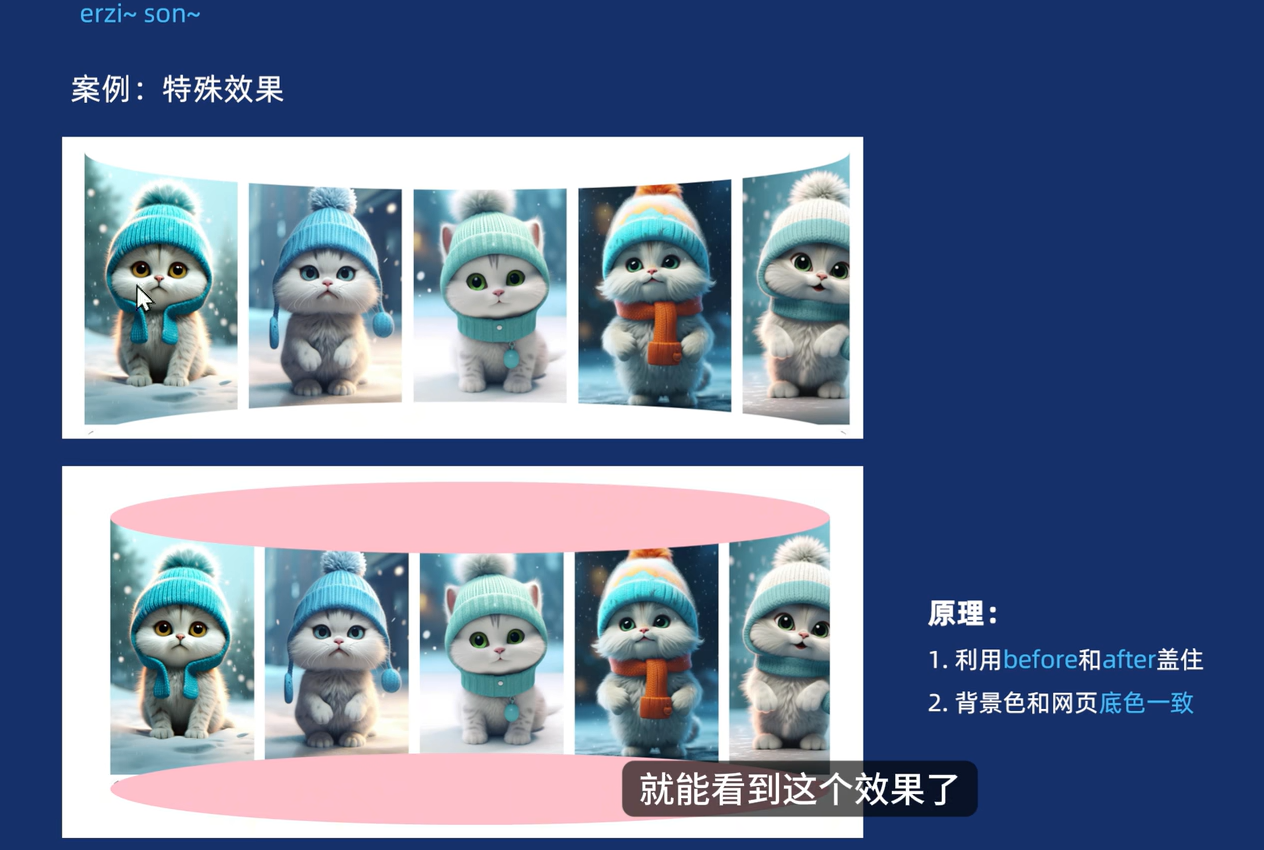
.box::before {
/* 居中显示 */
text-align: center;
line-height: 120px;
color: #000;
content: '可爱的小猫咪,滚动滚轮可以查看哦~~~';
/* 属于行内元素 但是加了定位,则可以直接给高度和宽度 */
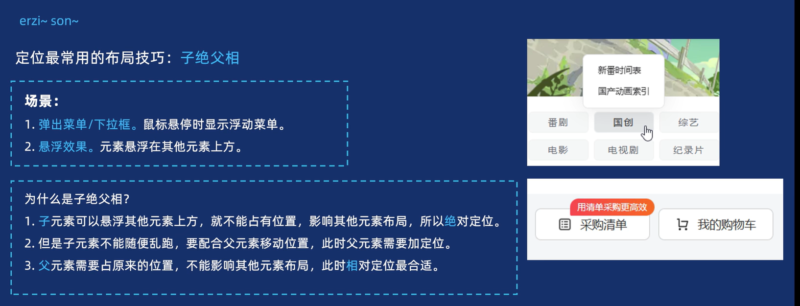
/* 子绝父相 */
position: absolute;
top: -50px;
left: 0;
width: 100%;
height: 100px;
background-color: #fff;
/* 弄成圆的 */
border-radius: 50%;
}
.box::after {
content: "";
/* 属于行内元素 但是加了定位,则可以直接给高度和宽度 */
/* 子绝父相 */
position: absolute;
bottom: -50px;
left: 0;
width: 100%;
height: 100px;
background-color: #fff;
/* 弄成圆的 */
border-radius: 50%;
}
ul,
li {
list-style: none;
}
.box ul {
/* 让图片都在一行上 */
display: flex;
gap: 15px;
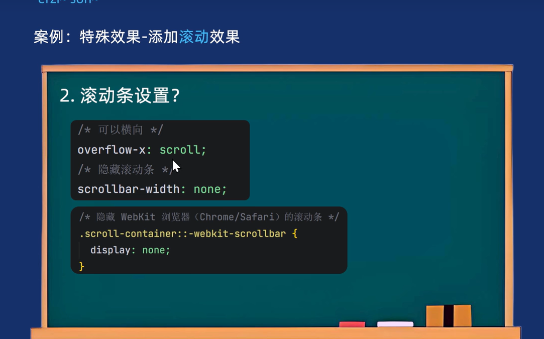
/* 给最长的盒子加滚动条即ul */
/* 水平滚动条 */
overflow-x: auto;
/* 隐藏滚动条 */
scrollbar-width: none;
/* 平滑滚动 */
scroll-behavior: smooth;
}
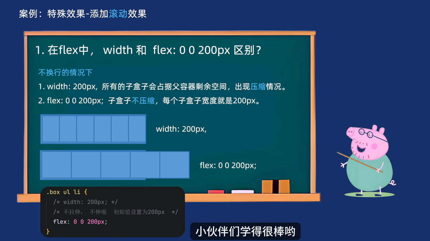
.box ul li {
/* 如果这样设置宽度的话,放到一行后会进行压缩的 */
/* width: 200px; */
/* 所以用flex布局,每个li都占200px */
/* 不拉伸 不压缩 初始值设为200px */
flex: 0 0 200px;
}
.box ul li img {
width: 100%;
}
</style>
</head>
<body>
<div class="box">
<ul>
<li><a href="#"><img src="../images/cat1.jpg" alt=""></a> </li>
<li><a href="#"><img src="../images/cat2.jpg" alt=""></a> </li>
<li><a href="#"><img src="../images/cat3.jpg" alt=""></a> </li>
<li><a href="#"><img src="../images/cat4.jpg" alt=""></a> </li>
<li><a href="#"><img src="../images/cat5.jpg" alt=""></a> </li>
<li><a href="#"><img src="../images/cat6.jpg" alt=""></a> </li>
<li><a href="#"><img src="../images/cat7.jpg" alt=""></a> </li>
<li><a href="#"><img src="../images/cat8.jpeg" alt=""></a> </li>
<li><a href="#"><img src="../images/cat9.jpeg" alt=""></a> </li>
<li><a href="#"><img src="../images/cat10.jpeg" alt=""></a> </li>
<li><a href="#"><img src="../images/cat11.jpeg" alt=""></a> </li>
<li><a href="#"><img src="../images/cat12.jpeg" alt=""></a> </li>
</ul>
</div>
<!-- 添加滚动效果用到了js -->
<script>
// 1. 找到ul
const ul = document.querySelector(".box ul");
// 2. 给ul添加滚动事件
ul.addEventListener("wheel", (e) => {
// 3. 打印滚动的距离
// console.log(ul.scrollLeft);
// 4. 滚动的距离 = 滚动的距离 + 滚动的方向 * 滚动的速度
ul.scrollLeft += e.deltaY * 1.5;
})
</script>
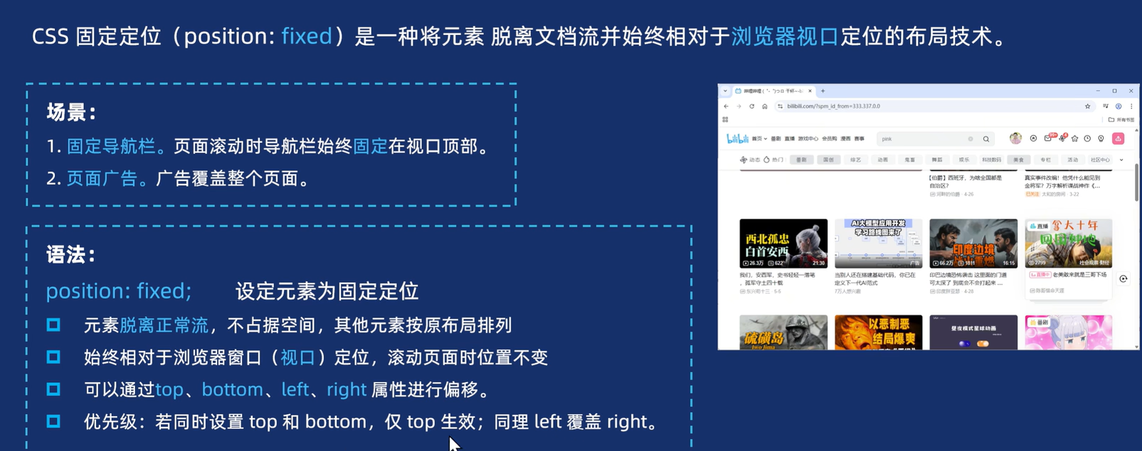
</body>2.4 固定定位
【1】语法
html
<head>
  <meta charset="UTF-8">
  <meta name="viewport" content="width=device-width, initial-scale=1.0">
  <title>Document</title>
  <style>
    .box {
      /* 设元素为固定定位 */
      /* 想让他们在浏览器下方固定 */
      position: fixed;
      /* 水平居中 */
      /* margin: 0 auto; 对于定位的盒子无效*/
      /* 先让盒子走父亲的一半,再往左移动盒子宽度的一半 */
      left: 50%;
      margin-left: -300px;
      bottom: 30px;
      width: 600px;
      height: 120px;
      background-color: rgba(0, 0, 0, 0.5);
      border-radius: 15px;
    }
  </style>
</head>

<body>
  <div class="box"></div>
</body>
2.5 粘性定位
html
<head>
  <meta charset="UTF-8">
  <meta name="viewport" content="width=device-width, initial-scale=1.0">
  <title>Document</title>
  <style>
    .nav {
      /* 设置粘性定位 */
      position: sticky;
      /* 即使是0也要写 */
      top: 0;
      width: 1000px;
      height: 100px;
      background-color: pink;
      margin: 100px auto;
    }

    .main {
      height: 2000px;
      background-color: skyblue;
    }
  </style>
</head>

<body>
  <div class="nav">我是导航部分</div>
  <main class="main"></main>
</body>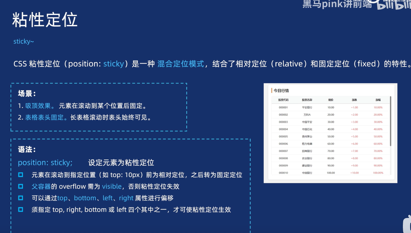
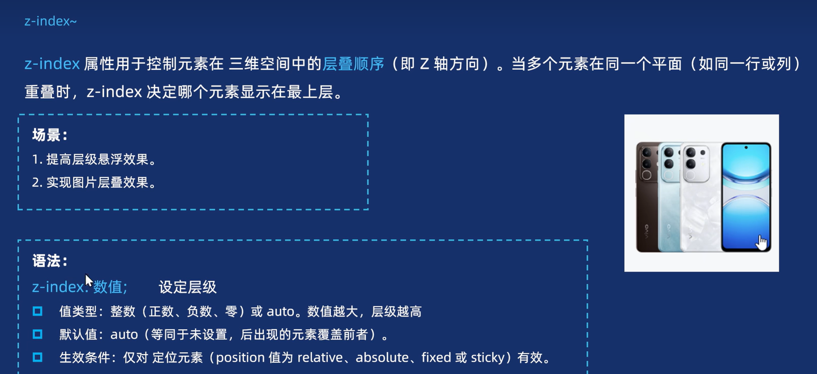
3. z-index叠放层次以及总结
3.1 z-index叠放层次
html
<head>
  <meta charset="UTF-8">
  <meta name="viewport" content="width=device-width, initial-scale=1.0">
  <title>Document</title>
  <style>
    .box img {
      /* 先定位 */
      position: absolute;
    }

    .tel1 {
      left: 30px;
    }

    .tel2 {
      left: 90px;
    }

    .tel3 {
      left: 150px;
    }

    .tel4 {
      left: 200px;
    }

    /* 现在弄个一个,鼠标一经过谁,谁就变成第一个 */
    .box img:hover {
      /* 改变层级就可以了 */
      z-index: 1;
    }
  </style>
</head>

<body>
  <div class="box">
    <img src="../images/tel1.png" alt="" class="tel1">
    <img src="../images/tel2.png" alt="" class="tel2">
    <img src="../images/tel3.png" alt="" class="tel3">
    <img src="../images/tel4.png" alt="" class="tel4">
  </div>
</body>
3.2 总结